Iño
For my personal project at Type@Paris I wanted to tackle a humanist typeface. I have always loved designing with them. When used in a text size they are incredibly comfortable to read. Although, what makes them easy on the eye at small size, can also make them feel unrefined when used at large sizes, resulting on the need for a spin off typeface: a display version. Display typefaces are often a more highly contrasted version of their text counterpart, with more delicate serifs and terminals. Having a text and display version of a single typeface is a customary practice these days, but for small studios and low budget projects, buying two full typeface families can quickly get expensive. I wanted to address this by attempting to design a humanist typeface that could work for text and display without the need for a more contrasted version of it.
I started by considering what makes a great display and a great text typeface. I looked at original printing specimens of Garamond for reference on letterforms, proportion, counter sizes, counter shapes and the terminals, particularly how the serifs were handled. While taking all of those things in consideration, I started to ideate on a personality for the typeface.
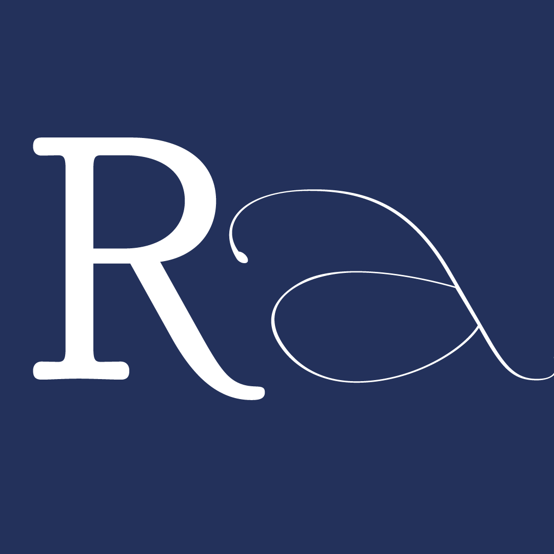
In my own native language, Portuguese, we tend to use more words than English, accents are also a huge part of our language, which is mostly non-existent in English. I was also interested on inspired by looking at Spanish texts and their use of punctuation. All of these added marks make for a incredibly animated and busy paragraph. I wanted to capitalize on that energy, by enhancing some of that movement. For that I looked at calligraphic serif letterforms, looking for characteristics that would accentuate vertical, and horizontal movement (long tails and legs on the Rs, Ks, and Qs, flatter bridge on the “n” and terminals on “e” and “c”) , and without being taxing on the eye, it would add texture and movement to a word, sentence or paragraph.
Thus Iño was born. Looking closely, you will notice the angular axis, accentuated by pinched counters and slightly heavier strokes on the upper right and left corners of the letterforms. The bridge of the n is slightly flatter than the typical calligraphic or humanist typeface (although you will find this trait in dutch typefaces more commonly). I did this, to help accentuate the horizontal quality I wanted to achieve in this typeface. I kept the concave quality of the Garamond serifs in Iño, because it complemented the tension between angular and rounded strokes that is characteristic of this typeface. It also helped give some texture to the serifs and avoiding having two strong optical horizontal lines moving through the typeface (on the x-height and baseline). The serifs are slightly thinner than Garamonds, and more angular, allowing them to look sharp when used in large sizes.
Iño also features some alternate glyphs and ligatures, as well as angular details on punctuation marks to help add to the texture and movement that is so characteristic with this typeface.
The overall effect is a typeface that looks refined when used in a large size, while remaining quite readable at a small size. I look forward to continue to develop this typeface and hopefully we will see the appearance of some italics in the near future!


The 6-week type design programme that you’ve been waiting for starts on 2 June and ends 10 July 2026.


Open to all Our summer programme is in English and covers typeface design and calligraphy techniques, type history, and software practices. Whether you’re a design pro or just curious about type design, you can learn all about it in a relatively short amount of time.
➼ Subscribe to our mailing list to don’t miss important updates.