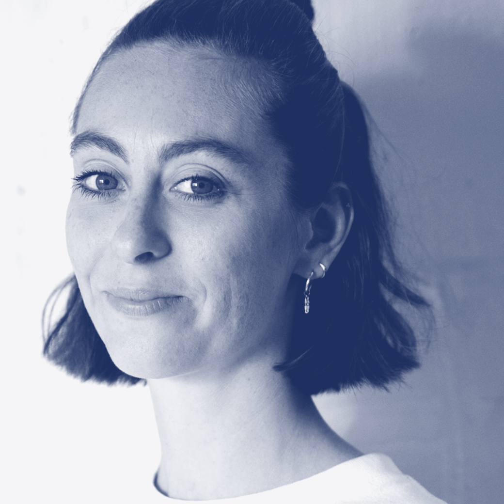
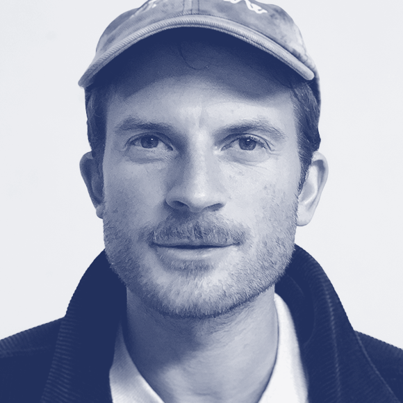
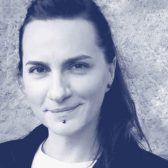
This second phase of TypeParis Summer24 has become one of the most diverse and complete of the programme: with two different international type guests, several visits to libraries and museums between Paris and Lyon and, of course, the development of the personal type design projects! This time, we have welcomed Marc Rouault and Julie Soudanne as instructors, who beside Jean François, Mathieu and Gina they have been teaching and accompanying the attendees during those weeks.
Libraries and museums visits: Paris and Lyon
One of the most significant moment on this second stage of TypeParis Summer24 is the compilation of references to help defining all typeface designs. And it is precisely thanks to the diverse organized visits to libraries and museums that attendees can enrich their own research according to their project briefs.
The first outdoors visit of this summer programme has been the one at the Livres Rares department of François Mitterrand Bibliothèque Nationale de France. Together with the guiding and the expertise of Jean-Marc Chatelain, the department’s director, we have explored through a collection of 17–19th century rare books containing extraordinary type specimens that have allowed the attendees understand the evolution of typographic forms and, simultaneously, to help them out finding a starting point for the first sketches of their personal type projects.

After the splendid visit to the BNF François Mitterrand, we have travelled towards Lyon, where the appointments both to the Musée de l’Imprimerie and the Musée Gallo-Romain awaited us. At the Musée de l’Imprimerie we have also consulted and admired awesome type specimens and historical inputs, such the Albert Hollenstein specimen or the impressive Ladislas Mandel original drawings. Following TypeParis traditions, a picnic over the Rhone have given us the needed energy to carry on with our Lyon typo-trip: the visit to the Musée Lugdunum (Gallo-Romain). While getting lost in that impressive building and its vast collection of extraordinary stone-carved Roman capitals, the attendees have focused on the details of Roman capital letterforms construction (ductus and proportions) and they have felt ready to begin drawing even better their own uppercase letters when back to Paris.
International guest critics: Sláva Jevčinová and Ruggero Magrì
Early in this second phase of the programme, we hosted Sláva Jevčinová, the first guest critic of TypeParis Summer24. Later on, it has been Ruggero Magrì’s turn, a TypeParis alumni, who has been back to Paris, but this time share his type design knowledge with us.
First, Sláva has helped individually all the attendees to get a more well-defined idea of the design they wanted to achieve concerning their briefs and references. Her training at TypeMedia and her experience as a type designer and sign painter have been very beneficial at this research stage.
One week later, with designs much more defined, Ruggero have looked one by one at the students’ designs with a fresh eye, giving in-depth feedback to them all. There is something special with him, because he is the first alumni who is back as a type critic. The exchange will have been very productive with the attendees of TypeParis Summer24.
Both guests have given a talk to conclude their whole day in the school and right after they have gone out for the regular Typo Bistro with the attendees to end properly those long days.

Broad style and typeface extension
Back to school, the main purpose of this second TypeParis Summer24 phase has been to set up a broad style for all attendees’ typefaces and to be able to construct a creative workflow based on the previous design space practice on phase one.
To do so, we have introduced the basics of a digital workflow, including the Bézier curves drawing and the correct point positioning and the spacing as an integral part of the design process. It has also been the time of introducing some design variations while changing style, weight and contrast to let them discover the range of design possibilities and to fuel their inspiration for their personal typeface projects. The idea of adding new masters is to research for new shapes as result of interpolation, variable font technology.
By the end of this extension stage, all students have moved to Glyphs and they will keep working on tracing paper for key new elements such as capital letters or numbers.
Do not miss their amazing forward moves on next phase!
– By Gina Serret
Learn more about TypeParis courses and conferences!
➼ Type & graphic designers interviews
➼ Summer24 programme
➼ Reports
➼ Attendees feedback series
Apply to TypeParis Summer25 course!
The deadline for applications will be next 14 March 2025.
SPONSORS


