


Quickly, we have reached the fourth week of the programme with very good feelings in class: all personal typefaces have enough solid pillars to be both completed and expanded into fully fledged families. And for that, we welcomed the instructor Malou Verlomme and the Glyphs’ co-founder Rainer Erich Scheichelbauer who, together with the rest of the instructors, pushed the attendees to obtain a functional digital fonts.
We counted with the precious external help of two more international guests critics such as Franziska Weitgruber and Dino dos Santos. And we even found time to make the last outdoor visit of the programme: the always enriching moment to discover more gems from BnF Arsenal.
Let’s discover more in detail how everything evolved during this third phase of TypeParis Summer23!
Design consolidation
At this advanced stage of the programme, it’s time to focus on developing a complete set of lowercase, uppercase, numerals and punctuation for the basic weight of each of the personal projects.
This phase started with the classical basic set meeting where attendees displayed all what they completed concerning the main weight of their typefaces. The evolution of all designs was incredibly exponential! The goal now is to get a functional digital font with the existing glyphs.
And the next step will be to test ideas and to sketch for potential family extensions such as italic, bold, display, script, stencil, condensed, etc. All them in line with each brief and each style of their already defined designs.
Glyphs’ support in class
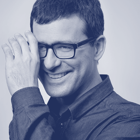
What it has also become a TypeParis Summer tradition already is the one-week full time presence of the Glyphs’ co-founder Rainer Erich Scheichelbauer.
To have this support every day at the school, especially at this point of the programme, is immensely helpful for the attendees: they have the privilege of being personally assisted by probably the person who masters Glyphs software the best. Due to our instructors as well Rainer’s energy and passion, not only the group was able to manage properly the font software in a few days, but also they acquired such an advanced level of digital workflow in Glyphs that by the end of the week they know how to use the composite-component system, to interpolate, to create multiple masters and to get variable fonts.
International guests
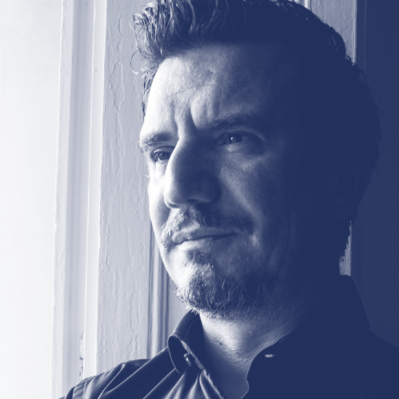
During this third phase, we had the chance to count with two very appreciated visits from Italy and Portugal: Franziska Weitgruber and Dino dos Santos.
The independent type and graphic designer Franziska Weitgruber arrived for the fourth week of the programme, when the group was asked to extend their main weight typefaces as much as possible. Franziska fresh review gave new perspectives and more power to the attendees to complete their glyph sets.
One week later, it was Dino dos Santos’ turn. Dino, founder of DSType, assisted the group with advanced advices to be able to fix last design mistakes and suggested them as well some future improvements for their typeface families. At the end of his critics, he did a global review where he talked, among other type design topics, about designing a usable typeface.

Bibliothèque de l’Arsenal
The highly intense rhythm at class had a nice break thanks to the last visit of the programme: the Bibliothèque de l’Arsenal. Placed in the ancient Arsenal de Paris founded by the king François the 1st in the sixteenth century, this library is considered an historical monument since 2003. Apart from the French literature, is specialised in the bibliophile and the histories of book and bookbinding.
Leaded by Christine Prieur and Fabienne Queyroux from the library, the entire group with Jean François Porchez and Gina Serret as instructors could enjoy their extended and precise explanation while showing one by one a curated selection of old type and calligraphy books.
This appointment at the Arsenal completed the full set of visits of TypeParis Summer23 and gave more historical tools to the attendees to guide them through the development of their personal projects. A better understanding of the construction and the history of letterforms is an essential goal of the programme since it clearly helps making easier all the creative process.

Expanding the family
As we have already introduced, by the end of this third phase, attendees should put all their energy on exploring the design space to expand their typefaces into fully fledged families. Once the main weight of the personal projects was completed with alternates, ligatures and language supports, the group was asked to explore potential family extensions such as the italic, bold, titling condensed, optical sizes or other concepts.
Thanks to the work they have done on those new family variations, attendees got also clues to fix and fine tune their main weight designs. From now on, they should try to complete the basic sets as much as possible to be test them and get them ready for the final delivery.

Do not miss the last phase of the programme!
– By Gina Serret
Learn more about TypeParis courses and conferences!
➼ Type & graphic designers interviews
➼ Summer23 programme
➼ Reports
➼ Attendees feedback series
Apply to TypeParis Summer24 course!
The deadline for applications will be next 14 March 2024.
SPONSORS


