We have a wonderful group of speakers and guests sharing with us this year at TypeParis. We wanted to find out a little more about each of them, so have presented them with a series of questions which they have generously taken the time to answer.
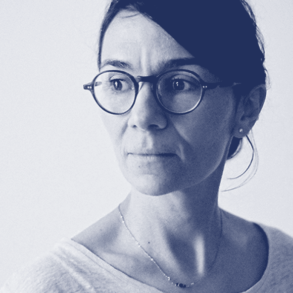
We are joined today by graphic designer, author and teacher, Camille Gallet. Camille is co-founder of Atelier Trois studio with Cécile Boyer and Emmanuel Pevny. Atelier Trois produces lovely work. It was very nice of her to give some time to answering some questions.
Tell us a little about what sparked your interest in graphic design, and, more specifically, typography.
Camille Gallet: I didn’t start with graphic design straight away. I first studied literature and then went into textile design at the École Nationale Supérieure des Arts Décoratifs. I just loved working with colours. I focused on graphic design at a second stage. I discovered in graphic design and more specifically in typography a good way to create meaning and shape. Words and letters are both shapes with meaning. Since the very beginning of our studio Atelier trois, we have used them to create visual typographic compositions.
“Words and letters are both shapes with meaning. Since the very beginning of our studio Atelier trois, we have used them to create visual typographic compositions.”
— Camille Gallet

When you approach a logo design project, how common is it to find the ‘perfect’ typeface for the wordmark? Do you often end up creating something custom?
Cases vary depending on the client and the design we have in mind. Some logos are fully based on the “right” typeface. If we don’t find the “perfect” typeface because the exact weight or glyph is missing, we use a custom-made typeface.
My partner Emmanuel Pevny loves typography and type design and draws himself most of our custom types.
What stands out as instrumental in your education and growth as a designer? This could be a person, school, or any other resources.
During my artistic education I met with several inspiring people: my associate obviously but also a few teachers, who influence my work each in their own way, among them Dirk & Evelyn Ter Bekke-Behage and Gérard Plénacoste.
Another significant moment of my education has been the discovery of the screen printing method. The pleasure of pure color made possible by this technique is still inspiring many of my choices like the almost systematic use of spot colors.
What do you love about the graphic design community? Are there are any negative traits or attitudes within the industry that you would like to see change?
I don’t think one can identify a real graphic design community. Especially in France I would rather talk about the sum of each professional or micro-communities. It’s just a shame we don’t get to work together more often. I believe we should stand up more to defend our practice and skill-set.
A few years ago we joined a designer’s group to create and exhibit self commissioned posters printed in silkscreen. Five years after its creation, Air Poster is a particularly good experience for us of being part and active members of a small graphic design community.

What is something outside of your industry that inspires you?
Our inspirations come from many places: designers and contemporary artists like the Bouroullec, Scholten & Baijings, Bridget Riley, François Morellet, Carsten Nicolai to craftsmens like potters, textile designers, woodworkers but also various sources in the every day life.
— Interview by Dave Coleman.
Learn more about TypeParis courses and conferences!
➼ Reports
➼ Type & graphic designers interviews
➼ Attendees feedback series
Apply to TypeParis Summer course!
The deadline for applications is 14 March, every year.
SPONSORS


