

We have a fabulous selection of international guests critics visiting us at TypeParis Summer24. We wanted to find out a little more about each of them, so have presented them with a series of questions which they have generously taken the time to answer. Discover Henrik Kubel’s interview.
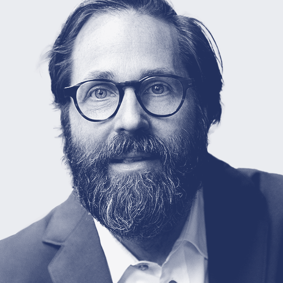
Biography Henrik Kubel is the principal typeface designer at A2-TYPE; he is holds MA’s from Denmarks Design School and Royal College of Art as well as diplomas in typeface design from Cooper Union in NYC, Plantin Moretus Museum in Belgium and Reading University in UK. He taught typography at Royal College of Art for many years. He is an expert in designing complex font systems with a contemporary feel and is highly specialised in creating typefaces for small point sizes and well as fonts for display use across all touchpoints.
Interview
Describe your day?
I wake up. I have breakfast, fruit or cerial and a cup of tea, I feed the cat, I take my kid to school. I ride my Vespa to our studio in Shoreditch, 15 mins away. I check my email. I start drawing type… We have our own office building /design studio. It is important for me to separate work life and home life. It has always been like this.
Have your work habits changed after the pandemic?
No. WFH is not a concept I embrace.
Favourite kind of music to listen?
Electronic music or silence, please.
Do you read news?
Yes! The New York Times. The Economist, The Independent, Weekendavisen. All news organisations we have designed custom fonts for.
What do you do to evade yourself from work?
I swim and I walk.
“We always try to infuse our own thinking in the drawings so that our contribution isn’t solely a carbon-copy of history. Yes, we are inspired by the past, but hopefully, we are also engineering the next generation of a certain style.”
– Henrik Kubel

What drives you to create new typefaces?
My mind.
How much a software can determine a type project?
Software is great! But if you have no ideas then it doesn’t matter at all – you are not contributing anything.
Does AI change the way you work?
Of course. We are yet to see the impact of this. I think it’s super exciting!
What is your ratio of self-initiated typefaces vs. typeface for clients?
50/50. We do work on many revivals. However, we always try to infuse our own thinking in the drawings so that our contribution isn’t solely a carbon-copy of history. Yes, we are inspired by the past, but hopefully, we are also engineering the next generation of a certain style.
Is it possible to draw a typeface for a language or writing whose language we do not know?
Yes! However, we always work with local experts to ensure our design meets the industry standard for whichever script we are designing.
What do you think of free fonts?
It is complete rubbish! Nothing is free. It costs money to go through education, it costs money to run a business, it’s time consuming and costly to do research and to design and publish new fonts! On top of this comes the cost of engineering sales systems online, advertising your work, paying studio rent, lawyers, accountants, tax, raising children, etc. It is beyond impossible to do anything for free! In my opinion, free fonts are harming our industry and clients that think fonts should be free should work for free themselves, none of them do! Even people working for not-for-profit organisations are being paid, why shouldn’t typeface designers be paid? Some of the key people advocating free fonts and software are themselves taking home huge pay checks from large companies, they get paid! Yet, they argue that everyone else should work for free, it makes no sense and it’s about time people wake up! And stand up!

Do you feel that your working methods and approach to your projects have changed through the years?
I started drawing fonts in 1993. I have worked in programs such as Illustrator, Fontographer, FontLab, RoboFont, and now Glyphs. It is a continuous journey of discovery and development. I am, of course, better today than I was yesterday. I have more experience, and with experience comes change. We have been fortunate to work with high-profile clients across the world with super high standards, all of them have made us into better designers.
Your foundry is one of the few foundries that is not on type distributor websites, why?
We invested a lot of time and money building the A2-TYPE font library and brand over the last 20 years. We have a vast amount of high quality fonts that are different from the rest of the font market (I am ignoring the copy cats! Out there). We have zero interest in sharing our hard work with large type sale forces that do very little apart from reaping the fruits of our hard labour. We are 100% independent for all of the right reasons.
“Having graphic design and art education as a background is a strength that you can use in typeface design.”
– Henrik Kubel
You’ve set up your own foundry, A2-Type, as well A2/SW/HK studio. How do things work between the two?
We started as a design company with one mission: only to use our own fonts in all of the client work we worked on. Over the years this turned into drawers of type that we eventually decided to polish, expand, final craft and then release. The platform for our fonts, A2-TYPE runs independently but is an integral part of our graphic design studio. We see and design type differently because of the fact that we are first and foremost trained as graphic designers. Having graphic design and art education as a background is a strength that you can use in typeface design, it is not just about being technically proficient in the latest software program, you need to have a lot more in your bag before you can actually contribute something.
Do you remember when you decided to pursue your career in design and typography?
I enrolled into design school in 1992 in Copenhagen, I did 5 years! I then went on to do further MA studies at Royal College of Art in London – I met Scott Williams here and we set up our design studio A2/SW/HK upon graduation. Ten years later, in 2010, we opened A2-TYPE. I have since commenced with further studies from type specific courses at Reading University, Museum Plantin-Moretus in Antwerp and Type@Cooper in New York. You can never know too much!
When you started who had the most impact on you?
Early on: My mom and dad, Peter Gyllan, Finn Nygaard, later in life: Margaret Calvert, Scott Williams, my life partner and our child and of course all of the people I have met along the way… Too many to mention.
During your creative process, do you sketch–draw on paper before moving on to the digital workflow?
A bit of everything. I can draw type by hand, I am classically trained, sometimes this is the quickest way to resolve a form or an idea before I go on screen. I use a pen and a tablet when I draw type.
How do you see the future for the type community?
It looks bright! And messy!
Do you have words of wisdom for young practitioners?
Work hard! Don’t steal your colleague’s outlines! Be original and always charge for your work.
Thank you very much, Henrik!
– Interview by Lilian Hervet
Register to the graphic & type conference in Paris ➼ Now24 conference
Learn more about TypeParis
➼ Type & graphic designers interviews
➼ Summer24 programme
➼ Reports
➼ Attendees feedback series
SPONSORS


