

On 1 June 2024, the Now24 conference will take place in Paris. On that day, more than a dozen graphic design lecturers, art directors and type designers are expected. Join to attend talks by international speakers around graphic design, web design, motion design, publishing, visual identity, communication and type design. If not already done, register now to take advantage of the best rates.

It seemed interesting to us to make you discover the profiles of our guests. Discover Jeremy Tankard’s interview.
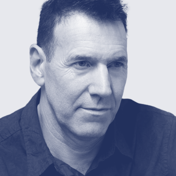
Biography Jeremy Tankard is a graduate of Central Saint Martins and the Royal College of Art. Initially working at Addison Design Consultants and then Wolff Olins, he left corporate design in order to pursue his interests in type as an independent type designer in 1998.
Designing type since the early 90s, his first typeface Disturbance was released through FontShop International in 1993. This was followed by Bliss in 1996 as part of the Agfa Creative Alliance and later typefaces for Adobe and Microsoft.
He is a member of the Double Crown Club, a past Chair of the Wynkyn de Worde Society, and current Chair of Letter Exchange.
Interview
Describe your typical day?
Jeremy Tankard Weekdays I get up at 6.30 (weekends at 7.30). Make coffee and read for about an hour then take the dog out for a walk. I’m back to start work by 8.30. Several years back I got in the habit of making a weekly agenda list which acts as a general guide for my week ahead. It’s a short term overview of all the stuff I have going on – including long term projects, client related work, company business, and family. To this list I’ve now added Letter Exchange work (as I am currently Chair of this society – https://letterexchange.org).
Depending on emails (clearing all the spam and junk that has accumulated over night) and work load I will sort out licensing questions and concerns, or dive right in to the fun stuff – type. Fun stuff can be reading and research, drawing, dreaming, developing, testing. All aspects of type design and production, which very much depends on what stage a project is currently at. Sometimes I do catch myself just staring at type, bit like I’ve run out of batteries. As I write the answers to these questions I’m at the stage of a new typeface, scheduled for release sometime around May. The glyph set is complete and final fit and adjustments need to be attended to before kerning starts. Ideally I want to have the type completed by the end of January so it can go through extended testing and be tweaked. Then all the marketing material can be produced.
Lunch is around 12.30 and I work through to around 6pm. After dinner I may do more work, it all depends on what needs to be achieved by any specific deadlines. I’m very good at giving myself deadlines and sticking to them – and generally get frustrated when things knock me off course. End of day is around 10.30pm.
What is your favorite way to start a day?
Jeremy Tankard Coffee, I recently got a home roaster so can now buy green coffee beans. I don’t go in for espresso so am always on the hunt for a good coffee shop that does drip filter medium roast from single estate bean – hard to find. With mug in hand I like to read for about an hour each morning. I like artists’ biographies and histories, specifically twentieth century – currently reading “The St Ives Artists” by Michael Bird, and have “Venice, city of pictures” by Martin Gayford, and “Artists” Lives by Michael Peppiatt lined up for reading next. Not sure which will be first, the paper used in Gayford’s book is very white and not that nice, type’s a bit spindly too, so I may read that one last… and the first thing I do when I get to my desk is to hit the keyboard to wake the Mac.
Do you prefer a permanent/dedicated workspace, separate from home or at home?
Jeremy Tankard Years ago I rented a studio space which kept everything separate. However, the downside was that all my books were at the studio so I had to keep bringing stuff back if I wanted to read or work later at home. It also was problematic for those “out of hours” bursts. Artistic careers don’t follow the 9–5 work pattern. Self employed work certainly doesn’t. I often work from 8.30 until late at night. TV is quite rubbish now so what else is there to do other than type ;). When we moved out of London I put the studio at home which suited me perfectly. I’m quite focused, and when deep into something, don’t like distractions or stopping – which of course can bring its own troubles. Even now my work pattern is a long day peppered with other duties of life. Company accounts are always done weekly on Saturday mornings so not to disrupt the working week. A few years ago I added a garden studio. This space is where the photography stuff lives and also doubles as a quiet space where I generally go to research and draw. I can lay all the books and drawings out allowing me to easily cross reference and review. It’s not totally computer free as I take the laptop down when writing. But I try to avoid the distractions of email and phone in there. It can be freezing in winter and boiling in summer, but the atmosphere and garden view outweigh any drawbacks.
Have your work habits changed notably after the pandemic ?
Jeremy Tankard No. I was independent before so nothing changed during those “lost years”. What I did notice though was how often I actually went into London – at least twice a month and sometimes much more, mostly for lectures and meeting friends. So having this removed made it more like prison. The double-edged sword of post-lockdown has been the reliance on streaming for meetings and events. Yes, it is good the option is there but I’m old school and enjoy the atmosphere, spontaneity or palpable enthusiasm of a face-to-face meeting. It also gets me out and away from the computer.
“No matter what field of design you go in to, you should always push for more, question everything and look, look, look.”
– Jeremy Tankard

Favorite kind of music to listen to while working?
Jeremy Tankard I am quite eclectic in this respect. Silence when I’m trying to write. But generally I will rotate between radio (classical music), CDs – indie, pop, classical, folk … some of my favourite ones you may know as they are French – M83 and Caravan Palace. Also lots of spoken word dramas. However, after many visits to the opticians and always being told to regularly look away from the work screen, I often have films or series running on the laptop next to me. I got a blu-ray player for the laptop, but also watch streamed. This way I can work, then break my gaze – the set up is perfect for a week of kerning as I do get jittery eyes doing this!
Do you read news?
Jeremy Tankard No. I gave up with the news several years ago. Headlines on the phone are enough.
What do you do to evade yourself from work?
Jeremy Tankard There are things that always seem to get left to the last minute. But work evasion is more the result of doing a more interesting job, rather than a sport or similar. I’d love to put off doing the accounts on Saturdays, but that is routine now, much like the dog walk so these are almost done without thinking. Cooking is a great distraction as is sough dough bread making – a recent occupation. I guess odd things that pop up out of the blue that don’t fill me with enthusiasm will get left. Instead I’ll go and flick through books on type. I’m distracted by type. Which is still work, so not sure if that counts :)
What drives you to create new typefaces?
Jeremy Tankard The belief that there is always something more to do, new patterns, rhythms and shapes to explore; new challenges to create. I have a huge and deep interest in art, design and culture, so for me it is second nature to want to reflect this in what I do – each new type design is me challenging myself to answer a question I’ve asked through my reactions to what is around me.
How much a software and its fixed rules can determine a type project nowadays?
Jeremy Tankard The knee-jerk answer is it doesn’t and I direct the software to do what I want. I have noticed that the software does have a worrying ability to dictate the outcome. So several years ago I started to draw more. I’ve always kept a sketchbook for each typeface – these act as their diaries, each is an A5 black book (sometimes they run to two or more if the typeface is particularly large). I also started to draw a lot on A4 paper, runs of letters, quick explorations of the shape I was after. As these progressed I began to formalise them on tracing paper. The simplicity and immediacy of doing this was a revelation. These aren’t finished production drawings, I use them in combination alongside each other; walk around them, stand back and view from all angles. The fact that they are “raw” allows me to look at them as nascent ideas – removed from the polish and blandness of the computer line. Once the ideas are fixed in the mind’s eye then digitisation can start with an open mind of what the end result will be. For me working directly on computer from the start is hopeless, I spend too long focusing on small details way before the whole concept has had time to develop. By drawing on paper I avoid killing the idea before it has been fully explored as a rough sketch.
Do you think AI will change the way to design typefaces?
Jeremy Tankard I’m a product of the computer generation. I grew up with a Sinclair ZX81 and then a Spectrum – mostly for programming in Sinclair BASIC and YS MegaBasic. I used the early computers at college in the 80s and 90s. I remember being told about Donald Knuth and Metafont and Richard Southall’s reaction to the idea that a computer can create a typeface. This was years ago. The result was Southall going to work with Knuth which ultimately lead to the Adobe Type Team and their Originals typeface programme. Computers have always been part of my life and certainly my working life. I guess I see AI as just another form of computer algorithms so for me it’s already here and has been for some time. Perhaps not the understanding of AI you mean or is commonly thought of through social media. Computers have been interpreting the outlines of letters for years – to rasterise them for screens, to adapt and change their shapes. The freedom that photosetting brought has been in the computer for decades, just controlled by the software. I think the perceived value of type is quit low now, but this isn’t the result of AI. Type has never before been such a base commodity. Because of this I feel there’s huge room for improvement as much of the detail that makes type function appears to have been lost; given over to eye-catching filters and short-lived “type porn”. I remember the early digital type trend “Grunge” of the 90s, no different in my mind now. We have amazing tools that help us make new creations but they can’t replace ideas. We each respond to the world around is in a unique way, some people use those responses to help them formulate a new vision. As far as I’m aware the jury is still out on how the “creative spark” occurs – and probably always will be. It is a unique part of being human and one of the most rewarding parts of the design process, so why would you want to hand it over?

What is your ratio of self-initiated typefaces vs. typeface for clients?
Jeremy Tankard I’m always developing at least one self-initiated type design. If a client project comes in then I put my work on hold. Clients don’t have the same approach or amount of time to allocate for a typeface to be developed as it should be – perhaps this is why so many under perform or are variations on previous designs. A client project may be more limited in its scope in order to meet a deadline and fulfil its requirement. In getting a job done, computers don’t speed up the design process, instead they make the production process easier and quicker. But if the design isn’t thorough first, then the end result won’t be. As a ratio, I guess generally it is around 75% my own work and 25% client work. Over lockdown it was 90% client and 10% my own as I had a large project on.
Are you rather one of those who draw or redraw type classics, or those who seek to totally invent new forms?
Jeremy Tankard I see little point in reinventing the past. Other designers do that, it’s not my path. I understand the need of a previous type to be reworked for current technologies and expanded for current needs. But much of this is production. It doesn’t excite me like the challenge of trying to create a fresh pattern and texture. If asked to reproduce a previous type style, then I would start by looking around the whole historical period to find a hook to excite me and offer a way to develop the idea in a new direction. It may be that the end result is reflective of a specific period and style, this is to be expected, but I would hope that it’s detailing moves the design in a new direction. Type is very much the culmination of minute details, slight shifts and rhythms. Display type is another thing altogether.
Is it possible (or desirable) to draw a typeface for a language or writing whose language we do not know?
Jeremy Tankard I would always seek advice. English is difficult enough and many get that wrong, so to expect the design of a non-native script to go well is a bit naive. You have to do your homework and immerse yourself, as with anything, ask questions, seek advice, look and review. Of course if you are inventing a language (https://en.wikipedia.org/wiki/Constructed_language) then you call the shots and are only limited by imagination and commitment. I have come across conflicting opinions over the design of different scripts, so it is sensible to be clear on what you want to achieve and ask the advice of a few people in order to make you own conclusions and then decide on a design direction. As with all things, there are different agendas and ambitions at play that can confuse what you want and how you think a typeface style should develop.
What do you think of this trend of free fonts?
Jeremy Tankard I tend to think that nothing is free. There is always a price to pay in some form or other. I’ve not really looked at the collections of “free fonts”, they generally bore me and I drift away as nothing stands out or catches my eye. I do think type designers need to work harder in all aspects of what they do. I get the impression that many undersell themselves and big up the speed and ease of production over the value of the type design. The problem here is that with no depth of thinking, development, social or cultural comment, there is little way to differentiate one from the other – no story to tell. A non-type designer looking at this thinness will rightly see it as having minimal or no value and something they can do themselves, so way buy the skill in or even invest in a typeface outside of their subscription.
As you get older you have increasing commitments, the small return against the cost of type development doesn’t generally add up to justify the investment made. You have to fully understand what you’re getting into and be aware of the time allocated to a project certainly if it is self-initiated (self-funded).
The increase of interest in type design we have seen may plateau a bit as the market can’t sustain the multitude of type designers through commissioning clients. Many will need to offset type design with other work and potentially cut corners. Type design from the view point of modification (legally dubious), “homage” types and display designs are increasingly being produced and seem to be the world of the graphic designer. The availability of font design software and the ease of production has made it very simple for everyone to make a font. So we have 100s of display types produced daily. However, text type design is less sexy for graphic designers and takes much longer to develop and requires more specialised skill, so I guess this is why we don’t see so much of this. Often I see text types being designed for book or exhibition projects, some look ok and work for their initial purpose but they often lack the depth required to function beyond this initial use. So “throw away type” like “throw away fashion” may be a thing, if it isn’t already. There are so many types for use that “fit the bill” why bother spending the time or money to try and create new ones. It is much easier to jump on the band wagon and reproduce previous ideas.
As a source of income a type designer can be commissioned to create a free font, but I feel these are very much directed by the commissioning company and don’t push for any cultural or creative change. Type is a product not an art – though it would be good to start seeing it as an art form. The commercial needs of advertisers and graphic designers is only one market; a small foundry or independent type designer can align themselves with other markets and potentially have a strong and rewarding career. There are so many opportunities for type and so much still to do I get dismayed by people’s inability to push for new things.
“I realise that some people are better suited to certain things. I’m just better suited to type.”
– Jeremy Tankard
How do you see the evolution in the way of designing typefaces since the 1990s, during which time you started your career?
Jeremy Tankard The design and needs of type have increased from the basic ISO Latin 1 Character Set of pre-OpenType to the wider European language support expected today. Different scripts are now commonly asked for and designed. In some ways this seems to have replaced creative exploration. Type is now often produced very quickly and for limited application. The needs of commissioned type may not be as thorough or far reaching as foundry type. Much appears to be for commercial product and advertising use, a display type doesn’t need to function as continuous text and adhere to typographic rules and requirements. Style-wise, nostalgia is bigger than ever, which is kind of sad but understandable as it offers a wide playground of ideas to plunder. My design education told that we design for the future; it never dawned on me that designing for the future would mean scraping from the past. However, I do strongly believe that we learn from the past to design for the future whilst living in the present.
With regard to marketing. When I started I could put an advert in Design Week that would generate sales which not only covered the advertising costs, but the printed specimen and to some extent the type development costs. Sales would continue over the months and year which would fuel the design of the next type. This basic linear route has gone – even that magazine has now gone. The market (as such) is very volatile and seems to hang on promo codes and discounts. There appears to be less interest in building a tailored library of typefaces. Why bother when one has access to thousands via a subscription system. As mentioned above – “throw away type”, but I also feel that this is reflective of social media which is only a limited snapshot of who uses type and their approach to and understanding of type.
Innovation, tradition, originality, reproduction: How do these words inspire you in typeface design?
Jeremy Tankard Innovation – to be aware of new approaches to design as well as new ways to show old ideas. To challenge convention, ask questions and to some extent expect those that use the fonts to accept this and challenge themselves to do more with them, and ultimately create new work that pushes culture forward.
Tradition – that the type I create is part of the ongoing development of visual language, grounded in traditions and conventions, but very much reflective of now and manipulative of future development.
Originality – (see Innovation). Nothing is original, but the way elements come together can point towards original thinking. Juxtaposition of ideas.
Reproduction – it would be good to be able to reproduce an effect or emotion through type design. In this way the texture and pattern created ignites a memory or desire of something past. This may be at the route of many revival designs – to recapture a lost past through recreating and reinforcing stereotypes.

Do you remember when you decided to pursue your career in design?
Jeremy Tankard Like many who don’t fit the concept of academic schooling I excelled at art. When I was 14, I remember being taken by my parents to meet the deputy head of the school I was attending. My options only included one science and the deputy head pointed out that the school was a maths and science based school, and each student was expected to take two sciences. My dad just said I was doing art. That was that and as far as I know I was the only one who took one science. I stayed on at school to take A levels and when the opportunity came to leave mid way through my A levels, I took A level art in one year and went to art school to do a Foundation course. After this I went to Central Saint Martins for three years studying Graphic Design; then two years at the Royal College of Art. It was at the RCA that I started a typeface design that became Disturbance. I also began a sans serif that eventually became Bliss. After college I finished Disturbance for FontShop International in 1993 and Bliss for Agfa Creative Alliance in 1996. In 1997 I started work on Blue Island for the Adobe Originals programme, and left to travel around Australia for six months. When I came back I decided to focus on type design full time. This was 1998.
I don’t really know what made me choose to do type design. I was always drawn to type but it may have been the culmination of finding graphic design not that fulfilling creatively. I realise that some people are better suited to certain things. I’m just better suited to type.
When you started, who were the teachers, mentors or professionals who had the most impact on you?
Jeremy Tankard At Foundation it was Dawn and Phil Garlic, they ran the Graphic Design module and interestingly set my first typeface brief – to design a typeface based on an artist. I chose Roy Litchenstein and based the typeface on his brushstrokes. This was 1986.
At Central Saint Martins, each year had very strong lecturers but I guess the lasting influence has been from Phil Baines.
At the Royal College of Art it was Richard Doust who quietly had my back and encouraged me to keep going with computers and technology, whilst Alan Kitching opened my eyes to letterpress.
Outside college it was designers like David Quay, Freda Sack, Gerard Unger, Matthew Carter, who all proved that you could focus on type design as a career. Of course there are also the many contemporaries that I have grown up with, some of which have gone, others are still ploughing away.
During your creative process, do you sketch–draw on paper (or tablet) before moving on to the digital workflow?
Jeremy Tankard Yes. I keep a sketchbook (black A5) for each typeface. This acts as its diary and contains all the notes, thoughts and basic sketches. I also draw on lots of A4 paper to explore shapes and ideas. Many of these are then cut and added to the sketchbook. At some point I start to develop more refined drawings on tracing paper, the great thing about these is that I can build words up and see how the ideas are developing without being distracted by the details of digitising. Macro before micro. Sometimes I may do ink drawings as a way to slow down before the rush to digitisation and font production. It’s very easy to give in to the needs of the software and cut corners, so I constantly refer back to the sketchbook and pre-digital drawings as a way to keep the digital development in check and on track with my original vision and intentions.
Do you have words of wisdom for someone who wants to become...?
Jeremy Tankard No matter what field of design you go in to, you should always push for more, question everything and look, look, look.
What will be the message you would like to convey during your Now24 talk?
Jeremy Tankard Hopefully I can enthuse people to consider design more.
Thank you very much, Jeremy!
– Interview by Jean-Baptiste Pernette
Register to the new graphic & type conference in Paris ➼ Now24 conference
Learn more about TypeParis
➼ Type & graphic designers interviews
➼ Summer24 programme
➼ Reports
➼ Attendees feedback series
SPONSORS


