We have a wonderful group of speakers and guests sharing with us this year at TypeParis. We wanted to find out a little more about each of them, so have presented them with a series of questions which they have generously taken the time to answer.
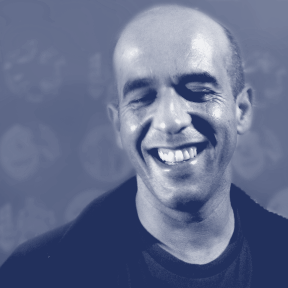
It was an honour and a pleasure to welcome Mário into the classroom on Tuesday. He is a super nice guy, friendly, funny and critiqued the attendees’ work honestly and insightfully. Mário is a accomplished type designer, and his work has strong ties to historical models, with his own interpretation over the top, which has made for a body of work with depth and integrity.
Tell us a little about what sparked your interest both in graphic design and type design.
Mário Feliciano: Since I was a little kid I’ve been into drawing, by the age of 5-6 I was drawing a lot… When I was a teenager I was reproducing record covers and surfing logos by memory in my school books. I guess my deep connection to the surf and rock / pop culture led me into graphic design and later on into typography.
Have you always enjoyed drawing type, even in your earlier years as an art director? How did your passion for creating typefaces emerge?
While still studying graphic design, I got a job as design assistant at Surf Portugal, and not too much later I became art director, that was in 1995 I guess. But prior to that I was already using fonts that I designed or modified, each month I experimented a new set of fonts. Not just mine. That was the time of David Carson, Ray Gun, Bikini, Emigre, grunge fonts! I started from there, playing ‘punk rock’… But soon I got interested in a more serious typography and I began investigating classical and traditional typography.
I was able to try new fonts with full liberty every month, this gave a very accurate perspective of what could work or could work not, what aspects affected the way we perceived text and written information. I also got involved in the editorial side of the magazine linking it with the typography.
What stands out as instrumental in your education and growth as a designer? This could be a person, school, or any other resources.
What I mentioned early was key but there were other factors. I guess I came across the right people to guide me and criticise my work at very early stage, John Downer, Matthias Noordzij and Jean François just to mention a few. Mathew Carter and Gerard Unger made some criticism on my work in very early days, around 1999, 2000, and that was very encouraging. But I think my work is defined by a broad interest in things, I don’t design only one style of typefaces, I might design anything.
I forgot to mention that in 1996 I got a contract with Adobe for them to release one of my typefaces, Strumpf, which later become an Adobe original. It’s a very ‘insane’ typeface inspired by the Smurf forms, hence the name. While finishing the typeface according to Adobe standards I had the chance to work with Carol Twombly and that was very inspiring. Remember that back than there was no internet where you could ‘see’ things! All my correspondence with Adobe was either made by post and fax, I think I send them floppy disk with the masters… for you to have an idea.
“I think my work is defined by a broad interest in things, I don’t design only one style of typefaces, I might design anything.”
What do you love about your field of work? Are there are any negative traits or attitudes within the industry that you would like to see change?
I love to design type. never get tired of it. But I often get tired of many other things related to running my foundry, which I do alone. But I love the fact that I can work alone, here in Lisbon for clients all over the world. I do not pay too much attention to industry changes, unless it becomes necessary such as when OpenType replaced postscript Type1.

What is something outside of your industry that inspires you?
Pop culture, and particular Portuguese ones inspire me, but I like to look at classical typographic models. I have many other interests other than typography, I have too many to mention! But music and surf are two of the most obvious; but it can go to old cars, recording techniques, philosophy or politics. And what I have learned through more the twenty years of experience, is that: the more more you know about ‘stuff’ the better designer you become!
Could you share one of your funniest or most embarrassing quirks/stories? (Go on, be honest, we’re all friends here)
Here is what I think funny story. For those you don’t know, I had a chance to have one of my typefaces, Geronimo, published by The Enschedé Font Foundry run by Mathias Noordzij with whom I created not just a professional but also a personal bound. Well, how did that happen? How did I became to know Matthias?
Back in 1997 I went to my first AtypI conference in Reading, England. There I was, alone, knowing no one. Not even the faces or names of other typeface designers, except for Suzana Licko, maybe… In the evening before the conference, there was a guy standing outside the university campus and I asked if could join him and his friends for diner in a restaurant near by. So I did. At the table, completely unknown to me at the time, were: Matthias (the guy who I asked if I could join them), Fred Smeijers, Anno Fekkes (all from Holland), John Downer and Robert Bringurst! — So, there I was having dinner with some of those who later become my typographic living heroes without knowing who they were…

— Interview by Dave Coleman
Learn more about TypeParis courses and conferences!
➼ Reports
➼ Type & graphic designers interviews
➼ Attendees feedback series
Apply to TypeParis Summer course!
The deadline for applications is 14 March, every year.
SPONSORS


