On 31 May 2025, the Now25 conference will take place in Paris. Join us, to listen a mix of inspiring speakers evoking topics as broad as graphic design, web design, motion design, publishing, visual identity, communication and type design. If not already done, register now to take advantage of the best rates.
It seemed interesting to us to make you discover the profiles of our guests. Discover Mathieu Réguer's interview.
Mathieu Réguer is an independent typeface designer based in Paris. After studying at École Duperré and École Estienne, he received his MA in Typeface Design from the University of Reading (UK) in 2008. He designed and produced custom font families for institutions and brands such as the French State, the Tasmanian West Coast, Culture Amp, Evolved by Nature or World Rugby. He is one of the founders of the typeface design programme at TypeParis, and has been a core instructor since the first session in 2015.
Interview
What is your favorite way to start the day?
Mathieu Réguer Mornings are an ever changing chaotic rush into an unpredictable race against the clock to get our kids to school on time. It’s a fun game.
What kind of workspace do you prefer?
Mathieu Réguer Having a dedicated workspace is very important to me. It’s not really about the space though, it is about the people I share it with. The friendships, the discussions, the feedback, the advices, the jokes… It is what makes the work worthwhile.
Do you listen to music while working?
Mathieu Réguer I listen to a lot of podcasts. Strangely enough I find speech not that distractive, quite the opposite, it helps me focus. Maybe a little too much, it’s not rare for me to realise that I have no idea what the podcast hosts have been talking about in my headphones for a couple of hours…
Do you consult any forms of social media?
Mathieu Réguer I barely use social media these days. I was an avid Twitter user a few years back, but I stopped using it a while ago. It was not doing anything good for me personally nor for the rest world generally. I am on Mastodon now, but I post very rarely. I mostly use it to stay up to date with colleagues and friends that I wish I would get to see more often.
What do you do to take a break from work?
Mathieu Réguer I have two kids and they are both extremely good at work evasion. They are awesome! They are so curious about everything, together we learn something new everyday. It’s amazing. I am very fortunate that my job allows me to be around and spend time with my family.
What drives you to create new typefaces?
Mathieu Réguer Maybe it is the urge to build things. You know how as a kid tree houses and pillow forts are the best thing ever, but once you’ve built them you are not quite sure what you are supposed to do in them. The real adventure is into the construction. The process is much more fun than the end result. Ultimately you are building a toy for someone else to play with. You make the typeface but someone else will write the words, someone else will set them, arrange them, print them, share them, sell them. I dont think it’s a coincidence that some type designers are hobbyist woodworkers, knitters or model builders… Making commodity items yourself for others to use is quite exhilarating.
I love code and programming, it is also something not unusual among type designers. You could even say that all type designers are programmers somehow. Digital fonts are literal software, sure, but more maybe importantly typefaces have always been programs, not computer programs, but cultural and visual programs.

How much does a software and its fixed rules determine the outcome of a type project?
Mathieu Réguer Font making software is amazing these days. It’s remarquable that several font editors are being build by developers who are type designers themselves. Having someone who practice your craft build your tool is quite unique. Of course the tools you use have an impact on the thing you produce. Font Editors are only part of the equation, specs and standards also have a huge incidence on what we do and how we do it. Bezier curves, Postscript, the OpenType or the UFO format have been shaping the way we work for decades. I don’t think the rules or limitations of a tool that influence the output as much as what it facilitates. When a tool makes something easy, it becomes a lot harder to do something else. This is why drawing on tracing paper is such an important part of TypeParis. Nothing is easy with a pencil, you have to draw the shapes you want to make, not the shapes your tool wants you to make.
Tools are not the only thing influencing letterforms of course. Who uses the software is more important that what the software is. There is still a long way to go, but with more accessible software, more schools, more courses (long or short, online or not), more opportunities for scholarships, initiatives like the Alphabettes Mentorship Program, the type making scene is finally getting more diverse. Different people from different parts of the world are making type with different needs and different perspectives, of couse this leads to different letterforms. It’s about time. And again, there is still along way to go.
“The real adventure is into the construction. The process is much more fun than the end result.“
– Mathieu Réguer
Do you think AI will change the way we design typefaces?
Mathieu Réguer I try to think about AI as little as possible, it’s not always easy.
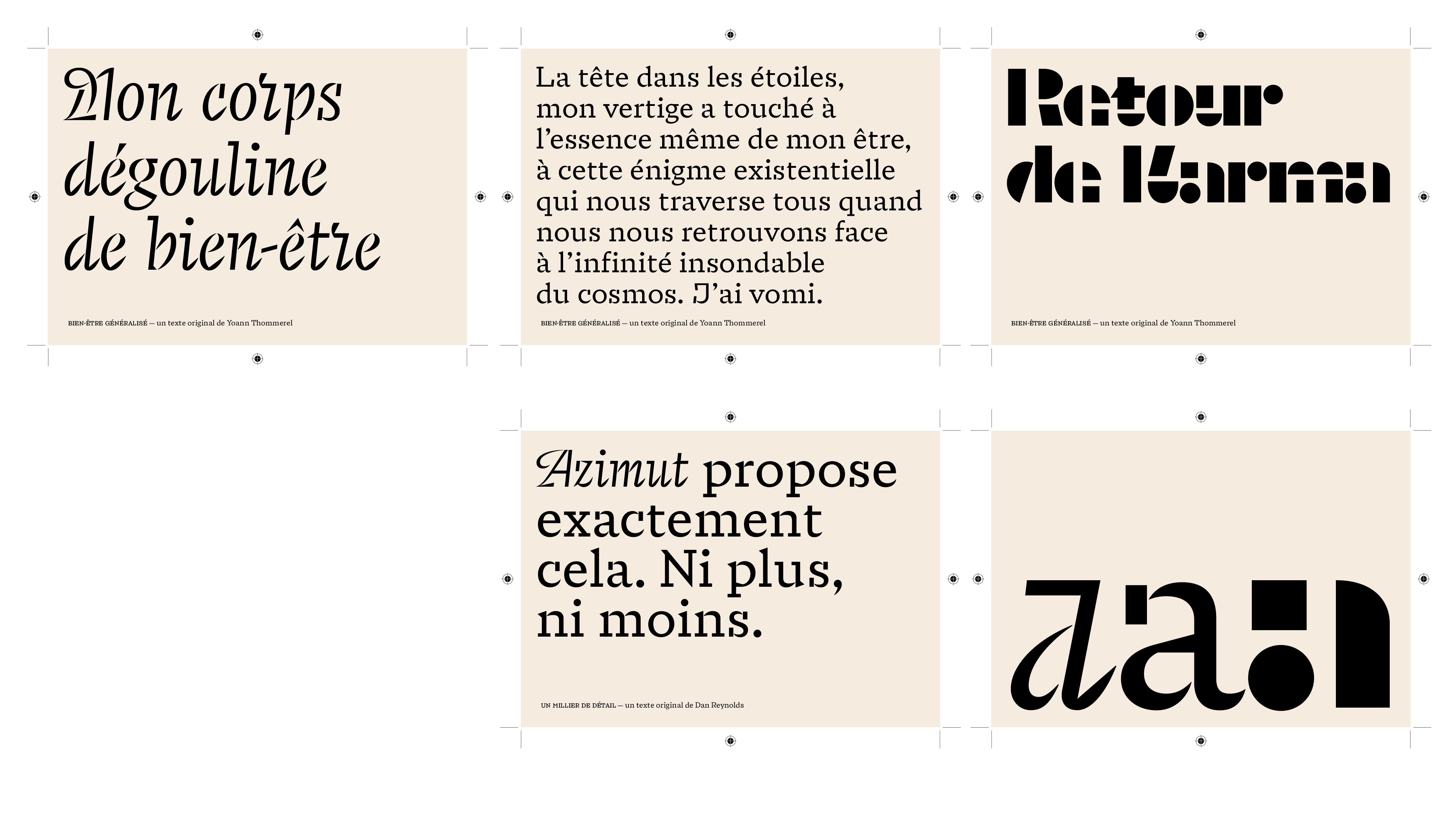
Recently you have made the font "Marianne" for the French state brand. Can you tell us more about this design?
Mathieu Réguer I may touch upon this during my presentation. Believe it or not, it started as a rather small project, limited to a specific scope. Given the context, it had every chance of being cancelled at every stages, but instead it grew larger each time. I am still in disbelief that it actually happened and that the typeface is being used everyday all over France. It’s not all about the letterforms though. 4uatre, the design agency behind the new graphic identity and the Services d’Information du Gouvernement, the public office supporting all State administrations regarding matters of communication (among other things), have been doing an incredible job informing, educating and assisting all public actors regarding the the French State’s graphic identity and the Marianne typeface. This is one major takeaways from this job for me: for a custom font to be successful, you need the people using it to believe in it and to push for it on a daily basis. A graphic identity and a bespoke typefaces are not a one shot thing, it is always an ongoing process.

You have been part of the TypeParis teaching team since the first day — can you tell us what is special about this summer type design course?
Mathieu Réguer Oh, TypeParis is definitely something special. Every type design course has its own specificities, its own perspectives and its own methods. What makes TypeParis special is the intensity and the community. Type design is a time consuming process. It takes time to do, it takes time to learn, it takes time to reflect on.
Well, there is not much time at TypeParis, about 6 weeks. While this look like a challenge at first, it turned out to be a real strength for the program. It is a really powerful constrain that completely shape the way we approach every new year. We cannot afford any down time. Everything must be perfectly paced and articulated for it to work. We build and fine-tune upon what went great the previous year and we try to find more efficient, more straightforward ways to approach the parts we struggled with. I am confident that Type Paris has been a solid program from the very start, but as a team we keep improving and refining. It’s a super interesting design process.
The attendees have always been amazing but we, the instructing team, get better as every year, so of course the end results are also getting better and better. I am genuinely impressed at what the attendees achieve in 6 weeks. And I am not only talking about the best projects, I mean all of the projects, every single TypeParis project is an outstanding achievement in its own way.
There is a thing that does not change. It’s the really strong sense of community that emerges very quickly among the attendees every year. I am not sure why it happens so consistently, but every cohort, every edition of TypeParis, has consistently created tight friendships and a strong fellowship among the attendees that last for years and stretches across continents. It’s so heart warming to see it happen even year.
“Nothing is easy with a pencil, you have to draw the shapes you want to make, not the shapes your tool wants you to make.“
– Mathieu Réguer
Do you remember when you decided to pursue your career in design?
Mathieu Réguer I am not sure. I know that I have always been drawing and doodling. My dad was into drawing as well and my parents always valued and pushed for creative endeavour. I wanted to be a comic book artist as a kid. I went down a sightly different path eventually but I never stopped drawing. For a long time I thought type design was just that: a very specific approach to this thing I love, drawing.
The more I think about the more I realise it wasn’t only about drawing though. Maybe it’s about reading as well. Reading has always felt magical to me. I remember the incredible joy I felt when I was first learning how to read. The whole world was unlocking before my eyes. Suddenly the library became the best playground: you can learn about anything you want, you can live through any story, any adventure, just by deciphering tiny scribbles on a piece of paper.
And with reading comes writing. One of my dad’s early job was at a photo-typesetting practice and he was also an early Mac user, so I knew about fonts as a kid. I remember making fake video games magazines on Quark xPress on his work computer and browsing through all the system fonts to find a cool one. Later on I went to study graphic design and realising during the first class of the first year that fonts were made by people was a little shock. It seemed so familiar yet so mysterious. And, well, if you really want to understand how something works, you can start by drawing it. So here I am, drawing letters, still trying to understand how the whole reading thing works.
What other speaker would you not want to miss at Now25?
Mathieu Réguer I know this sounds like a vanilla answer but I really mean it. More than any speaker in particular, what I am most looking forward to with Now25 is the whole range of presentations. The variety of talk and perspective is very exciting. Having both type designers and graphic designers speak together at a single event is a wonderful idea and really one of the strengths of the conference. The whole is greater than the sum of its parts — a very typographic approach in a way.
Thank you very much Mathieu!
– Interview by Burke Smithers
Register to the graphic & type conference in Paris ➼ Now25 conference
Learn more about TypeParis
➼ Type & graphic designers interviews
➼ Summer25 programme
➼ Reports
➼ Attendees feedback series