


We have a wonderful group of speakers and guests sharing with us this year at TypeParis. We wanted to find out a little more about each of them, so came up with a series of questions which they have generously taken the time to answer.
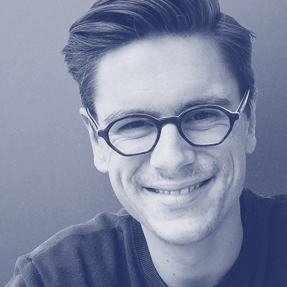
This week we chatted to Peter Biľak. Currently living in The Netherlands, Peter works in the field of editorial, graphic, and type design. He started Typotheque in 1999, Dot Dot Dot in 2000, Indian Type Foundry in 2009, Works That Work magazine in 2012, and Fontstand, in 2015. Peter currently teaches at the Type & Media postgraduate course at the Royal Academy of Arts in The Hague.
What is it you like about typography?
Peter Biľak: I am interested in all aspects of text; the possibilities it gives to capture the content, but also to the formal attributes of text, which is type design and typography. Just like great text, great typography engages the reader, in a very direct way. Additionally, I am very interested in type design, as it is one of the rare visual disciplines that has a potential to escape the trends of fashions. It takes a long time to develop fonts, and some of these fonts have a very long shelf-life. If they followed trends, fonts would be outdated even before the fonts were published, as the production cycle is usually longer than the life-span of a typical design trend.

At what point in history would you choose to live?
I am very happy with the period in which I live right now, there are plenty of challenges to be addressed. Having said this, there are many other periods which are equally interesting, but particularly interesting would be a period between 1450-1600, when most of the European conventions of typography have been settled, and new forms of writing introduced.
Has your creative process changed over the years?
I suppose I moved from pure intuition to a combination of both sides of hemisphere, and I use more research in work. I suppose this is a natural development, when one learns more about something.
What is your favourite magazine/movie/T.V. series?
I don’t watch much TV, but I look forward to National Geographic arriving at the door every month, and read it cover to cover. It has informed the magazine I publish now, Works That Work. The movies that left a mark on me were Antonioni’s Blow Up (1966), which is a thriller without any marks of a typical thriller. It questions truth and fantasy, like very few other films I have seen. I love Forman’s One Flew Over the Cuckoo’s Nest (1975), but Hombre (1967) also left an impact for me, as it redefined a typical hero, and when I saw it (being 10 or so), made me question role models. I enjoy new films too, but can’t recall one that would be as impactful as those.
What sparked your interest in type design?
See Q1 above.
Your most satisfying achievement?
I am always proud when something has its own life outside of the authors’ original input. It is easy with typefaces, those are completed by other designers by putting them in context. I started two different magazines (Dot Dot Dot and Works That Work) which are different as when they started. I started a gallery during my study times which has now its third owner, but keeps running. Or companies I started, in which I am no longer involved (e.g. Indian Type Foundry), and the best example — my daughter Elisa.

Name something that inspires you.
Plenty of things. Basically everything. Places I visit, people I meet, favours I taste, stories I hear, music I listen to, shows I see, nature, sounds. Once I learned how to pay attention, there isn’t much which is not inspiring.
Inspiration rarely comes to me when I am behind the computer, that’s why I find time outside of the office as important as work itself.
– Interview by Dave Coleman.
Learn more about TypeParis courses and conferences!
➼ Reports
➼ Type & graphic designers interviews
➼ Attendees feedback series
Apply to TypeParis Summer course!
The deadline for applications is 14 March, every year.
SPONSORS


