We have a wonderful group of speakers and guests sharing with us this year at TypeParis. We wanted to find out a little more about each of them, so came up with a series of questions which they have generously taken the time to answer.
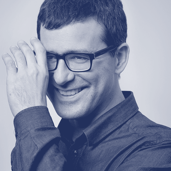
We talked to the very talented Rainer Erich (‘Eric’) Scheichelbauer. Rainer Erich was born in Vienna, and studied photography, philosophy and Dutch. Today, he creates and produces typefaces, teaches type design, and occasionally translates Dutch books on typography into German. Eric joined the Glyphs team in 2012, and has been writing tutorials and the handbook. He recently started his type service office Schriftlabor with three other designers in Vienna.
What is it you like about typography?
Rainer Erich: There is something very appealing and convincing about good typography that is pretty hard to explain. The same content can come across as trustworthy or reliable because of good typography or as totally nuts with bad typography.
At what point in history would you choose to live?
I am pretty happy with now. Typefaces have never been better. Going back in time would have so many drawbacks. To tell you the truth, I find people suspicious who proclaim that everything was better in the past.
Has your creative process changed over the years?
Oh yes. I have always worked with vectors, you name it, infographics, illustrations, comics, typography. But now I am focussing on type design exclusively. That is still vectors, but very different stuff than I used to do, and I do it much better and faster than I used to do it. That is partially due to the software I use, and partially due to my better understanding of PostScript vectors and the math behind it. This, in turn, stems from my 16 years of teaching in Vienna. I would not have delved so deeply into the subject if I hadn’t been in a situation where I had to explain it to someone else.

What is your favourite magazine/movie/T.V. series?
Do not get me started about cinema! I love the French cinema, the subversive humor of Claude Chabrol, the quiet style of Agnès Varda, the subtlety of André Téchiné, Krzysztof Kieślowski’s monumentalism. I am a big fan of Woody Allen. I also like Hal Hartley, and lately Wes Anderson. Oh, and the Monsieur Hulot films still crack up. There are some Austrian films that are great in their total weirdness.
I don’t get to watch much TV. Last thing I saw was Borgen, the Danish TV show, which was very good. And there is a great Austrian show called Schlawiner.
What sparked your interest in type design?
My first paid commission ever was adding diacritics to a font, and making sure it would work on Windows 95 and in Quark XPress 3 on the Mac. That was tough.
Your most satisfying achievement?
I am pretty happy about how the Sephora typeface system turned out. That was a commission I did together with Matteo Bologna’s Mucca Design.

Name something that inspires you.
Anything beautiful in life, really. A walk through a forest. A good dinner. An entertaining comedy evening. A good game of football, even. You name it.
Thanks Rainer Erich!
Interview by Dave Coleman.
Learn more about TypeParis courses and conferences!
➼ Reports
➼ Type & graphic designers interviews
➼ Attendees feedback series
Apply to TypeParis Summer course!
The deadline for applications is 14 March, every year.
SPONSORS


