Last week was big. Type@Paris attendees completed their typeface in the begin of the week. Suddenly the project they working one since mid June become a tangible font that anyone can use to set texts. Everybody worked really hard to achieve this stage. The Monday started with a session about serifs and terminals proportions in lowercases and capitals. How to design the vertical serifs of a E, F, or T. How to adjust visually the terminals of the c, f, r… How to to improve the consistency of the diagonal endings depending the contrast and style of the typeface. Weeks after weeks we’re going into small details, methods who help to gain certain overall quality. There isn’t any magical tricks in typeface design, more an accumulation of thousands little systems builts all together. Any minor, local design decision you have to take on one letter can have a great impact on your global design. On the afternoon as well on Tuesday, Mathieu Réguer was focusing on glyph set extensions: How to design punctuations, diacritics, composites, etc. The idea was to have everyone ready for the visit of Lucas de Groot on Wednesday.
On Wednesday 8 July we welcomed Lucas de Groot, who spent a full day with the group. Every hour, three students on a separate room with Lucas for a unique type crit. The rest of the class staying with Mathieu Réguer and myself. All the crew was very impressed by the dedication of Lucas de Groot during his type crit. They learned a lot!
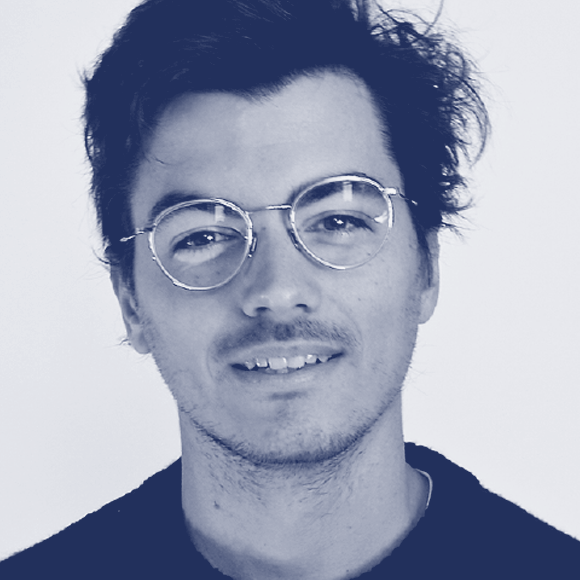
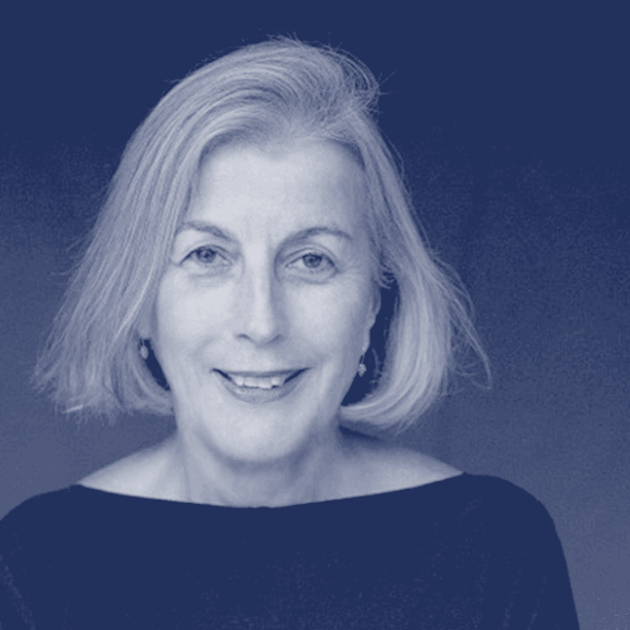
Laurence Madrelle + Lucas de Groot
On the evening, we all moved to Le Tank to enjoy the talks. Laurence Madrelle, presented her projects for Sceaux city, and few others: “cities, design, the epitome of class and elegance,” as pointed by Kara Gordon. Lucas de Groot, type designer, first time in Paris since 30 years, discussed about Thesis, Calibri projects (.etc) and his extreme curves, proportions and kerning crazy concepts. Pizza and beer was amazing as well as the performance of speakers: Laurence Madrelle + Lucas de Groot. Watch the replayDon’t miss the last #tptalks15 of the summer, Wednesday 15 July: Register now!
On Thursday morning I teached to the Type@Paris crew how to design a bold or even extrabold from their typeface. I have started from two simple letters, n and p, first with a demo on the black board, followed by a real case on the computer: step by step, moving points, using transform tool proportionnally to avoid to lost the curves quality, taking notes about the process constantly. Dave Coleman, one of the attendees who already is a confirmed Glyphs user conducted a great demo about how to play with MultipleMaster in Glyphs app. It was really fun to see suddenly him teaching to the group! We’re a real small community helping each others, that’s good.
Mathieu Réguer brought some Plantin final artworks as reference. For the afternoon, they have to complete more glyphs in this extrabold variant. Really cool! It was a revelation for few of them. Their unique weight transforming into a typeface family. Designing an extrabold is crucial because it help to confirm if the design desicions made for their unique weight works. A typeface family is a complex system of shapes, proportions, style who works independently from the weight, contrast, width. So, if a certain kind of terminals can’t perform on the extrabold as it was on the regular, it probably mean that the terminals have to be reconsiderer. The objective of each of the attendees is to develop a secondary style who will fit their initial ideas: in some situations, an extrabold was a perfect companion, in others, it was a sanserif or high contrast version, even an italic. For the final project to be finished for Friday 17 June 2015, each of the students have to complete a full typeface along a companion of their choice. Just a week left!

Librairie Paul Jammes
The last visit was memorable. We’ve got the honor to meet André Jammes, the owner of Paul Jammes bookshop, in Saint-Germain des Près. This quarter was the center of publishing, printing, bookhop for centuries, because of the Sorbonne no far away. Sadly, today in this area, most of the bookshop are now luxury boutiques, fashion shops. André was borm on the first floor of this building and meet people that we all know by reputation: Stanley Morison, Beatrice Warde, Jan van Krimpen, Charles Peignot, John Dreyfus, Jeanne Veyrin Forrer and many others. Just imagine one minute that André was at the first meeting on a café in Boulevard Saint Germain, of the Association Typographique Internationale back in the mid-fifties. André Jammes know not only history of typefaces and typography (he is also an historian of photography), but gossips about typographic world from this period. He was with Henri Jean Martin and Marius Audin, founding member of Musée de l’Imprimerie de Lyon too. It’s just fascinating. André Jammes library is full of typographic treasuries that you can even have in hands, touch, smell. He studied the Romain du Roi since the 60s and know everything about the Commission Bignon who set up the ideal formula for an ultra-legible new typeface called Romain du Roi, built from precise grid, precise drawing of each serif, curves and any details. André and his granddaughter Isabelle, received the Type@Paris crew with a collection of amazing books and lengthy stories about them. We all learned a lot from his immense knowledge and generosity. Next time, you’re in Paris, visit this bookshop and buy a book!

See you next week for more! Register for the next free Talk now.
Learn more about TypeParis courses and conferences!
➼ Reports
➼ Type & graphic designers interviews
➼ Attendees feedback series


