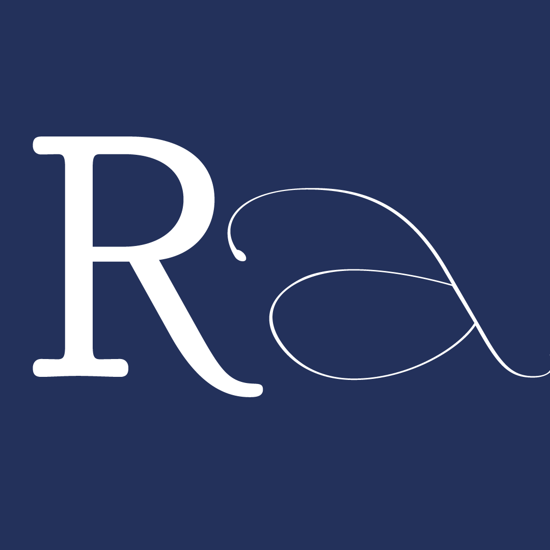
Empadinha
Empadinha is a type family made for fellow foodies, cooked out of a mix between France, Brazil and even a pinch of my Japanese heritage.
Lately I’ve been reflecting a lot on my identity as a 4th gen japanese brazilian, and wondering how can I sum up what it is to be brazilian. In it’s essence, it is diverse, a mix of cultures and it has a human warmth that comes from community.
For my typeface project, I wanted to channel this idea of making mixes, which is something oh-so-very Brazilian. Influenced by the quintessentially French Fournier type, the Regular weight was designed for setting texts in small to medium sizes—perfect for magazines, books and restaurant menu descriptions.
The Black weight was designed as a display cut companion, reeling in the human touch and movement of the brush as a nod to Brazilian vernacular signs, while keeping it structured enough to work as a system. Its chunky nature and rhythm are sure to pack a punch in flavor for headlines!
And with mixing at its core, those two weights interpolate to provide surprinsigly functional middle cuts of Medium, SemiBold, Bold and ExtraBold. So it can range from Empadinha (little empada) to Empadão (big empada), depending on how hungry you are!
As a Brazilian empadinha, you can pick your size and dersired flavor of stuffing, “ao gosto do freguês!”
Even before coming to TypeParis (it’s been two long years of pandemic anxiety) I really wanted to make the most out of this course, and especially learn more about parts of the type design process that I wasn’t so familiar with, like the production part, or what do I need to look out for when designing a text face.
But looking back on these 5 *very intense* weeks, it turned out I learned so much more than that, and even more about myself than I had expected.
It’s been a wild ride to say the least. Looking back, it feels like time flew by but also it has the weight of like, months. That’s how intensive it was.
It might have been pure joy and flow for me personally when we had calligraphy exercises, but those were short-lived and it was challenging from beginning to end.
This was my first time making not just a typeface for text but also a family with multiple weights, plus starting to get an italic to work with a roman, but also the urge to go wild and do something super display and again out of my comfort zone.
Here are a couple of things that I learned:
– Simplify but don’t lose the SOUL
I’m detail oriented and a perfectionist (a blessing and a curse)
Global view, drawing more (and variations!) to understand the core of the typeface but also how its design system works so as to make design decisions, go back and forth, draw then redraw, correct, proof etc. So at first it felt like a bit of torture to keep on drawing and expanding the character set quickly and letting ugly or weird shapes just be while we did that even though we didn’t have a clear idea of what we wanted our typeface to be.
How it was before TP, my previous experience with calligraphy, lettering and bit of type, more organic shapes and looser subtle approach to digitization and digital craftsmanship – Apparently, there is such a thing as “too consistent” in type design (I never thought I’d hear that feedback on a negative note lol).
If you make all the letters have the same shape, proportions and terminals, it can become very boring. So throughout the entire course I’ve been trying to wrap my mind around how to add novelty and playfulness in variation while also keeping the whole system working together. As Mathieu said many times in this course for a variety of things related to type design: “it’s a balancing act”.
Our guest critic Ian Party illustrated this well comparing type design to a symphony, in which you have many different instruments working together, but each at different volumes and at different paces.
I guess this will keep on resounding in my head for a long time after TypeParis, and it’s perhaps the biggest takeaway for me at this point in my type journey – I’m way more organic than I thought.
This might feel like I’m contradicting myself after my previous statement, but this became SO CLEAR when I struggled with translating handmade drawings into bezier curves (and this has always been a struggle, even though I’ve been doing it for years now).
From calligraphy and lettering I’ve learned the nuances that makes shapes dynamic and lively. And for all letterform drawing, like we learn early on, we must trust our eyes rather than math. And for someone who, for some reason, has never handled rulers and precise measurements very well, eyeballing made my eyes sharp and critical and I could get away with my shapes.
But it turns out, especially for type, to get a sense that your system works well and that your weights and proportions are consistent enough, using measurements is pretty important and useful. Eyeballing everything and making sure it stays consistent through endless edits takes a lot of work.
Also the kinds of calligraphic subtleties that I like are apparently hell for bezier point placement, and end up making shapes that are too complex and hard to interpolate.
And it so happens that when you are designing for text and small sizes and you print the proof, you see that most of those tiny things just disappear!
So I’ve learned to simplify, even if it goes a bit against my nature. I really suppressed my calligraphic urges during the Roman design, as I wanted to push myself to try something out of my comfort zone.
But guess what? Calligraphy is full of SOUL, and in the end these urges do seep back into the design choices. And when it matched the brief, and instructors pushed us to go wild and experiment, I let it take the wheel for the black weight. But this feeling permeates the type family as a whole, bringing a human touch and warmth that is oh-so-very-Brazilian.
It’s hard to feel like a typeface will ever be finished, especially in the beginning of the process in which you’re exploring and opening more and more possibilities. Just like in design, the brief is what helps you to stay focused and have a goal, even if it’s not too clear in the beginning.
It’s really great to see it applied early on to get the sense if “it works” even if the character set is not yet complete.
It is an iterative process, that could go on forever as our critical eye progresses. But it needs either a deadline or a “letting go” to end. I’m not sure what the future holds for this and my other typefaces in the drawer, but I feel like now I have the basic tools and necessary knowledge to ship them someday. For now, it just feels good to be closing a chapter, accepting its incompleteness and imperfections (even if it’s forced and hard). But I can also say I’m proud of what I and we have accomplished in a very short amount of time and in crazy conditions.
Like every workshop and course I’ve ever taken, there’s always this urge to achieve an incredible result at the end of it. But like each and every of them taught me, it’s actually just the beginning of a new chapter, with a new perspective and information that can only get distilled with time. Time to let it all sink in and experience to put these into practice.
I feel like I’m leaving TypeParis with some answers, but way more questions and things to reflect upon—which in my book is often a sign of the learning process at its finest.
So despite the challenges of the in-betweens and unknowns, I’m looking forward to this new chapter, and hopefully making Empadinha ready to serve very soon!


The 6-week type design programme that you’ve been waiting for starts on 2 June and ends 10 July 2026.


Open to all Our summer programme is in English and covers typeface design and calligraphy techniques, type history, and software practices. Whether you’re a design pro or just curious about type design, you can learn all about it in a relatively short amount of time.
➼ Subscribe to our mailing list to don’t miss important updates.