Manufaktura
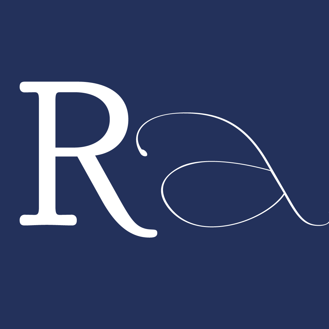
Manufaktura combines classic forms and geometry to create a modern typeface family where elegance negotiates with rationalism. It includes text versions and a display, each with its own characteristics. The design of the regular version reflects the general proportions of Didot, blended with geometric counters and few decorative details to achieve a mechanical and rhythmic look to the typeface. The large, angular counters create tension with the rounded outer shapes of the letters, giving Manufaktura its unique feel. The traditional ball endings have been replaced with simple, geometric shapes to further remove any ornamentation. Manufaktura comes with regular, medium and bold weights with strong contrast and fine serifs that can be used in text applications, especially in large sizes. The black display version further pushes the shapes into more brutalist forms with a strong slab serif, while maintaining the geometric counters and high contrast characteristic of the typeface. It is used as a display for headlines or other design-focused applications. The type family has a set of lower and capital letters, numerals, a set of French and Polish diacritics and basic symbols.
My background being Polish-born yet raised primarily in Canada, has left me nostalgic for Polish design and architecture that used to surround me. Therefore it was important to me to bring in some inspiration from Poland into my design. After I found an example of Didot being brought back to Warsaw, with the application of strange Polish didactics, I decided to use this as my main form of inspiration having always been drawn to the rationalism in Didonian typefaces. My experience in graphic design made me interested in creating a modern interpretation of classical shapes with simple mechanics.
The future of Manufaktura remains to be seen - as my first ever attempt at designing a typeface, I learned to look at letter forms in a new way. The person I was at the beginning of the program is not the person I am today, therefore I will approach my next typeface in a completely different way. Ideally I can take some type away from the typeface and go back to it after some time with fresh eyes. My goal is to focus on the Black Display version to further expand the character set and further push the shapes and proportions.


The 6-week type design programme that you’ve been waiting for starts on 2 June and ends 10 July 2026.


Open to all Our summer programme is in English and covers typeface design and calligraphy techniques, type history, and software practices. Whether you’re a design pro or just curious about type design, you can learn all about it in a relatively short amount of time.
➼ Subscribe to our mailing list to don’t miss important updates.