Rougir
Weather it is a dictionary, a bible, or a wedding invitation, printed pieces like these have been around for hundreds of years. As a designer, I have always found interest in the everlasting quality and tradition of printed pieces. More so, the interest lies in the evolution found in how these pieces are designed and recreated throughout their years. These thoughts are which lead me to create Rougir.
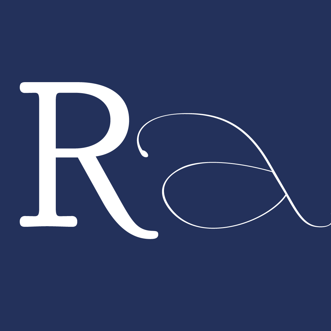
Rougir is a typeface inspired by Oldstyle fonts similar to Garamond, Georgia and Caslon. Designed for modern day wedding and event invitations, this typeface is meant to be used in small weights, but also have the ornamental qualities to be presented in things like wedding invitations. Rougir takes reference from oldsyle weights for contrast and tone, from calligraphy with details like terminals, and it also pulls elegance (for example swashes) from modern day wedding invitations. Rougir is diverse: it can be used in many different sizes and formats, but it really sings when it is used in small printed formats.
Though there were many ups to the curation of the typeface, there were definitely some learning moments for me. The two obstacles that I learned most from throughout my process was figuring out the weight of contrast as well as the terminal shape.
Contrast was a challenge. I wanted to create something with higher contrast so it would look light and elegant, but I also wanted something that could be read easily at small sizes (a challenge for high contrast fonts). I began my research by looking at many different oldstyle fonts that worked in small sizes, while comparing them to wedding invitation inspiration that I had collected. With these two references l came up with a contrast similar to Georgia. This gave the font the elegance I wanted while still being able to be read at small sizes.
The second challenge for me was the terminal shape. At first I wanted my terminals to be perfectly round, similar to what you might find on a Didot, but that didn’t lend itself to the calligraphic style I was going for and it just wasn’t looking right. So instead, I went back to my calligraphy— I drew out letterforms and practiced terminals in many different shapes and sizes. Eventually I found out a terminal to suit my style a little bit more; round, but not perfect. Now it looks like a calligraphic hand influenced the typeface instead of being too mechanical— it gives it a humanistic feeling to it. These terminals later influenced my swash elements, which quickly became one of my favorite parts of the typeface.
Rougir currently consists of five weights; Regular, Medium, Semibold, Bold, and Black as well as a high contrast Display version. Interpolations between these variables has given me the oppertunity to easily create at lest 15 more versions of the typeface. Rougir is far from being done, but I love where it is heading. I am planning on refining the weights, expanding on the Display version, adding in more swash elements, and I would even like to add italics in the future. I look forward to see where this typeface will head.


The 6-week type design programme that you’ve been waiting for starts on 2 June and ends 10 July 2026.


Open to all Our summer programme is in English and covers typeface design and calligraphy techniques, type history, and software practices. Whether you’re a design pro or just curious about type design, you can learn all about it in a relatively short amount of time.
➼ Subscribe to our mailing list to don’t miss important updates.