Poliveau
For my personal project at TypeParis I wanted to design a text typeface for magazines with an organic feel that would also work great with different applications and contexts for an ecologic system.
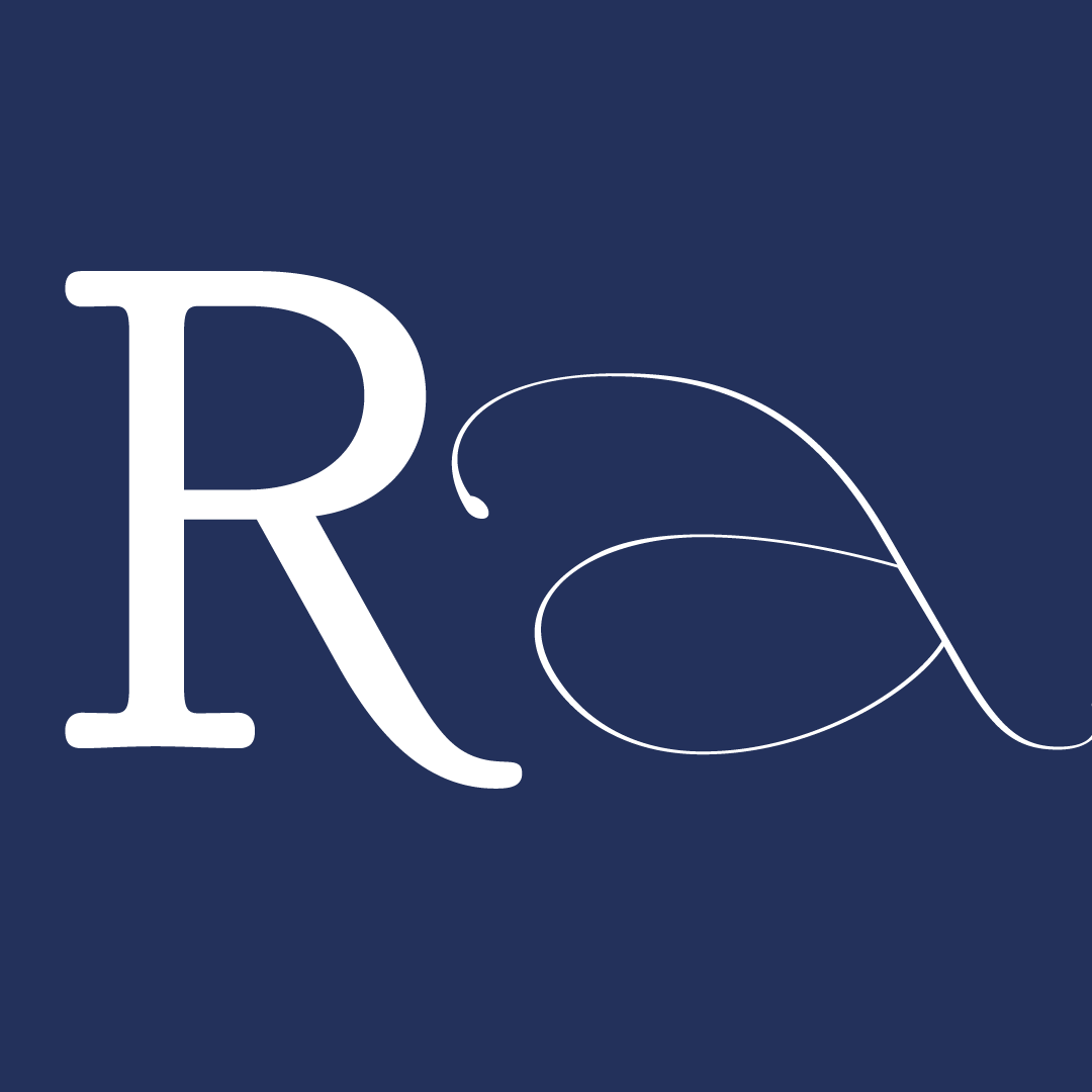
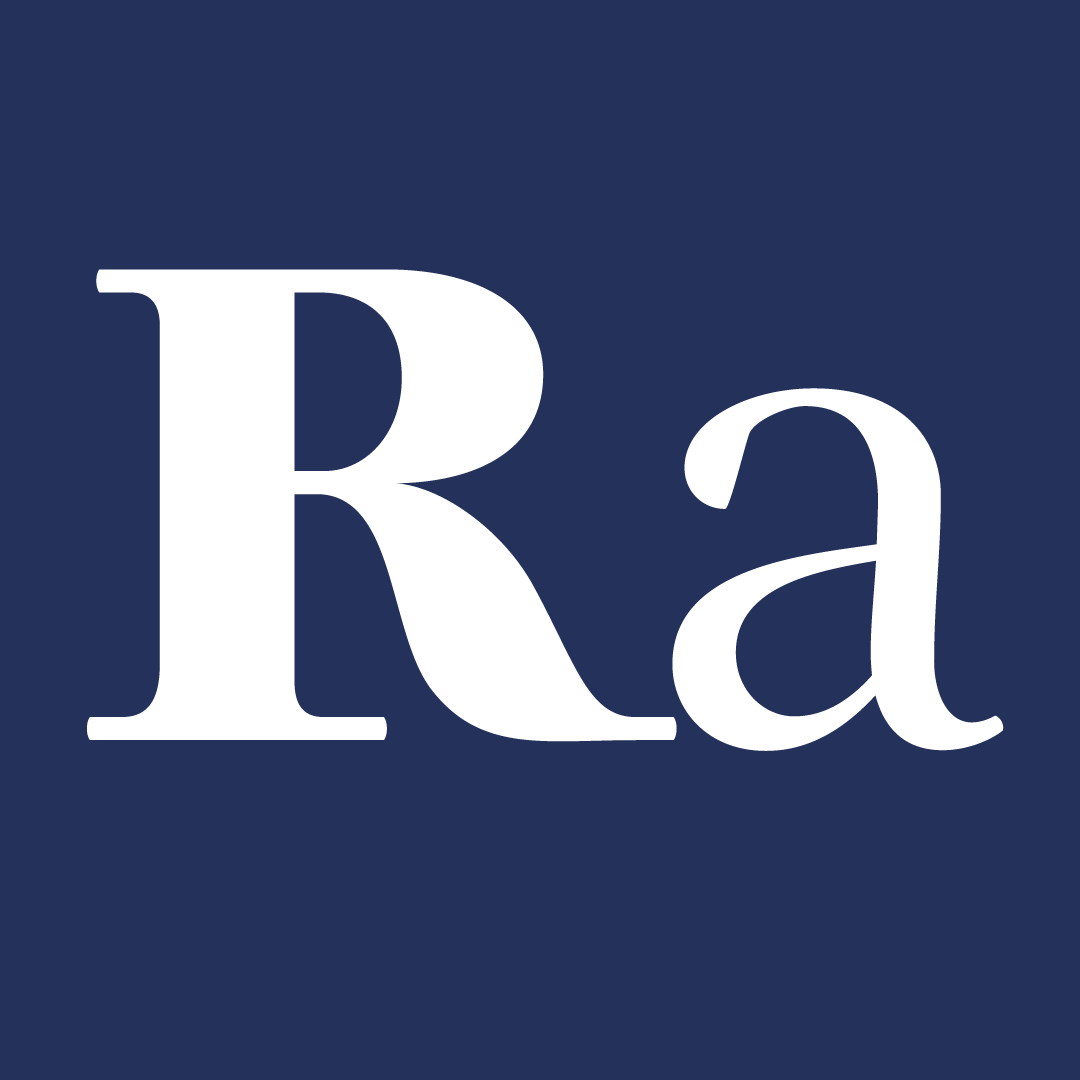
Mixing two tools, the letterforms are based on my own calligraphy with the broad nib pen as a structure and the brush for an asymetrical terminals. The uppercase letters are strongly influenced by the roman caps that we discovered on our day trip to visit the musee Gallo Romain at Lyon.
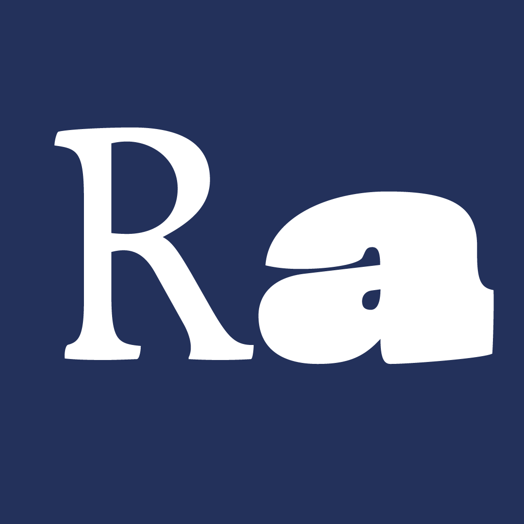
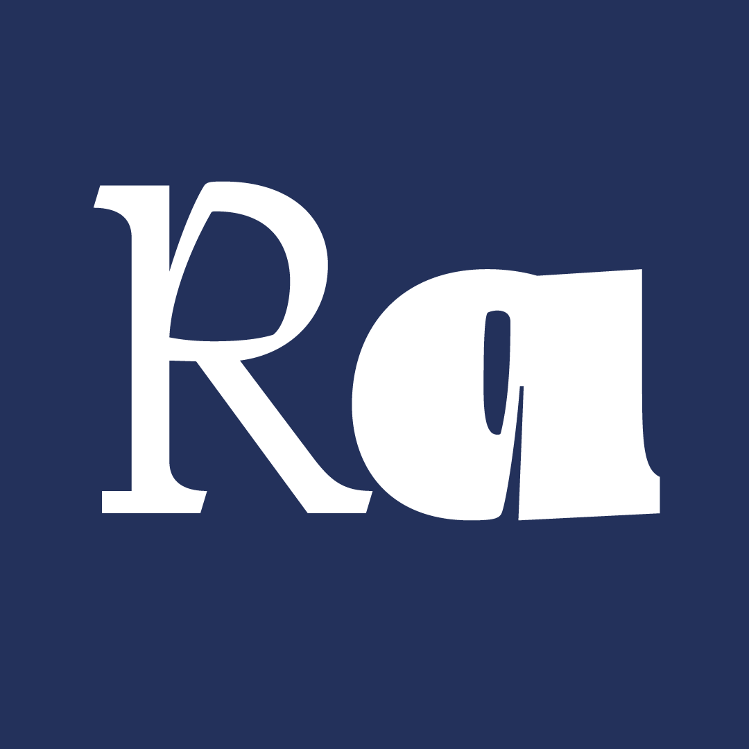
My goal for the program was to learn how to work with multiple masters and using this as a starting point to build and design the whole family.
After designing 4 masters the restult was a suitable text typeface with this organic feeling while remaining versatile for other applications. It includes 2 styles, and 7 weights that have old-style numerals, punctuation, diacritics, and a huge set of lowercase and uppercase ligatures.
Thanks to Jean François, Mathieu, Julien, Xavier and the guest critics to push me to go further and explore new possibilities.


The 6-week type design programme that you’ve been waiting for starts on 2 June and ends 10 July 2026.


Open to all Our summer programme is in English and covers typeface design and calligraphy techniques, type history, and software practices. Whether you’re a design pro or just curious about type design, you can learn all about it in a relatively short amount of time.
➼ Subscribe to our mailing list to don’t miss important updates.