Kiosque
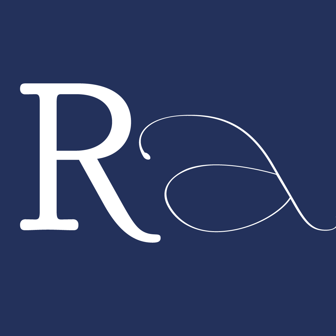
Kiosque is a contemporary humanistic serif typeface that was created during the five weeks of Type Paris 2017. It comes in 5 weights and 10 styles, both roman and italic. Based on the humanistic script, constructed and simplified, it would probably be categorized as “garalde”. The counters have corners in the middle of curves, revealing the translational construction of the stroke. Some letters – like ‘R’ – have a pointed leg, tapering down almost straight to give the typeface character.
The brief I made for myself was to design a typeface for a book publisher publishing short stories in pocket size. The typeface is to be used for the title cover as well as synopsis text on the back. The style should work nicely with both older classics and newer stories. The format of the books are quite small; around A6. Titles/author should stand out despite the small size.
Like most of the class I started with writing letters in a humanist script with a broad-edge pen. On top of that I traced my letters, exploring how serifs and curves can be manipulated while still maintaining the humanistic proportions and construction. Knowing it would be used for titles printed in rather small format I decided that a high x-height was appropriate. Early on I was attracted the the corners within the counters that are created naturally by the broad-edge. I applied that feeling to the serifs and turned them very sharp thinking that it would add character to the titles of the books. And it did. Maybe to much, which was especially apparent when set in text, which was the second use case. So I decided to try out a bunch of different serifs to see how that would affect the character of the typeface. After a day of tests I finally decided on a much softer, curved serif that eases in to the stem gradually.
My first weight was the Medium and after the glyph set was almost done I started working on a Black master, with interpolation in mind. The process of creating the Black weight helped me see certain details that didn’t work. Feeling I had a pretty good flow of things I started experimenting with an italic. This was new territory for me and it taught me a lot of new things. It took me some time to find the right shapes but once I had it figured out it went quicker and quicker. Then I could not help myself and went on to create a black master for the italics too, knowing I might not have time to finish it all. In the end I managed to have the basic latin alphabet done.
I’d also like to thank all of the instructors; Jean François Porchez, Mathieu Réguer, Julien Priez, Xavier Dupré, Stéphane Elbaz, for always pushing us to do even better, as well as sharing so much of their invaluable knowledge, experience and personality. And, let’s not forget all the guest critics. Thanks you all!


The 6-week type design programme that you’ve been waiting for starts on 2 June and ends 10 July 2026.


Open to all Our summer programme is in English and covers typeface design and calligraphy techniques, type history, and software practices. Whether you’re a design pro or just curious about type design, you can learn all about it in a relatively short amount of time.
➼ Subscribe to our mailing list to don’t miss important updates.