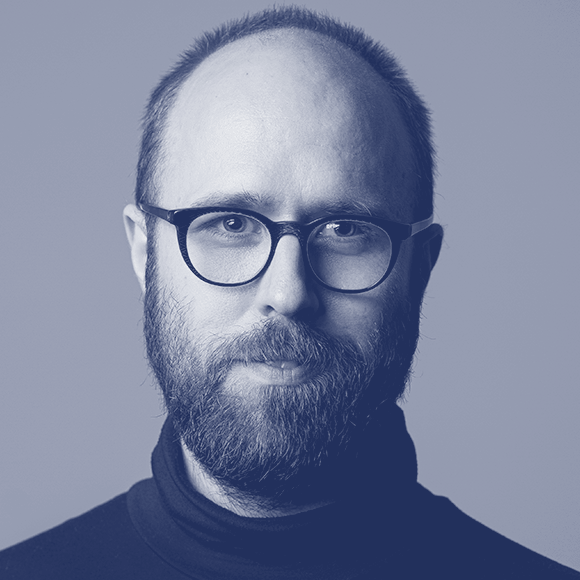
We have a stunning group of speakers and guests sharing with us this year at TypeParis. We wanted to find out a little more about each of them, so have presented them with a series of questions which they have generously taken the time to answer.
David Březina is a typeface designer, writer, lecturer, and chief type officer at Rosetta type foundry. He designed typefaces for a diverse palette of the world’s scripts, but focuses mostly on Gujarati and Latin. David holds a Master’s degree in computer science from Masaryk University in Brno (Czechia) and an MA in Typeface Design and PhD from the University of Reading (UK). His cross-disciplinary PhD thesis studied visual similarity and coherence of characters in typefaces for continuous reading in Latin, Cyrillic, and Devanagari scripts.
What would be the ideal balance between consistency and independence in a multi-script typeface project?
David Březina This is a big question which only leads to more questions. I treat it as an ongoing professional discussion within the field where each multi-script project provides its own unique answer.
The requirement of consistency relates to design objectives. The consistency can be conceptual or more specific, literal, reusing shapes. It may depend on the genre, the overall style, current fashion, visual culture etc. The decision regarding introducing consistency across scripts ought to depend on whether it serves a meaningful purpose in a particular context. There is often less need for it than systematically-inclined type designers might assume.
It is worth mentioning that visual connotations are not always transferrable. If a cross-script consistency makes one script look chic and modern while the other one looks dated then perhaps a different solution is needed. Neither we should assume that design concepts such as contrast, stroke modulation, or proportions work the same in different scripts. Applying the same principles robotically may create awkward letter shapes or affect reading experience. This is why multi-script type design requires a thorough research and collaboration with specialists.
The expectations may also differ depending on a particular script combination. Scripts with shared history, such as Cyrillic, Greek, and Latin, invite more consistency while other combinations, such as Latin and Chinese, may need less of it.
But consistency and readable shapes are also something that can be negotiated between the designer and the reader. It is a gray area, full of exciting opportunities.
“Consistency and readable shapes are also something that can be negotiated between the designer and the reader.”
— David Březina

How did the idea of the useful and powerful Hyperglot come up with? How much time did you need to obtain all the data to make it run?
As any type designer, we wanted to report languages our fonts support. At Rosetta, we have been building a database of required character sets for years and Hyperglot is the public and cleaner version of that. Additionally, we also developed the tools that use the database to diagnose language support in fonts: the command-line tool, the Python module, and the web app. This took us roughly a year on and off. We published it to celebrate when Rosetta turned ten last year.
“The decision regarding introducing consistency across scripts ought to depend on whether it serves a meaningful purpose in a particular context.”
— David Březina
During your creative process, which is the percentage of the traditional drawing on paper before switching into the digital workflow?
I draw very little. I do think visually a lot and I make a few sketch notes to record ideas, a couple of letters maybe. I draw parts of letters often and I seem to like diagrams and arrows a lot. The difference between the perception of a pencil sketch versus digital drawing is so profound that I see little need for drawing the full alphabet on paper.
“The difference between the perception of a pencil sketch versus digital drawing is so profound that I see little need for drawing the full alphabet on paper.”
— David Březina
What do you do to escape work?
I cycle. Tarmac and gravel roads. Ideally, uphill.
What is the first thing you do when you sit down at your desk?
The current morning ritual is a teapot of a black tea and an episode of Duck Tales.

Do you prefer a permanent/dedicated workspace, or do you like to keep mobile?
We have a nice studio in Brno. Working from cafés one runs a risk of interacting with annoying people. I do not take these interactions well.
Favourite kind of music to listen to while working?
I have absolutely no musical standards. Currently, I am indiscriminately engrossed in all kinds of old Italian pop music: Peppino Gagliardi, Ricchi E Poveri, Dalida, Mina, Patty Pravo, Laura Pausini, New Trolls, Pino D’Angiò, … I take everything and I play it loud. Italian friends judge me.
Thank you very much, David!
– Interview by Gina Serret
Learn more about TypeParis courses and conferences!
➼ Reports
➼ Type & graphic designers interviews
➼ Attendees feedback series
➼ Summer23 programme
➼ Now23 conference
Apply to TypeParis Summer course!
The deadline for applications is 14 March, every year.
SPONSORS


