We have a fabulous selection of international guests critics visiting us at TypeParis Summer26. We wanted to find out a little more about each of them, so have presented them with a series of questions which they have generously taken the time to answer. Discover Laura Meseguer’ interview.
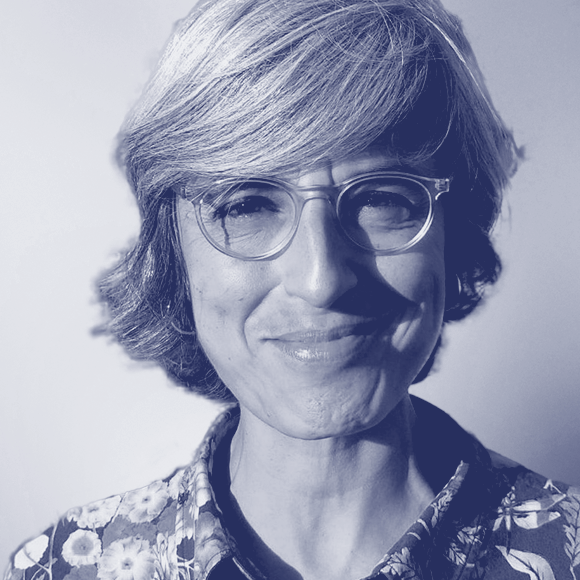
Biography Laura Meseguer is a freelance designer, typographer and type designer. Her activity combines commercial work and personal projects, specializing in all kinds of typography-based work — from lettering for monograms and logotypes to custom typefaces and book design. Her work has received numerous international awards, including TDC, Laus, ISTD, Hiiibrand, ED-Awards, and the 2018 Premio Gràffica. She lectures and leads workshops worldwide and has served on the Board of ATypI (2017–2023). She is currently a member of the BCD Cluster of Design.
Interview
What’s your favourite way to kickstart your workday?
Laura Meseguer I like to start the day with yoga or pilates practice, later breakfast and a bit of quiet time before “opening the studio”. When working, I check my calendar and prioritise tasks. My schedule varies, but I design typefaces, teach, work with clients, manage Tipo-g, and develop personal projects for Type-Ø-Tones. I aim to design in the mornings when I’m most focused and leave meetings and correspondence for later.
What do you do to evade yourself from work?
Laura Meseguer Walking at the seaside and swimming are probably my favourite ways to disconnect. Living in Barcelona makes it easy to spend time outdoors. I also enjoy visiting museums or bookshops. Activities that engage the senses are often a good counterbalance to spending long hours on a screen.
Do you prefer a permanent workspace or do you like to keep mobile?
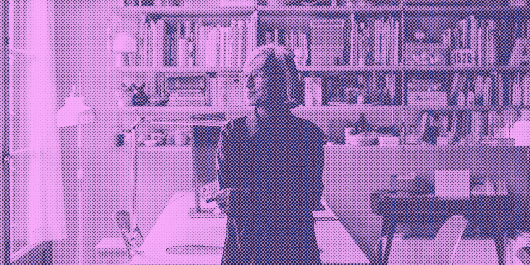
Laura Meseguer I definitely prefer a dedicated workspace. Type design requires long periods of concentration and consistency. While I enjoy working from different places occasionally, I feel most productive in my studio environment, where I have access to all my tools, references, and work in progress.
What’s your favourite kind of music to listen to while working?
Laura Meseguer It depends on the task. When I’m drawing or spacing letters, I often listen to folk music. If I’m writing or preparing lectures, I usually prefer silence or “focus music”. Type design requires a particular kind of attention, and sometimes silence is the best soundtrack, but as I work in a shared space with other designers and architects, silence is almost an impossible state.
Do you keep up with the news, as well social media?
Laura Meseguer I follow both general news and design-related blogs, despite the most comes from my one daily hour visit to Instagram. For typography, I pay attention to specialised publications, newsletters, conferences, and conversations within the community. Some of the most valuable information still comes through personal exchanges rather than formal media. My relationship with social media is mixed. It is useful for staying connected to the international type community and discovering new work, but it can also become overwhelming. I find it most valuable as a way of exchanging ideas and maintaining professional connections rather than purely as a marketing tool. I’m not good at it, to be honest, it’s a full time job that I can’t assume. So I do it organically, but I recognize that I should be more active.
“I don't think AI diminishes the value of good type design; if anything, it may make thoughtful design more valuable.”
– Laura Meseguer
What motivates you to design new typefaces? How much influence does software have on type design?
Laura Meseguer Curiosity. Every typeface begins with a question. Sometimes it is a formal question about a particular shape or historical reference; sometimes it is a practical need for a specific custom project.
Software has a significant influence because it shapes the way we work and the possibilities we can explore efficiently. Variable font technology, interpolation tools, and scripting have expanded what is possible. However, software should remain a tool rather than a creative director. The most interesting ideas still come from the designer, not from the software.
Do you think AI will change the way we design typefaces?
Laura Meseguer It already is. AI will probably automate some repetitive tasks and help designers explore larger design spaces more quickly. What interests me most is how it may affect decision-making and research. The challenge will be preserving authorship, judgement, and cultural context. I don't think AI diminishes the value of good type design; if anything, it may make thoughtful design more valuable.
AI will certainly change the way we design typefaces, but perhaps not in the way many people imagine. I don't see it replacing the role of the type designer. What I see is a powerful set of tools that can assist with repetitive tasks, help generate alternatives, analyse large amounts of visual information, or accelerate technical production processes. The real challenge is not whether AI can draw letterforms, but whether it can understand the cultural, historical, and communicative dimensions that make typography meaningful. Designing a typeface is not simply generating shapes. It involves making thousands of interconnected decisions about language, reading, context, technology, and aesthetics. Those decisions come from experience, judgement, and intention. What concerns me more is the perception of value.
If AI contributes to an even greater abundance of typefaces and visual content, there is a risk that people will see type as something instantly generated rather than carefully designed. At the same time, abundance often increases the value of expertise. When everyone can generate something, the ability to recognise quality, originality, and relevance becomes even more important. I think AI will become part of the type designer's toolbox, much like interpolation, scripting, or variable font technologies did. The question is not whether we use it, but how we use it responsibly and creatively.
What is your ratio of self-initiated typefaces versus client work?
Laura Meseguer Throughout my career it has varied. Many of my typefaces started as self-initiated projects that later found commercial applications. Client work brings valuable constraints and real-world requirements, while independent projects allow more experimentation. Both feed each other.
Do you redraw classics or invent new forms?
Laura Meseguer I don't see those as opposites. Every typeface exists within a long historical conversation. Understanding historical models is essential, but simply reproducing them is rarely enough. I am interested in finding a balance between tradition and innovation, learning from the past while creating something that responds to contemporary needs.
“The future of type design depends not on choosing one model over another, but on ensuring that multiple models can coexist sustainably and continue supporting innovation and diversity.”
– Laura Meseguer
What can you tell us about the state of the font market today?
Laura Meseguer The market is more diverse than ever. Independent foundries, distributors, subscription models, and direct sales all coexist. Designers discover fonts through many channels now, from social media and newsletters to integrated platforms. This creates opportunities but also challenges, particularly around visibility and sustainability for independent designers.
At Type-Ø-Tones, we have experienced many of these transitions firsthand. Being independent offers freedom and direct contact with users, but it also means taking responsibility for marketing, licensing, customer support, and distribution. A distributor can provide visibility and reach, while direct sales allow a closer relationship with clients and a clearer understanding of how fonts are being used.
What has changed most is how designers discover typefaces. Social media, newsletters, design blogs, conferences, online communities, and integrated software platforms all influence the process. Designers are exposed to more fonts than ever before, which creates opportunities but also makes it increasingly difficult for individual releases to stand out. I don't think there is a single ideal business model today. Different foundries succeed through different approaches. What matters is maintaining a sustainable relationship between creators and users while preserving the quality and diversity of the typographic ecosystem.
Do subscription platforms make the world better?
Laura Meseguer They certainly increase access to typography and make fonts available to a wider audience. The downside is that they can reduce the perceived value of type design by encouraging the idea that fonts are interchangeable commodities. The challenge is finding business models that improve access while still supporting the people who create the work. The font market today is more diverse and fragmented than at any other point in my career. When I started, distribution channels were limited and visibility depended largely on a few established players. Today, independent foundries can sell directly, collaborate with distributors, participate in subscription services, or combine several models simultaneously.
On the positive side, these platforms have dramatically increased access to typography. Designers, students, small businesses, and organisations can now work with professional fonts that might otherwise have been beyond their reach. In that sense, subscription platforms have helped raise the general level of typographic awareness and usage. The downside is that convenience can sometimes obscure authorship. When fonts appear as an unlimited resource within a subscription package, users may become less aware that each typeface represents years of work by individual designers and foundries. The perception shifts from acquiring a carefully crafted design tool to selecting one option from an endless menu.
As a type designer, I value accessibility, but I also believe it is important to preserve the connection between the work and its creators. Typography is not a commodity like electricity or bandwidth. Each typeface carries a specific design vision, cultural references, technical expertise, and considerable investment of time. The challenge for the industry is to find models that democratise access without making the creative labour behind the work invisible.
What do you think of free and open-source fonts?
Laura Meseguer Open-source fonts have brought enormous benefits in terms of accessibility, language support, and technological innovation. At the same time, they raise important questions about sustainable business models. I think the future will continue to include both open-source and commercial approaches, each serving different needs.
Open-source fonts have become one of the most significant developments in contemporary typography. They have expanded language support, encouraged technical innovation, and made quality typography available to people and organisations around the world. Many important projects would not exist without the open-source model.
I don't see the discussion as a conflict between free and commercial fonts. They serve different purposes and often complement each other. Open-source projects have raised expectations regarding quality and accessibility, which has benefited the entire industry.
However, creating and maintaining typefaces requires expertise, time, and resources. Commercial foundries play an essential role by supporting long-term development, specialised research, custom projects, and experimental work that may not fit open-source funding models.
From the user's perspective, having access to both ecosystems is beneficial. The important thing is understanding that "free" does not mean "free to create." Behind every successful typeface, whether open-source or commercial, there are designers making thousands of decisions and investing substantial effort. The future of type design depends not on choosing one model over another, but on ensuring that multiple models can coexist sustainably and continue supporting innovation and diversity.
Do type design and expressive lettering feel like creative breaks from one another?
Laura Meseguer Absolutely. Type design requires building systems and thinking about consistency across hundreds or thousands of glyphs. Lettering can be more immediate and expressive. I enjoy the overlap because both disciplines inform one another. Lettering can introduce spontaneity, while type design provides structure and discipline. I think you can see the relationship in my work.
Outside of TypeParis, do you teach? And do you think Should students experiment or follow historical models?
Laura Meseguer Yes. I teach typography in the Editorial Design Master's programme at Elisava in Barcelona, and I also direct Tipo-g, where I teach type design and related subjects. Teaching emerged naturally from my practice. Sharing knowledge helps strengthen the discipline and creates opportunities for dialogue. I have also discovered that teaching is one of the best ways to continue learning myself.
Both are essential. Historical models provide a foundation and help students understand why certain conventions exist.
Experimentation is equally important because it allows students to develop their own voice. The challenge is finding a balance between knowledge and exploration.
“Every typeface exists within a long historical conversation.”
– Laura Meseguer
What’s the balance between hands-on craft and digital tools?
Laura Meseguer Understanding the origins of letterforms remains valuable. Calligraphy, drawing, engraving, and historical printing techniques teach lessons about form, rhythm, and movement that are difficult to learn through software alone. Digital tools are indispensable, but they become more meaningful when grounded in an understanding of craft.
Although much of my work is digital, drawing remains an important part of the process. Sketching is often the fastest way to test ideas and explore possibilities before committing them to software.
What role should critiques about the proliferation of typefaces play in education?
Laura Meseguer The question is not how many typefaces exist but whether a new typeface contributes something meaningful. Students should be encouraged to ask why a project deserves to exist and what problem it addresses.
Typography should be a fundamental part of every design curriculum, while type design itself benefits from specialised study. Understanding type is essential for all designers, even if they never design a typeface themselves.
Should formal education be required to become a type designer?
Laura Meseguer No. Many excellent type designers are self-taught. Formal education provides structure, feedback, and community, but curiosity, discipline, and sustained practice are ultimately more important than any particular educational path.
Do you remember when you decided to pursue design?
Laura Meseguer I was interested in visual communication from an early age, but typography became the focus gradually. The more I learned about letterforms, the more I realised how much depth there was beneath the surface. Many people have influenced me throughout my career. The experience at the Type and Media programme in The Hague was particularly formative. Beyond specific teachers, I have learned a great deal from colleagues, collaborators, and the wider international type community.
Do you have words of wisdom for aspiring designers and type designers?
Laura Meseguer Develop curiosity and patience. Learn to observe carefully. Study history, but don't become trapped by it. Seek feedback, embrace revision, and remember that design is a long-term practice. Most importantly, enjoy the process of learning because it never really ends.
Thank you very much Laura Meseguer!
– Interview by Malo Haffreingue