

On 1 June 2024, the Now24 conference will take place in Paris. On that day, more than a dozen graphic design lecturers, art directors and type designers are expected. Join to attend talks by international speakers around graphic design, web design, motion design, publishing, visual identity, communication and type design. If not already done, register now to take advantage of the best rates.

It seemed interesting to us to make you discover the profiles of our guests. Discover Victoria & Vitalina Lopukhina’s interview.
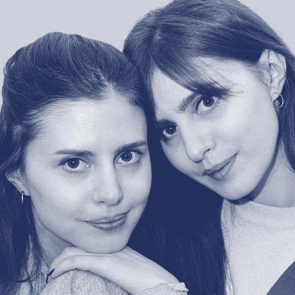
Biography VikaVita work as a duo as calligraphers, illustrators, graphic designers, type designers and teachers. Very quickly on their career, they enjoyed working with typography —especially with artistic calligraphy and lettering. Cyrillic script as rooted in the Ukrainian tradition is something for which they dedicate their time. It is in these ancient roots that they found an inspiration for a path forward for Cyrillic letterforms.
Interview
Describe your day?
VikaVita These days are quite diverse for us. Since the two of us spend most of our time in Kyiv, and with the overall state of war in Ukraine, we often hear sirens, air raid alerts, and sometimes explosions. The success of the day depends on whether there was an air raid alert or not. If not, we send the kids to school in the morning and start working. Currently, we work from our respective homes and mostly communicate online, even though we live just 5 minutes away from each other. However, we often meet to work together.
Before the war, we rented a workshop near Sofiivska Square in Kyiv, and it was good. However, after the full-scale war began, it no longer made sense. In the initial days and weeks, we didn’t even stay in Kyiv. Vita decided to stay at home and moved between Cherkasy region and Kyiv. She maintained her teaching activities in Kyiv, while freelance projects could be done at the dacha in the Cherkasy region.
As for Vika, she moved to Vienna, worked and lived there for almost two years, and continues to work with Glyphs and with Schriftlabor.
What is your favorite way to start a day?
VikaVita When everything is calm, with good news or at least the absence of bad news. Now, we’ve learned to appreciate each new day, and honestly, you feel how every day could be the last, so you just sit down and work on projects. There’s no time for procrastination.
Vika: I love my apartment in Kyiv, and it’s such a joy to sit and work peacefully at home, listening to my favorite music (I’m a music lover and enjoy various genres). I have all the materials here: a million pens, markers, brushes, spray cans. Papers and artworks are organized in folders that often travel in tubes to various exhibitions.
Before the full-scale war started two years ago, I had just finished renovating the apartment. But when the war began, I dropped everything and left. This apartment is right in the center of Kyiv, in a cozy neighborhood, just like my sister’s apartment. And when the war is over, we invite you to visit!
I missed my workspace and this apartment for two years, and now I want to sit and work here (photo). But I’m often on the road, between Kyiv and Vienna, and because planes aren’t flying, the journeys often take 18-24 hours. So, I’ve learned to work anywhere, as long as there’s an internet connection.
Vita: In my apartment, there’s a room, our workshop with my husband, and I find it very cozy. We moved to this apartment in the summer of 2022 when the full-scale war had been ongoing for several months. Therefore, it influenced the design of this room. My husband is a volunteer; he helps paint military vehicles with camouflage patterns. So, in our room, we have many certificates and acknowledgments for both my husband and me, for our volunteer assistance.
I adore this place because there’s no need to specifically go somewhere when you have a workspace at home with all the necessary materials. It’s definitely convenient, especially during wartime (alarms can start at any moment, and our home has an underground parking that currently serves as our shelter).
Last year in Kyiv, there were frequent and prolonged power outages, which taught us to complete projects quickly and very focused. The client is still expecting the work on time, and as long as there’s power on the MacBook, we had to finish the layout in time :)
Do you prefer a permanent/dedicated workspace, separate from home or at home?
VikaVita Home, sweet home!
We’ve worked in different places, had our own workshop, and spent time in various offices and coworking spaces. But what could be better than sitting back at home, relaxed, with a cup of coffee or tea, and enjoying favorite music.
“We probably fell in love with letters because they opened up to us in a new way, and we understood that they represent the pure form of an image, the perfection of design.”
– VikaVita

Favorite kind of music? Are they different according to a certain type of activity?
VikaVita A lot, but it seems electronic and relaxing music suits best. For example: Aphex Twin, Niels Frahm, Nosaj Thing, Hania Rani, Bonobo, Kiasmos, etc. Or even some light blues, jazz or some psychedelic rock. Various music genres come into play, depending on the season and mood, but the main thing is that it should be intricate enough to make it challenging to focus on the lyrics and get distracted. We’ve realized the desire for more cozy and gentle music because the anxiety and worry during the war have taken away our sense of comfort.
When something serious requires concentration, either meditative electronic music or even brown noise, or silence works well. Although I (Vika) don’t like silence now; I’m afraid of hearing the sharp sound of a siren or, worse, an explosion. It happens, so it’s better to use headphones and work with them on. As for me, Vita, I often work in silence or with rhythmic, quiet electronic music. I’ve gotten used to working without headphones to listen to the sounds around me. If the work is mechanical, such as painting a wall based on a sketch, we can sometimes even watch a movie or listen to lectures. This way, we’ve listened to many interesting lectures and podcasts and watched a lot of movies :)
Do you read news?
VikaVita We have to read the news frequently because our lives depend on it. Mostly, it’s Telegram channels about rocket launches from Russia or Belarus, specifying the trajectory, destination, and quantity. It helps us understand whether to seek shelter or stay at home. Honestly, no one in Kyiv goes to shelters anymore. But we always remind ourselves not to regret later; it’s better to read and assess the danger in time and, if needed, take cover, especially if there’s a child involved. As we write all this, we still can’t believe that this is our reality.
What do you do to evade yourself from work?
VikaVita Yes, sports are essential, like a reset. We attend dance and stretching classes. It’s been quite a while; it’s our second passion—dancing! Since childhood :)
How much a software and its fixed rules can determine a type project?
VikaVita We absolutely love the Glyphs app and always encourage all type designers to switch to Glyphs—everything is clear and intuitive there.
Well, as calligraphers, we freely incorporate all the rules with an artistic approach. Moreover, working more often with Cyrillic and focusing on “Ukrainian Cyrillic,” we make even more exceptions to the rules. But there are certain rules, of course; you need to know them to skillfully break them ;)
Do you think AI will change the way to design typefaces?
VikaVita Still, we believe that AI cannot replace a living person. Talent, expression... it all comes from the character of an individual. Perhaps we are too naive. We don’t even try AI, as there is an unwritten rule among font designers — not to provide a platform for AI to grow on.
Hopefully, others also adhere to this rule besides us :)

What is your ratio of self-initiated typefaces vs. typeface for clients?
VikaVita In fact, our experience in font design is relatively limited; you could say we’re newcomers. We often started working on our own fonts, but almost all of them remained unfinished. We have numerous original fonts that have lingered in the realm of lettering, never fully developed into font files.
We collaborated on several projects with Dima Rastvortsev (in our opinion, one of the best type designers in Ukraine, with vast experience and a unique approach). In these projects, we designed the letters, conceptualized the font, and Dima helped adeptly compile them into font files: a font for the French Institute in Ukraine (French Spring), a script for Kyivstar, and a font for the antique store Violity.
Ukrainian designers are exceptionally talented and possess extensive knowledge of Cyrillic! We actively promote these guys in all our lectures.
We also frequently provide feedback on Cyrillic fonts for various studios, and on an ongoing basis for Schriftlabor.
Are you rather one of those who draw or redraw type classics?
VikaVita We are among those who look at traditions and interpret them. We love studying historical calligraphic scripts. In terms of calligraphy, we master various styles, from Roman Capitals (with a brush) to Copperplate and pointed pen Business Coursive. We also delve deeply into the roots of Cyrillic.
Type classic? Perhaps they refer to what has already been created, historical examples. But simply copying is dull. Copying itself is a useful exercise; it’s worth redrawing something once to understand the logic of the tool or the author’s ideas. However, presenting “historical fonts” without an author’s interpretation is boring. Why do we seek inspiration in historical examples? At the very least, to avoid repeating other authors :)
Instagram, Behance, or Pinterest have plenty to inspire, but it’s not always safe. You never know where your work might lead you or whom you might (accidentally!) duplicate / violate someone’s copyright. In historical examples, everything has long been invented; a slight author’s interpretation (that’s where the magic lies) can result in an interesting logo, lettering, or font. And no one will come to complain about replicating a composition (calligraphic) or similar serifs in the font.
Therefore, in any new place (city, country), we visit museums, libraries, and archives to explore something new ;)
Perhaps it’s worth mentioning who, for us, and which school of graphics and calligraphy serves as an example—Hermann Zapf and the entire German school of graphics and calligraphy from the mid-20th century, in general.
Is it possible to draw a typeface for a language or writing whose language we do not know?
VikaVita We believe that one doesn’t necessarily have to be a native speaker or writer to have an understanding of how to draw letters correctly, etc. It’s essential to be somewhat familiar with the context to have exposure to different examples of letters. For instance, a trip to a Cyrillic or Arabic-speaking country, with photos of various examples, can be helpful. Museums, archives, etc., can also provide valuable resources. It’s not mandatory to know, for example, Bulgarian, Serbian, Ukrainian, Belarusian, and Russian languages to create Cyrillic. Knowing the alphabet, the rules for constructing Cyrillic letters, and having some knowledge of the history of writing would be beneficial, but knowing the language is not obligatory. You can seek the perspective of a professional and a native speaker, simply asking for comments, which will always be helpful. We are often asked to provide commentary on Cyrillic as well.
“Without traditions, there are no innovations.”
– VikaVita
What do you think of this trend of free fonts?
VikaVita We can judge the trend of free fonts within the country. The trend of freely available fonts in Ukraine has become overly popular, to the point where it’s even annoying that large companies commission their own fonts for publicity and release them for free. It was an interesting move, but at some point, there was so much of it that there’s a concern the market won’t continue to develop within the country. It’s actually alarming. Many design companies are too afraid to deal with licenses, finding it easier to use fonts from Google Fonts than to navigate font licenses and pay for them. As graphic designers, we work with various design companies, both large and small and know about that. Perhaps this issue is more specific to Ukraine than to the broader European context; I don’t know. This is just an opinion.
When and how did you start working together?
VikaVita Probably since the age of 4. We’ve been drawing together our entire lives. We were the best at drawing in school, and we also studied together at the art academy. Throughout our lives. Initially, we thought we would draw illustrations, then we were really into fashion. However, during our third year at the academy, we realized that we love letters and are probably most attracted to them.
We discovered that letters can be both painting and graphics and design (typographic design)—all about letters. We probably fell in love with letters because they opened up to us in a new way, and we understood that they represent the pure form of an image, the perfection of design.
You do lettering and calligraphy on many different media, which one do you prefer to work on?
VikaVita I think we still love large formats. When we come across a project involving wall painting, it’s always a joy! Because most of the time, we work on computers anyway.
In your opinion, how to find the right balance between tradition and innovation in lettering and calligraphy?
VikaVita Without traditions, there are no innovations; without calligraphy, it’s challenging to create lettering. Even if you make lettering not following calligraphy principles, but breaking all the rules, at the very least, you should be aware of these principles. In essence, knowledge of traditions is a solid foundation, but overall, with this knowledge, you need to move forward, evolve, look into the future, without getting stuck in the past.

Do you remember when you decided to pursue your career in design?
VikaVita Since childhood, we knew we would become designers. We also attended dance classes concurrently, contemplating which path was closer to us. But, of course, we chose design! Our dad engaged in drawing with us during our childhood; he also loved to draw. In our family on our dad’s side, although everyone was an amateur in drawing, all had talent.
However, we didn’t know precisely what type of designers we wanted to become. Firstly, we were constantly drawing comics (photo) and advertisements. In the ’90s, we watched commercials on TV and then created storyboards in homemade notebooks for our invented ads. Later, we discovered the world of cartoons on Nickelodeon: CatDog, SpongeBob SquarePants, The Angry Beavers, Hey Arnold, and so on. We also watched Pokémon. We used to run from school just to catch the latest Pokémon episode and draw a new character-pokémon from memory in our notebooks. It was a blast! We even dreamed of getting into animation. Perhaps that’s why we often enjoy drawing those ”Babble letters” in the style of Nickelodeon cartoons.
When you started, who were the teachers, mentors or professionals who had the most impact on you?
VikaVita Indeed, yes, our teacher, Professor Vasil Chebanik, instilled in us a love for letters, especially for Cyrillic. He showed us that Cyrillic could be different, that it was not necessary to just redraw the Cyrillic letters we have been using since the reform of Russian Tsar Peter the First. That one could seek inspiration in historical samples. He began to focus on letters after visiting an exhibition in Germany and meeting Albert Kapr. At that time, Kapr was an authority for everyone and, truthfully, remains an authority today. Kapr posed the question: why use the Peter’s I alphabet instead of your historical Ukrainian (Ruthenian) samples? After this, our teacher started to develop this theme and to some extent, drew us into it as well. For which we are grateful.
Then we started traveling to various exhibitions and workshops around the world, communicating with colleagues, submitting our works to exhibitions and contests. We made our student projects at a level where they already looked like they were realized and displayed them on Behance. Probably, our journey began with this platform because many of our projects were noticed by different companies, publications, and journals precisely on Behance.
During your creative process, do you sketch–draw on paper before moving on to the digital workflow?
VikaVita We always draw by hand before digitizing. When there’s an opportunity to quickly scan, we draw on paper, which is our favorite process. But if we’re on the road or traveling, we use an iPad.
Do you have words of wisdom for someone who wants to become...?
VikaVita Be prepared that this is not a job, but a state of the soul. Don’t be afraid of it; we wish to be passionate about it without burning out.
What will be the message you would like to convey during your Now24 talk?
VikaVita We want to talk about Ukrainian Cyrillic.
What other speaker wouldn’t you want to miss at Now24?
VikaVita We want to hear from everyone!
Paul Show—a legend, probably has been wanting to hear his speech for a long time.
It’s great that TypeParis has gathered such wonderful speakers.
Thank you very much, VikaVita!
– Interview by Jean-Baptiste Pernette
Register to the graphic & type conference in Paris ➼ Now24 conference
Learn more about TypeParis
➼ Type & graphic designers interviews
➼ Summer24 programme
➼ Reports
➼ Attendees feedback series
SPONSORS


