This week has really brought out the survivor in each of the attendees. It’s the white-knuckle week. Everyone is acutely aware that the end of the programme is rapidly approaching, and that much of their time toward the end will be spent printing specimens and preparing presentations. So this is the week to make it count!
Monday began with a group review by Jean François and Mathieu. They were impressed by the work done over the weekend, and conducted a detailed inspection of each attendees projects, providing valuable feedback. Most people at this point had all lower and uppercase completed.
“It was great to have access to the people who created and support the software we use.”
This was followed by an explanation of punctuation and diacritics. A big morning. The students continued on their projects at their tables.
In the afternoon we welcomed the Glyphs team duo for a full week with the attendees: Georg Seifert and Rainer Erich Scheichelbauer. They went in-depth straight away on outline quality, and using components to assemble and manage diacritics in Glyphs. It was great to have access to the people who created and support the software we use. Later we got a surprise visit from Julien Priez, who visited a few students to help their projects along.
Now that spacing has been explained in great detail the previous week, it is important for the attendees to start improving the texture and rhythm of their typefaces by playing close attention to their spacing. Xavier joined us again on Tuesday and gave further insight into spacing capitals, highlighting the similarities to the lowercase strategy, as well as the unique challenges involved.
“…it is important for the attendees to continue improving the texture and rhythm of their typefaces by playing close attention to their spacing.”

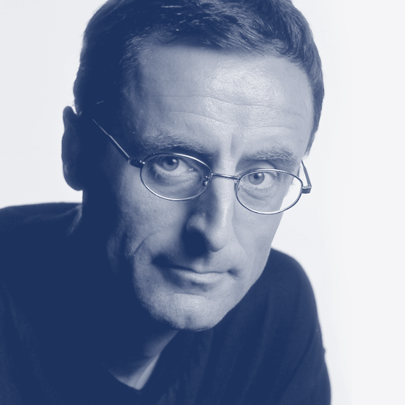
François Rappo joined us on Wednesday as our guest critic for the day. He sat with the students, three at a time, for the whole day and offered his insights. The attendees got a lot out of this. At this end of the programme, there is a lot for the guest critics to see and work with, which is helpful for presenting rich feedback. Each new guest is chosen for their ability to give the right feedback at a particular stage. François Rappo was the right person on the right week. His eagle eyes proved to be very valuable for the attendees, as well his immense historical knowledge. The TPTalks in the evening were fantastic as usual, view the talks and read more here.
Now that the class has been working on the digital outlines of their regular typeface for some time now, completing as much of the glyph set as they can, it is time to move to their second style. Many are choosing to create a black version, some are creating masters that feel quite different stylistically but are still interpolable, and some are even taking on the challenge of italics.
This second style is invaluable not only for expanding the utility of their type system, but for identifying and rectifying ‘breaks’ in the system. If a shape fails to work in the black version, perhaps it’s not a good shape for the regular? Or, if it is, the challenge of finding a compromise, a way to make it work in the black, is always a useful exercise. This back and forth, pushing, pulling and stretching the shapes inside the design space, makes for a stronger typeface. Pushing attendees to work second style is also a way to allow them to play within the design space, to be surprised by the shapes produced by interpolation.

“This second style is invaluable not only for expanding the utility of their type system, but for identifying and rectifying ‘breaks’ in the system.”
Work continued on Thursday—under the guidance of Jean François, Mathieu, Marc Rouault and Xavier Dupré—and the students are now truly buried in their projects. With multiple styles, numerals, interpolation, diacritics, punctuation, and even the beginnings of some OpenType features, such as ligatures and alternate glyphs, they are truly discovering what it takes to design a typeface. There is no class on Friday, so the class is gearing up for a three-day working weekend, to launch into the final week well-prepared to take their projects to a successful conclusion.
— By Dave Coleman
Learn more about TypeParis courses and conferences!
➼ Reports
➼ Type & graphic designers interviews
➼ Attendees feedback series
Apply to TypeParis Summer course!
The deadline for applications is 14 March, every year.
SPONSORS


