Julie & Julien
Format is a contemporary slab serif typeface family with various weight and width variants for a wide range of uses. The large x-height, short ascenders and descenders make it a comfortable to be used in different applications as the styles constitute a melange of fonts. Though the initial inspiration of the typeface and the purpose of creation was born from the brief of creating a condensed font for revolutionary posters, it surprisingly changes its aesthetic when pushed to different extremes like the very light extended weight and the very condensed light weight. Format has unique styles for several usages in different contexts and sizes as the fonts transform with two parameters i.e. the weight and the width.
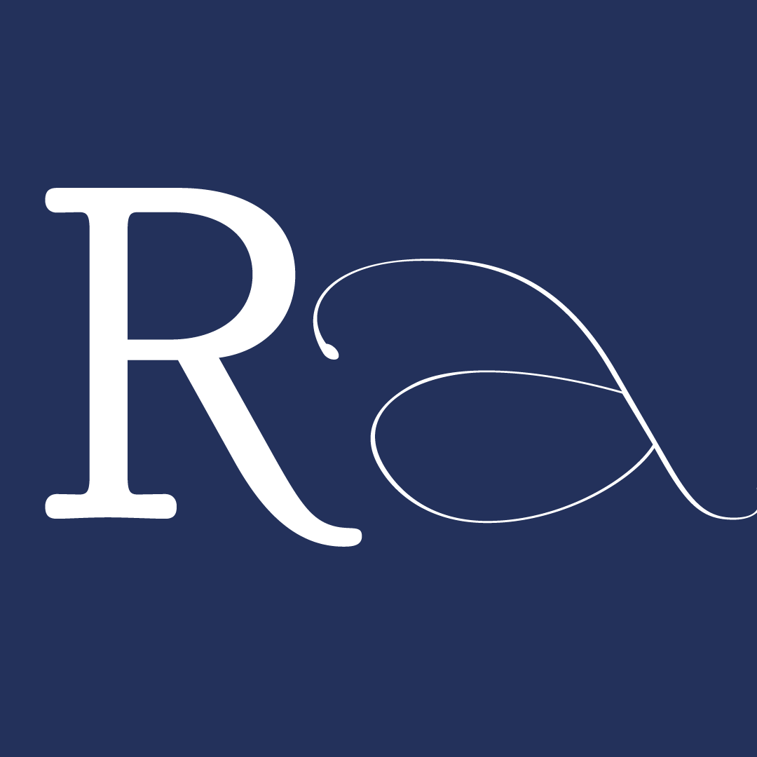
The typeface is not based on expansion like a conventional slab serifs but in fact the round counters are calligraphy based with asymmetric serifs to compliment the calligraphic counters. This style of the typeface came about from different explorations done on some calligraphic letters drawn during the course. The exercise exploring the design space led to a very condensed black weight of the basic calligraphic letters which gave a a slab serif feel. Also it made me realize the fact that a typeface transforms drastically with the same structure just by changing different parameters. Since it has fonts for usage in different sizes and context there is a set each of lining and oldstyle figures for display and text usage respectively. In spite of the short descenders it has a well constructed double storied ‘g’. The standard ligatures are available and the resolved in a fun way for usage in large sizes as an aesthetic feature.
Therefore the initial digital sketches were that of a condensed black but I quickly moved on by the adding an axis and creating an extended light weight to see the results of interpolating diagonally opposites axes.
The several styles in the typeface including a stencil version for the condensed black can be used for different purposes like poster or headlines, beautiful display uses, text settings for screen and print as well. And this fact corresponds with the name format.
There are more possibilities to expand and push this family to the extremes of each axis as the quest of a type designer is to try and solve problems in the most extreme situations with the same consistent structure. Therefore, not just for catering the customer, it would great to find the solution for the most extreme design space for a letter in this typeface for the future.


The 6-week type design programme that you’ve been waiting for starts on 2 June and ends 10 July 2026.


Open to all Our summer programme is in English and covers typeface design and calligraphy techniques, type history, and software practices. Whether you’re a design pro or just curious about type design, you can learn all about it in a relatively short amount of time.
➼ Subscribe to our mailing list to don’t miss important updates.