Botnia
Botnia is a typeface inspired by the Finnish architect and designer, Alvar Aalto’s (1898–1976) Organic Modernism. On the contrary to the strict geometric rules of the Bauhaus and other early modernist movements, Aalto favored a more humanist approach on modernism.
In his work, Aalto used natural, organic forms while keeping the overall look sharp and modern. Whether it’s his attention to details such as door handles and bent wood, or large scale proportions and curvatures, there is always a sense of warmth and comfort in Aalto’s work.
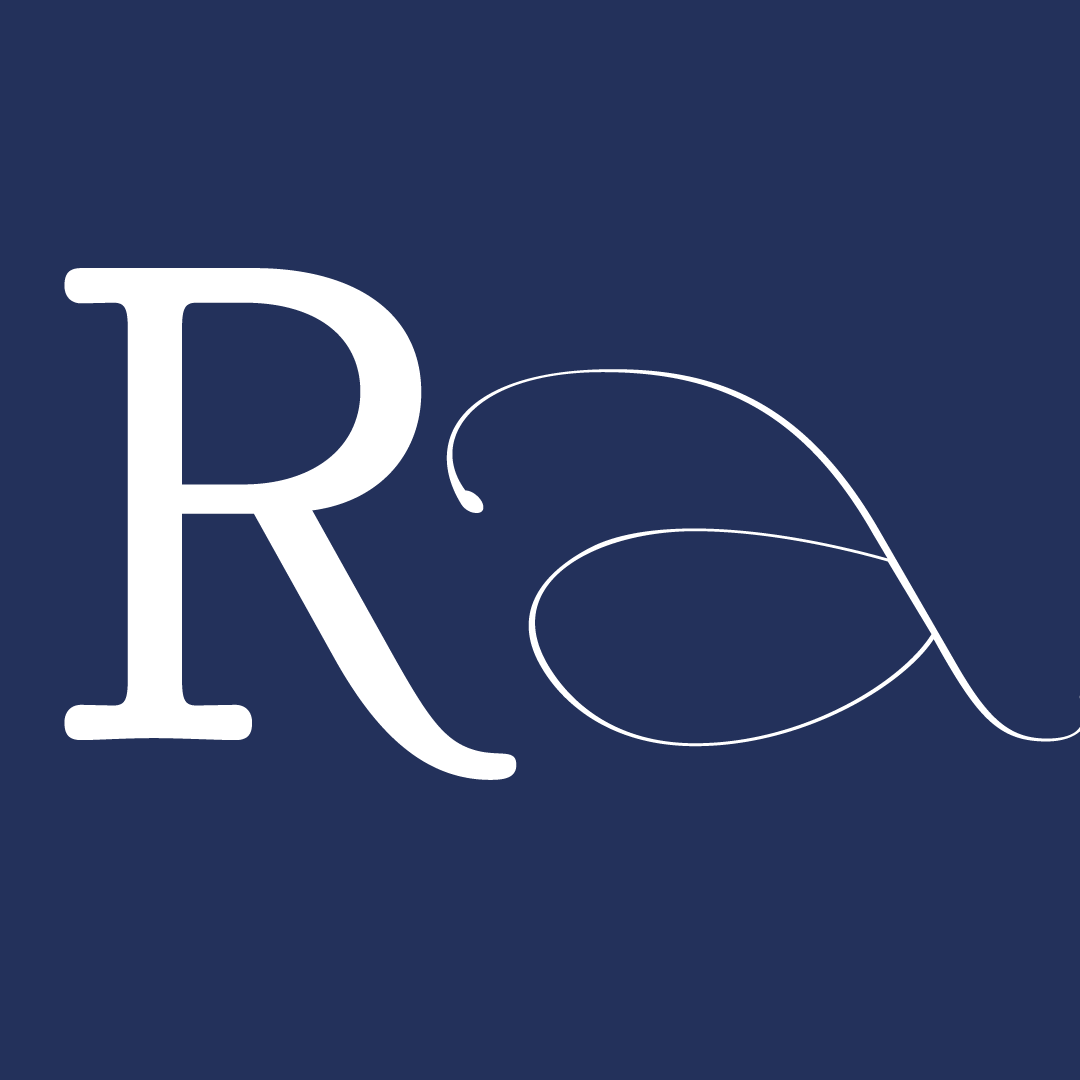
Usually the type in Aalto’s buildings is set in Futura or other similar kinds of geometric sans. In Botnia, the goal is to translate Aalto’s philosophy into a typeface itself. Botnia is a serif typeface that explores the organic design principles of Aalto’s work with it’s considerably large x-height, open counters and strong horizontal rhythm. It is designed to be legible and humane, yet clear and modern in spirit.
Botnia comes with 5 different weights ranging from light to black, giving a lot of usage options to make it’s reader feel welcome.
Credit images: Alvar Aalto Foundation


The 6-week type design programme that you’ve been waiting for starts on 2 June and ends 10 July 2026.


Open to all Our summer programme is in English and covers typeface design and calligraphy techniques, type history, and software practices. Whether you’re a design pro or just curious about type design, you can learn all about it in a relatively short amount of time.
➼ Subscribe to our mailing list to don’t miss important updates.