

After a first phase of introduction and adaptation to TypeParis method and rhythm, things are getting serious at this point of the programme: personal projects begin to take form! Thanks to the previous visits to several libraries and museums, all attendees were able to collect historical sources and to do parallel research based on each project brief. Moreover, the design space practice as a colophon of the first exercise allowed the students to discover the range of style possibilities and fuelled their inspiration for their personal typeface designs.
Based on their choice of brief, this second phase has started focusing on a keyword in lowercase in order to explore early ideas: time to start sketching!
Lyon trip
But first, as a TypeParis tradition, at the beginning of the third week of the programme all the crew travelled to Lyon to visit the Musée de l’Imprimerie and the Musée Gallo-Romain. Again, awesome type specimens and historical inputs which added to the previous ones, helped the attendees setting up a starting point to begin sketching their own letterforms.
After an intense morning at the Musée de l’Imprimerie, during the afternoon all the crew got lost inside the Musée Gallo-Romain surrounded by the beautiful stone-carved Roman capitals on display.
Back to Paris
Once returned to Paris, they were introduced to the basics of a digital workflow as well as to the italics. With Jean François Porchez and Gina Serret, who gave some demos of italic calligraphy, they learned the essential differences between the roman letterforms and the italic ones. And again, going back to calligraphy, they ended up drawing several letters in italics.
It was also the moment to switch into a digital workflow: first contact with Glyphs for some of the students! They learned the point positioning and curve drawing from scratch and they understood the importance of caring about the spacing from the beginning, as an integral part of the digital design process.
Despite at this moment the attendees started expanding their typefaces using Glyphs, they still kept working on tracing paper for key new elements such as capitals and numerals. The mission by the end of this phase was to build up a more complete set of letters –adding capitals, numerals, and all the necessary glyphs– and, later on, to enlarge their type family with other variants in line with the style of their typeface and design concepts.

Guest critics
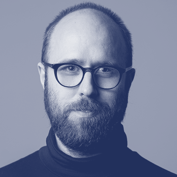
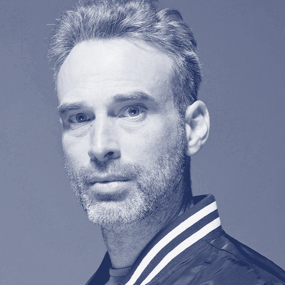
We had the chance of hosting two international guest critics these weeks of the programme: first, David Březina and later on, Ian Party. Both of them look at the students’ designs with a fresh eye, giving in-depth feedback to them all. Also, they both gave a talk after sharing the whole day with the attendees.
Special evenings: Arabic type design sessions
As a novelty this year, we were so lucky of having Nadine Chahine with us for two evenings. Right after the daily sessions, she joined us to give to the students an introduction to Arabic type design.
TPTalks
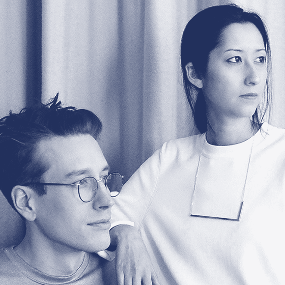
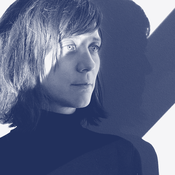
During this second stage of the programme, we had the pleasure of having Studio Yukiko, David Březina, Ian Party and Marta Cerdà as lecturers. They offered us a stunning diversity of knowledge: from the accuracy and research of David, to Marta’s humanity in her graphic design projects; and from the experimentation of Ian designing type, to the same experimentation of Studio Yukiko but now using type.
Studio Yukiko shared with us their love and ability for playing with type, always with the goal of finding new letterforms for each commission. And right afterwards, thanks to David Březina we got conscious of the importance of the visual coherence between a group of letters, which is probably the hardest part of type design.
In the fourth evening of talks, Marta Cerdà, live from Barcelona, gave us a human lesson of how important is to respect the history of calligraphy and typography in all kinds of commissions, even if they ended up being a super modern digital product. But first, it was Ian Party’s turn, who showed us how his background as a signpainter and passionate of graffiti drove him to a very experimental process.
If you missed some of the talks, you are now able to watch them all online:
Studio Yukiko
David Březina
Ian Party
Marta Cerdà Alimbau
That’s all by now. Stay tuned to not miss how the students’ projects move forward!
See you for Phase #3!
– By Gina Serret
Learn more about TypeParis courses and conferences!
➼ Reports
➼ Type & graphic designers interviews
➼ Attendees feedback series
➼ Summer23 programme
➼ Now23 conference
Apply to TypeParis Summer course!
The deadline for applications is 14 March, every year.
SPONSORS


