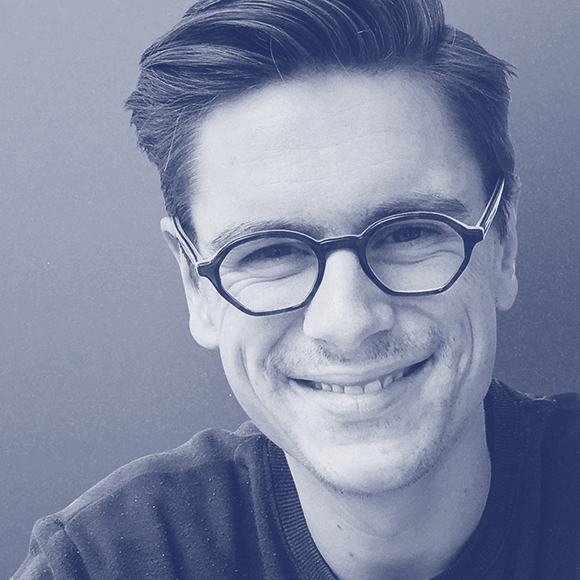
We have a wonderful group of speakers and guests sharing with us this year at TypeParis. We wanted to find out a little more about each of them, so have presented them with a series of questions which they have generously taken the time to answer.
Born in Zurich, Claudia currently resides in London, where she is Design Director, and partner of Spin Studio. Claudia works alongside SPIN founder, Tony Brook and the team on identities, books, marketing campaigns, motion graphics, packaging and websites. Her personal experience includes projects for the BBC, Crafts Council, Dig Delve, Ministry of Sound, Proa Foundation, University for the Creative Arts, and Wallpaper magazine.
Typographic experimentation is an essential part of the SPIN studios practice. Playful expressions blending the analogue with the digital, making ‘conceptual lettering’. Hybrid type forms that spring from conceptual conceits. The studios aesthetic brings together the rigorous, the refined and the irreverent in a search for new surprising letterforms. The outputs of this process can be seen in an occasional journal published by Unit Editions – SPIN: Adventures in Typography.
Claudia will be speaking at the final #tptalks for 2018. To join us, please register here.
Have you and your partners at SPIN had to work over the years to guide your clients to a place where they are more willing to embrace experimental and unconventional typography?
Claudia Klat: Usually clients get in touch with us because we have a certain visual approach. Our aim is to come up with a bespoke solution that is in the best case thought provoking, beautiful, memorable and leaves a lasting impression. In order to do that we rely on building an open and engaged client relationship. We had some amazing clients who trusted us to embrace a more playful and experimental approach.
In general I think clients are better educated these days in the field of graphic design, which makes it easier to have a creative discussion with them and end up with an interesting result. But I definitely would love to see more experimental and unconventional typography especially in the UK.
“Our aim is to come up with a bespoke solution that is in the best case thought provoking, beautiful, memorable and leaves a lasting impression.”
—Claudia Klat

Do you ever feel yourself getting too comfortable (be it with a particular style, type of project, field, environment, medium)? If so, what steps have you taken to shake things up?
When ever we have time we work on studio projects like for example Spin’s Adventures in Typography which involves a lot of experimentation away from the computer. It’s also an opportunity to push yourself creatively into uncomfortable situations. Also to work with hands definitely shakes certain routines up.
What is your favourite way to start your day? What is the first thing you do when you sit down at your desk?
Big cup of black coffee. Read emails. Check calendar. Play music.
Favourite television show / movie / book / magazine (pick as many as you like to answer)
TV:
– Curb your enthusiasm
– Father Ted
– The Vietnam War (documentary)
– Voyeur (documentary)
– Game of Thrones
– Black Mirror
– American Horror Story
– Rick and Morty
– Fargo
– The Thick of It
– High Maintenance
– Veep
– Bored to Death
Films:
– Sunset Boulevard
– Paris, Texas
– Metropolis
– Dead Man
– Enter the Dragon
– Rita Sue and Bob too
– Kes
– Cabaret
– Moonlight
– Léon: The Professional
– American History X
– Män Som Hatar Kvinnor
– North by Northwest
– Taxi Driver
– Eternal Sunshine of the Spotless Mind
– Reservoir Dogs
– Wild at Heart
Magazine:
– The Gentlewoman
– Apartamento
– DotDotDot
– Idea magazine, Japan
– Avant Garde magazine
– Neue Grafik
– Typografische Monatsblätter
– Oase
Books:
– Freunde + Freunde. Karl Gertner, Dieter Roth, Daniel Spoerri, Andre Thomkins and Friends
– The Danzig Trilogy. Gunter Grass.
– The collected plays of George Bernard Shaw.
– Hot Love, Swiss Punk&Wave 1976—1980
– Learning from Warsaw
– Lance Wyman: The Visual Diaries 1973–1982
– Conditional Design Workbook
– Yes Yes Yes Alternative Press ’66—77′ from Provo to Punk
– Lange Liste 79–97
– 69 / 96
– Beauty and the Book
– Irma Boom – Ibo

– Interview by Dave Coleman.
Learn more about TypeParis courses and conferences!
➼ Reports
➼ Type & graphic designers interviews
➼ Attendees feedback series
Apply to TypeParis Summer course!
The deadline for applications is 14 March, every year.
SPONSORS


