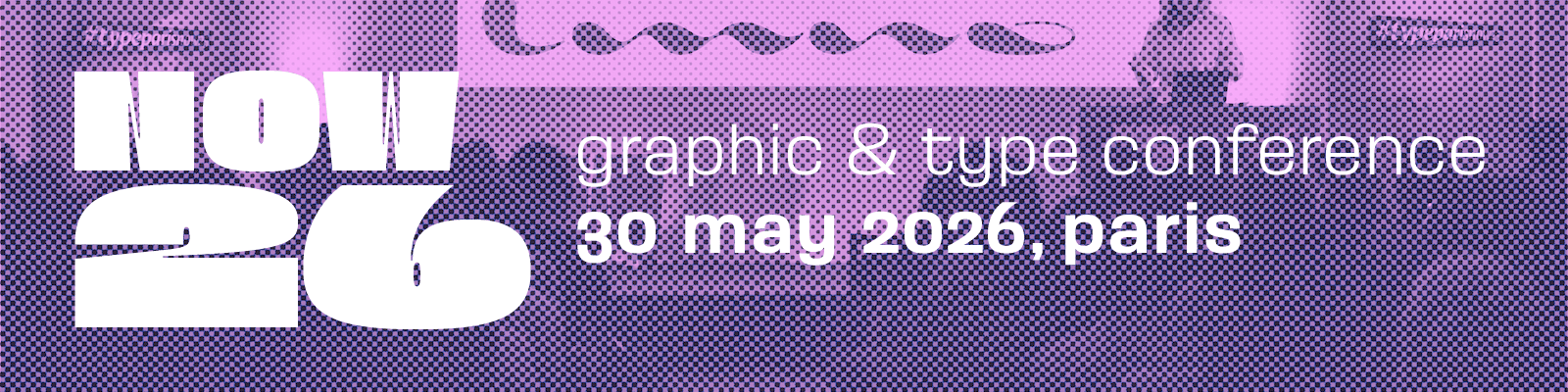
Mark your calendars for Saturday 30 May 2026! The Now26 conference is happening in the beautiful city of Paris. It’s going to be an epic event, with a mix of inspiring speakers covering a wide range of topics like graphic design, web design, motion design, publishing, visual identity, communication, and type design. If you haven’t already, don’t miss out on the best rates by registering now!
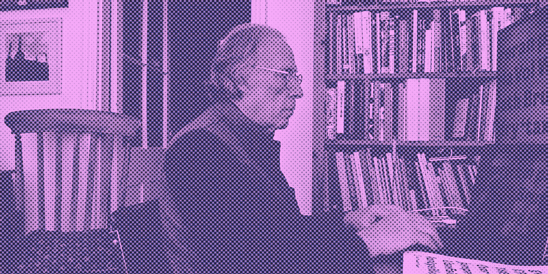
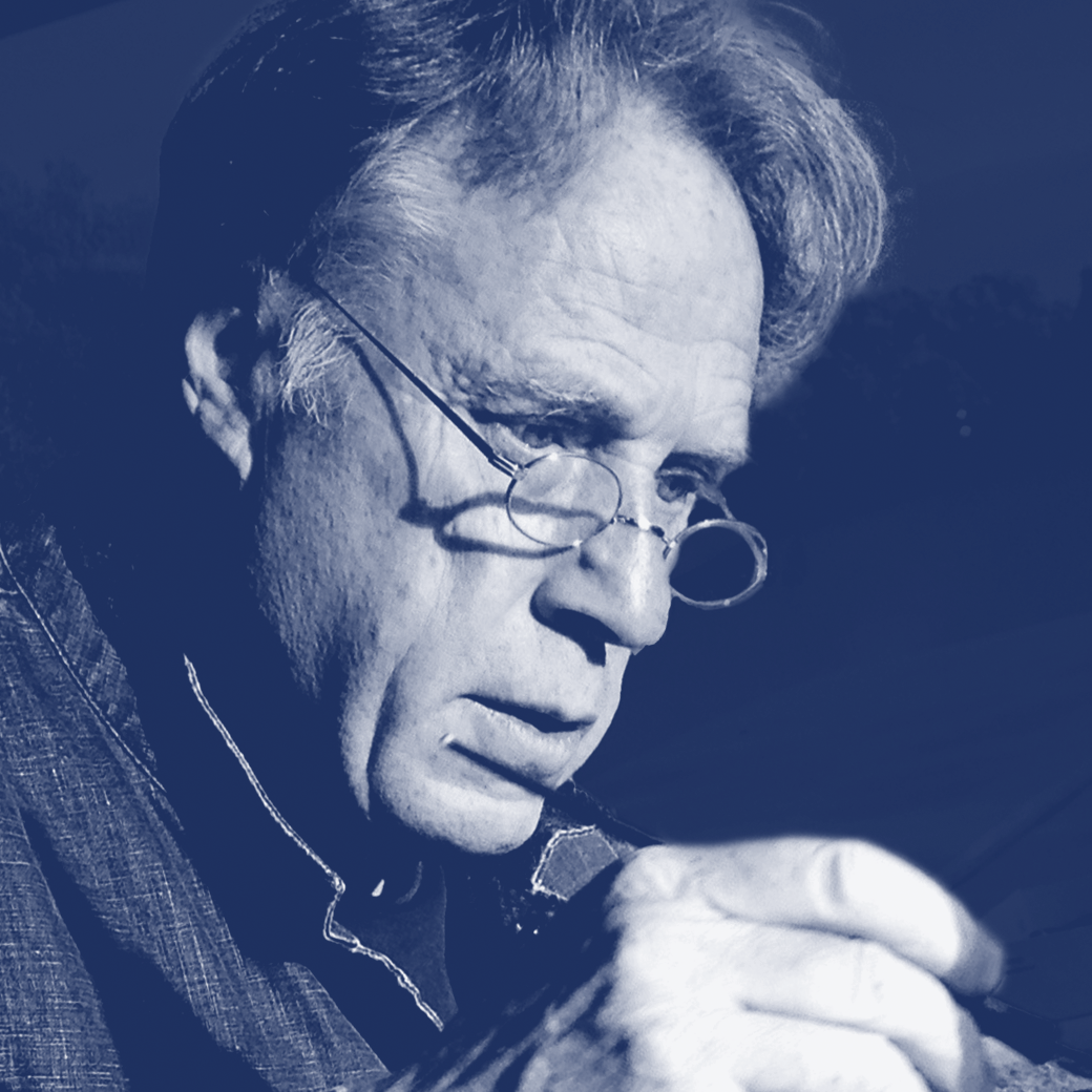
We would like to invite you to explore the profiles of our esteemed guests. Discover the captivating interview of David Quay.
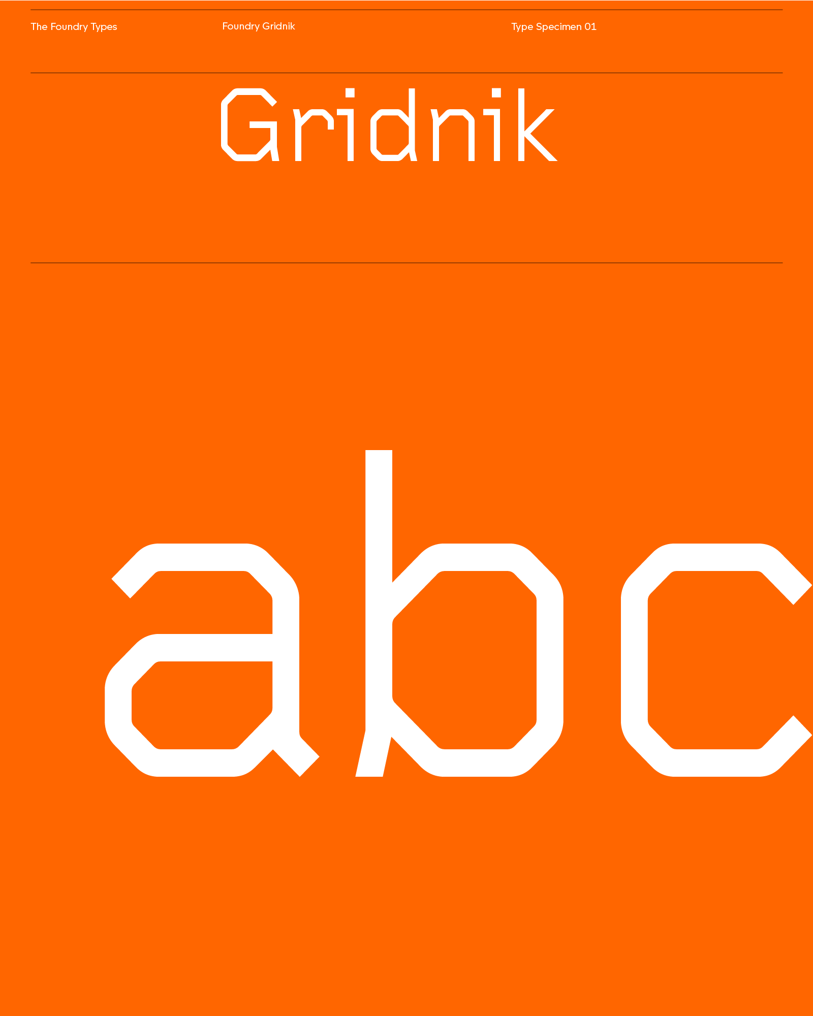
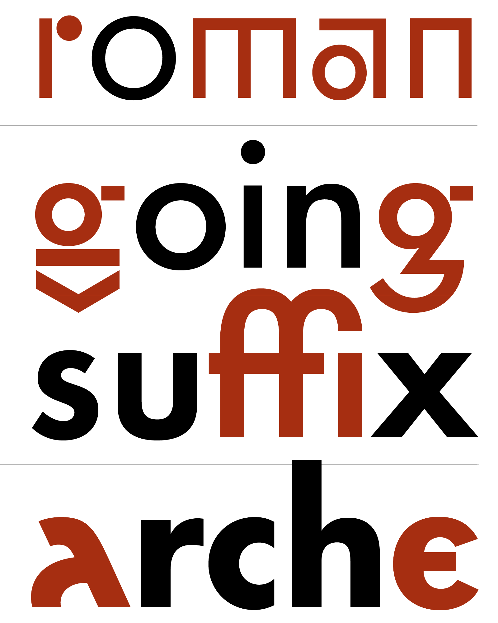
Biography David Quay is a graphic designer and type designer. After studying graphic communication at Ravensbourne College, he worked in London before founding David Quay Design in 1987 and designing typefaces published by ITC and H Berthold. In 1989, he co-founded The Foundry, the UK’s first digital type foundry, producing exclusive typefaces and major bespoke projects, including UK railway signage and the Lisbon Metro. He teaches typography internationally and has held academic positions across Europe. A Fellow of the ISTD, he co-chaired the society from 1994 to 1999 and collaborated with Wim Crouwel on the Architype Crouwel Collection and Foundry Gridnik.
Interview
What’s your favourite way to kickstart your day?
David Quay I work alone at home, my partner has her own studio upstairs where she works on her artist books. We often discuss each other's work and ideas. We also have a studio in Budapest. First thing around 07.30, I make coffee in my classic octagonal coffee maker with a slice of kosher cake that I dunk in. I also try to walk an hour a day along the seafront where I live.
What does your typical day look like?
David Quay Open up my emails and immediately throw 90% in the trash. After answering the important ones, open up Glyphs and check what I worked on the day before. Around 11 o’clock, I often speak to my partner in The Foundry Types, Stuart de Rozario, for a 30-minute or so and discuss business. I then work the rest of the day, except for a late lunch. At 21.00 I stop, time to relax, watch a film, then read, at the moment I am watching a DVD collection of Claude Chabrol and reading the Hungarian writer, Sándor Márai’s Gloed (Dutch title).
“I started drawing letters when I was 9/10 years old. At 13, I knew I wanted to do something with art or design.”
– David Quay
What’s your favourite kind of music to listen to while working?
David Quay If I am really concentrating, I prefer silence; otherwise, if I am spacing and kerning, I listen to a variety of music, from the music of Vaughan Williams, Vladimir Martynov, John Tavener, Ólafur Arnalds and the singing of Les Choristes. I also listen to podcasts on the BBC has a 1000 podcasts on all different subjects that are very informative.
Do you keep up with the news and social media these days?
David Quay I only read The Guardian Newspaper online as I think the journalists have integrity. I post every few days, on my Type Tourist page in Facebook, a photograph of lettering I have recently found on the street. Occasionally, I also paste it on LinkedIn, and I also repost anything Stuart posts on The Foundry Types page. LinkedIn is good to see what other type designers are doing. Facebook, I have a few colleague I interact closely with.
What drives you to create new typefaces?
David Quay The typefaces that I consider my best come from a story I need to tell. For Instance, Kade, my name Quay in Dutch, was an attempt to encapsulate the hard life of the skippers and fisherfolk in Nederland. I cycled all over the country, talking to people in small fishing villages and harbors.
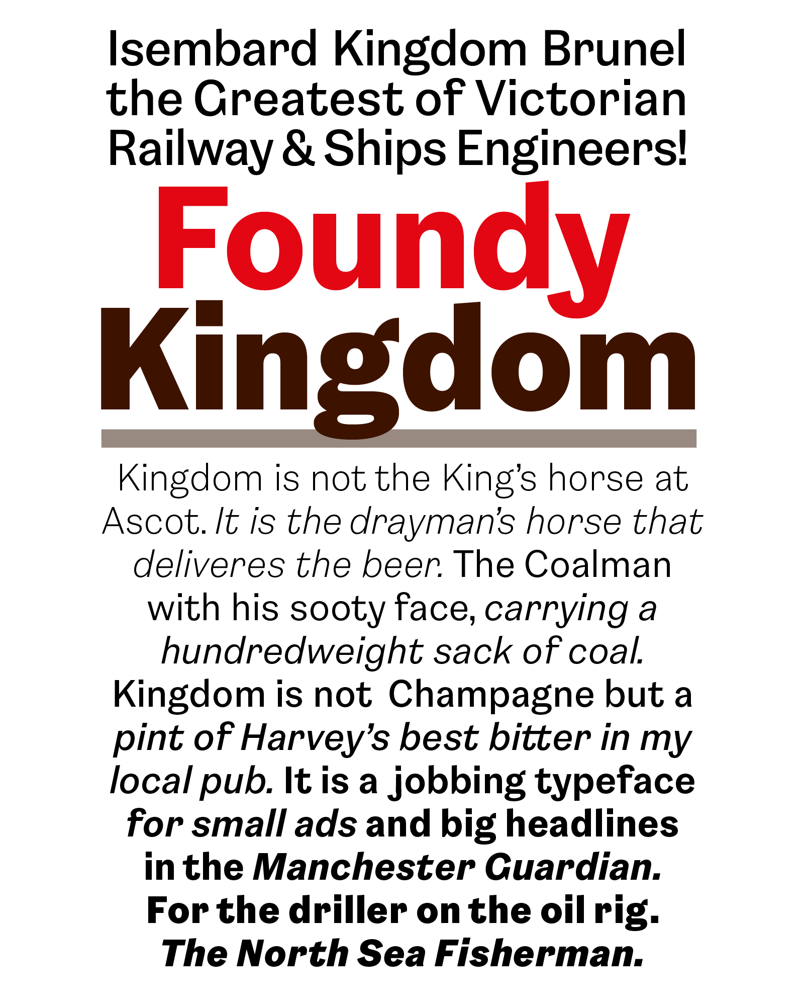
I even bought a Dutch “sleepboot” tugboat to go even further into Belgian harbors and parts of the German Frisian Islands. The story formed, but it took me a long time sketching to find an idea that worked. The forthcoming typeface from The Foundry Types, “Kingdom” is based on vernacular lettering I have photographed around England. It is a typical English Grotesque. A King has a “Kingdom”, but it is the people who make it! It is not a “Champagne” typeface for the aristocracy, but a typeface for the working man and a pint of bitter in the local pub.
How much can a software determine a type project nowadays?
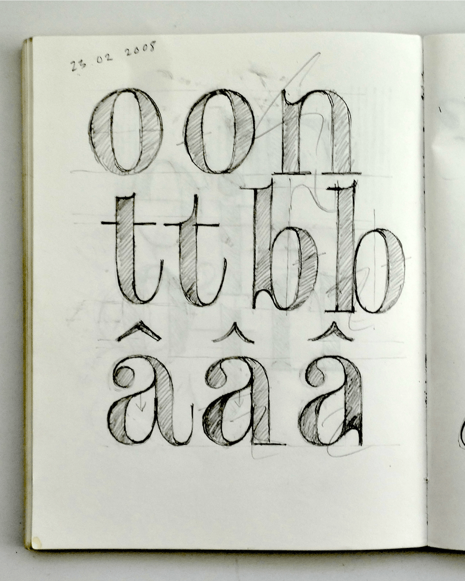
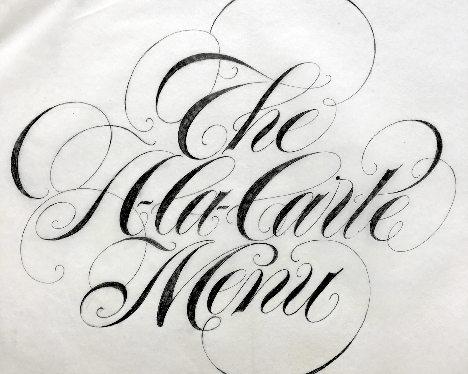
David Quay I started off using a pencil, now I am using Glyphs. I prefer the pencil, but with Glyphs, I do not have a problem; I find it an easy tool to use. I still sketch a lot, as I find the pencil the most effective way to see an idea instantly.
Do you think AI will change the way to design typefaces?
David Quay It will certainly affect all; it will make the workflow easier. In the future, it will help make fonts, but it will still need the input of creative ideas. It will affect all creative businesses and further democratise the type industry, whether that is a good or bad thing, we have to wait and see!
What is your ratio of self-initiated typefaces vs. typeface for clients?
David Quay When we first started, it was a mix of self-initiated projects and corporate work. We released a major family every year along with the Archetype series. We also did many large corporate typefaces: British Rail, British Gas, National Westminster Bank, Lisbon Metro, Swiss Air and many more. Today, I concentrate only on making fonts for resale. Corporate work I leave to Stuart de Rozario, my younger business partner.
“I started off using a pencil, now I am using Glyphs. I prefer the pencil, but with Glyphs, I do not have a problem; I find it an easy tool to use.”
– David Quay
Are you rather one of those who draw or redraw type classics?
David Quay I have been involved with one classic that was a commission, from ITC to design a very English typeface. I was given a Motif magazine by Ralf Beyer when I was 16, which contained an article by James Mosley on the English vernacular lettering. There was an image of a typeface by Alexander Wilson, “Wilson’s No. 1 English” from 1760. I saw its beauty then but did not understand why. I showed it to Freda Sack, my partner in The Foundry, 30 years later, she immediately fell in love with it too! Luckily, St Bride Library in London had some very good specimens that we could photograph and enlarge. Six months later, the typeface, now called Wilson, was presented to the ITC review board, which turned it down. We carried on and developed into a full family, fortuitously, Alexander Wilson had also made a bold version and italics. It has sold well to type connoisseurs. Foundry Wilson typeface was a labour of love!
What can you tell us about the state of the font market today?
David Quay At the moment, it is all very confusing; the market is changing rapidly, we have to try various approaches. Easy access of a bunch of fonts via subscriptions platforms such as Canva, Creative Cloud does make the world better or not? Does it add value to the fonts as a design product, or reverse? From what I can see now, it is very difficult for some independent type designers and small companies to survive. When we started The Foundry, new typefaces were highly prized. Now, they are devalued by free fonts, piracy, and many badly crafted fonts. Google free fonts and Canva have not helped.
What was the most challenging typeface genre?
David Quay Designing text fonts, I found the most demanding as it has to be read and be very legible in small sizes. Foundry Wilson was the most demanding as we wanted to keep as near to the original as possible. Looking at a printed specimen of the original Wilson text, every inked letter “e” prints slightly differently. Where do you draw the line!
What was it like to design typefaces before the digital era?
David Quay I am always doodling ideas on envelopes. I have more refined drawings in my sketchbooks and of course, before the digital age, we drew every letter of the alphabet. Letraset was my learning curve. Bertholds and ITC both had very different approaches; I learnt from both. ITC had a formula that each typeface had to fit. It was after they rejected Wilson that I saw that it was not the direction I wanted to go in. Berthold, making individual typefaces, beautifully crafted, was the direction I preferred. Looking back, I see that Wilson did not fit into their scheme.
What was it like to launch the first digital foundry in the UK during the 90s?
David Quay We were the first independent type foundry in the UK, possibly in Europe. Initially, we only drew. The drawings then went to our sister company, which digitized our drawings using the Ikarus software programme. Only later did we start using the Apple Macintosh and Fontographer to do it all ourselves. With every typeface release, we sent out a flier all over the world. The response was overwhelming. Only later did we have any competition, one of whom was Jeremy Tankard, he had his own unique style. We admired his work. It was an exciting time!
“Learn AI!”
– David Quay
Do you remember when you decided to pursue your career in design?
David Quay I started drawing letters when I was 9/10 years old. At 13, I knew I wanted to do something with art or design. At 14, my art master suggested that I go to art school and study graphic design. At 15, I had an interview at Sidcup School of Art and Design and was accepted. I started at the beginning of September, I was the youngest in the school. I was very lucky, Ralph Beyer, who was a very successful stone carver, came to teach at the school. He taught and inspired me with his love of letters. He had been an assistant to Eric Gill, he taught me how to draw and space Roman capitals as Gill had taught him. Within a few months, he asked me to make the drawings for the large inscriptions he had been commissioned to do. An example, QUEEN ELIZABETH II OPENED THIS HOSPITAL ON THE 5TH MAY 1966…. I worked for him through my art school days. I also worked for 6 weeks at J Walter Thompson during the summer vacation. I enjoyed it, but it proved I did not want to work in an advertising agency!
Do you have words of wisdom for someone who wants to become a designer?
David Quay Learn AI!
Thank you very much David!
– Interview by Malo Haffreingue
Register to the graphic & type conference in Paris ➼ Now26 conference
Learn more about TypeParis
➼ Type & graphic designers interviews
➼ Summer26 programme
➼ Reports
➼ Attendees feedback series