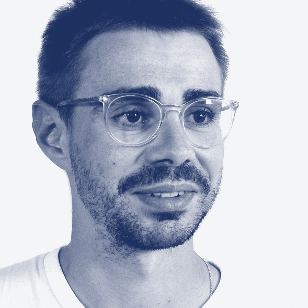
We have a fabulous selection of instructors coming at TypeParis Summer26. We wanted to find out a little more about each of them, so have presented them with a series of questions which they have generously taken the time to answer. Discover Léo Guibert interview.
Biography Léo Guibert is a type designer based between Paris and Toulouse. He holds a Master’s degree in Type Design from École Estienne and a postgraduate degree from Ésad Amiens. He collaborates with international type foundries on retail and custom fonts, and teaches type design at École Estienne in Paris.
Interview
What drives you to create new typefaces?
Léo Guibert In the early years of my studies, when I discovered the discipline of type design at the BA in École Estienne, I was seeing this practice as a visual game with shapes and was just focusing on completing this game. I was trying to achieve a consistent system of shapes that would have pleasant forms and where the system’s logic would more or less follow a calligraphic structure. So, at that time, trying to achieve a decent result and finetune it was already a motivation by itself to create typefaces.
A bit later, at MA level, at ÉsadType in Amiens, I realised it was also possible to depart from writing influence when it would make sense conceptually. At that moment, I started to understand that type design is not only an individual track of craft and practice that you fine-tune all your life: it is also design as a whole. Thinking of it as such really opened a new dimension, where I was allowed to apply concepts or design intentions throughout the whole typeface. So this became another fuel for designing new typefaces that were not only driven by the visual result but also by an intellectual exercise.
The missing piece of this puzzle is the destination and context of use for those typefaces. It is the most important one in any design discipline, but it took me some time to take it into consideration. Probably because I entered type design through this game approach, rather than as an already skilled graphic designer who would learn how to build the visual tool he needs. While I enjoyed thinking through the creative design process applied to type design, I was still missing the input of font users: what they actually need, and how. So this topic of understanding and anticipating more the context of use that visual designers build and need is what currently motivates me to create new typefaces.
How much a software and its fixed rules can determine a type project?
Léo Guibert Type design has always needed tools to translate design ideas/the drawn glyphs into the final output that makes up a typeface. And I assume type designers have always been looking for the most accurate and reliable tools possible.
What is remarkable now that the tools are software and the produced fonts digital, is that we’ve reduced the number of required steps and tools, since they can almost all be contained within one piece of software. This makes typeface design more accessible to individuals, and also makes the design process far more precise, since you no longer affect or deteriorate the initial drawings when producing the font. On the usage side as well, the specifications expected by Microsoft or Google for fonts in digital environments have a huge influence on the shaping and standardization of type: at the design level, but especially at the family level.
So yes, tools have always had a strong influence on the design of typefaces, but I think we’re lucky to live in an era where it’s really up to the designer to control how much of this influence and standardization is needed in each project. That said, these tools and specifications remain largely shaped by a Western and Latin-script-centric perspective. This becomes clear as soon as you work with other scripts. In Arabic, for instance, which I’m increasingly interested in, many of the script’s features require compromises or specific adaptations to fit into the “typographical logics” of baseline or bounding box. It’s a reminder that the neutrality of these tools is relative, and that there’s still room to make them genuinely serve a wider range of scripts and design communities.
“Type design is not only an individual track of craft and practice that you fine-tune all your life: it is also design as a whole.”
– Léo Guibert

What is your ratio of self-initiated typefaces vs. typeface for clients?
Léo Guibert I work as a freelancer with various type foundries, either on custom work for their clients or on their retail typefaces. Between those projects, or in my free time, I keep drawing my own typefaces. I would say the ratio is around 75% client work and 25% self-initiated typefaces.
I don’t really separate these two practices: it’s always type design, just under different circumstances, each with its own advantages. I like working with others because it brings a different kind of input, client constraints, briefs, and feedback that push the design in directions I might not have explored on my own. On the other hand, self-initiated work is where I can dedicate real time to research, exploring historical or visual sources, taking the time to question drawings for ages, and pushing designs that are perhaps less guided by market expectations.
These two practices feed each other and form a whole in my practice. What I explore freely in my own typefaces sometimes resurfaces in client projects. And the discipline and problem-solving I develop through commissioned work sharpens how I approach my personal typefaces.
Are you rather one of those who draw or redraw type classics?
Léo Guibert For my self-initiated projects, I often work from references, though I don’t think they all fit under the definition of a “type classic.” I like working from sources because they give me clues and milestones, and the project naturally extends from its own design constraints. Those references are often multiple, and aren’t approached as a strict, singular source corpus, the way they would be in a typical revival project. It’s more about trying to capture a feeling, a visual universe, or a context of use. As for type classics, I do of course look at the key designs in typeface history — from the lead type era, but also from phototypesetting and digital typefaces. They’re full of lessons, and have had such a strong influence on so many other typefaces we still use today, that it feels important to look back at the original moment a shape shifted, or when a new design based on a specific source was created. But I’m also drawn to vernacular uses, or strong graphic design gestures applied to typefaces, for other reasons. So my sources can also be quite informal, and less “important” within the academic history of type.
I don’t really think totally new forms can exist, at least not as a whole. Even when a typeface is designed without any sources, or with deliberately unconventional shapes, it will still have to exist alongside existing typefaces, which inevitably places it within the scope of what has already been drawn. What is constantly renewed, and in that sense does contain new forms, are the recipes, the specific combination and intensity of each visual element that make up each typeface.

Do you sketch–draw on paper before moving on to the digital workflow?
Léo Guibert It really depends on the project. In day-to-day work, even for the creative steps of drawing the first key glyphsof an alphabet, I’ve gotten into the habit of drawing digitally from the very beginning. I sometimes do quick sketches on Post-its, but mostly to share with colleagues or clients, to help visualise an idea more clearly. But for self-initiated typefaces, with no time constraints, I tend to draw more and more by hand, on paper and tracing paper. The first reason is that there’s a lot of hand-drawing involved when you teach the basics of type design. So I felt it was important to practise more, and regain a good quality of drawing, in order to show students good examples rather than mere scribbles. In doing so, I realised how nice it can be to slowdown the design process and stay within the blurrier, more open-ended results of hand drawing, before freezing everything digitally. Another reason that’s pushed me to draw more by hand in recent months is my screen time, and the health of my eyes. It’s nice, after a full day working on a computer, to still be able to do type design, but in a more analogue way.
Finally, these constraints influence which projects I work on, and when during the day. Some design ideas are very precise and need to be worked digitally from the start, in order to have good visibility and properly assess the shapes. But for other projects, the level of definition can stay fuzzier for longer, while the structures are still being defined by hand.
You recently extended Aukio to a Pro version, a typeface inspired by Nordic calligraphy and lettering: why did you choose such references for the design?
Léo Guibert I had the chance to live in Finland between 2022 and 2025. I didn’t know much about Nordic design culture in general beforehand. I knew a little about the region’s famous architects and product designers, but when it came to graphic and type design, I mostly knew contemporary designers from the last decade. There, I discovered a very specific style of Nordic calligraphers and lettering artists from the second half of the 20th century: a squarish style with Uncial references that was completely new to me, and one that also shared traits across Finland, Sweden, and Denmark. Aukio was a nice project to work on, because it relied on a lot of sources I had only recently discovered at the time. So I had all the excitement of diving into this newfound interest in Nordic calligraphy, lettering or ex-libris, while simultaneously drawing the various attempts that would become Aukio. It all felt so exciting, moving between the discovery of this rich visual corpus and narrowing down the shapes in the design process itself. It wasn’t like those projects where you let the intricacies of specific references sink in slowly. Of course, this shows in the result: Aukio was not about reinterpreting a precise source, but more about painting an unmistakable portrait of the Nordic lettering style.
“Typography was the core element of graphic design projects”
– Léo Guibert
Outside of TypeParis summer course, do you teach?
Léo Guibert Yes, I’ve had several experiences teaching and mentoring abroad, mostly in Jordan and Finland. For type design, I was mostly used to taking part in short workshops lasting a few days, or a week at most. But this year, I went back to France and I discovered longer-term programmes, and the implications they have for following students’ projects over time. TypeParis sits somewhere in between: six weeks is long in the grand scheme of things, but it still carries the same intensity and demanding workload as a workshop.
This year, I also started teaching the type design class at BA level at École Estienne. This is definitely a different pace, and it requires other approaches as a teacher. It’s more of a marathon, where you need your students to keep working and advancing on their typeface design while also juggling so many other school activities that demand their time and focus. Type design is quite a slow process, so it takes some ingenuity to sustain motivation at the same level, between the initial exciting moment of setting up the design drafts, and the long stretch of fine-tuning and optimising the typeface.

What motivated you to start teaching?
Léo Guibert I had the opportunity to start teaching “Typography” adult evening courses while I was still a student. It was initially the practical need of having a student job, but I quickly found the experience very rewarding. On one hand, teaching something forces you to be clear in your own head about it; and on the other, I really enjoyed meeting people outside of my usual social circles. So I enjoyed the experience on both levels.
Later on, when opportunities to give workshops on lettering or type design came up, I was very excited. At that time I was already working quite intensively, so these short workshop moments felt refreshing within my working routine. It was also around then that I started appreciating the fresh and sometimes wild ideas of students. Freed from the internalised constraints of the professional world, they propose things outside the box that I would never have thought of. It’s amazing as an intellectual exercise, and also because you then need to find technical solutions or workarounds for those creative ideas.
And more recently, since I’ve been teaching longer-term classes, what motivates me is fine-tuning the way I distil information or feedback in the most beneficial way for the students and the progress of their projects.
Do you think that it’s more important for students to experiment and go off the usual roads of type design, or to learn by following the historical shapes of the type design world?
Léo Guibert I’ve taken part in workshops focused on wild, experimental graphic results, and others more dedicated to transmitting a traditional approach to type design, based on developing the eye and refining skill. I have to say I’ve seen super exciting results from both. Here again, it really depends on the destination and context of use of the typefaces being produced. Display typefaces give an instant sense of satisfaction, because they shout the personality of their designer, and with a good eye for shapes they can be achieved in a relatively short time. On the other hand, learning the more classical way, and aiming for typefaces usable in text, requires a much longer process and discipline, as there are so many intermediate steps to understand along the way.
I think both approaches can feed each other, and either one can be an entry point for developing a broader interest in type design on one side, or in graphic design on the other. That said, while there are valuable lessons to take from the off-road, experimental approach, the traditional approach remains necessary at some point, in order to build typefaces that can work across a wider range of use cases.
Do you remember when you decided to pursue your career in design?
Léo Guibert I became interested in design studies during high school, mainly because I liked to draw and spend time on the computer. It was still quite blurry back then, but I understood that becoming a graphic designer was away to combine both interests, so I decided to pursue a Baccalauréat in Applied Arts in Toulouse, my hometown. It was a nice setup, because throughout the Baccalauréat we had a lot of time dedicated to discovering the main fields of design: graphic design, product design, architecture, or fashion design. This allowed us to narrow down the design areas we were interested in quite early on. In my case, it confirmed my initial interest in graphic design, and it was also at that time that I started focusing on letters in various ways. With some classmates, I got into graffiti, and this practice led to my first attempts at looking at and drawing letters at a large scale. And in class, I quickly felt that typography was the core element of graphic design projects. No matter how many other assets you sprinkle around a project, you’ll still need to deal with typefaces at some point. From those two perspectives, I joined the BA in Typography and Graphic Design at École Estienne. I didn’t know type design was a career at that time, but I felt it was the most important tool to understand, so I figured it was better to start early. It was during this BA that drawing alphabets finally became my primary interest, driven by the idea of designing a visual tool, meant to be used and deployed within a larger visual system.
When you started, who were the teachers, mentors or professionals who had the most impact on you?
Léo Guibert Throughout my learning journey, many people have played an important role in my development as a type designer. Some have such a strong personality in how they share their practice that you know instantly they’ll matter to your apprenticeship; for others, it takes years for their teachings to sink in before you realise how helpful their approach was.
At the beginning of my student years, at École Estienne, the Franck Jalleau & Michel Derre duo was very important. Their teaching focused on drawing skills and discipline, placing writing at the heart of all type design. This might seem a bit strict once you start designing fonts that move beyond that scope, but it is a powerful approach pedagogically.
I discovered the professional dimension of type design during an internship at Typofonderie, where I later joined the team for several years. Jean François Porchez shaped my working habits and discipline, especially the attention to detail and how every component of a typeface should be thought of as part of a deeper system of relations, even the smallest ones. Later, collaborating with various type designers, I appreciated discovering the specific systems and ideas each one applied to type, variations that refreshingly break my workflow’s routine and force me to rethink it.
The relationship between graphic and type design always felt difficult to me. In the last year of my MA, Margaret Gray really opened up something that let me think of them as more intertwined: how layout-level parameters could be handled at the type design level. Later, Emmanuel Besse as a teacher at ÉsadType, and Göran Söderström through professional collaborations, both pushed my appreciation of that relationship further, from the type designer’s perspective. They both have an eye for the stylistic details worth focusing on,the ones that create the spark that makes a typeface stand out for graphic designers.
Thank you very much Léo Guibert!
– Interview by Malo Haffreingue
Learn more about TypeParis
➼ Type & graphic designers interviews
➼ Summer26 programme
➼ Reports
➼ Attendees feedback series