

While Phase 2 focused on designing a new typeface in Regular weight, Phase 3 marks a significant milestone by introducing an equally important new step: adding italics, black, and creative variants. Furthermore, the production process on Glyphs is an integral component of this development.
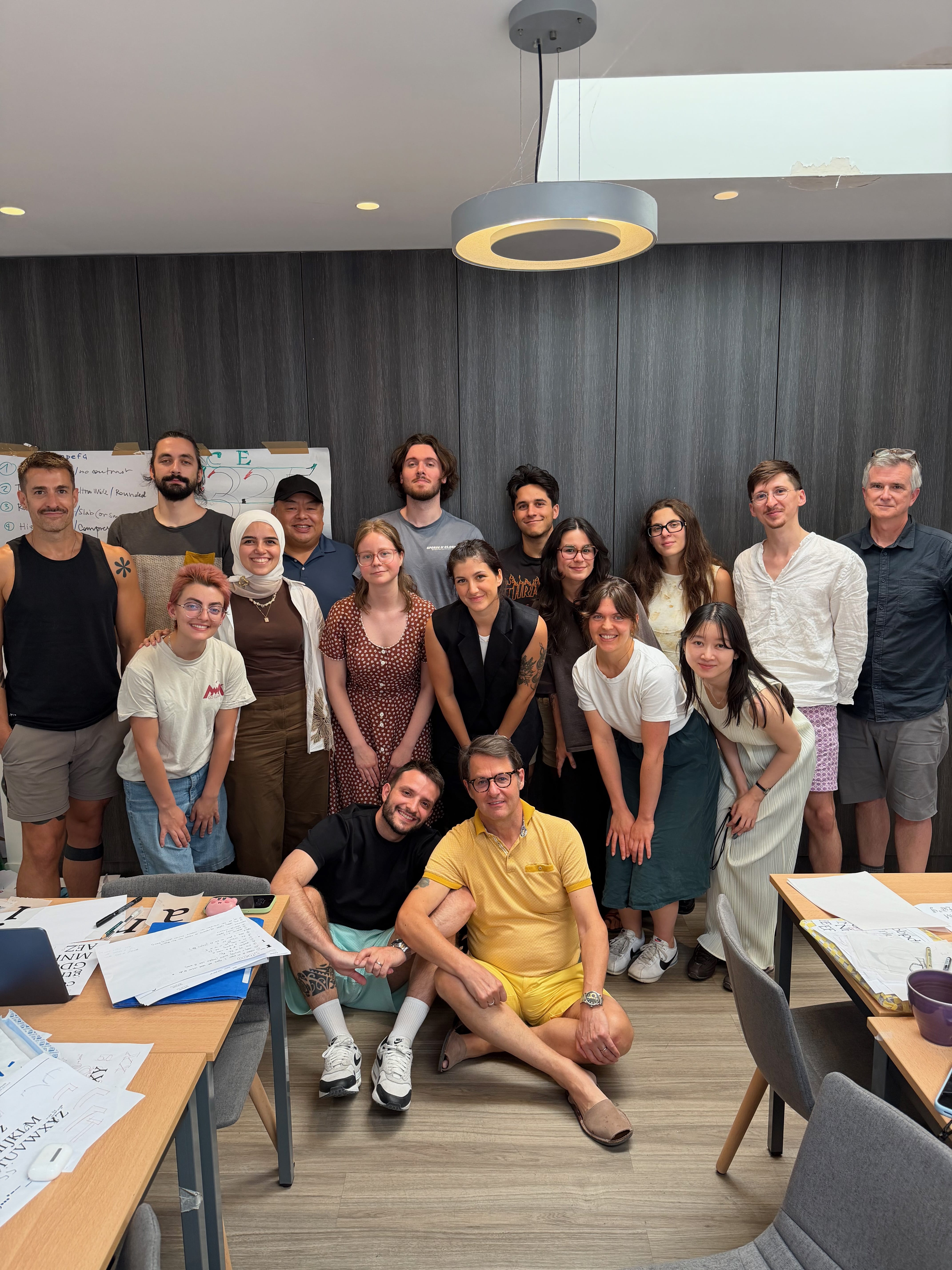
The team for the phase 3 includes (by order of appearance) Ruggero Magrì, Jean François Porchez, Rainer Erich Scheichelbauer, Léo Guibert, Greg Lindy. We were also thrilled to host Jovana Jocić as type critic for the TypeParis Summer26 edition. Enjoy the third report below:
Expanding the personal typeface into a large type family
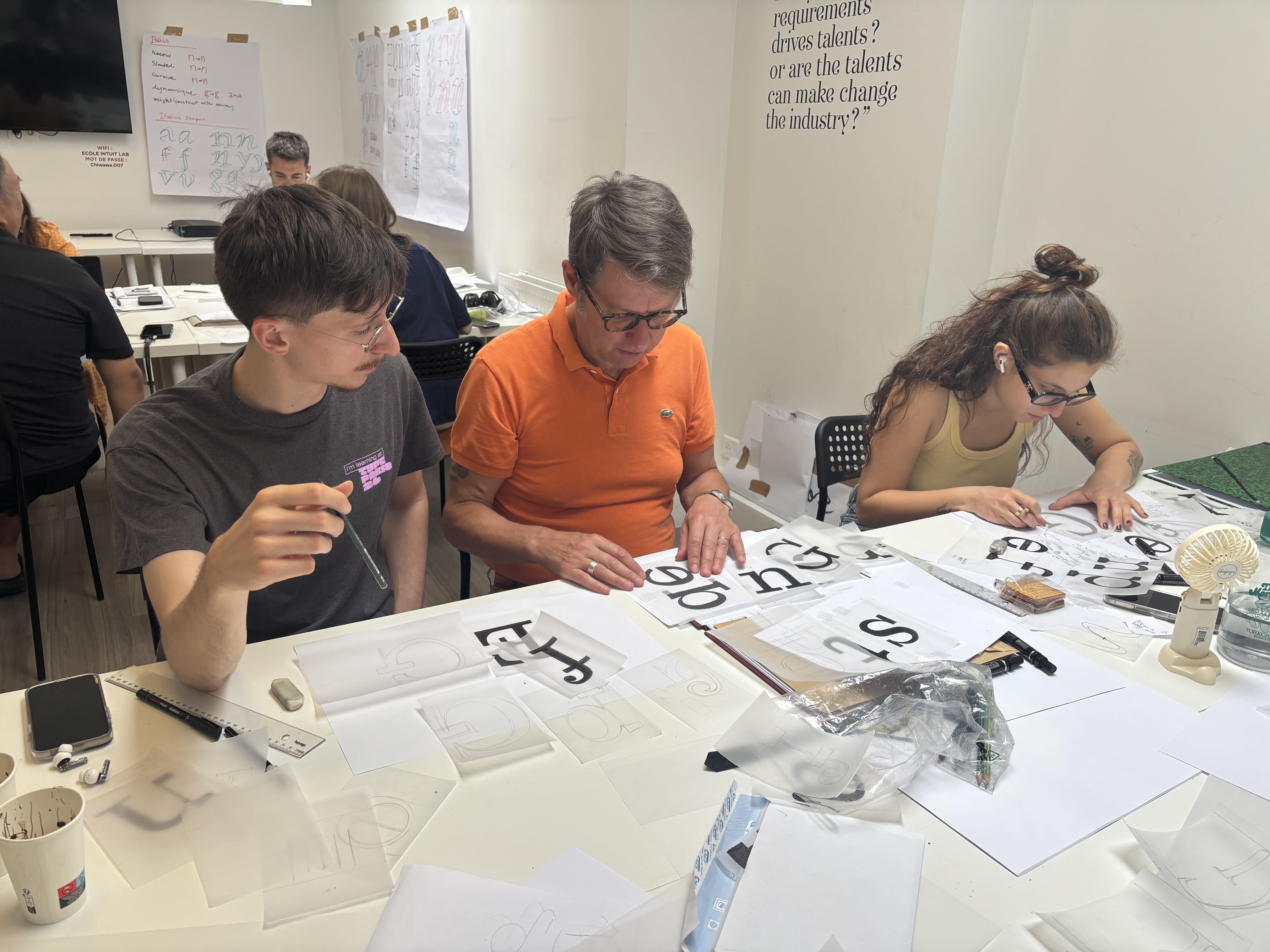
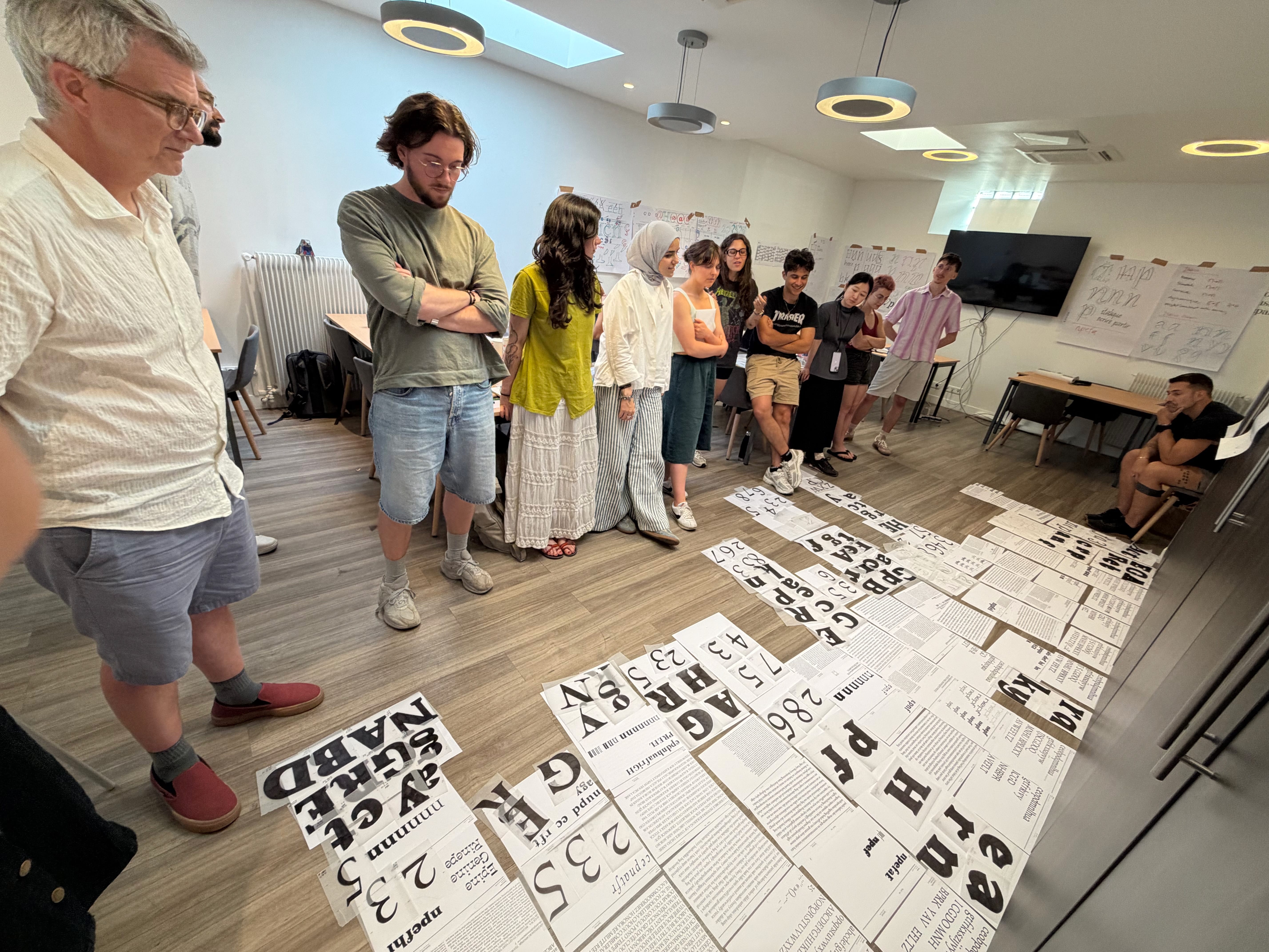
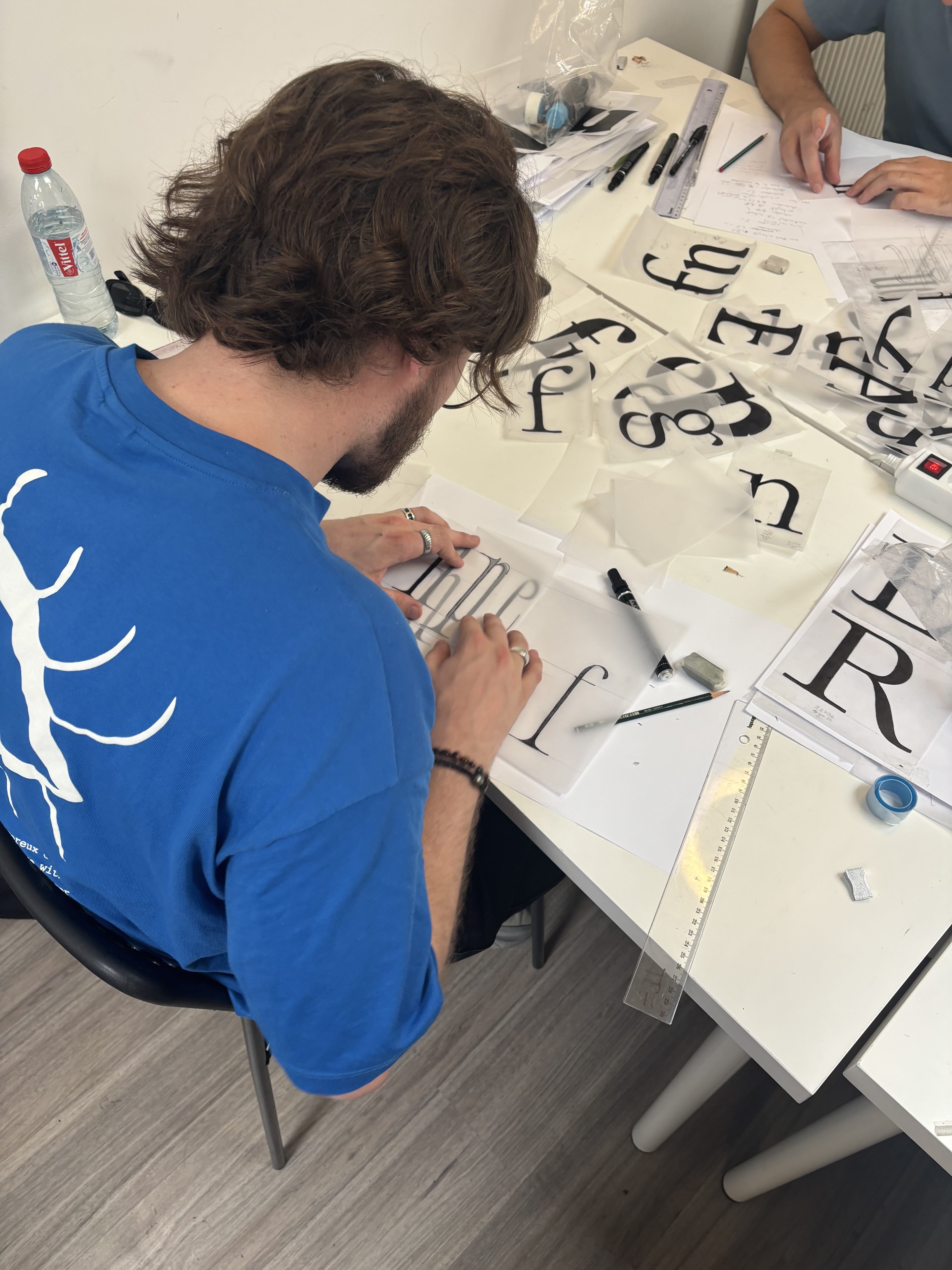
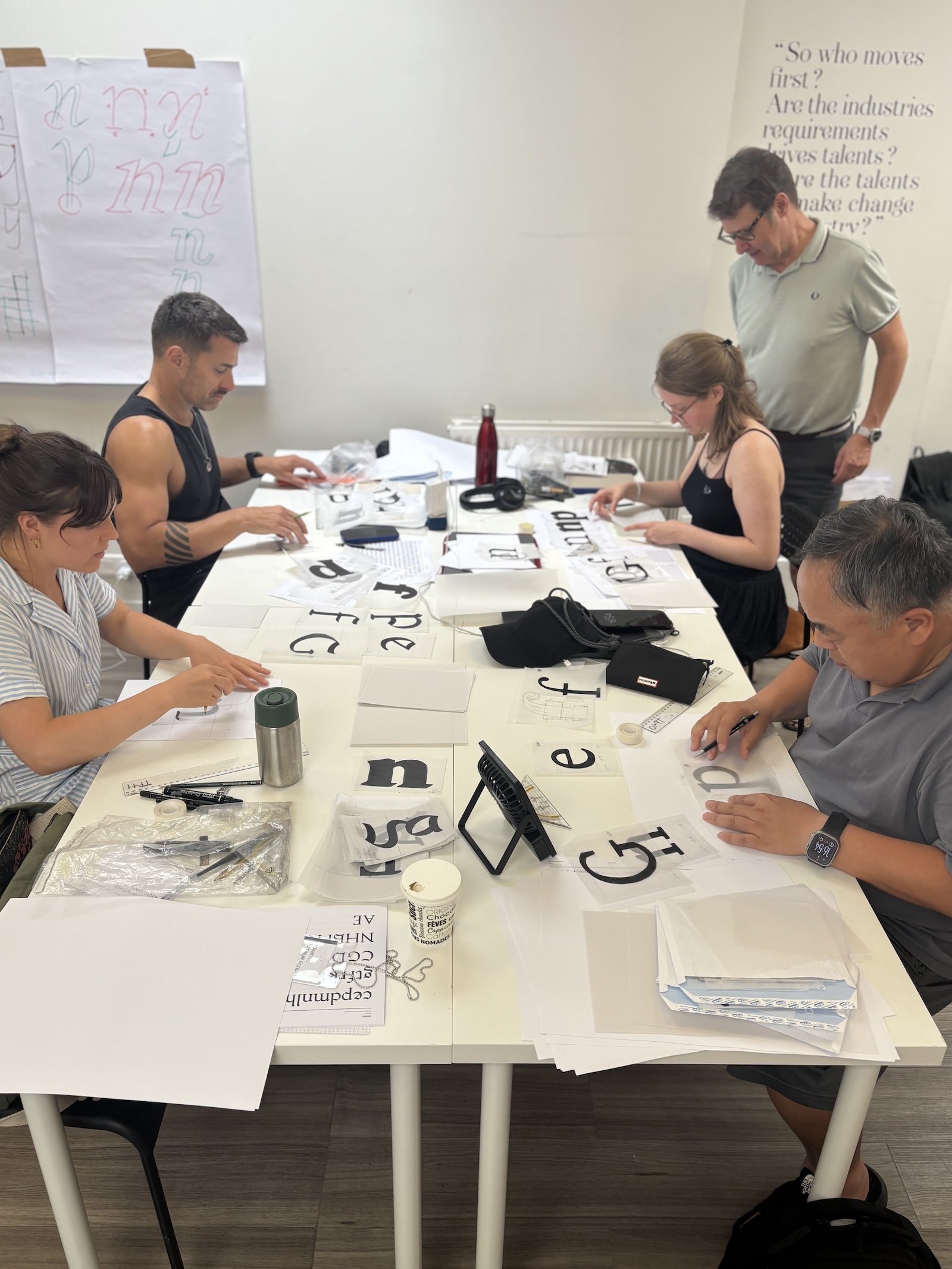
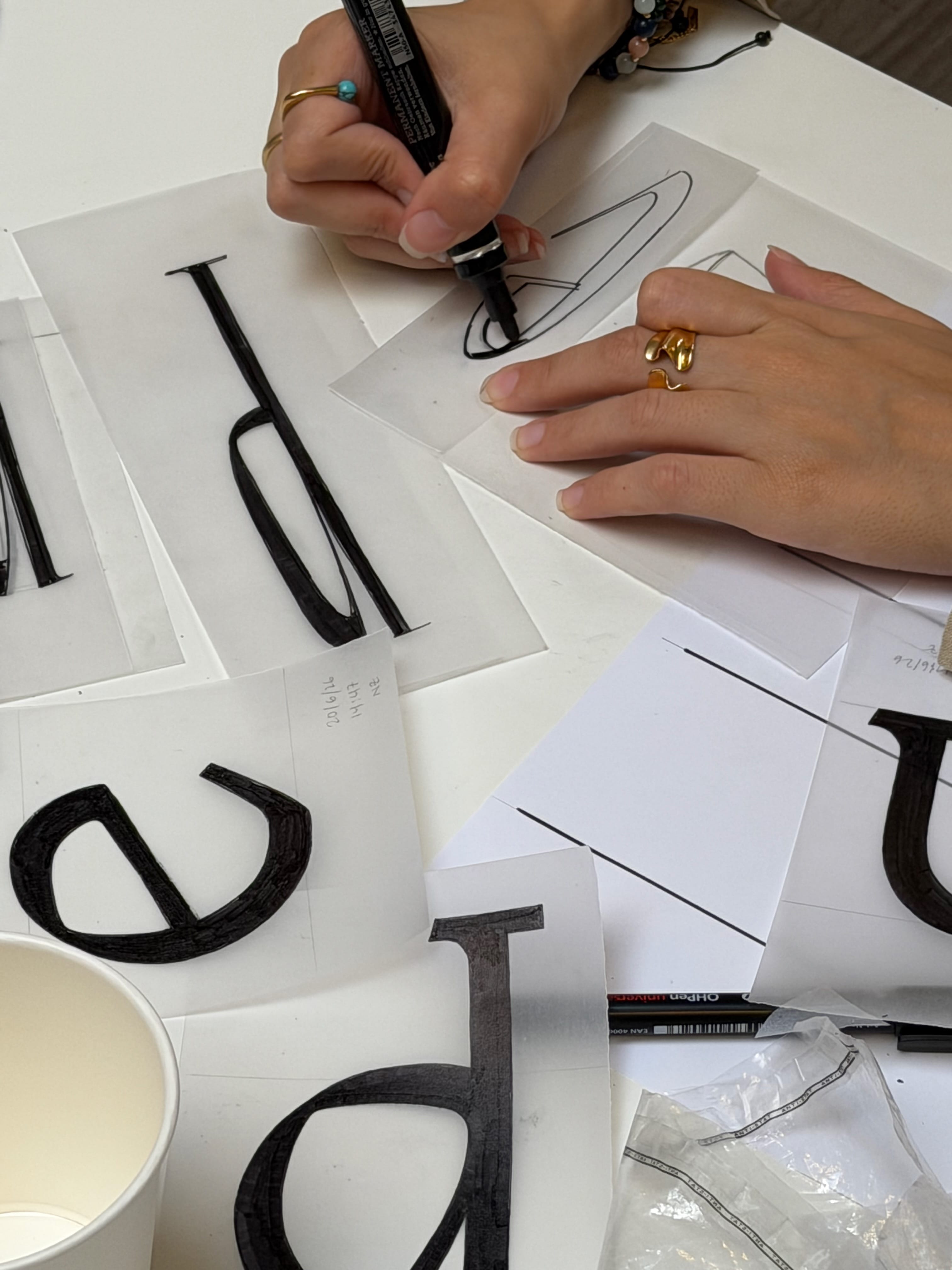
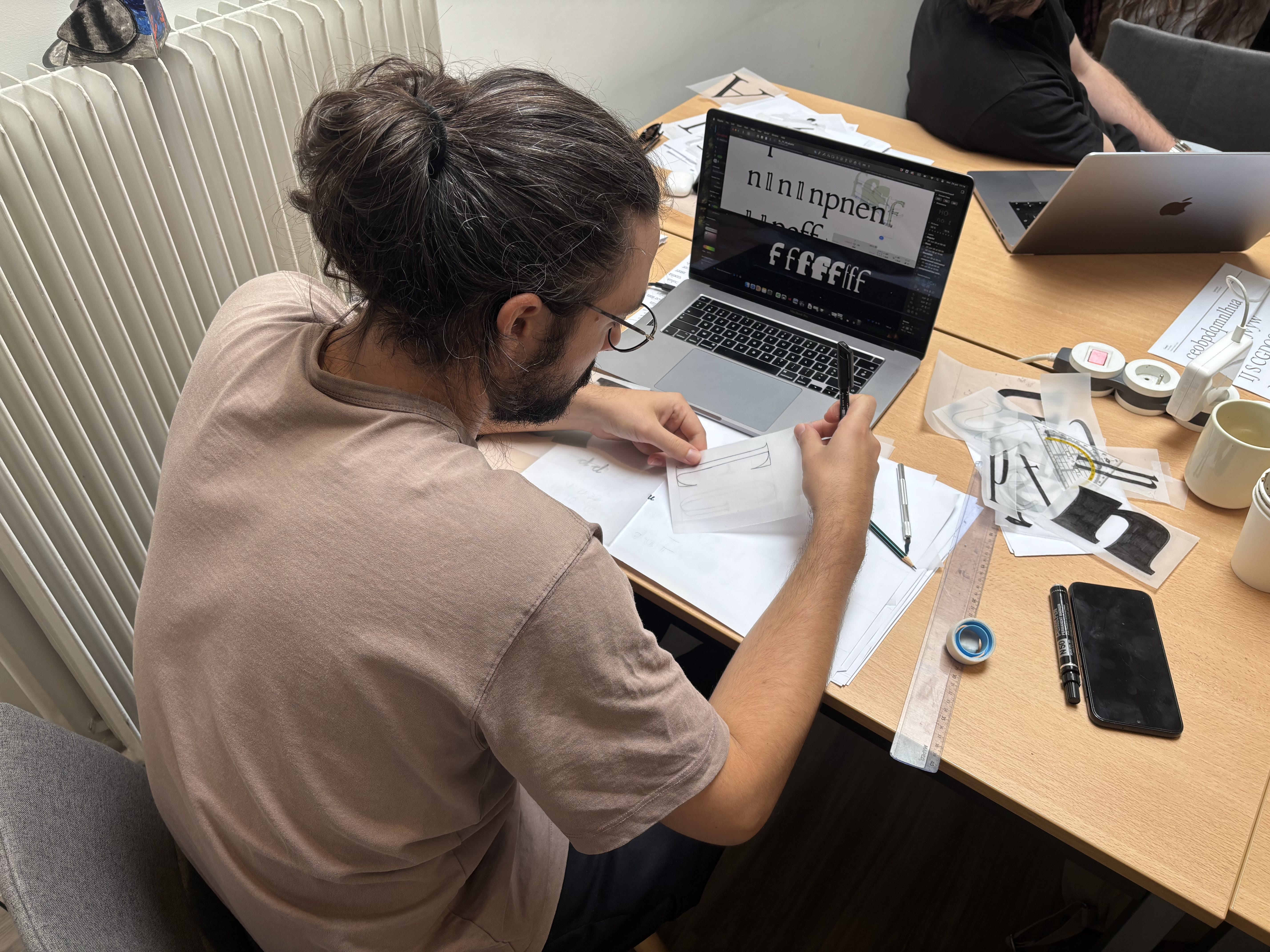
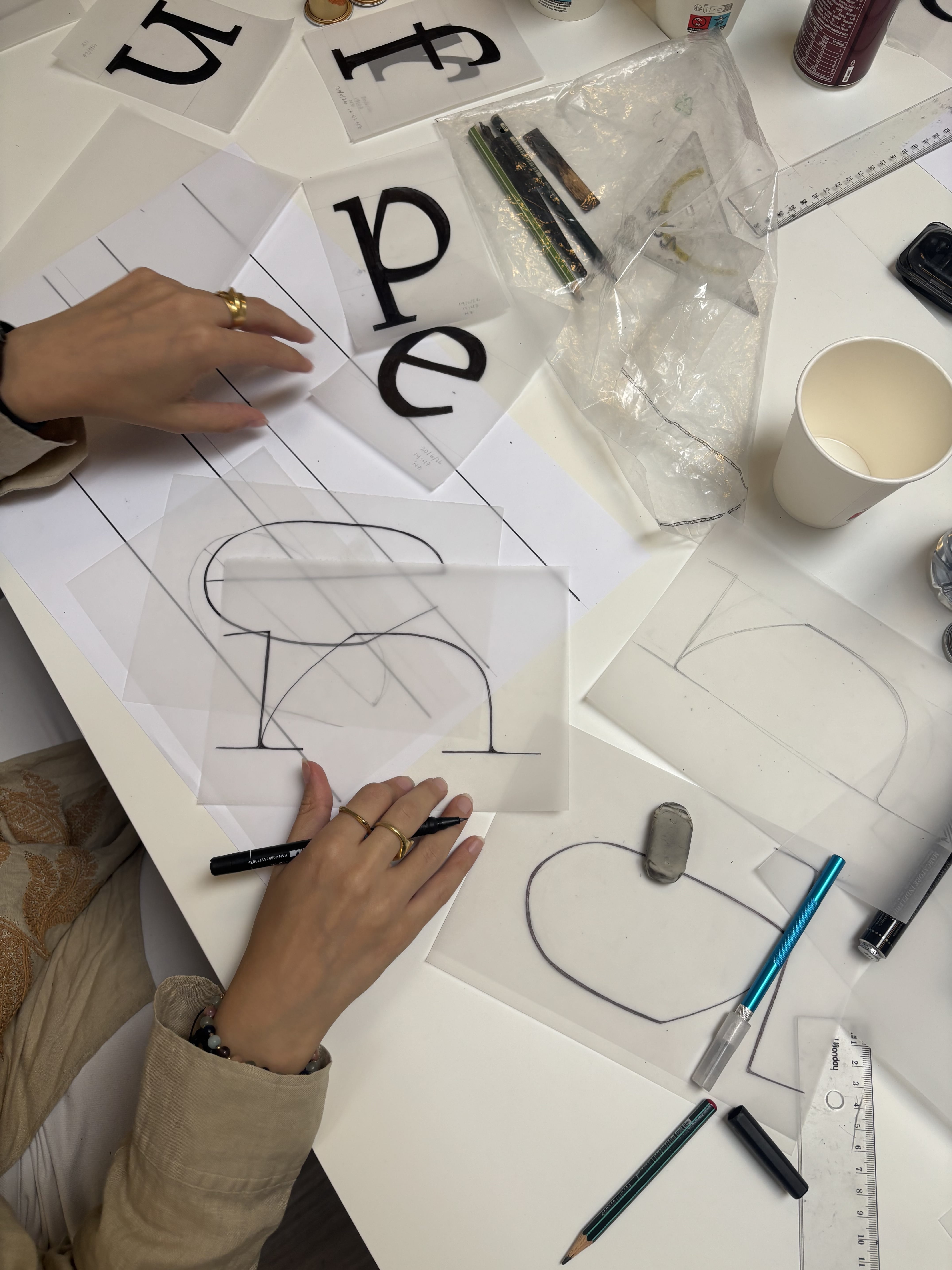
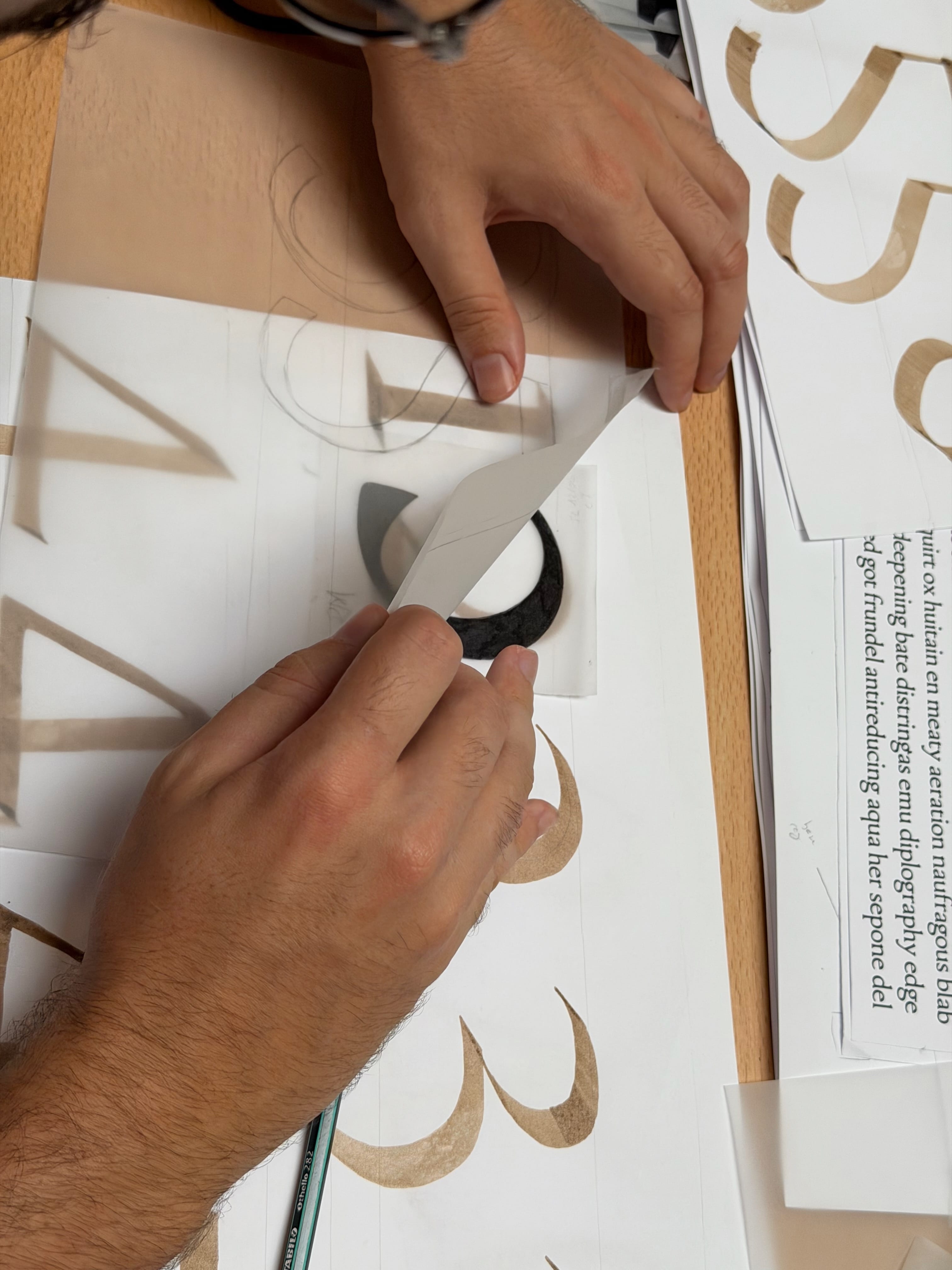
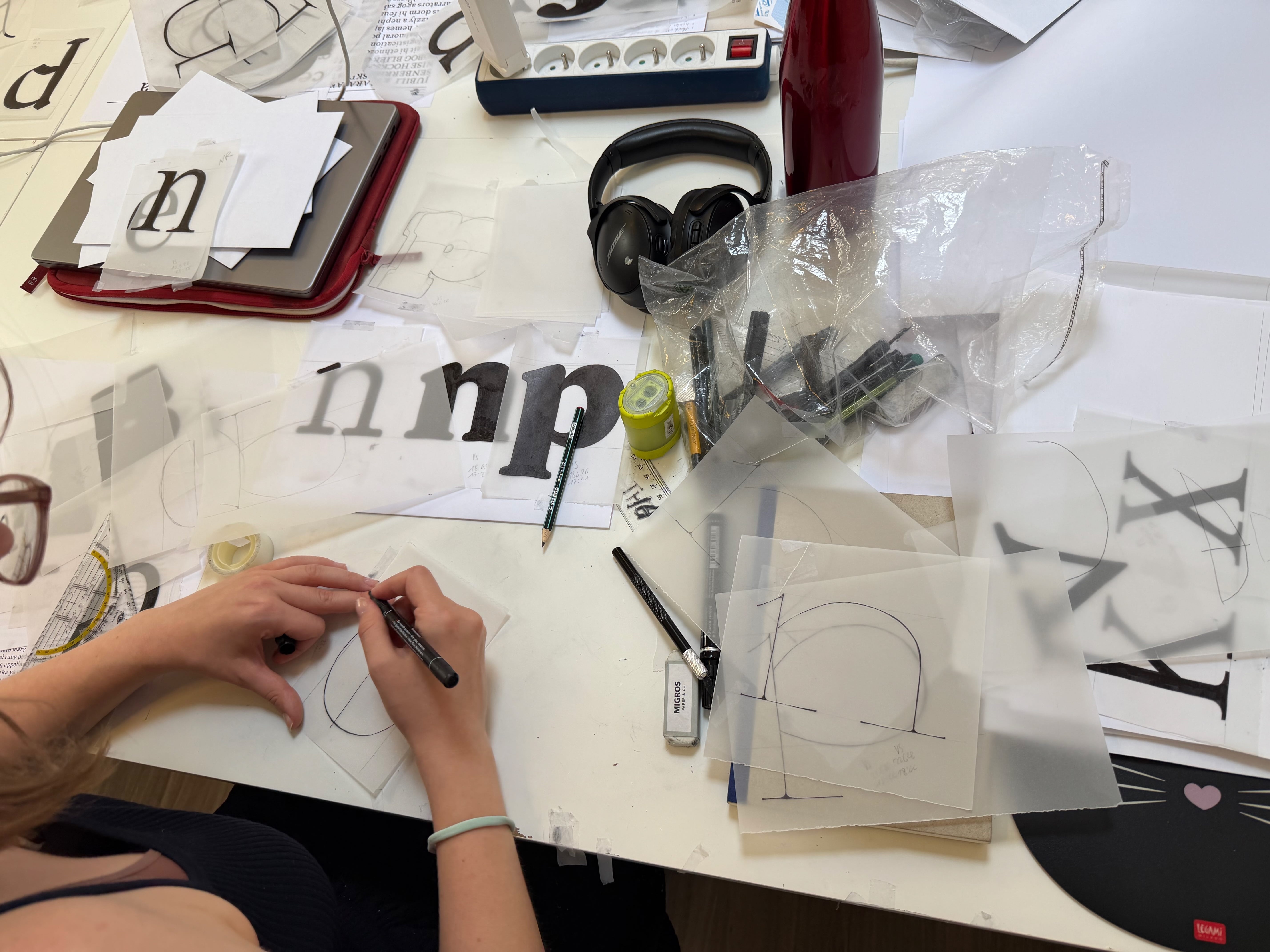
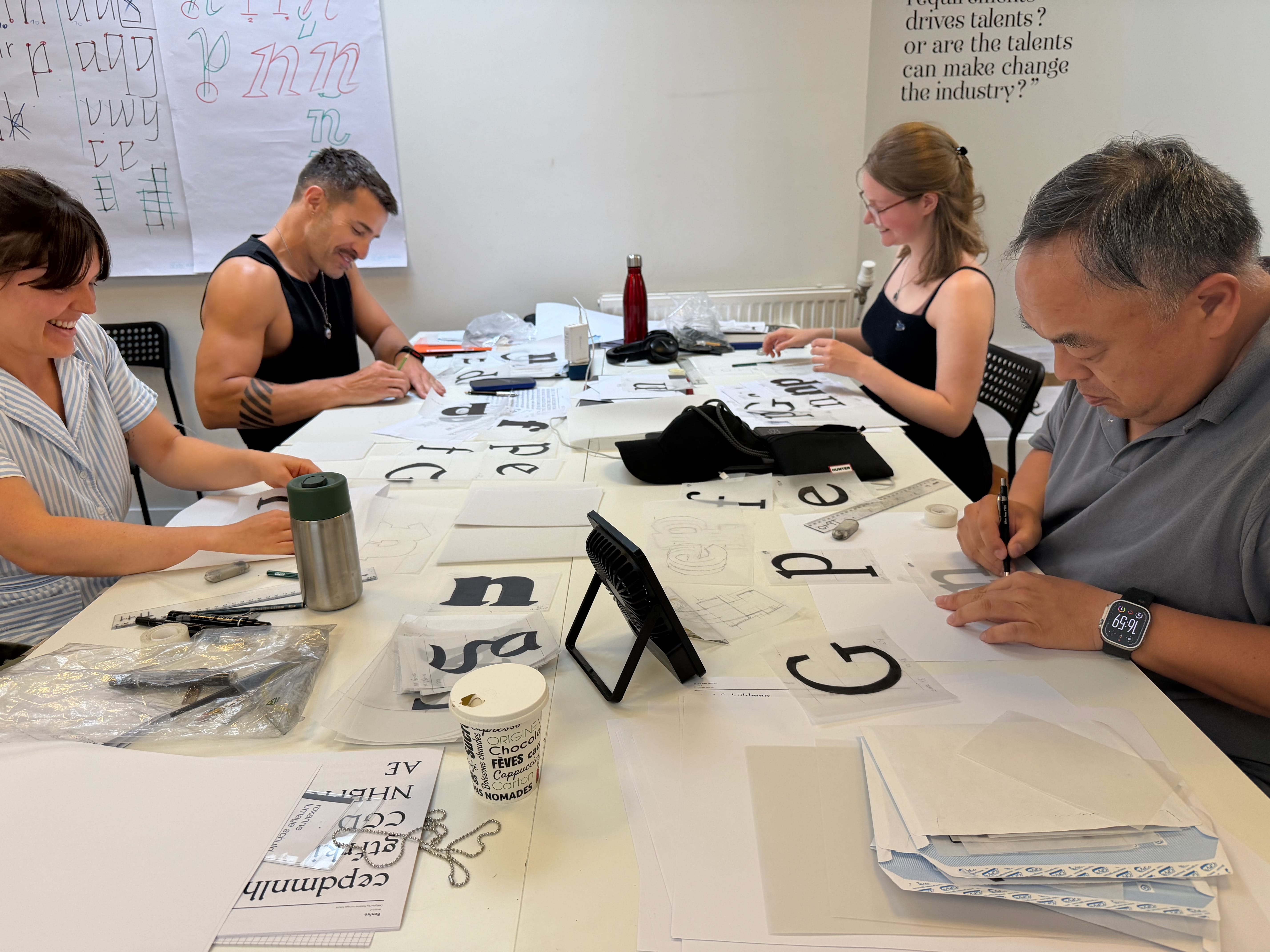
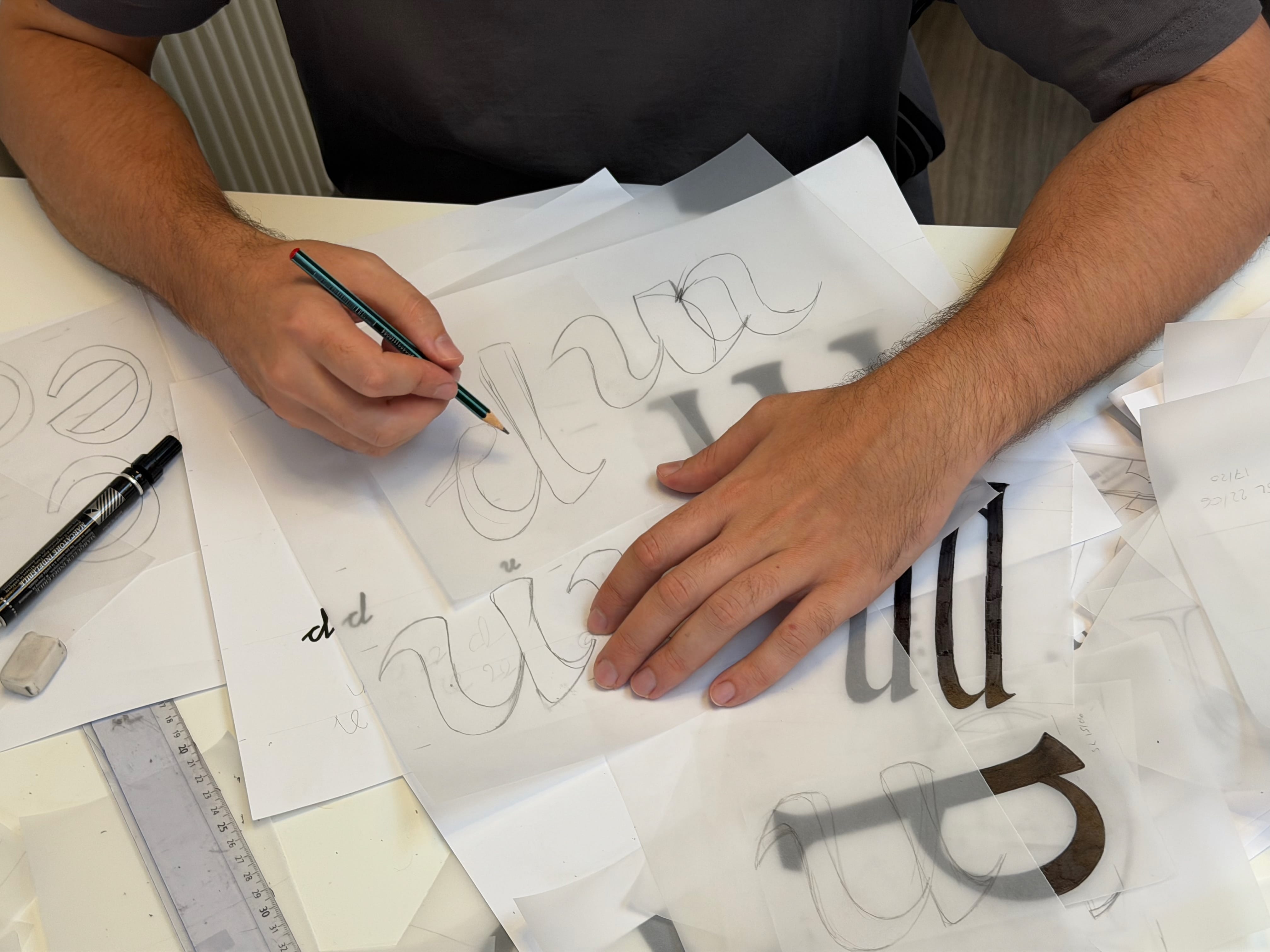
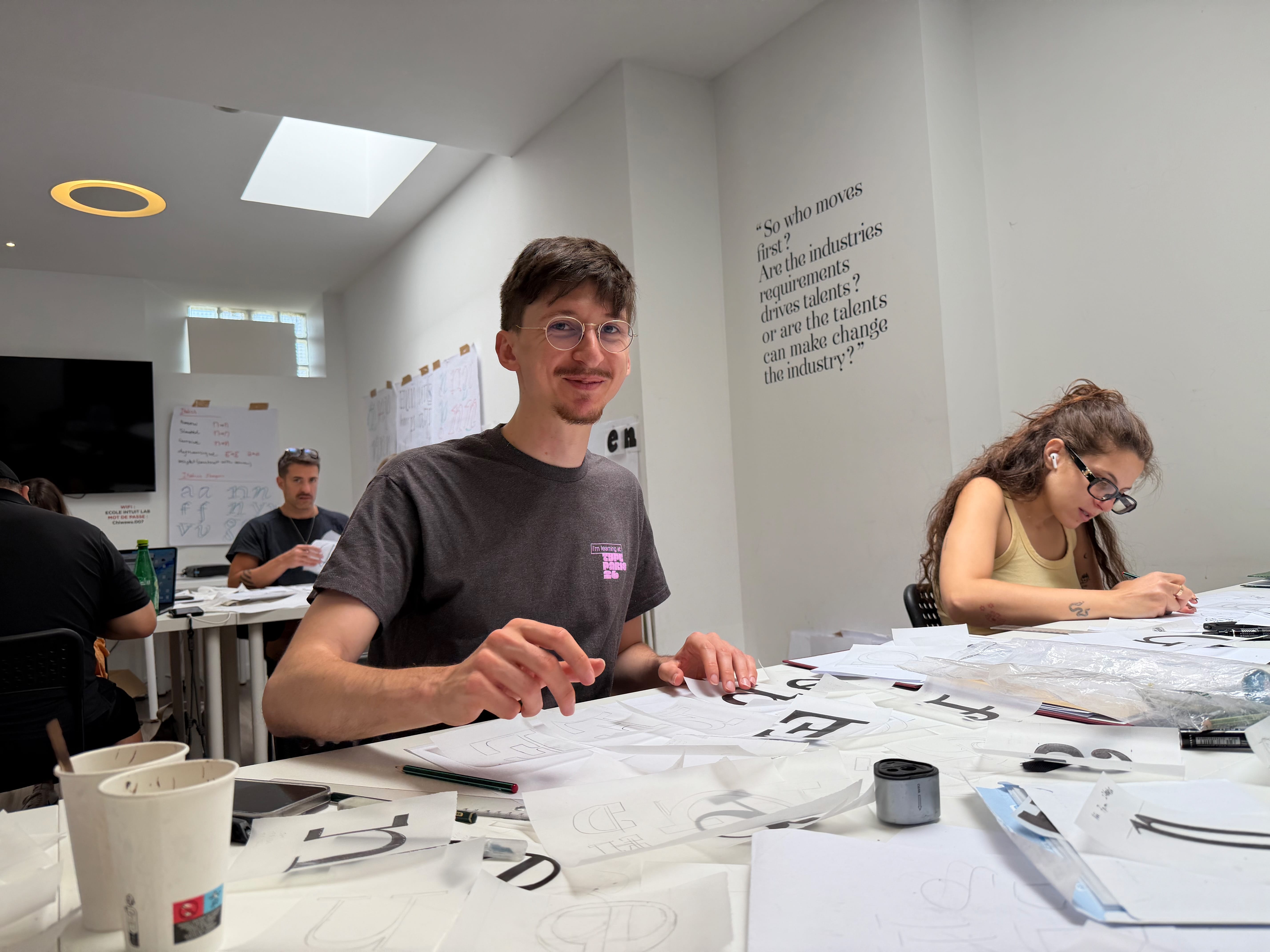
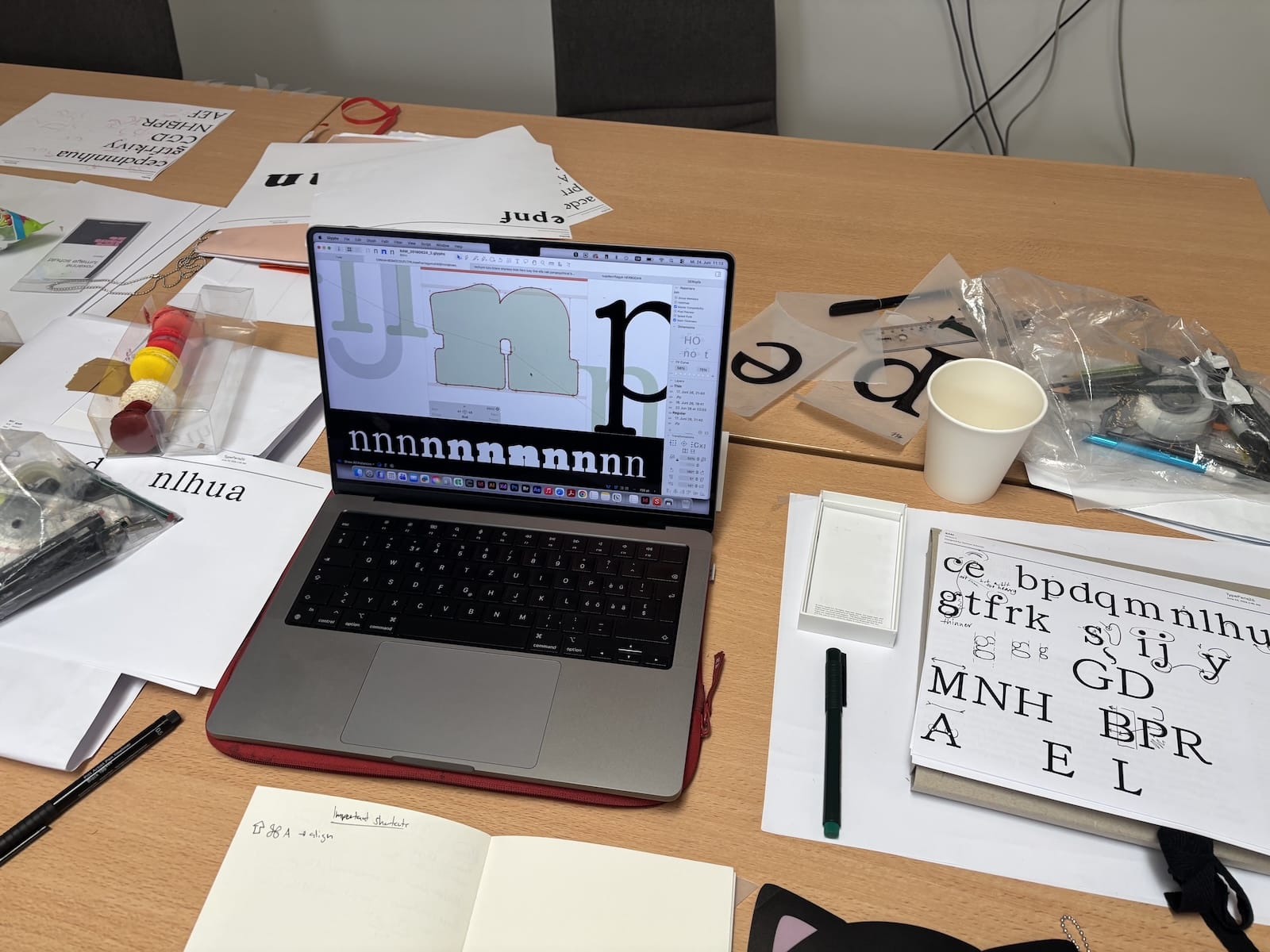
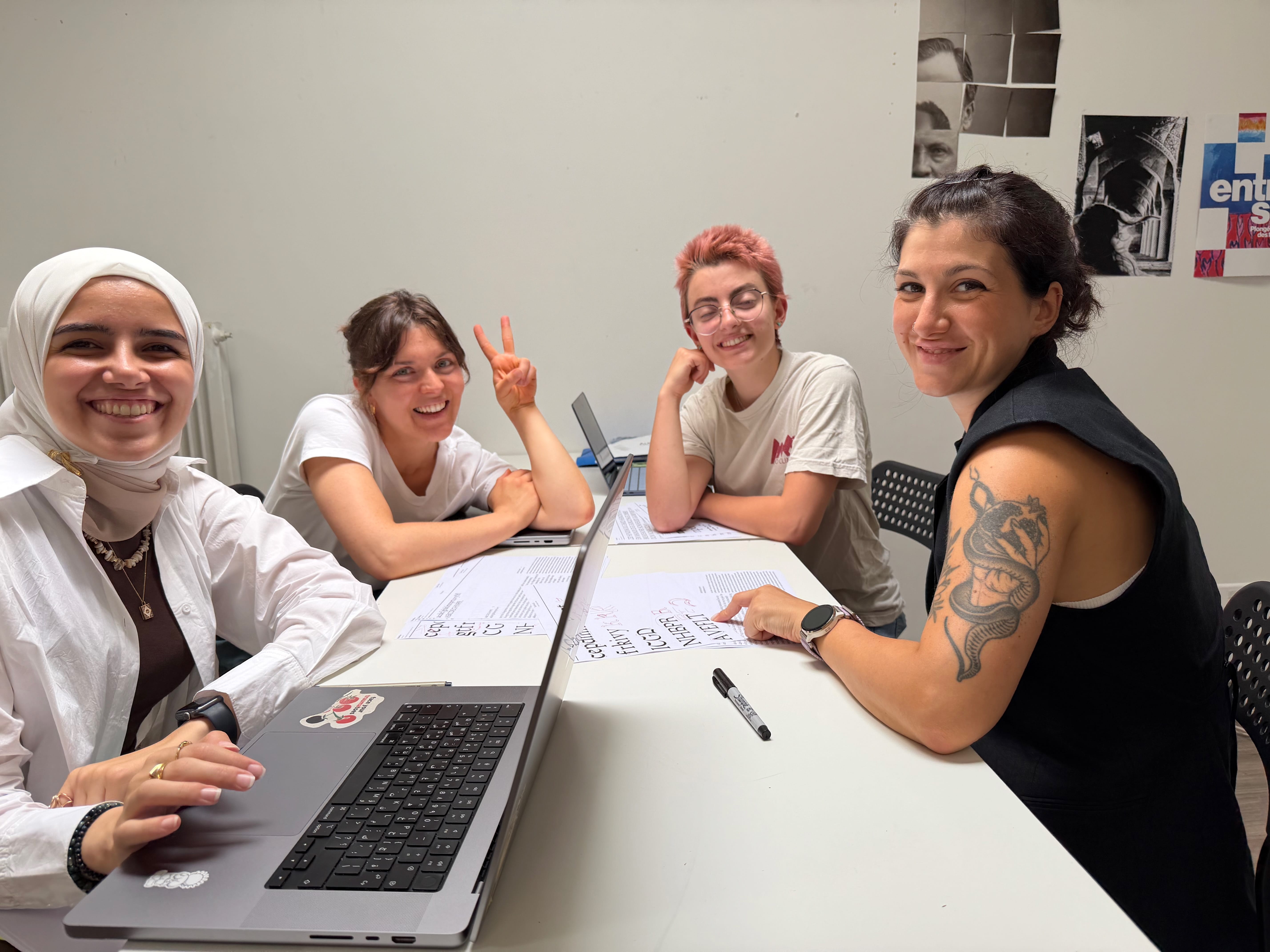
This short phase starts with a meeting that allows everyone to show the extent of the letters drawn in different variants. Some letters are still on tracing paper, others on Glyphs. The progress made by attendees between Friday and Monday is quite exceptional. They’re working hard to build a font family that actually works as a professional font.
While last Thursday and Friday during phase 2, they discovered the principles for drawing black and italic, these additions matching their project’s brief and design style, this Monday afternoon is dedicated to exploring creative variants in a short time. The idea is to maximise the possibilities of design, by exceeding one's own limits. They explored variations from their family like a black slab, thin rounded, reverse contrast slab or sans, stencil, condensed, decorated display, and so on. From there, they picked up the most interesting variation who matches the best their personal type project.
In a period where variable fonts have become tools for graphic designers, these explorations are important to also understand how the interpolation between different masters makes it possible to imagine non-expected design.
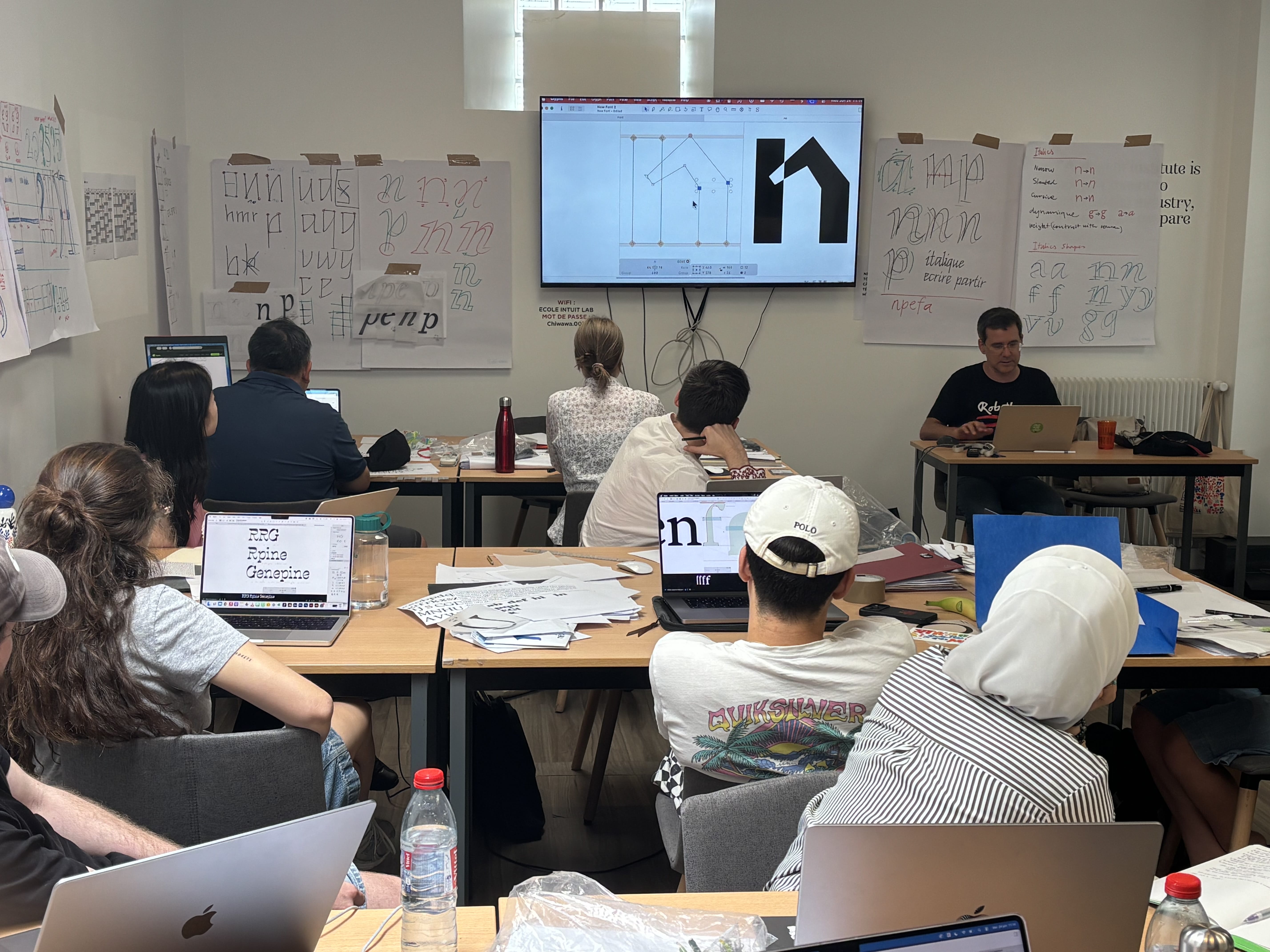
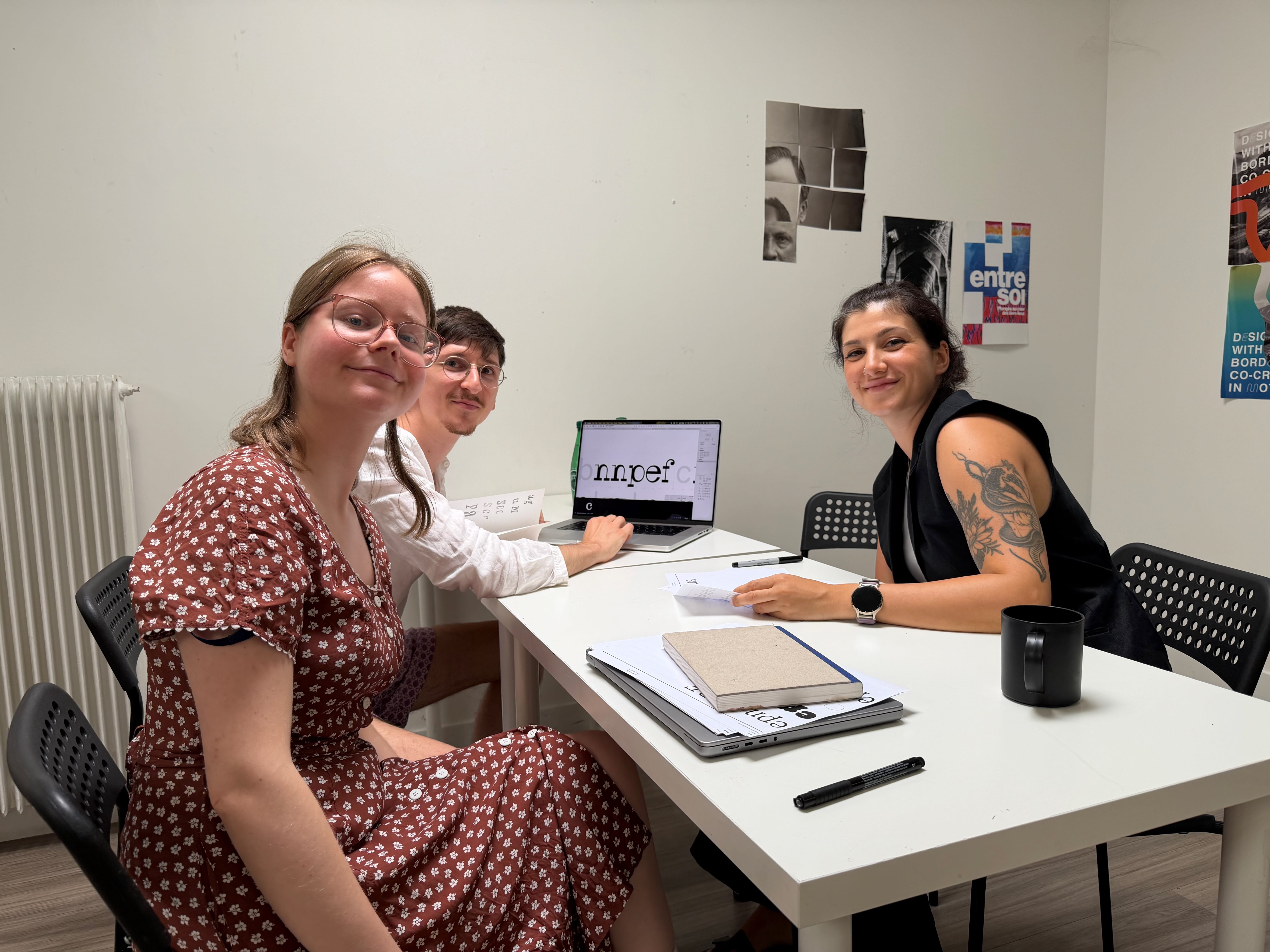
Rainer Erich Scheichelbauer from the Glyphs app was super useful to make Glyphs files work well. They have the privilege of being personally assisted by someone who is arguably the best Glyphs software expert. Daily support from a Glyphs software expert helped attendees master font software and advanced digital workflow, including composite-component systems and variable fonts. Rainer is also essential for participants to gain autonomy on the Glyphs app, which is incredibly beneficial for the attendees.
“Maximise the possibilities of design, by exceeding one’s own limits.”
Welcome to Jovana Jocić, third type critic of the summer
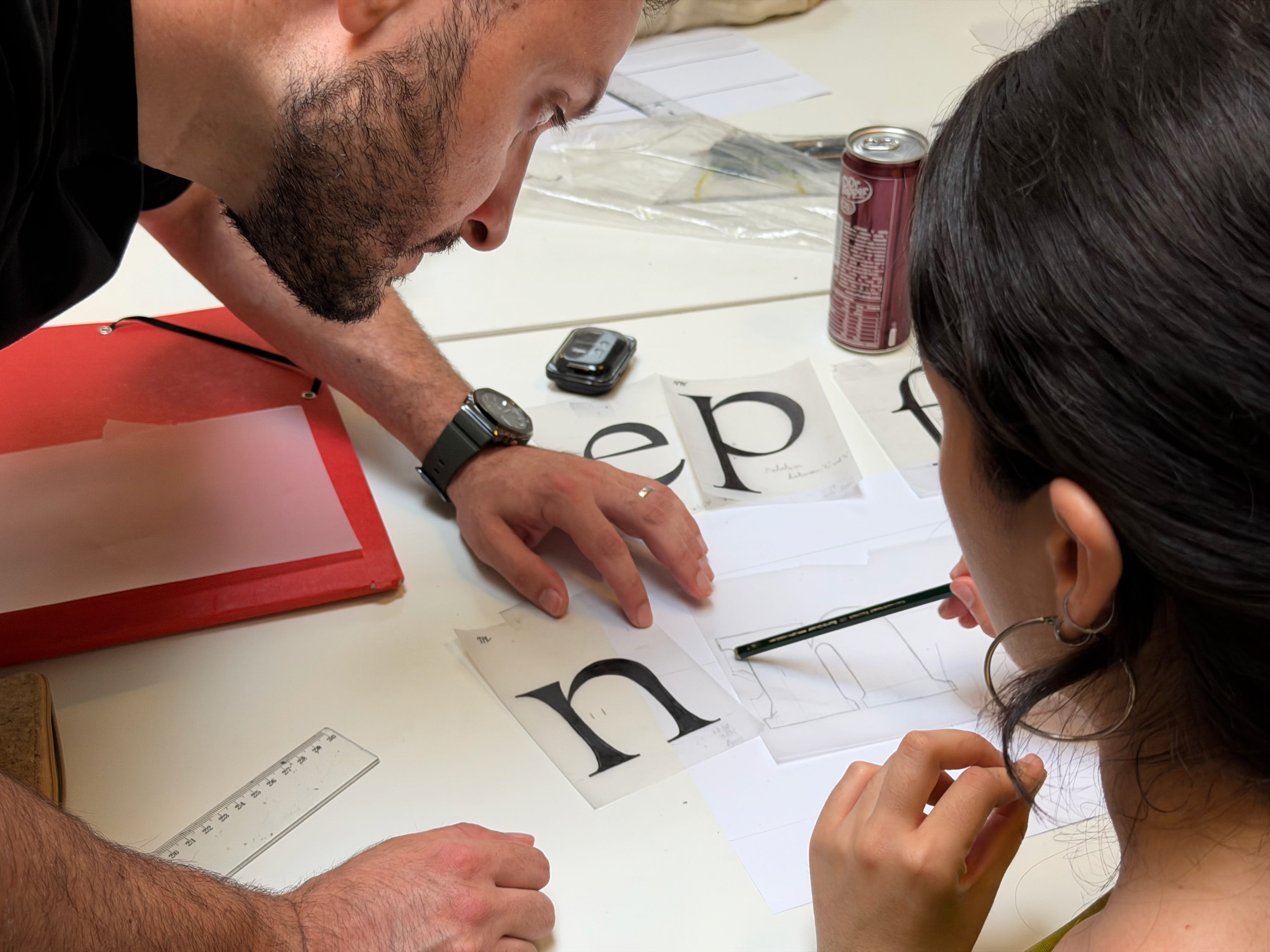
Jovana Jocić was there to help them solidify their design. Our weekly guest critics encourage small group interactions, which allow for comprehensive feedback on designs throughout the day. We appreciate their dedication to helping attendees. Their comments are also a way for TypeParis Summer26 to know how to make decisions, because they have to synthesise all the comments received.
At the end of the day, Jovana Jocić presented her work to all the attendees. Being at this high level in 2026, years after completing the TypeMedia course in The Hague, encourages participants in the sense that they perceived that they too could progress as quickly. The exchanges with her will have been instructive.
End of Phase 3 objectives achieved
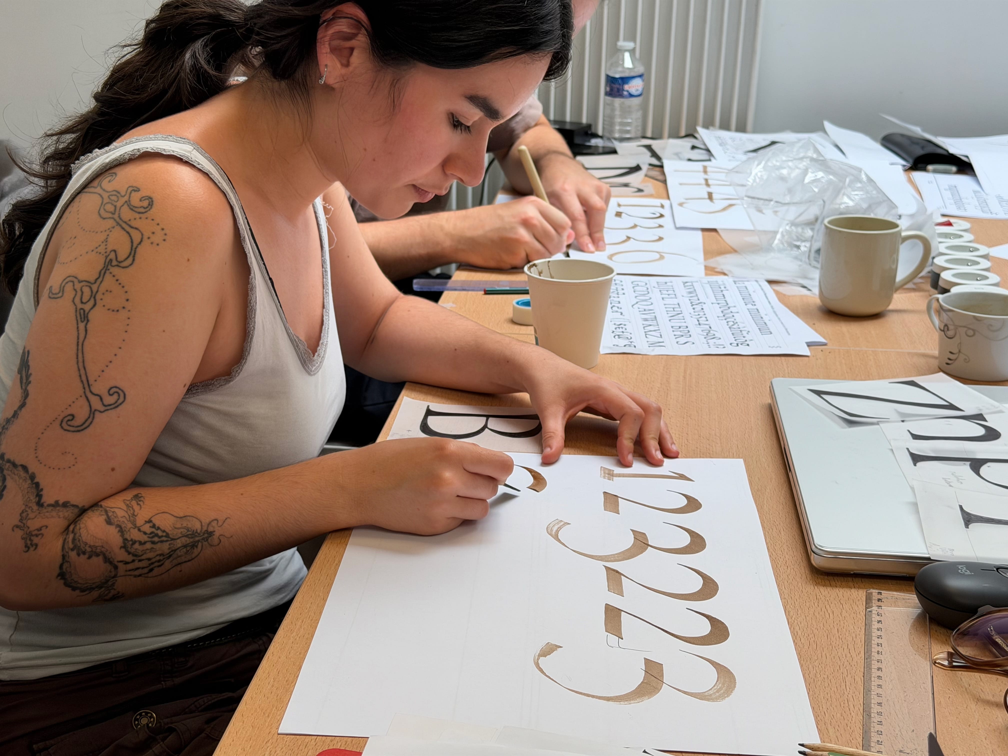
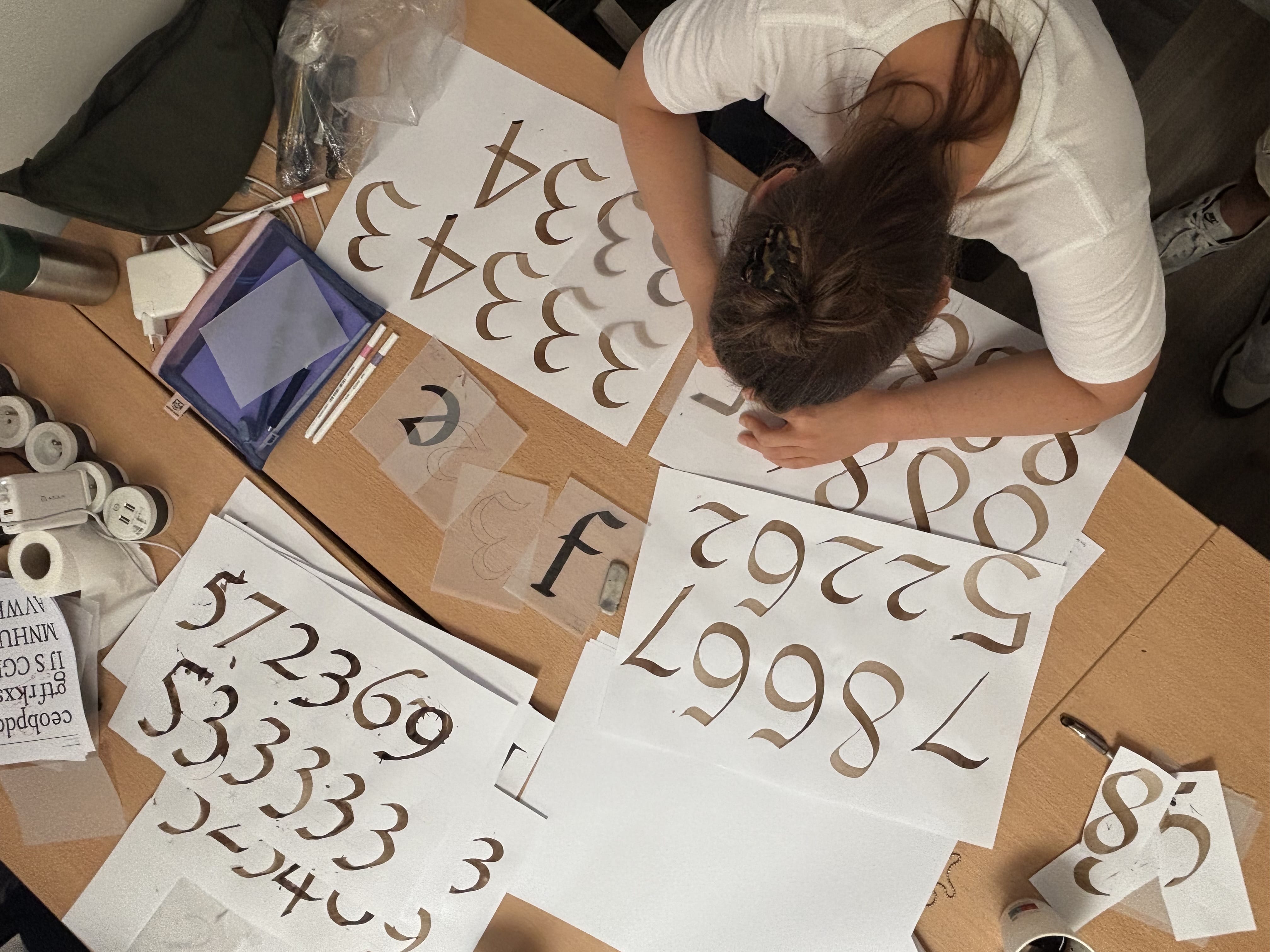
In the second part of the week, they had several projects to realise in parallel: How to establish drawing principles in the roman that remain coherent in the entire typeface family. How to design punctuation, diacritics that integrate into the global style? Learning how to draw numerals adapted to their design. The numerals are designed differently if the typeface is more inspired by the classical forms of the Renaissance and writing than if the typeface is of more rational inspiration such as the Didot and Slab serif styles in the 19th century.
On Friday, they had managed to have a fairly complete roman typeface, with punctuation, accents that work well for settings words, texts, headlines, etc. The attendees had also established consistent variations in weights, italics, and display according to their initial brief. In reality, the basis for a complete and solid type family was visible to each of the attendees.
The Phase 4 will be dedicated to the production and completion of their typeface, as well using digital tools such as the Glyphs app. It will be a matter of having a demanding and qualitative design, while remaining innovative, creative, and original.
– By Jean François Porchez
Learn more about TypeParis courses and conferences!
➼ Type & graphic designers interviews
➼ Summer26 programme
➼ Reports
➼ Attendees feedback series
Apply to TypeParis Summer27 course! The deadline for applications will be next 14 March 2027.