


At this point in TypeParis Summer26, all the attendees should be fully immersed in their personal type projects. It’s time to give them the love and attention they deserve, make some bold design decisions, and take them to the next level.
But guess what? We didn’t just spend our time in the classroom. We also had some exciting adventures in type history! We visited two amazing libraries in Paris and had an unforgettable day in Antwerpen, Belgium.
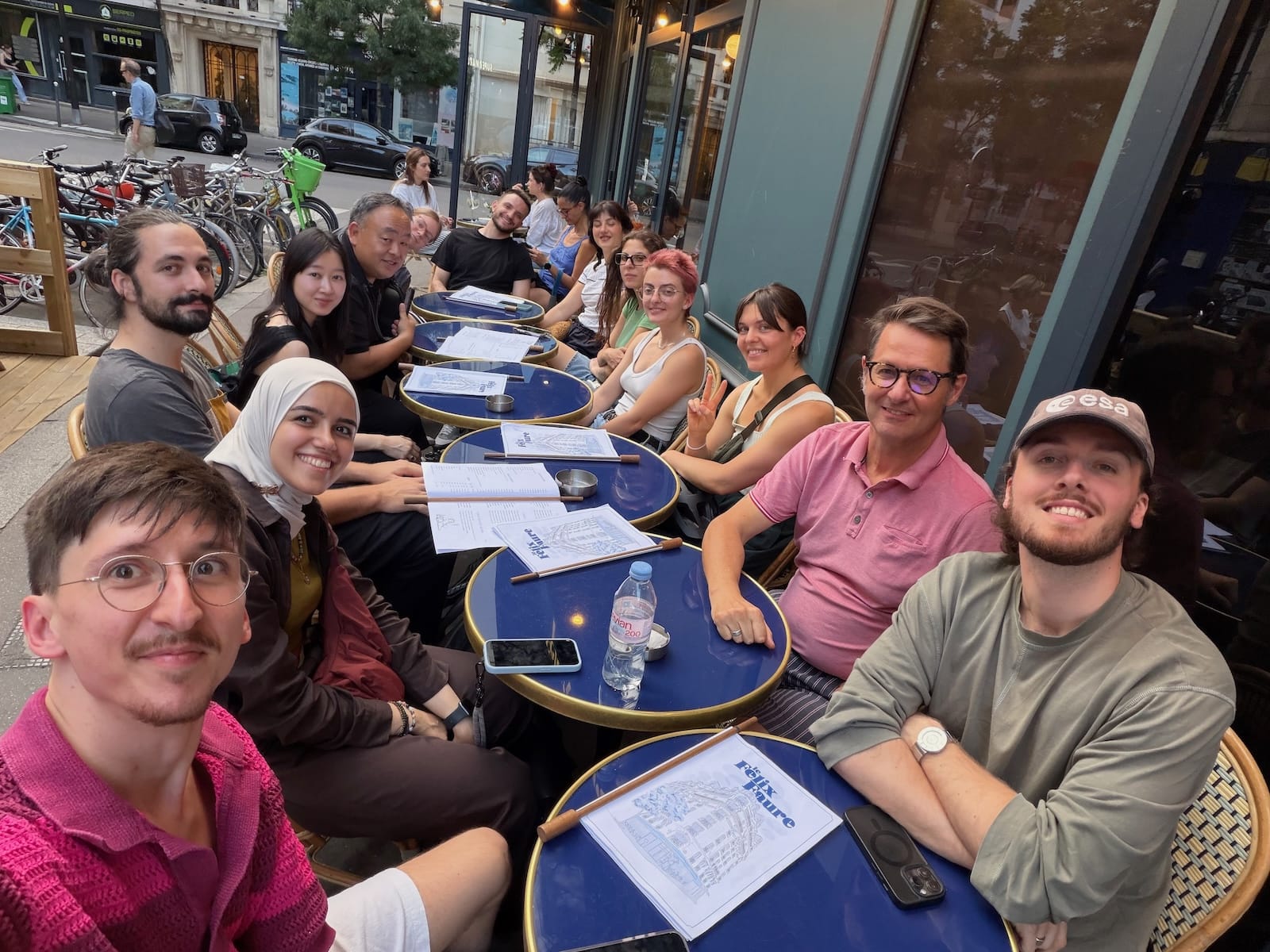
The team for the phase 2 includes (by order of appearance) Rugger Magrì, Jean François Porchez, Léo Guibert, Mathieu Réguer. Last but not least, we were thrilled to host two of the four type critics of this TypeParis Summer edition: Laura Meseguer returns after being with us in 2018) and Thomas Bouillet. They’re both incredibly talented and we’re so lucky to have them with us. Enjoy the second report below:
Crafting letters, shaping stories
While phase 1 was dedicated to understanding the foundations necessary for the practice of typeface design, from calligraphy to contemporary digital tools to build a large family of fonts, phase 2 allows everyone to get to the heart of the matter: the design of a new typeface based on a personal brief resulting from a reflection started even before the TypeParis Summer course.
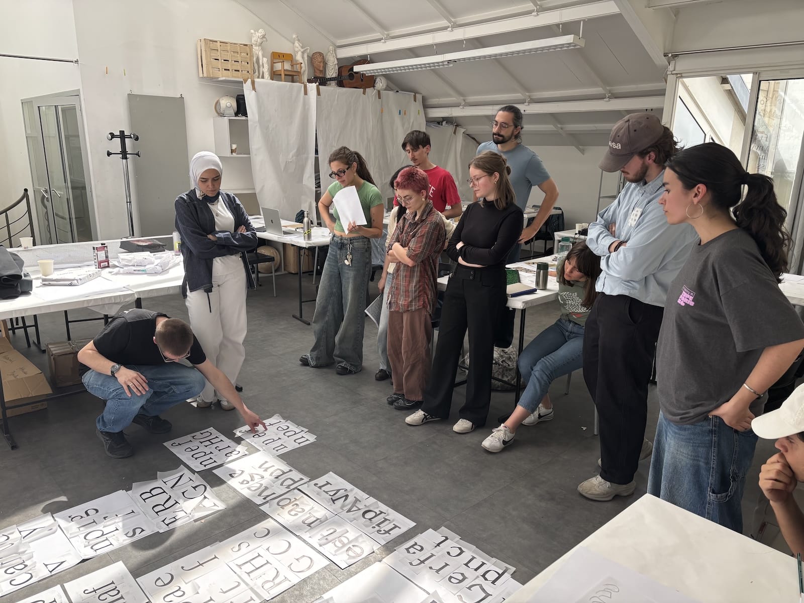
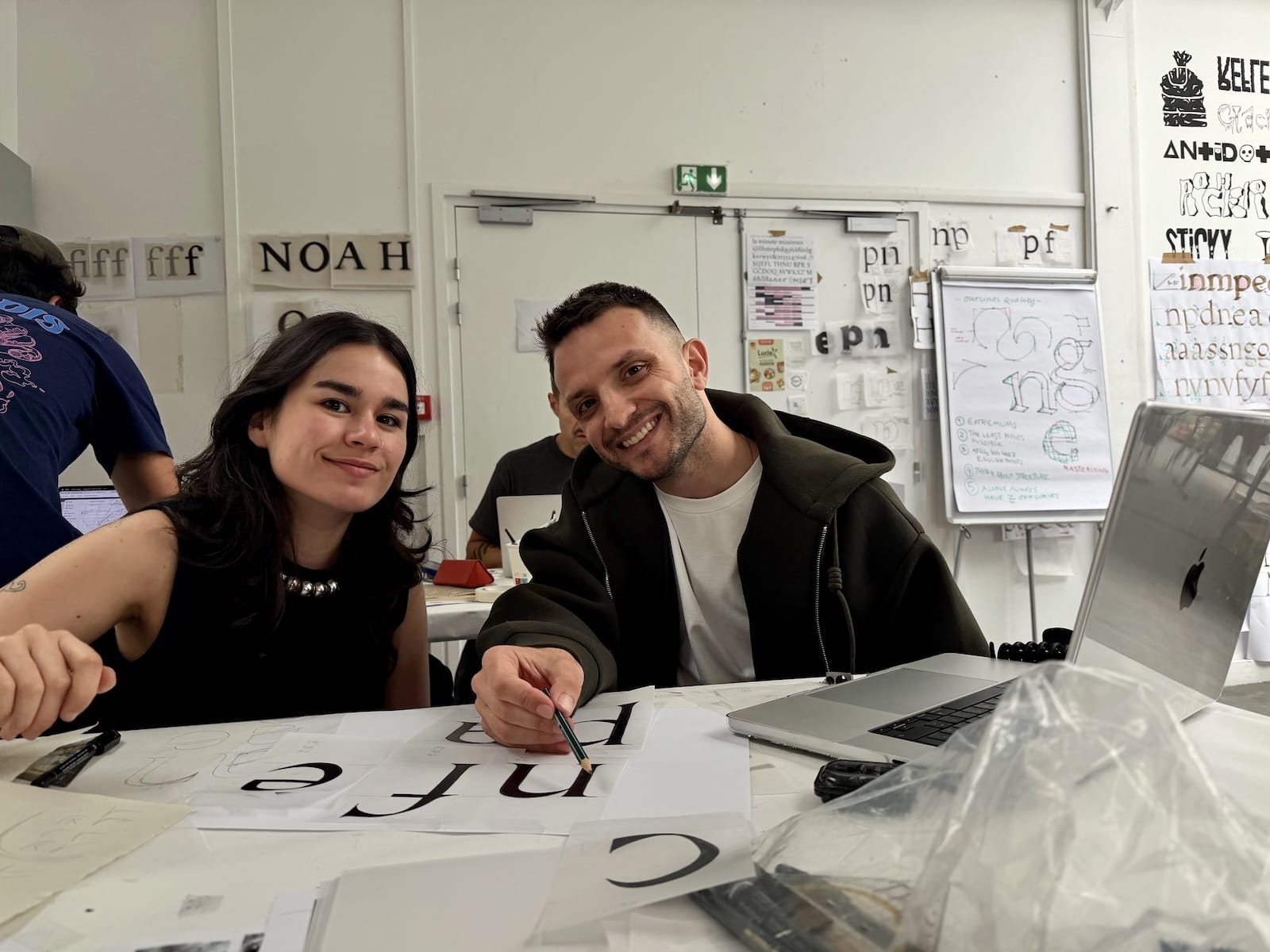
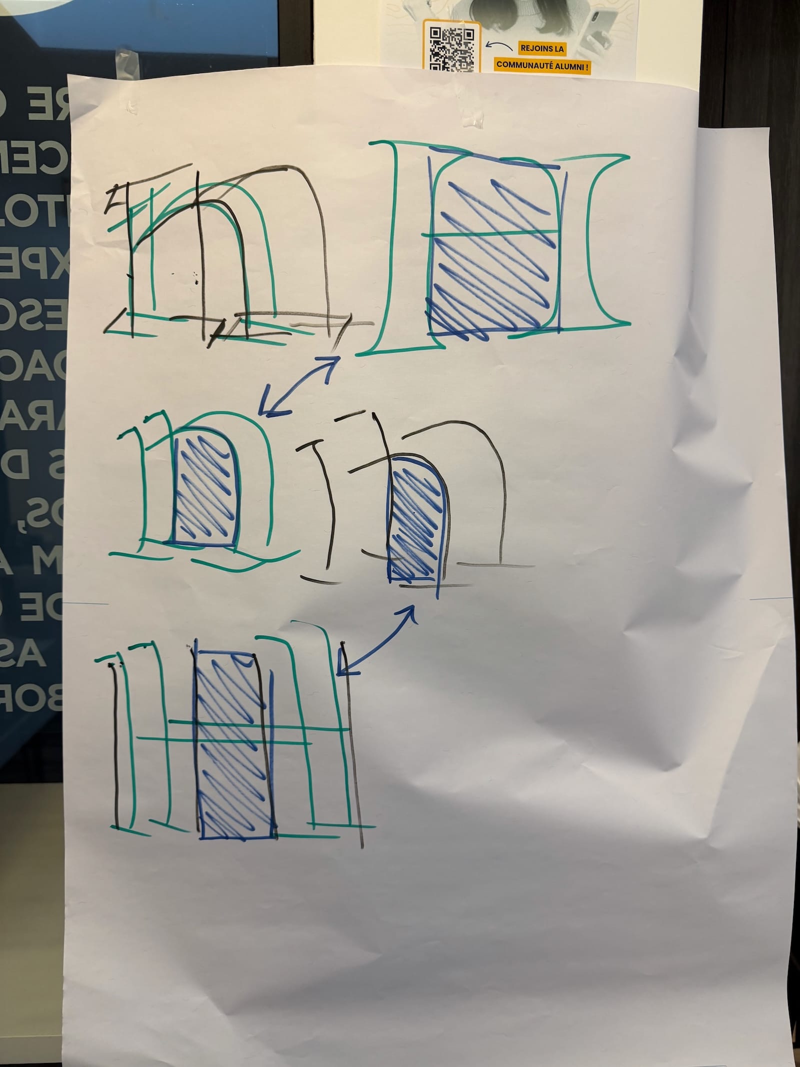
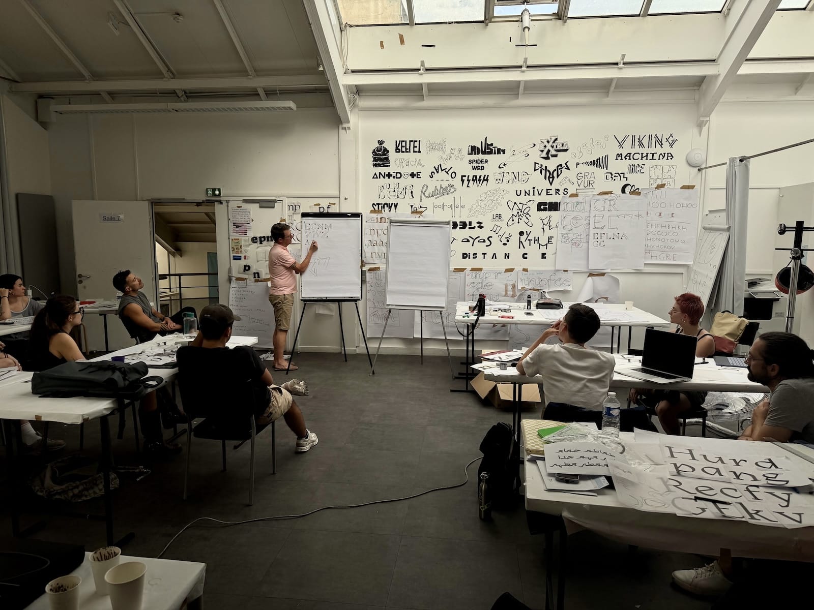
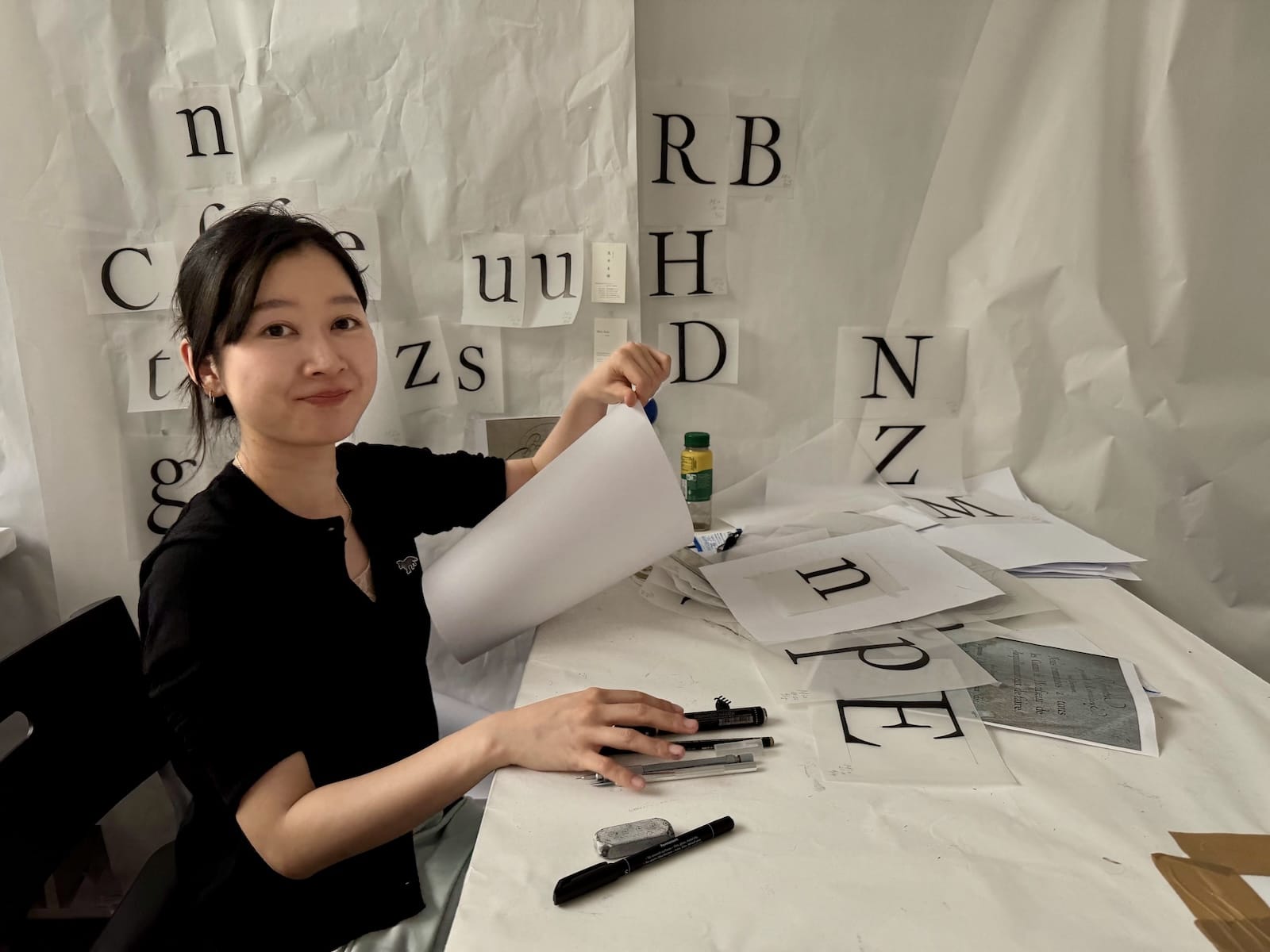
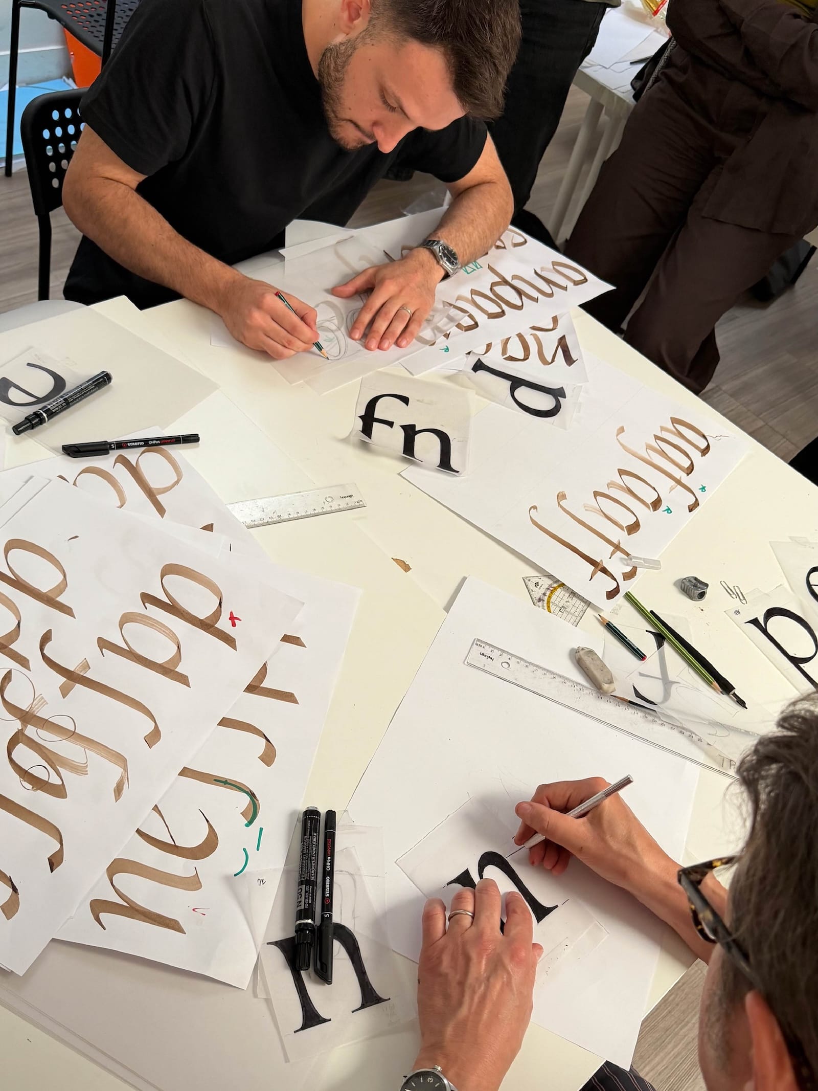
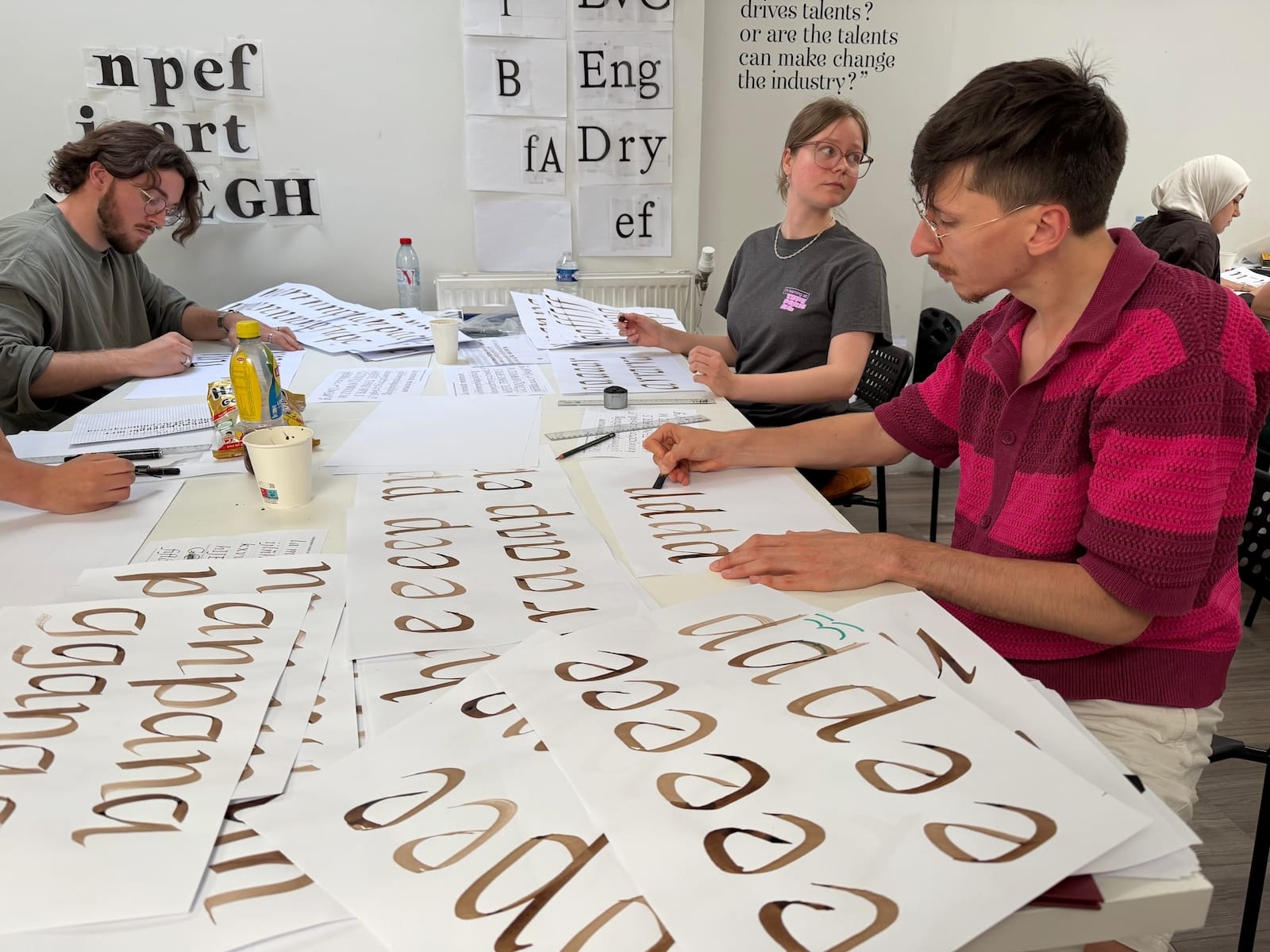
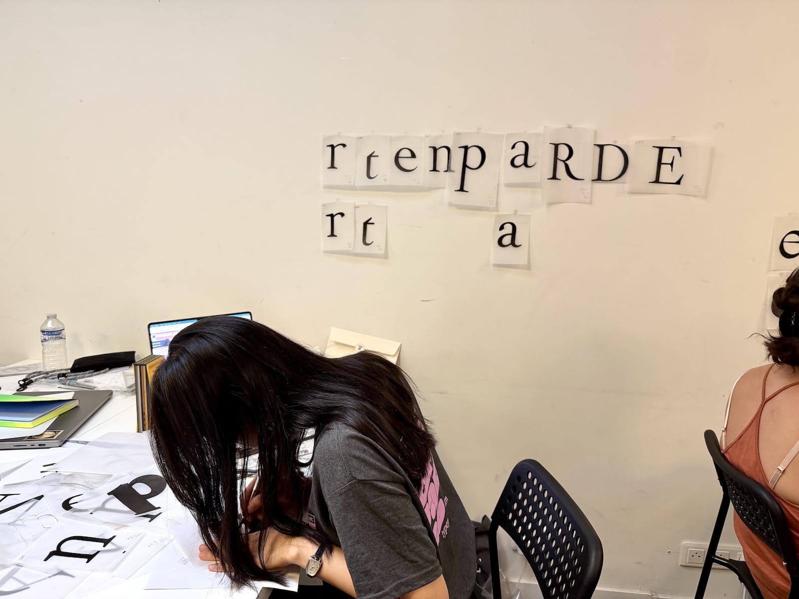
Various topics, starting from research on Renaissance typeface reference taken up in calligraphy, revival of historical typefaces with a view to associating them with a contemporary use, or a personal story. From the first day of this phase 2, they started to draw their first minuscules using the usual TypeParis key glyphs: n, p, e, f. This is a difficult and fantastic moment in same time because it is a matter of formally transcribing a relatively abstract brief. But with the help of instructors, over the days the type projects have solidified!
“Multiple viewpoints helps attendees stretch their approaches on type design.”
Welcome to Laura Meseguer and Thomas Bouillet, the two first type critics of the year
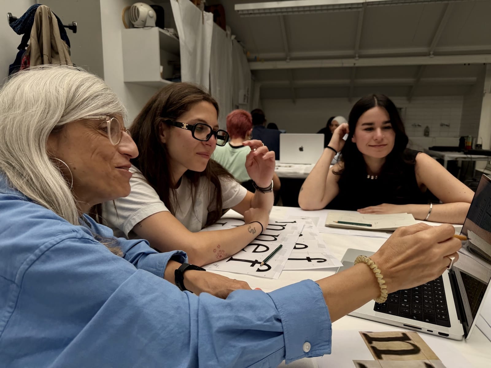
Laura Meseguer arrived at a key moment, the finalisation of the brief. Her contribution will have been undeniable, her long experience and her creative qualities making the difference, the participants reported to us.
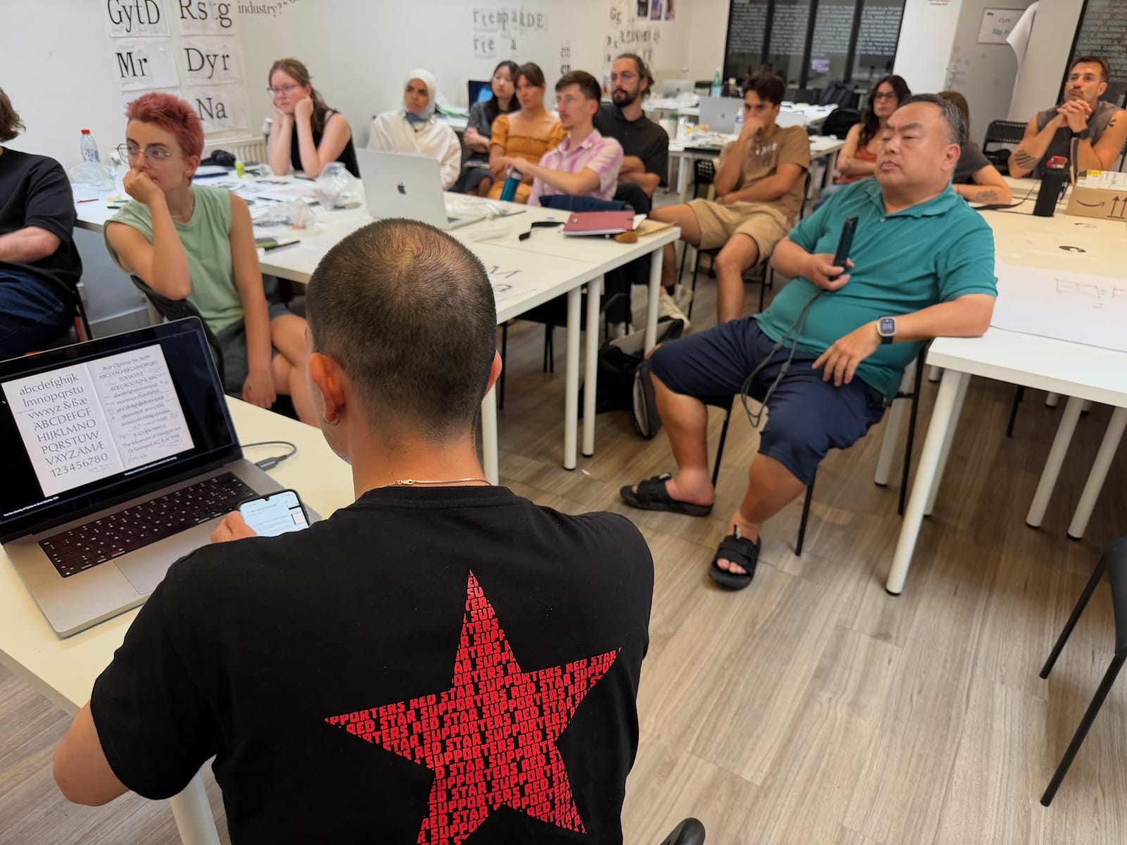
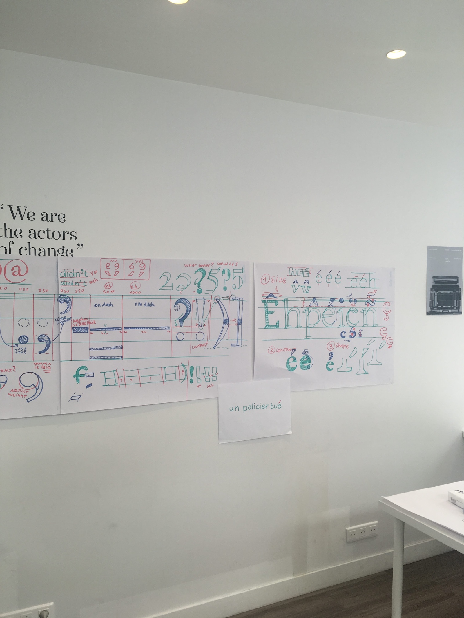
Thomas Bouillet was there the week after to help participants consolidate their ideas and how the endings, terminals, serifs, contrasts, and shapes in general could be declined in variations of weights, widths, and so on.
The principle of weekly guests is to spend with small groups rather than with all classes. Our type critics end up spending a very full day providing feedback on designs, and we’re grateful for their hard work and dedication to helping us improve.
Each year, attendees learn an important lesson: how to absorb wildly varying comments and suggestions from instructors and guests. Like any creative discipline, type design is highly subjective. While there are important principles to follow, there’s also a lot of room for personal taste. It’s not only okay to receive differing takes from those whose opinions we respect, but it’s actually positive. It provides multiple viewpoints and helps attendees stretch their tastes and approaches.
At the end of the day, our type critics offered up some last words of wisdom and admired the impressive progress from the students! Then they presented their work to the group. The exchanges at the end of their presentations are always splendid. It is indeed a rare moment when our attendees can ask the most delicate questions about the type design scene and typography, from design process to ethics and economics.
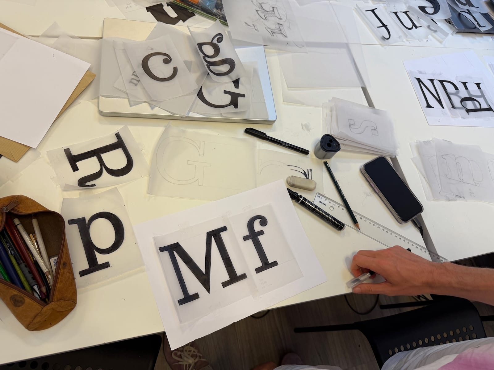
The personal type project is solidifying
The first step was to draw on tracing paper the many letters as possible in lowercase and capital letters, then learn to draw accents and punctuation adapted to their style.
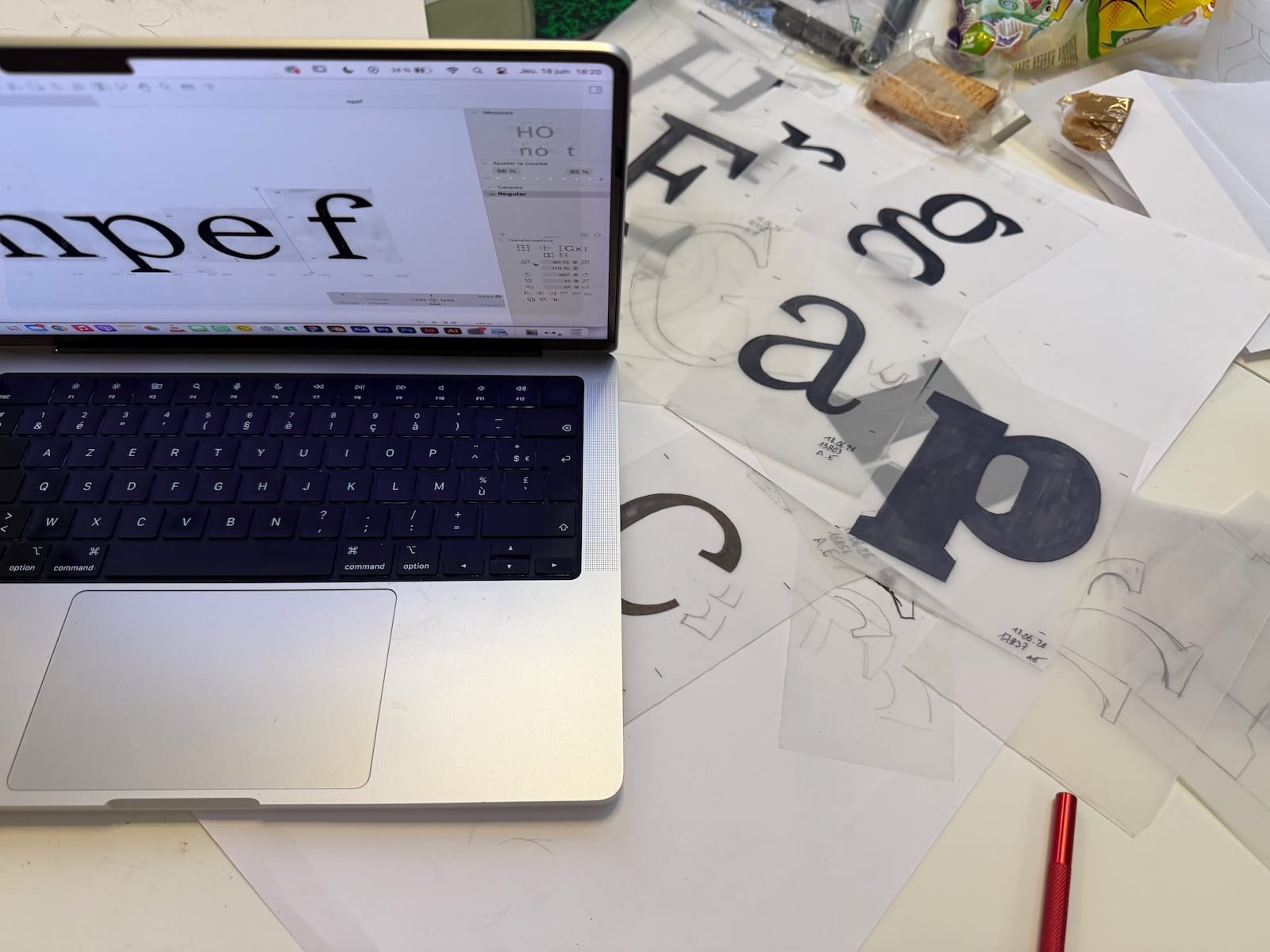
But everything goes very fast during this summer training. Because in a few days, not only were the basic forms identified, but the Black was started as well as the italics. Attendees also established a digital workflow as we learn at TypeParis, which allows them to complete the basic set in an easier and faster way. It is during this phase that we also teach them the importance of good spacing, as an intrinsic element of the digital design process.
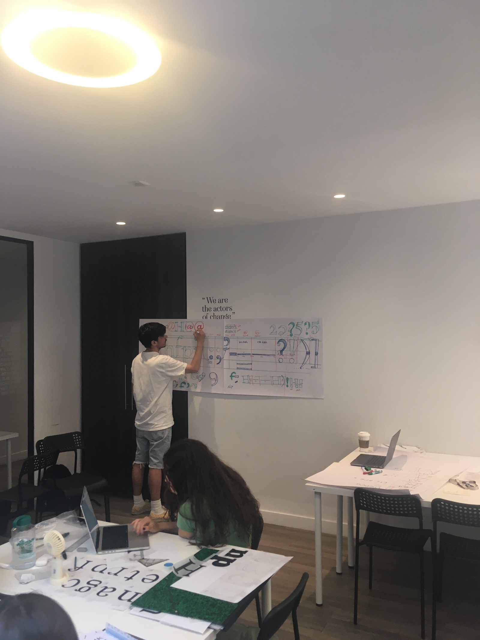
In order to focus on the design and keep it coherent through all the variations, the attendees are always invited to explore tracing the shapes for new key elements such as capital letters or numerals, regularly switching from a digital workflow to the method of hand drawings or even calligraphy if necessary.
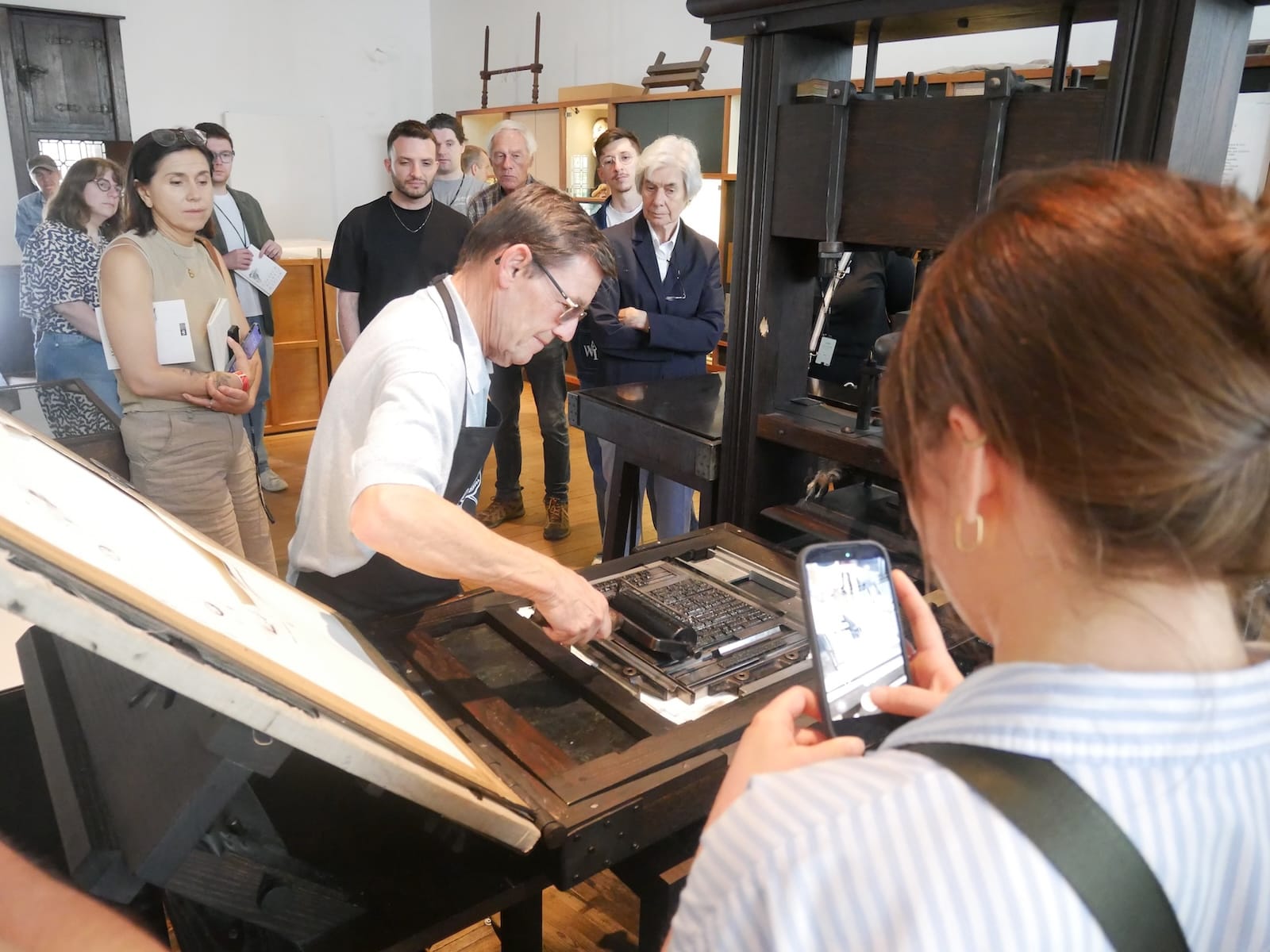
Visiting the Plantin-Moretus Museum in Antwerp
During our visits to Antwerp and Paris, we had the privilege of exploring libraries and museums with rare collections. These experiences provided us with good insights into typography and type design history.
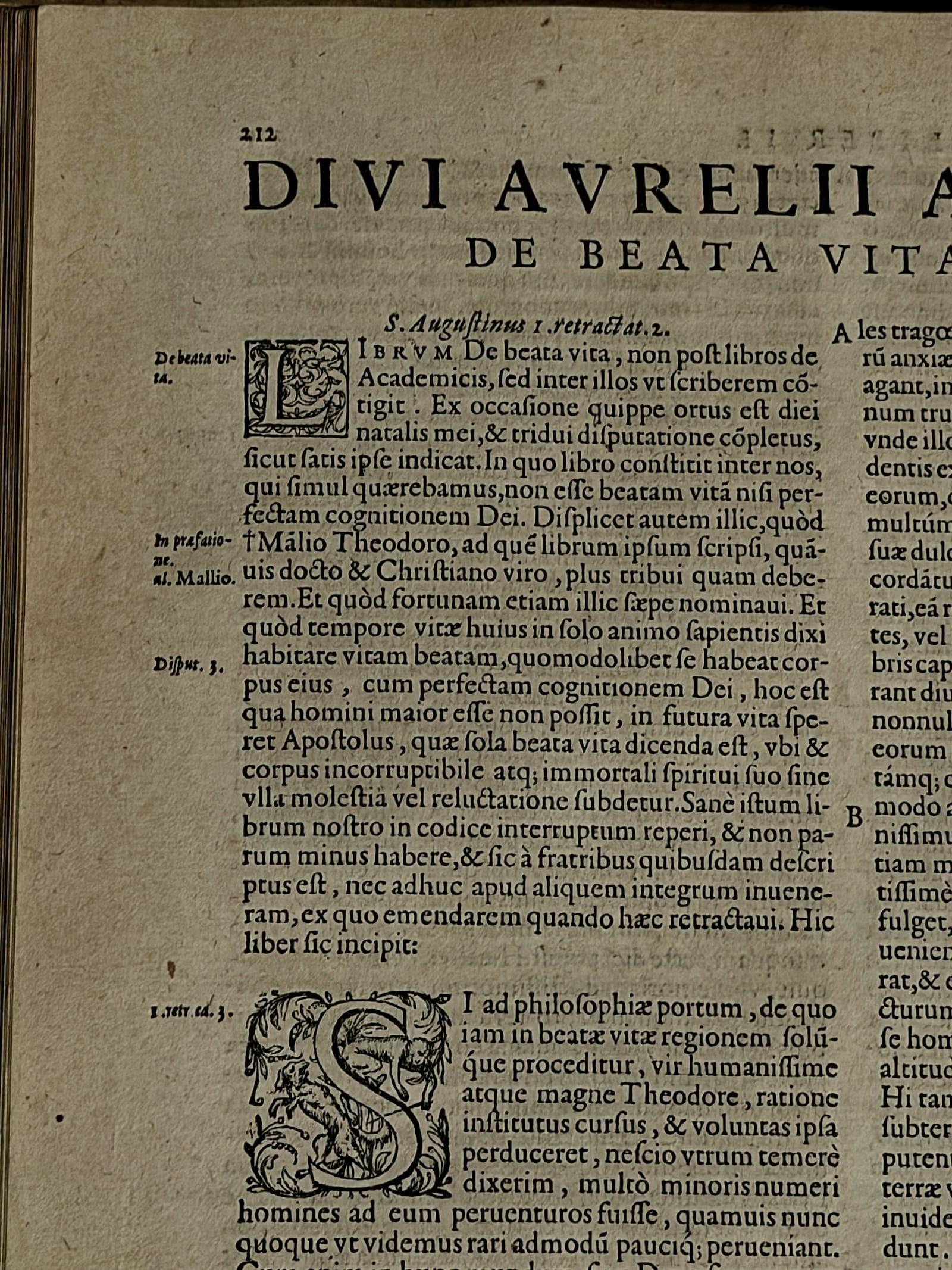
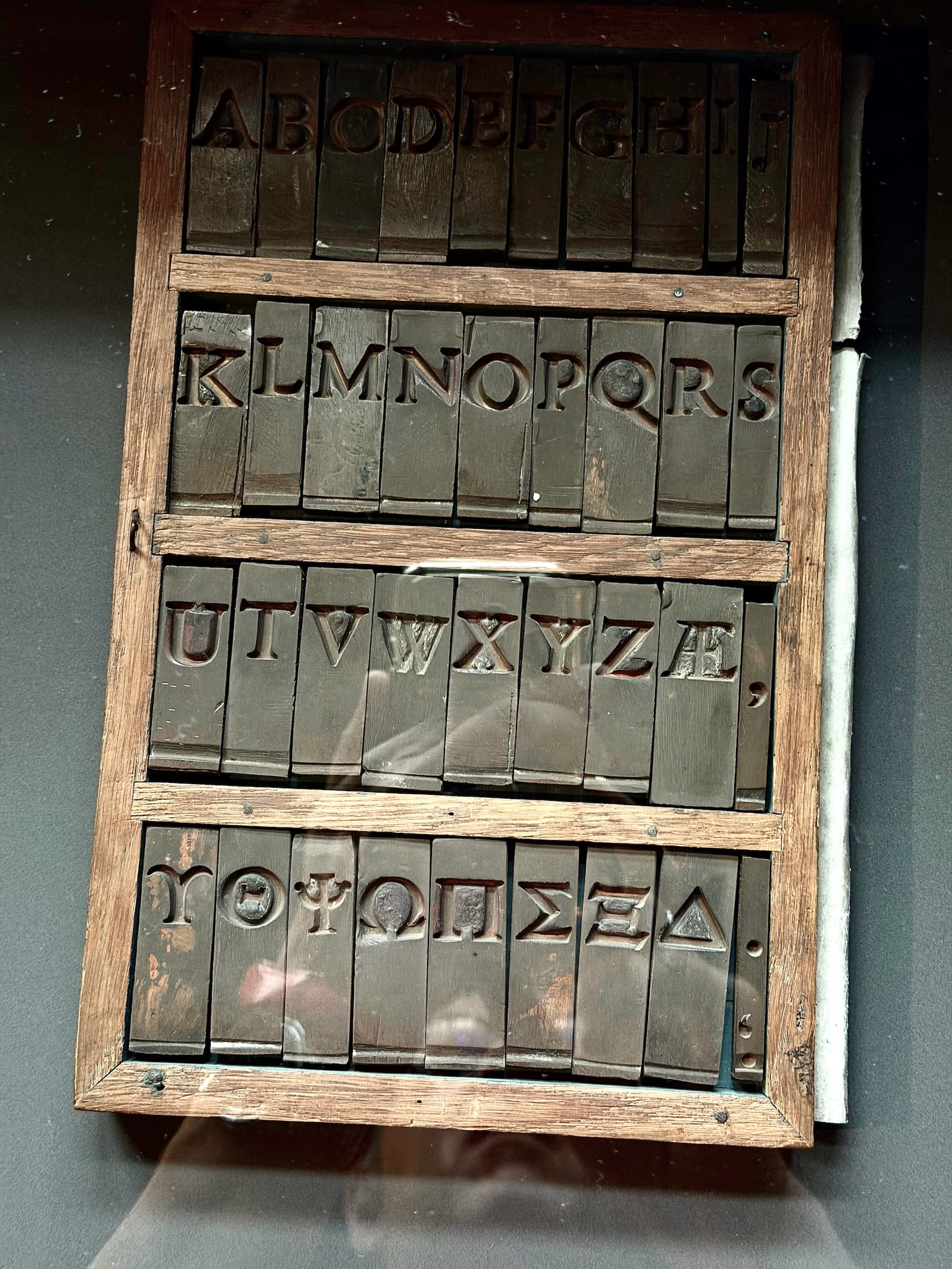
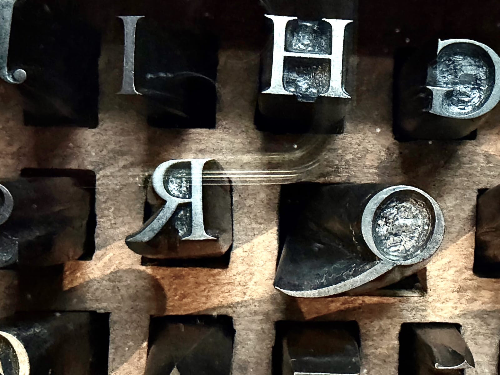
We embarked on a journey to Belgium to visit the Plantin-Moretus Museum in Antwerp. This institution is a real treasure for typography history lovers, as it dates back to the 16th century. We were also fortunate to witness an extensive collection of historical type specimens too, mostly from the Low Countries, Germany, and various other countries.
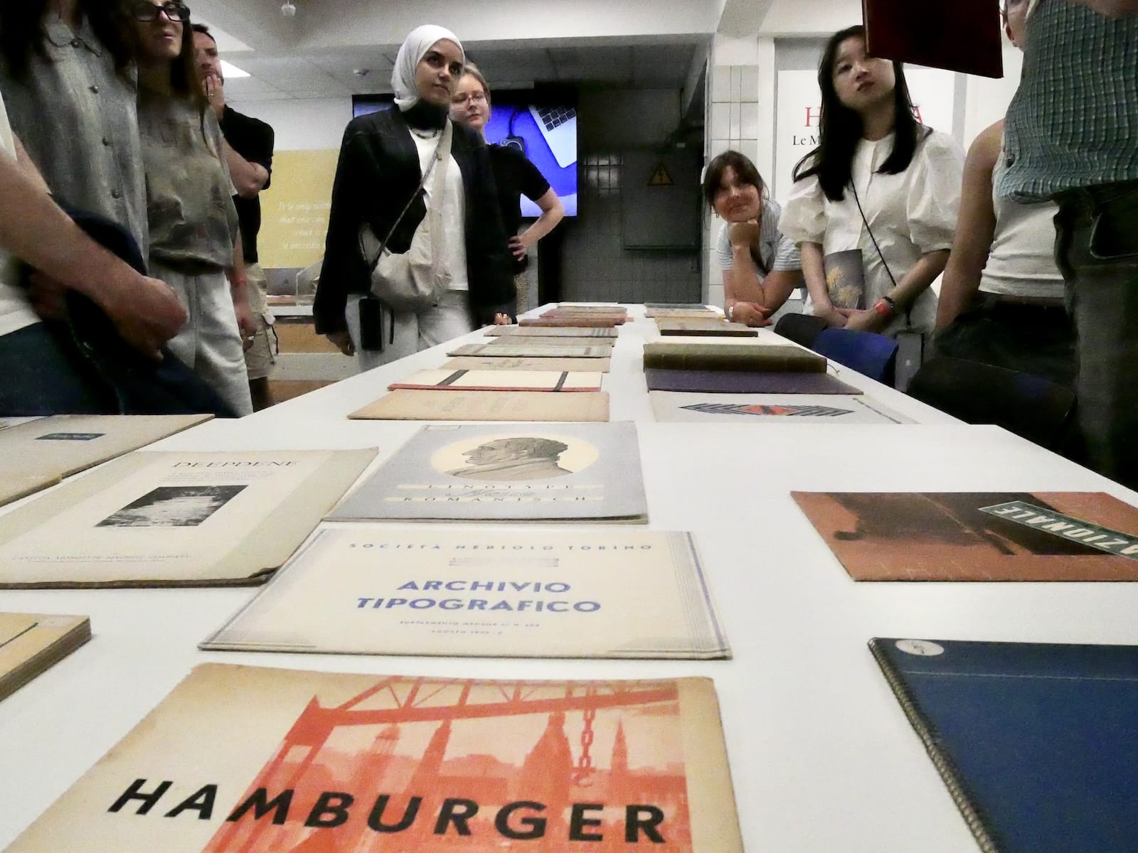
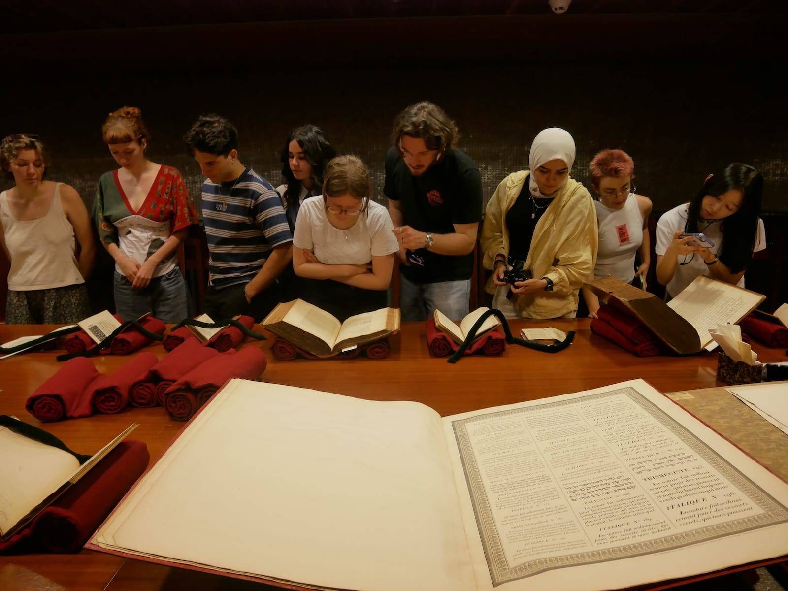
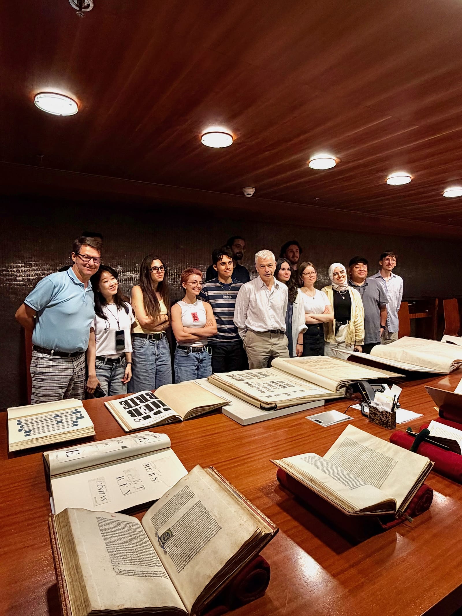
Visiting the Rare Books department of the Bibliothèque Nationale de France and Forney library.
We visited the Rare Books department of the Bibliothèque Nationale de France. Thanks to Jean-Marc Chatelain, the director of the department, we were able to access the collection of exceptional type specimens spanning from the 17th to the 19th centuries.
Then we had the chance to discover another collection in a Parisian library: Forney. This time, the focus was Deberny & Peignot and the French type specimens of the 19th and early 20th centuries presented by Françoise Meyniel.
These initial visits were important for the attendees. They illuminated the evolution of typographic forms over time, which is precisely the knowledge we sought to gain in preparation for designing distinctive type projects.
At the end of this Phase 2, TypeParis Summer26 attendees have a clear idea of their design goal. The main typeface is fixed, and ideas for extensions appear. The Phase 3 and Phase 4 will be dedicated to extending their typeface using digital tools such as Glyphs app, including punctuation, numerals, and diacritics, as well as adding variants like italic and bold, encouraging exploration of different weights and styles.
– By Jean François Porchez
Learn more about TypeParis courses and conferences!
➼ Type & graphic designers interviews
➼ Summer26 programme
➼ Reports
➼ Attendees feedback series