
We have a fabulous selection of instructors coming at TypeParis Summer26. We wanted to find out a little more about each of them, so have presented them with a series of questions which they have generously taken the time to answer. Discover Greg Lindy’ interview.
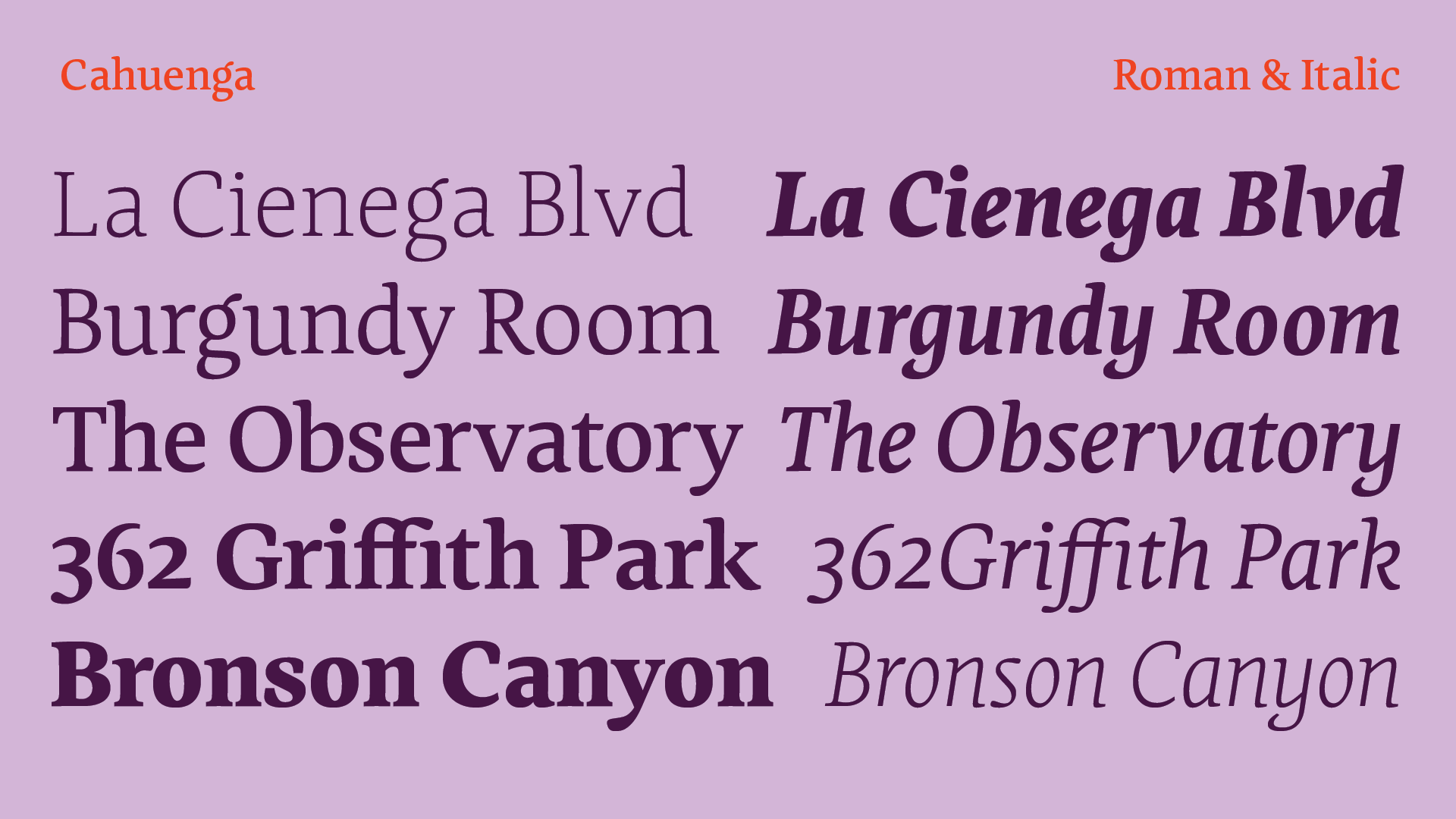
Biography As Creative Director of Lux Typographic + Design, Greg has published original typefaces for licensing and developed bespoke typographic solutions for a wide range of clients. While serving as Design Director at Intersection Studio, he discovered how typefaces perform in real applications. Solutions must communicate a client’s objectives, a principle that shaped Greg’s relationship with letterforms and ultimately led him to establish LuxTypo.
Interview
What do you do to evade yourself from work?
Greg Lindy Surfing is the main thing. I grew up with it, unfortunately I don’t seem to get in the water enough. But when I do, the stress sheds itself — water has a profound effect and having all your focus on catching a wave there’s no space to think of anything else.
What’s the first thing you do when you settle into your desk?
Greg Lindy I check emails, then assess what’s what for the day by updating the daily schedule. I usually have another cup of coffee and proceed with the day. I try to take breaks so that I’m not sitting for too long. Since that last few years, I take lunch at my desk — as there seems to be too much to do to take a proper lunch break — or so I think… but I make up for it by taking a short nap around 3-4PM, depending on the day. Then continue to work until 7PM or so. I used to feel subconscious about the nap, but a dentist friend told me he does the same thing, he hops into the patient’s chair and snoozes for a half hour. And, around 5 PM, another coffee.
Do you prefer work in a dedicated workspace, at home or to keep mobile?
Greg Lindy I appreciate all three. Before the pandemic, I maintained an office away from home. I enjoyed the separation and being out. Then with Covid, we all worked from home… I continued to do so. Partly, I like the dynamic but also saving the money on rent. I do enjoy working remote, but more from a week-long Air Bnb, oppose to a Starbucks or such. I guess with remote, I still like the since of settling in for a longer time without the distraction of others coming and going.
What’s your favourite kind of music to listen to while working?
Greg Lindy I like a decent range of music — and it does depend, to a degree, what I’m working on. I tend to gravitate to music that’s from the early 80s or contemporary groups that are inspired by that era. Sometimes the typeface or particular tasks will inspire the genre or word settings that I am working with. It can range from Erik Satie to Miles Davis to Nick Cave.
Do you keep up with the news?
Greg Lindy I keep up to a degree with a preference to source a wide objective range… get many views and formulate my conclusions. This can include certain YouTube channels as much as “established” traditional platforms. For typographic/type design specific sources — again, it varies. It can be publications like Eye Magazine or blogs/articles I stumble upon. A great resource of late has been my students at ArtCenter in Pasadena. They are more use to pulling in a lot of things and bringing them to class. They act as my aggregate.
“The hands learn differently than the brain.”
– Greg Lindy
What are your thoughts on social media these days?
Greg Lindy It is tiresome and not my thing. With that said I utilize Linked In more these days. Instagram is done in my opinion — the ads have ruined it and very difficult to make noise on it unless you had 30K + followers from a while back. Mail Chimp is a great platform — it’s more targeted. At least you know that who you are talking to are interested (to a degree). As for Tik Tok or whatever, it’s beyond me.
What drives you to create new typefaces?
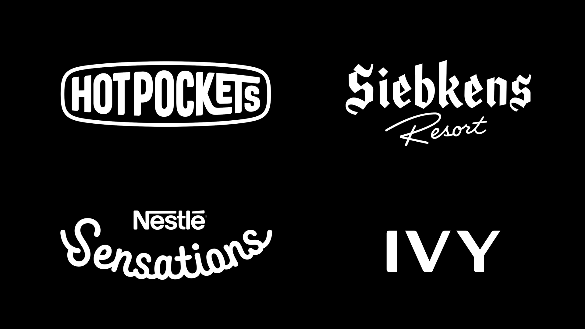
Greg Lindy I’m first and foremost a graphic designer — I create typefaces that I would want to use. Then I figure if I want to use it, perhaps a few others would like to as well. The range of inspiration is wide. It can be a “groove” that you keep fixated on, like a musician, and see how it can evolve. Sometimes it might be lettering seen driving around Los Angeles — or — something historic that I’ve encountered. I don’t gravitate to drawing classics — there are other designers that do it in far more superior manner than I could ever do. But this is not so say I am not inspired by them. As the typeface further develops and becomes clearer where it wants to go, I will then source references to ensure that it will take a coherent path. So it could “barrow” something from history as much be inspired by something from left field as long as the “font-system” can accommodate them in a believable manner.
Do you sketch before going digital? How much software and fixed rules determine a project these days?
Greg Lindy I sketch enough to understand what I want. My skills with vectors out weigh that of the pen. However, I will set the mouse down regularly to work out certain things, as the hands think differently than the mind. But once I figure out “what’s what”, I move back to the computer. Software gives working structure. Like any other tool — like a table saw or similar in complexity. With understanding of the tool, you can outline a process that best works with in those parameters creating efficiencies and such. I don’t find inspiration from the software — though I do seek opportunities to leverage its use to make the end product as dynamic as it can be.
Do you think AI will change the way to design typefaces?
Greg Lindy Yes, to a degree — or more evolve things. The idea it will generate what you want is absurd (though it can try). Ai is a tool, used in certain capacities it can assist in completing particular tasks more efficiently. My experience with Ai has been more with writing or better put, editing. The absence of any human skill and knowledge of what the desired outcome should be results in the absurdity. The only way the “user” can qualify what’s what is by knowing “how” to arrive at the desired result without the assistance of Ai. But perhaps it’s just a matter of time that it will be able to think for us as well.
What is your ratio of self-initiated typefaces vs. typeface for clients?
Greg Lindy I’m not sure the ratio. I constantly have a self initiated typeface going on — and client work seems to stream at a comfortable pace. I find them equally in passion. With self initiated work, you make the rules. This can be liberating as much as it can be frustrating. I love client work because there are parameters set by the client. Their criteria can expose you to avenues that you normally wouldn’t follow down with personal work. For example, completing a brush-script for a consumer brand… I would not really consider doing this on my own as the graphic designer in me would not naturally want to use this style. But, as letterforms and such, the opportunity to work on behalf of the client opens up new views.
What can you tell us about the state of the font market today?
Greg Lindy It has change a great deal over the last decade — I think you need to do all that you stated. The ability to go it as an independent is better with the tools to set up an online store front being much easier than before. The challenge is around getting customers to your shop. Partnering with distributors to get your fonts to the various platforms enables you to go wide, but your royalty will be less. Hopefully volume offsets that. The other issue is the market is saturated. Social platforms have to be approached strategically. Partnering with a person that specializes in social marketing is important. In regards to my fonts, I’m not quite sure “how” designers stumble across them. There is a bit of residual effect from being part of the font co-op “Village,” but now I rely on the distribution platforms, making sure keywords will resonate with customer searches.
“To me the biggest learning comes from seeing and using type.”
– Greg Lindy
Do subscription platforms make the world better? And the free fonts ?
Greg Lindy Neither better nor worse… just is. Of course there’s the good and the not-so-good that comes with this evolution. People are more aware of fonts and their presence, they appreciate the “culture” that type brings. I feel fonts as an intellectual property are more valued now — 30 years ago no one thought twice about sharing fonts among one another — now more users are aware. Along with this, we have more choices — but more choices doesn’t mean better. My mind is on what the next move may be. I guess this is what keeps me up at night.
For the free… you get what you pay for, ha-ha. I guess for this to work for the “creators” of the intellectual properties, certain models need to be in place — and in some instances — are in place currently. At the moment I have no interaction with this topic — it’s not say that I won’t in the future, though I’m curious to see how it plays out.
What motivated you to start teaching?
Greg Lindy The interaction with others and the opportunity to share knowledge. It is a great mental exercise — it forces you to reexamine what you know and express it in a manner that others can understand which ends up making you smarter. It has strengthened my personal practice as well by fine tuning the way I communicate with clients. In addition, the students bring so many things to the class — each term, I am excited to see what new motivations, inspirations and goals they are considering. It’s a cliche, but I do in fact “learn” from the students. Today, I teach at Art Center College of Design in Pasadena (close to Los Angeles). I have been teaching Font Design for the past 13 years. I addition, I have taught at Otis College of Design — where I was introduced to Jean François Porchez, and Cal Arts. I regularly conduct font design workshops as well.
Do you think students should experiment or follow historical models?
Greg Lindy We have been at a point where entry into the craft is not very prohibitive. Students are more visually literate than before and proficient with digital tools. So I say, “go at it” — don’t ask for permission. I think it is a great way to foster interest. However, the next step is incredibly important — if a student truly wants to move beyond mimicry and move into comprehension, they need to take the next step and dive into the fundamentals so they can work with the system in a cohesive manner. I think at this point, the student’s desire to “know more” has been piqued and they are willing to take on the foundational aspects — they want to embrace the craft.
What’s the balance between hands-on craft and digital tools?
Greg Lindy All of these are important and should be exposed to students. The hands learn differently than the brain… writing gestures, setting type and with the smell of ink create a connection that digital tools do not. There is a sense of “magic” with digital tools and they create a disconnect. Calligraphy is a struggle — this makes you aware of the pain and reward that goes into the craft. With setting type the limitations guide you, it is an ongoing negotiation with the medium. These analog methods force you to slow down, be in the moment and be more aware. They connect us more personally to type and remind us that type is physical — digital tools do not.
What role should critiques about the proliferation of typefaces play in education?
Greg Lindy It is a phenomenon that can’t be ignored. In some ways it’s great to see there’s so much interest — it does bring awareness to the craft. But we have to be careful, as it also creates a great deal noise. I think we need to encourage students to “like stuff” but be discerning. As an instructor, we need to highlight the fonts that have purpose and contextualize their importance — expose them to criteria to judge and encourage the student to be critical.
“Be aware of how design plays into your interests and is essential for defining that culture.”
– Greg Lindy
Should type design be taught as a specialized subject or integrated into the core curriculum?
Greg Lindy Well, I enjoy that Font Design at Art Center is an elective open to the students. This means pretty much every student that enrolls in the course is there because they love type. However, the paths we take to get to the learning outcomes really are foundational to the overall typographic curriculum. Students are exposed to what lies beneath the water line so to speak, that the other typography courses are not able to touch on. I could see a need for type design courses to be part of core curriculum.
Should formal education be required to become a typeface designer?
Greg Lindy I’m self taught — so I don’t think that formal instruction is a prerequisite. With that said, had there been more specialize instruction when I was entering into the vocation in the early 90s, I probably would have taken it. Instruction gets you to certain points faster. I tell students “you don’t need me” once they have a grasp of the fundamentals and such. To me the biggest learning comes from seeing and using type. This will inevitably lead to asking questions, and that’s where the learning comes from. You search for the answer on your own or seek instruction at that point for something specific. Before you know it, you start to establish a relevant point of view.
Do you remember when you decided to pursue your career in design?
Greg Lindy It was the second term in college 1985, Cal State Northridge (Los Angeles). I needed to take an elective for full-time status, and I saw the course “2D design”. With in month, it became apparent that this is what I wanted to do. The class was liberating in many ways. The instructor was pretty cool, she wore leopard spot patterned pants, had an asymmetrical hair style and was into great music. The more I put myself and my interests (surfing and music) into the projects, the more encouragement she would give. Towards the end of the term, she pulled me aside and noticed I had not declared a major — so she recommended I go the route of design.
When you started, who were the mentors who had the most impact on you?
Greg Lindy The 2D design teacher I just mentioned — Terry Yarbrough. A few terms later, I had a Swiss trained typography instructor, Jean Bruggenjohann — she had the same affect on me with type that the 2D design teacher had in the beginning. From Jean’s class, I discovered I could not get enough type. We had exercises in drawing type as well as setting type via “paste up”. This translated to really looking and acknowledging the importance of spacing. Also at school, we had a class in letter press, Myra Feely oversaw the print lab and gave us full reign to explore. Fast forward to my graduating term and I met Henk Elenga from Hard Werken, the Rotterdam based design collective. Henk had established the “LA Desk” where I had the opportunity to intern. This is before computers. His approach was eclectic and the type/design sensibilities he exposed me to have stayed with me throughout my career. Another important person is Michael Rey, my first boss. He was very encouraging and allowed a lot of freedom. We had a Mac, but the amount of type digitally was limiting. Michael had type setter’s books as well. He also had a license for Fontographer, and this was the gateway into designing digital fonts — albeit the postmodern oddities of the early 90s. I started diving deeper into the fundamentals and became aware of the teachings of Gerrit Nordzij. With the studio, Michael Rey became a typographic patron, he really encouraged my development and created a studio environment that felt like a master’s program in design while working there.
Do you have words of wisdom for someone who wants to become a type designer?
Greg Lindy By all means, go for it. I have enjoyed the ride. Observe, whether it’s design, type, etc. — it is something we live with and interact with — always be looking and asking yourself questions. Do not rely on ”swiping” for developing your point of view. Embrace books — design specific, or just nicely designed. Be aware of how design plays into your interests and is essential for defining that culture. Make design and type a hobby as much as a profession. Ask questions from your instructor, boss and clients… design is about that.
Thank you very much Greg Lindy!
– Interview by Manau Quellec
Learn more about TypeParis
➼ Type & graphic designers interviews
➼ Summer26 programme
➼ Reports
➼ Attendees feedback series
Apply to TypeParis Summer27 course! The deadline for applications will be next 14 March 2027.