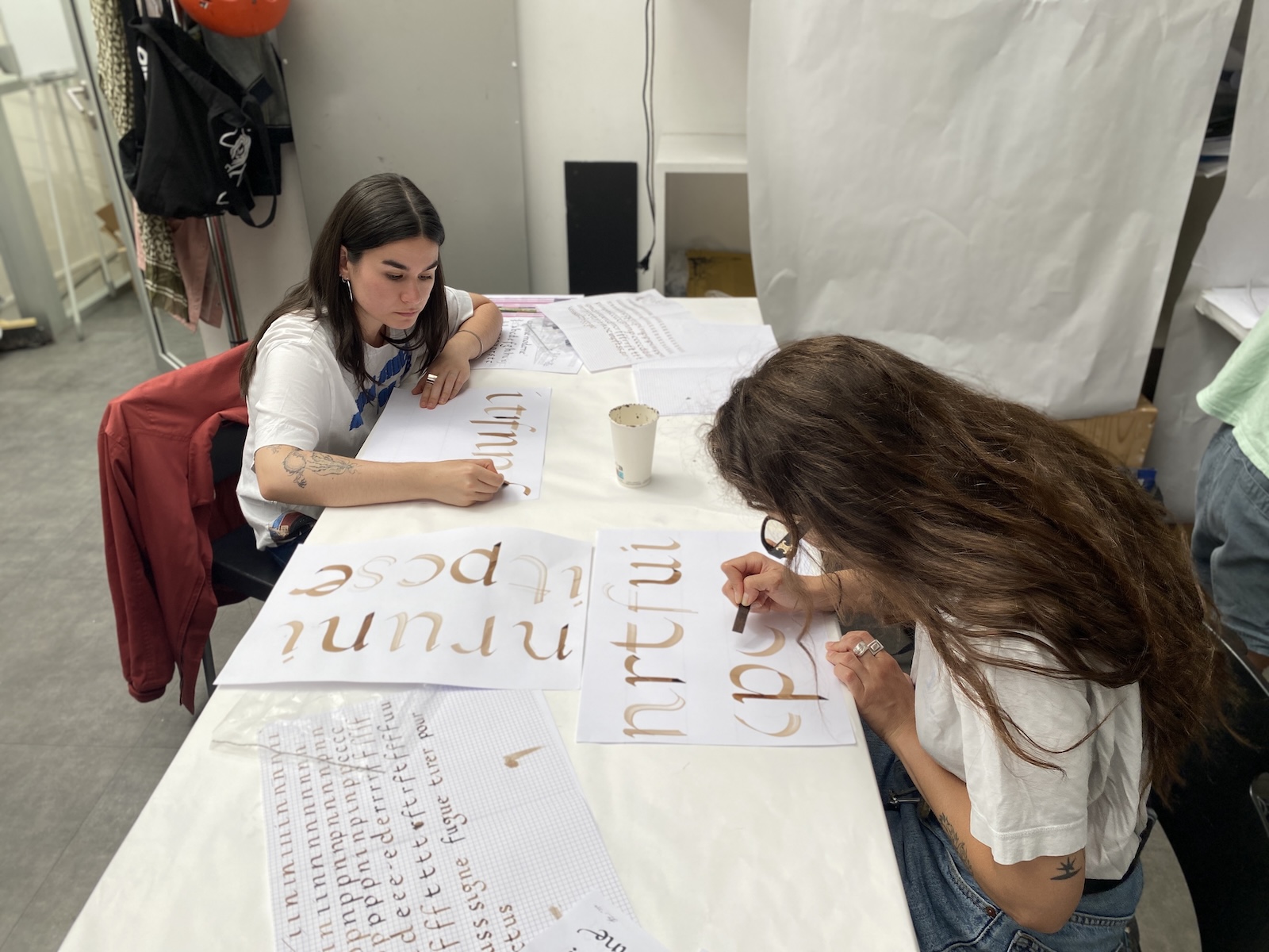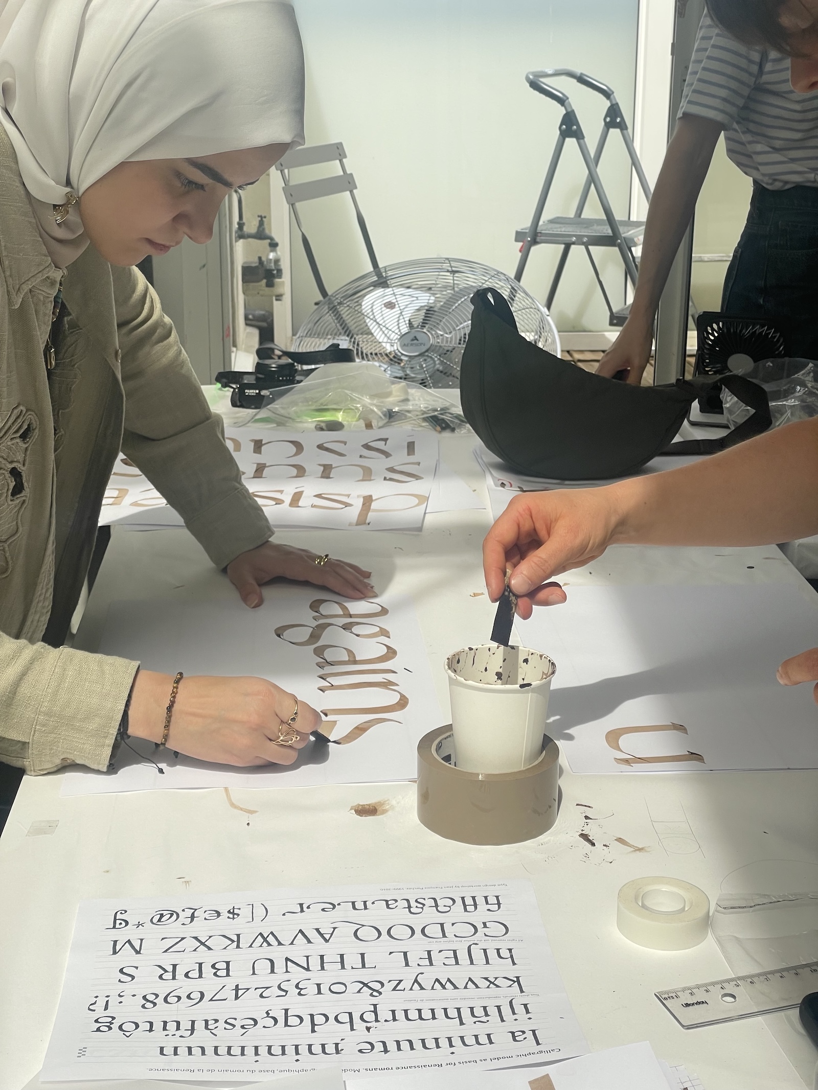


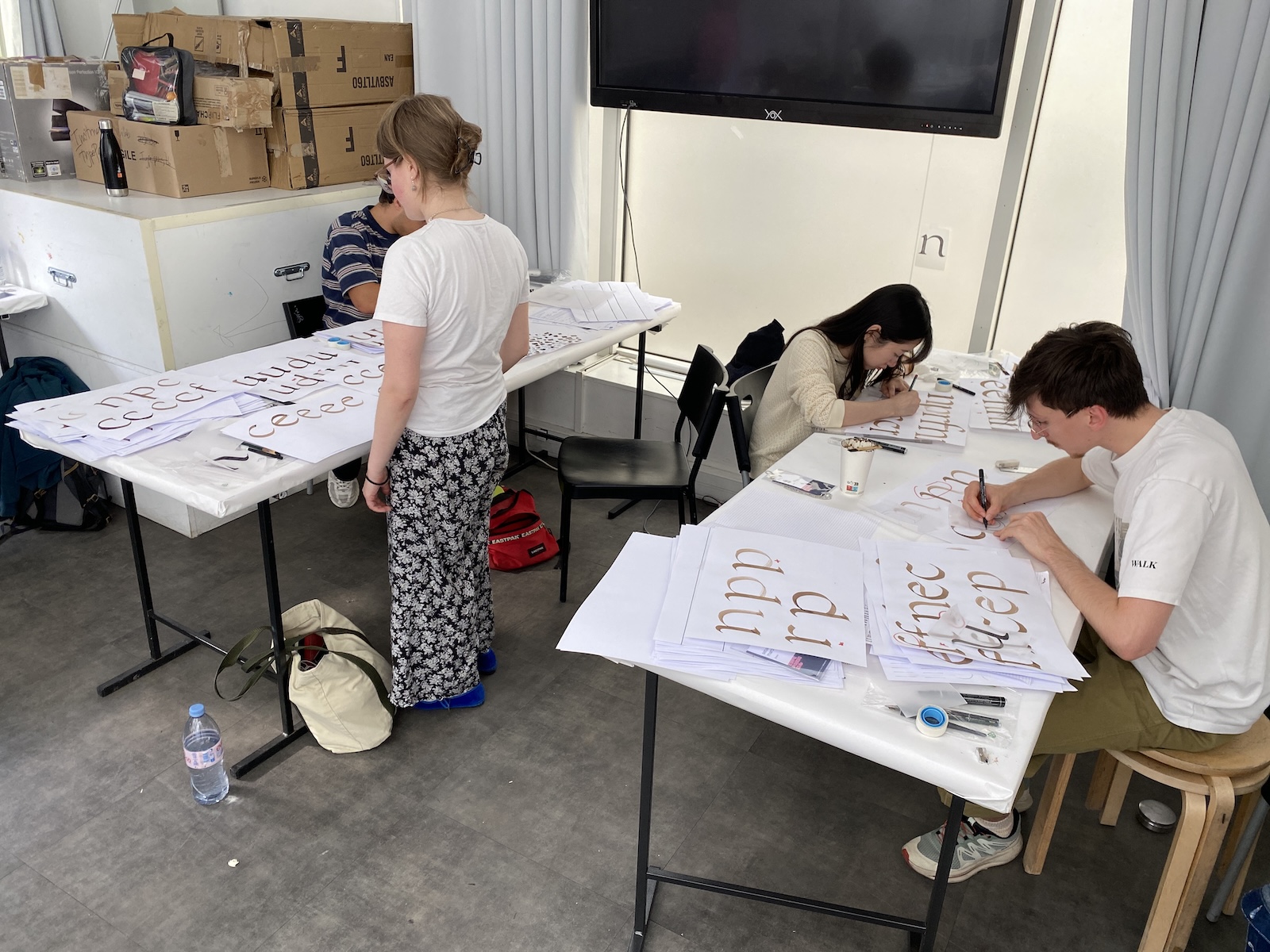
The Now26 conference will have been great again this year. An excellent introduction for attendees of TypeParis Summer26 which started on 2 June 2026 for 6 weeks. On that day, the discovery was total, presentation of the Summer programme by Jean François Porchez. Starting from calligraphy in the morning with Gina Serret (typeparis18 alumni). In the afternoon, based on humanistic calligraphy, the first letterforms drawings appeared on the tables.
The attendees also met instructors Mathieu Réguer, Léo Guibert, Ruggero Maggrì (typeparis18 alumni too) during this phase. Under their guidance, the students kept practicing their calligraphy skills and even drew a modular humanistic alphabet.
The TypeParis Summer course is built in 5 phases. For this phase 1, it was a matter of understanding the link between writing, especially Renaissance models, and the typographic structure of classic serifed typefaces. Enjoy the first report below:
Calligraphy as foundation
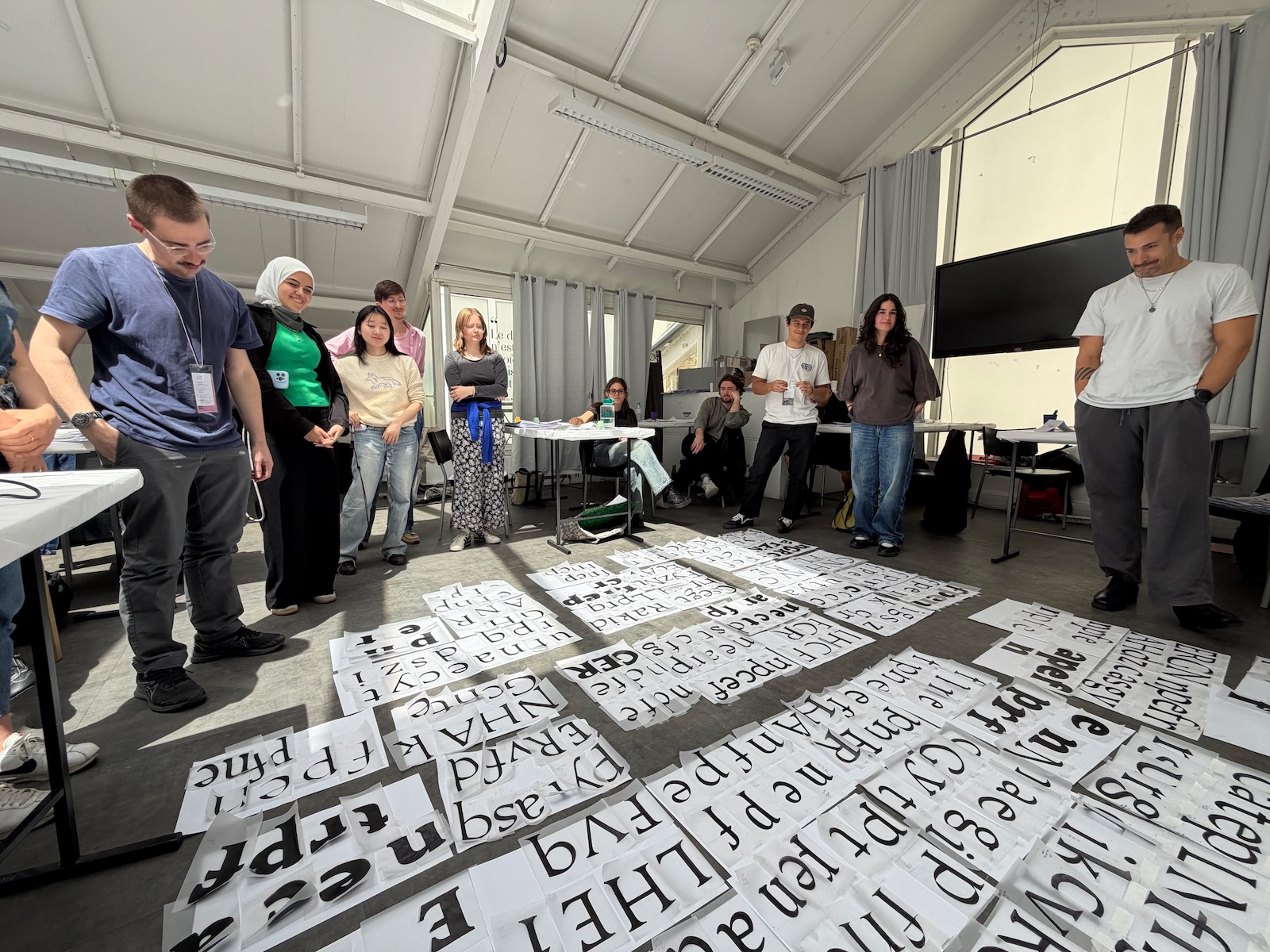
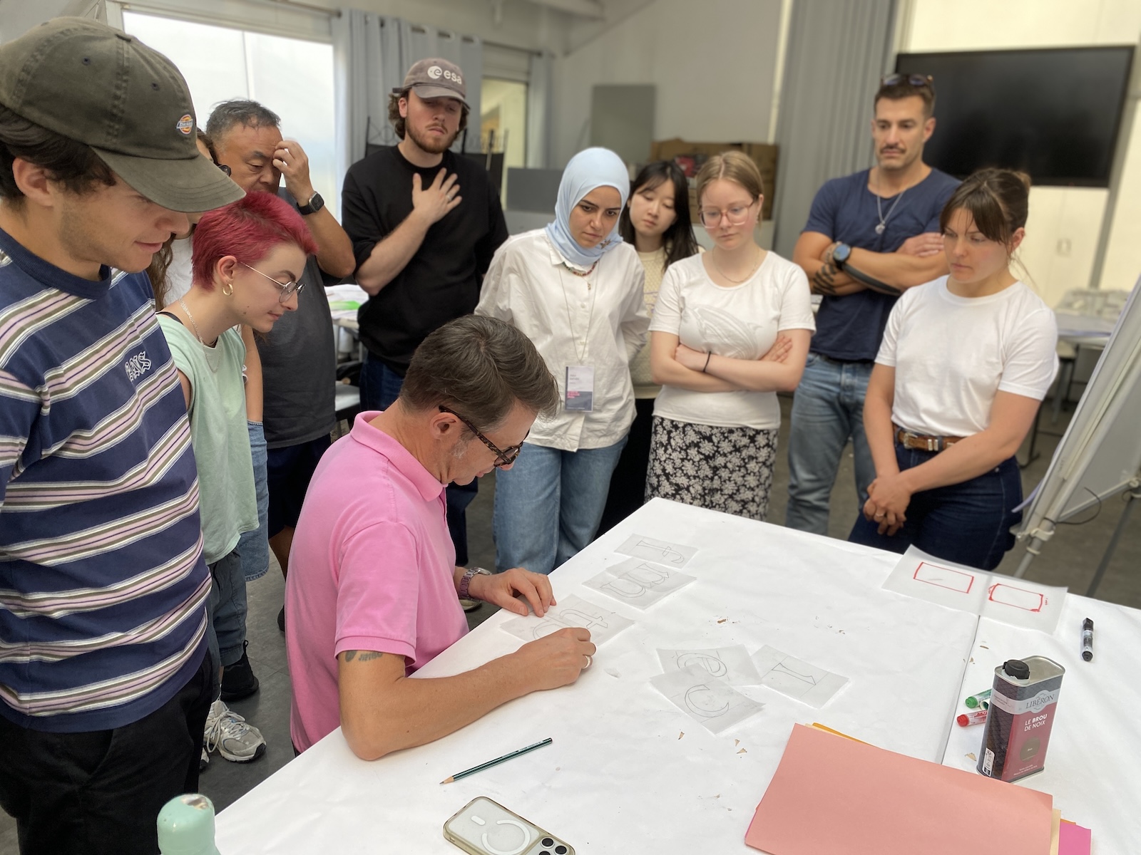
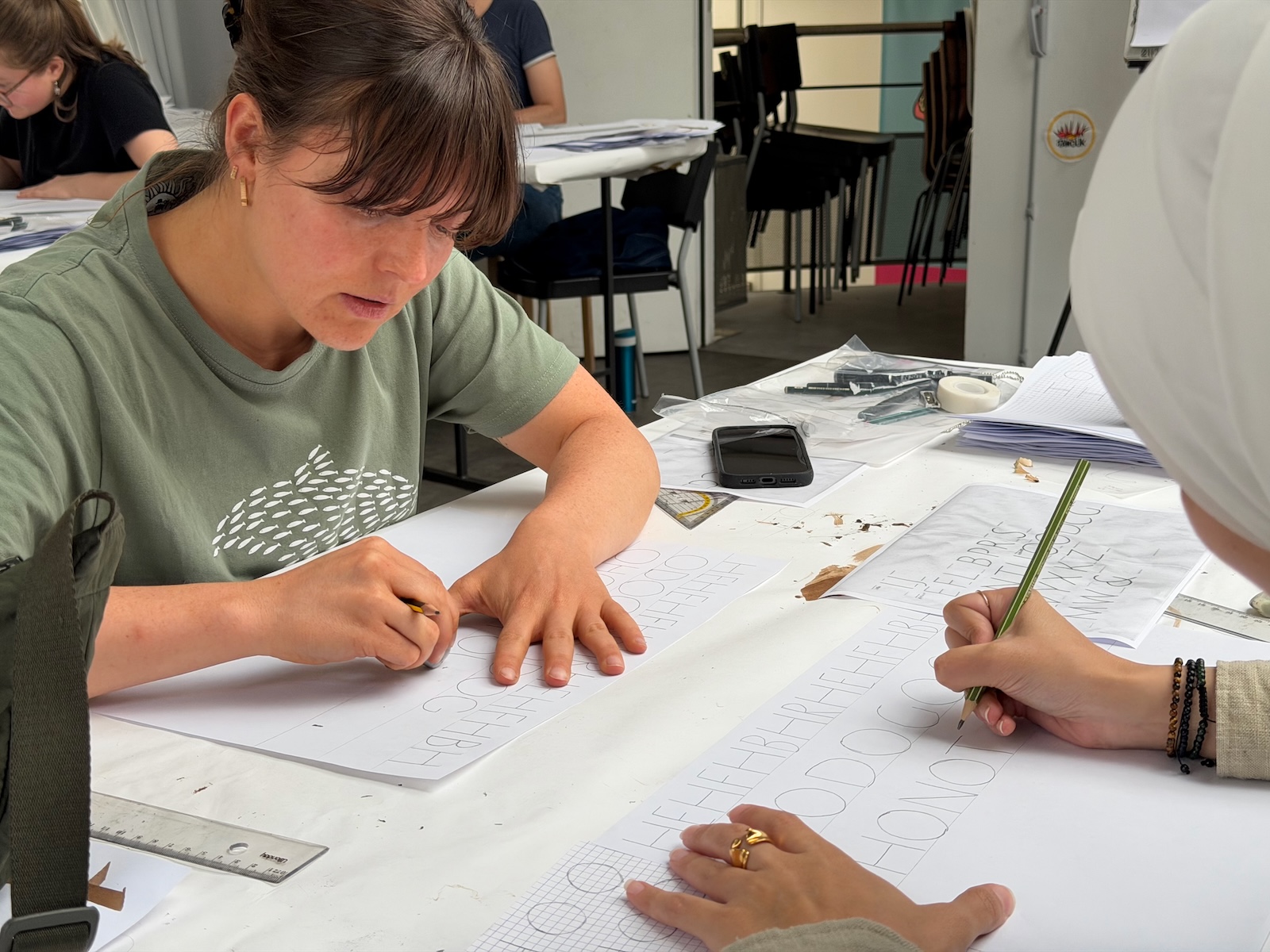
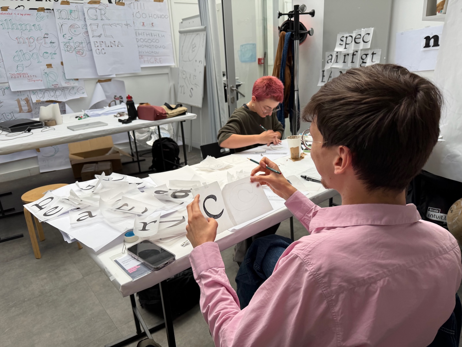
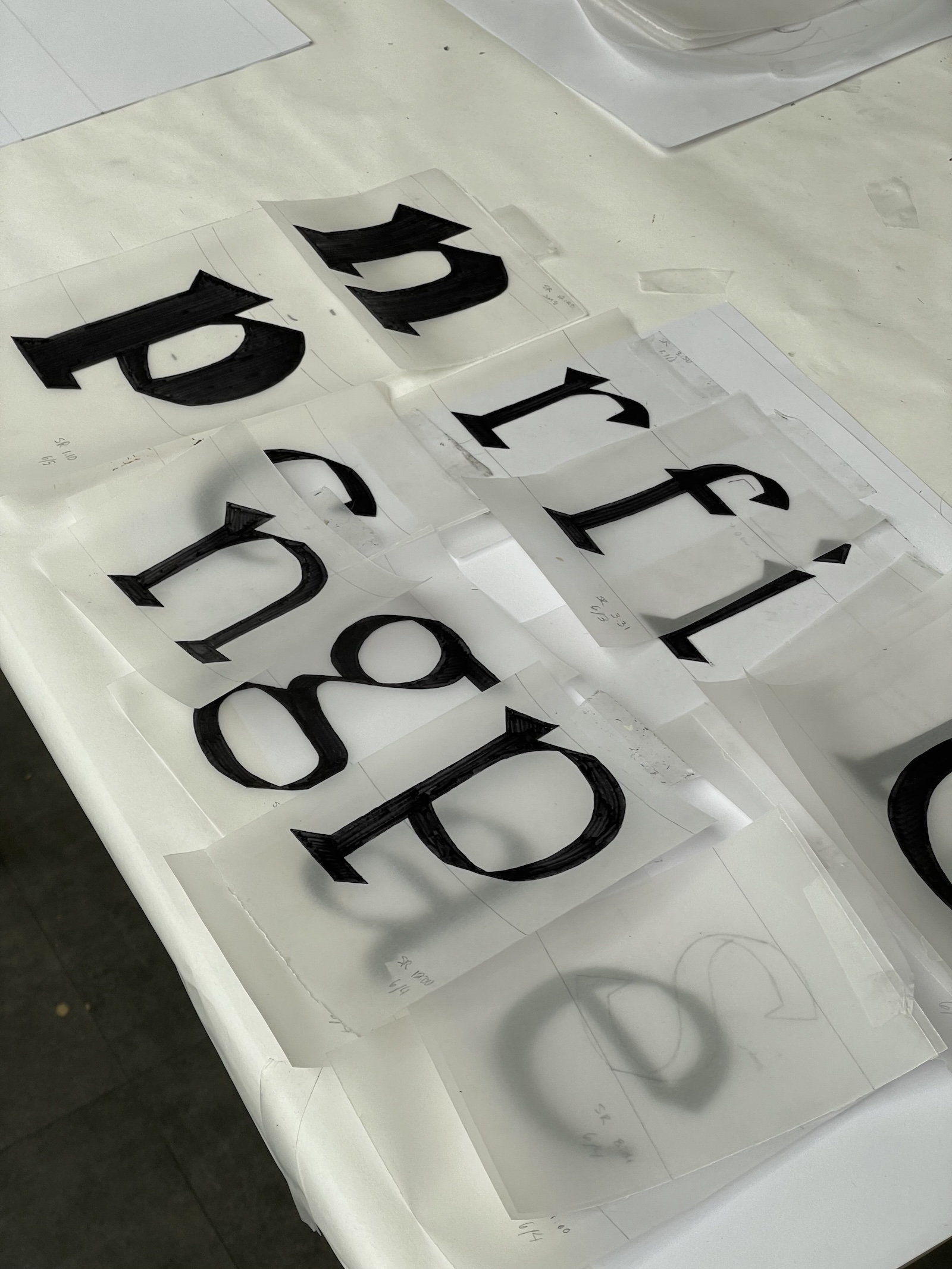
The first challenge was to understand that the humanist alphabet is modular, a bit like the geometric alphabets of the Bauhaus. The big difference is that the Bauhaus alphabets are based on the square, round, and triangle, while Renaissance modular typefaces are influenced by the shapes produced following writing models and tools. This method helped to discover the importance of counterforms drawn on an oblique axis. The primary goal was to encourage holistic thinking and to understand all shapes as part of a unified modular system. The ductus of the humanist calligraphy is essential in this aspect.
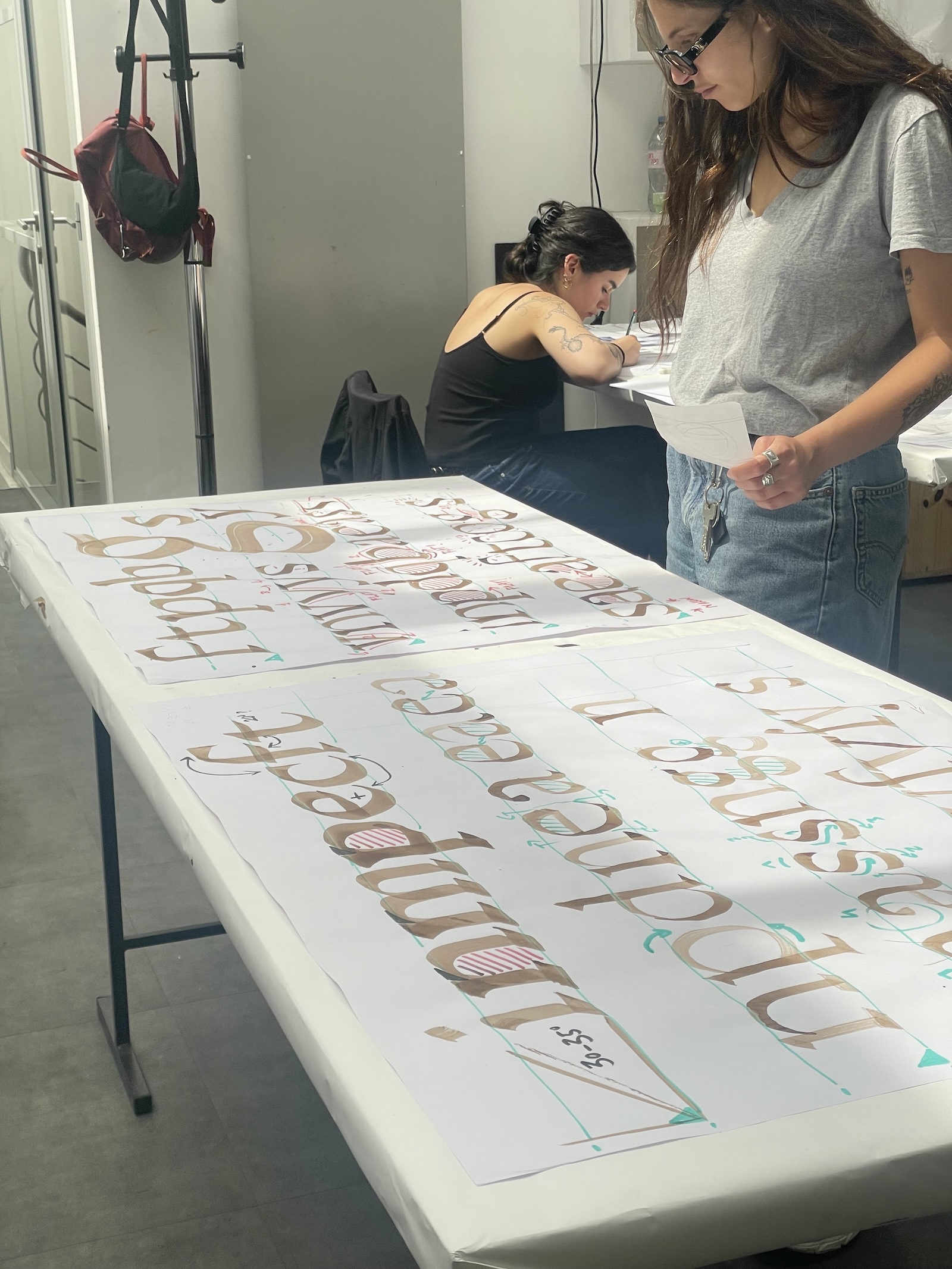
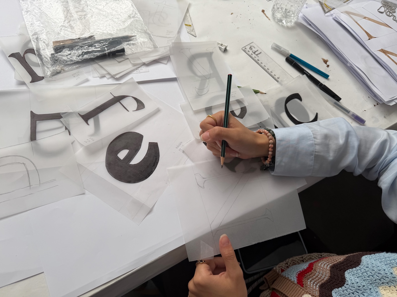
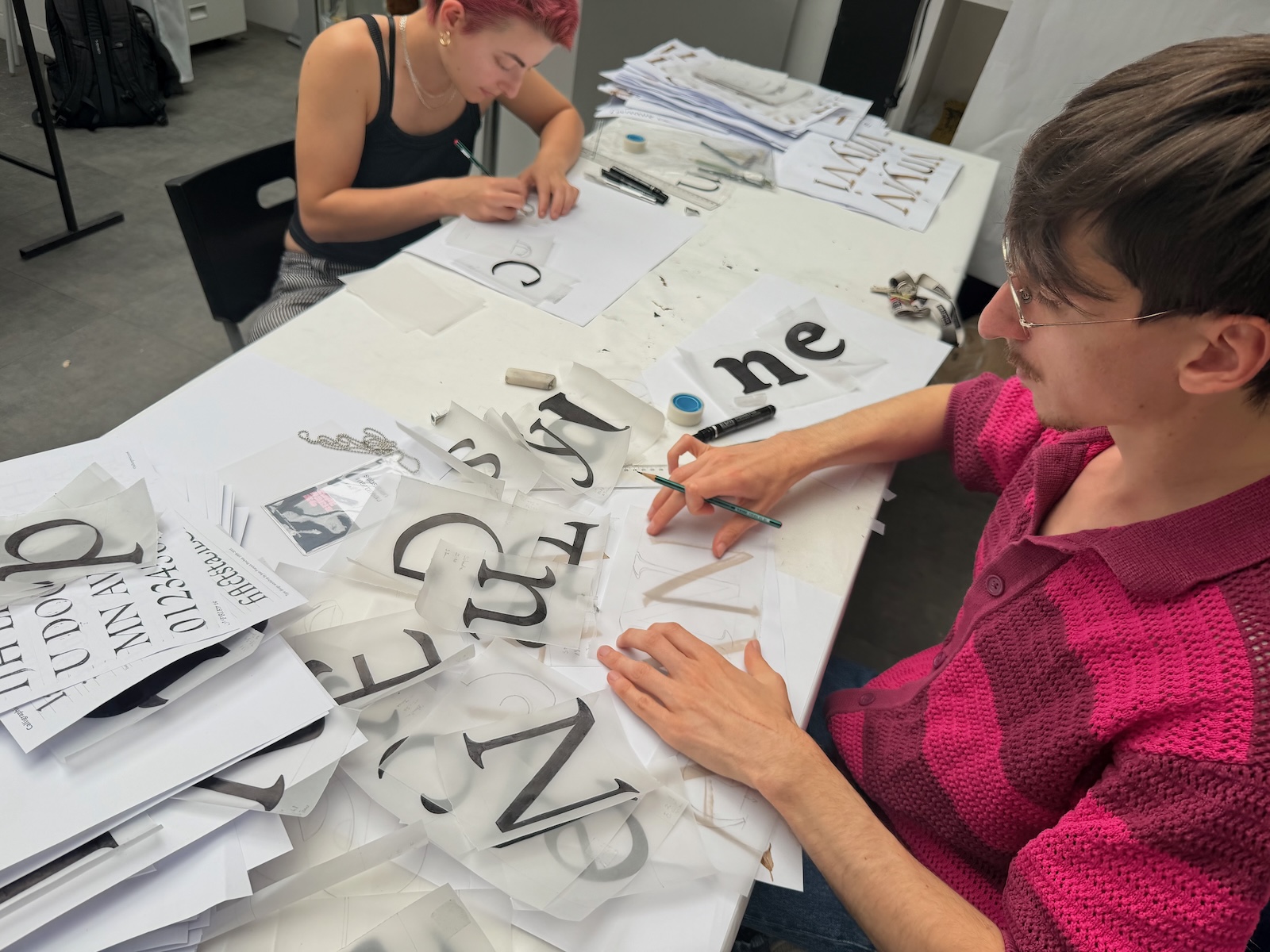
Following the traditional hand-drawing technique from the 60s
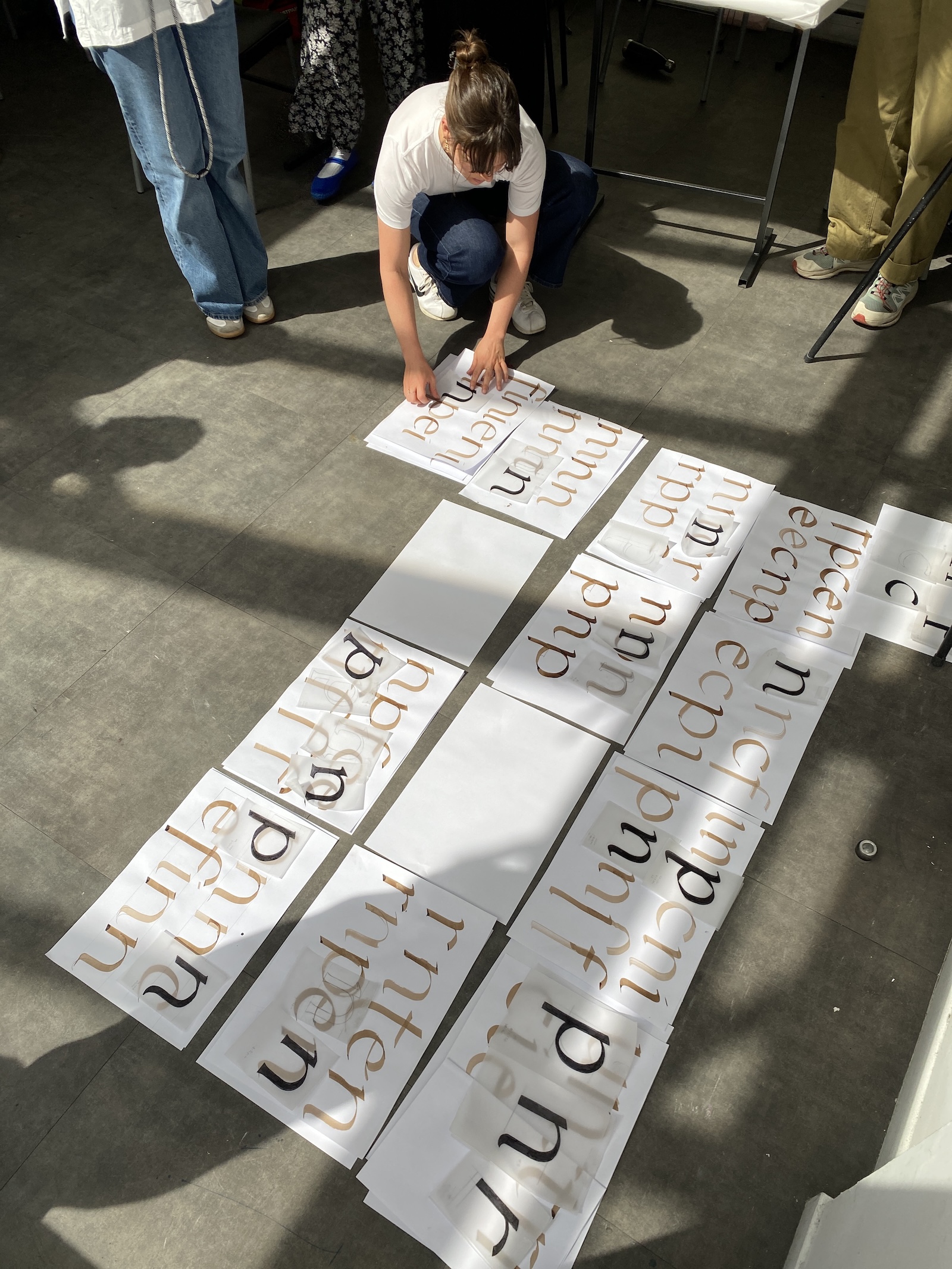
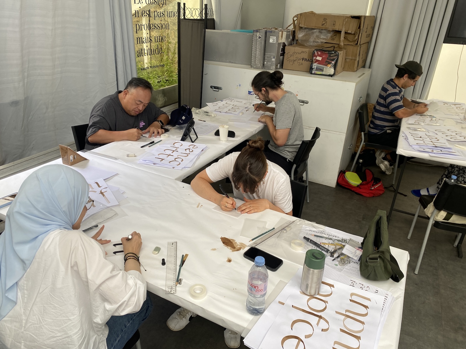
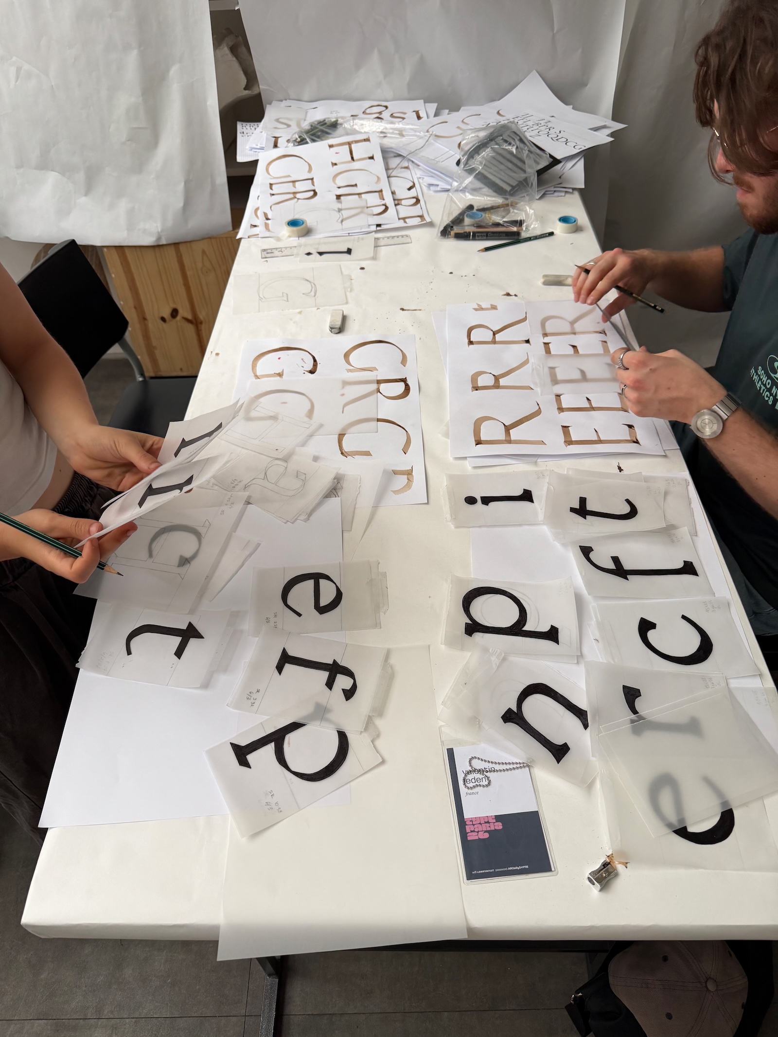
On the first day, attendees embarked on a journey from small-size calligraphy to large-size humanist calligraphy. They drew the finest letterforms from their own humanist calligraphy onto tracing paper, following traditional hand-drawing technique developed in France from 50s and 60s. This allowed them to grasp the structure of their letters, stabilise and refine their shapes, and carefully study and reconstruct letter proportions, including good curves, weight, contrast, endings, and serifs.
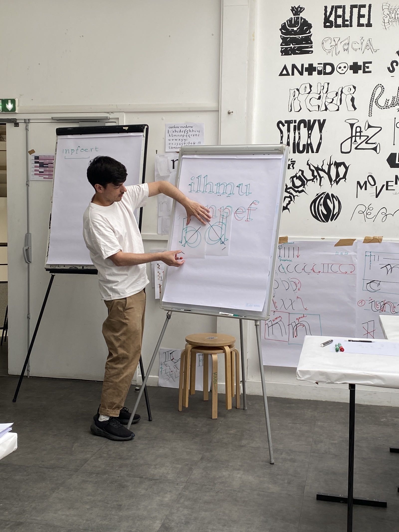
Type design involves creating interconnected systems
We also discussed the evolution of typeface attributes and axes of a design space in type design: contrasts, weight modulations, serifs, terminals, etc.
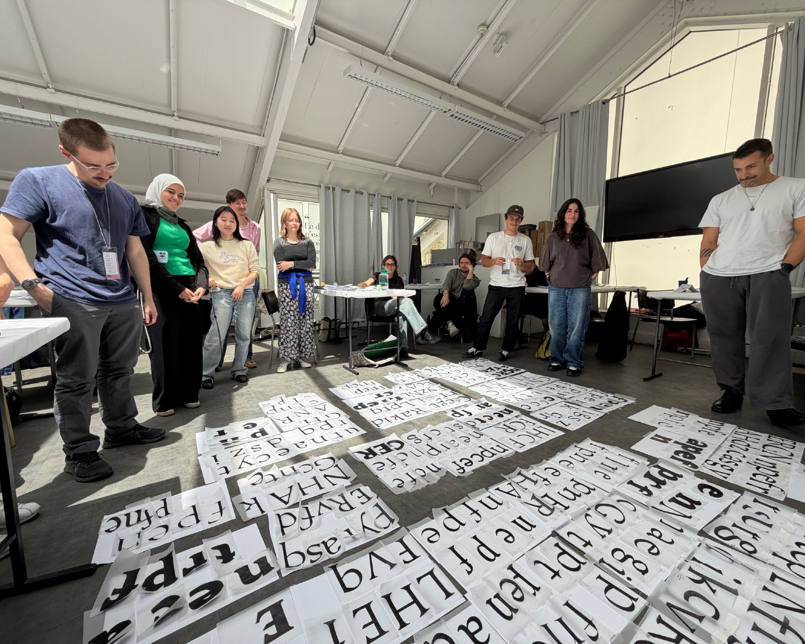
Building upon their humanist typeface, attendees expended their design on Black, High Contrast, and Condensed, Slab serif versions. The idea is that it was clear for all – as examples – that a terminal ending can adapt to different contexts or how the same serif needs to be delicate in a High Contrast version but thick and short in a Black weight for text, but remaining coherent.
The objective was to understand how the design of a font not only is about drawing shapes, but also about creating a multitude of systems that must work together.
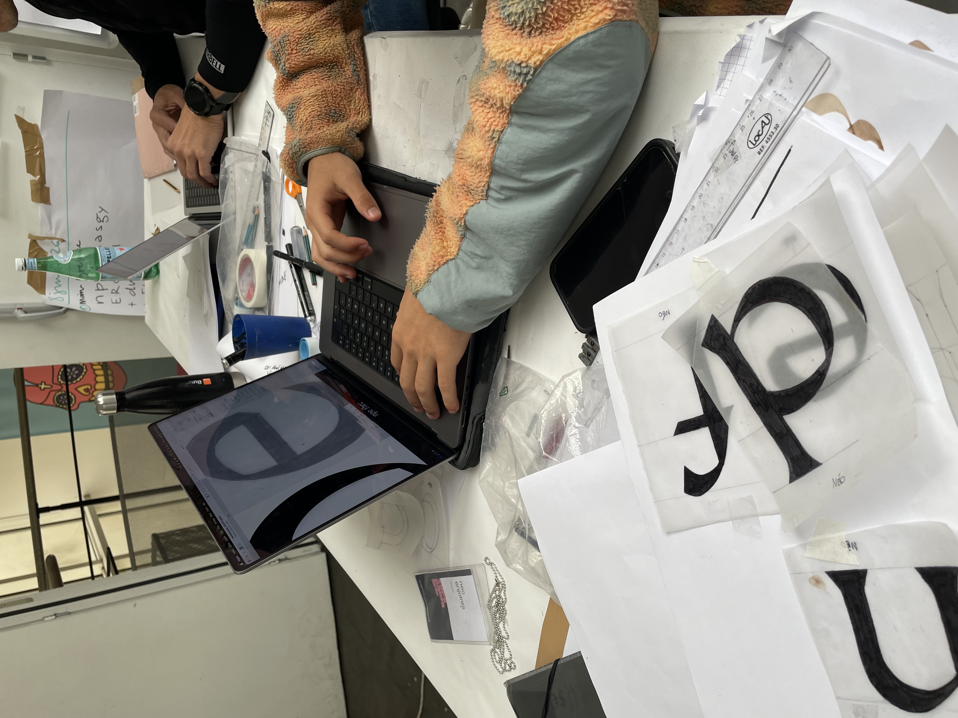
Towards the end of phase 1, some of these many drawings were digitised using Bézier curves using Glyphs app in a professional way, learning interpolation, and the basis of variable fonts.
Creating a consistent typeface brief
It’s time to wrap up the first phase of TypeParis Summer26 and get ready for the exciting second phase. Attendees have been working hard to create a consistent typeface brief that will guide them for the next four weeks. To make sure everyone has everything they need, attendees visited the Typofonderie library in Clamart. I helped them find some really cool resources that will be super helpful for the upcoming personal typeface projects. Are you keeping up with us for phase 2?