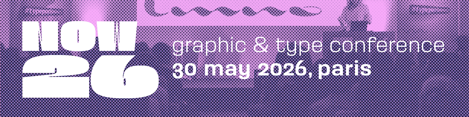
Mark your calendars for Saturday 30 May 2026! The Now26 conference is happening in the beautiful city of Paris. It’s going to be an epic event, with a mix of inspiring speakers covering a wide range of topics like graphic design, web design, motion design, publishing, visual identity, communication, and type design. If you haven’t already, don’t miss out on the best rates by registering now!
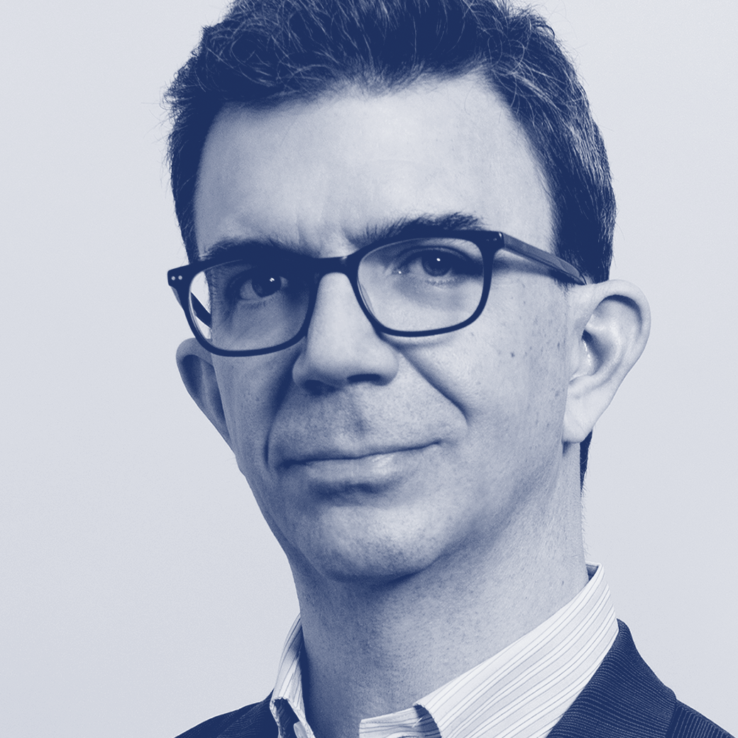
We would like to invite you to explore the profiles of our esteemed guests. Discover the captivating interview of Tobias Frere-Jones.
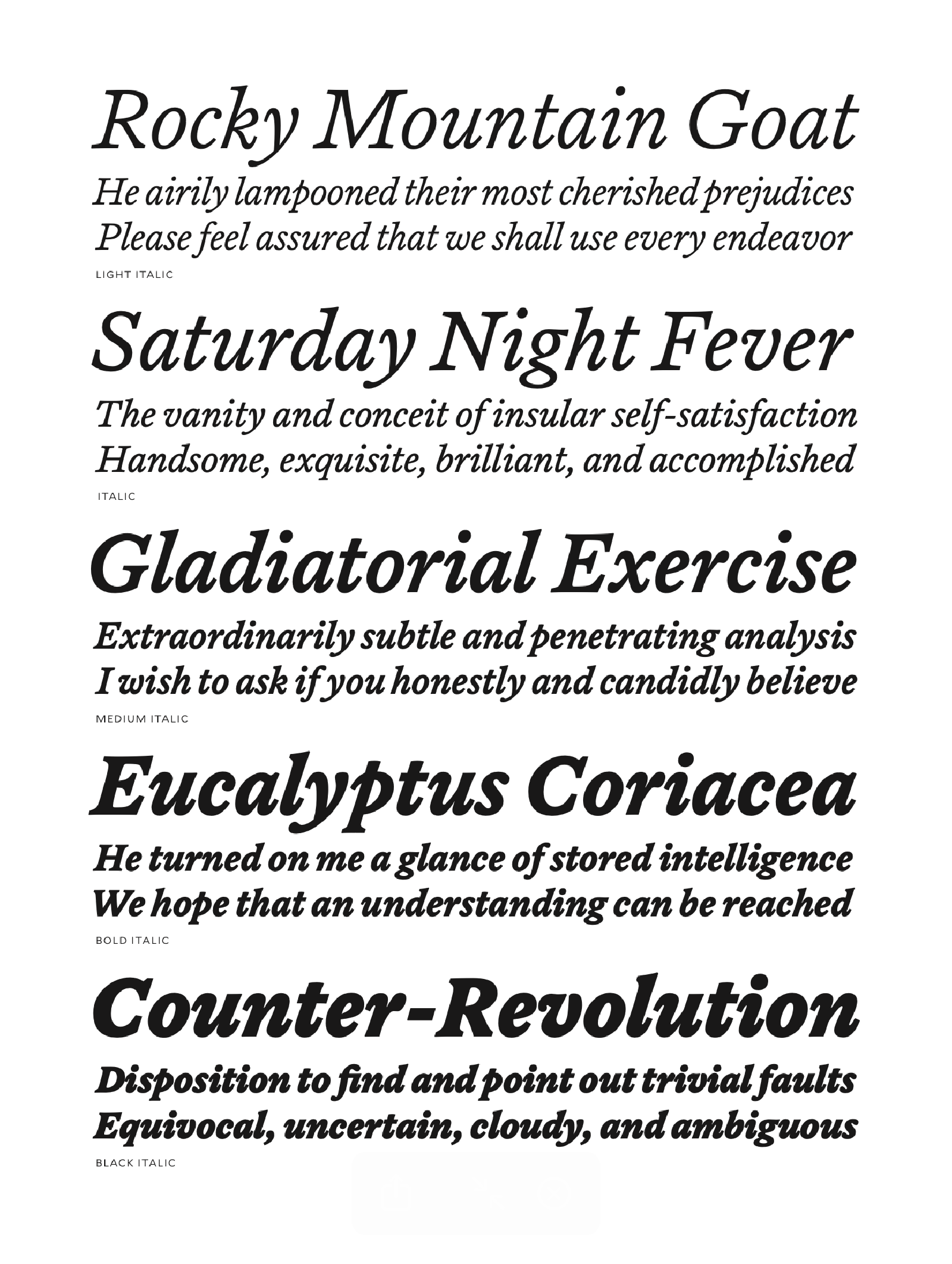
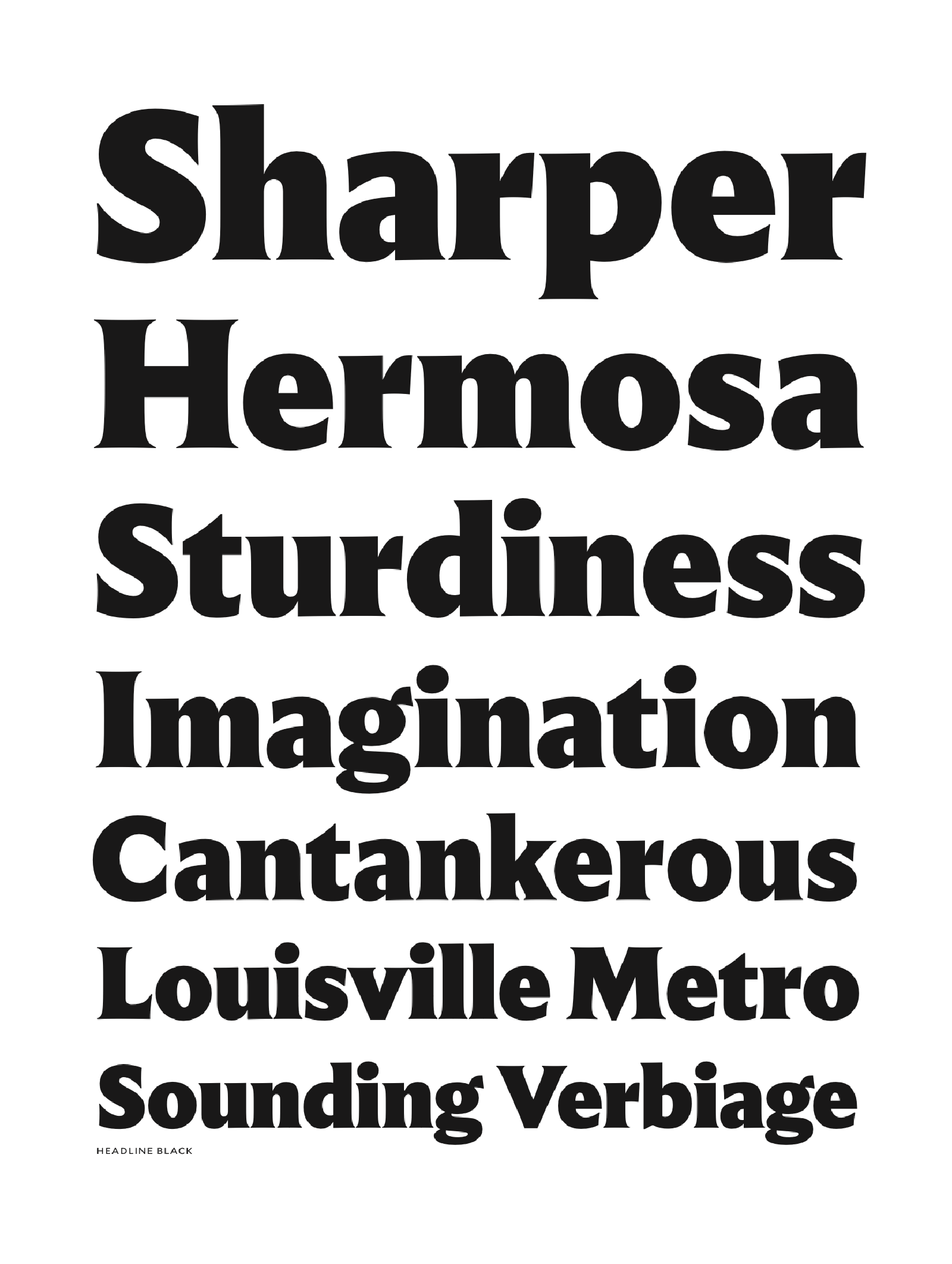
Biography Over 35 years, Tobias Frere-Jones has become one of the world’s leading typeface designers, creating widely used fonts such as Interstate, Gotham, and Whitney. A graduate of the Rhode Island School of Design, he has taught at the Yale University School of Art since 1996. His work is held in the collections of the Victoria and Albert Museum and the Museum of Modern Art, and he has received major honors including the Gerrit Noordzij Prijs, the AIGA Medal, and the 2019 National Design Award from Cooper Hewitt.
Interview
How do these daily habits and interests influence your creative process in typography?
Tobias Frere-Jones It always starts with coffee — Christine is a bit of a coffee nerd. I like online archives about history — maps, newspapers — especially New York City. Some of it eventually connects to typography, much of it doesn’t. I like to study the past beyond the famous names and the official narratives. [about music] I find it hard to listen to words and draw letters at the same time, so it’s almost entirely without vocals. Mostly abstract and glitchy electronic.
“Don’t try to put all your ideas into the same design. It will become very hard to clearly see your objective. Give your ideas the space to grow on their own.”
– Tobias Frere-Jones
What inspires you to design new typefaces or to draw type classic? How do you view the potential impact of AI?
Tobias Frere-Jones I want to make typefaces that actually add to the user’s palette, rather than just being my version of something. It should be an idea or a combination that wasn’t there before, or didn’t behave like that.
For values, we believe it’s important to accurately acknowledge all contributions, whether they’re from colleagues today or figures from history. The customers are also a vital part of the ecosystem too, and they deserve understanding and fair treatment.
I don’t see this as an “either/or” question [about type classics]. We must reckon with the skeletal forms of the alphabet, but also the renditions that past designers have made, and the cultural associations that they bring. Those layers of meaning are inseparable. Perhaps it will make us value actual human input more, assuming we don’t all drown in AI’s slop. Perhaps it can make simple tools, but I wouldn’t trust it to draw anything. Checking and confirming its work will take nearly as long as doing it myself, so what’s the point? It all feels like a response in search of a problem. Nobody asked for this.

What do you think of this trend of free fonts?
Tobias Frere-Jones There are two distinct kinds of free fonts: first are the amateurs and hobbyists, making fonts and posting them to Dafont and similar sites. I think of them as a separate ecosystem of design, not really affecting professional makers and users. They foster a larger, longer-term appreciation of type, and that’s good. Then there’s Google. They can be a positive influence when they make families like Noto, supporting so many writing systems around the world that smaller foundries can’t address. But in the conventional Western market (that is, the Latin-based scripts) Google Fonts has a corrosive effect.
How do references to the vernacular influence your creative process?
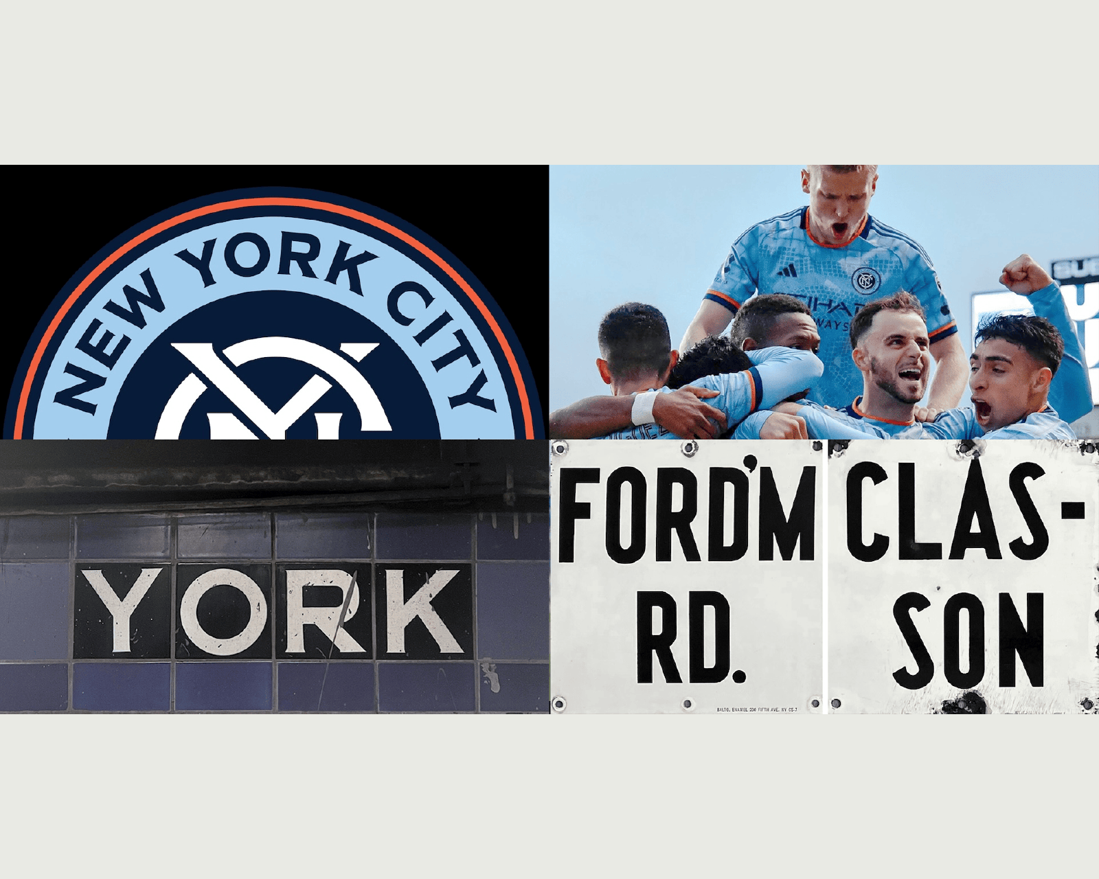
Tobias Frere-Jones I think we’re obligated to work with all of culture as source material, and not just the parts that fit neatly into books on a shelf. That means looking at all of the activity outside type history. It shows most clearly when there’s a chance to point at something recognizable in our shared landscape, like (in the case of Gotham) architectural lettering.
“I get into digital form as soon as possible, so I can see these shapes turning into words. Until then, the shapes are just abstract compositions.”
– Tobias Frere-Jones
Can you tell us what values you consider important to pass on when teaching typography?
Tobias Frere-Jones I taught typeface design at Yale for 25 years, teaching students to be better users by letting them see for themselves what goes into a typeface. Once in a long while a student would go on to be a typeface designer, but that was actually not the aim, it was to create more sensitive and observant users.
Do you remember when you decided to pursue your career in design?
Tobias Frere-Jones As a teenager, I had wanted to be both a painter and a writer, and thought I would eventually have to choose one field and abandon the other. I found typeface design by chance, and realized that it could treat it as the intersection of these disciplines. I decided on this path when I was 17 or so. I got to learn the daily practice of type design from David Berlow at Font Bureau, but also type history from his colleague Mike Parker. But most of all I got to spend many days alongside Matthew Carter as a designer and a teacher, and saw his skill and humility.
During your creative process, do you sketch–draw on paper before moving on to the digital workflow?
Tobias Frere-Jones I get into digital form as soon as possible, so I can see these shapes turning into words. Until then, the shapes are just abstract compositions. So much of the design is in the conversation between the letters, and I can’t see that on paper.
Do you have words of wisdom for someone who wants to become a type designer?
Tobias Frere-Jones Don’t try to put all your ideas into the same design. It will become very hard to clearly see your objective. Give your ideas the space to grow on their own. I’m very happy to see more designers from outside the West. I recently visited Vietnam and saw some really exciting work from designers like Đông Trúc Nguyễn. I’m also seeing more designers starting their careers outside the Latin alphabet, in South Asian scripts or Arabic.
“I want to make typefaces that actually add to the user’s palette, rather than just being my version of something.”
– Tobias Frere-Jones
What will be the message you would like to convey during your talk?
Tobias Frere-Jones That type can create a sense of place, a kind of accent to be recognized.
What other speaker wouldn’t you want to miss at Now26?
Tobias Frere-Jones Flavia Zimbardi. With projects like Women in Type, she’s playing a leading role in supporting women type designers and promoting their work. The industry is becoming more inclusive but does not have enough women in leadership positions or sufficiently recognizes their valuable contributions.
Thank you very much Tobias!
– Interview by Benjamin Rouzaud
Register to the graphic & type conference in Paris ➼ Now26 conference
Learn more about TypeParis
➼ Type & graphic designers interviews
➼ Summer26 programme
➼ Reports
➼ Attendees feedback series