Seraphine
Seraphine is a revival of the Didot typeface family that brings elegance and sophistication and is well-suited for both modern and classical designs. Its modern take on Didot’s high contrast and vertical stress offers a timeless yet contemporary feel, suitable for versatile typographic applications.
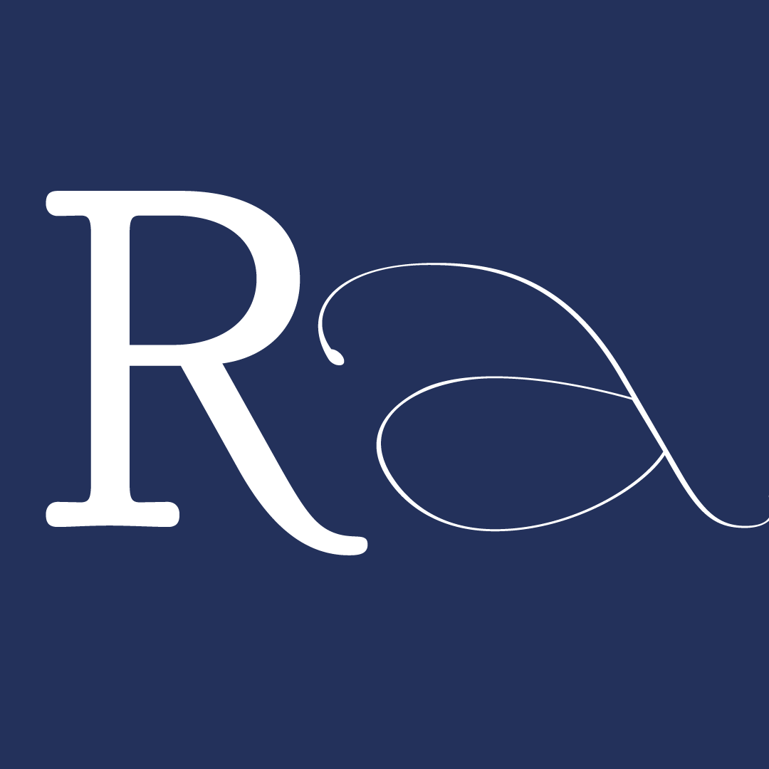
The process started with a selection of basic letters n, p, e and f as well as with the selection of the most iconic and beautiful letterforms such as a or g. The next step was to trace the selected letters on tracing paper. Each letter was traced (and many of them refined after feedback from our instructors) to capture the essence and details that define Didot’s aesthetic.
Once the initial tracings were complete, they were scanned at a high resolution to ensure a smooth process of digitisation. These scans were then imported into Glyphs, in order to commence the transformation from physical to digital. In Glyphs, each letter was digitized, creating clean vector paths that would form the foundation of the Seraphine typeface.
However, digitizing the letters was only the beginning. To create a cohesive and versatile typeface family, further adjustments and refinements were required. Afterwards, some creative masters were created in order to get a solid base for further interpolation and gain new typeface weights.
The Seraphine Family is a comprehensive family consisting of multiple weights and styles designed to meet diverse typographic needs. It is a result of the interpolation of four creative masters varying in contrast and weight. That led to 15 new unique typefaces which were narrowed down to the final selection consisting of the following typefaces:
Seraphine Regular: The foundation of the family, ideal for body text in both print and digital media.Seraphine Bold: This weight adds emphasis and strength to headlines and prominent text. Seraphine Condensed: A sleek and narrow design perfect for tight layouts and sophisticated designs. Seraphine Display: High-contrast and dramatic, ideal for titles, posters, and luxurious branding. Seraphine Title: perfect for headlines and highlighted text.
Each weight in the Seraphine family is designed to work harmoniously together, providing designers with a versatile toolkit to create various typographic compositions. Whether used individually or combined, the weights and styles of Seraphine offer a cohesive and elegant solution.


The 6-week type design programme that you’ve been waiting for starts on 2 June and ends 10 July 2026.


Open to all Our summer programme is in English and covers typeface design and calligraphy techniques, type history, and software practices. Whether you’re a design pro or just curious about type design, you can learn all about it in a relatively short amount of time.
➼ Subscribe to our mailing list to don’t miss important updates.