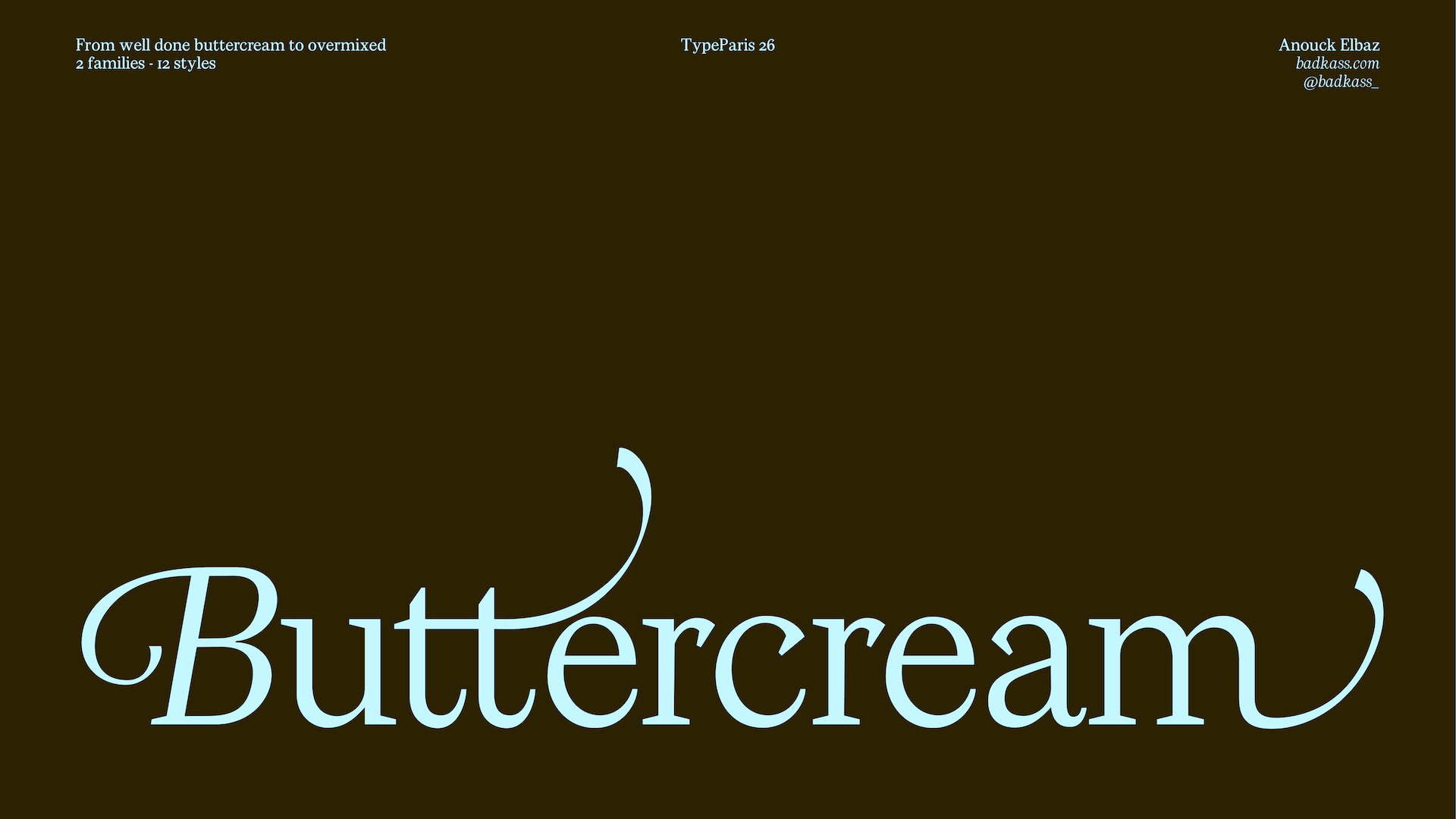
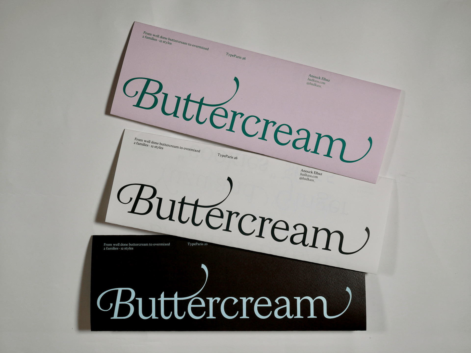
Buttercream
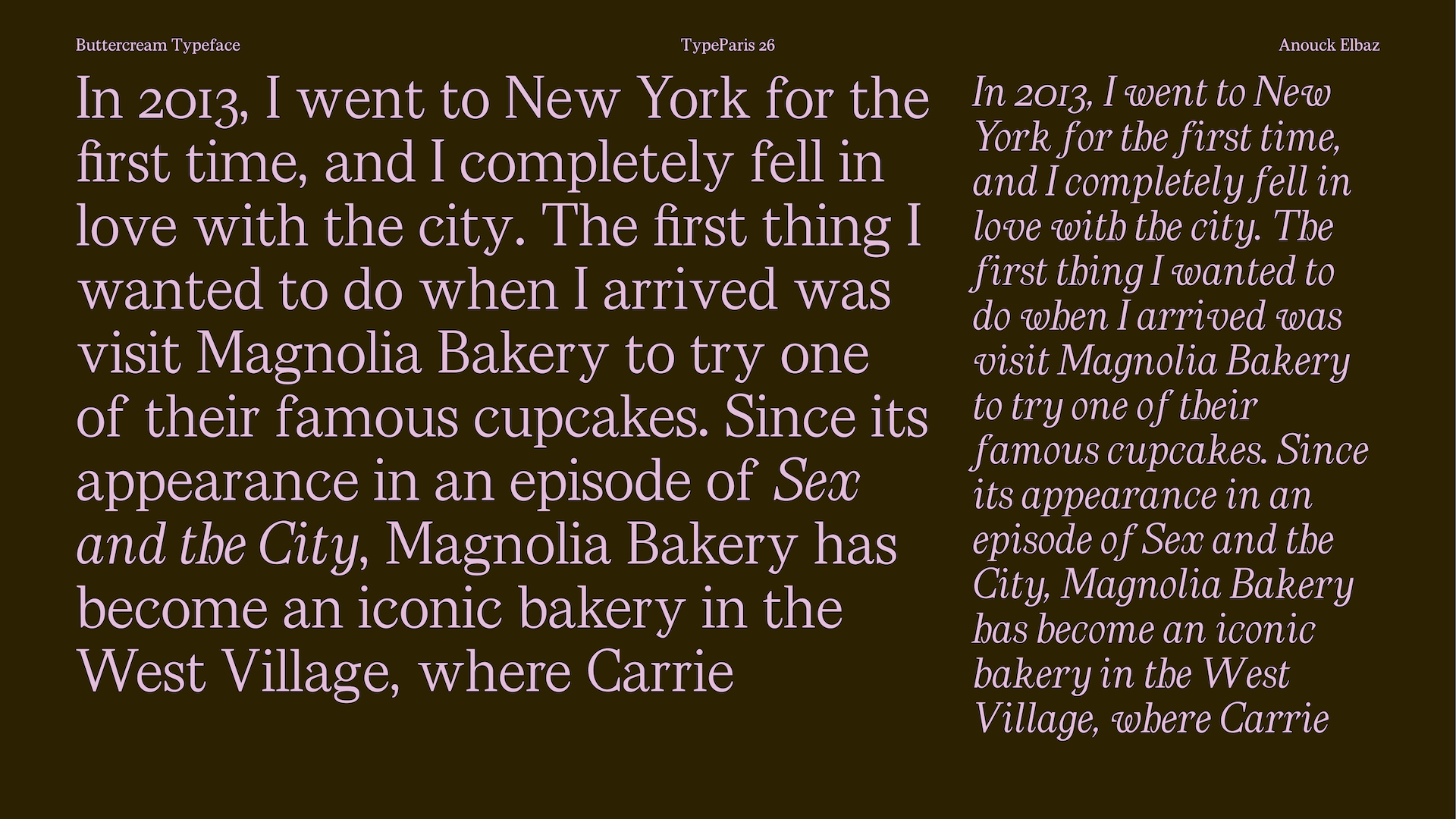
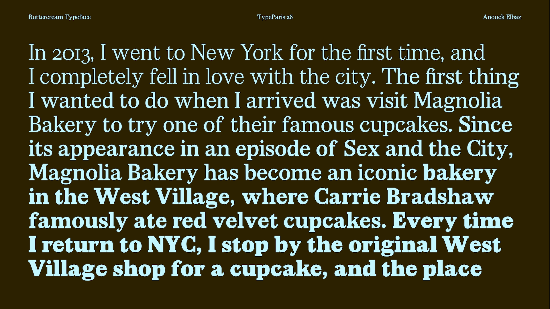
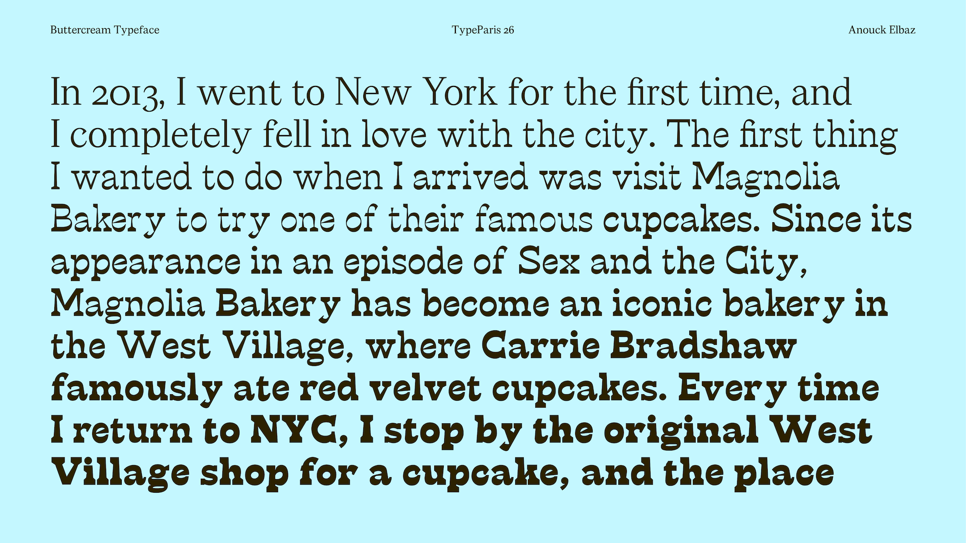
In 2013, I went to New York for the first time, and I completely fell in love with the city. The first thing I wanted to do when I arrived was visit Magnolia Bakery to try one of their famous cupcakes.
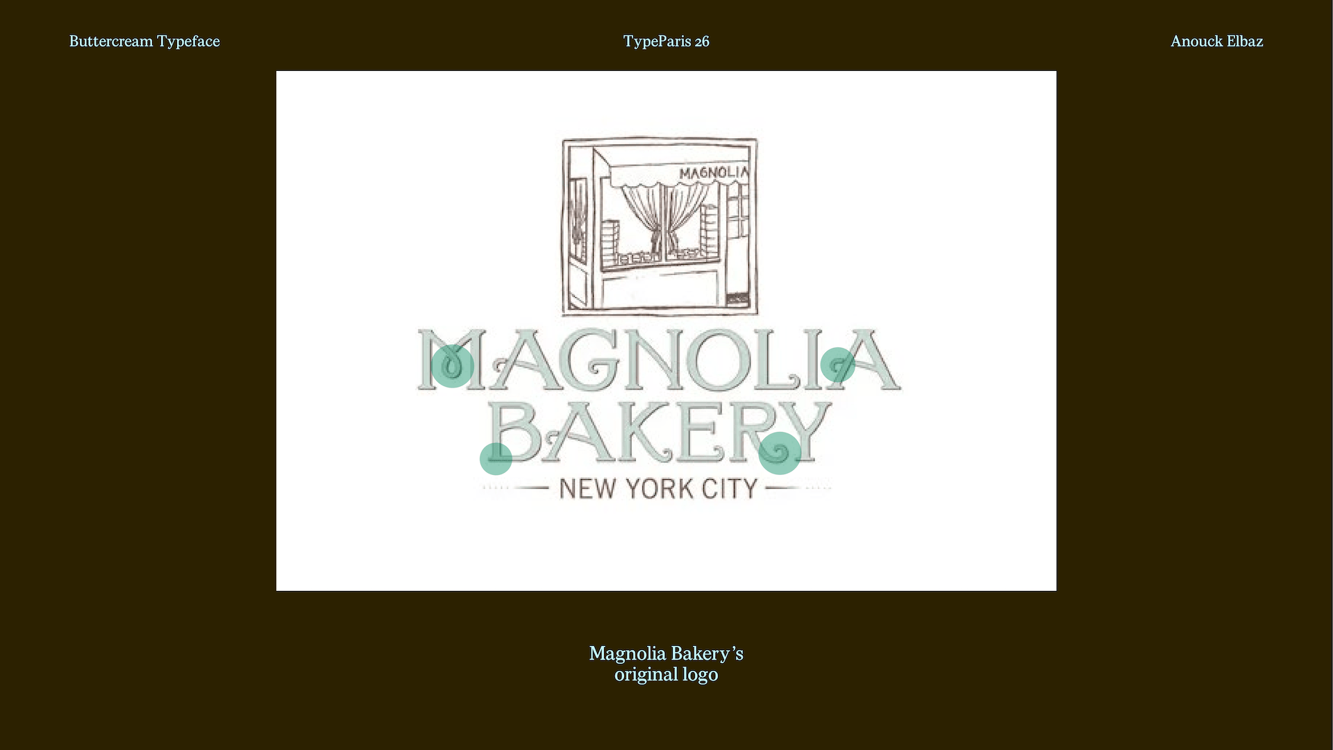
Since its appearance in an episode of Sex and the City, Magnolia Bakery has become an iconic bakery in the West Village, where Carrie Bradshaw famously ate a red velvet cupcake. Every time I return to NYC, I stop by the original West Village shop for a cupcake, and the place never seems to have changed. Despite its popularity, the original bakery has remained remarkably unchanged: the same small, unpretentious shop and the same slightly dated interior.
Because I’m passionate about baking and TV shows, I wanted to design a typeface that would reflect the original aesthetic of Magnolia Bakery.
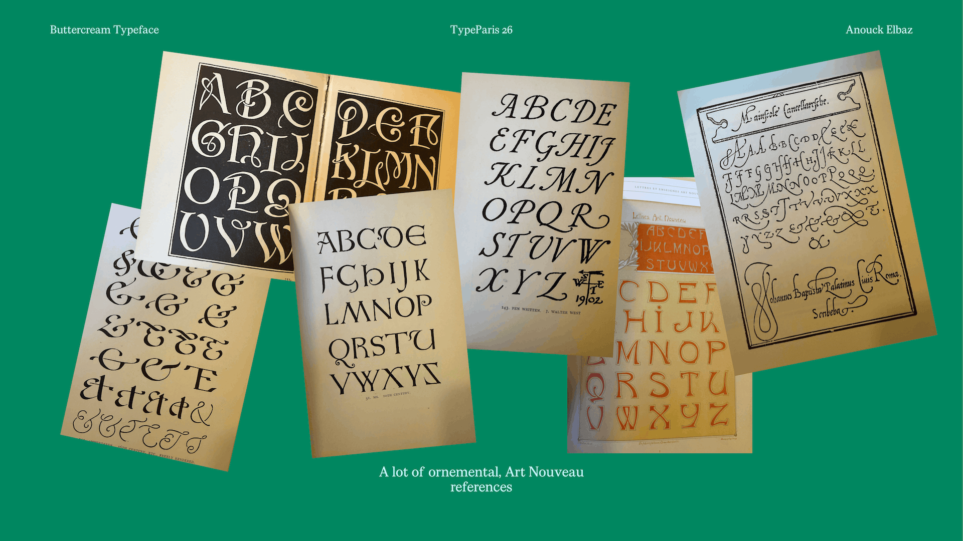
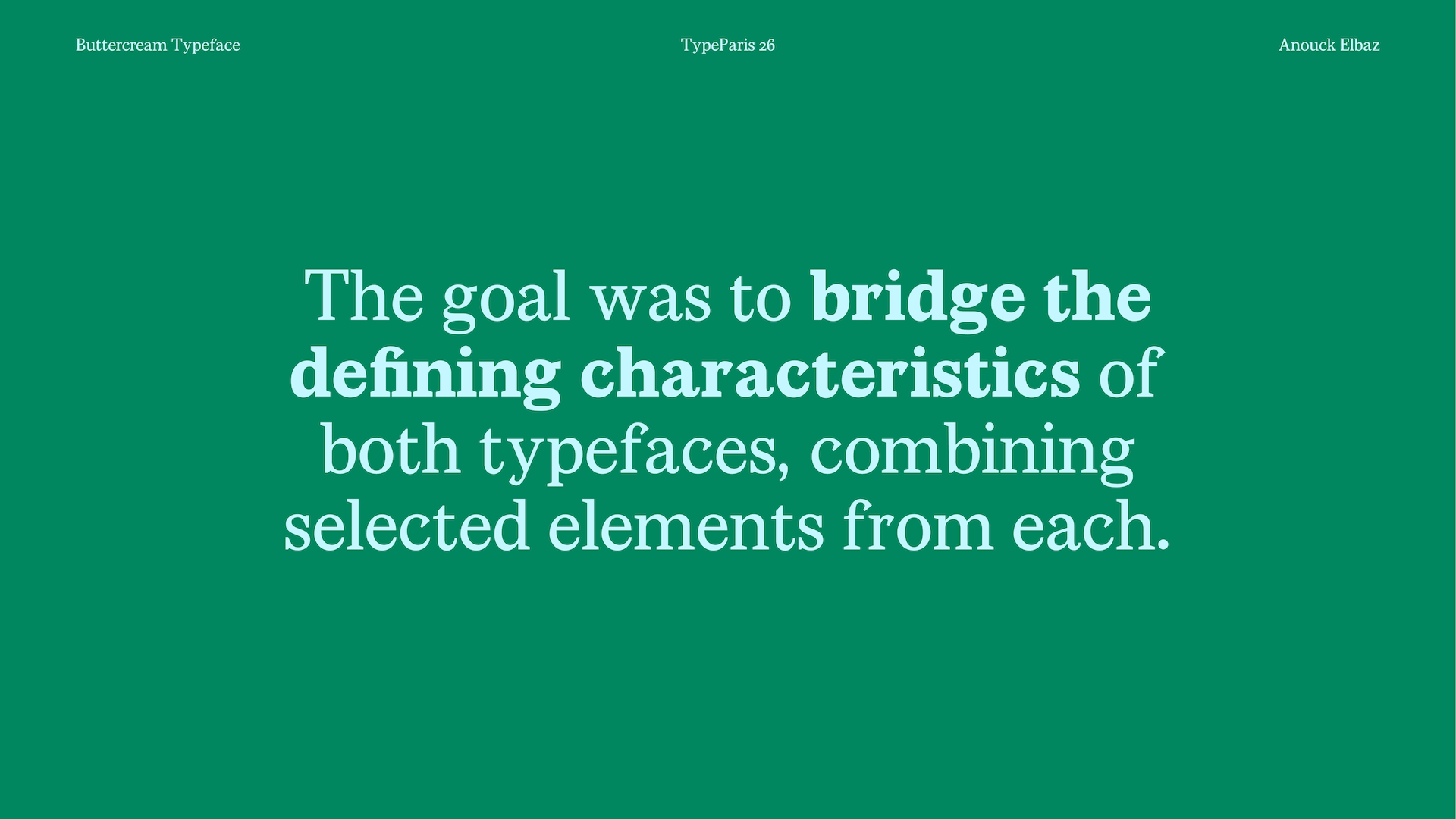
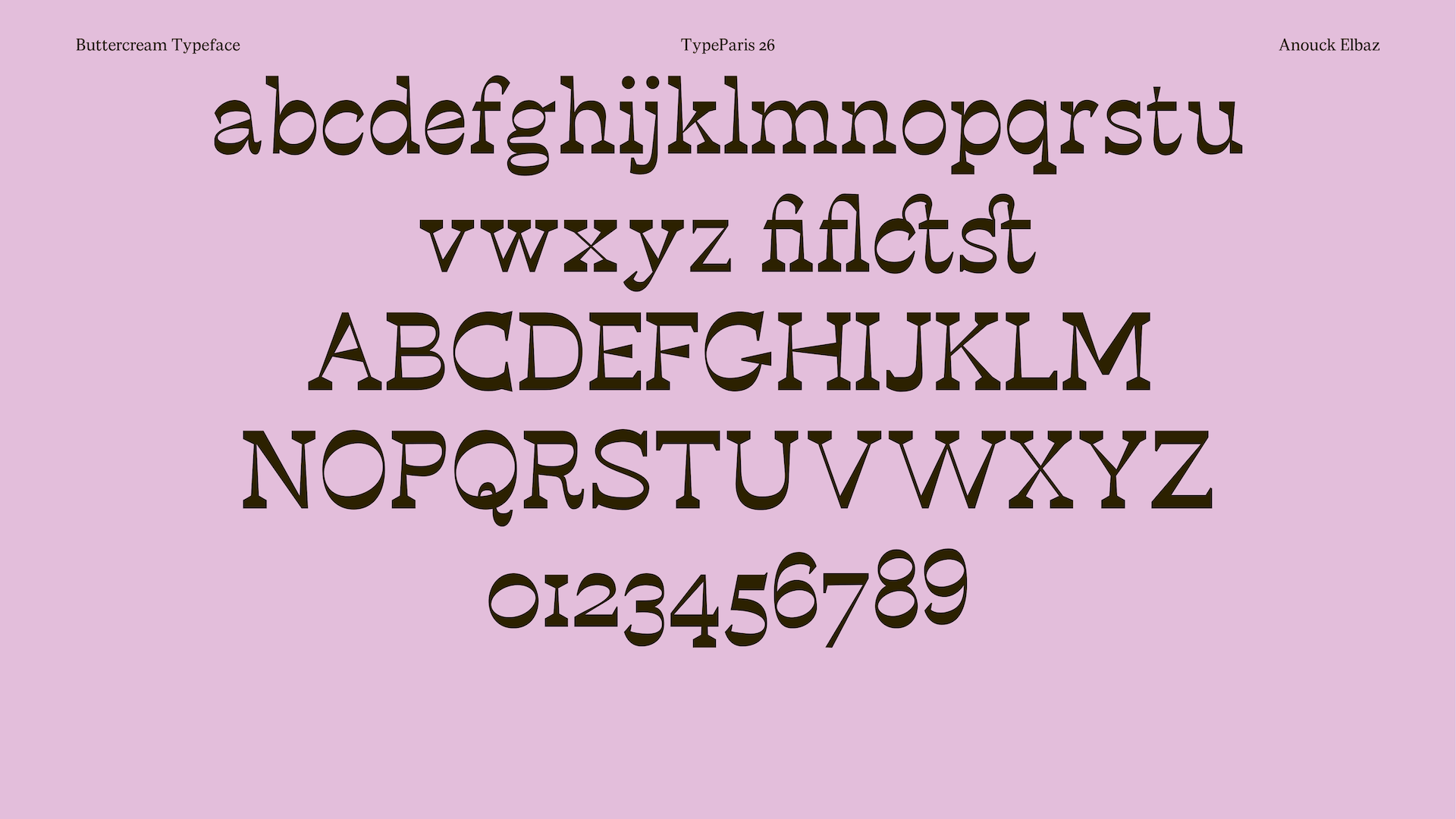
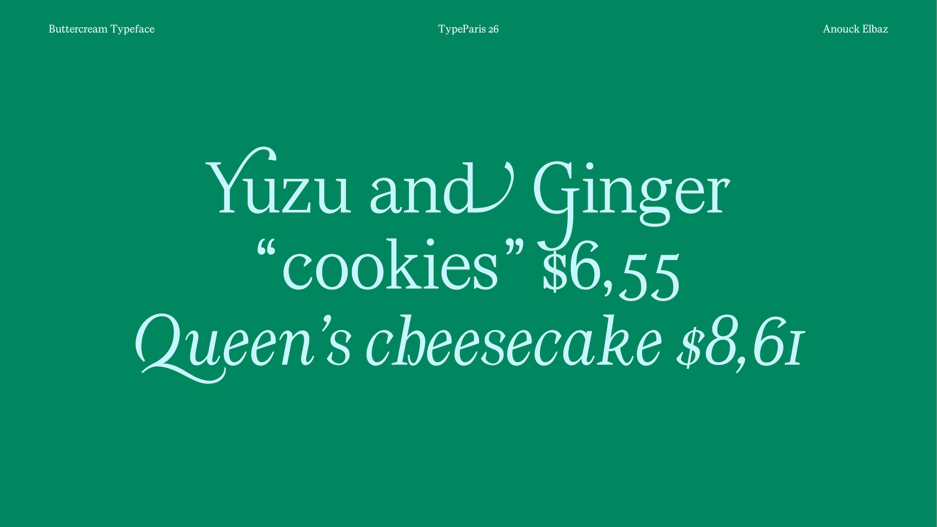
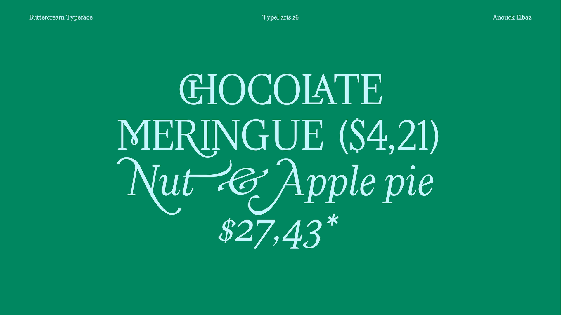
My project takes inspiration from slab serifs (for the industrial New York reference), traditional Roman typefaces (for their handcrafted spirit), and ornamental scripts and Art Nouveau typefaces (to reference the ornamental quality of Magnolia Bakery’s original logo).
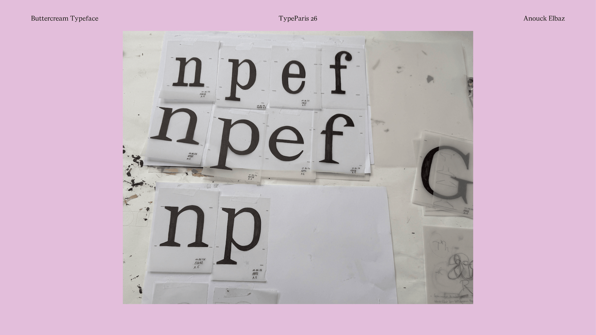
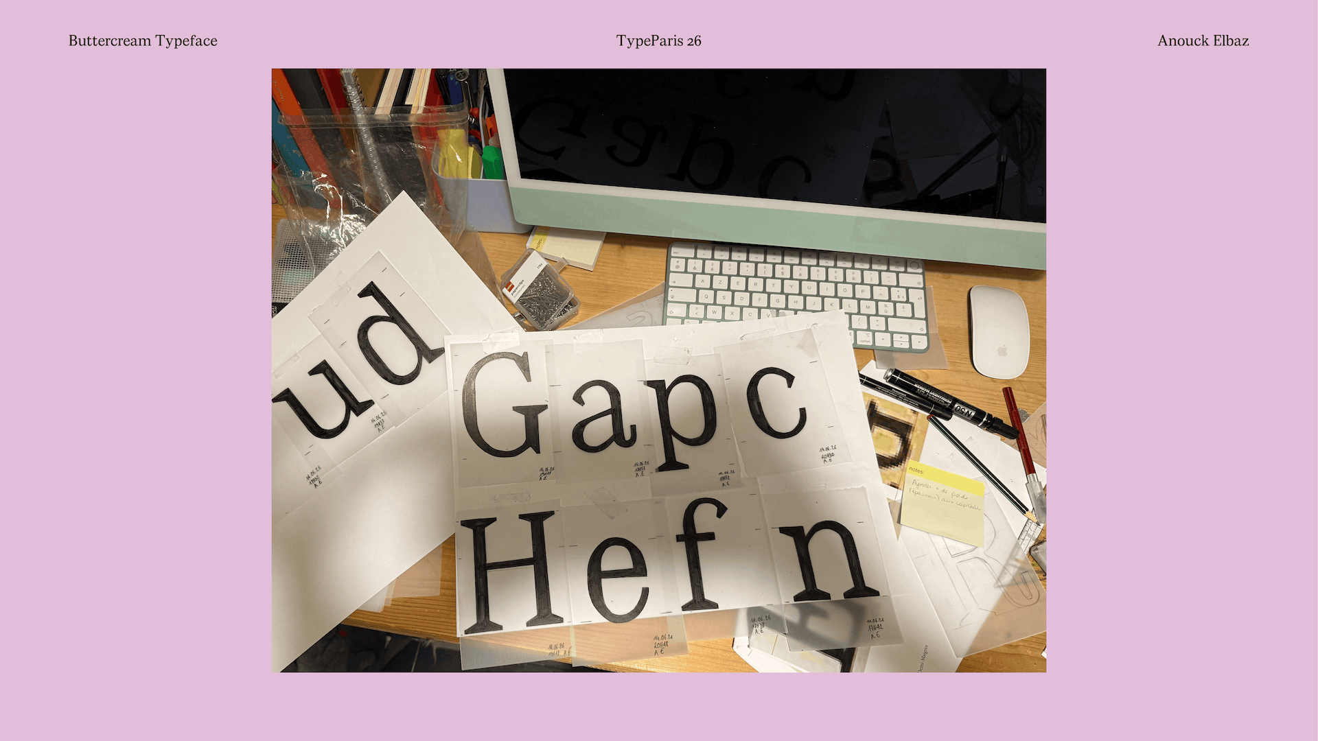
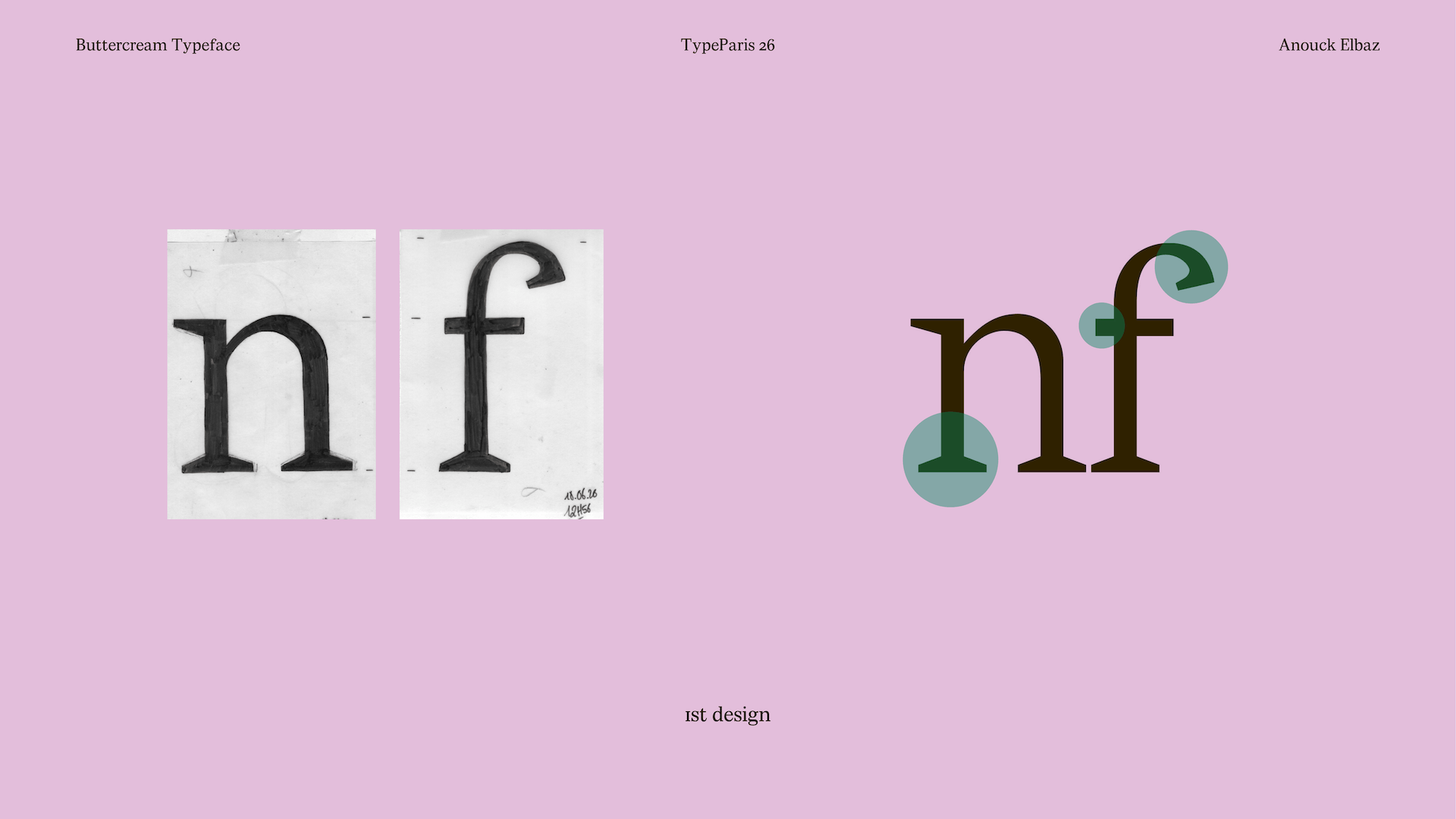
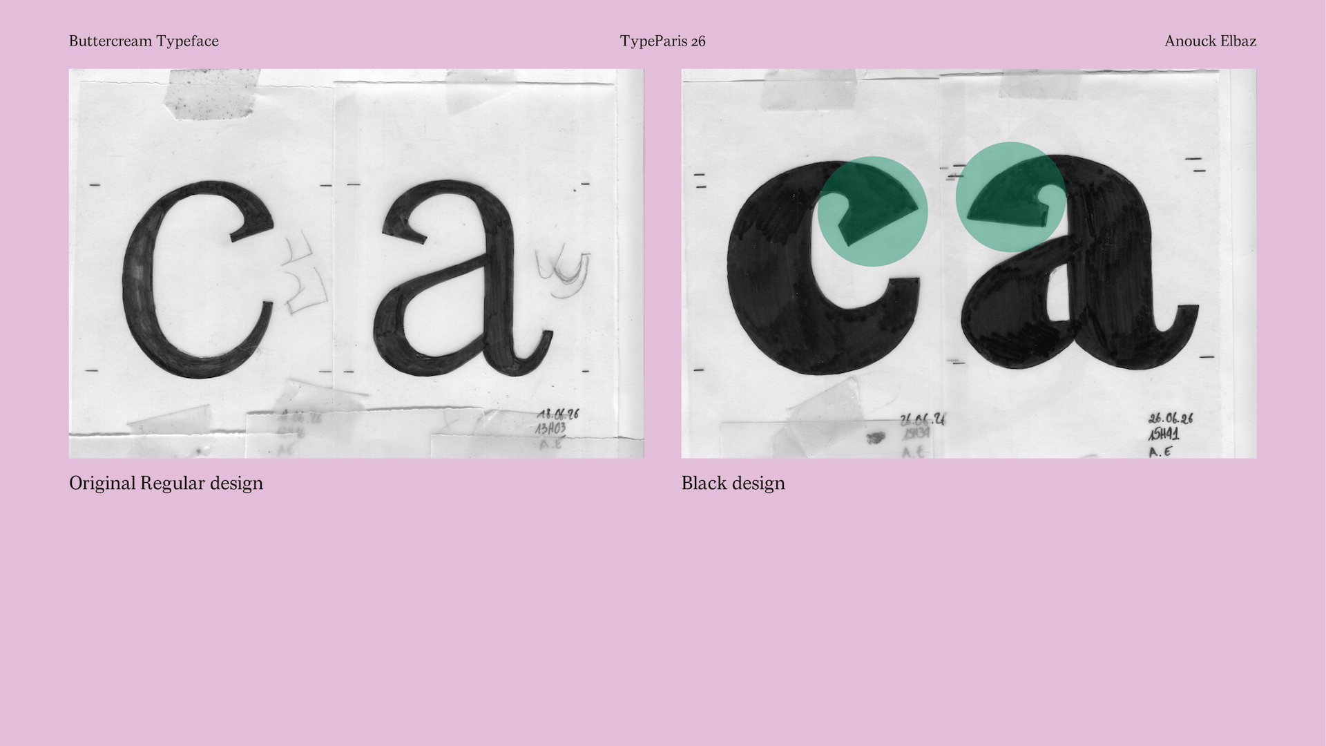
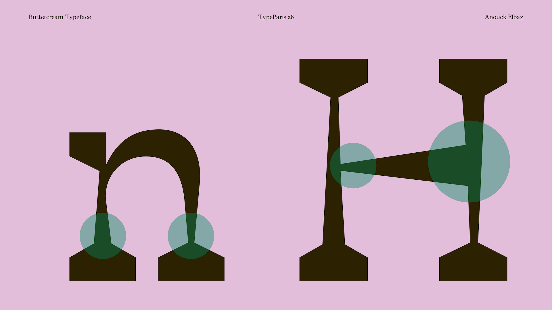
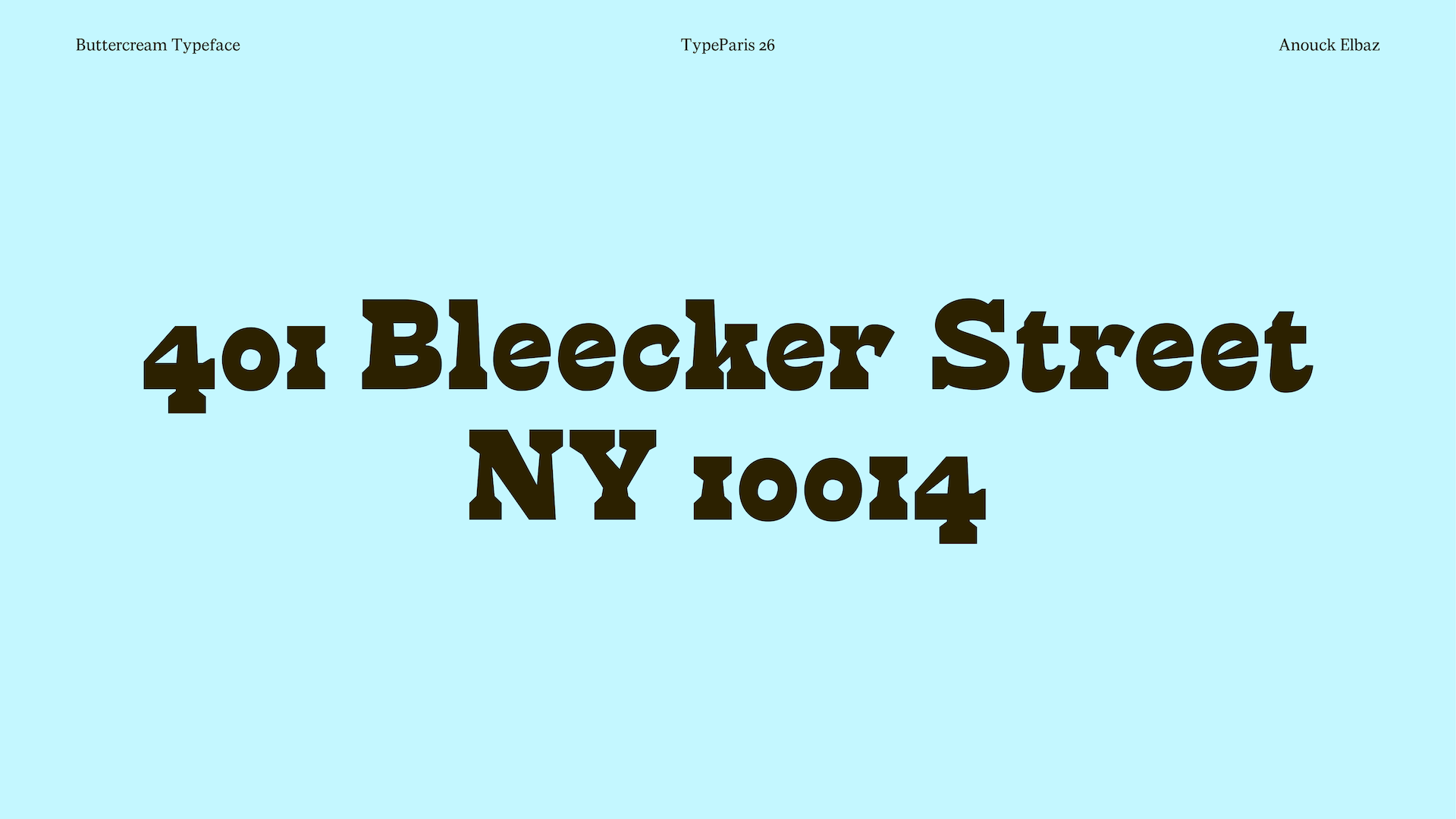
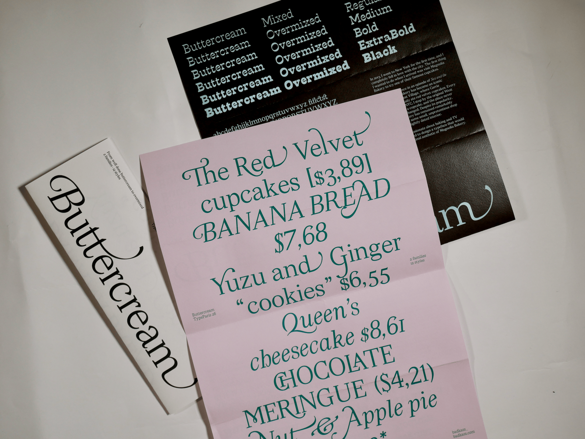
I started by studying my references and trying to decide which elements of each one I wanted to keep: the serifs? The terminals? The width? It was difficult to find a balance because they were all so different, but I decided to keep the condensed proportions and rounded shapes of the slab serif, while using the proportions and terminals of the Roman typeface. However, the Roman terminals were quite unusual, so I really struggled with their shape. In the end, I redesigned the terminals about fourteen times. It was only after designing the Black weight that I finally understood how those terminals could behave and where their strength lay.
The third master completely changed the direction of my project: reverse contrast. It started as a fairly traditional reverse-contrast design, with thin, straight stems, but then the diagonals introduced a triangular shape that gradually spread to all of the straight stems, giving the typeface its slightly funky personality. The interpolation results were even funkier and surprisingly satisfying.
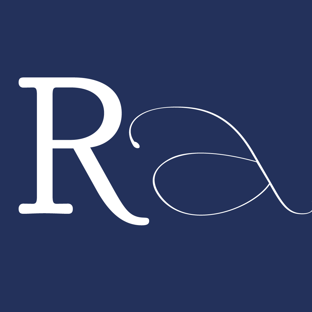
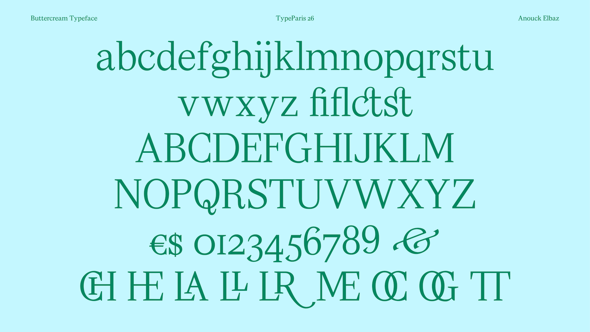
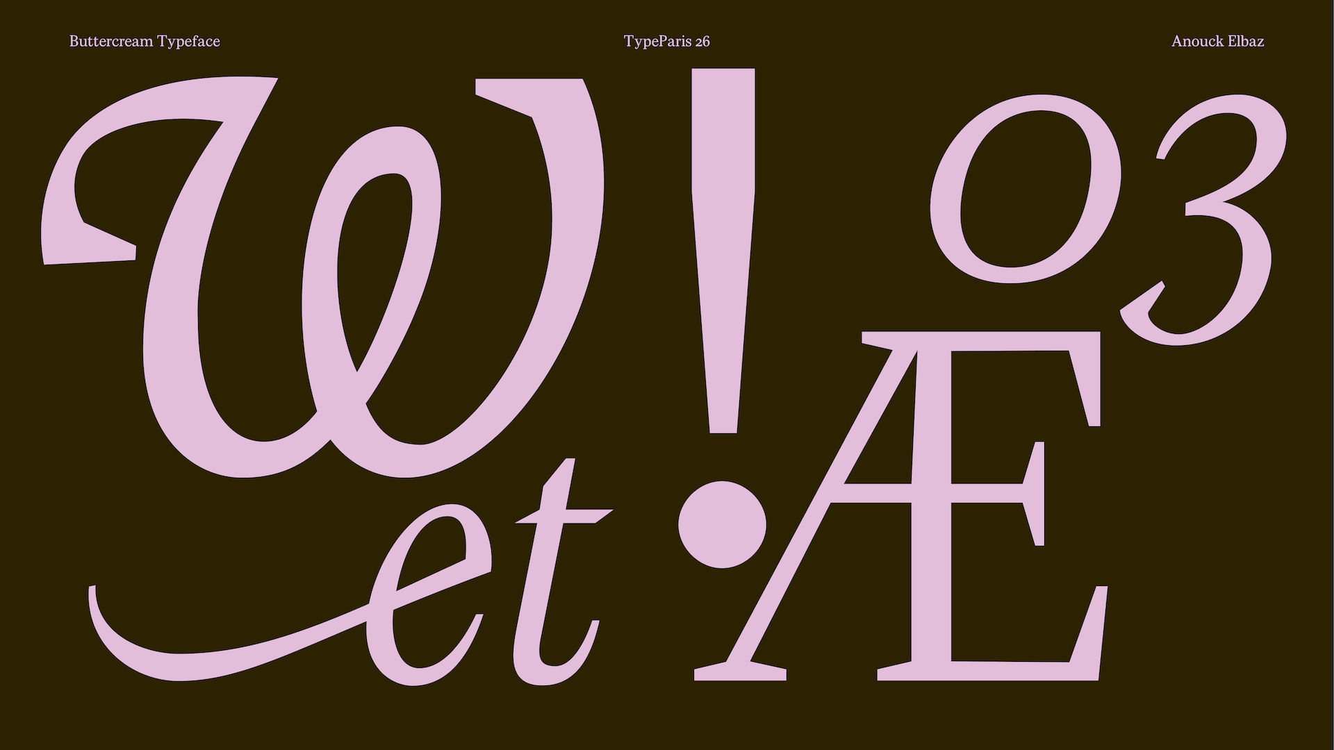
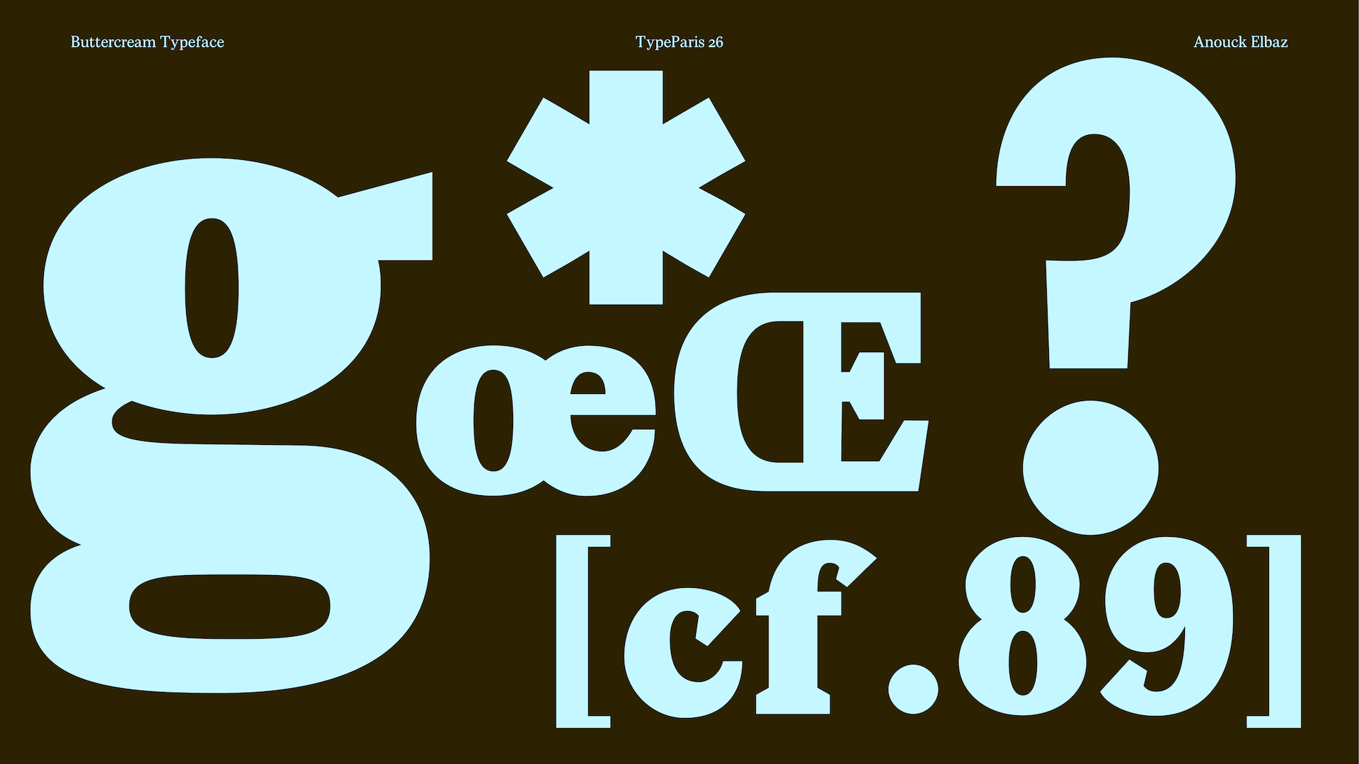
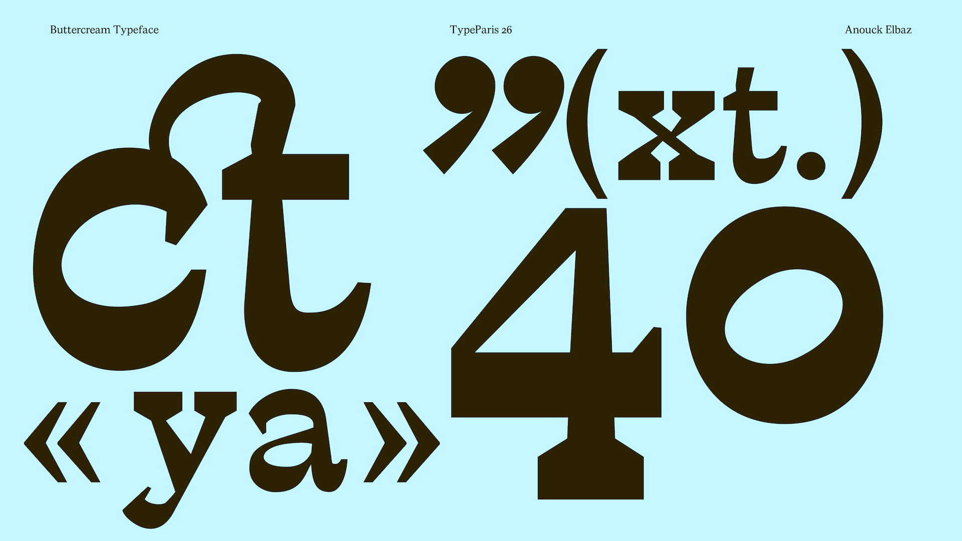
The final stage of the design was adding the swashes and ligatures, which were a central part of the project because of the ornamental references in Magnolia Bakery’s original identity. This was certainly the most enjoyable part of the process. After spending so much time fixing interpolation issues, drawing the swashes really felt like the cherry on top.
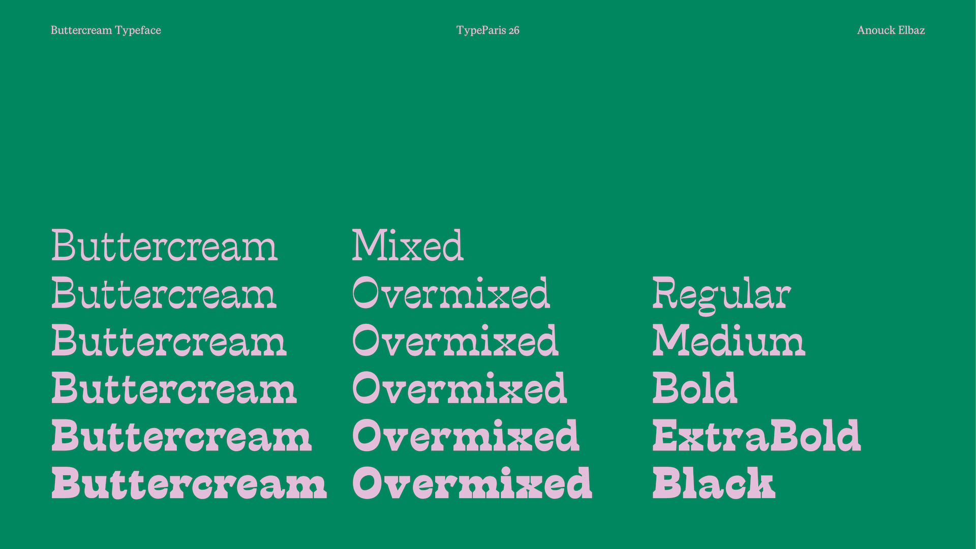
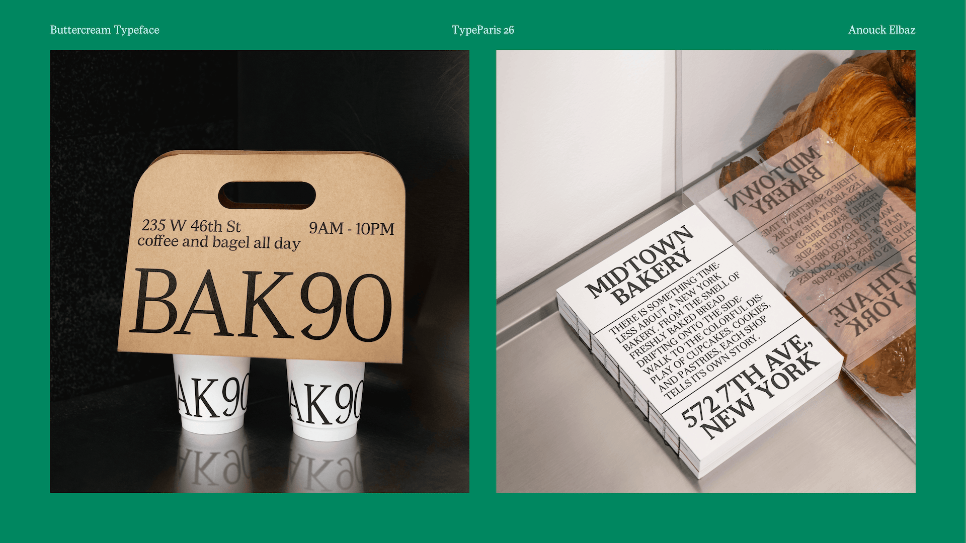
In the end, Buttercream is a surprisingly versatile typeface. On the one hand, it is a very classical and ornamental family; on the other, it becomes a funky cowboy font.
Apply before 14 January for the three-week type design course starting 5 April and ending 24 April 2027.
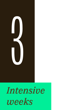
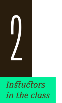
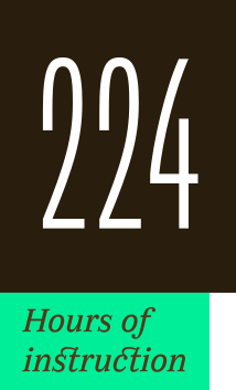
After 10 years in Paris, we reinvent our type design programme. We go from 6 weeks to 3 weeks, while maintaining the fundamentals that make TypeParis’ reputation.
The course will take place in Menorca, Spain for the first time. In 2027, we offer two levels, Foundation and Expert, which allows you to discover type design, or to gain expertise after an initial training.
➼ Subscribe to our mailing list to stay informed, until application period is launched.
Get ready & apply before 14 January 2027