Alriwaq
The starting point for this typeface was a visit to Abboudi Abu Jaoudeh’s poster collection in Lebanon.
I was drawn to the lettering on the posters: the Arabic calligraphy, the hand-drawn titles, the thick strokes, the sharp endings, the round curves, and the way everything felt expressive without needing to be polished. The posters had a strong visual presence, but they were still functional.
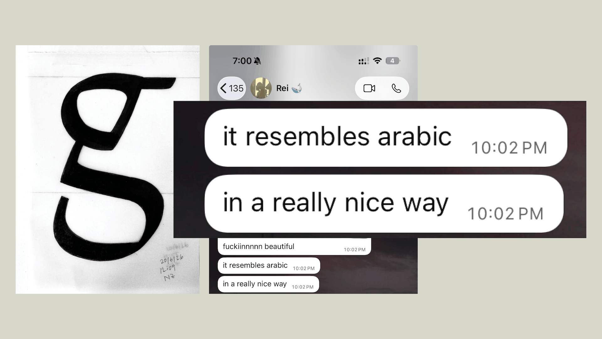
When I came to TypeParis, I wanted to see if I could carry some of that feeling into a Latin typeface. The challenge was figuring out what “inspired by Arabic” actually meant. After a few conversations with several instructors, we reached a conclusion that reverse contrast is not a direction I should explore as it felt like the most expected solution, because it directly borrows a structural logic associated with Arabic and applies it to Latin. I also did not want to copy Arabic shapes and paste them into Latin letters. I wanted to respect that difference between the two scripts.
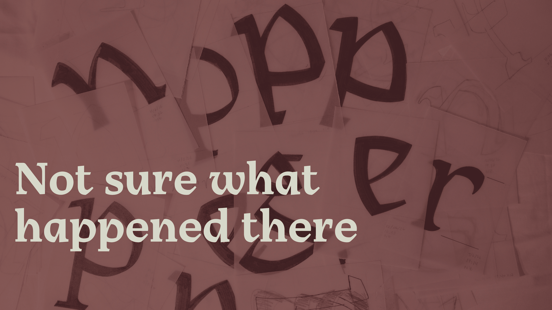
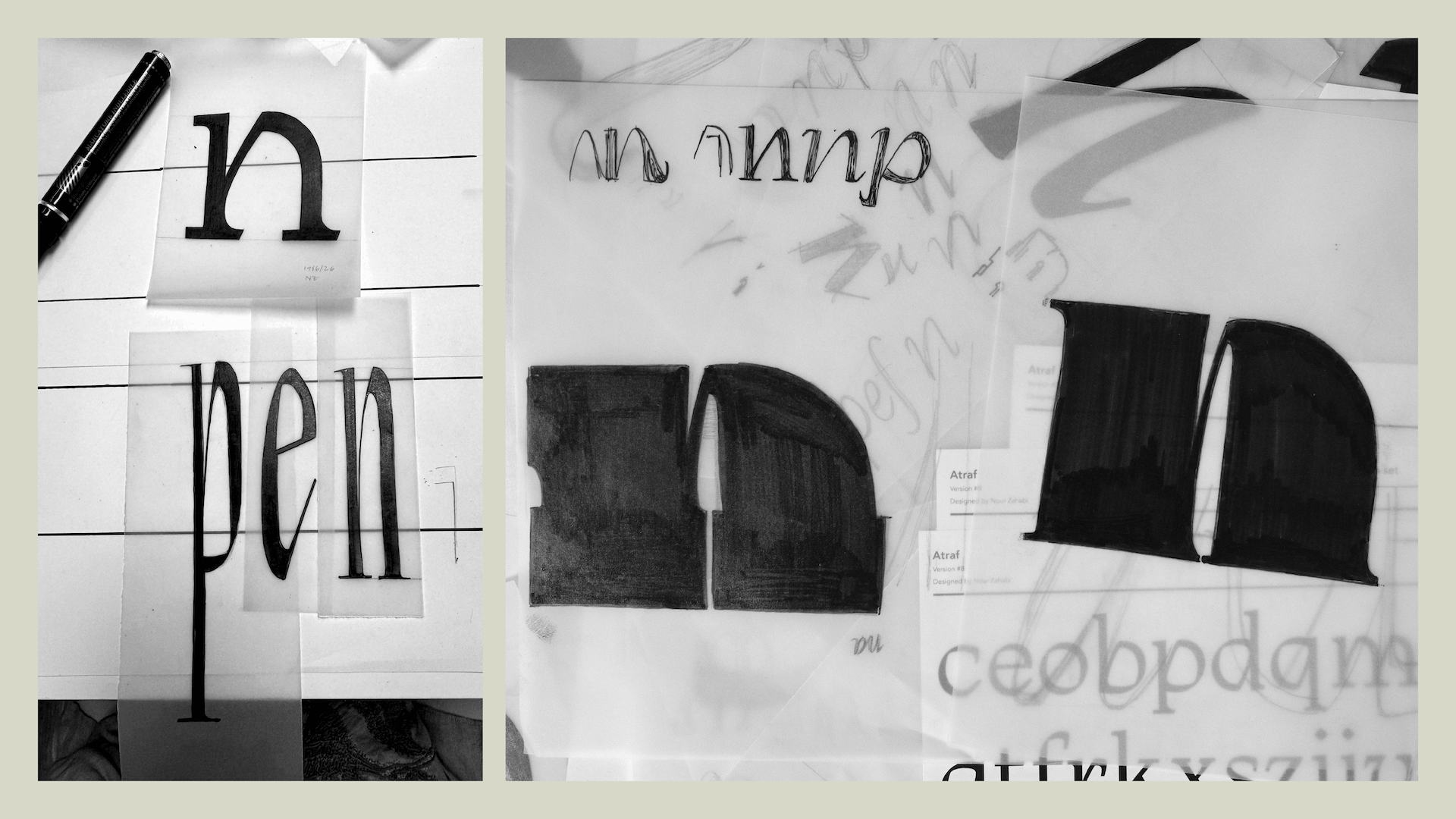
During this process, I had a conversation with Laura that became an important point of reference. She suggested that it can be helpful to look closely at letterforms, then remove that visual reference and try to draw from memory. This approach stayed with me throughout the project. Whenever I felt like I was drifting away from my initial brief, I returned to this method. It helped me focus on what I had actually absorbed rather than what I was directly seeing, and it guided me back to a more intuitive and personal interpretation.
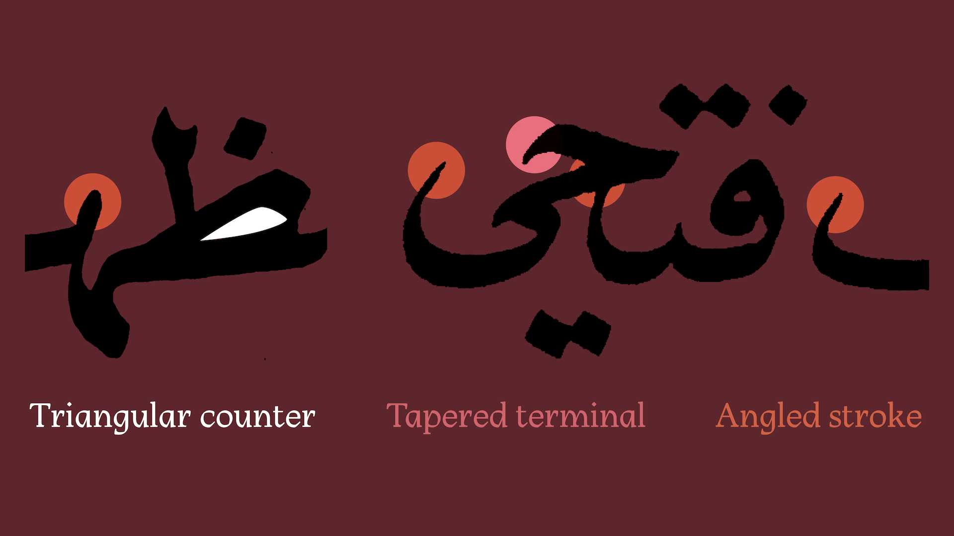
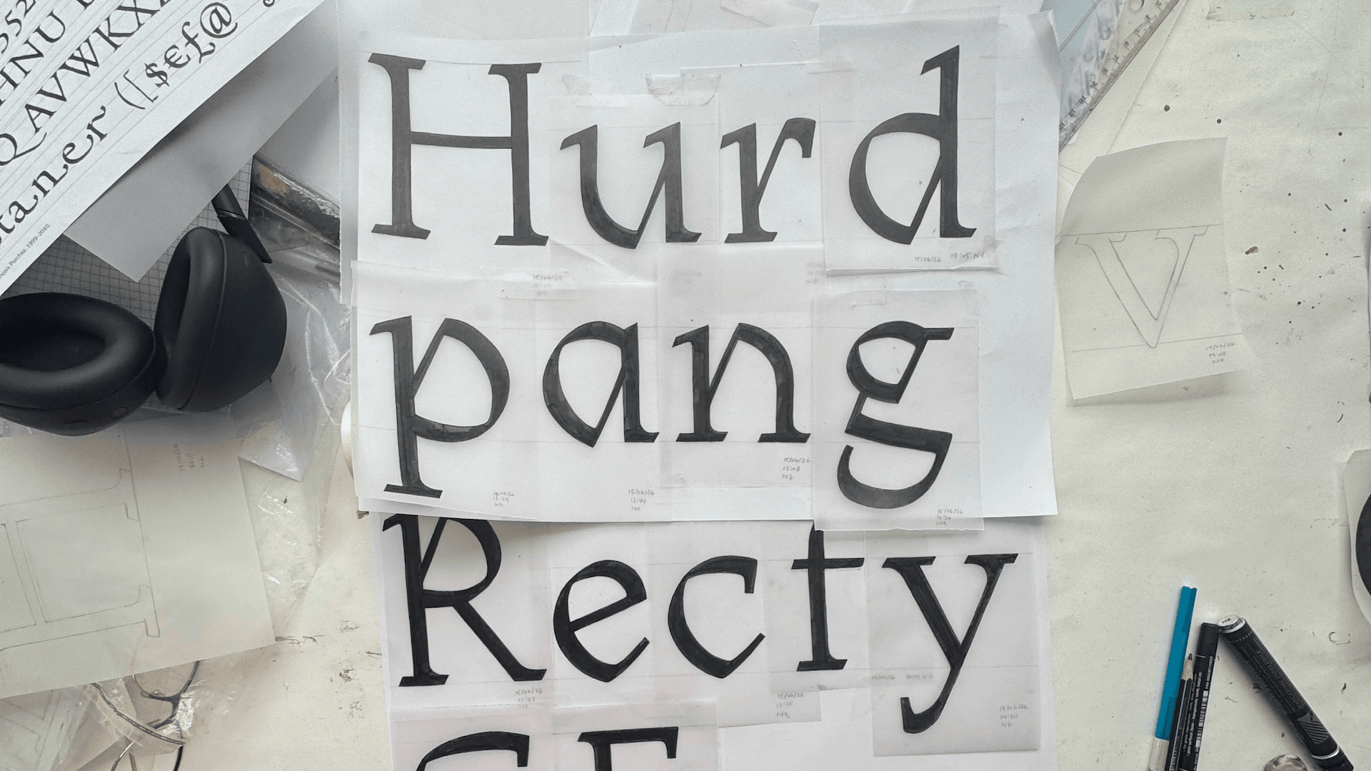
So the project became about finding a quieter way to bring that influence in. I wanted the typeface to stay true to Latin letterforms, but still carry something from the Arabic lettering that inspired it. Instead of copying forms, I started looking at smaller details: how thick and thin strokes meet, how sharp and soft edges sit together, how counters are shaped, and how a stroke enters a letter.
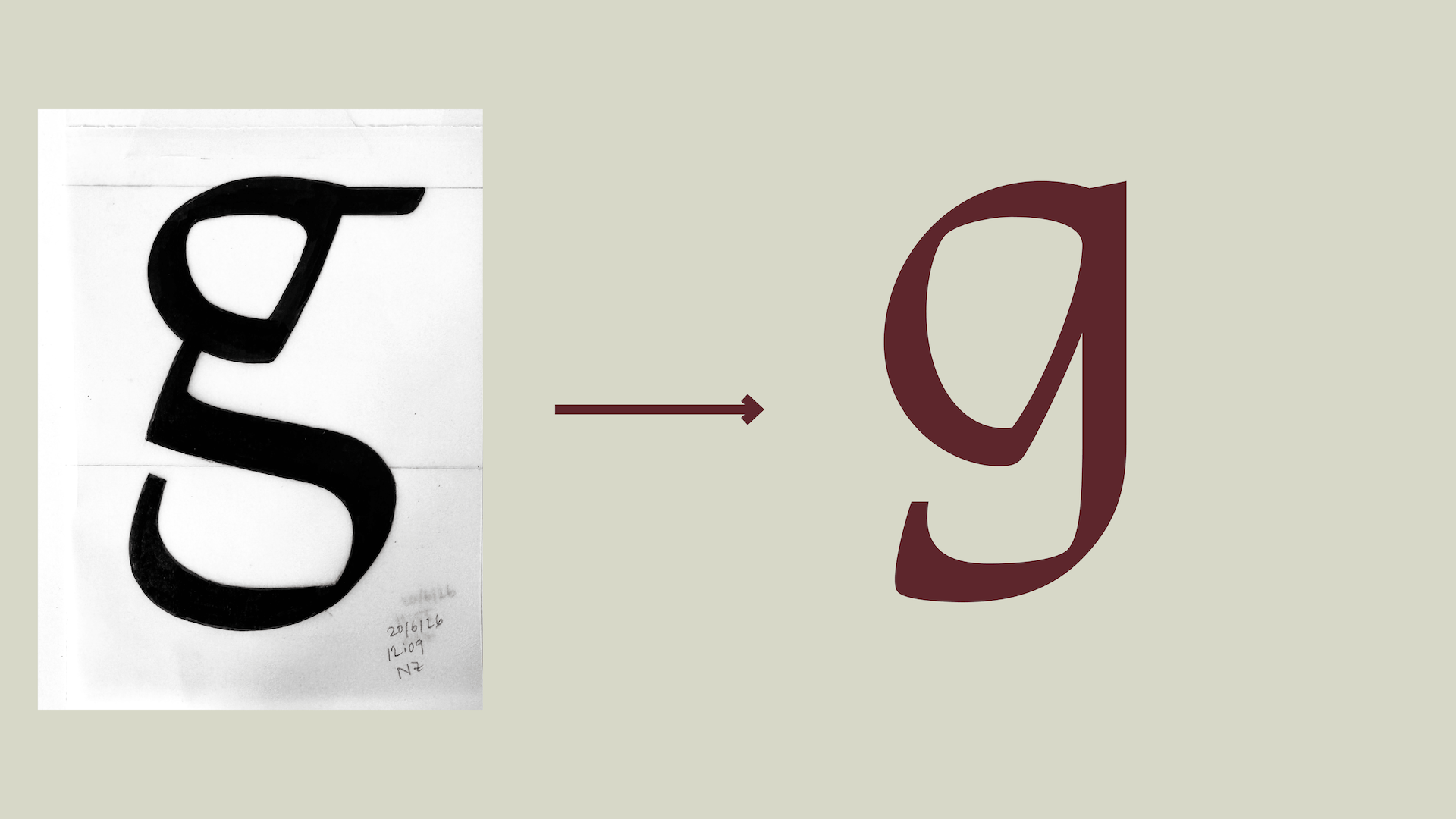
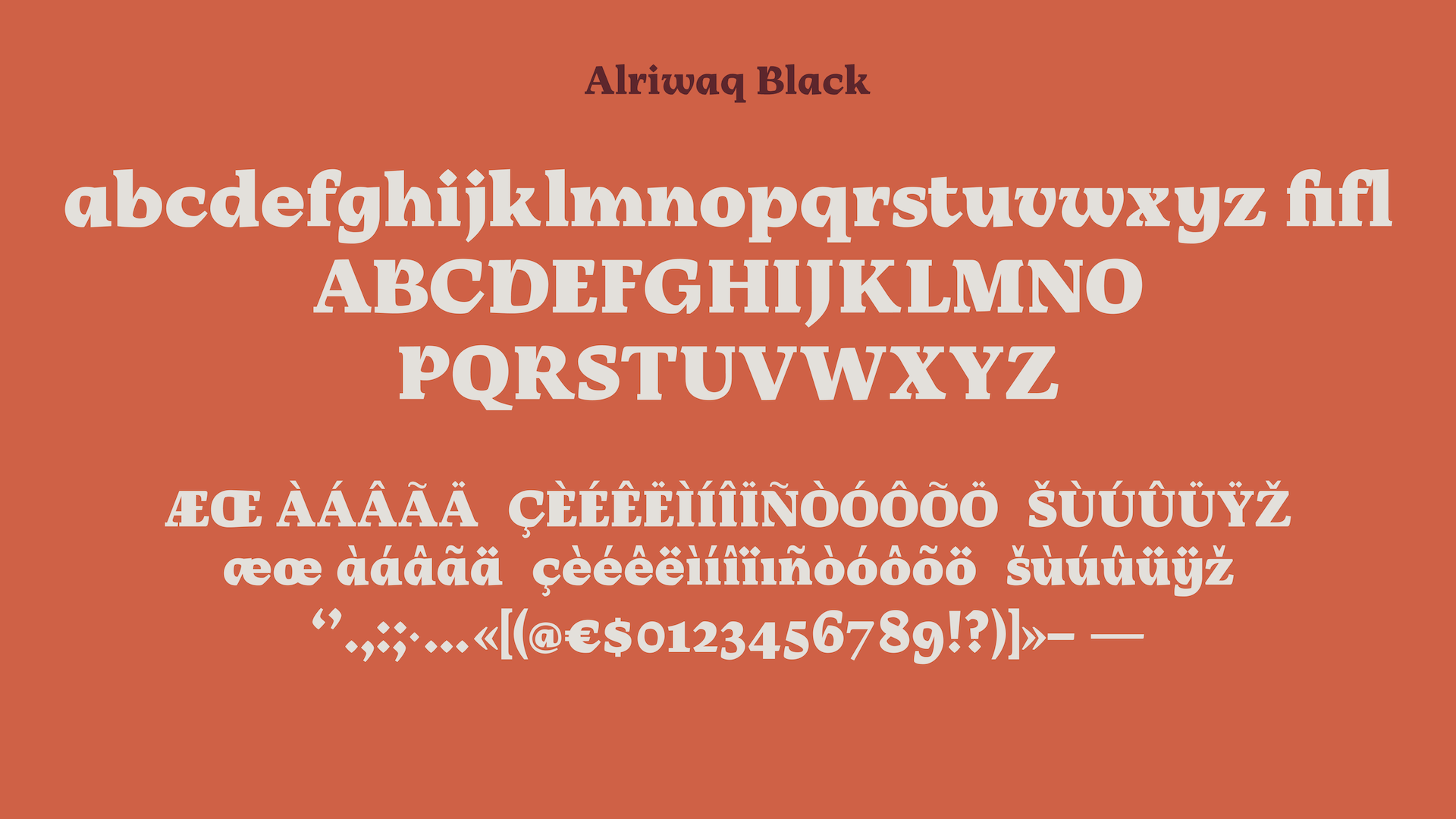
The entry stroke became one of the main features of the typeface. Many letters begin with an angled gesture, which gives the family a sense of movement. The letters remain upright, but the angle gives them a slight italic energy. It became a way to bring in the feeling of a written stroke without making the typeface fully calligraphic.
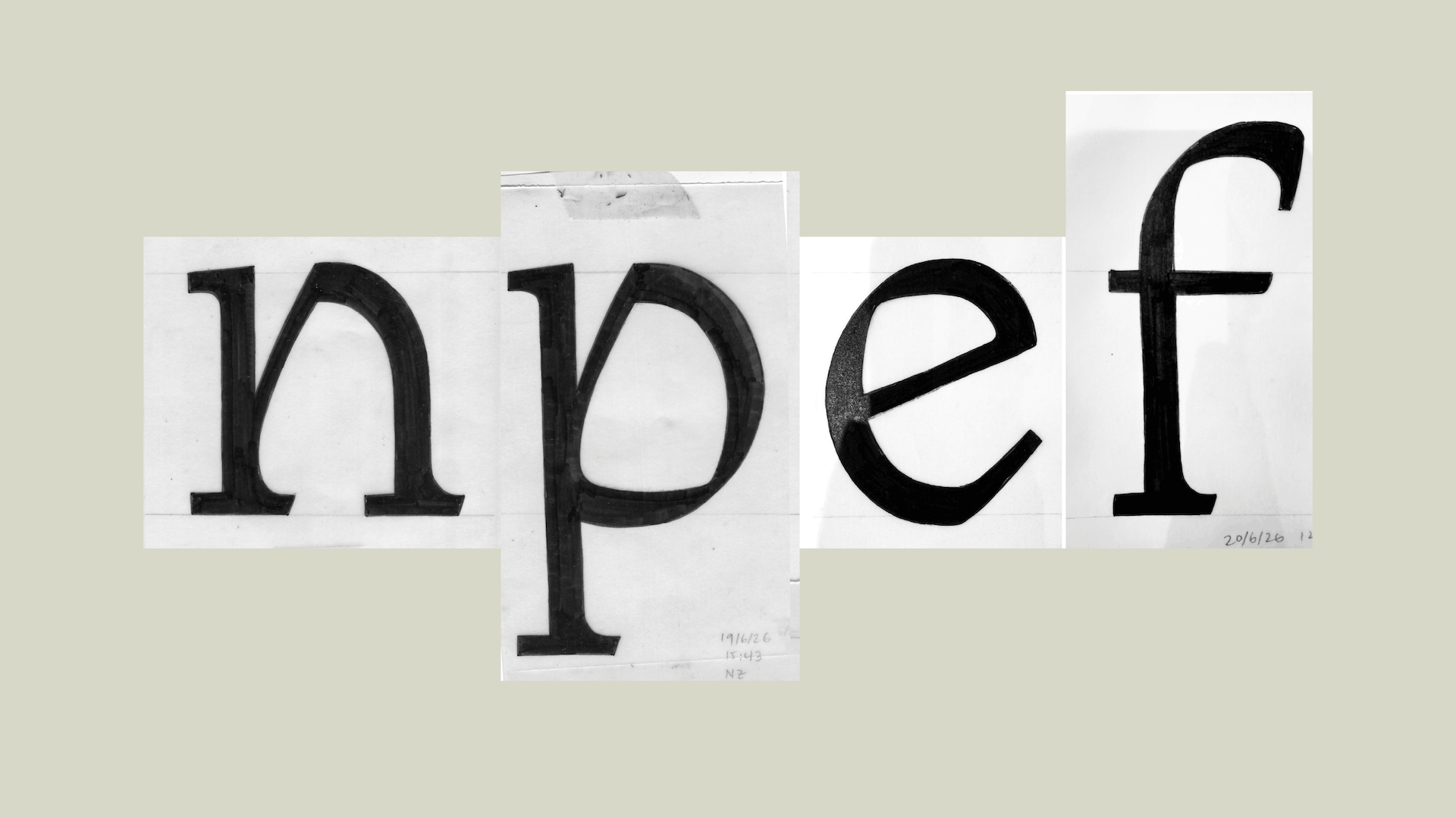
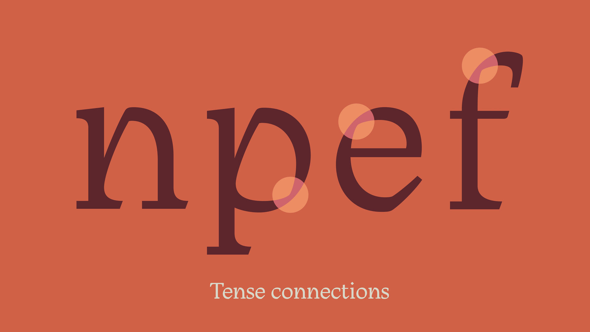
The counters also became important. I started shaping them as soft triangular spaces rather than round ones. They are not pointed or aggressive, but they create a bit of tension inside the letters. This appears in forms like the a, p, o, n, and e, and helps give the typeface its own rhythm.
Another part of the system is the contrast between sharp and soft details. Some strokes end with sharper cuts, while other parts stay curved and fluid. This tension comes from looking at Arabic lettering, where curves and sharp turns often exist very close to each other. In the Latin letters, I tried to adapt that relationship without making it too literal.
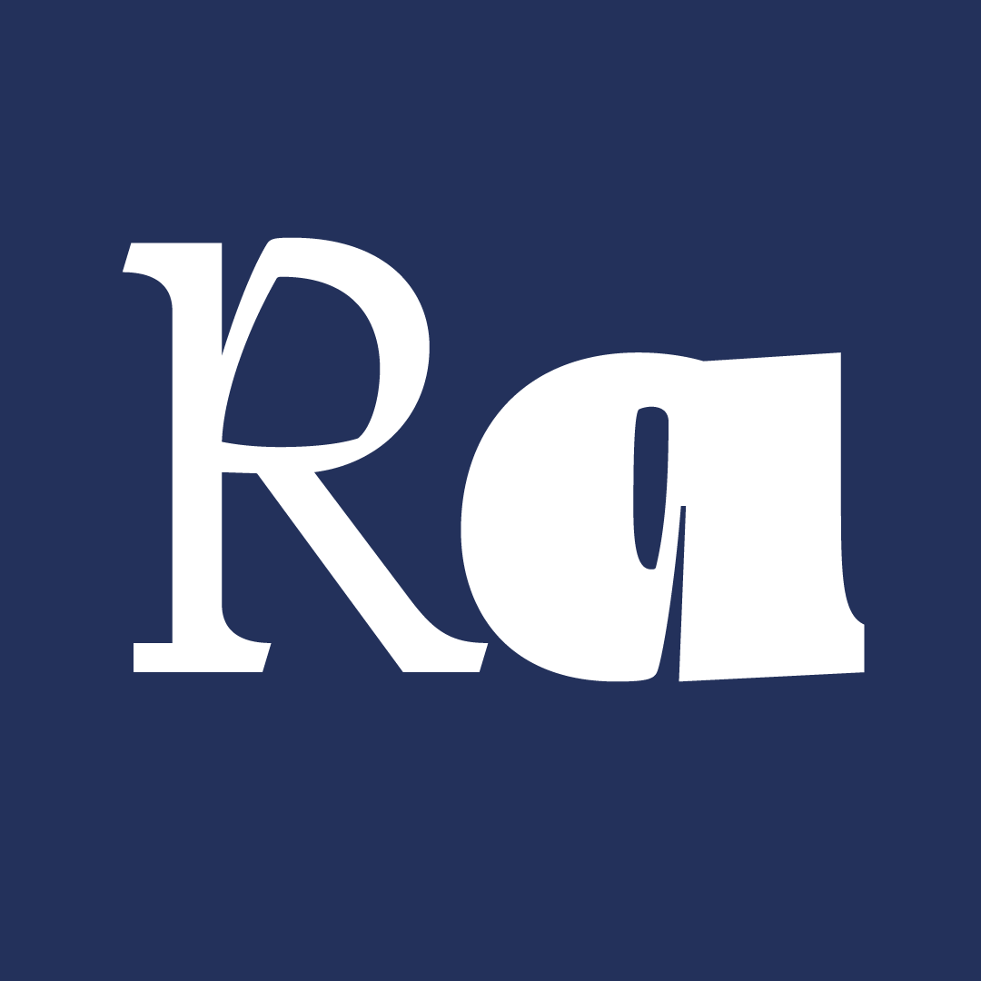
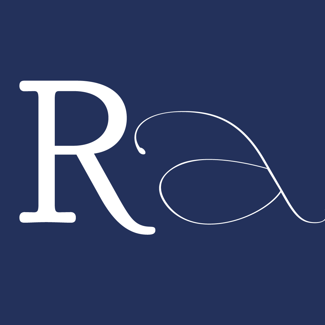
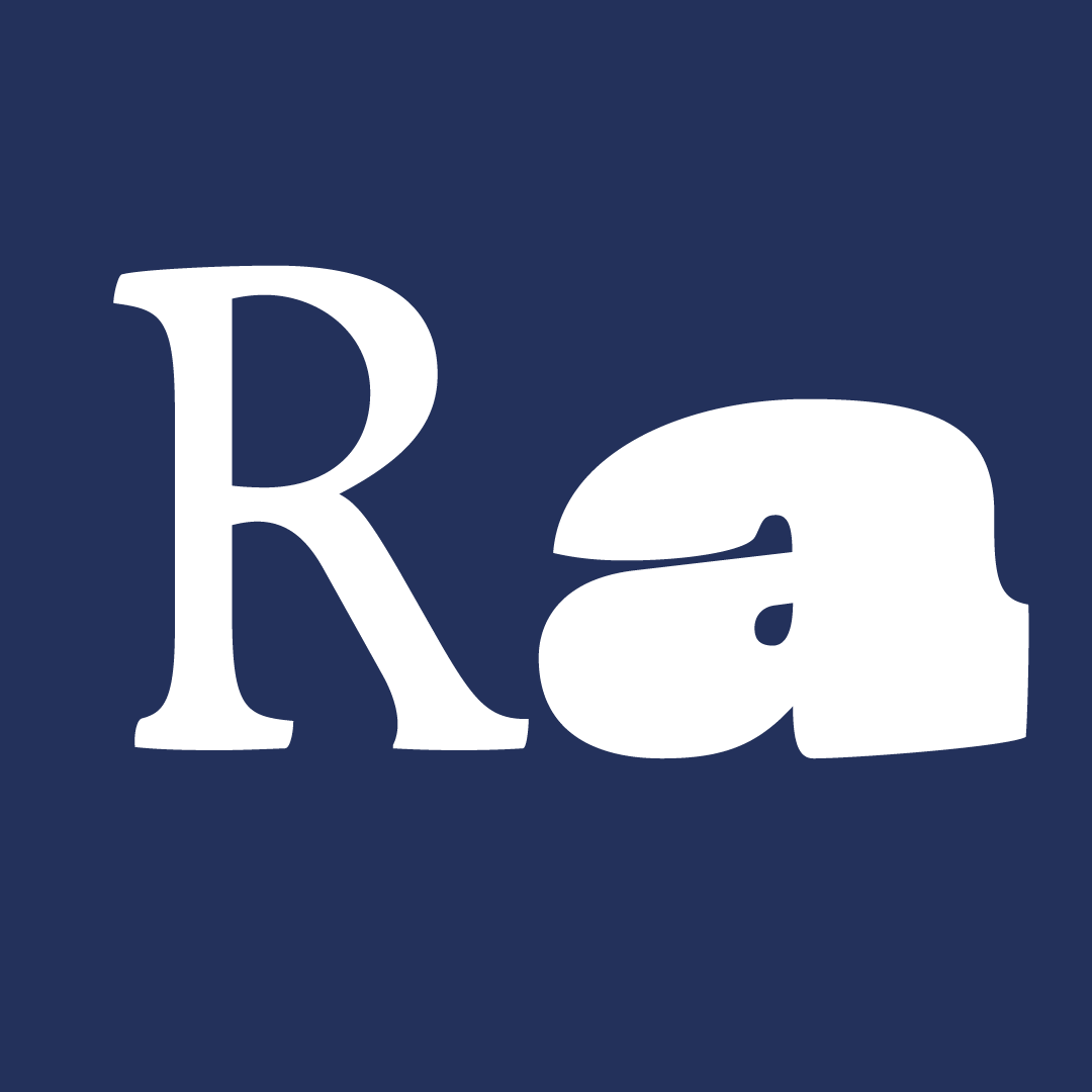
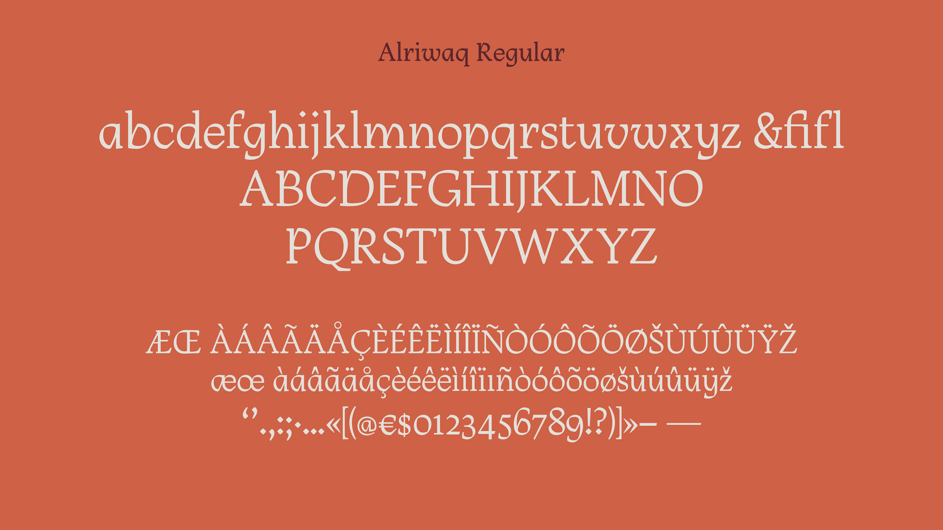
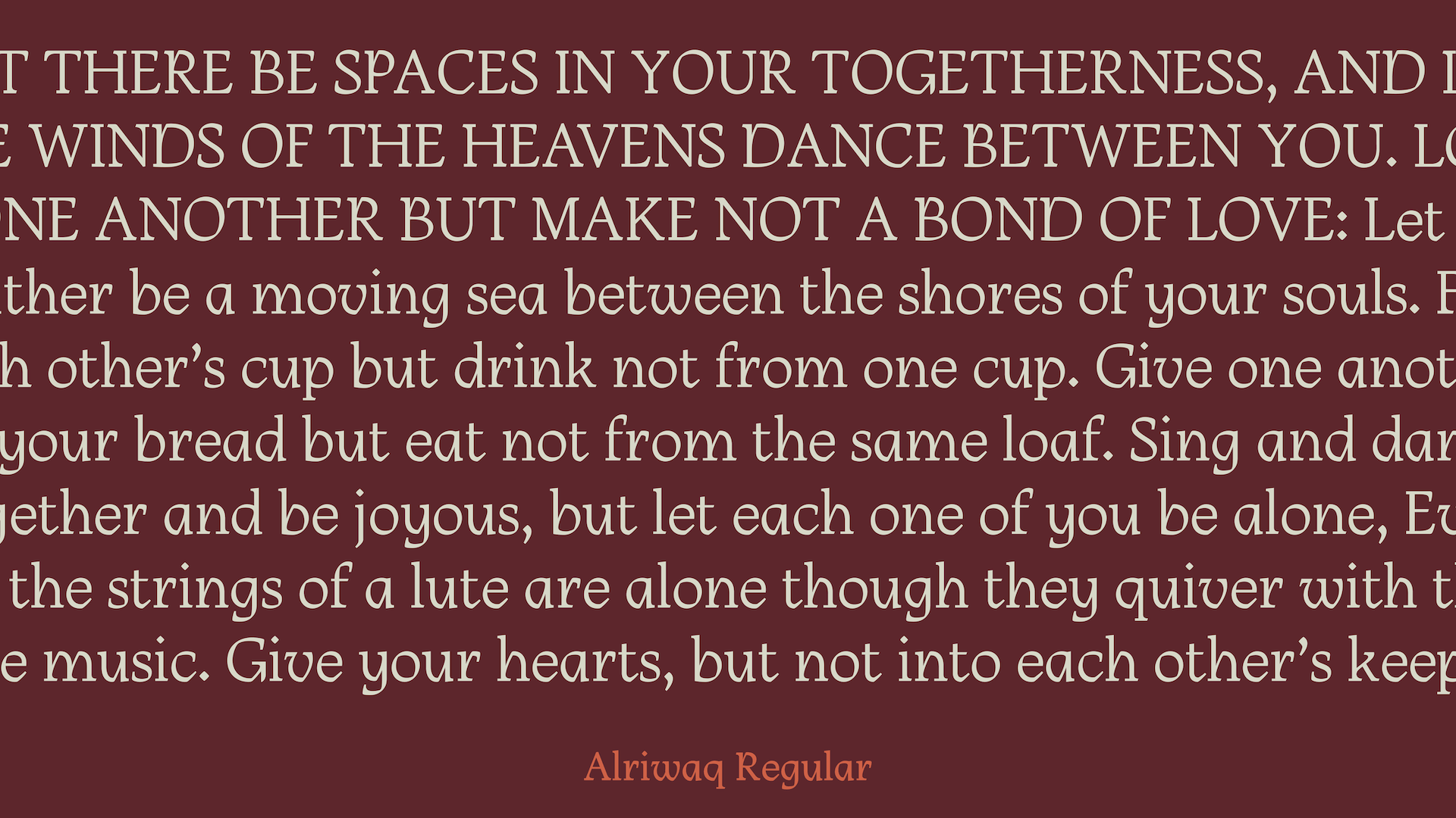
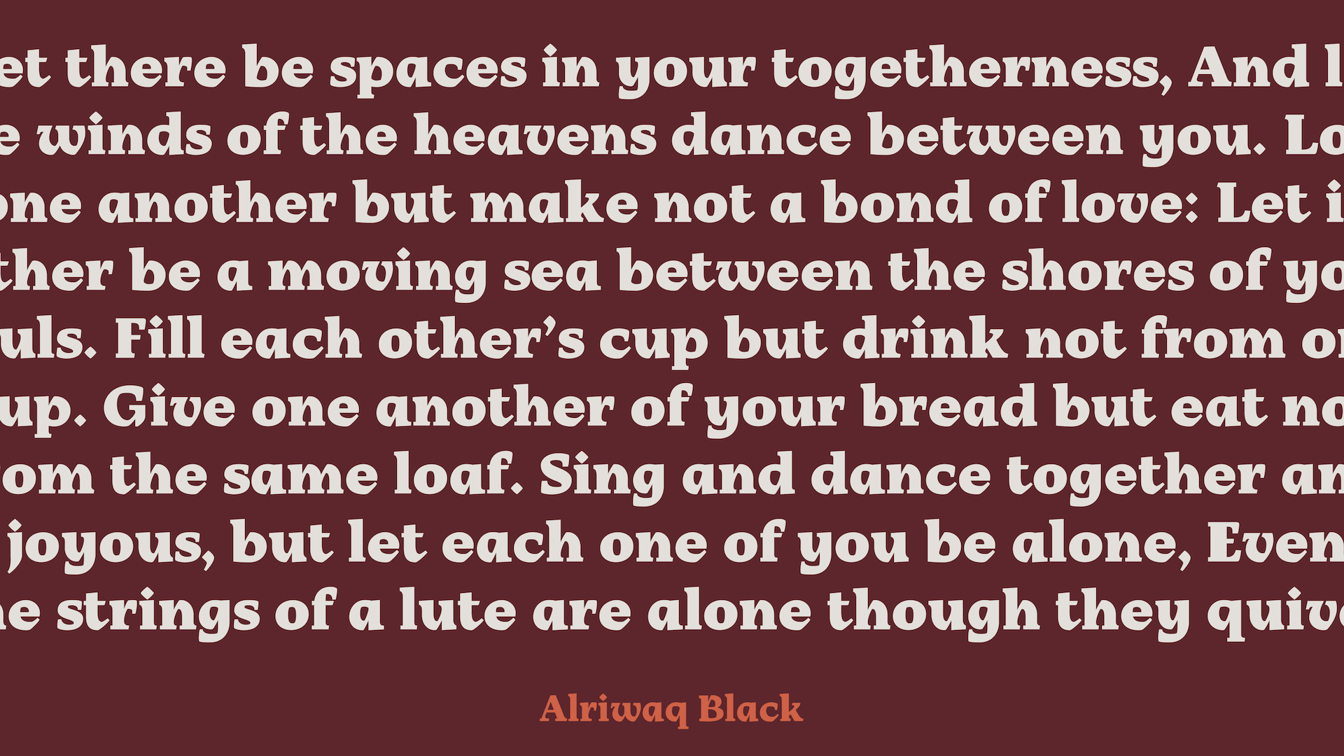
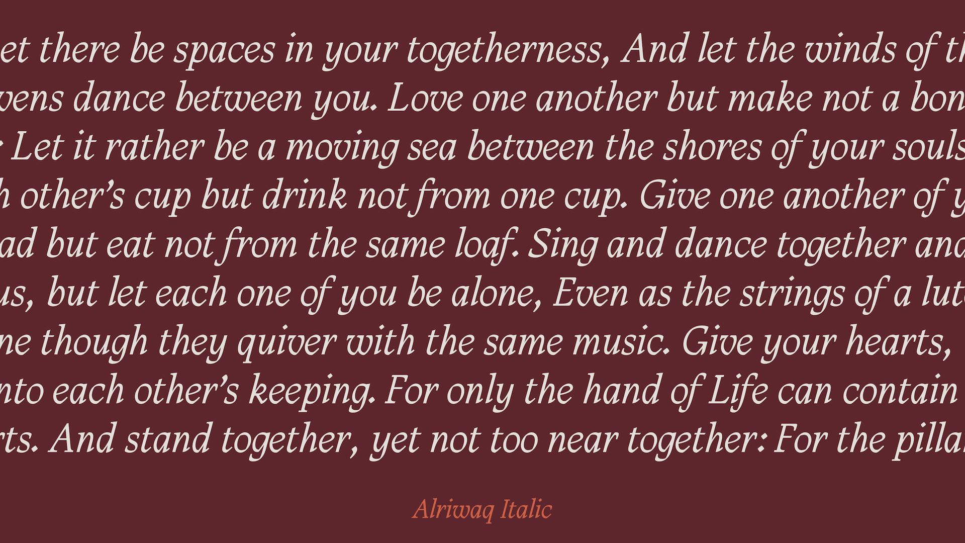
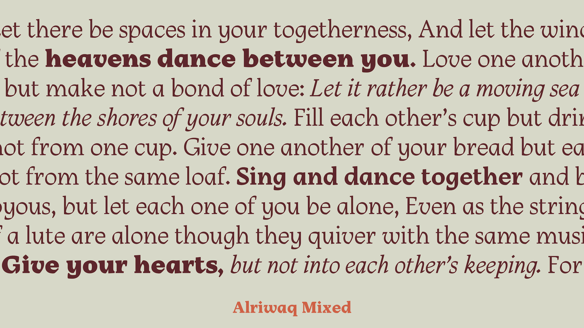
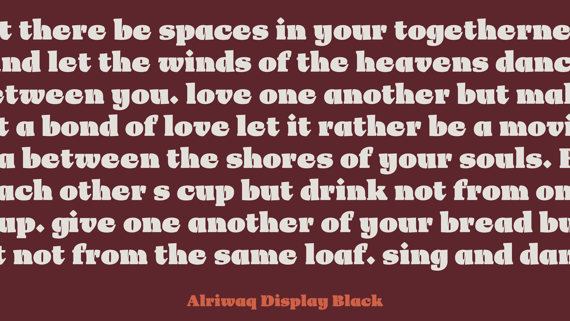
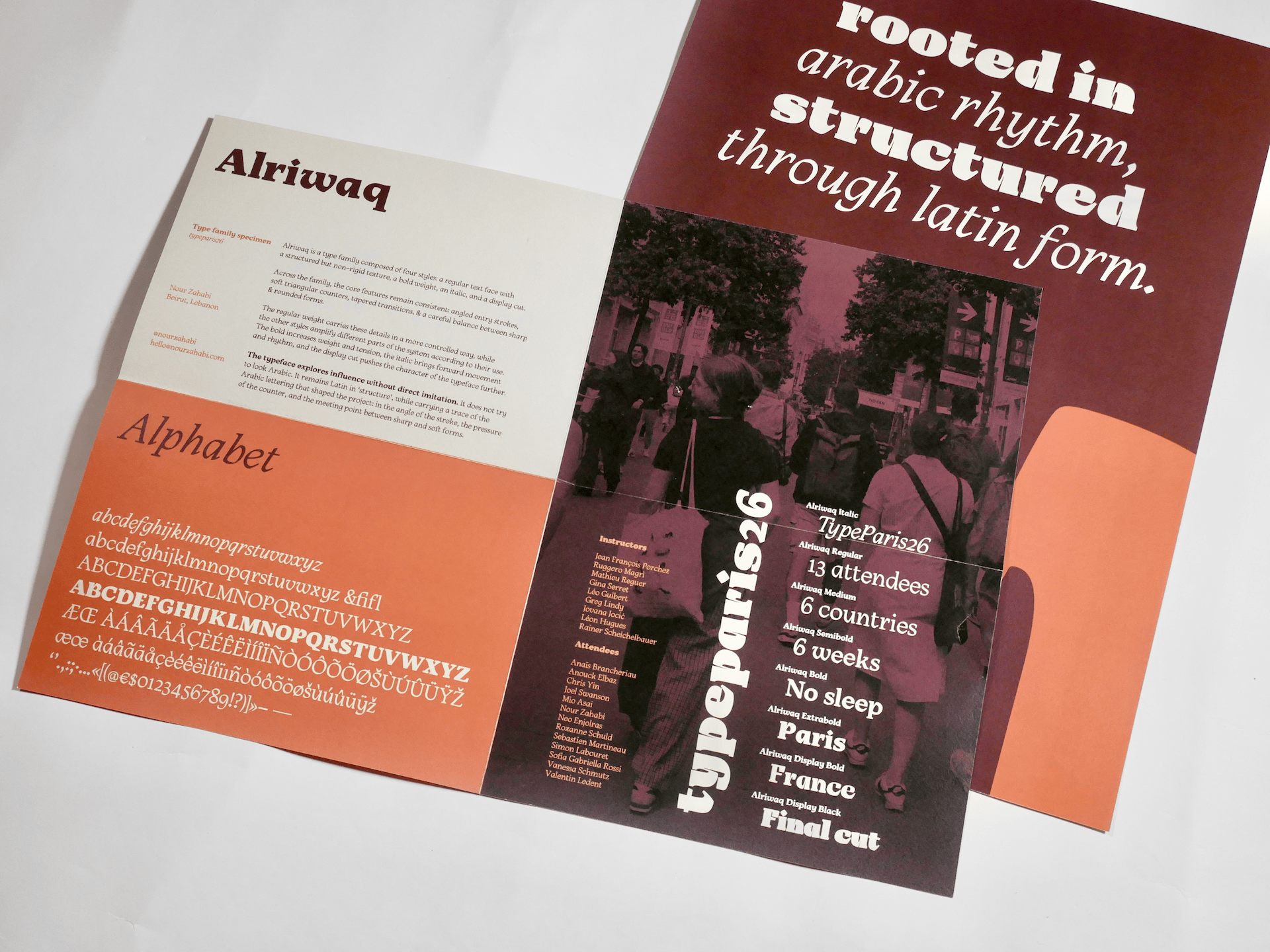
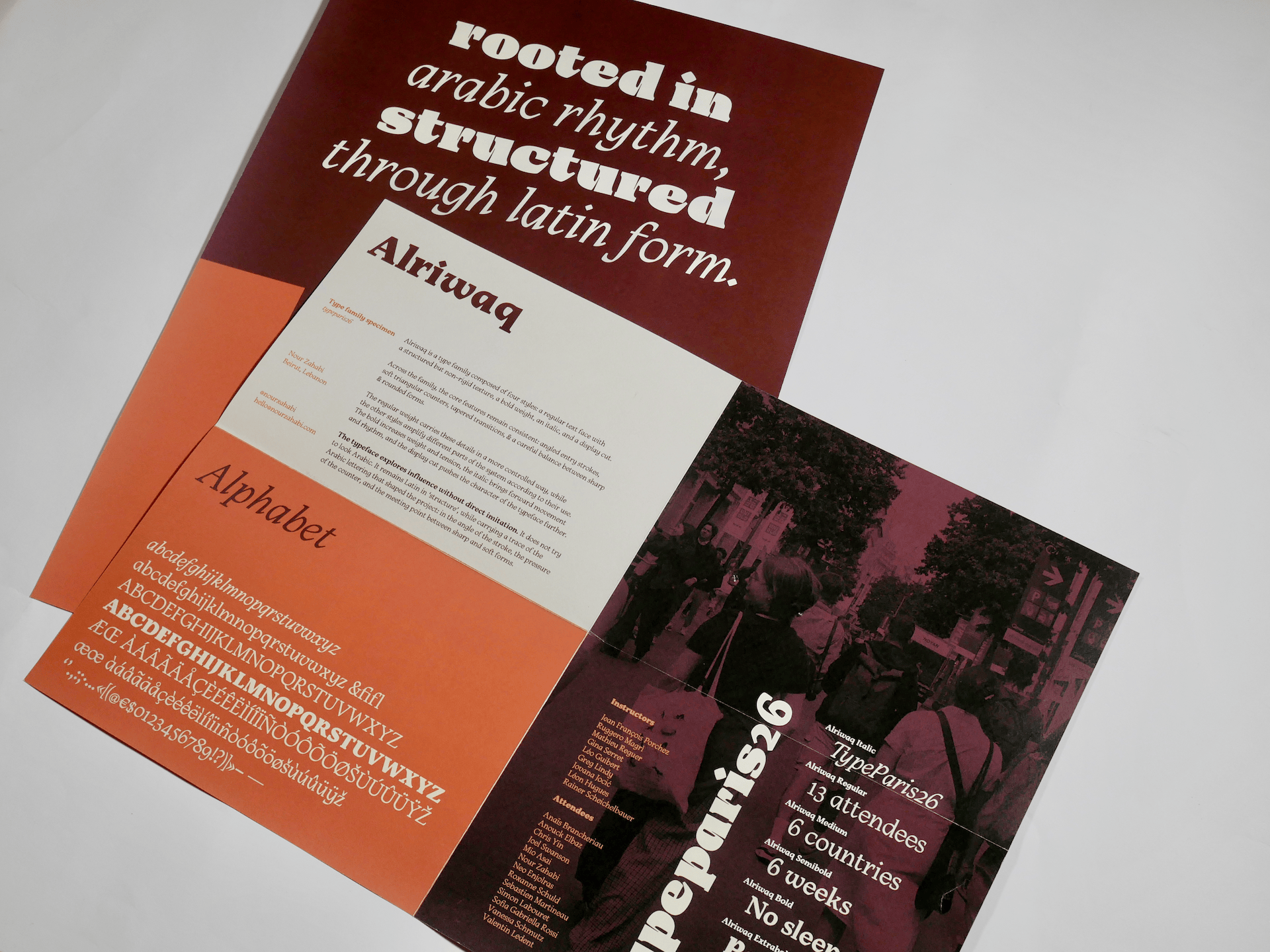
The result is a type family composed of four styles: a regular text face with a non-rigid but still structured texture, a bold version, an italic version, and a display cut. Across these styles, the main features remain consistent: angled entry strokes, soft triangular counters, tapered transitions, and a balance between sharp and rounded forms. The regular weight carries these ideas in a more controlled way, while the other styles amplify different aspects of the system depending on their use.
The typeface is intended for posters, titles, exhibition identities, cinema material, and arts publications. These are contexts where type can do more than deliver information. It can also create atmosphere.
In the end, the project is about influence without direct imitation. The typeface does not try to look Arabic. It stays Latin, but it carries a trace of the Arabic lettering that shaped the project: in the angle of the stroke, the pressure of the counter, and the meeting of sharp and soft forms.


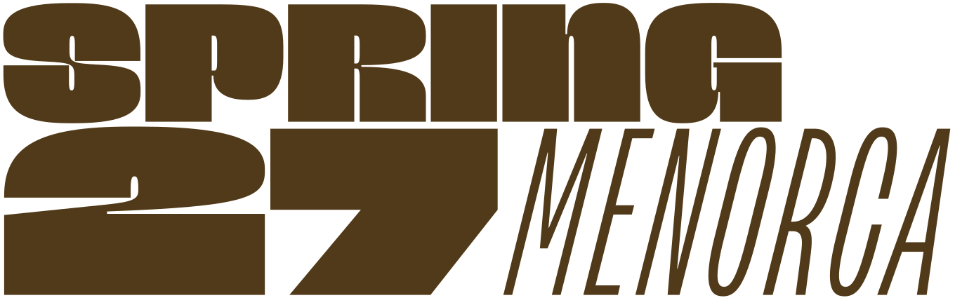
Apply before 14 January for the three-week type design course starting 5 April and ending 24 April 2027.
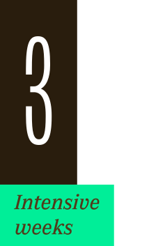
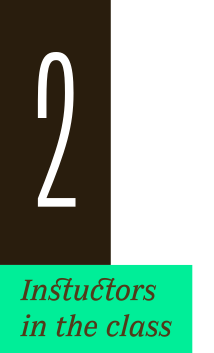
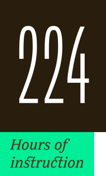
After 10 years in Paris, we reinvent our type design programme. We go from 6 weeks to 3 weeks, while maintaining the fundamentals that make TypeParis’ reputation.
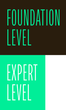
The course will take place in Menorca, Spain for the first time. In 2027, we offer two levels, Foundation and Expert, which allows you to discover type design, or to gain expertise after an initial training.
➼ Subscribe to our mailing list to stay informed, until application period is launched.
Get ready & apply before 14 January 2027