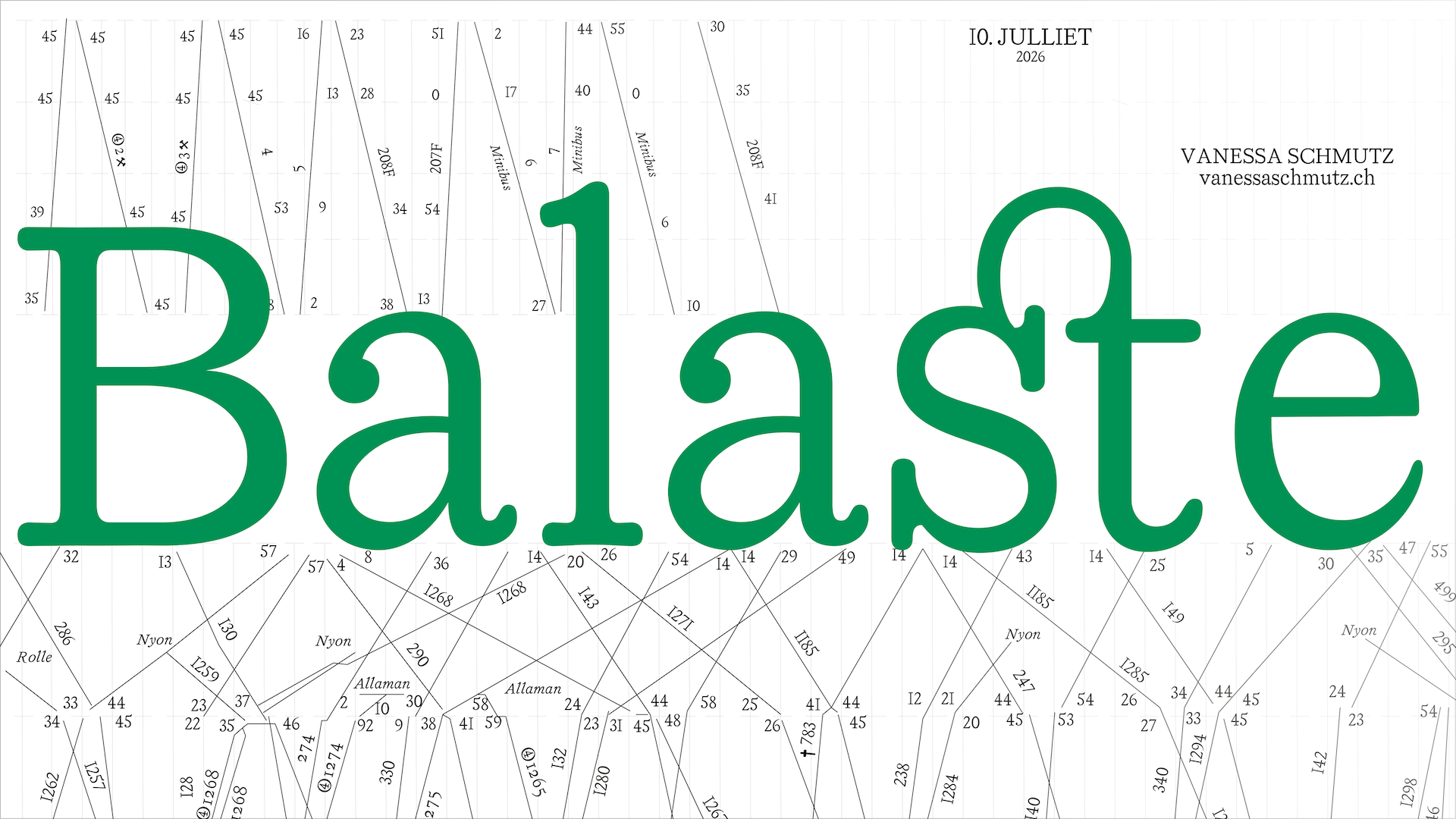
Balaste
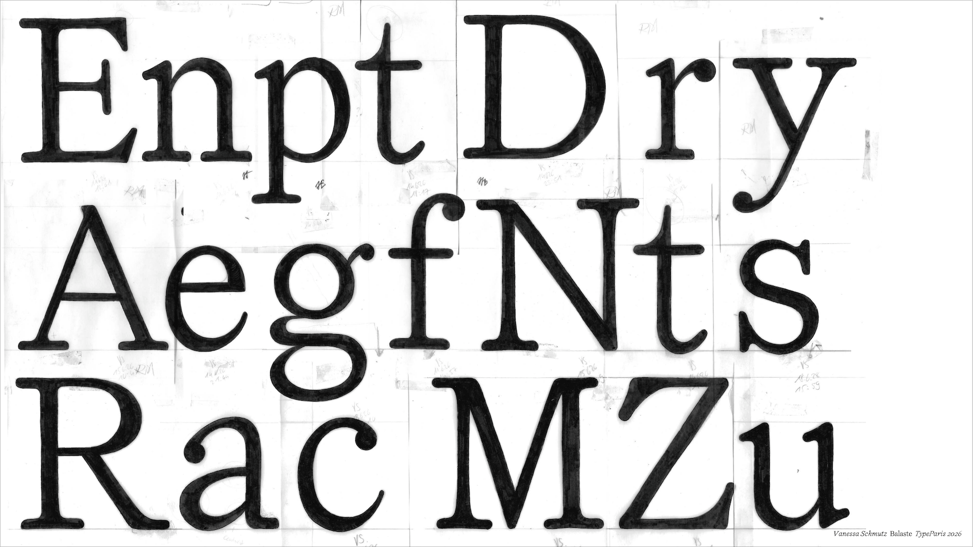
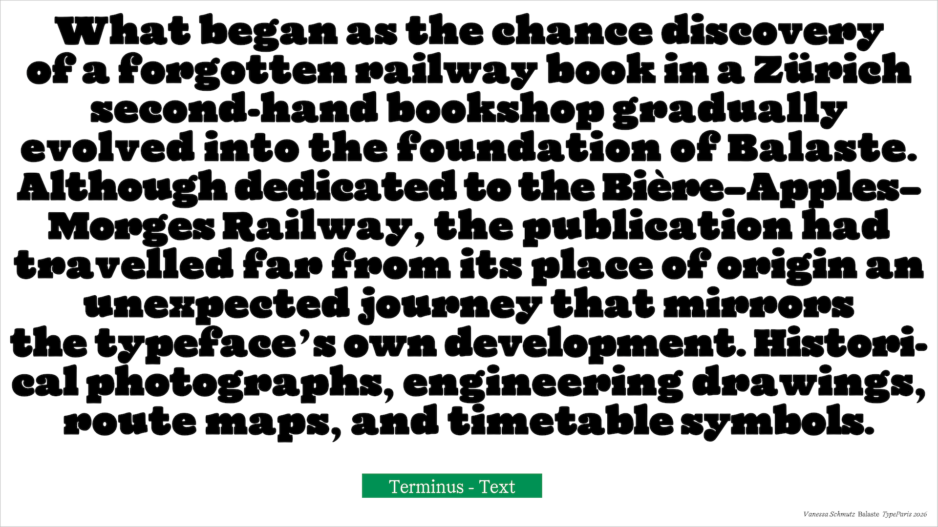
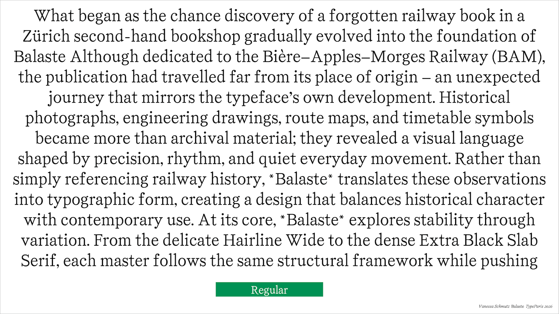
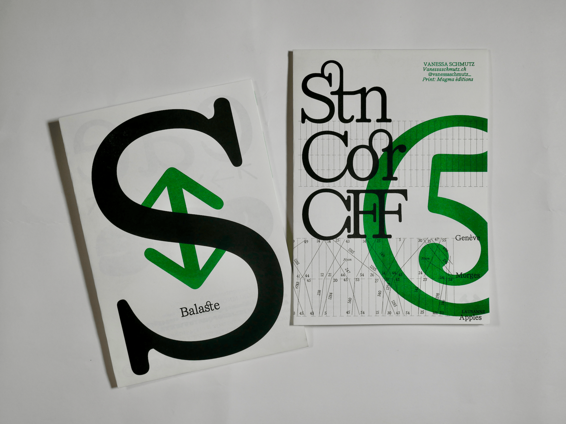
Balaste began with an unexpected discovery: a book on the Bière–Apples–Morges Railway, also known as the BAM. Although the railway belongs to the canton of Vaud, the book was found on the other side of Switzerland in a second-hand bookshop in Zürich, where it became the starting point for this typeface. Richly illustrated with historical accounts, photographs, and technical drawings, it offers a vivid and sometimes humorous insight into the railway's history, inviting the reader to travel back through the decades of its operation.
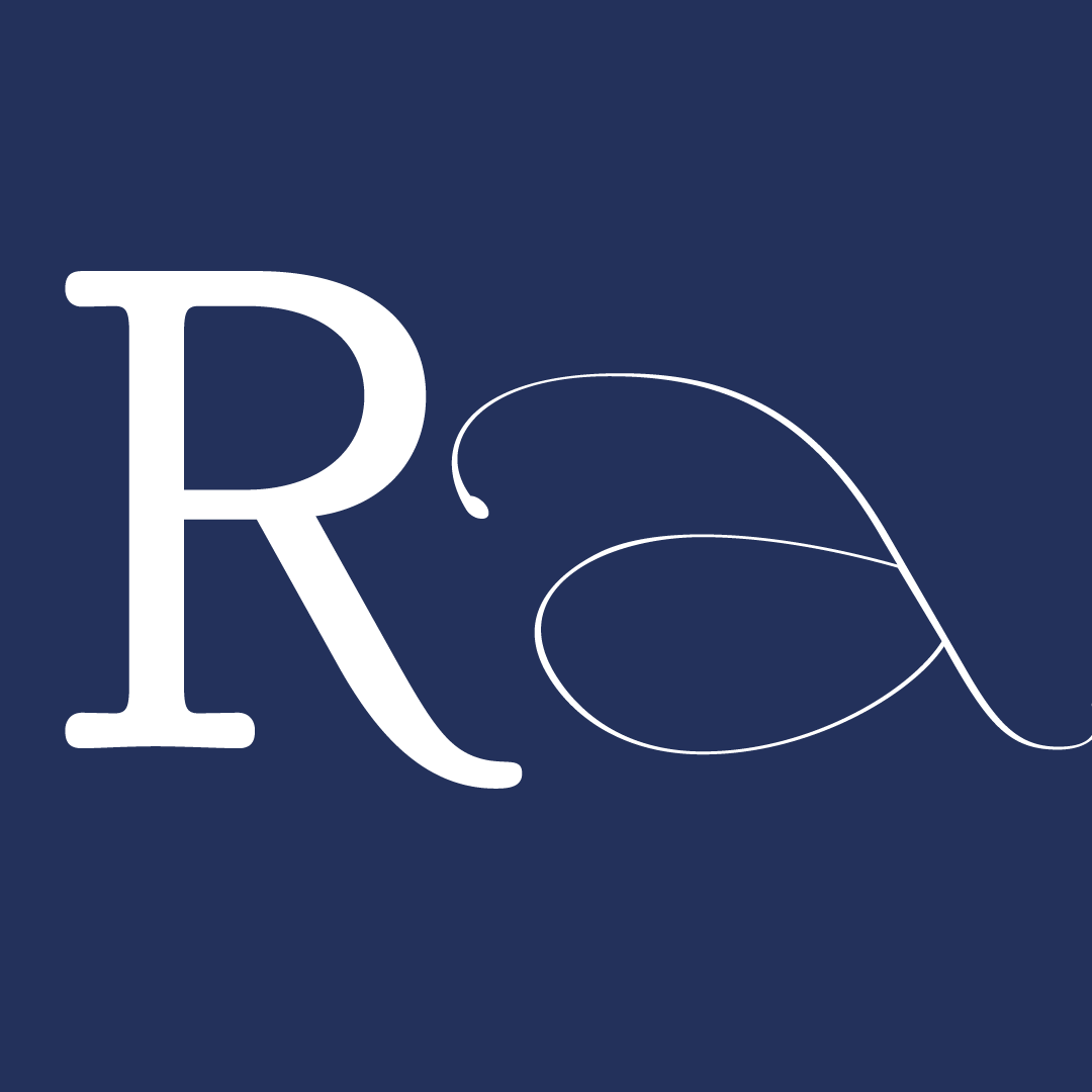
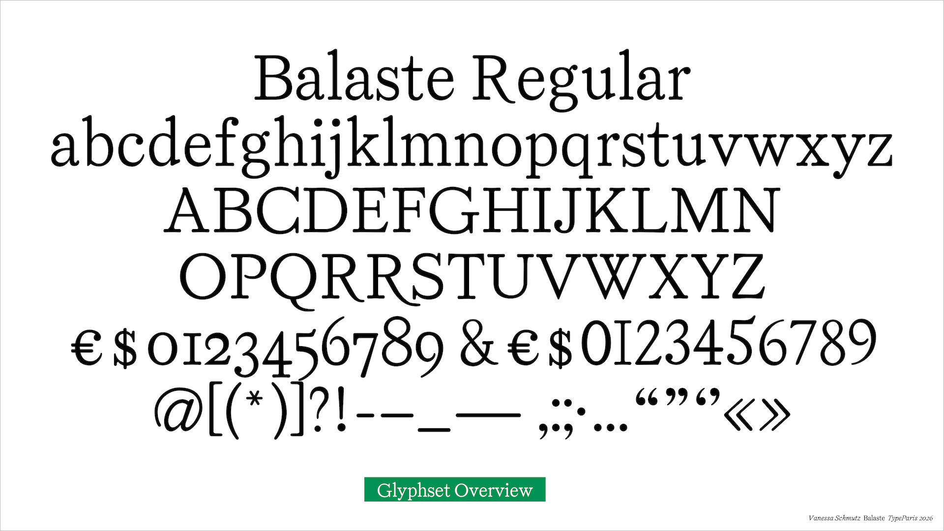
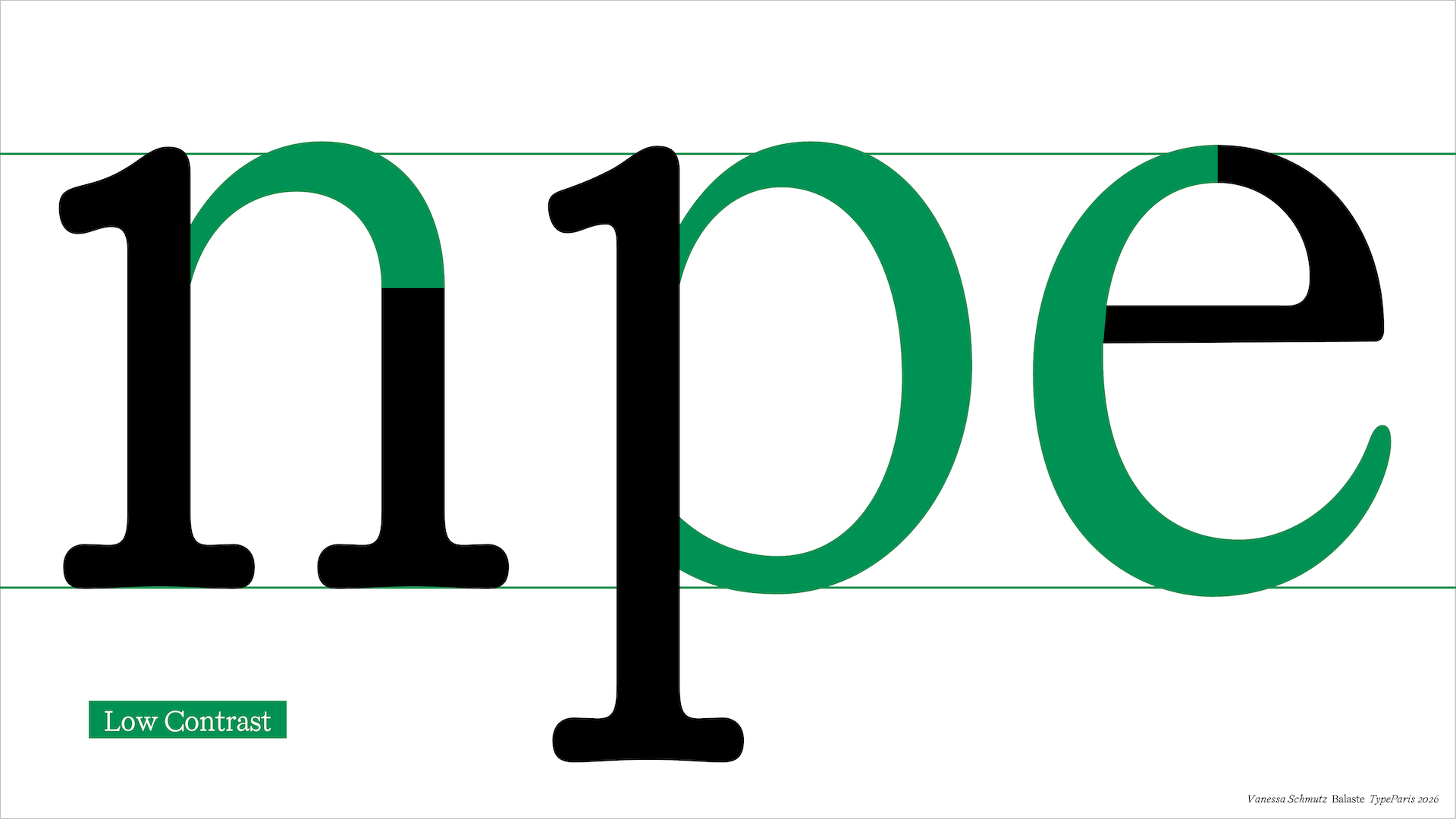
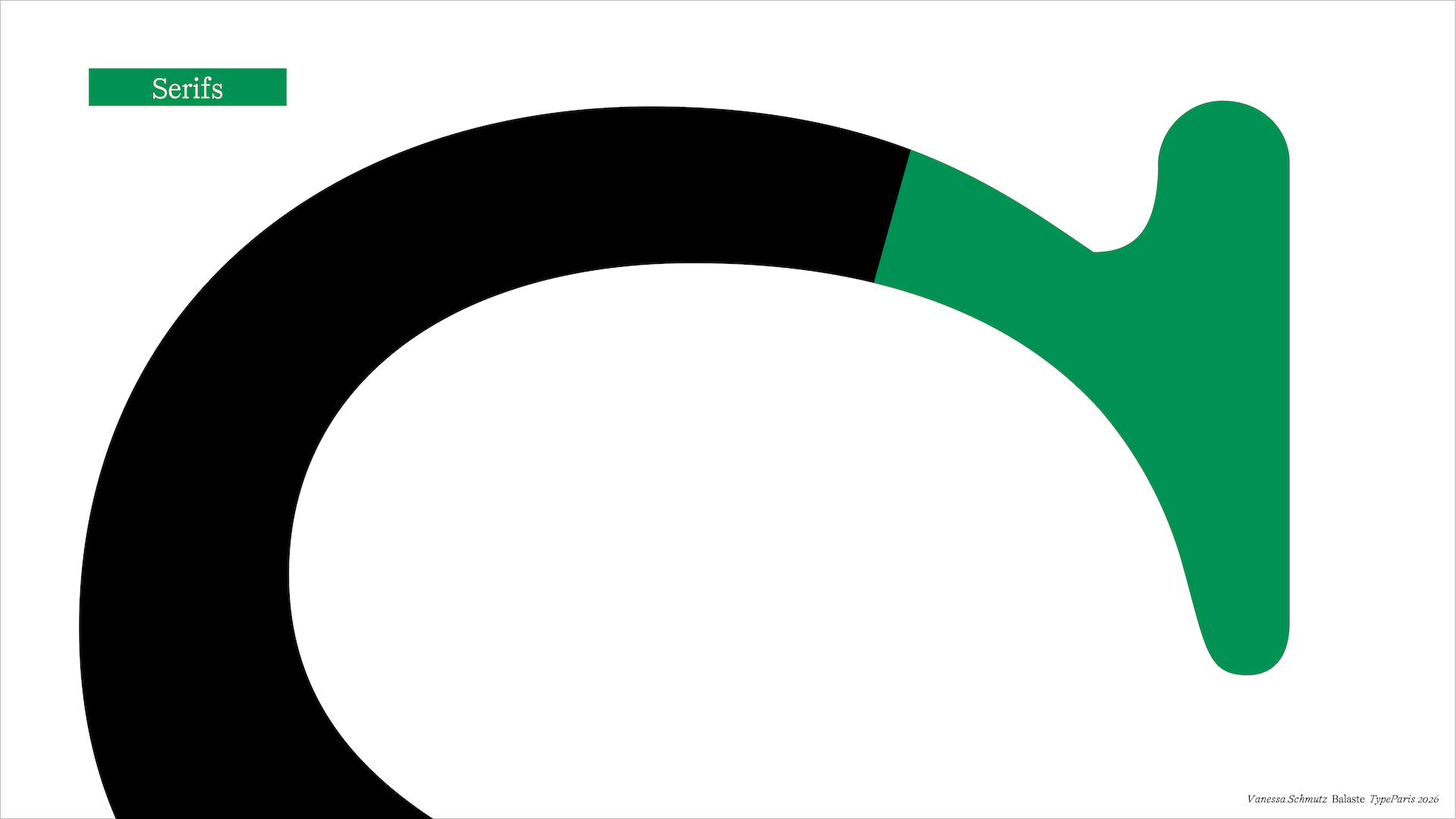
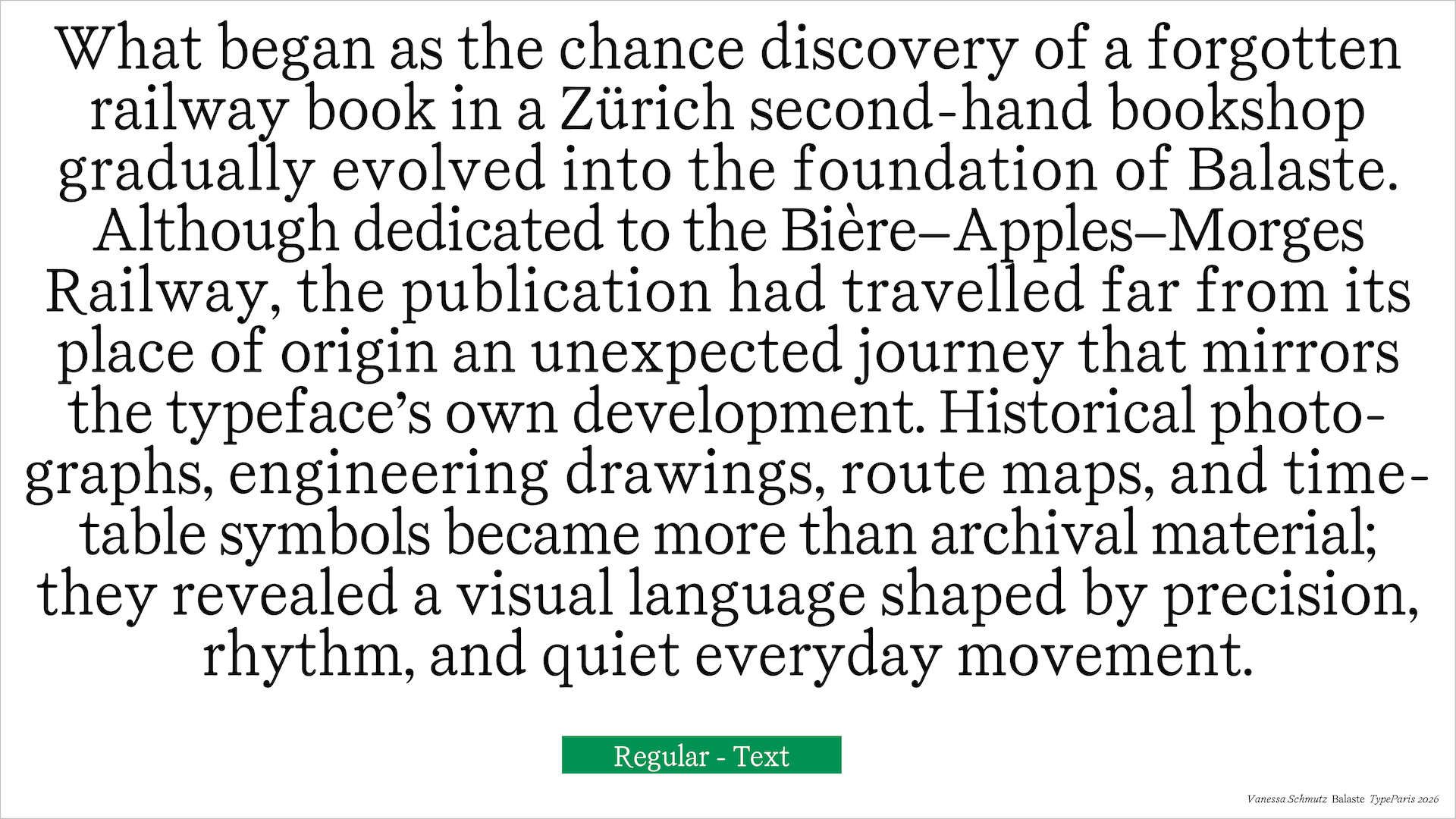
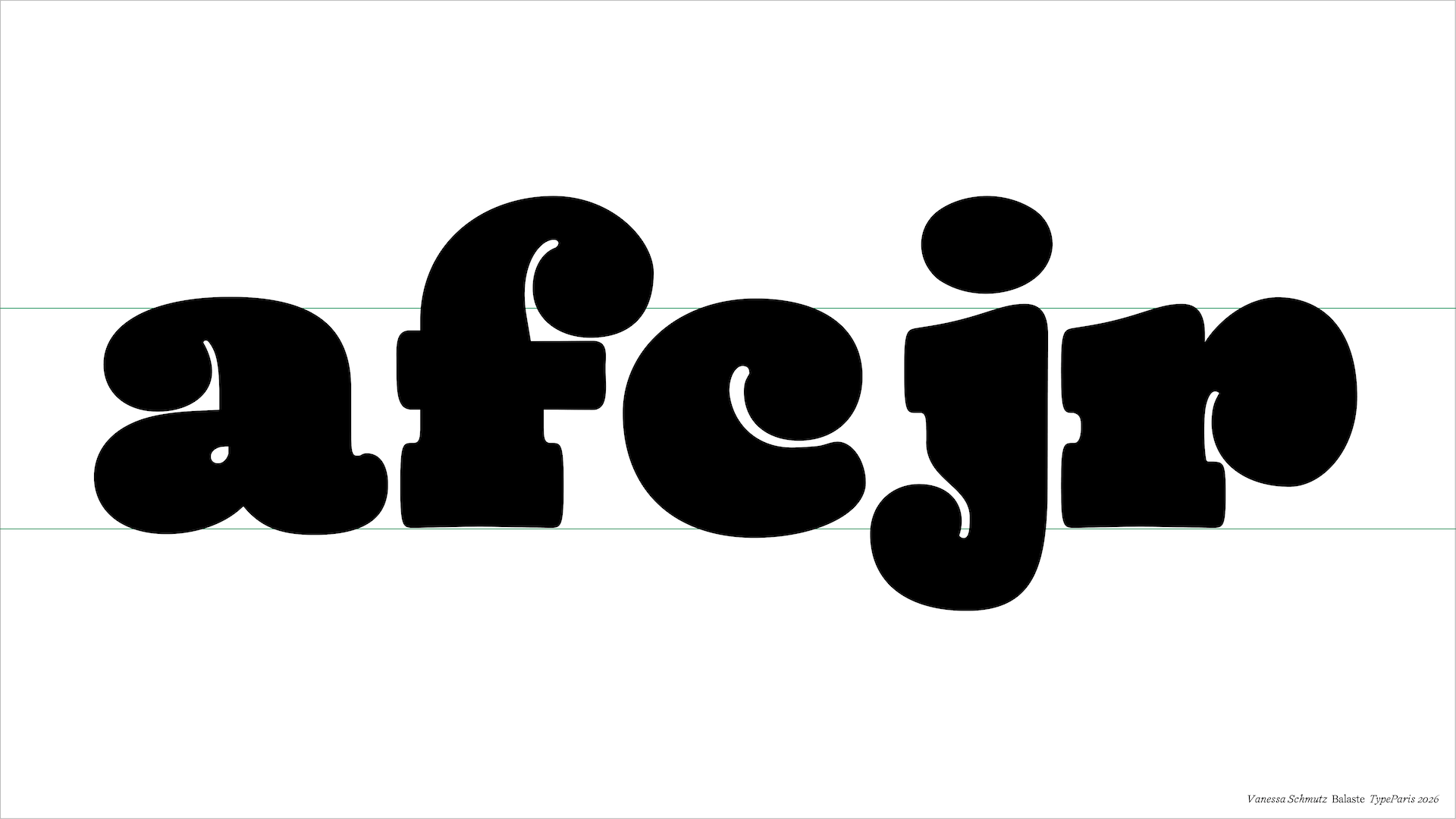
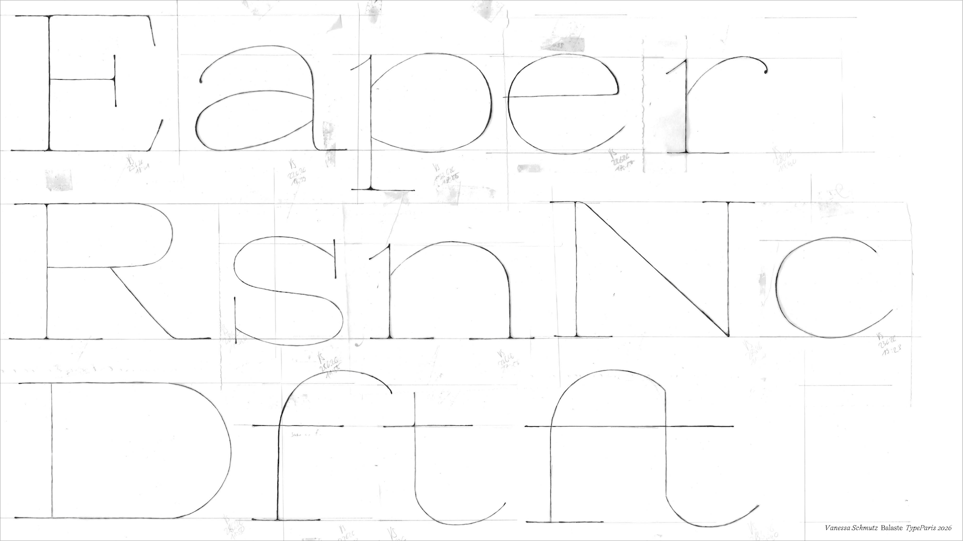
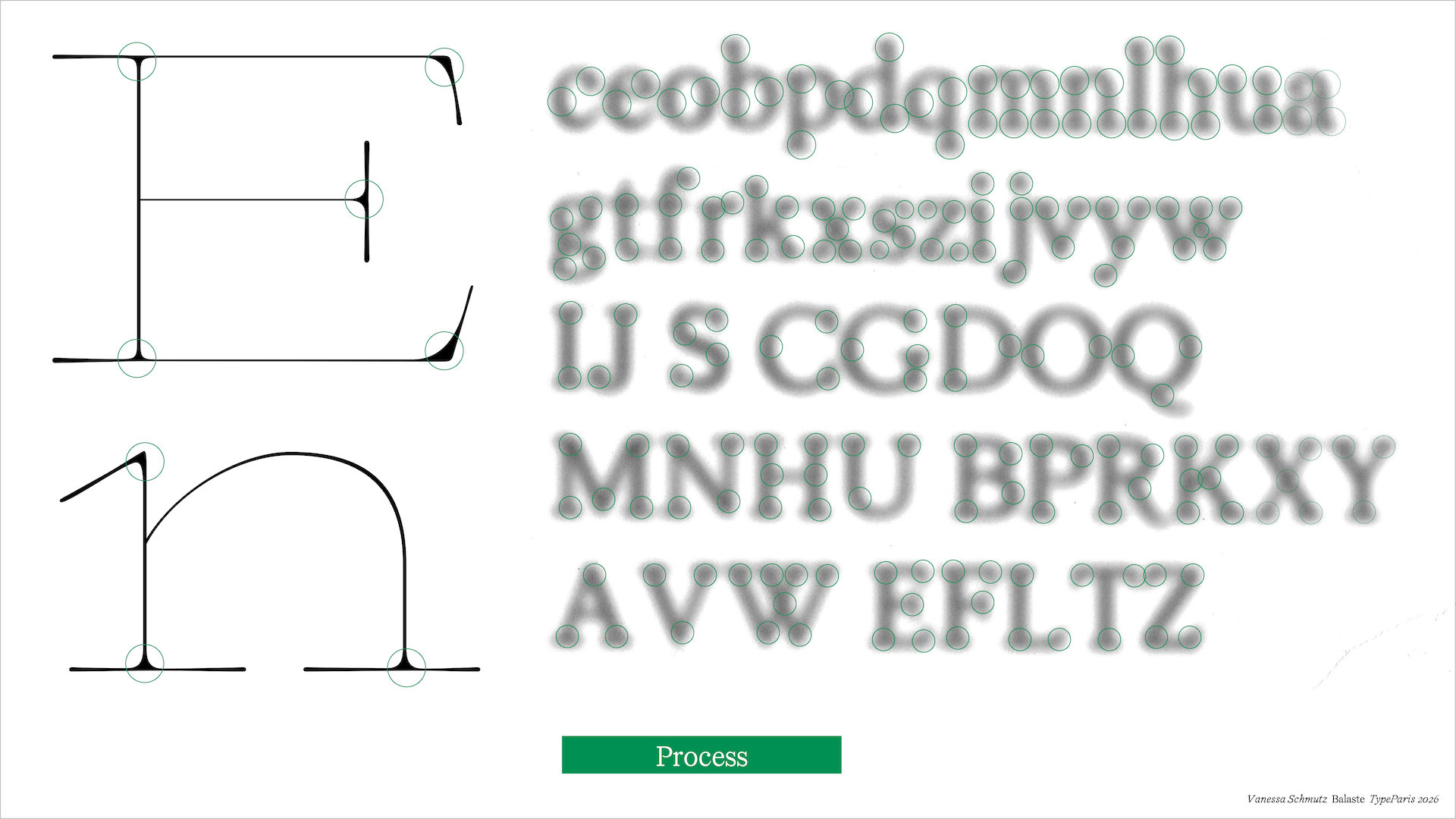
This fin-de-siècle influence is reflected in the Regular weight's pronounced verticality and subtly condensed proportions. Drawing on broad-nib pen traditions, Balaste features moderate stroke contrast, rounded serifs, humanist proportions, and calligraphic terminals. Together, these characteristics mirror the atmosphere of the railway itself: quiet, warm, and compact. This gives the typeface an easy-to-read, humanistic, and classical feel.
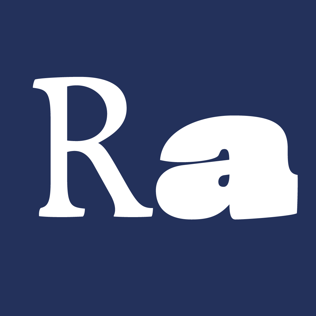
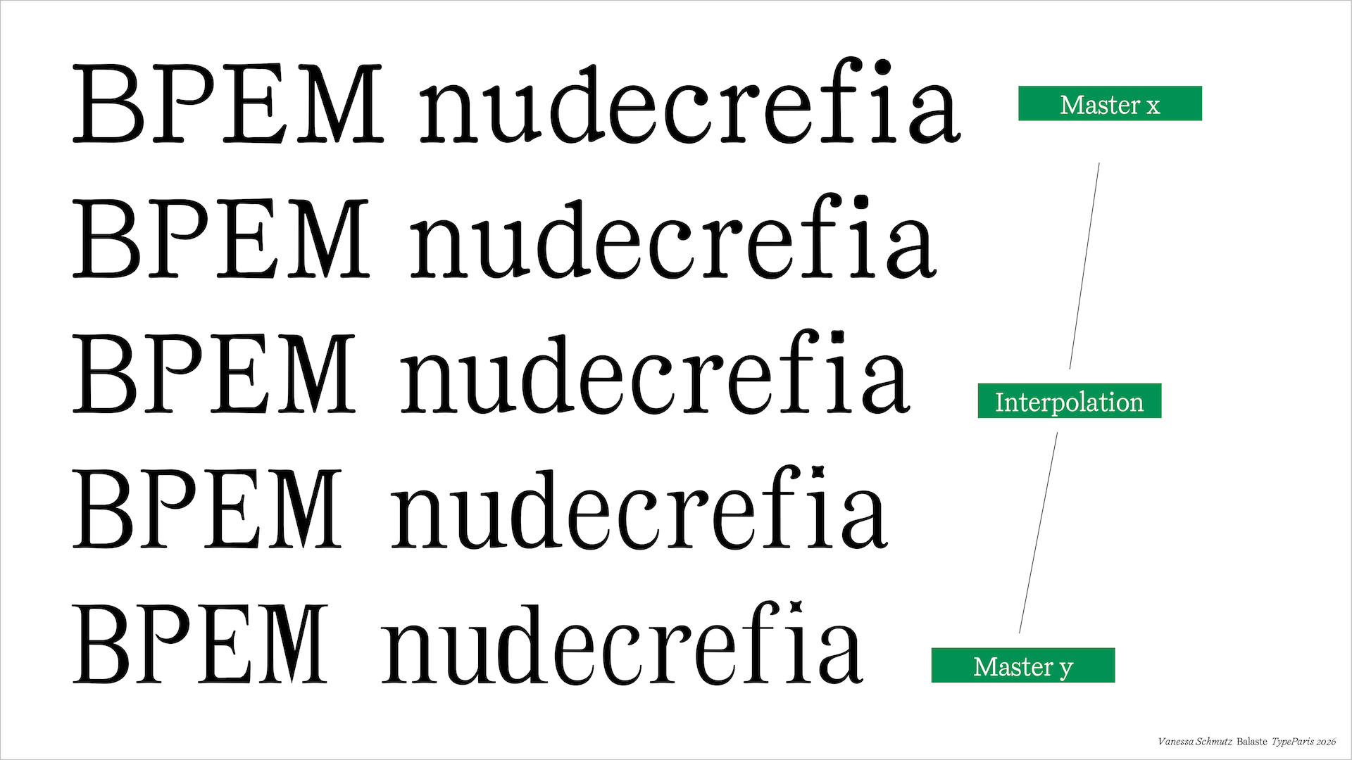
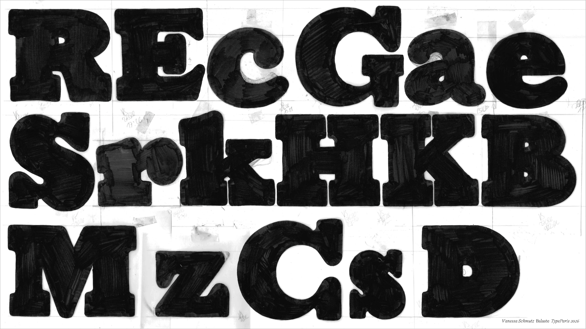
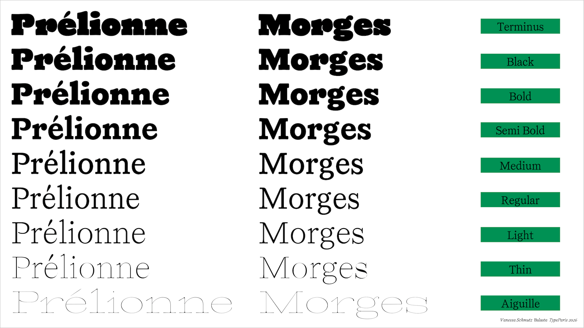
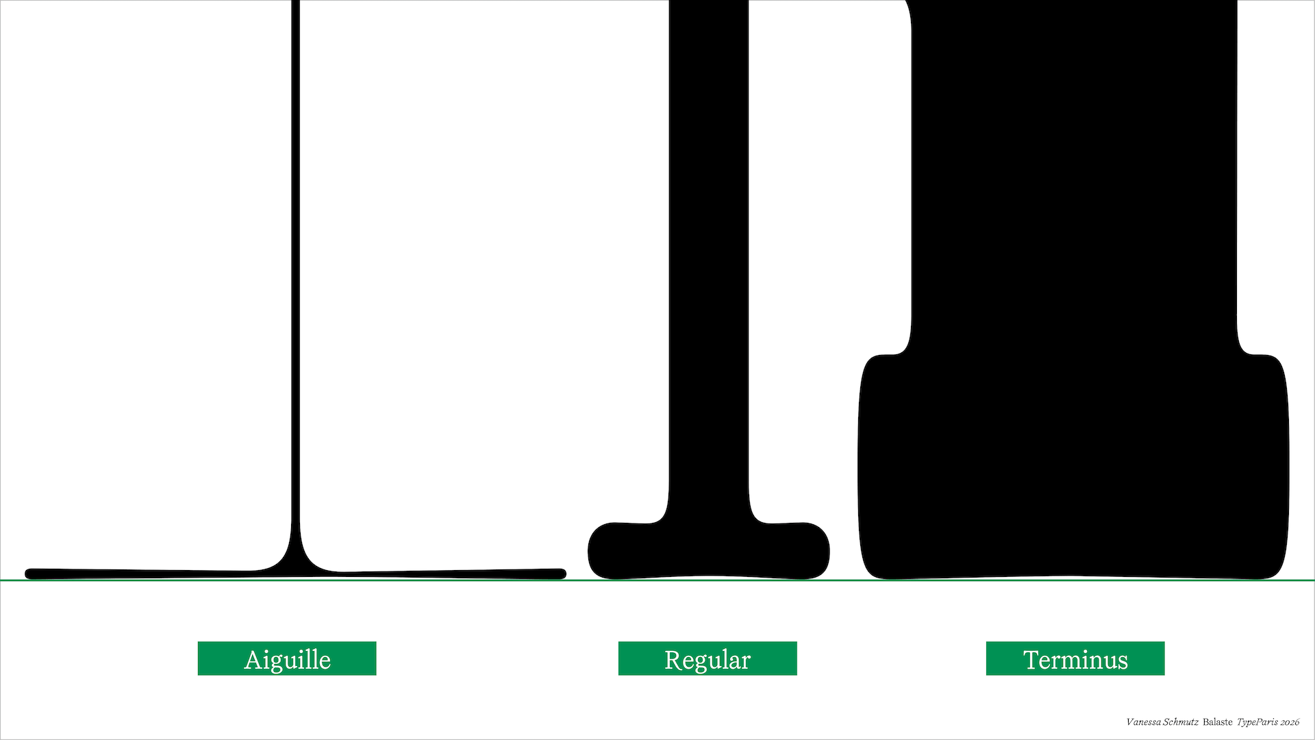
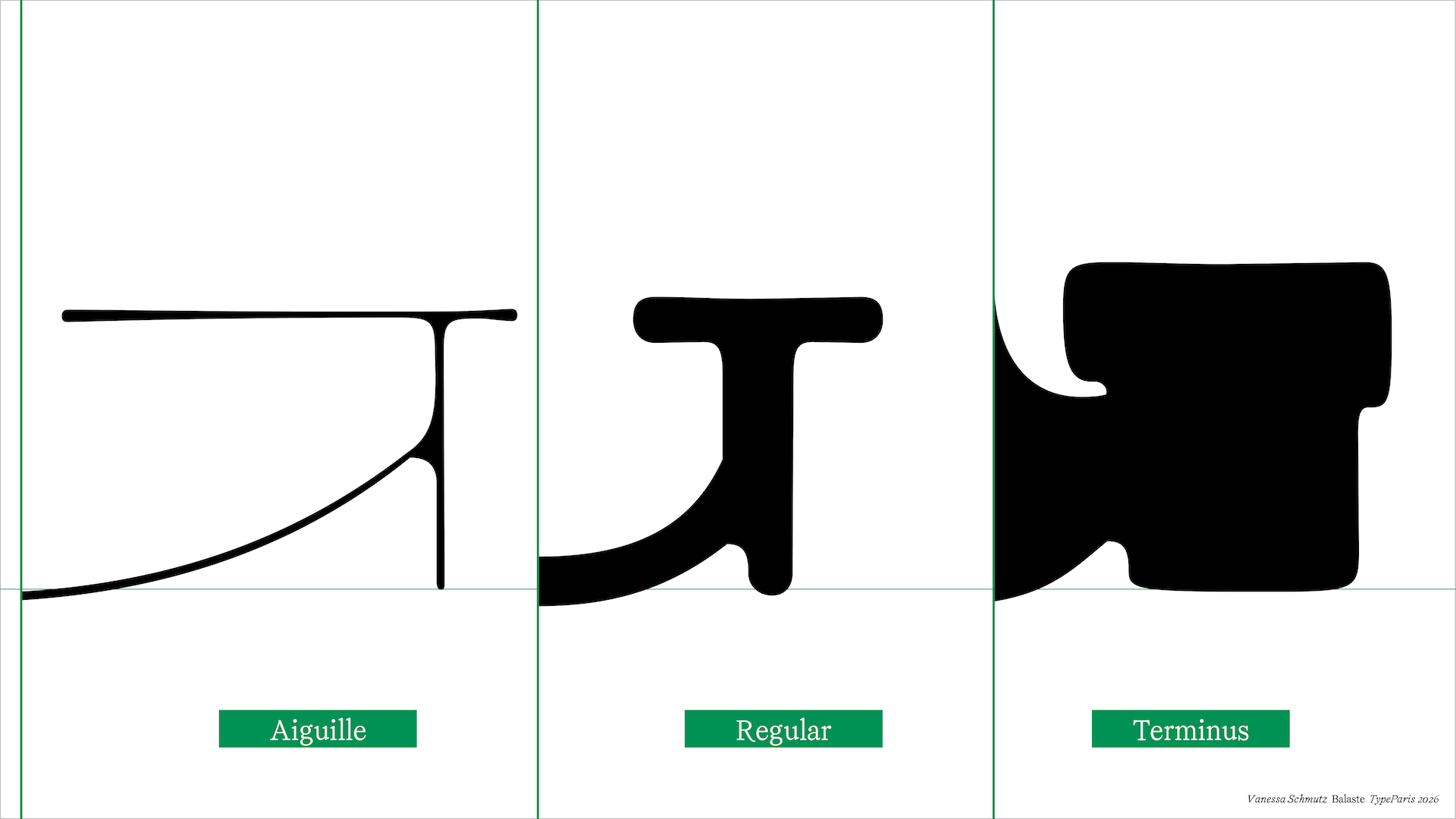
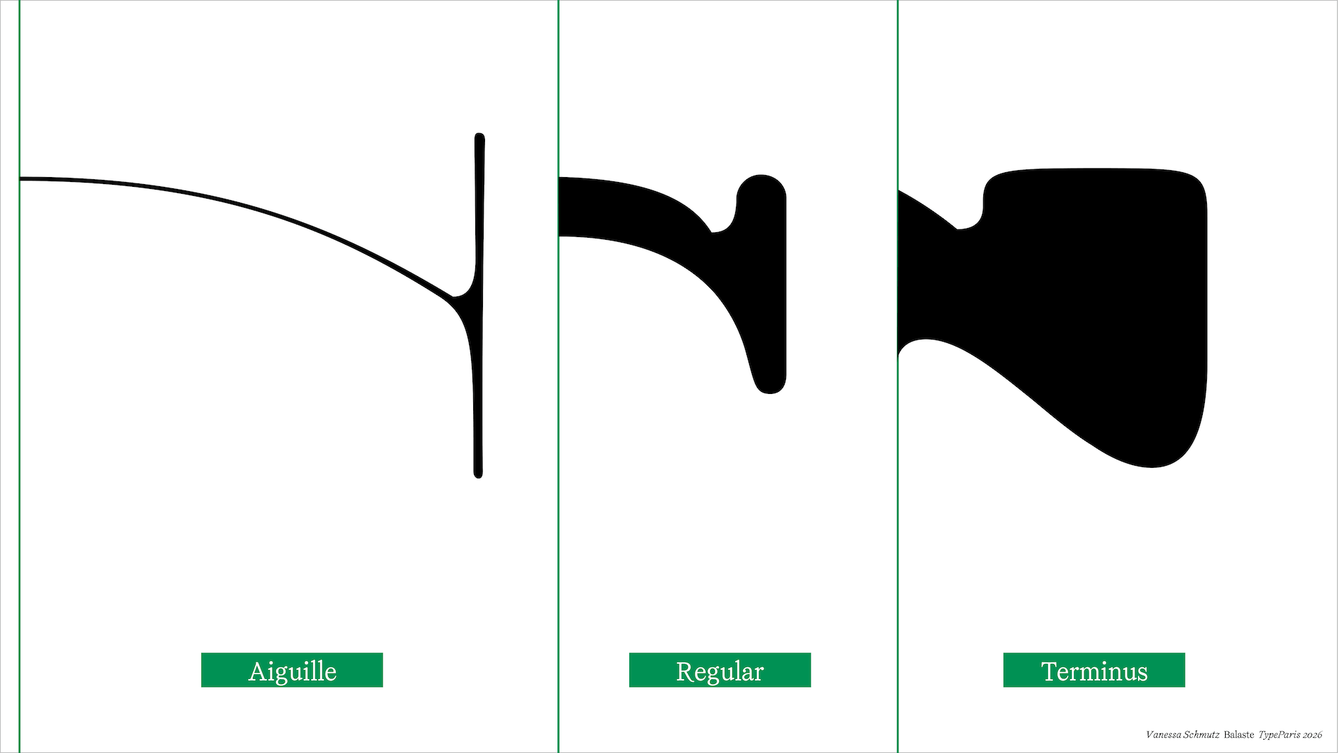
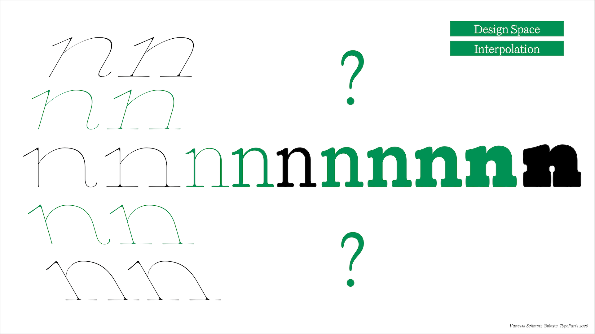
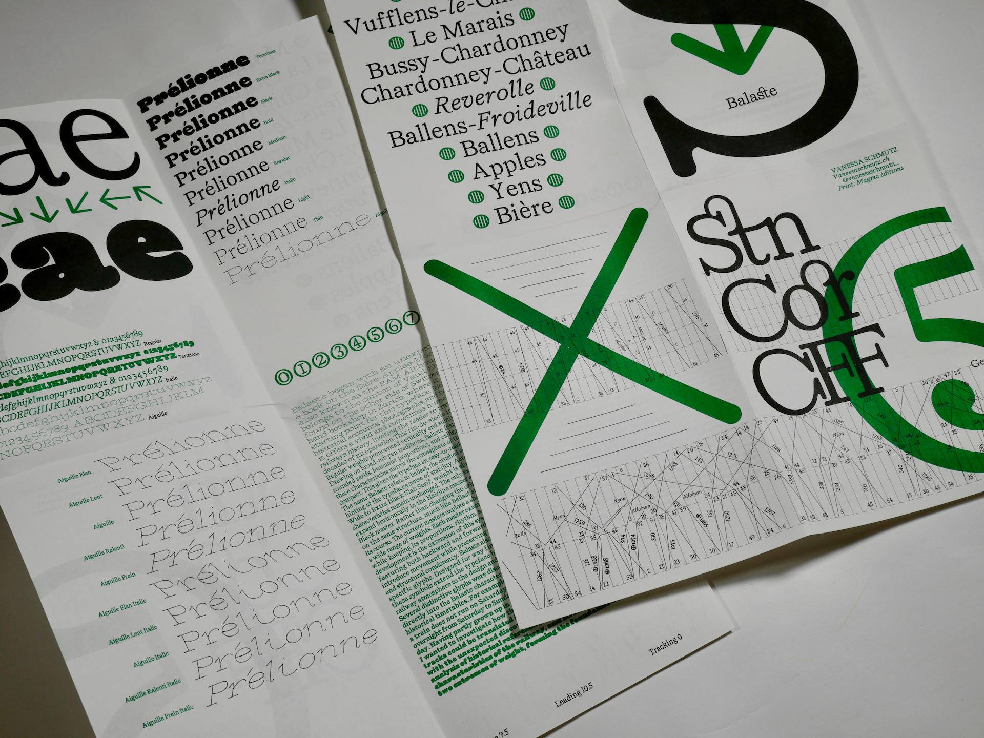
The name Balaste refers to ballast, the crushed stone that stabilises railway tracks, hinting at the typeface's sense of stability. Across the family, from Hairline Wide to Extra Black Slab Serif, weight is abruptly introduced while the core characteristics remain unchanged. The only exception lies in the serifs, which expand horizontally in the Hairline master and extend vertically in the ExtraBlack master. Rather than changing the original forms, each style is based on the same structure, much like ballast stabilises a railway without altering its course.
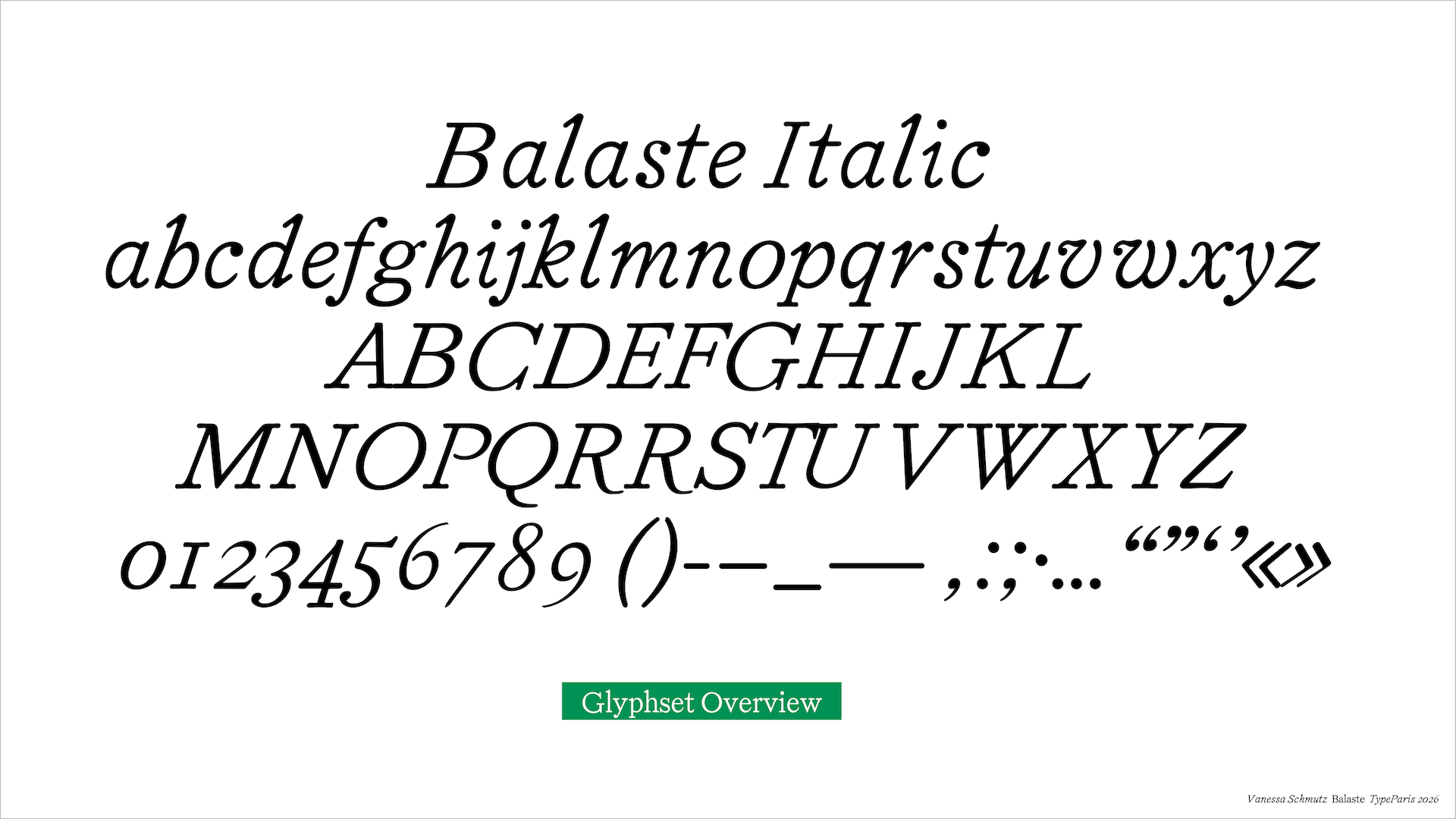
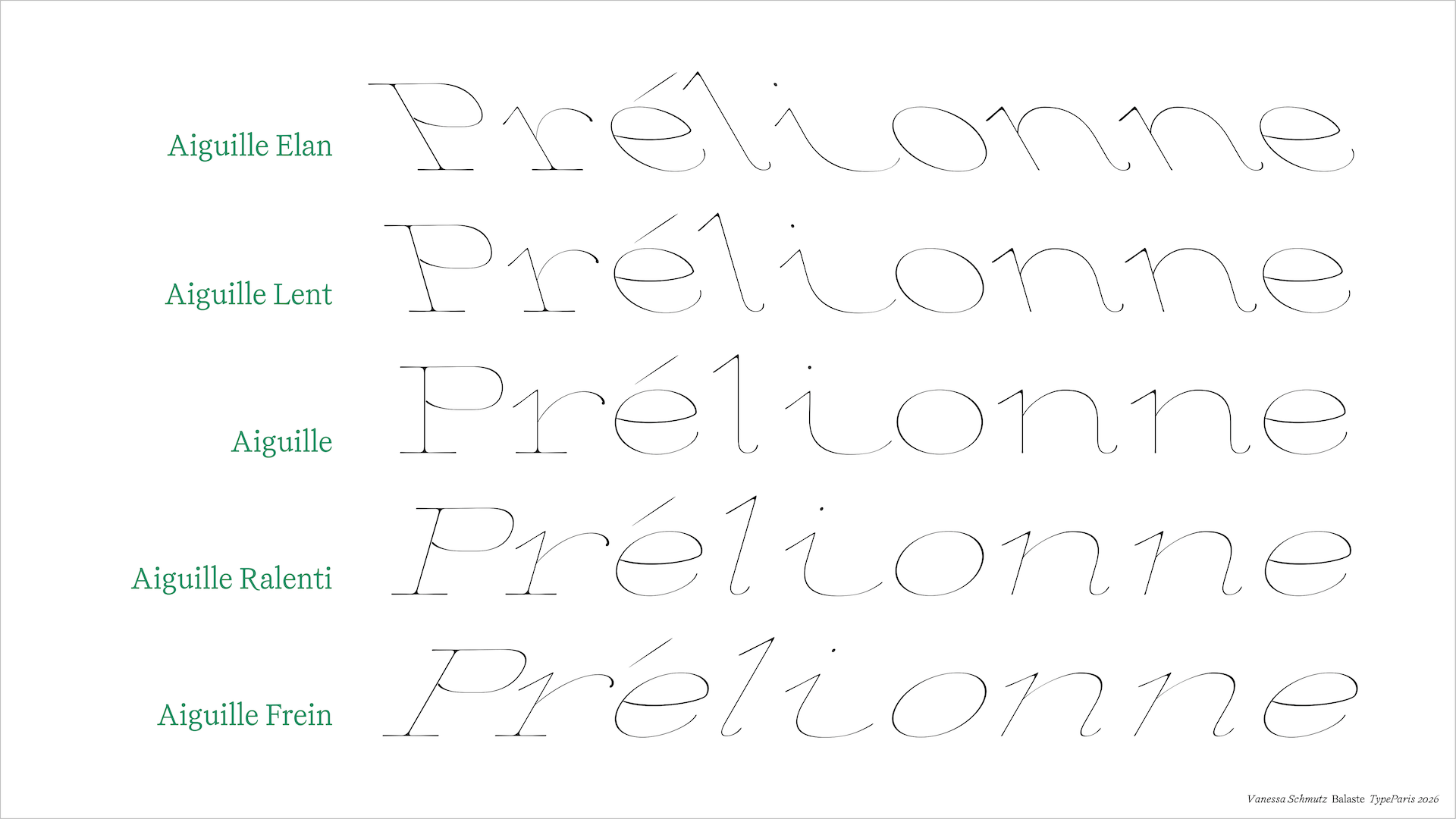
The current masters explore a shared structural foundation across a wide range of weights. Each master examines how far the design can be pushed while keeping its proportions, rhythm, and construction intact. Another development is the extension of this system with an additional axis of speed, featuring both backward and forward slants. The challenge here is to introduce movement while preserving the typeface's defining characteristics and structural consistency. The speed axis is explored through two distinct variations. One preserves the serif construction of the typeface, while the other applies italic characteristics across the design. Future development will be to extend this axis to the regular style, resulting in a backward-slanted italic that further expands the speed exploration of the type family.
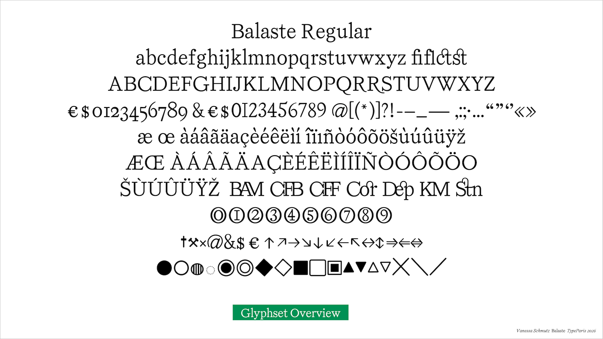
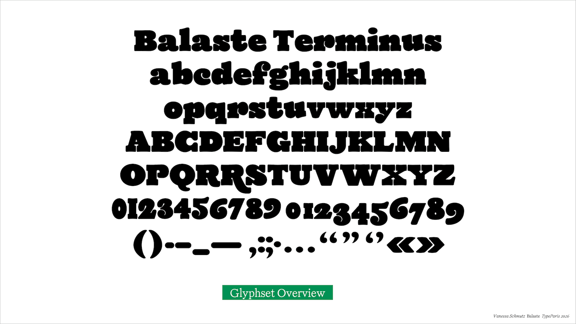
Balaste also features a dedicated set of railway-specific glyphs. Designed for wayfinding, timetables, and documentation, these symbols extend the typeface beyond the alphabet, bringing the railway atmosphere to the design and keeping it functional in a train context. Several distinctive glyphs were discovered in the book and incorporated directly into the Balaste character set. Among them are symbols used in historical timetables. For example, the two hammers indicating that a train does not run on Saturdays, or the cross showing that it operates overnight from Saturday to Sunday and on Sundays until the following day.
Having partly grown up in Apples and often travelled on the BAM, I wanted to investigate how the familiar curves of the railway tracks could be translated into typographic form. What began with the unexpected discovery of a book developed into an analysis of historical references, an exploration of the physical characteristics of the railway, and an adaptation of the two extremes of weight, forming the foundation of Balaste.
Apply before 14 January for the three-week type design course starting 5 April and ending 24 April 2027.

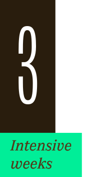
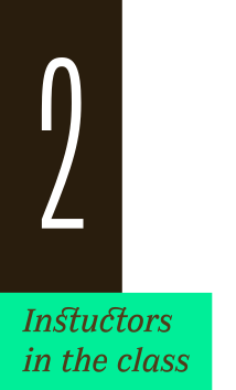
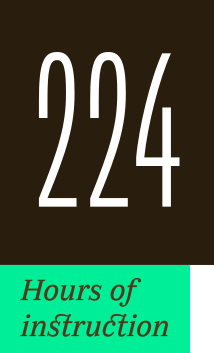
After 10 years in Paris, we reinvent our type design programme. We go from 6 weeks to 3 weeks, while maintaining the fundamentals that make TypeParis’ reputation.
The course will take place in Menorca, Spain for the first time. In 2027, we offer two levels, Foundation and Expert, which allows you to discover type design, or to gain expertise after an initial training.
➼ Subscribe to our mailing list to stay informed, until application period is launched.
Get ready & apply before 14 January 2027