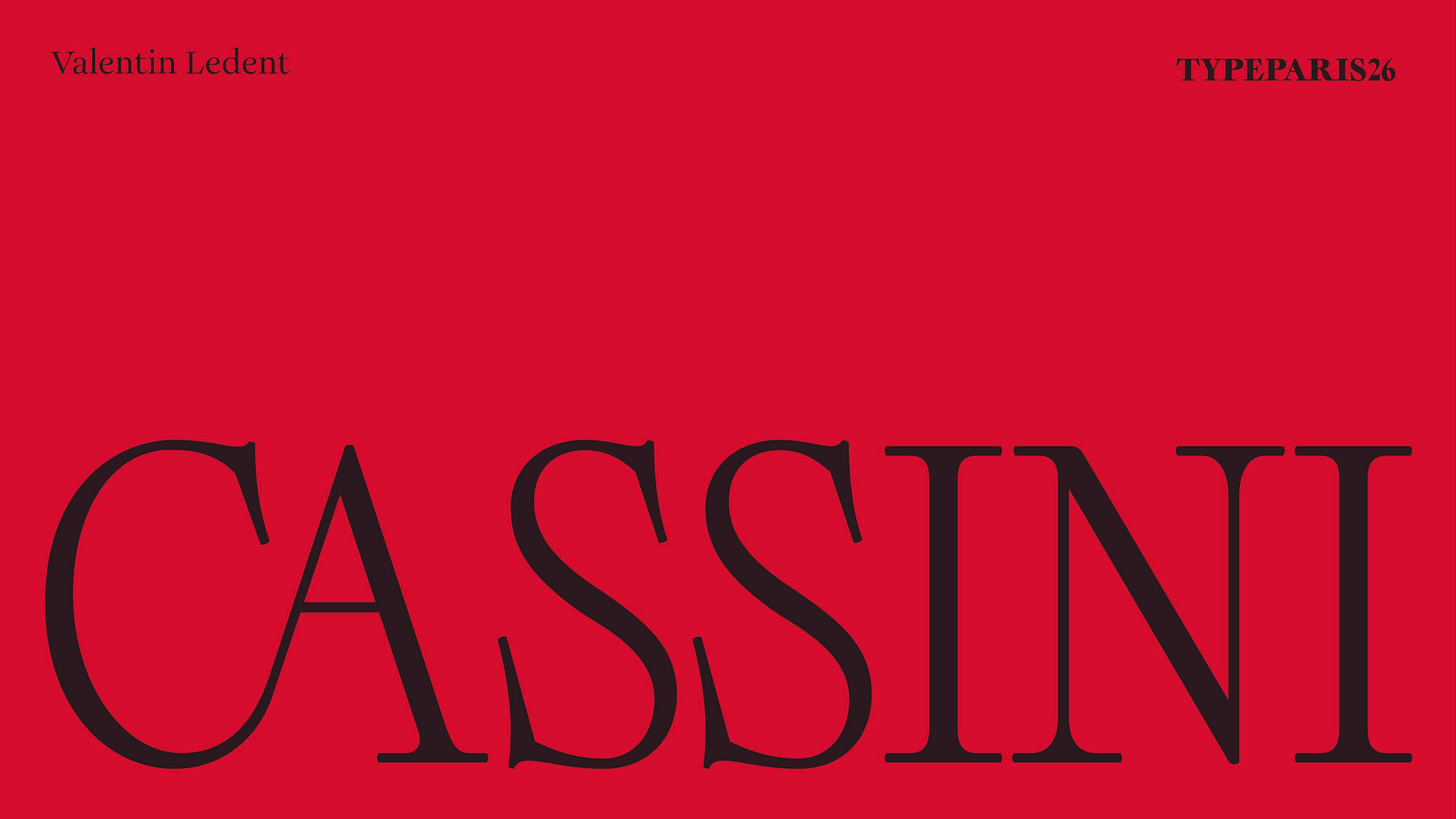
Cassini
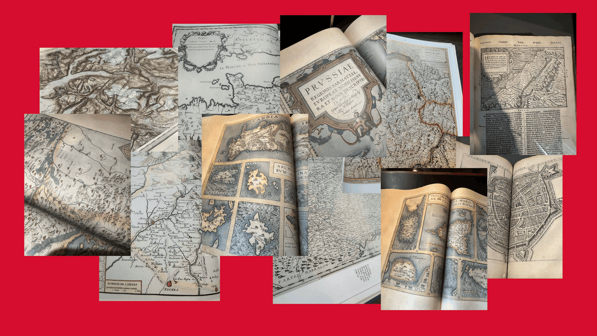
I discovered maps as a child, through my grandparents. They were part of many moments spent outside: before going hiking, skiing, travelling, or simply trying to understand where we were. I remember being fascinated by the fact that a whole territory could fit on a sheet of paper. A map could show mountains, rivers, roads, villages, borders, distances but also suggest a way to move through them. Later, I started collecting maps at home. I liked them first as objects, for their colours, textures and details. But the more I looked at them, the more I became interested in something less obvious: the role of typography in the way we read and imagine a place. This is what led me to the Carte de Cassini.
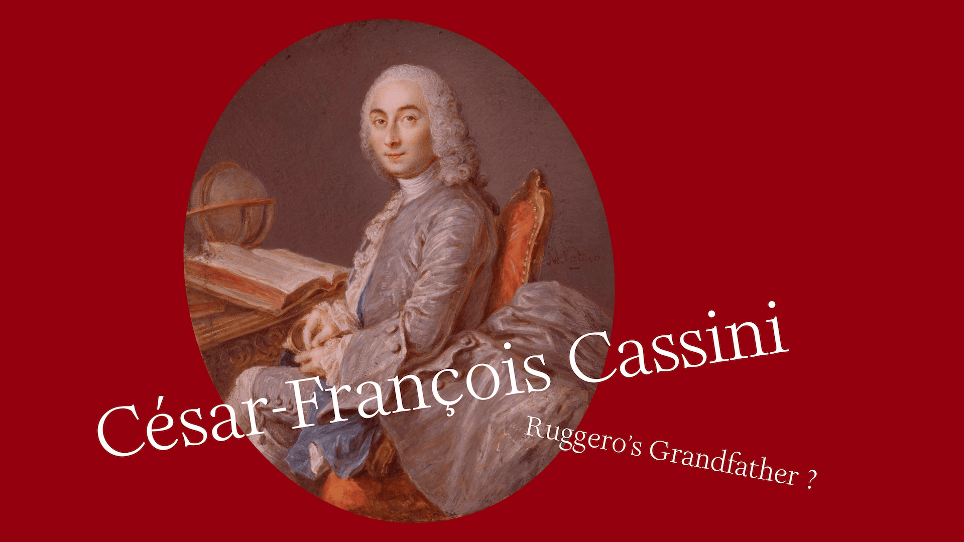
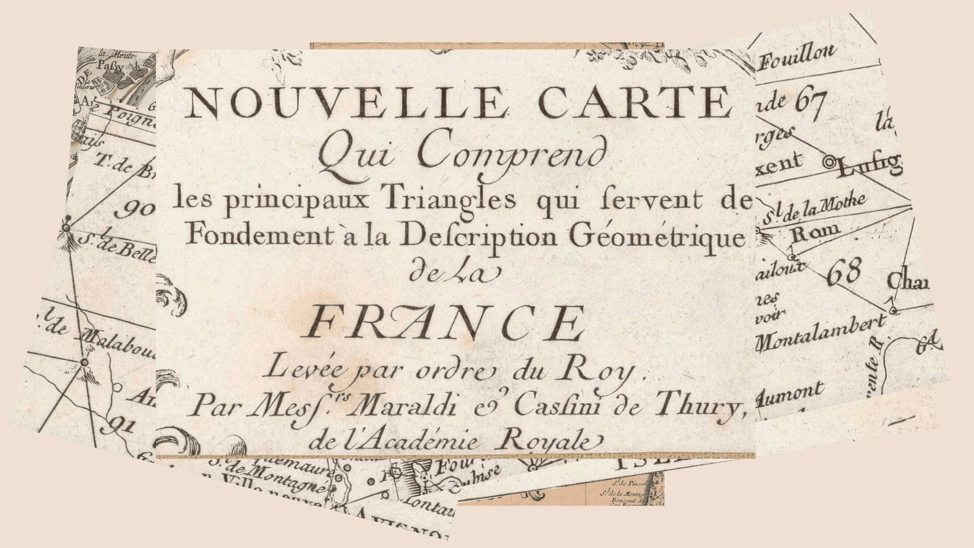
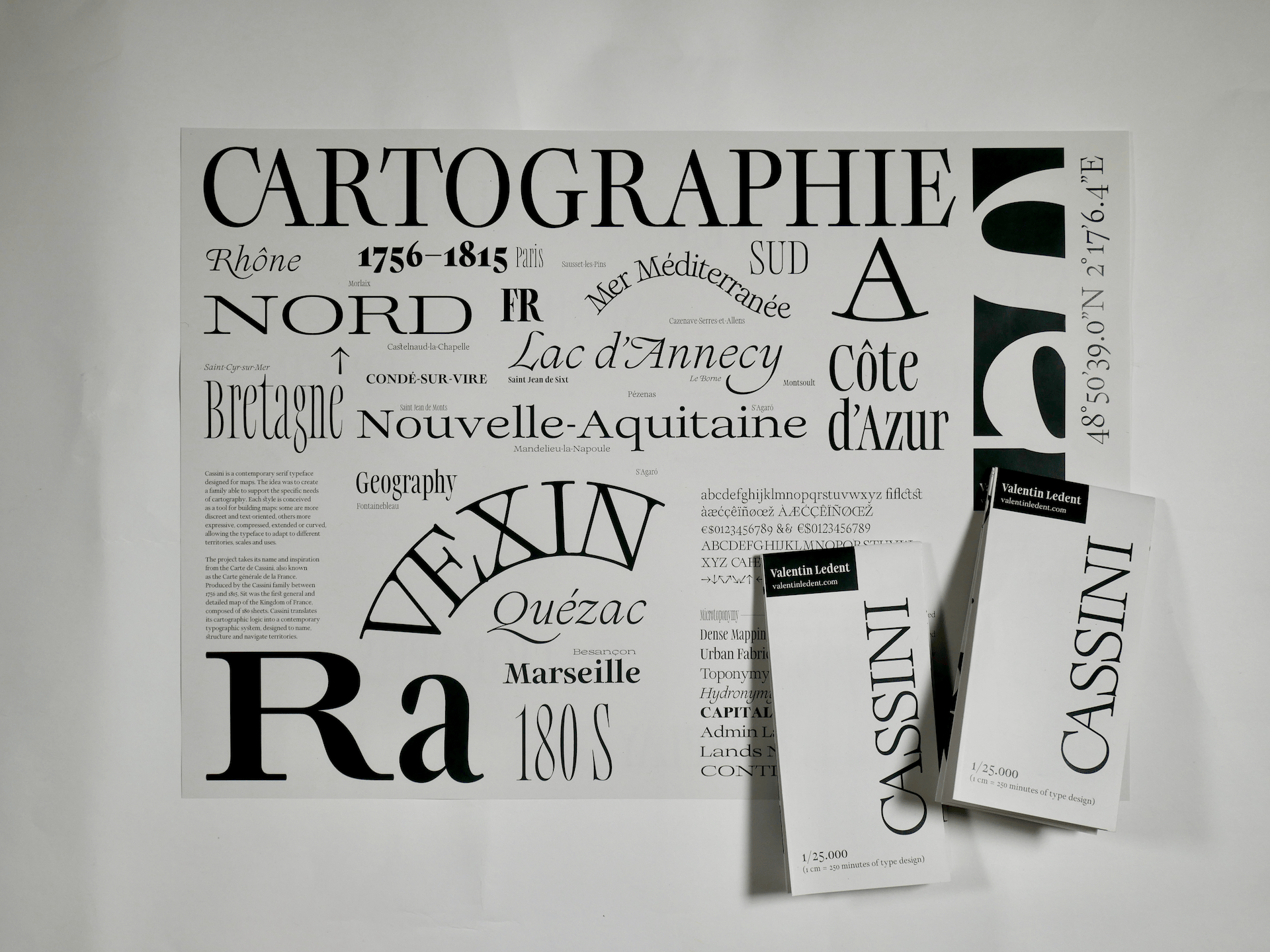
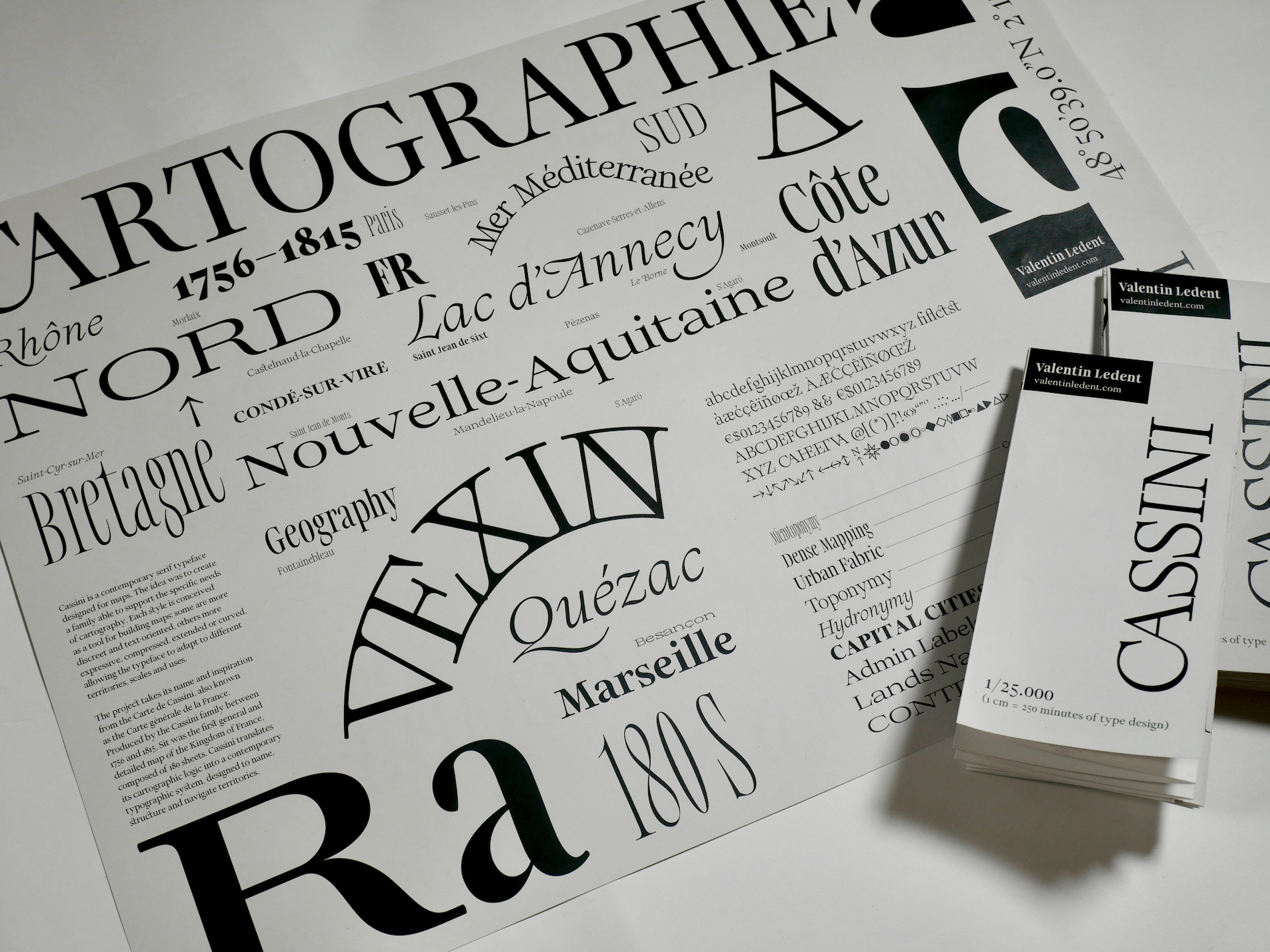
This project began with the Carte de Cassini, also known as the Carte générale de la France. Produced by the Cassini family between 1756 and 1815, it was the first general and detailed map of the kingdom of France, composed of 180 sheets. Looking at it today is fascinating because it shows a France that feels both familiar and distant. The territory is recognisable, but the borders, names and visual codes belong to another time.
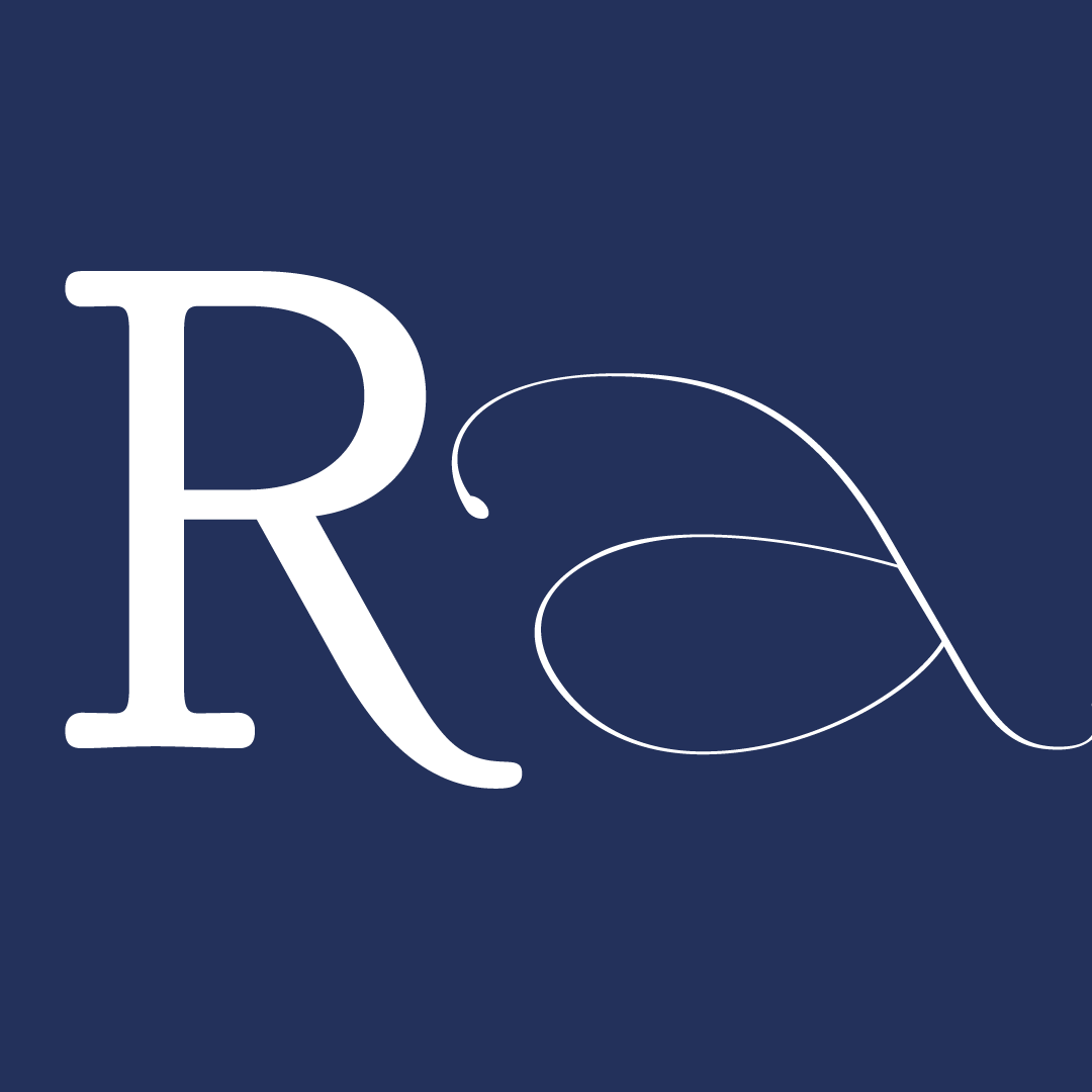
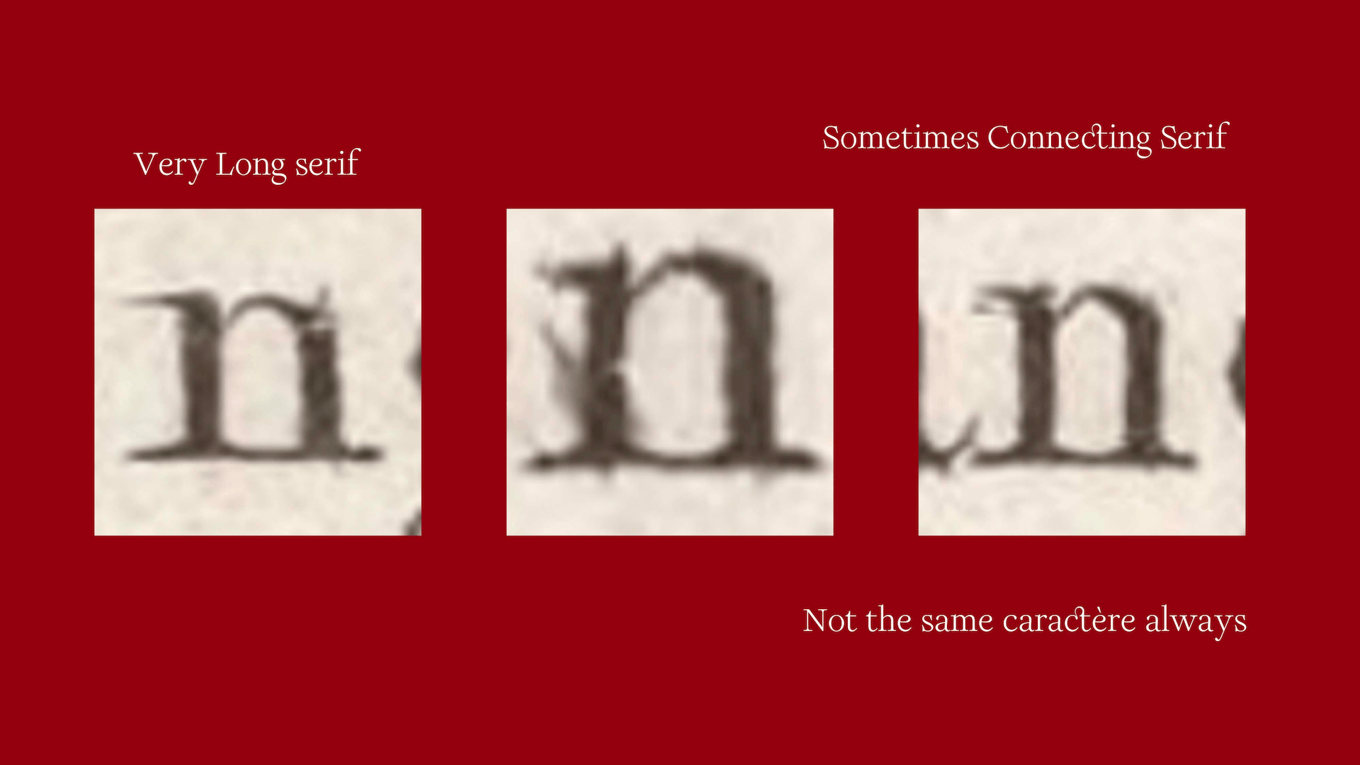
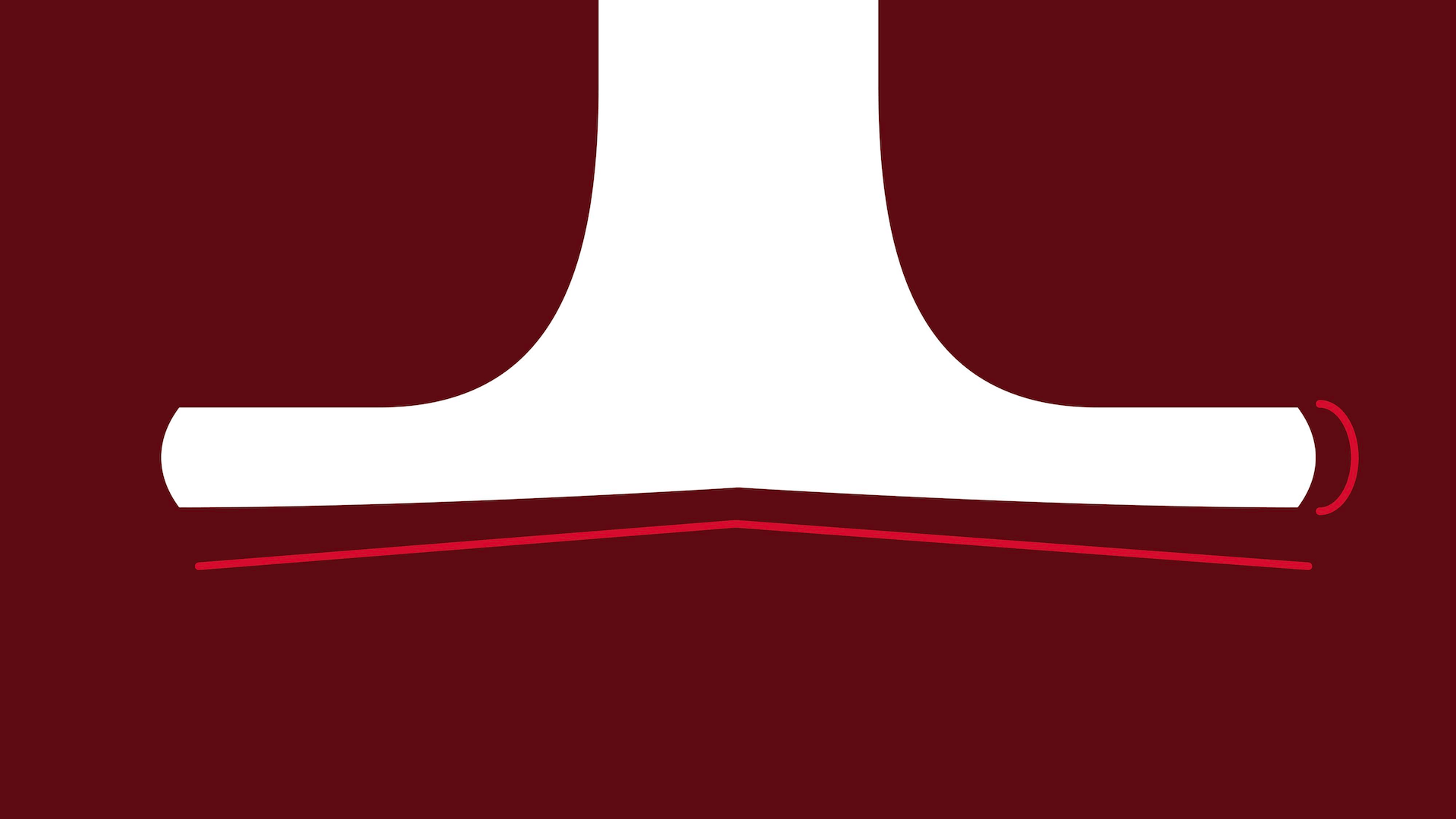
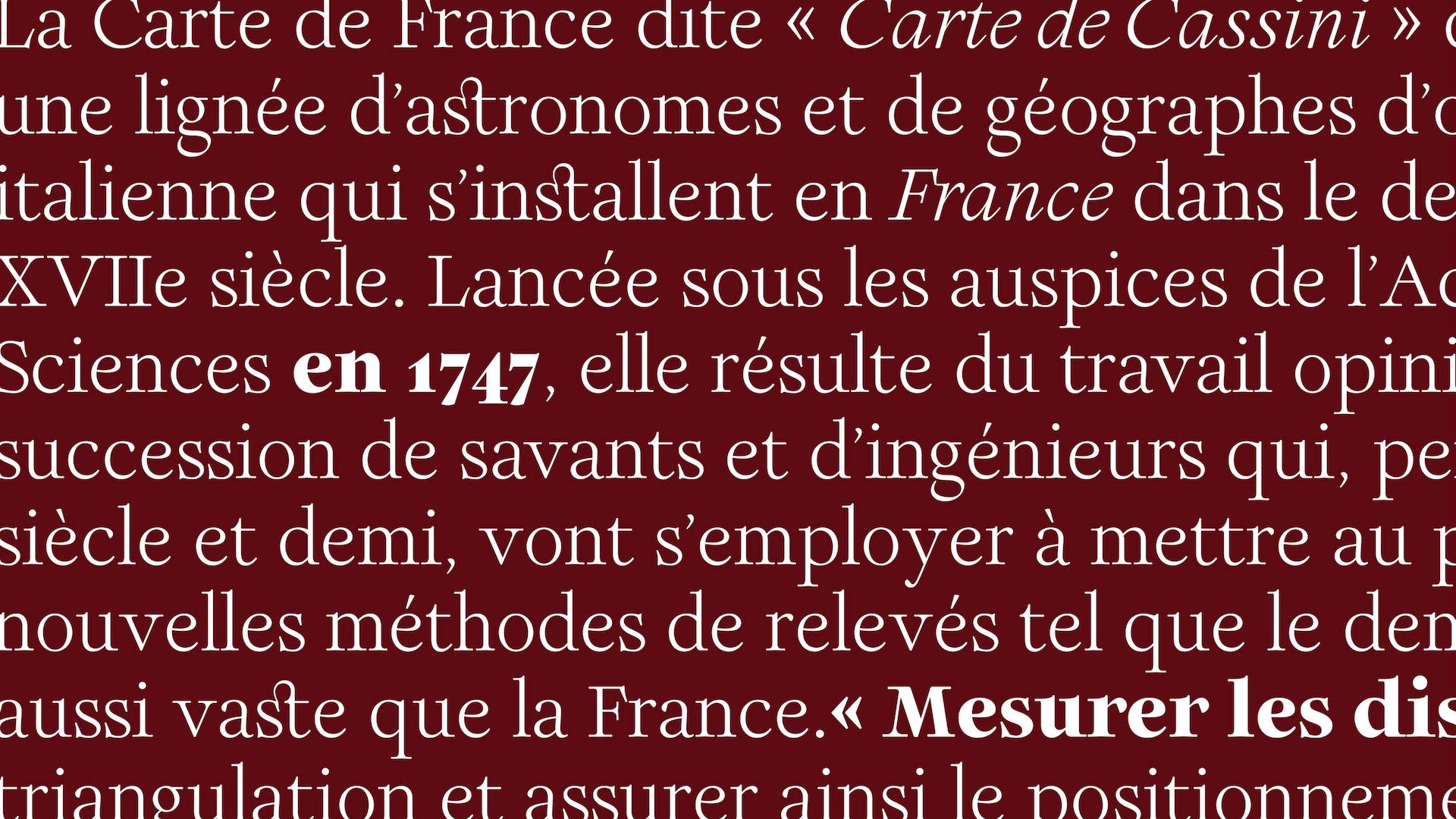
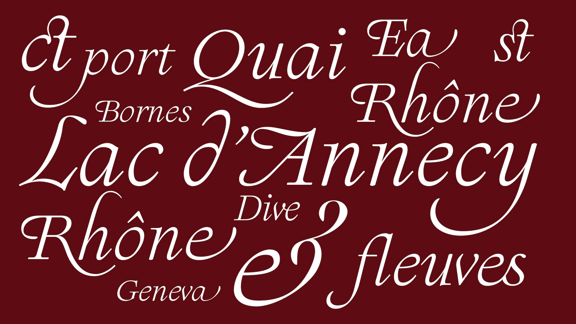
What interested me most was not only the map itself, but the lettering used throughout it. The Carte de Cassini is a scientific and geodetic project, made to measure, organise and represent the country with precision. At the same time, its engraved typography carries a strong human presence. Some forms suggest the influence of writing and the pointed pen, with contrast, pressure, long serifs and small organic details that bring warmth to a very precise cartographic system. The names of towns, rivers, regions and landscapes are not just labels placed on a surface. They follow the movement of the territory, create rhythm, hierarchy and atmosphere.
This tension became the starting point of Cassini: how can a typeface be precise enough to organise information, but human enough to give character to a place? A map needs clarity, hierarchy and structure, but it also needs a voice. Typography helps the reader navigate between different layers of information, understand the scale of a territory, and feel the difference between a river, a city, a region or a mountain range.
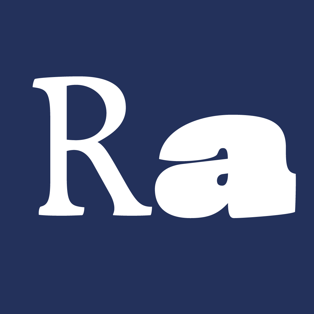
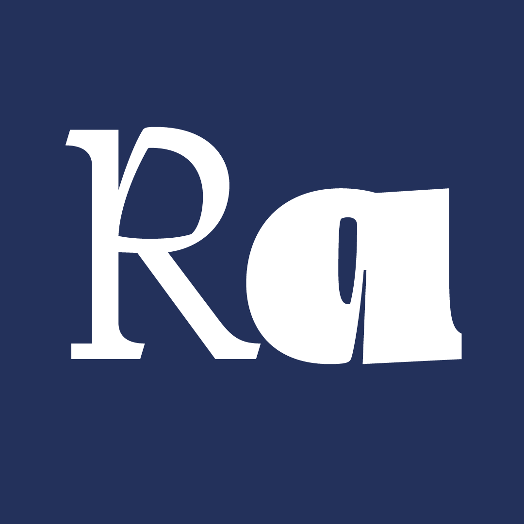
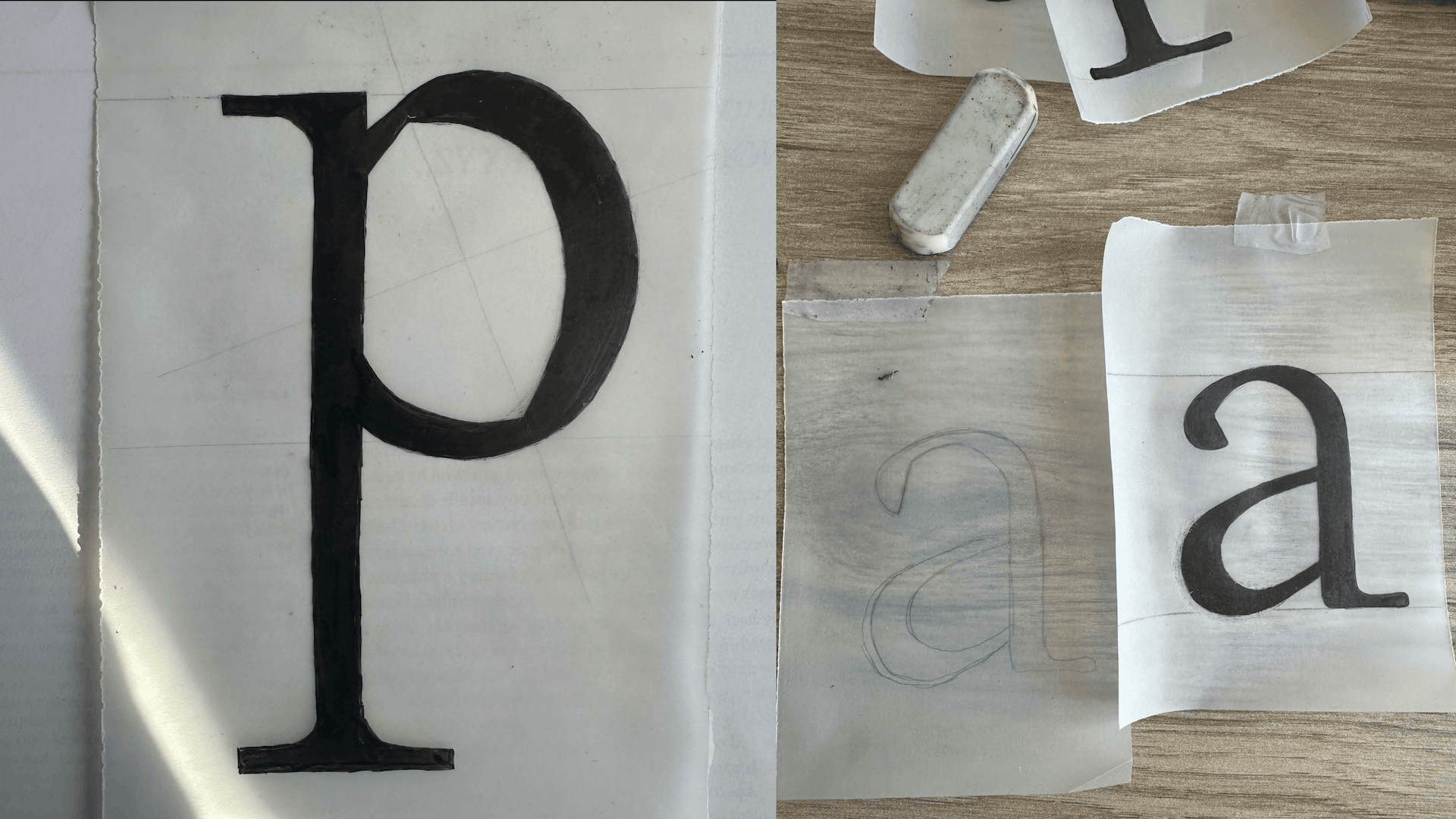
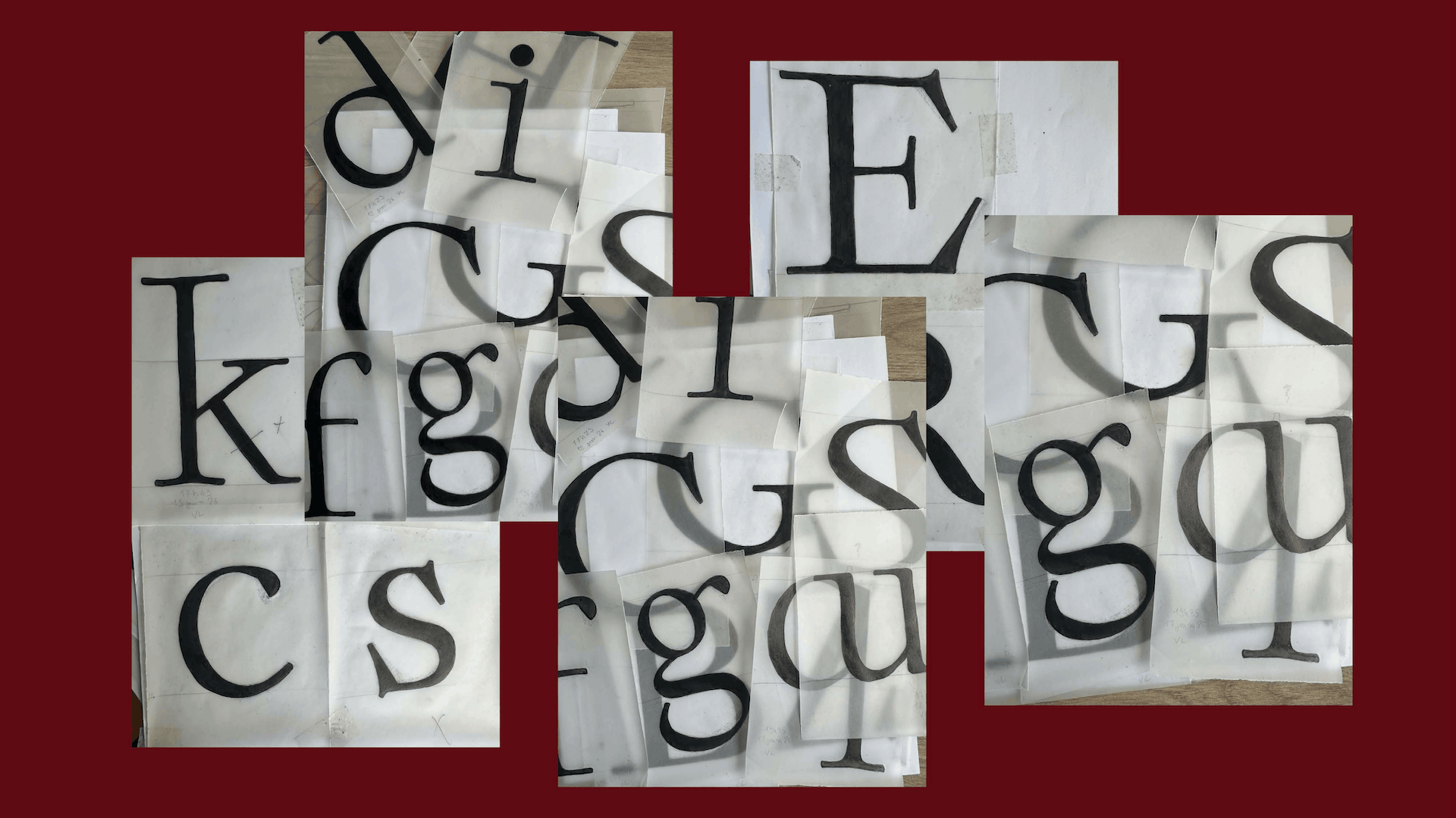
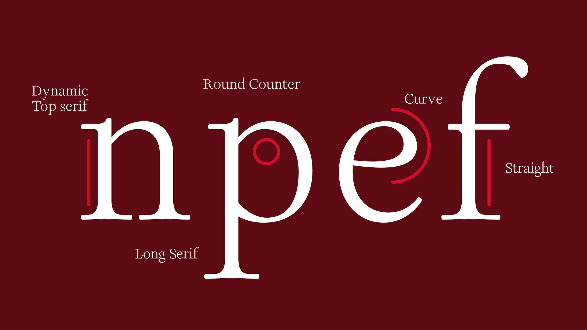
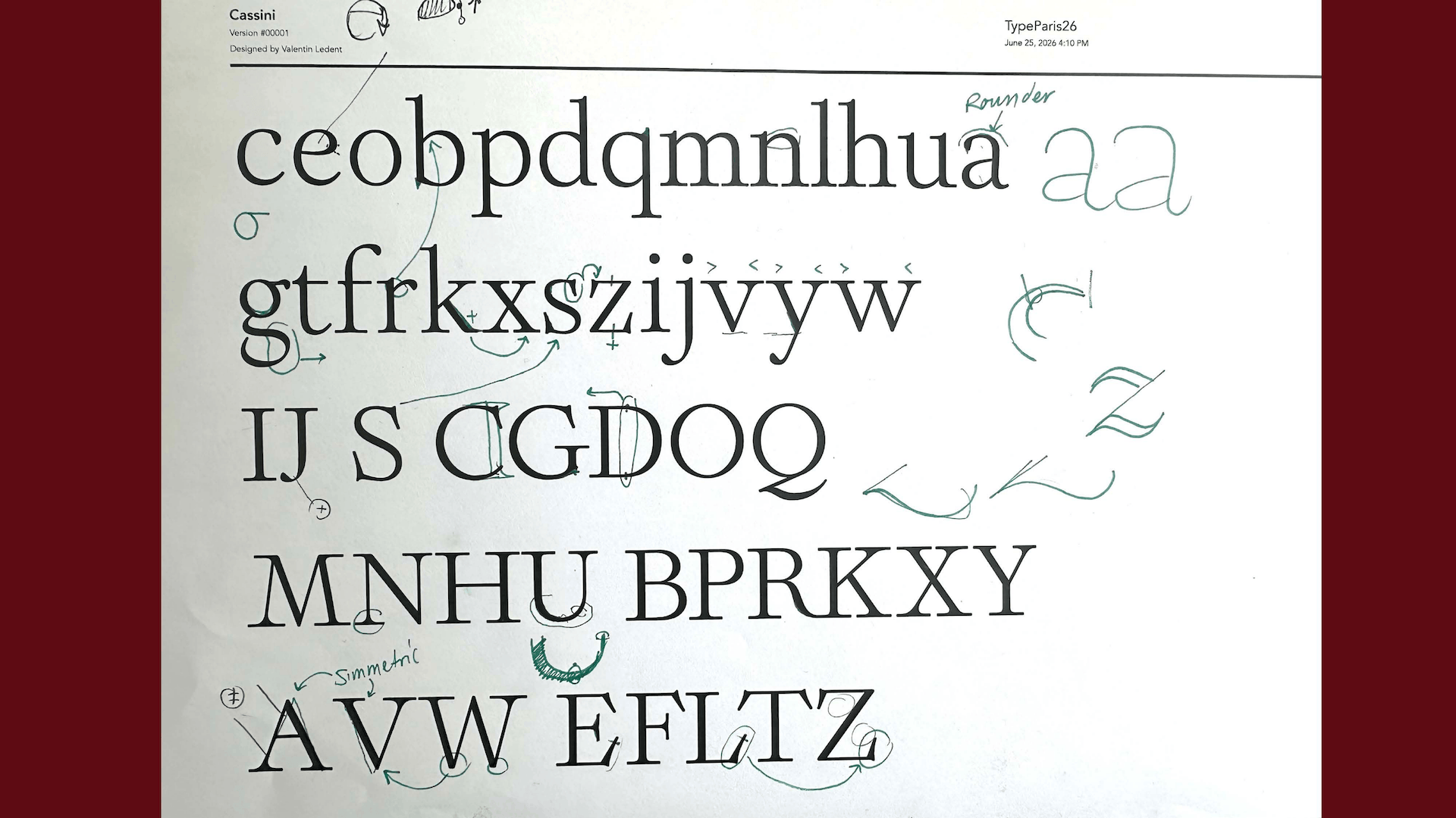
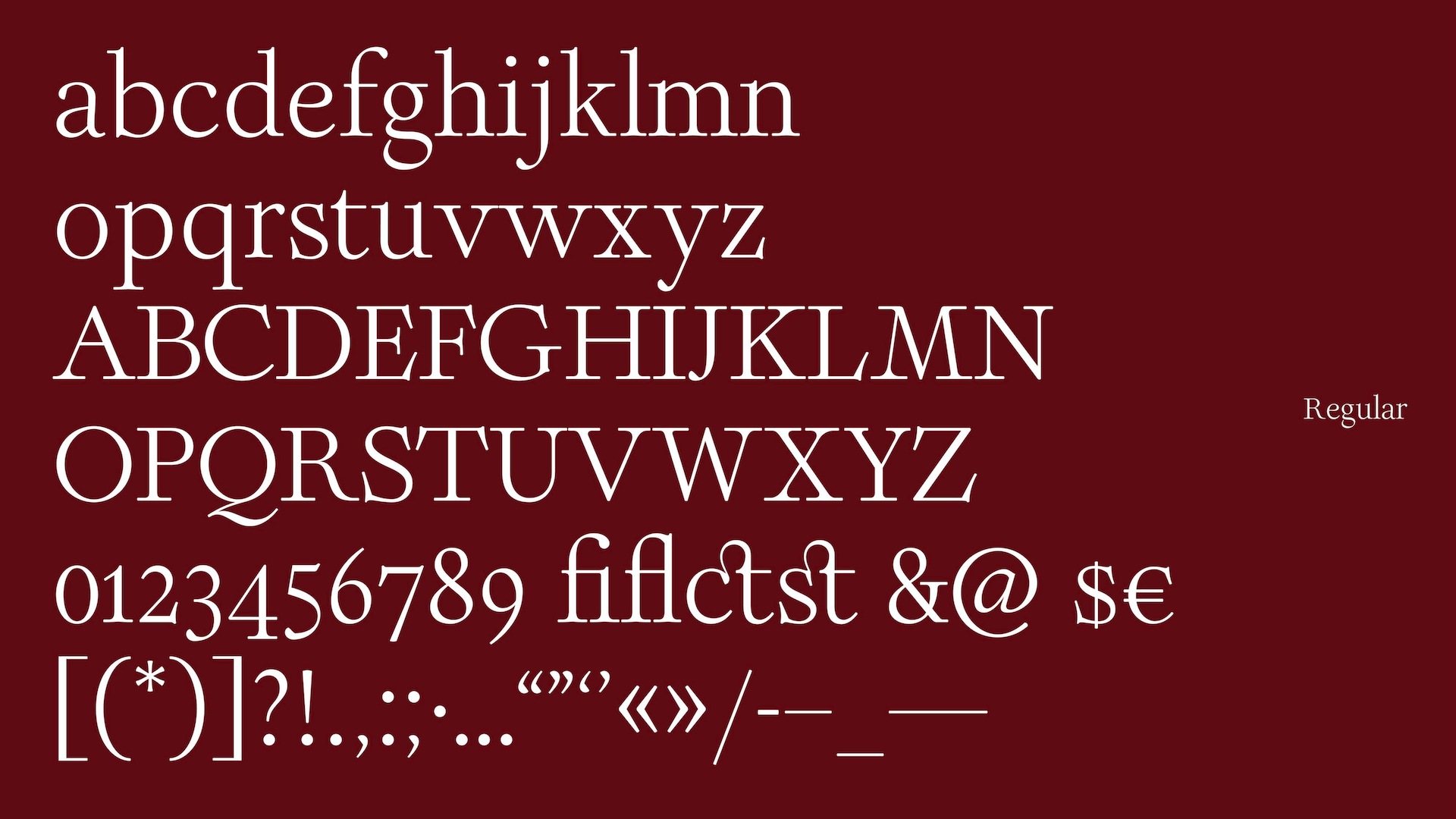
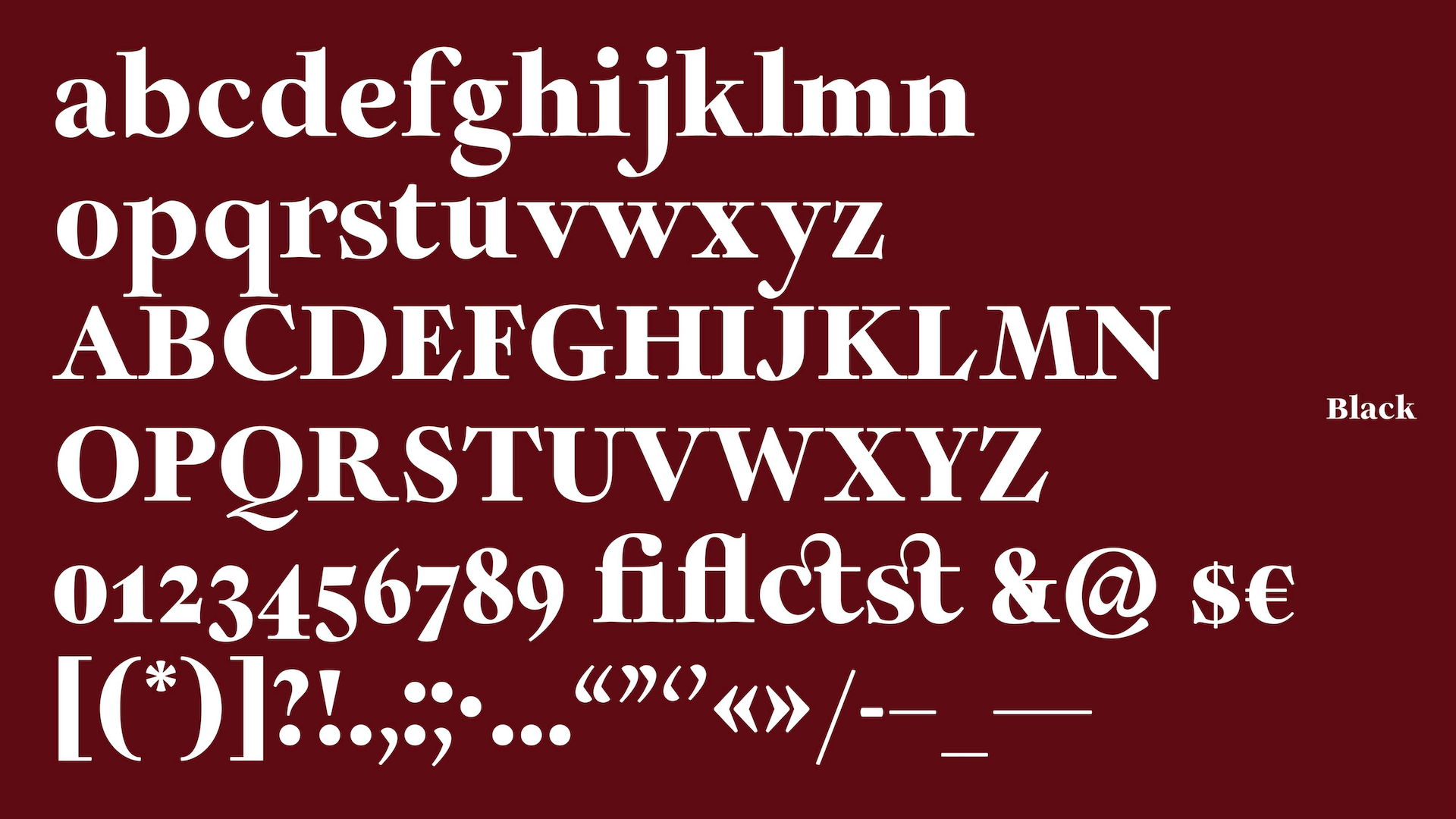
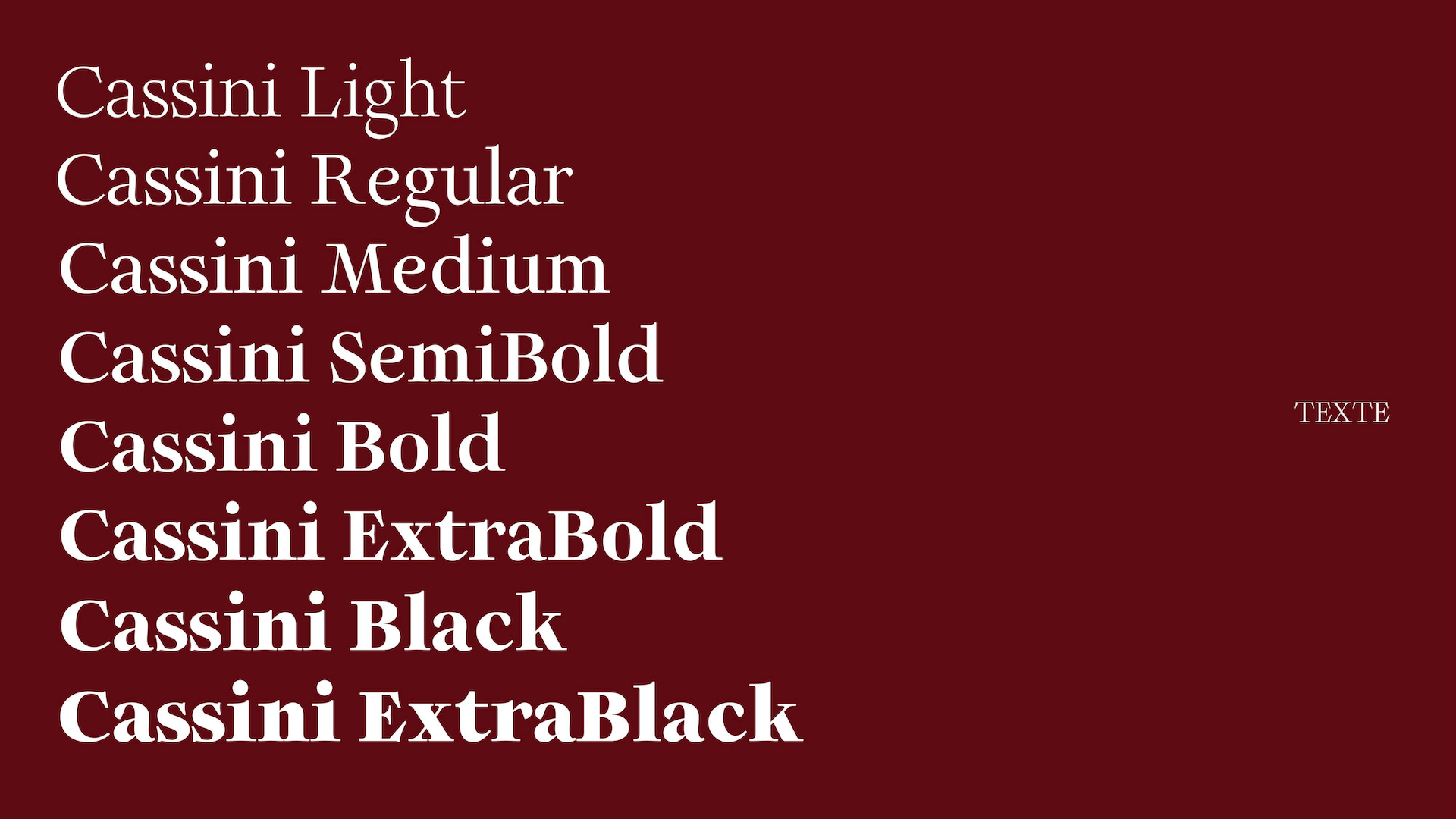
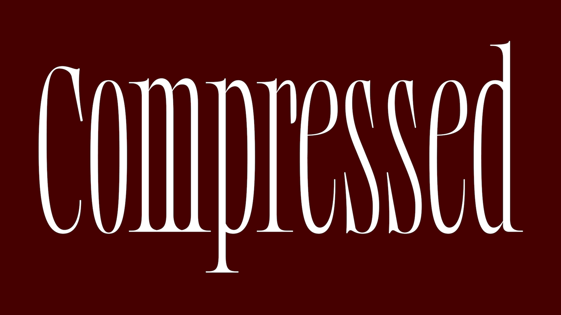
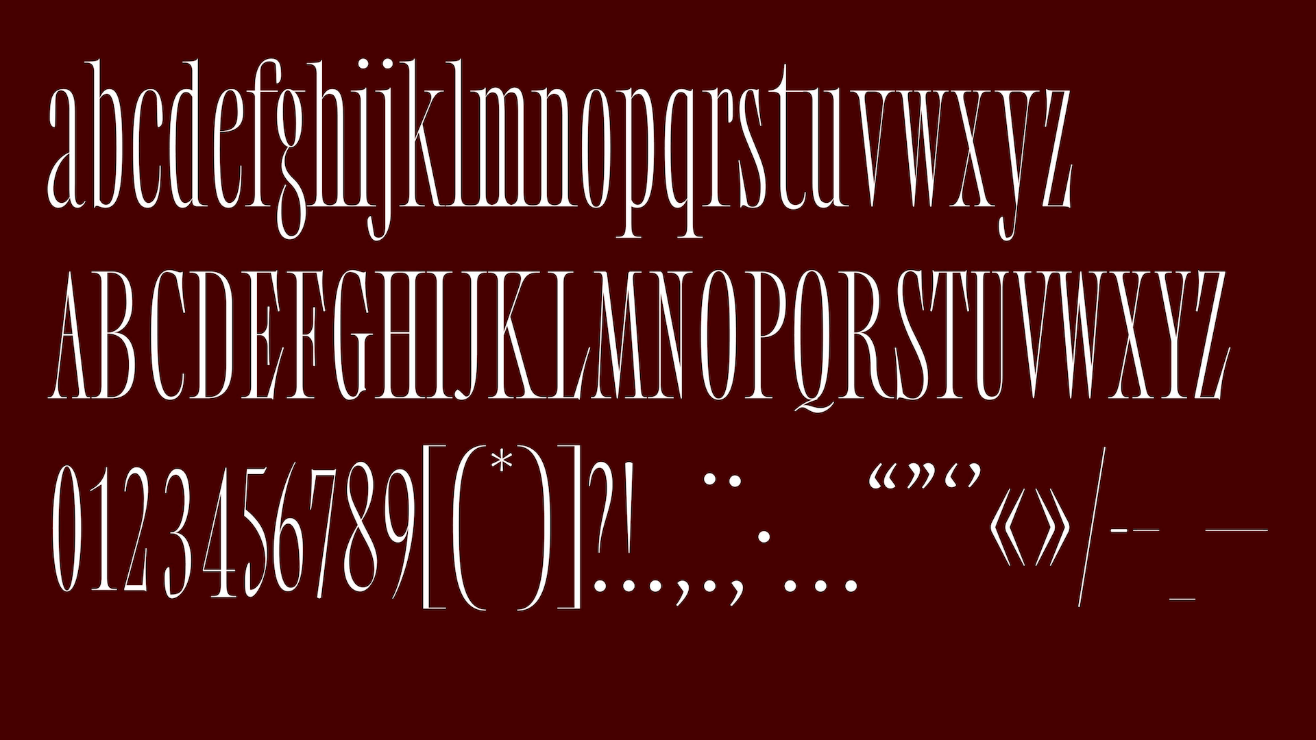
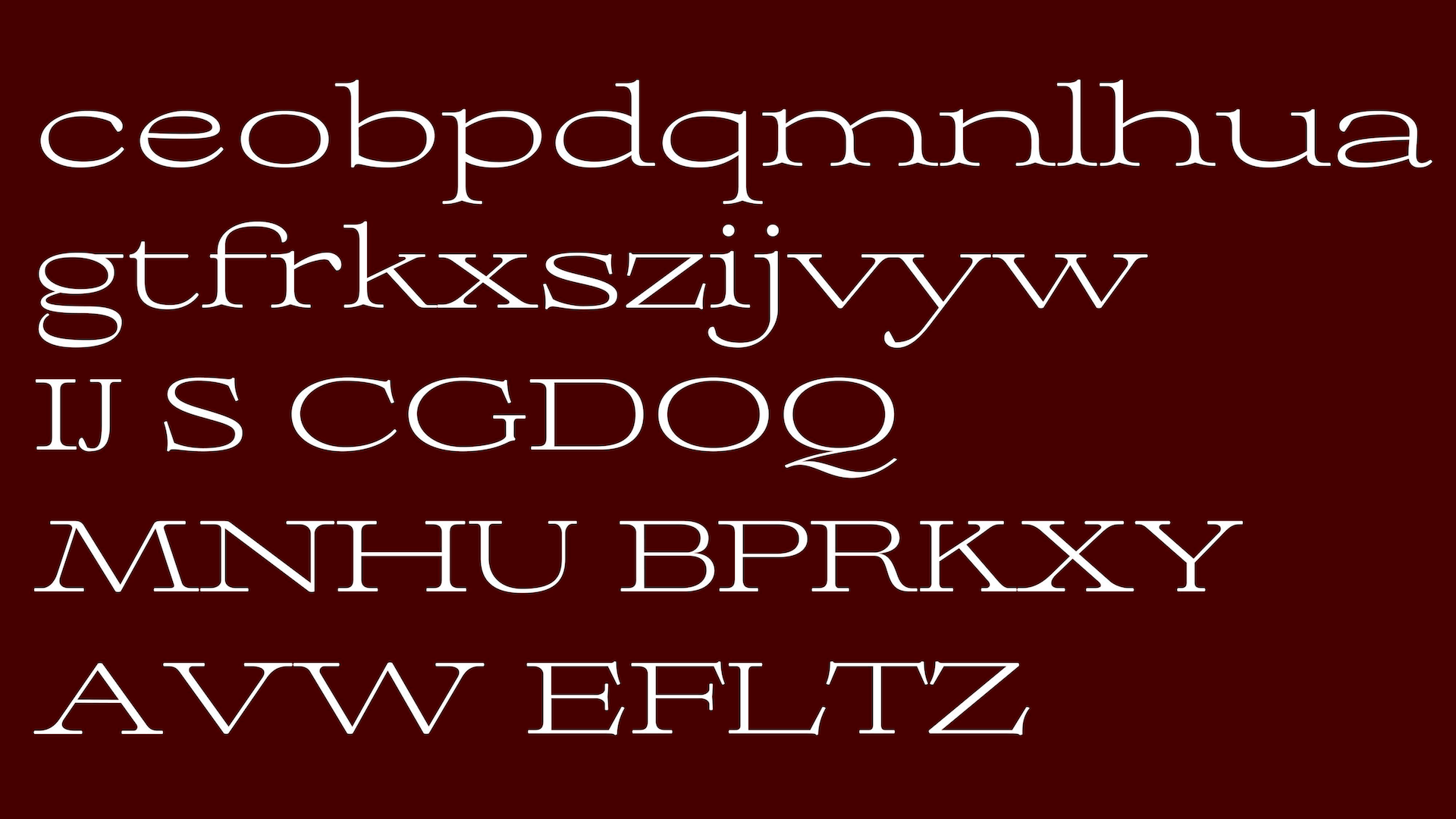
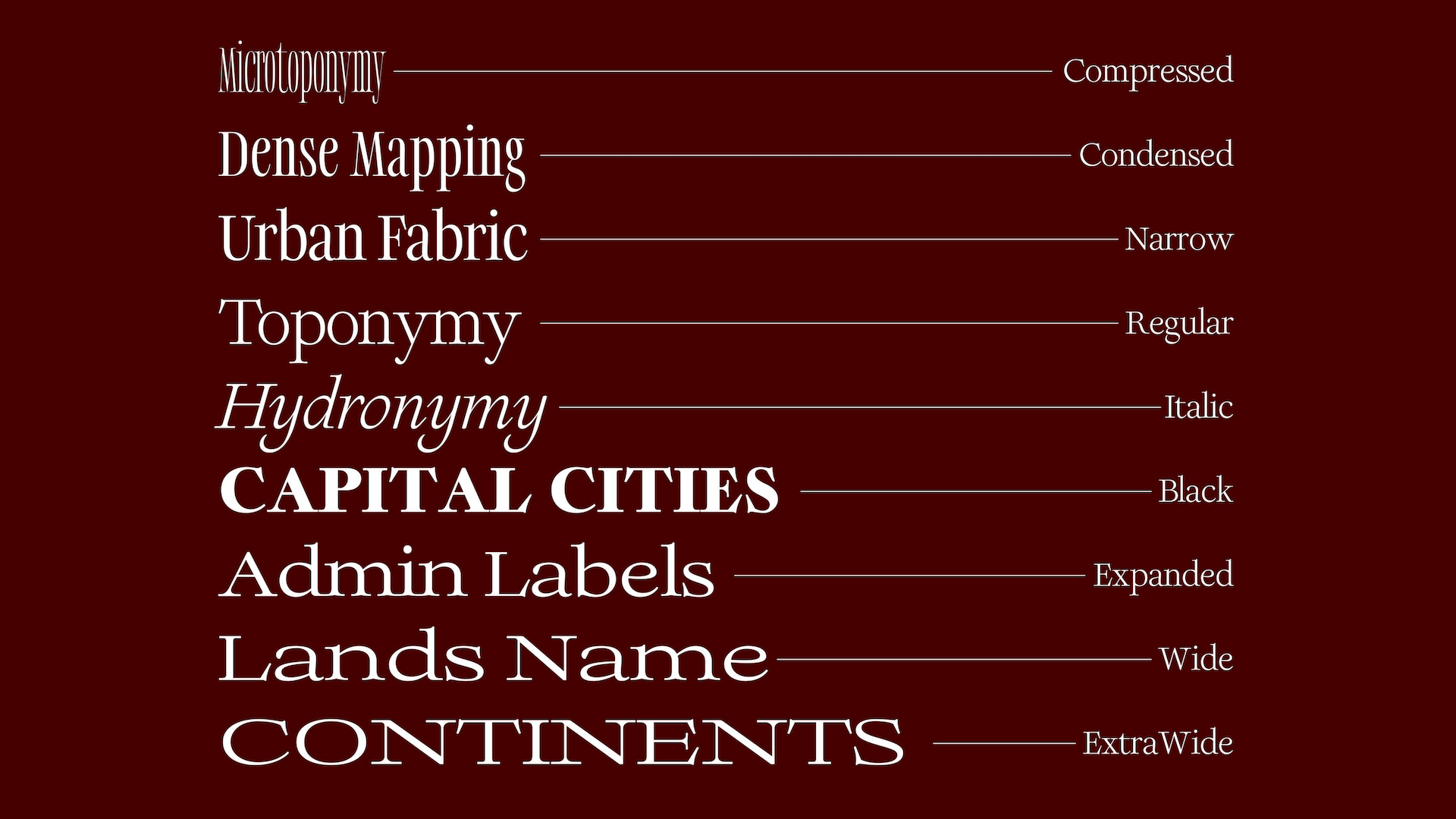
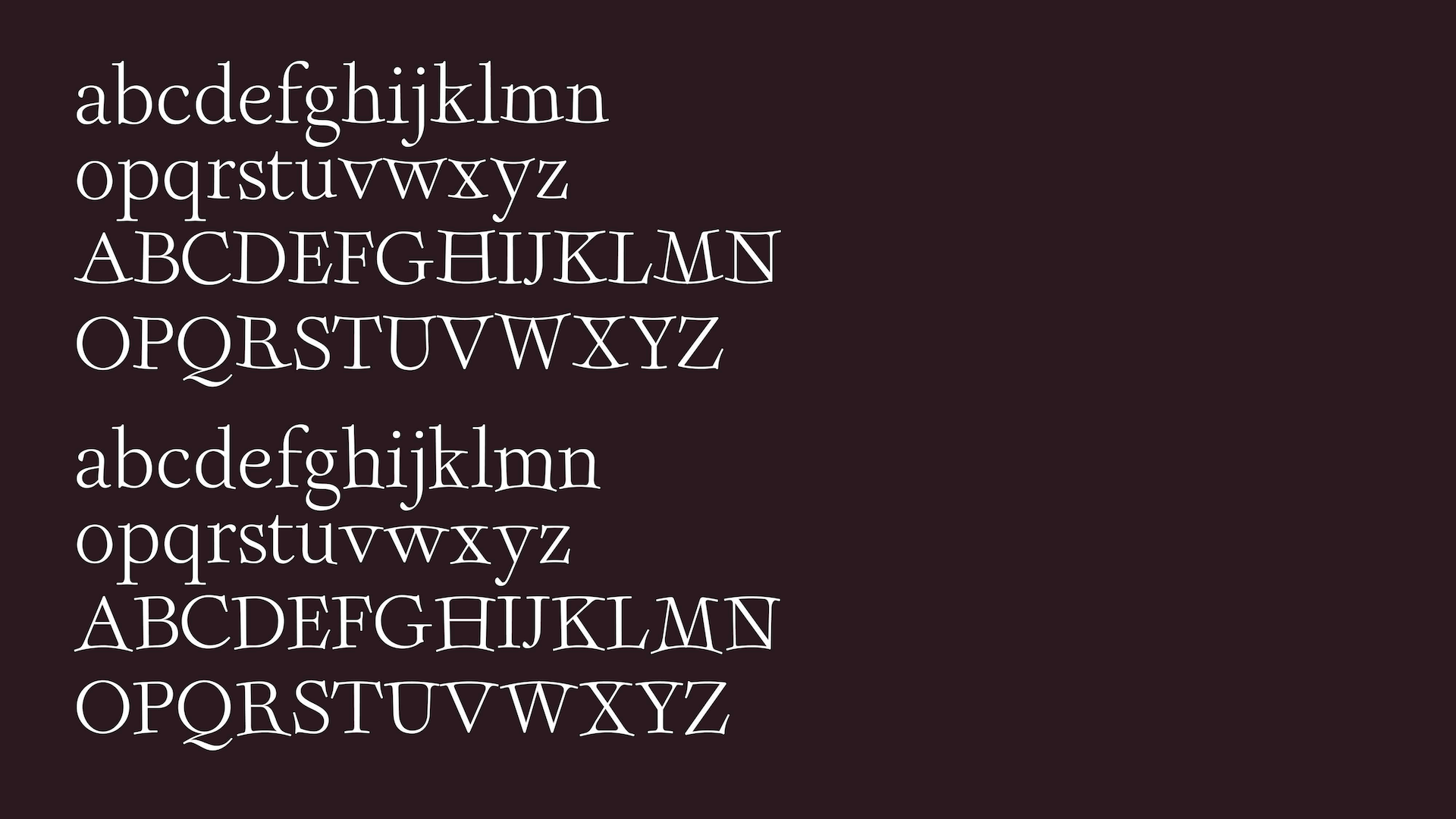
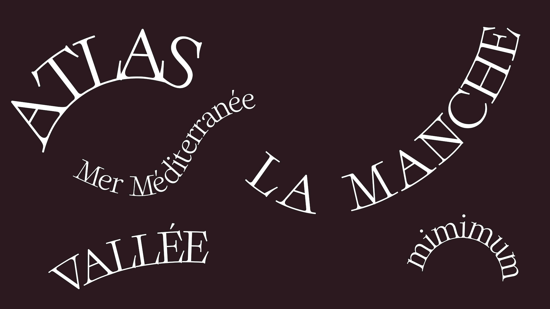
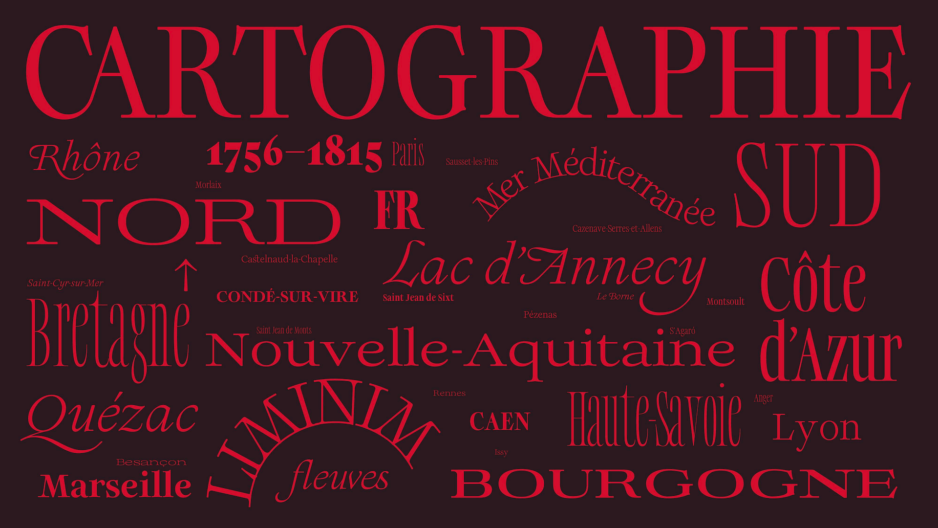
Cassini is a contemporary serif typeface designed for maps. The idea was to create a family able to support the specific needs of cartography. Each style is conceived as a possible tool for building maps: some are more discreet and text-oriented, others more expressive, compressed, extended or curved, allowing the typeface to adapt to different territories, scales and uses.
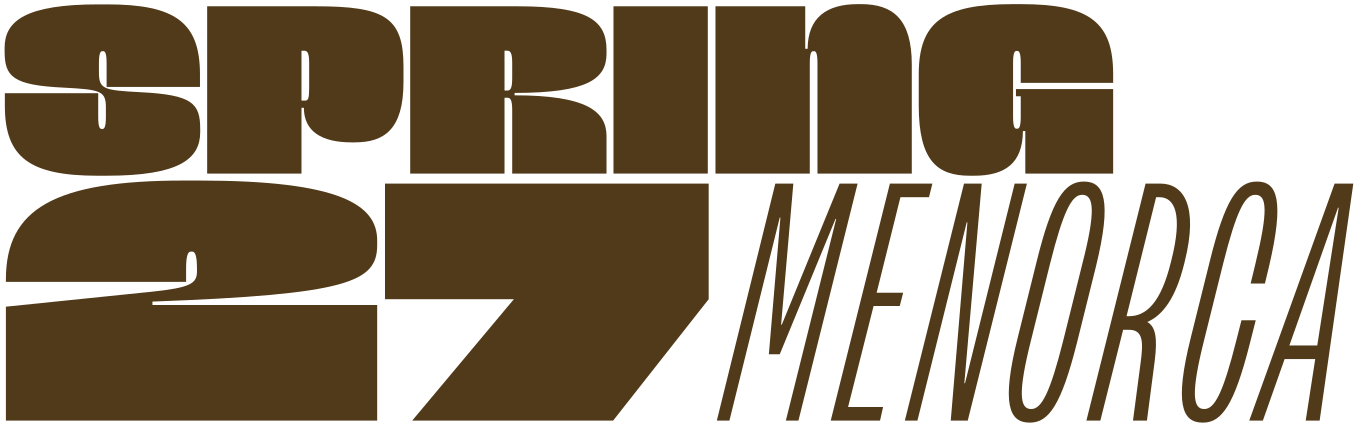
Apply before 14 January for the three-week type design course starting 5 April and ending 24 April 2027.
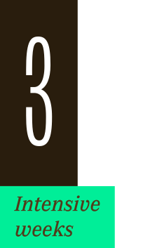
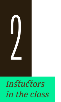
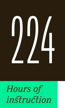
After 10 years in Paris, we reinvent our type design programme. We go from 6 weeks to 3 weeks, while maintaining the fundamentals that make TypeParis’ reputation.
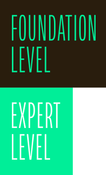
The course will take place in Menorca, Spain for the first time. In 2027, we offer two levels, Foundation and Expert, which allows you to discover type design, or to gain expertise after an initial training.
➼ Subscribe to our mailing list to stay informed, until application period is launched.
Get ready & apply before 14 January 2027