Volte-Face
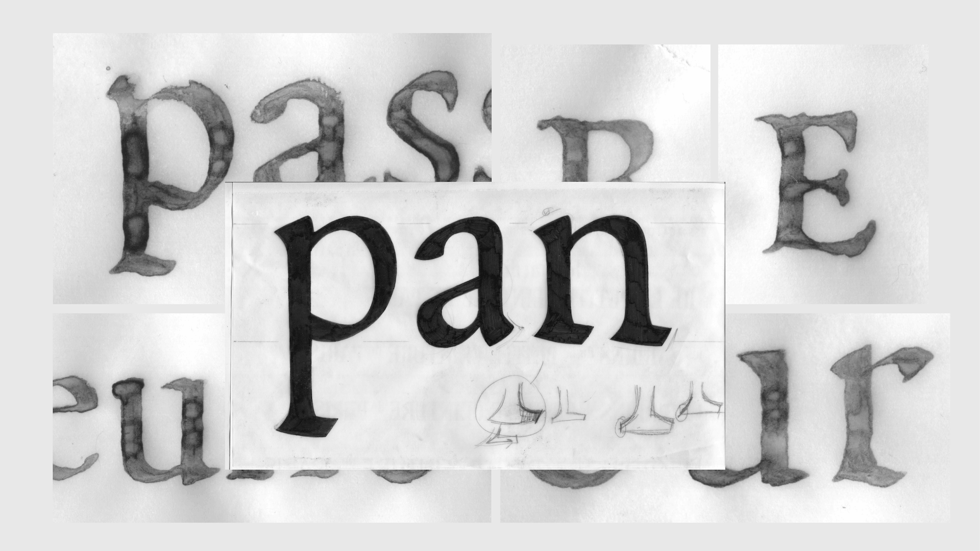
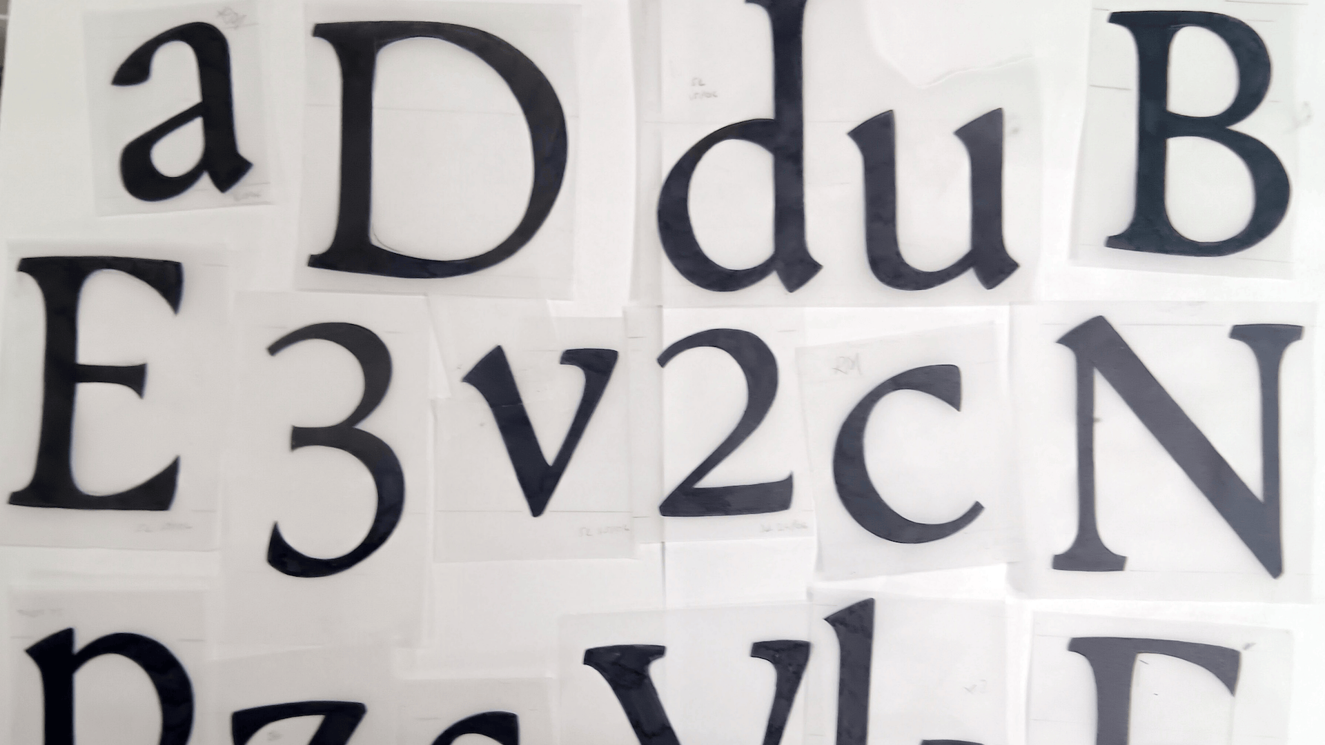
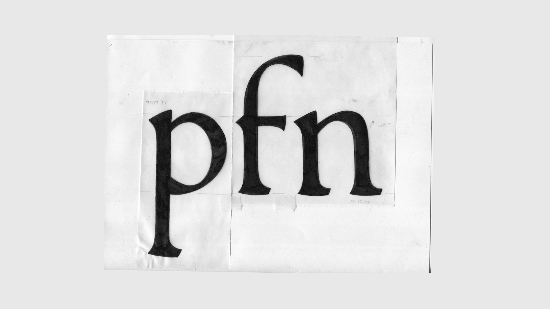
I joined TypeParis with a very specific goal: to learn how to transform calligraphic research into fully developed typefaces. My main interest lies in understanding how the identity of a handwritten form can survive the rigid process of type design: the vectorisation, normalisation, and countless decisions required to build a consistent font… And without turning it into a caricature of its calligraphic origin. This question became the starting point for the entire project.
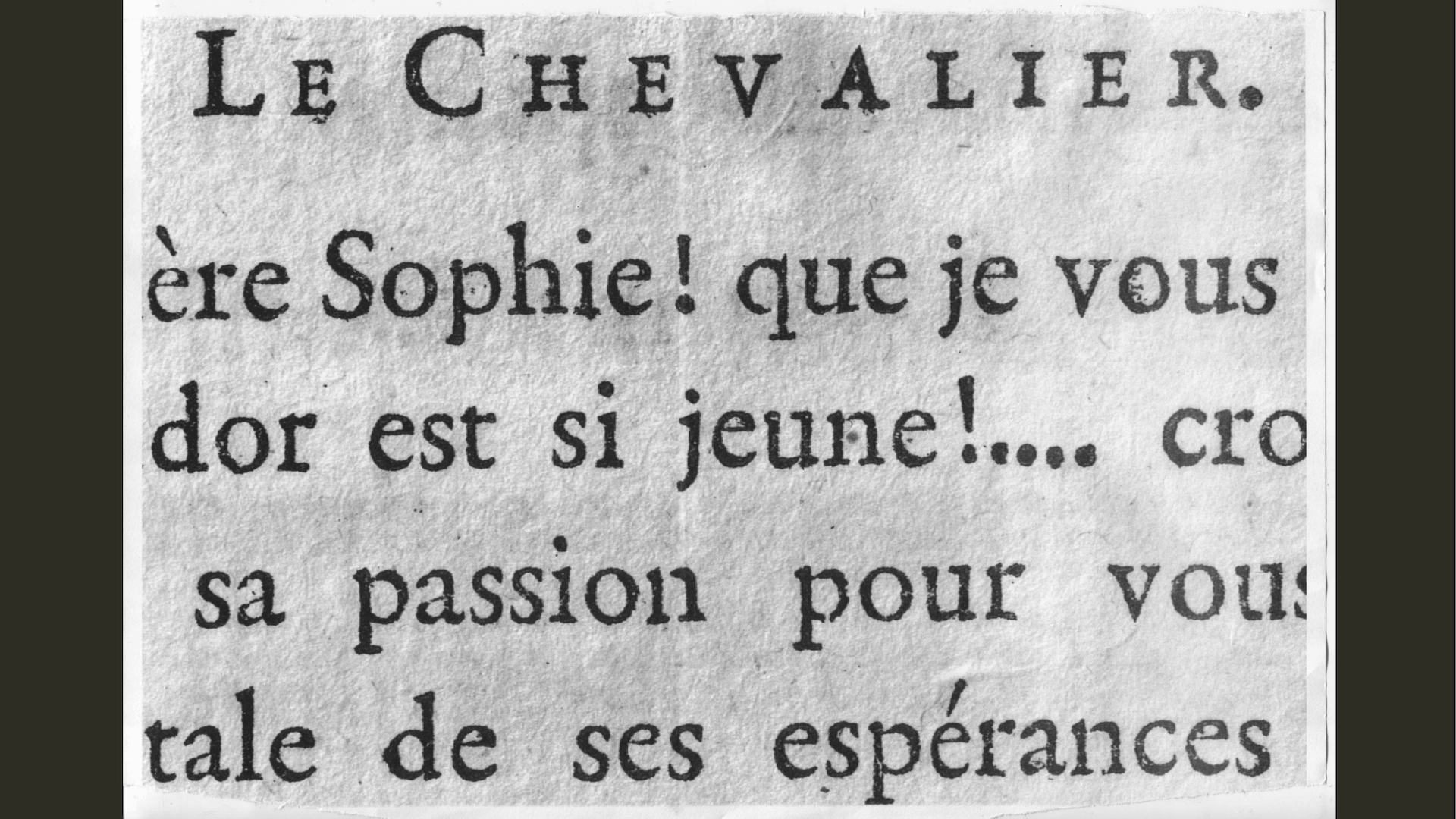
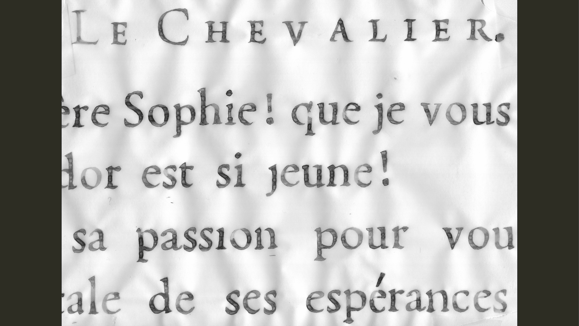
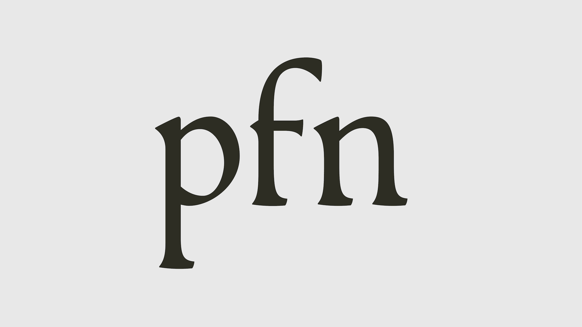
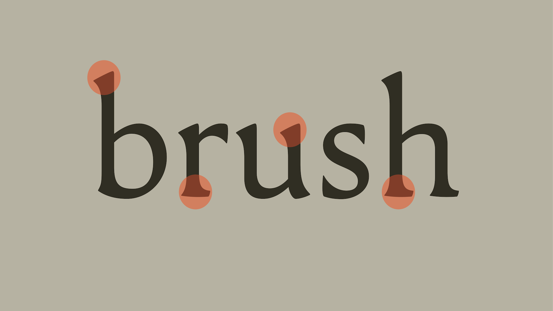
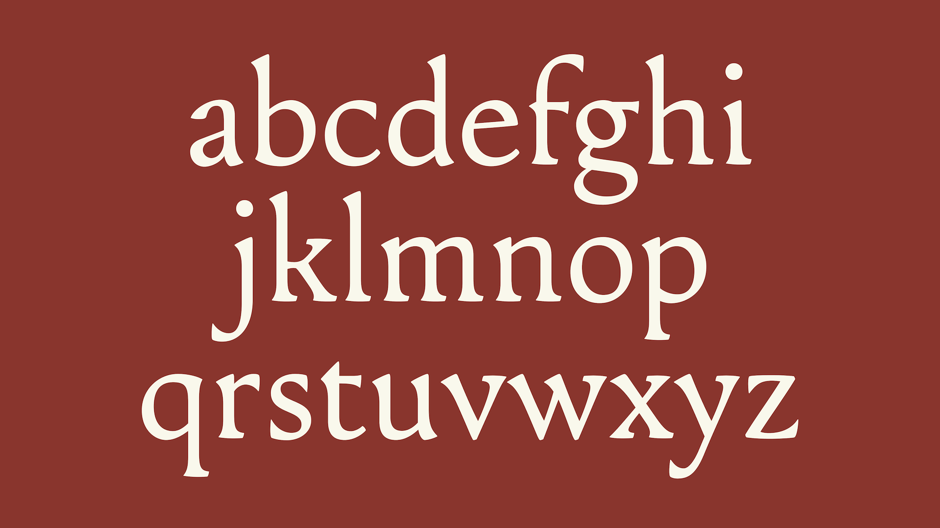
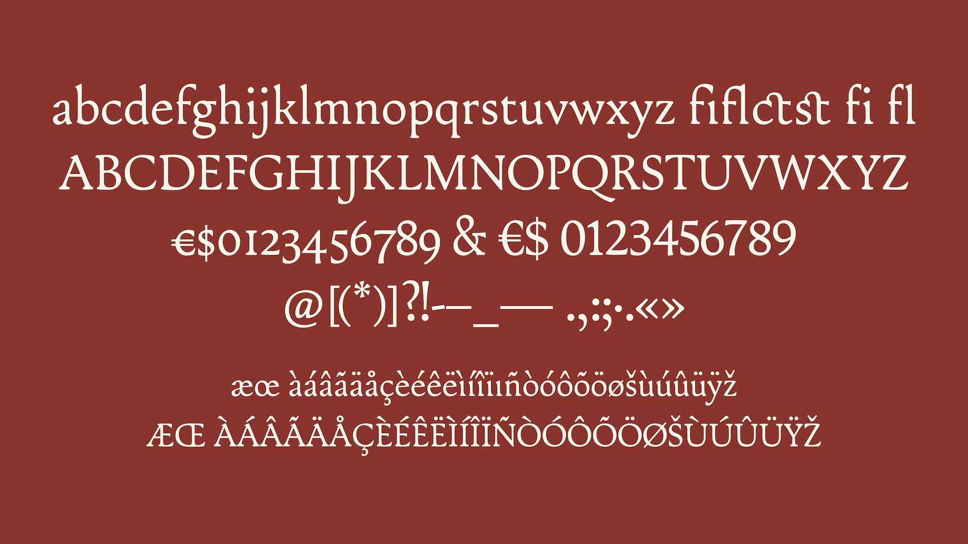
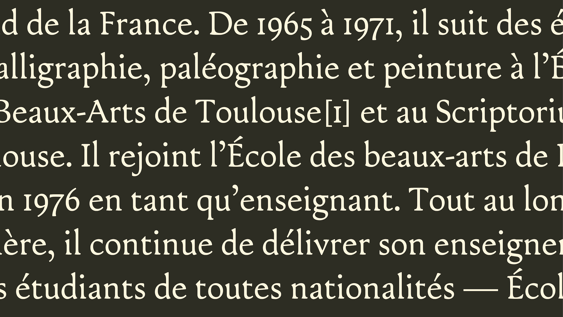
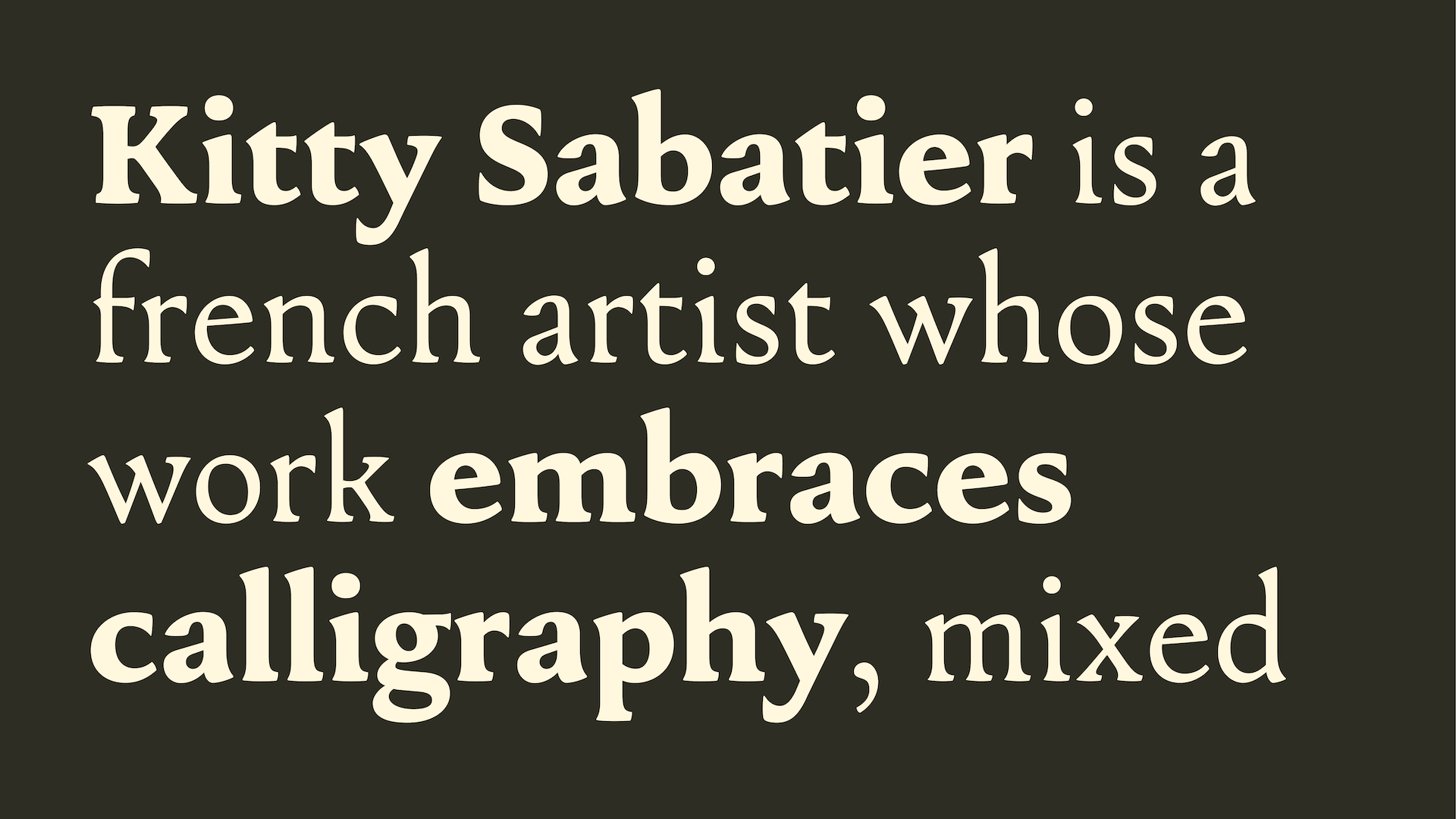
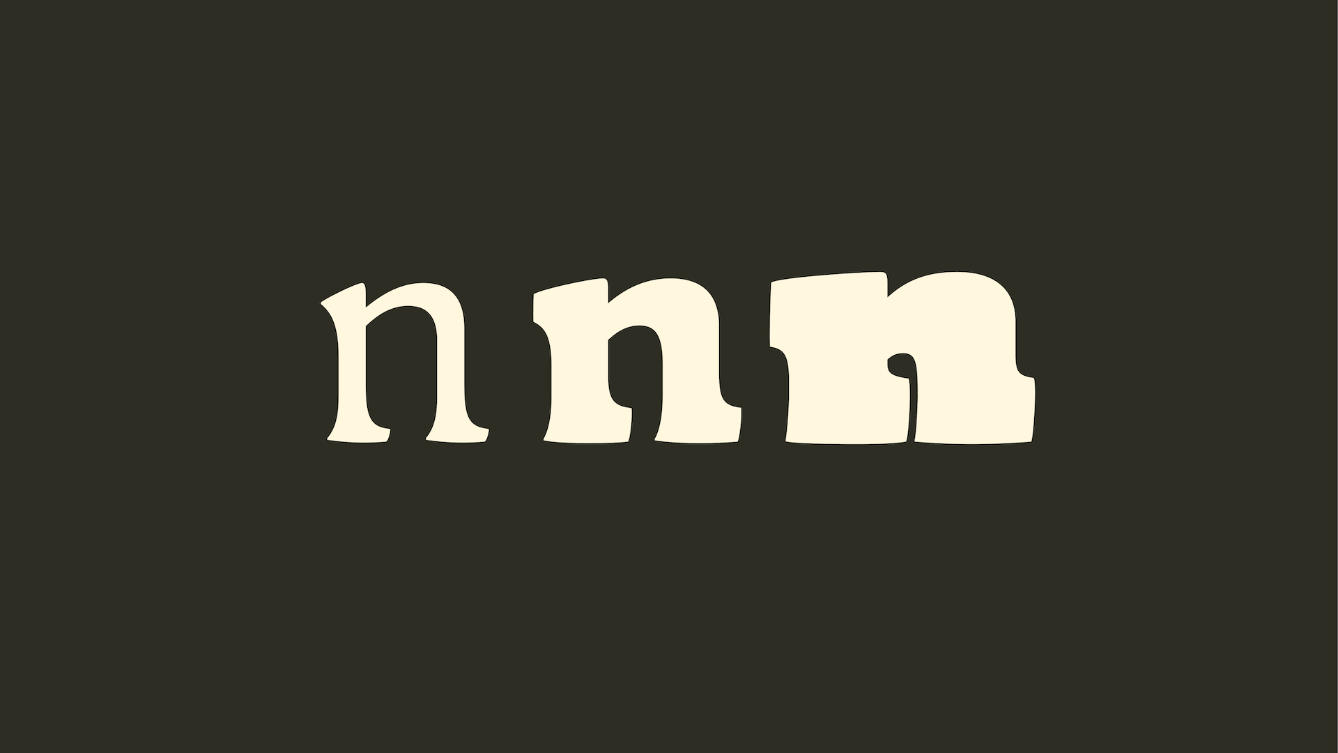
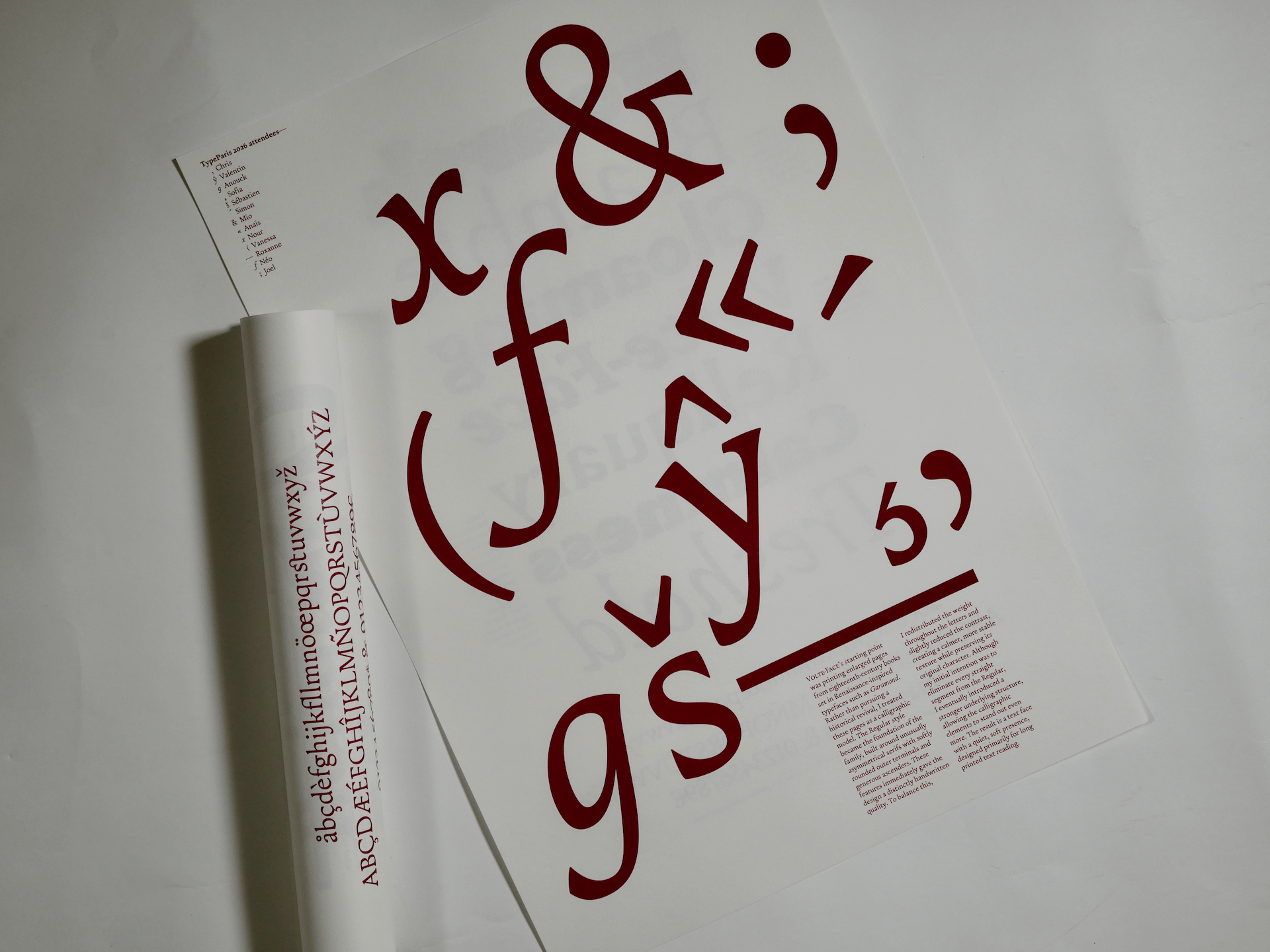
For Volte-Face, I began by printing enlarged pages from eighteenth-century books set in Renaissance-inspired typefaces such as Garamond. Rather than pursuing a historical revival, I treated these pages as a calligraphic model. The Regular style became the foundation of the family, built around unusually asymmetrical serifs with softly rounded outer terminals and generous ascenders. These features immediately gave the design a distinctly handwritten quality. To balance this, I redistributed the weight throughout the letters and slightly reduced the contrast, creating a calmer, more stable texture while preserving its original character. Although my initial intention was to eliminate every straight segment from the Regular, I eventually introduced a stronger underlying structure, allowing the calligraphic elements to stand out even more. The result is a text face with a quiet, soft presence.
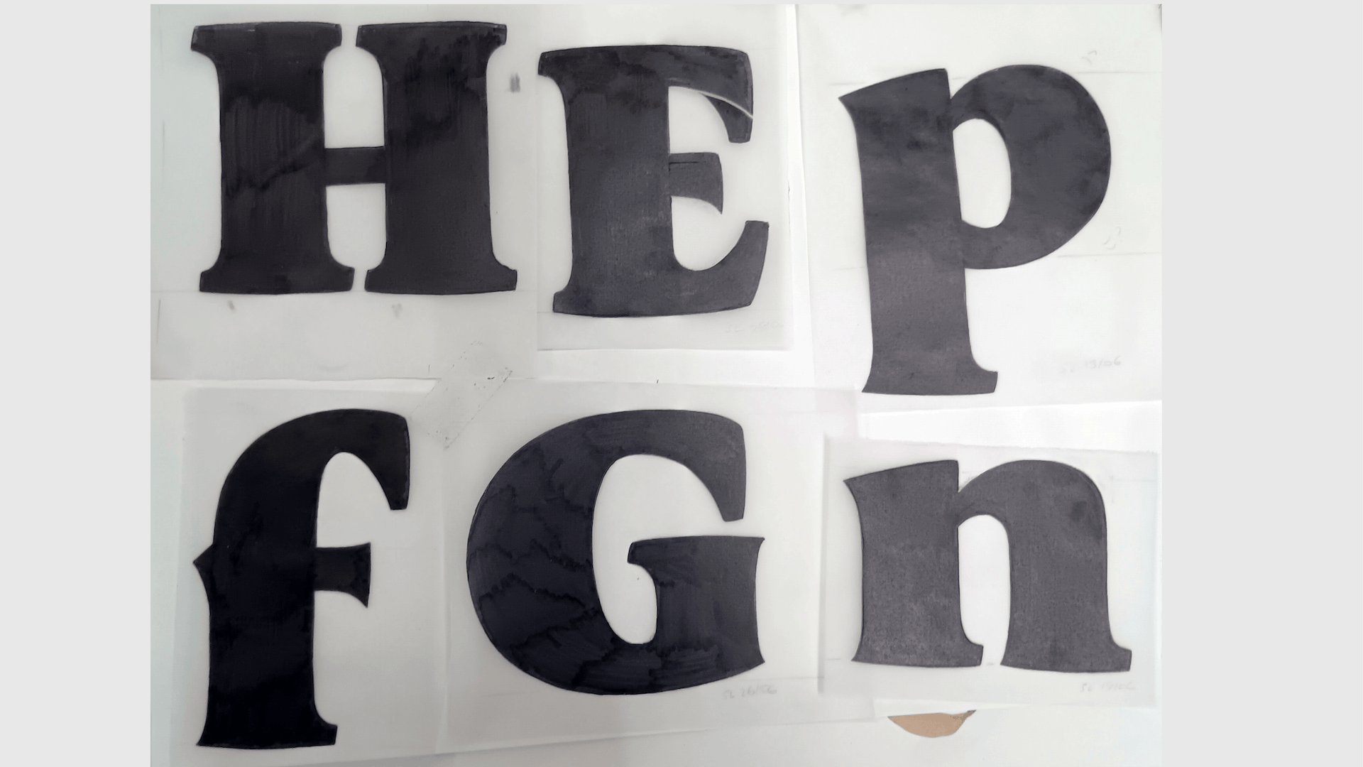
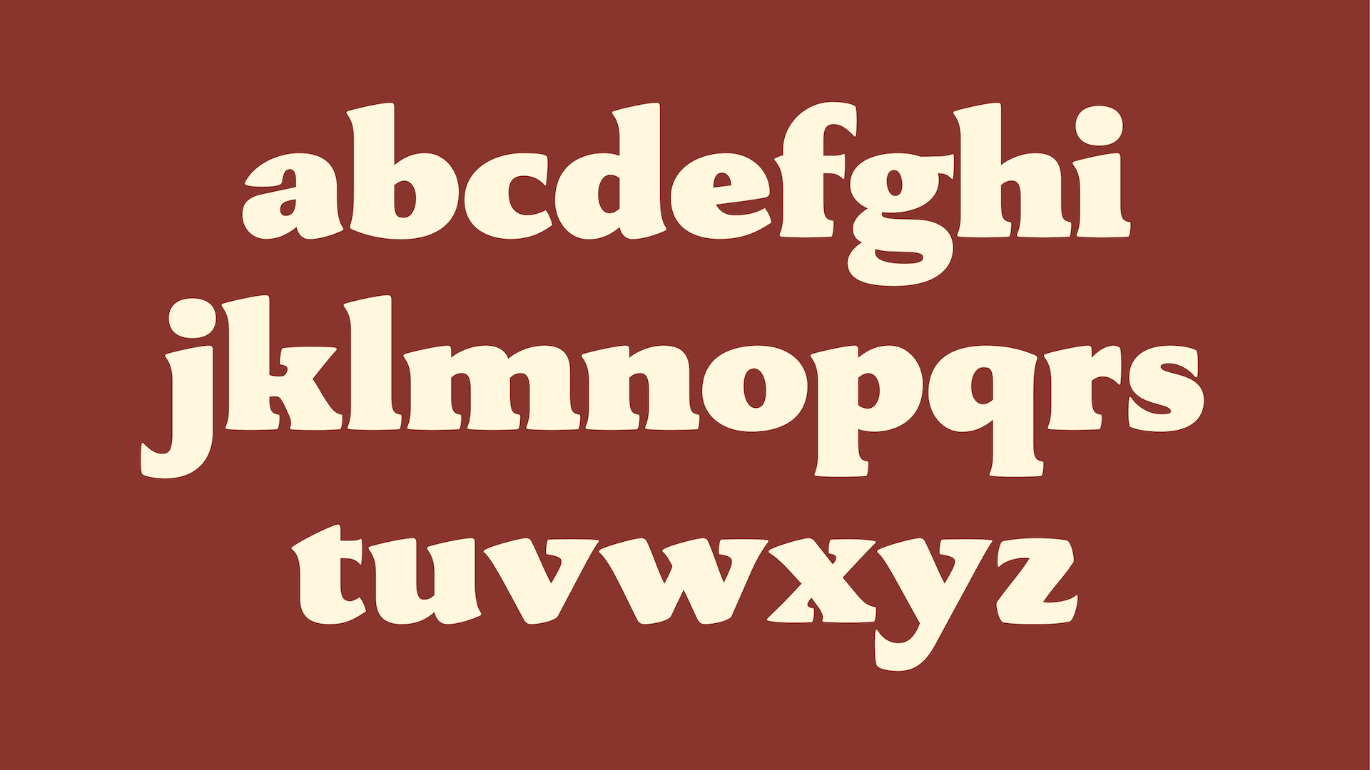
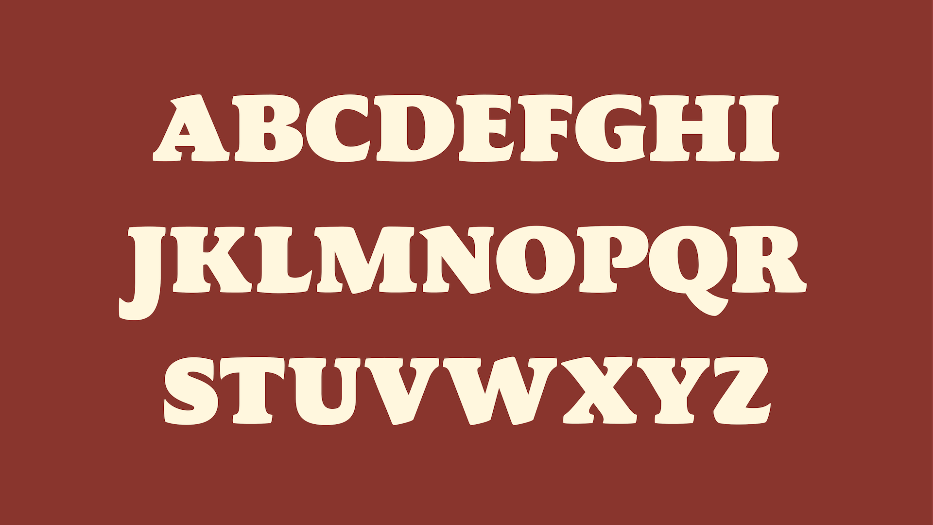
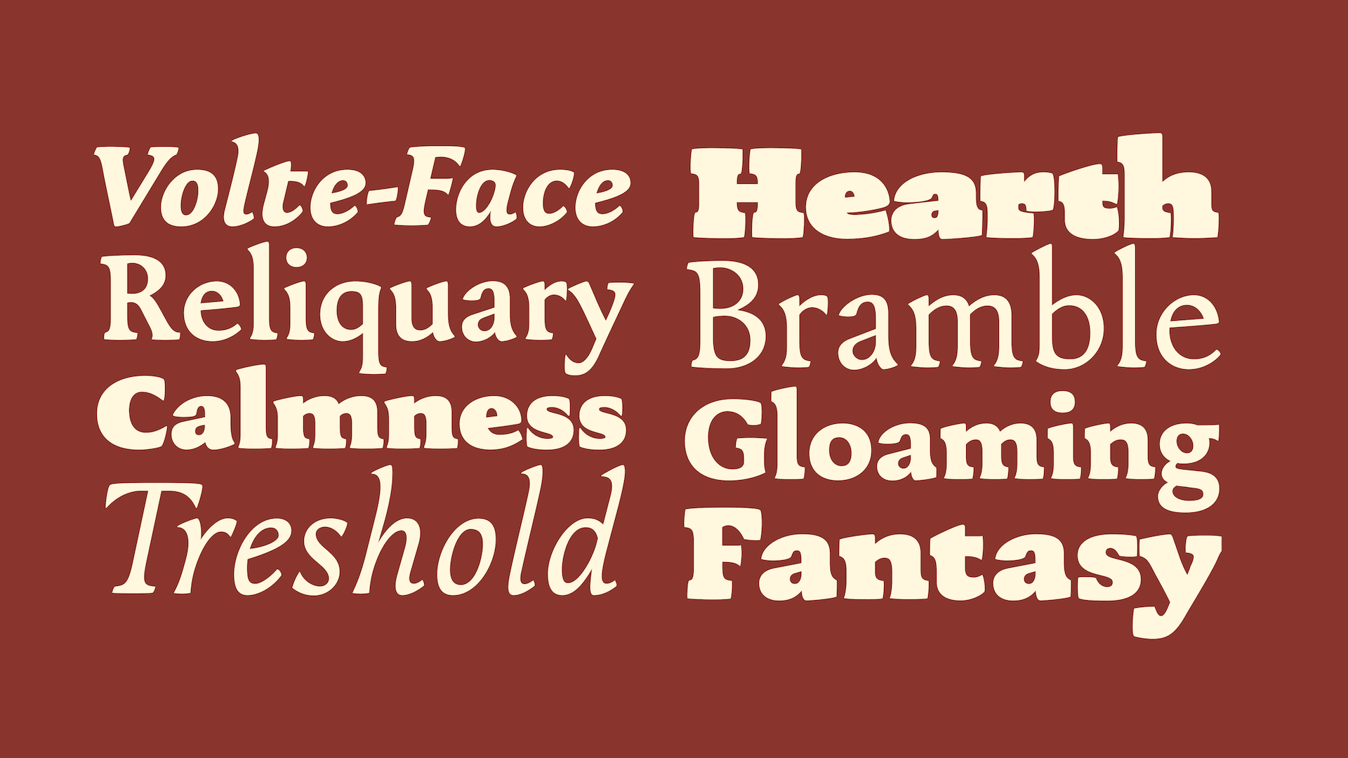
Instead of treating weight as a purely functional expansion of the family, I wanted the personality of the typeface to evolve across its styles. The softness already present in the Regular is amplified in the Black, where the asymmetrical serifs and generous proportions take on a much stronger visual presence.
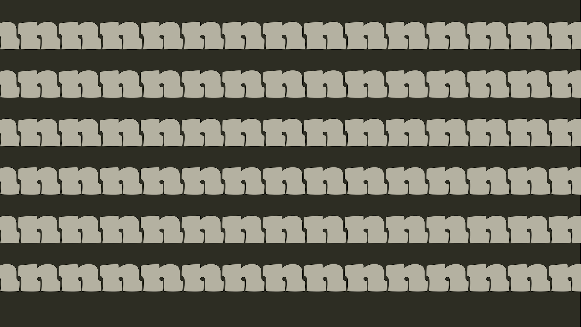
From there, I deliberately moved away from the original concept and developed an Ultra Black display style. Here, the asymmetric serifs become oversized, playful forms that interlock from letter to letter, creating bold textures and unexpected interactions. Although this style technically interpolates with the rest of the family, I chose not to let interpolation dictate its design. Its purpose is to exist as a display face first, fully embracing its own logic and personality. Interpolating between the Regular and this exaggerated Black produces a series of unexpectedly convincing low-contrast styles.
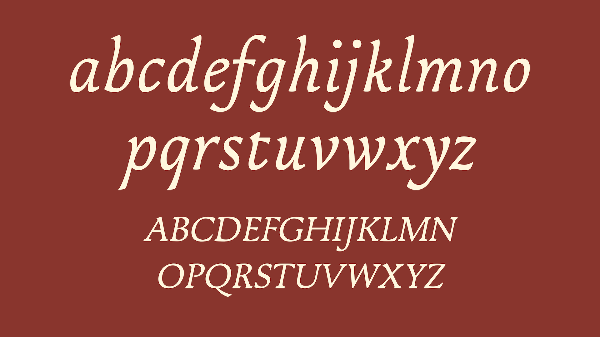
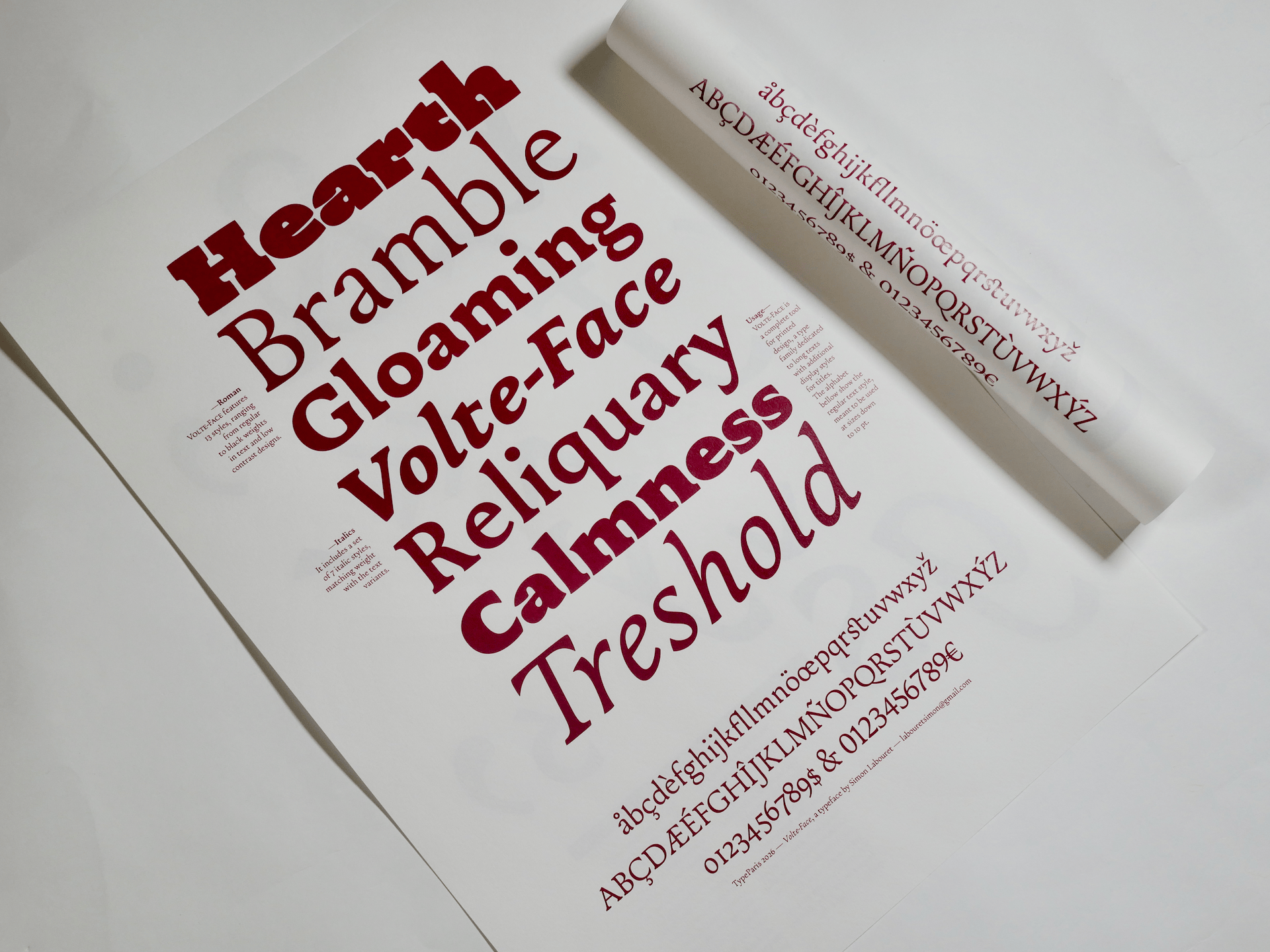
The family also includes an italic developed across the same range of weights as the roman, making Volte-Face suitable for extended printed text while offering a distinctive display companion.
Beyond its calligraphic origins, Volte-Face is also inspired by the world of independent and creative book publishers. It is intended for texts where typography supports immersive reading while retaining enough personality to emerge in titles, chapter openings, and display settings.




Apply before 14 January for the three-week type design course starting 5 April and ending 24 April 2027.

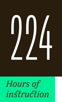
After 10 years in Paris, we reinvent our type design programme. We go from 6 weeks to 3 weeks, while maintaining the fundamentals that make TypeParis’ reputation.
The course will take place in Menorca, Spain for the first time. In 2027, we offer two levels, Foundation and Expert, which allows you to discover type design, or to gain expertise after an initial training.
➼ Subscribe to our mailing list to stay informed, until application period is launched.
Get ready & apply before 14 January 2027