Brambly
Brambly is a text typeface designed under the guidance of Jean François Porchez, Malou Verlomme and Mathieu Réguer during the type@paris 2015 summer session.
Brambly originated from calligraphic and then typographic experiments I made during the masterclass. Mostly based on the humanistic proportions and keeping the traditional oblique axis, I tried to reincorporate some of the features I found in my calligraphy and make the design more contemporary. The design evolved, in a very organically way during the different stages. The typeface was build, refined, step by step, shaped with trials, sometimes fails and multiple directions exploration; always trying to make the system work together. Brambly is more a learning–typeface–project than a finished piece. It has yet steady serifs, letting the typeface be used in text and some sharpness in the drawing, reinterpreted from calligraphic details, giving to it this crispy texture.
There was no starting plan, with a predefined goal to reach. There was however a starting point, and then an iterative process, leading to different stages, some were working, some other wasn’t and leads towards new ways.
We can make a parallel with the gardener vs architect theory Peter Bilak talked about. I let the design grew organically, seeing where I had to interact to make it work as a type system.
The result is a crispy textured typeface, suitable for text. Combining round and more vegetal shapes with the sharp angles, even sometimes sharps as knife. The brambles are a perfect metaphor for the design process but also the look & feel the typeface has.
Brambly is now a family of two cuts: Regular and black. I decided to use the interpolation process to add some weights, and the future plan is to complete the matching italic.


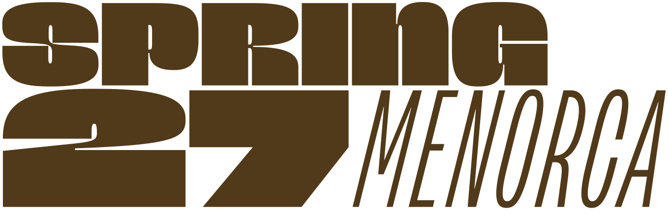
Apply before 14 January for the three-week type design course starting 5 April and ending 24 April 2027.
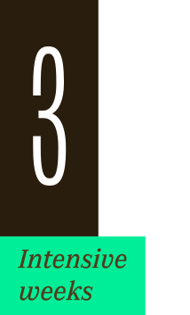
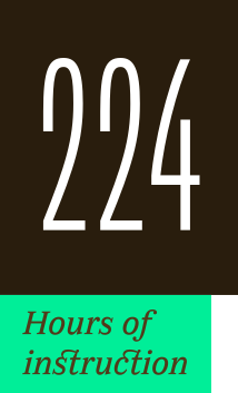
After 10 years in Paris, we reinvent our type design programme. We go from 6 weeks to 3 weeks, while maintaining the fundamentals that make TypeParis’ reputation.
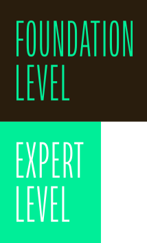
The course will take place in Menorca, Spain for the first time. In 2027, we offer two levels, Foundation and Expert, which allows you to discover type design, or to gain expertise after an initial training.
➼ Subscribe to our mailing list to stay informed, until application period is launched.
Get ready & apply before 14 January 2027