Trajet
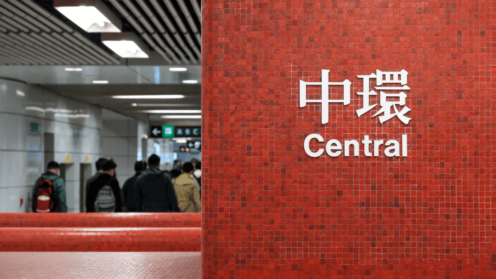
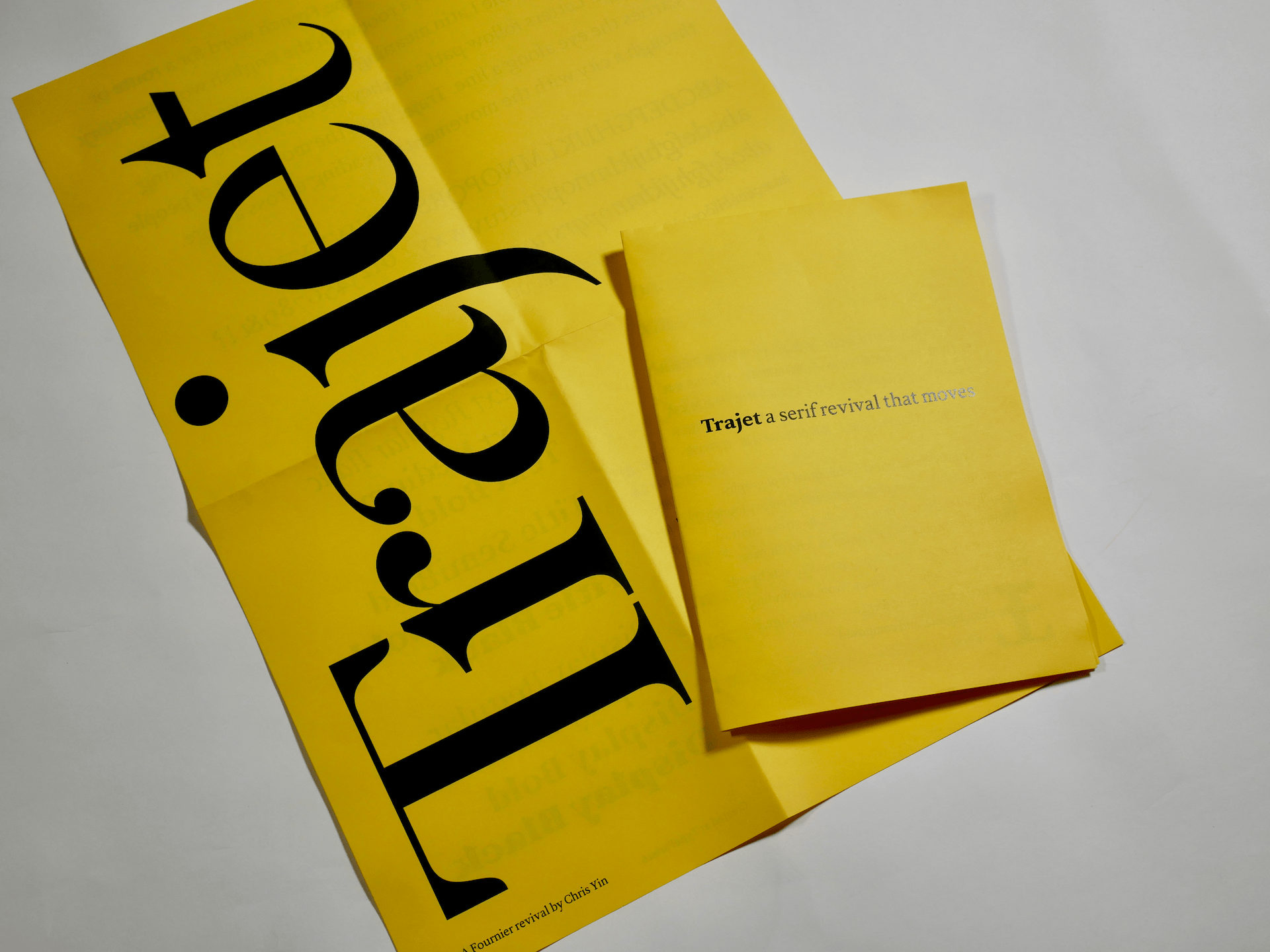
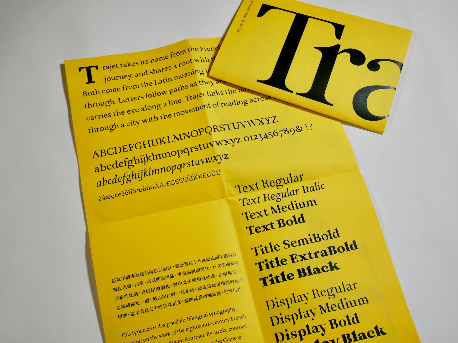
Trajet takes its name from the French word for a route or journey. It is related to the English trajectory, and both derive from the same Latin root meaning to move across or to pass through. The name felt right because letters follow paths as they are drawn: strokes trace directions, terminals mark endings, counters lead the eye. Each letter has a trajectory across its own small space. Metro systems are literal networks of routes that guide people through a city. Trajet links the movement of people through space with the movement of reading along a line of type.
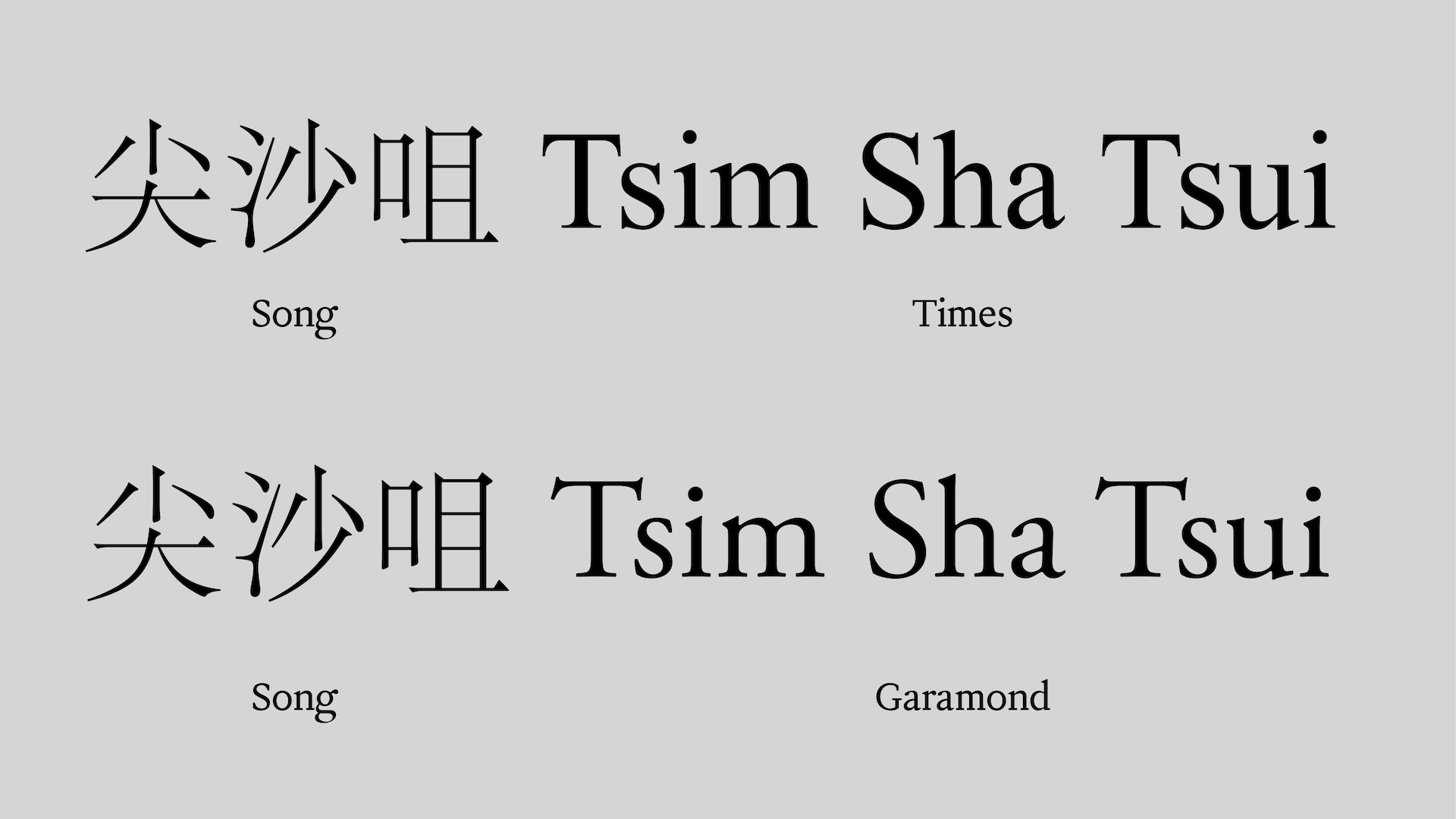
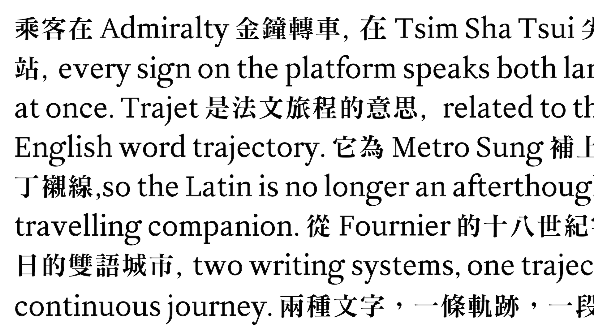
The journey behind the typeface begins with a gap I kept noticing in Chinese type design. Designing Chinese type is demanding — a basic character set contains more than 7,000 characters, and commercial fonts can exceed 15,000. With so much effort devoted to the Chinese glyphs, the Latin component is often an afterthought. Chinese Ming or Sung families are commonly paired with a generic Garamond or Times, a pairing that can feel mismatched in weight and texture, and designers frequently ignore the included Latin and substitute their own. My aim with Trajet is a Latin serif that matches Chinese serifs in weight and readability, so bilingual layouts work as one.
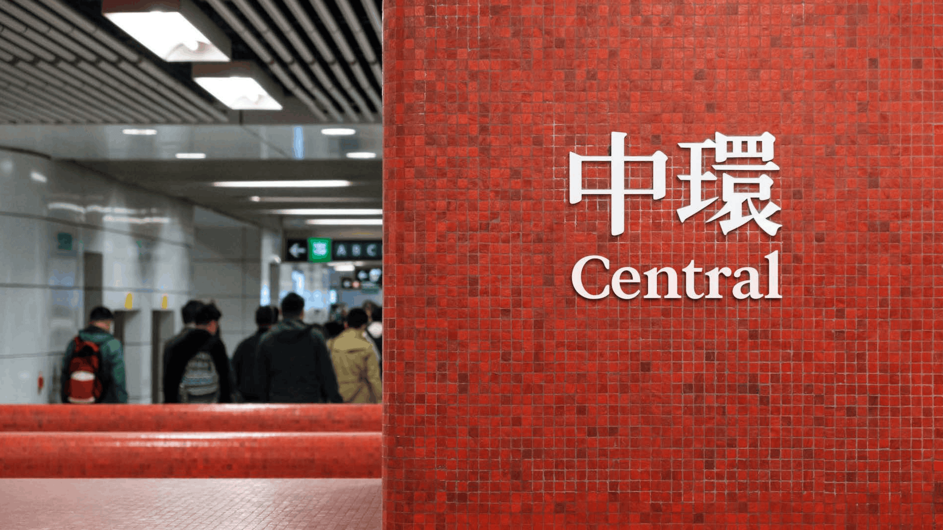
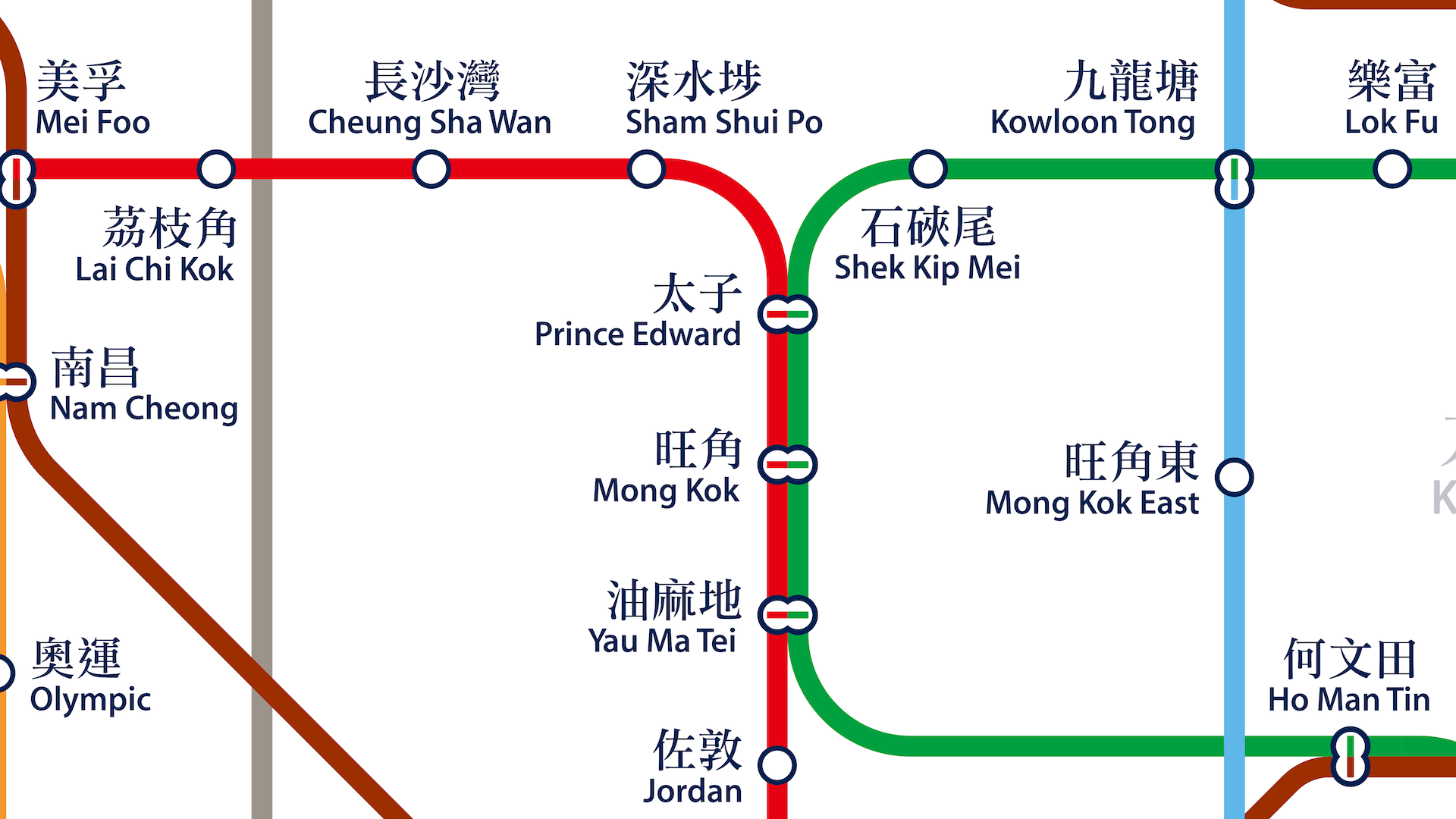
The specific gap Trajet fills belongs to Metro Sung, Sammy Or's digital adaptation of the hand lettering he created for the Hong Kong MTR in the 1980s. On the original signage, the English station names beneath the Chinese were set in a sans serif chosen for clarity in transit. Out of respect for that history, the digital Metro Sung includes no dedicated Latin serif. Trajet completes the pairing — tuned in rhythm, contrast, and proportion so that Latin and Chinese sit together and read as parts of one coherent system.
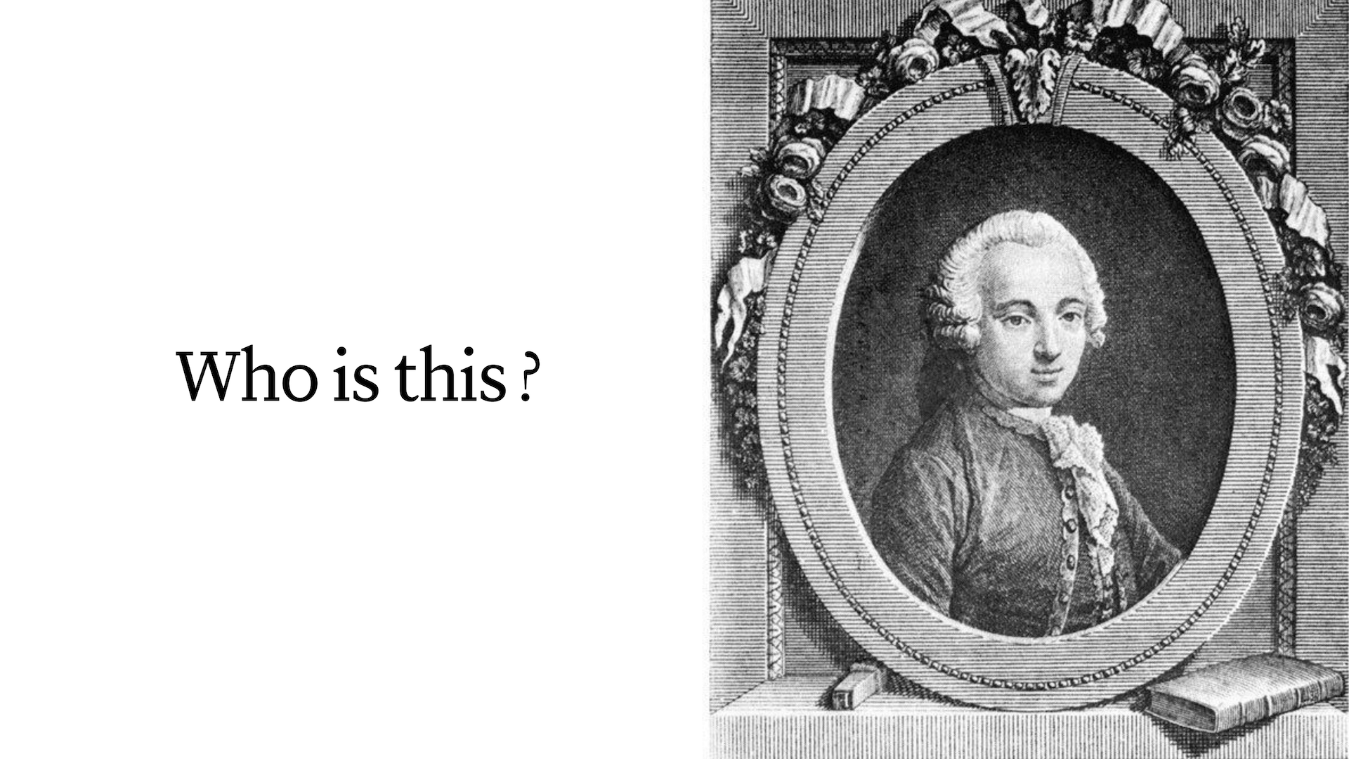
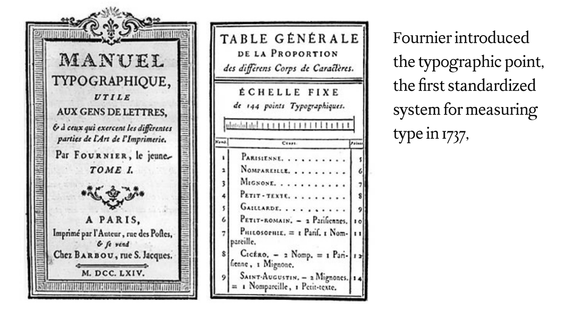
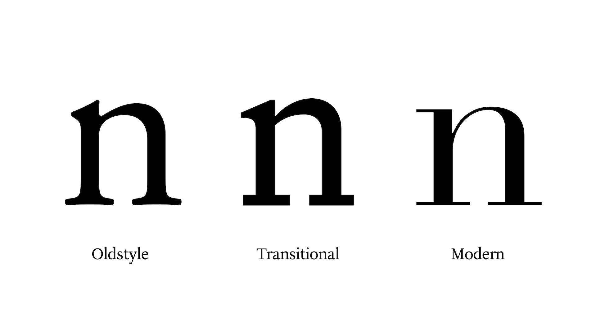
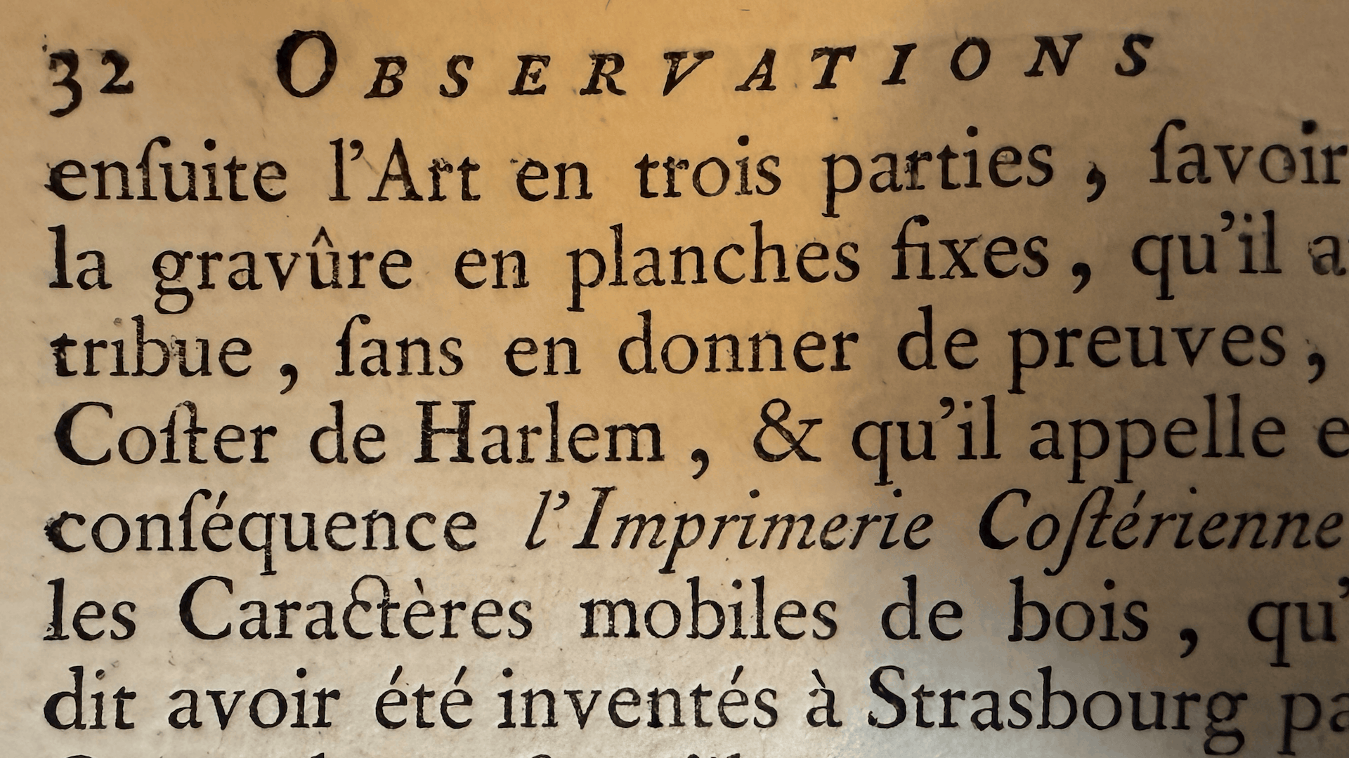
For the design itself, I turned to Pierre-Simon Fournier, the eighteenth-century French punchcutter who standardised the measurement of type and laid the groundwork for the point system still in use today. His typefaces belong to the transitional style, a bridge between older calligraphic letterforms and the sharper, more rational designs that followed: greater contrast between thick and thin, a more upright stress, flatter and crisper serifs. Trajet interprets these sources and adapts them for contemporary use.
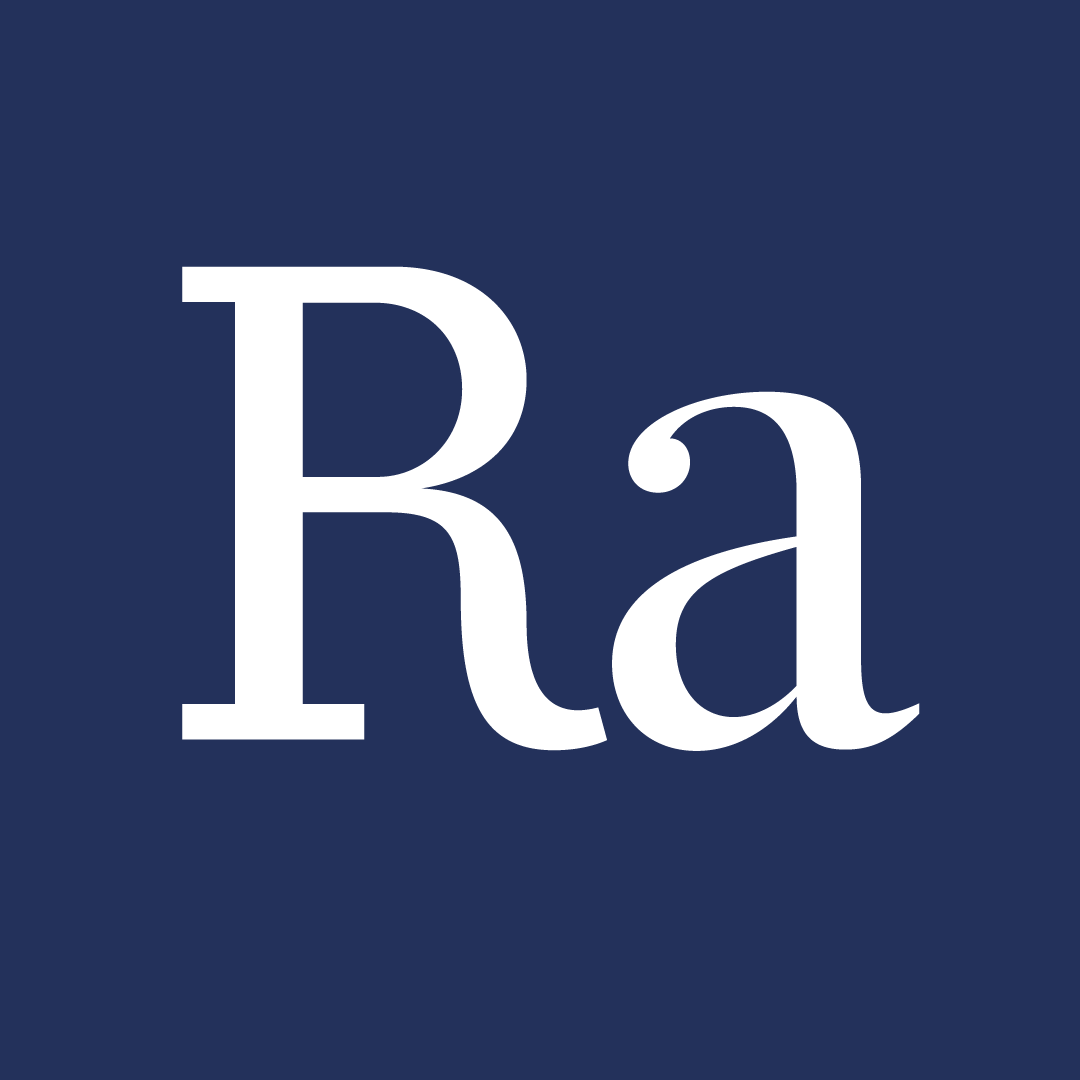
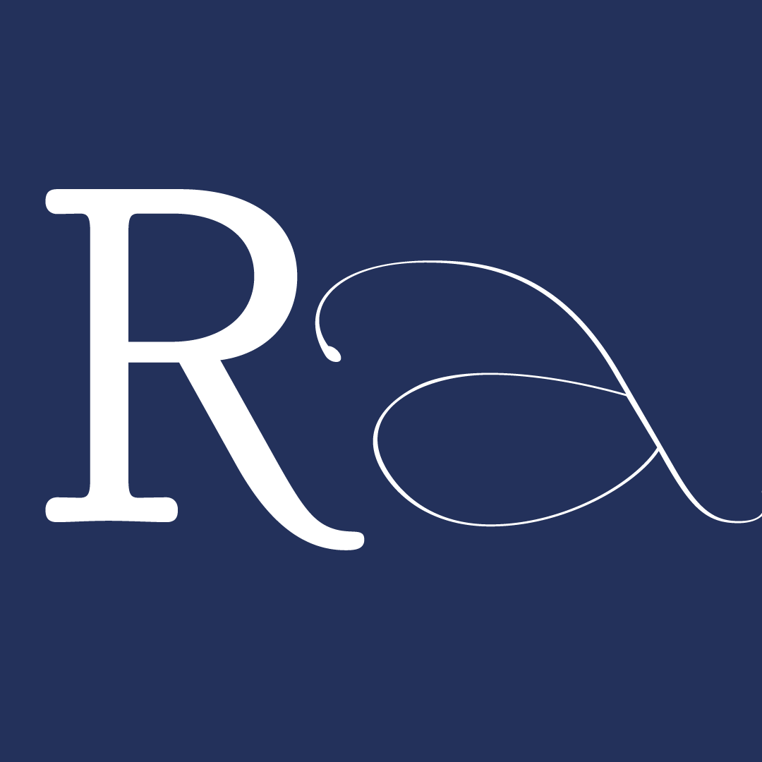
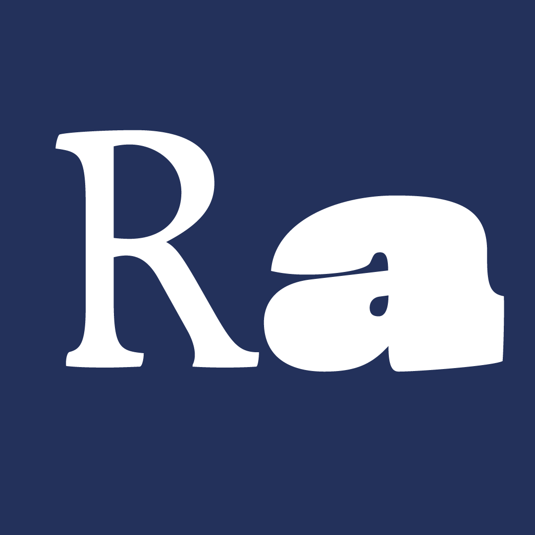
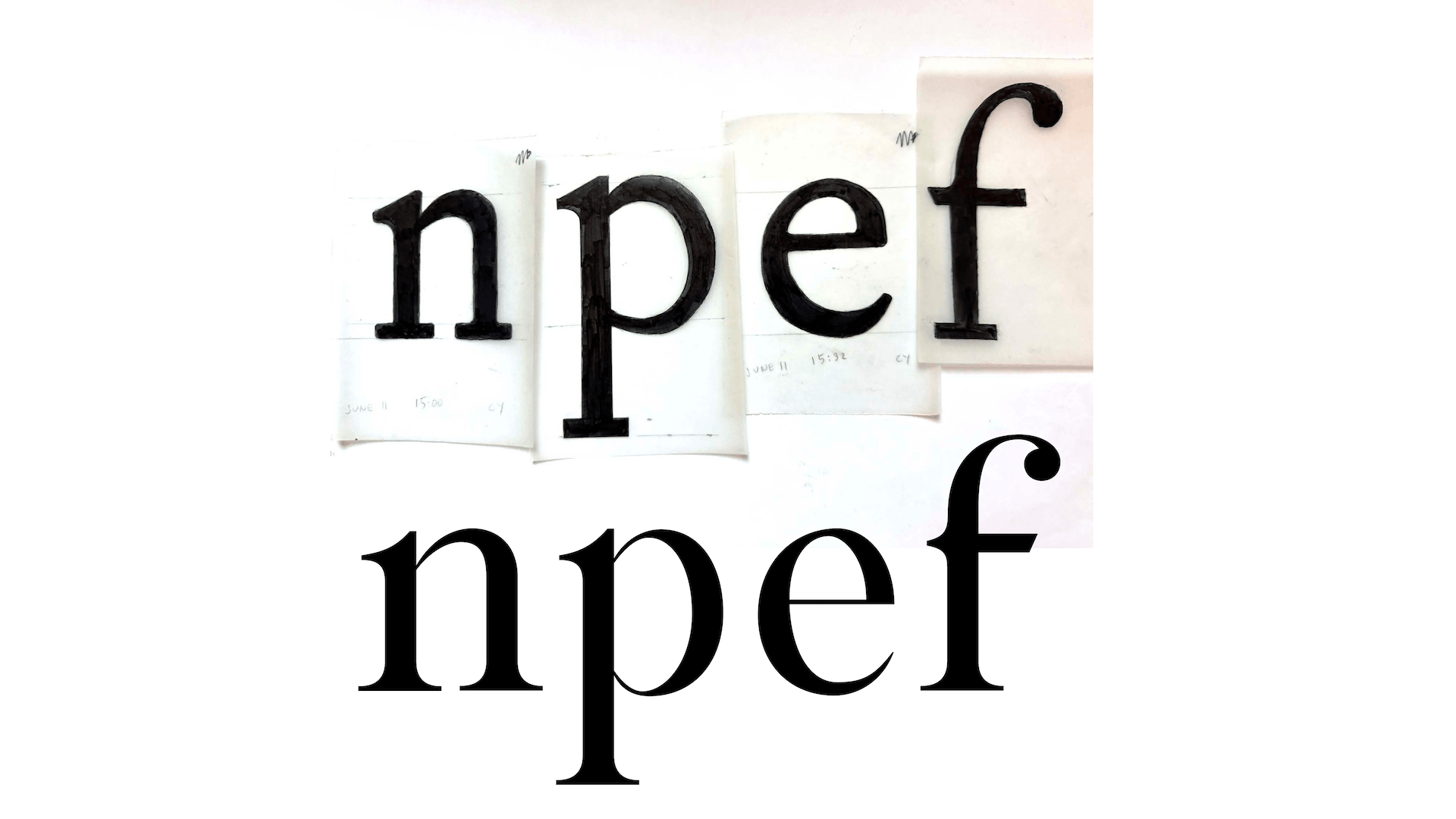
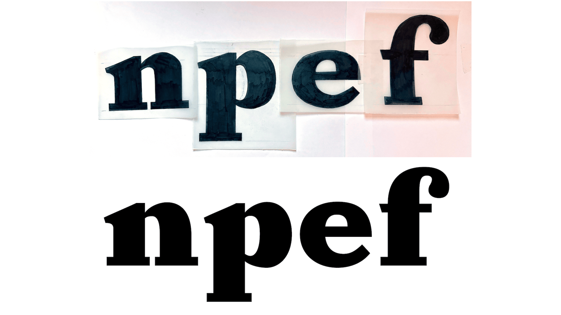
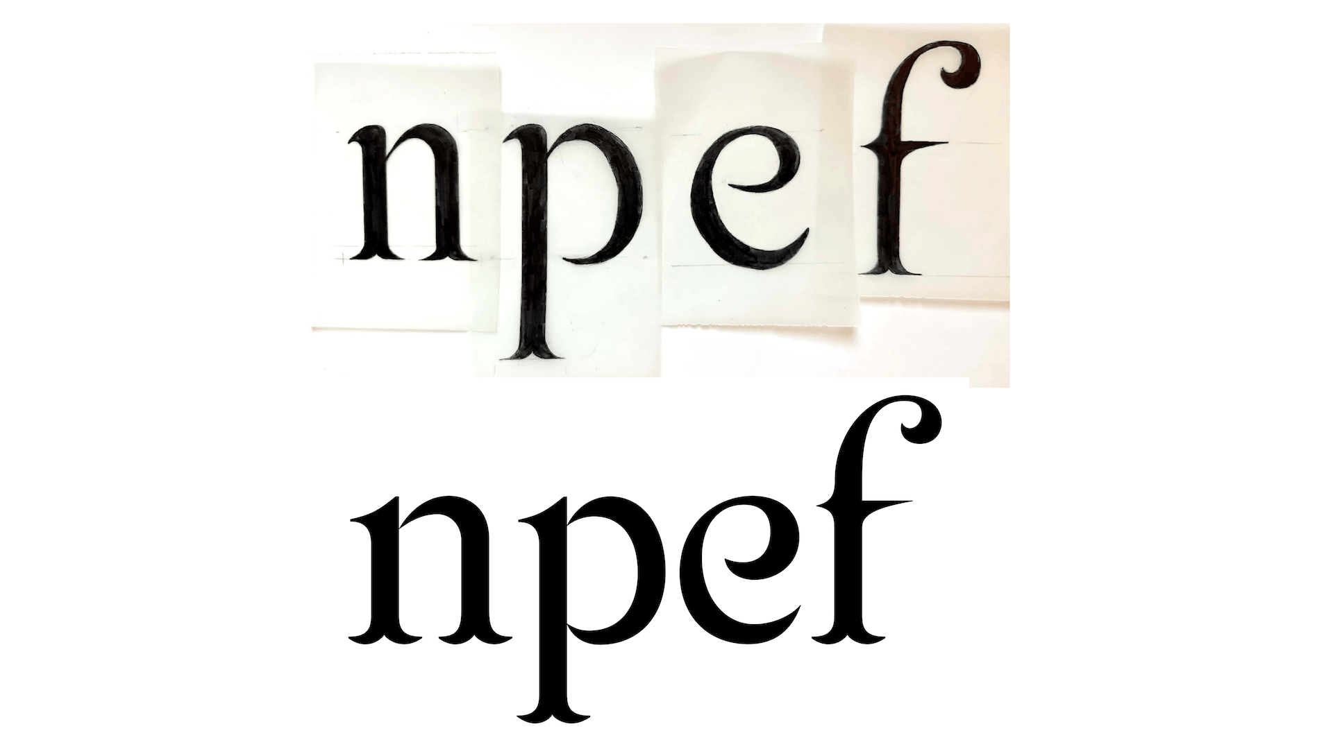
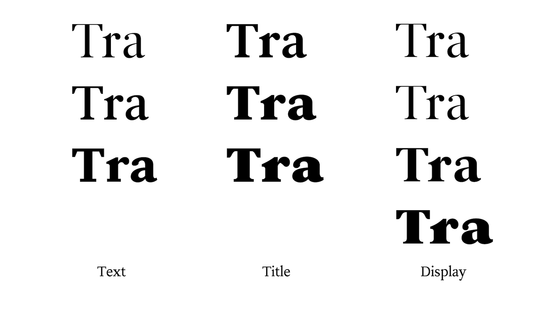
Trajet comes in three families. Trajet Text is made for long reading with a lower contrast that holds up at small sizes and on the printed page. Trajet Title bridges the family, refined for headings and subheads. Trajet Display is the most expressive cut, with higher contrast and sharper detail that rewards large sizes such as signage, posters, and anywhere the letterforms themselves take the centre stage.
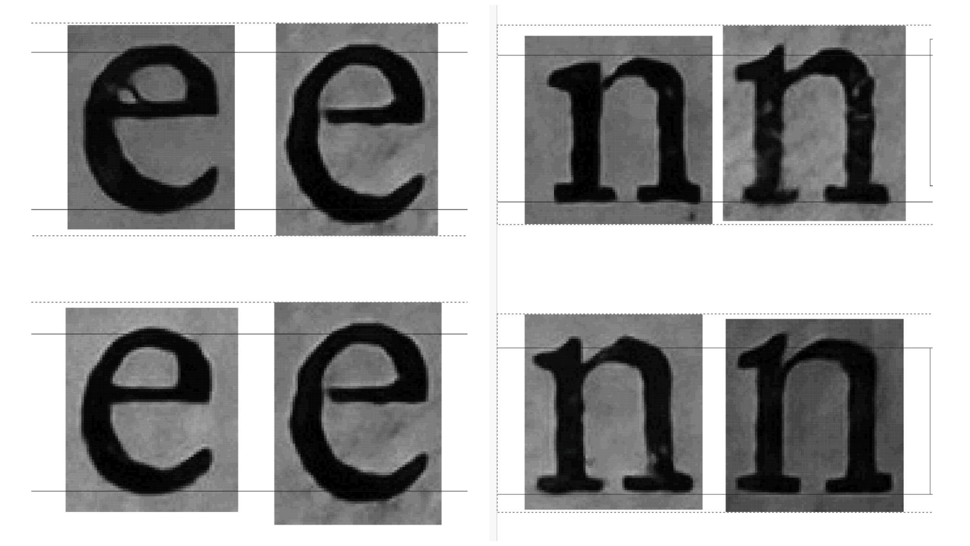
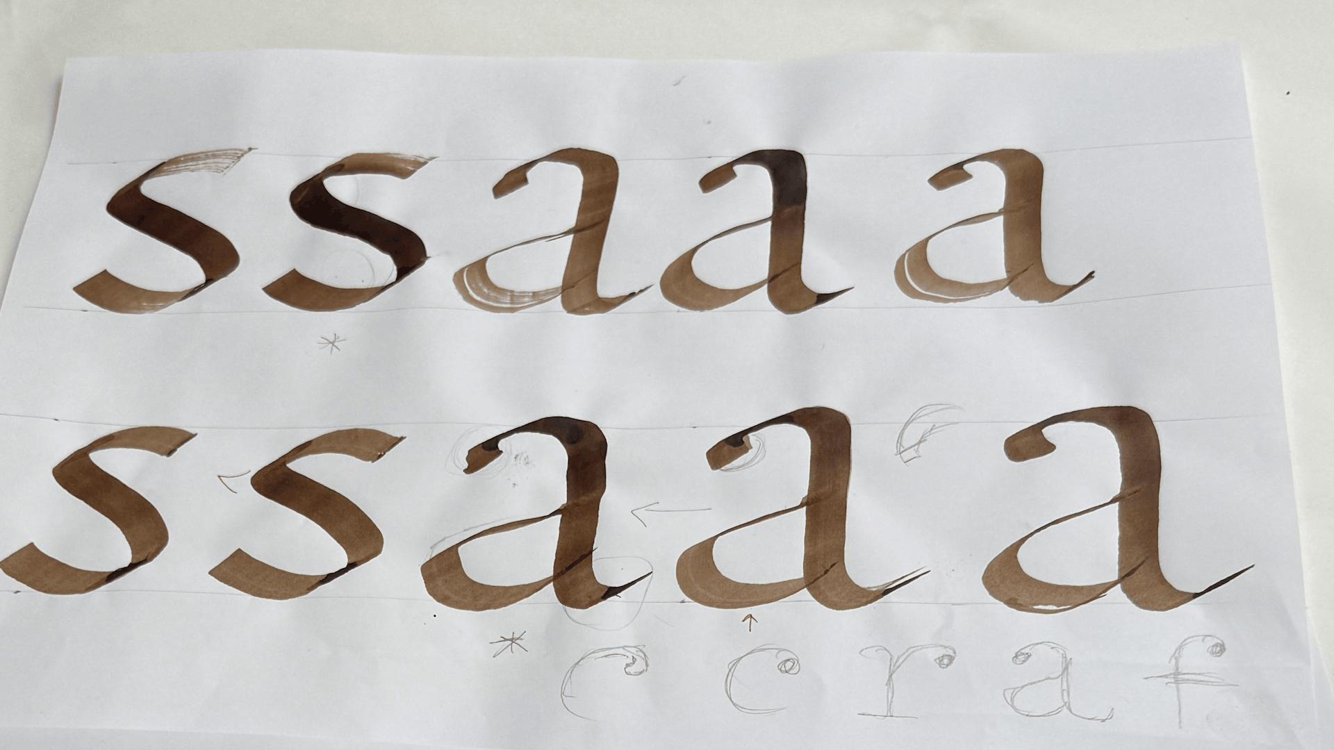
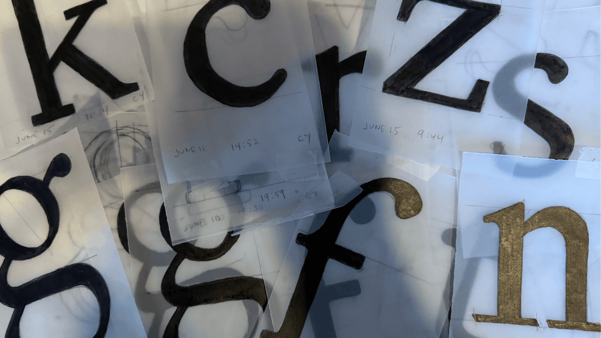
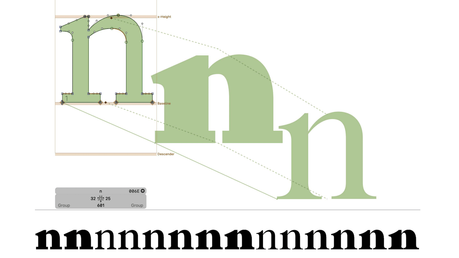
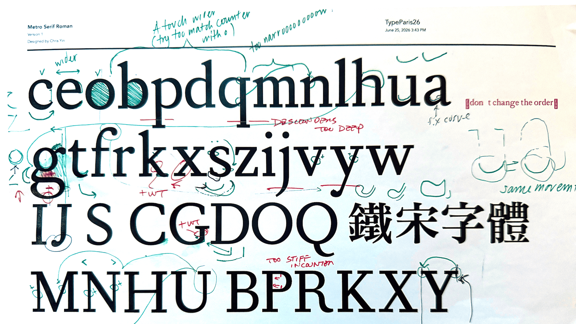
What I take away from TypeParis, above all, is the process. Latin type has its roots in calligraphy, and a revival should return to that source rather than work from digital copies. Drawing letters by hand — understanding how pen strokes contrast, create stress, and establish rhythm — leads to better letters on screen. Trajet carries that lesson forward: informed by history, drawn by hand, made for bilingual use.

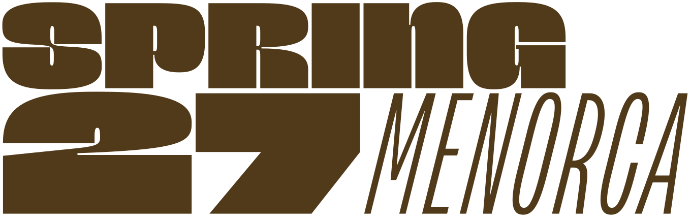
Apply before 14 January for the three-week type design course starting 5 April and ending 24 April 2027.
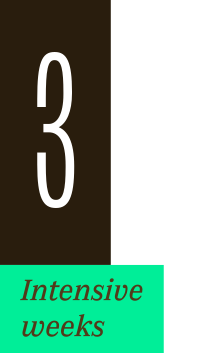
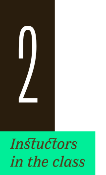
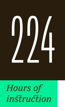
After 10 years in Paris, we reinvent our type design programme. We go from 6 weeks to 3 weeks, while maintaining the fundamentals that make TypeParis’ reputation.
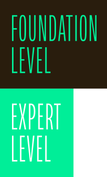
The course will take place in Menorca, Spain for the first time. In 2027, we offer two levels, Foundation and Expert, which allows you to discover type design, or to gain expertise after an initial training.
➼ Subscribe to our mailing list to stay informed, until application period is launched.
Get ready & apply before 14 January 2027