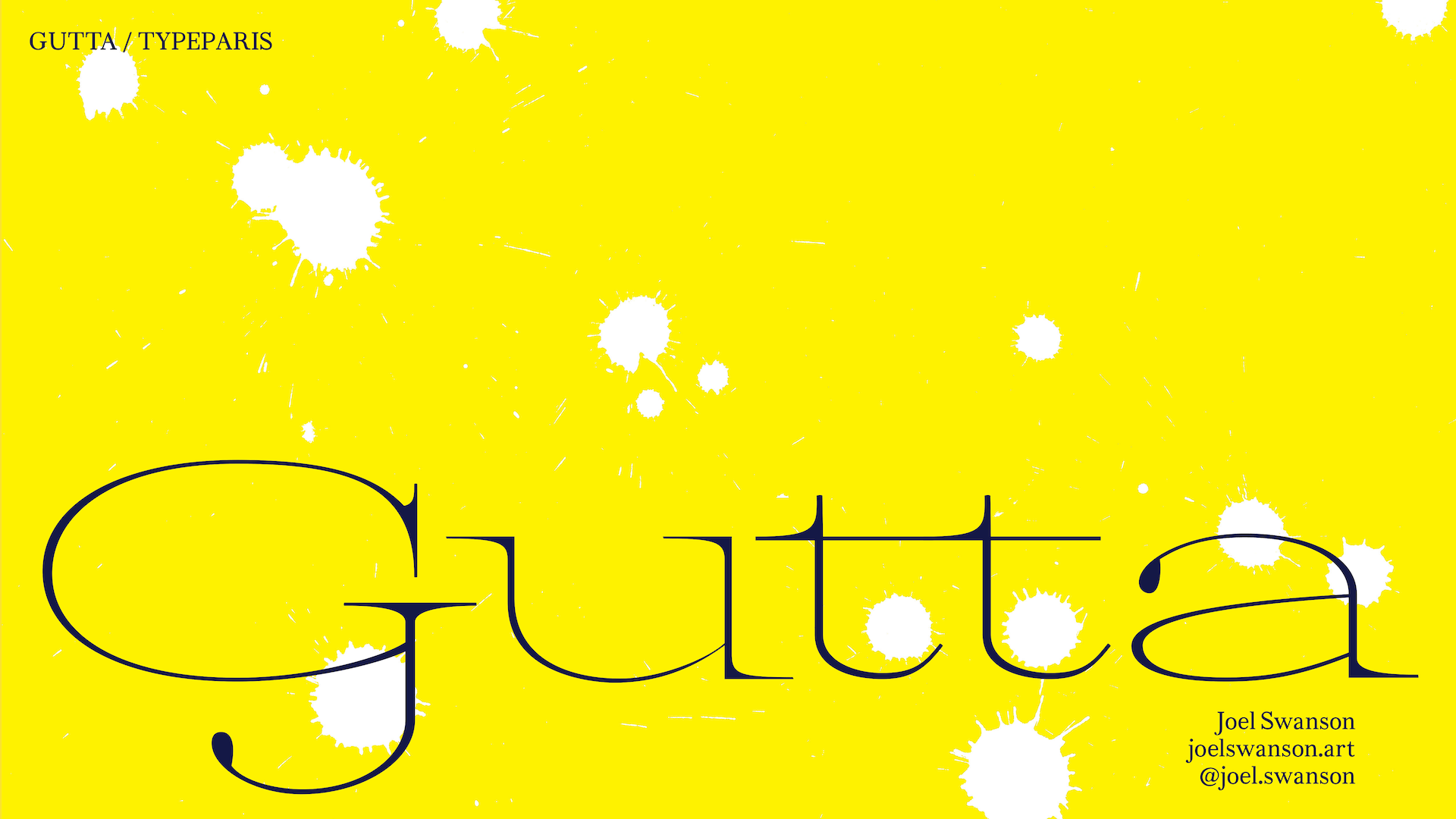
Gutta
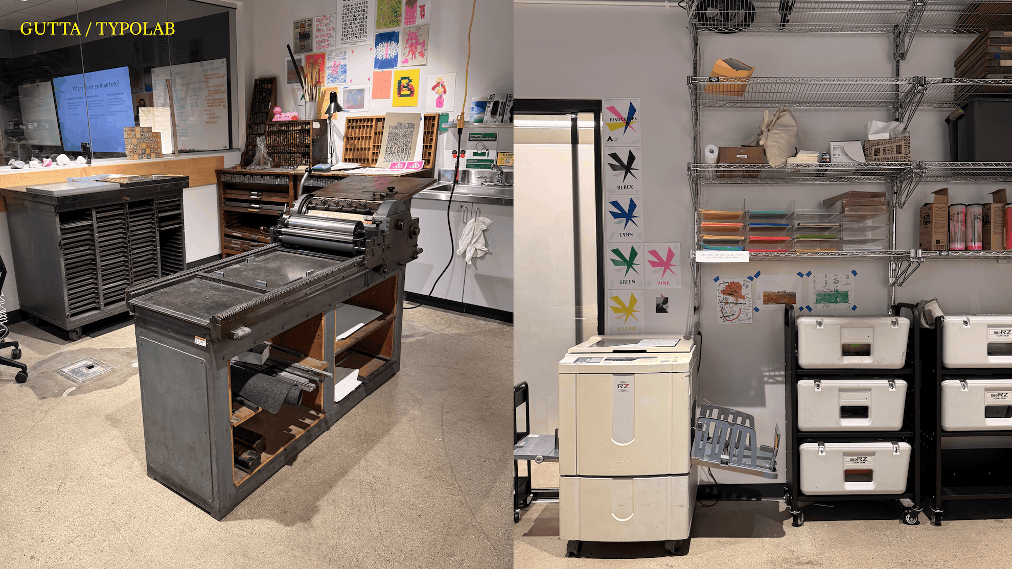
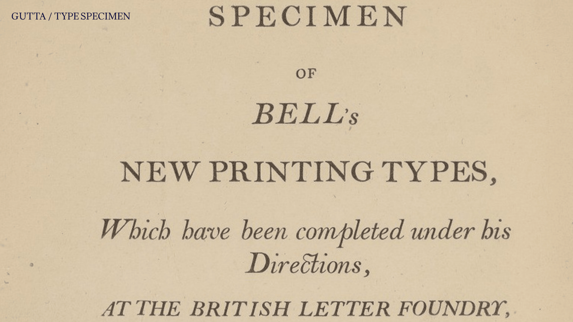
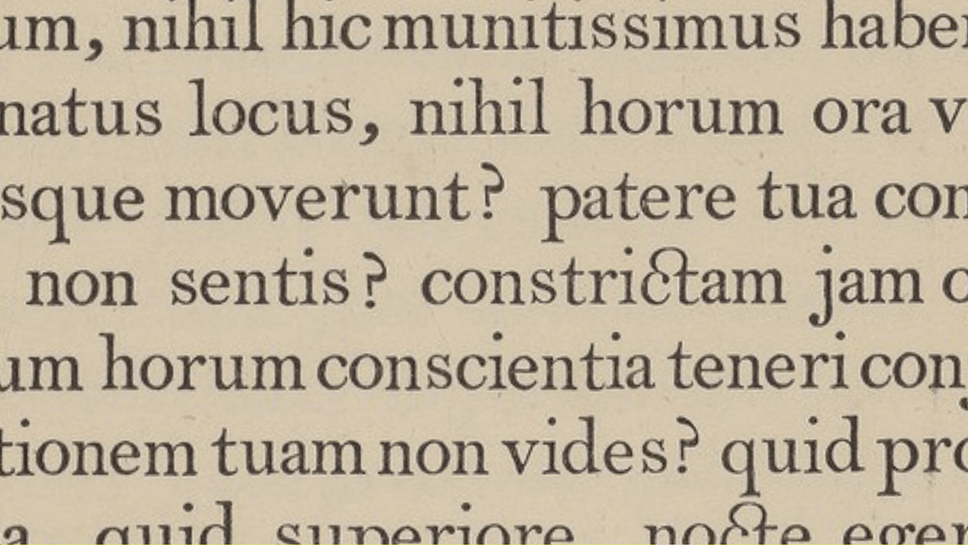
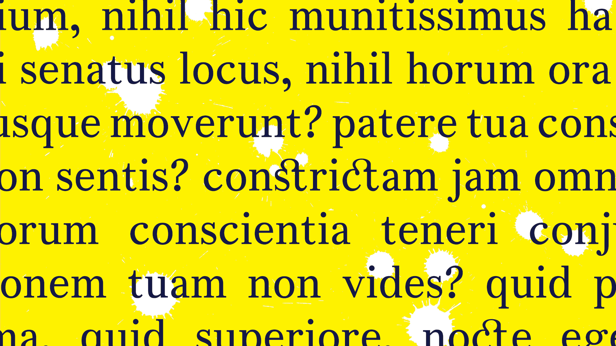
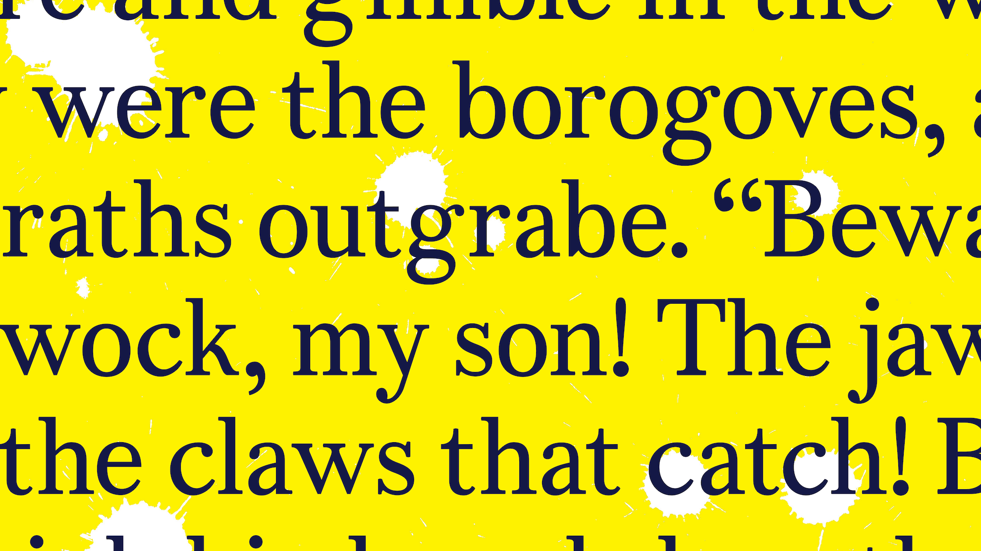
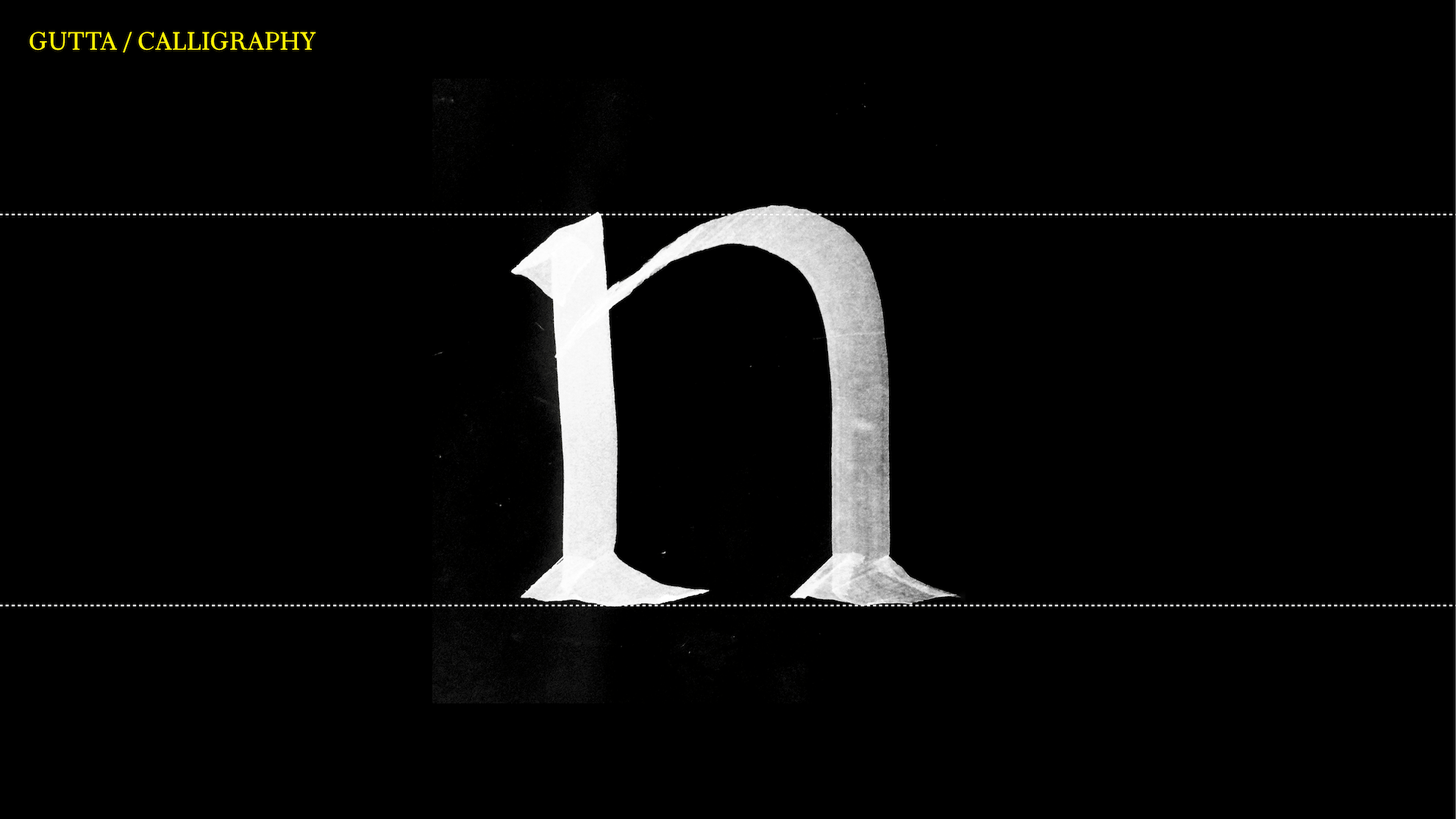
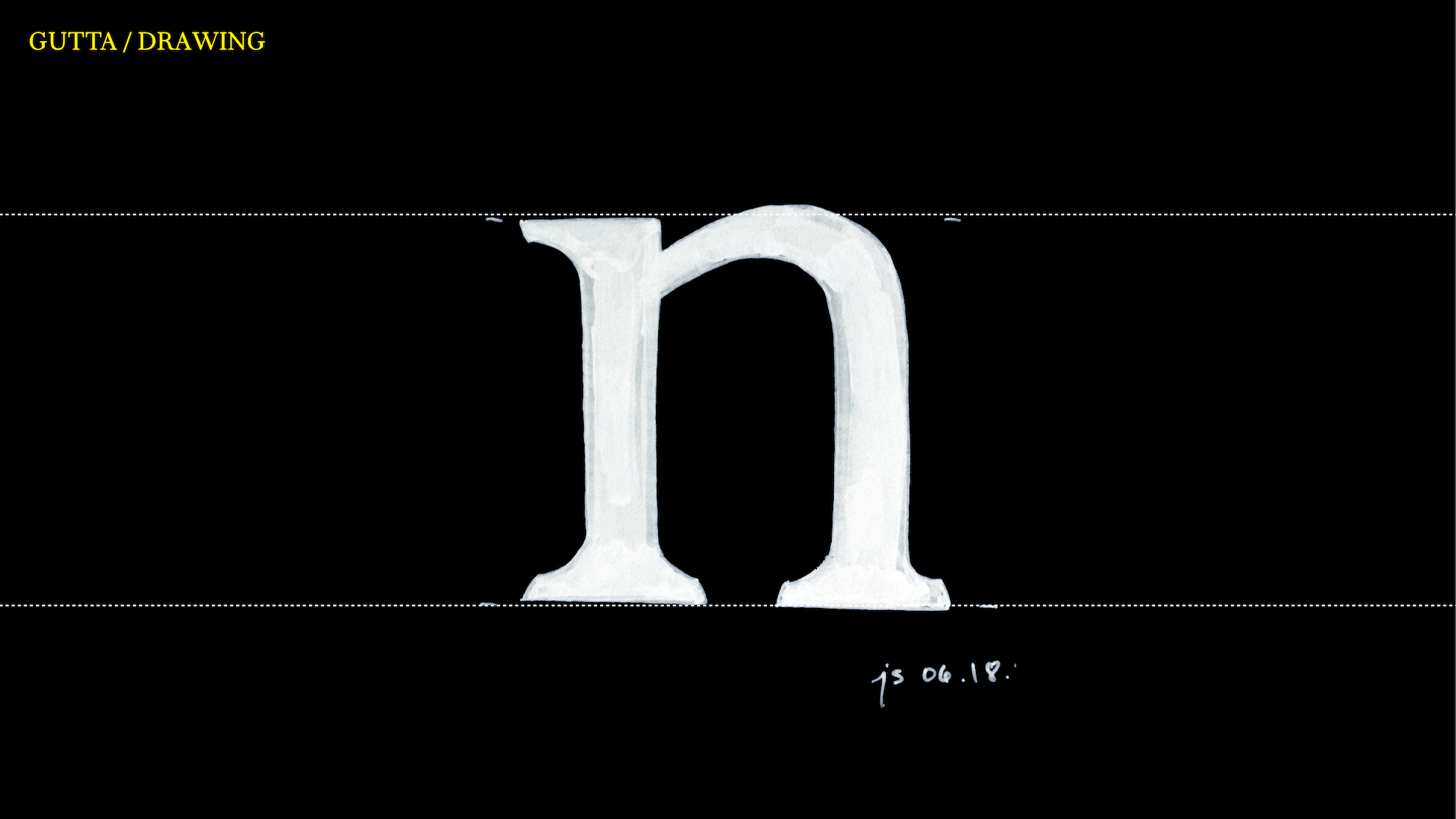
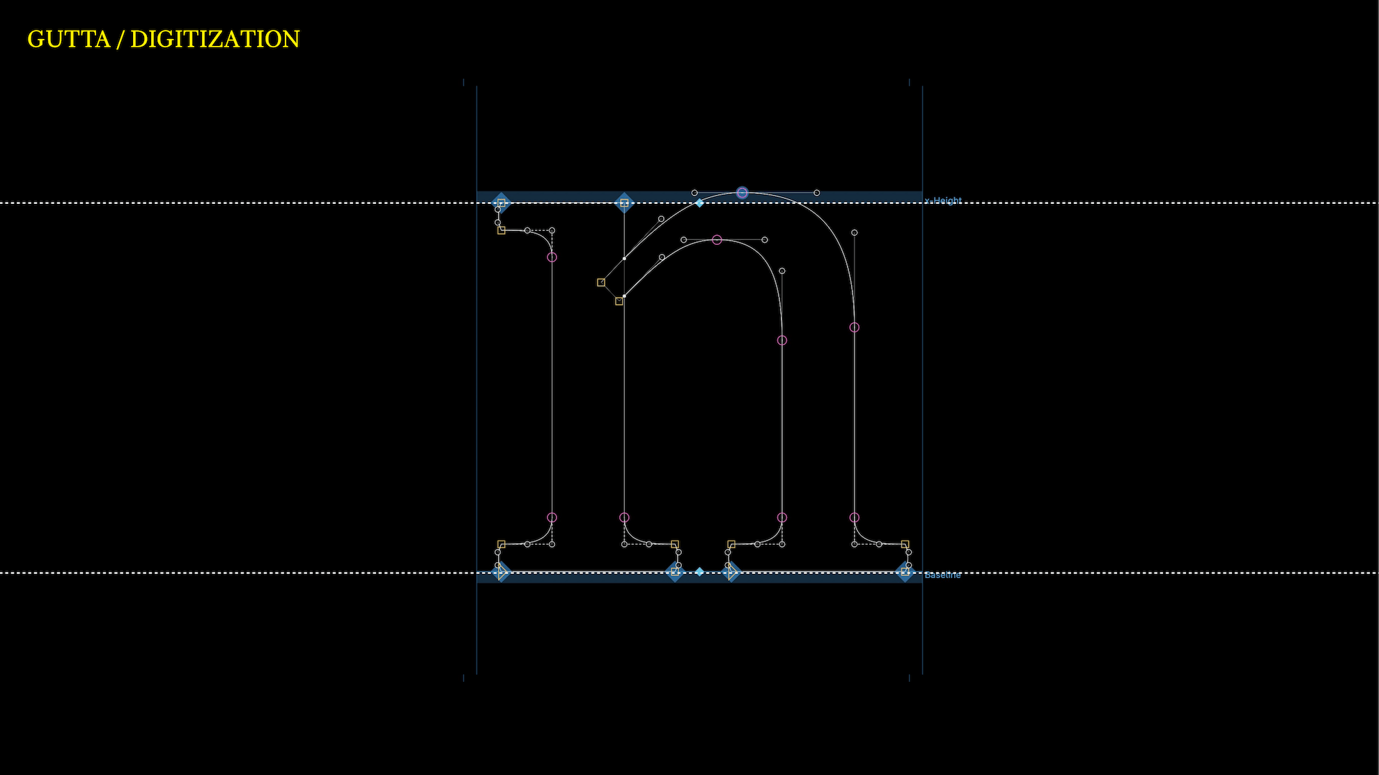
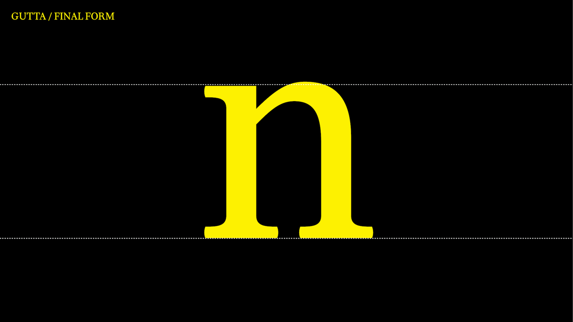
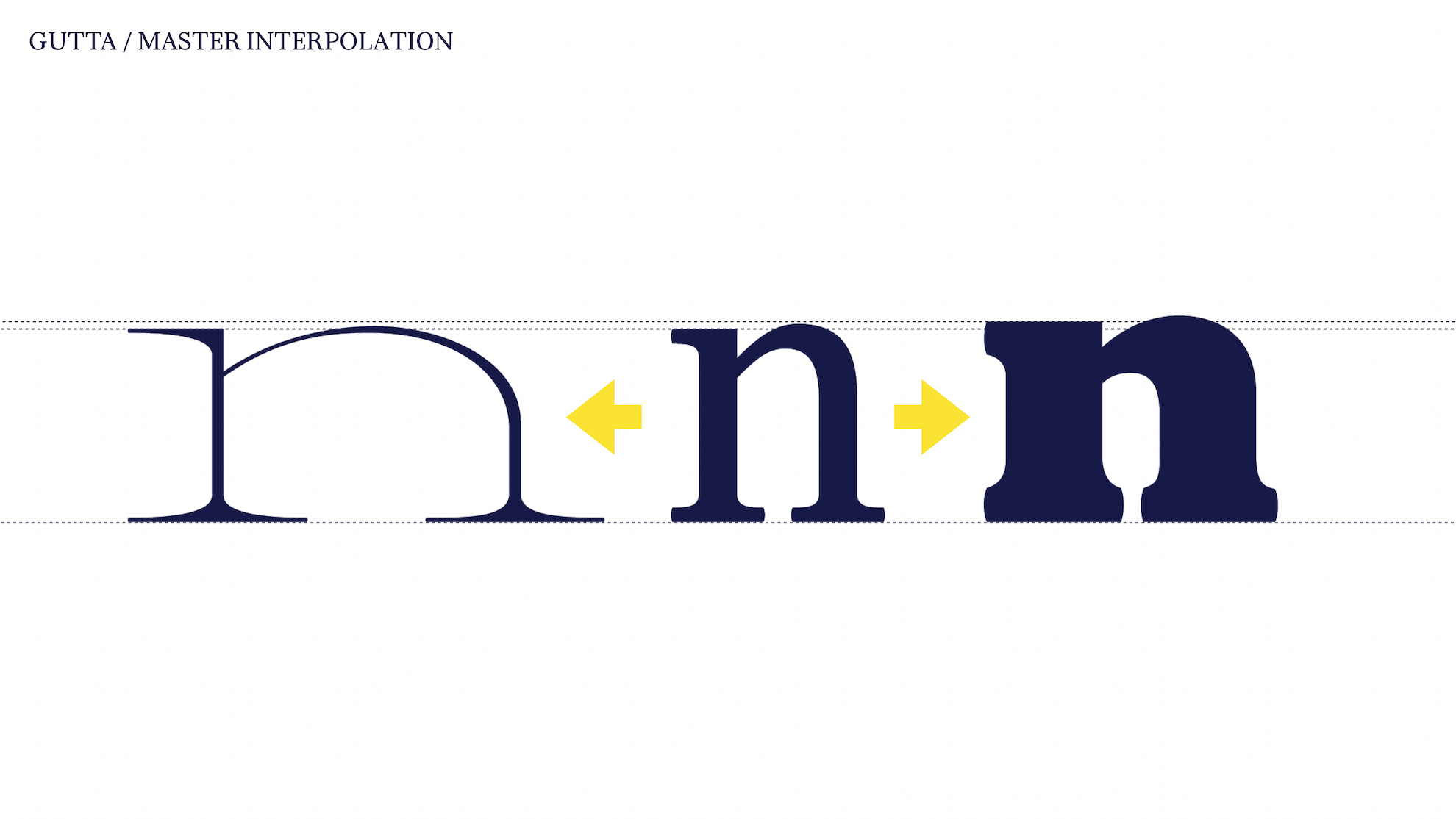
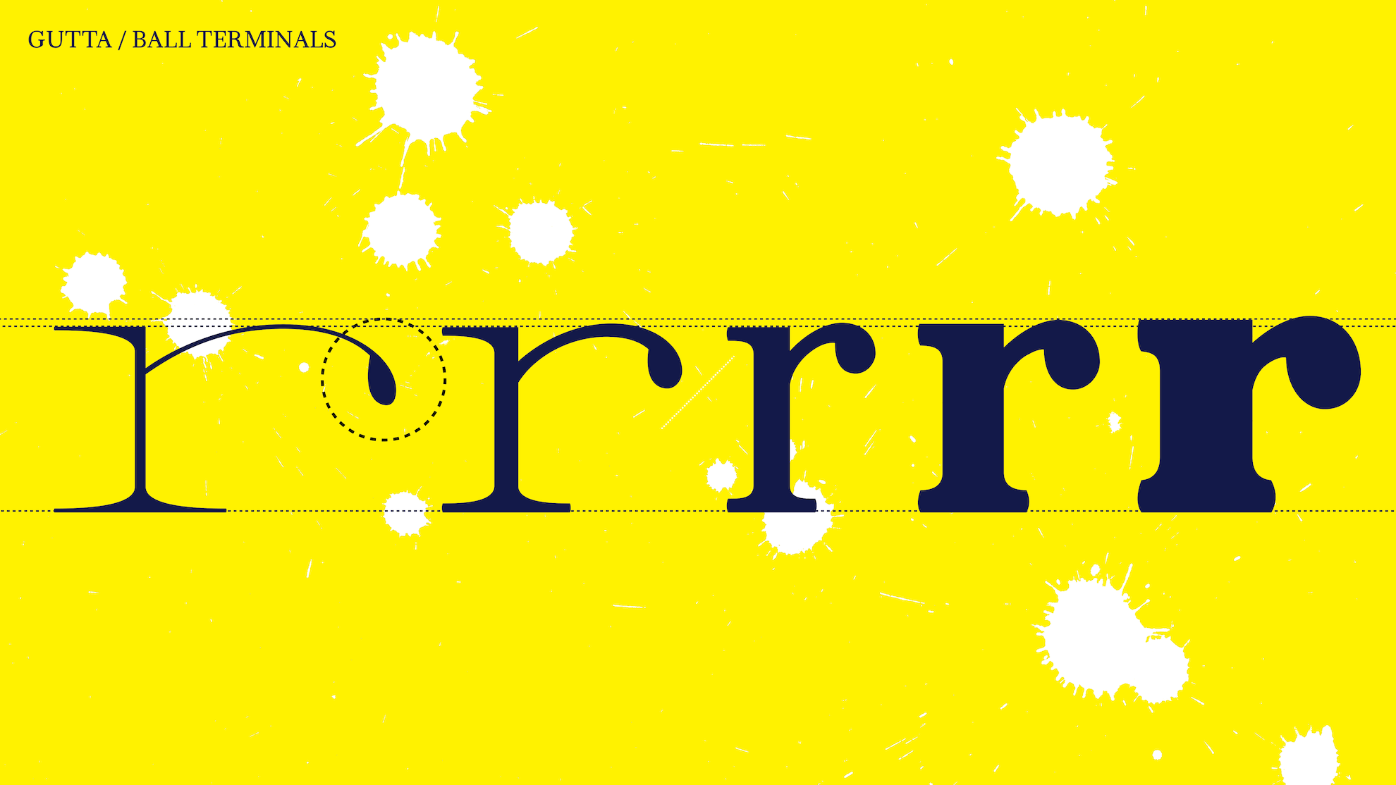
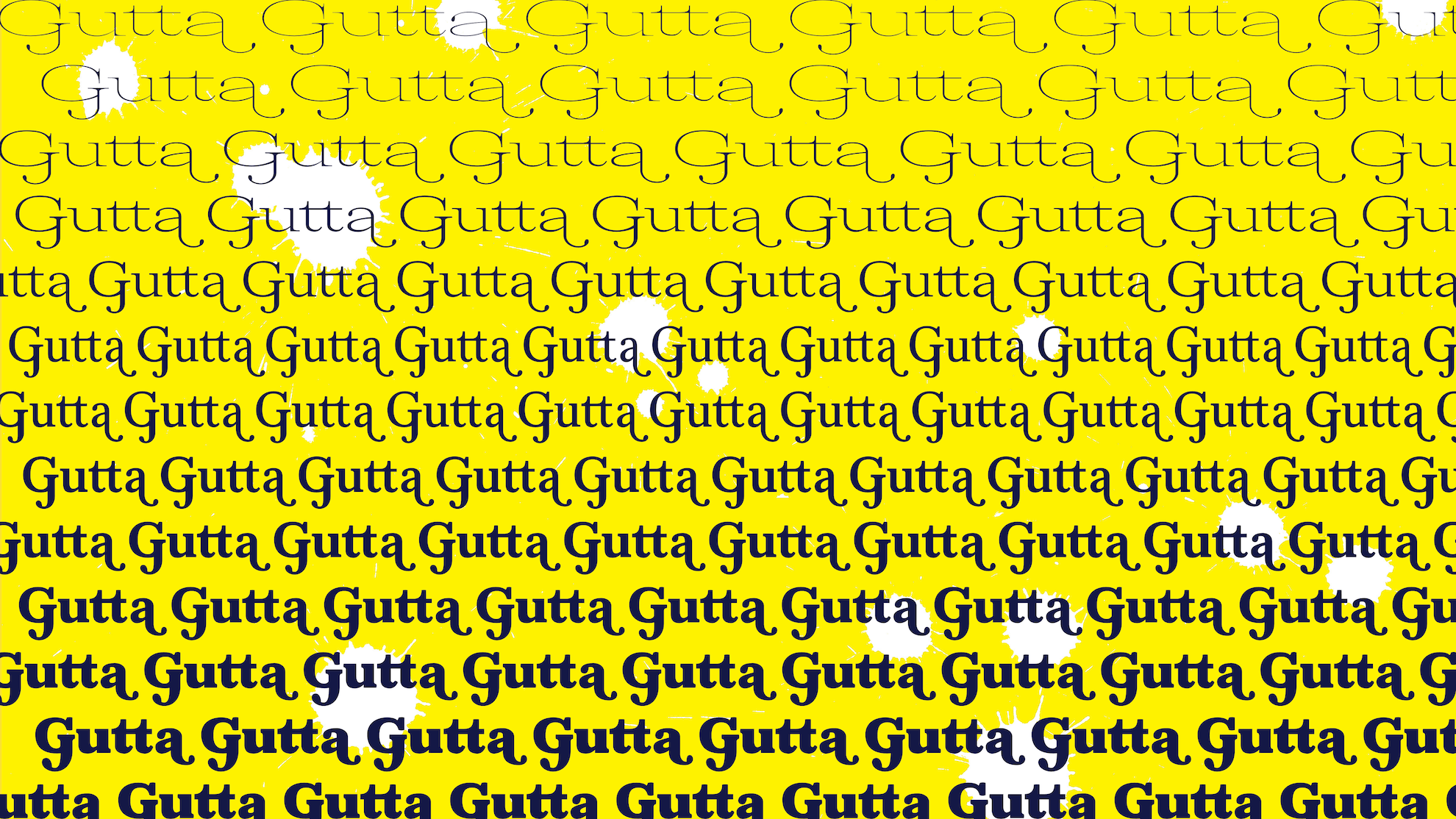
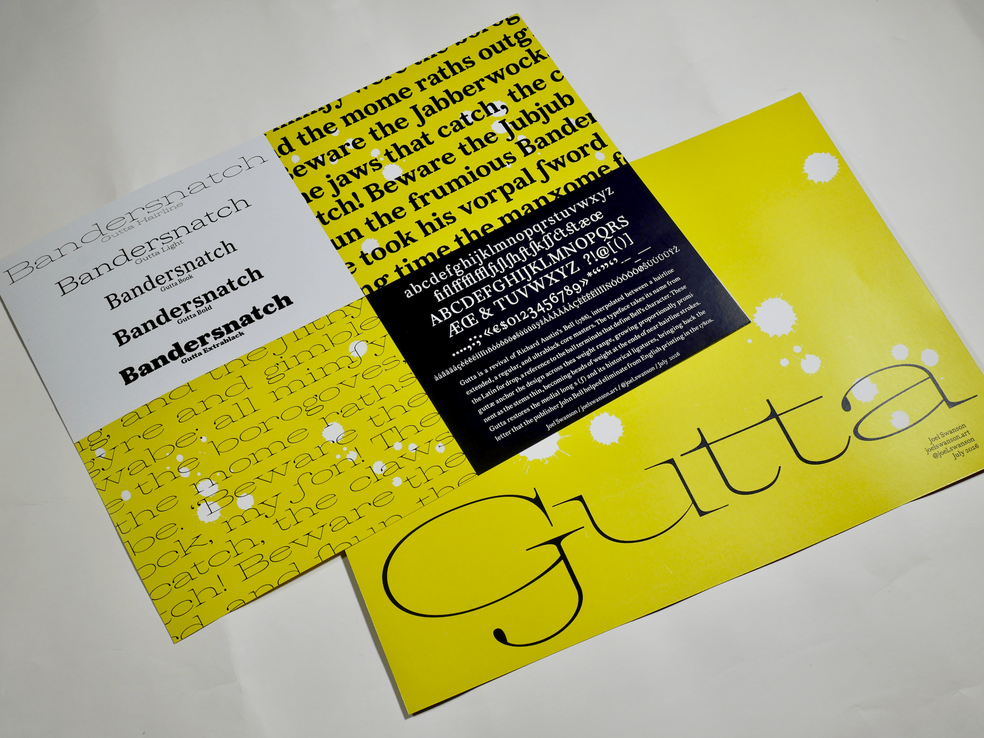
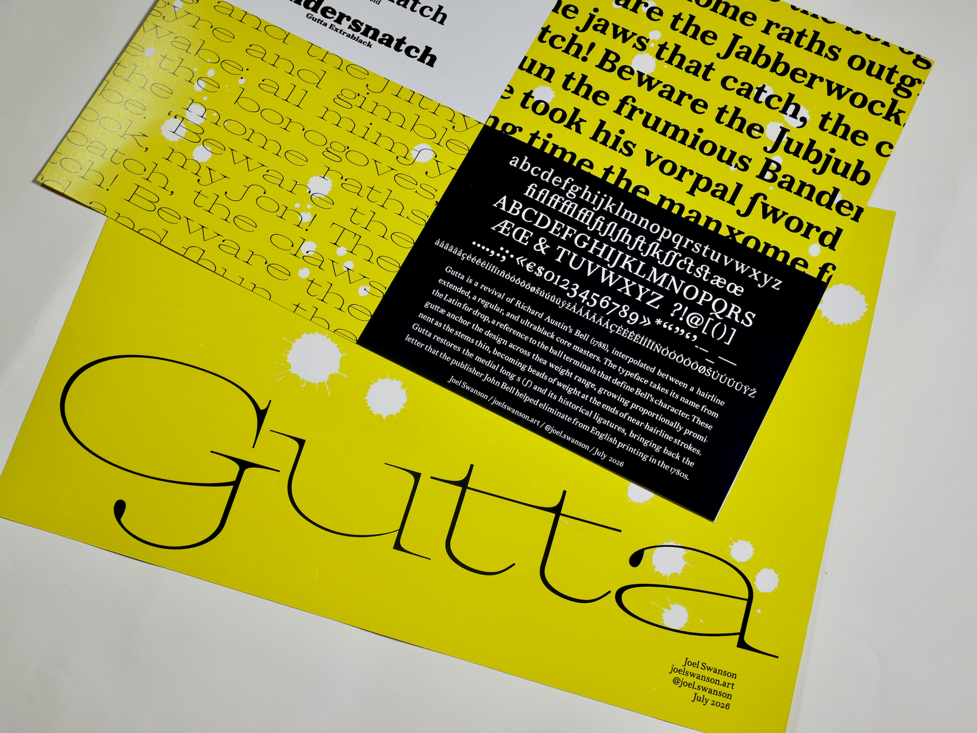
Gutta began with a drawer of metal type: a full set of Bell, the face Richard Austin cut in 1788, acquired by the TYPO Lab at the University of Colorado Boulder’s ATLAS Institute. Out of that came a serif family in three masters, a hairline extended, a regular, and an extra black, focused with one detail: the ball terminal.
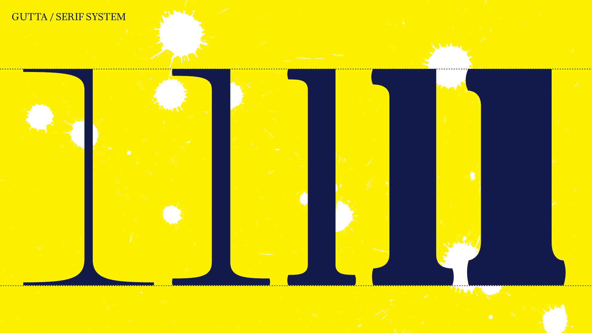
The name comes from the Latin for drop, which is what a ball terminal is: a bead of weight at the end of a stroke. The guttae are what hold the typeface together across the weight range. In the extra black, they're dense anchors at the ends of heavy strokes. In the regular, they sit at Bell’s familiar proportions, the sharp, poised drops that separate it from Baskerville and other transitional typefaces. In the hairline extended, the stems thin toward nothing while the ball terminals hold their mass: beads of weight suspended at the ends of nearly nothing. They stop the letters from evaporating and give the lightest cut its personality.
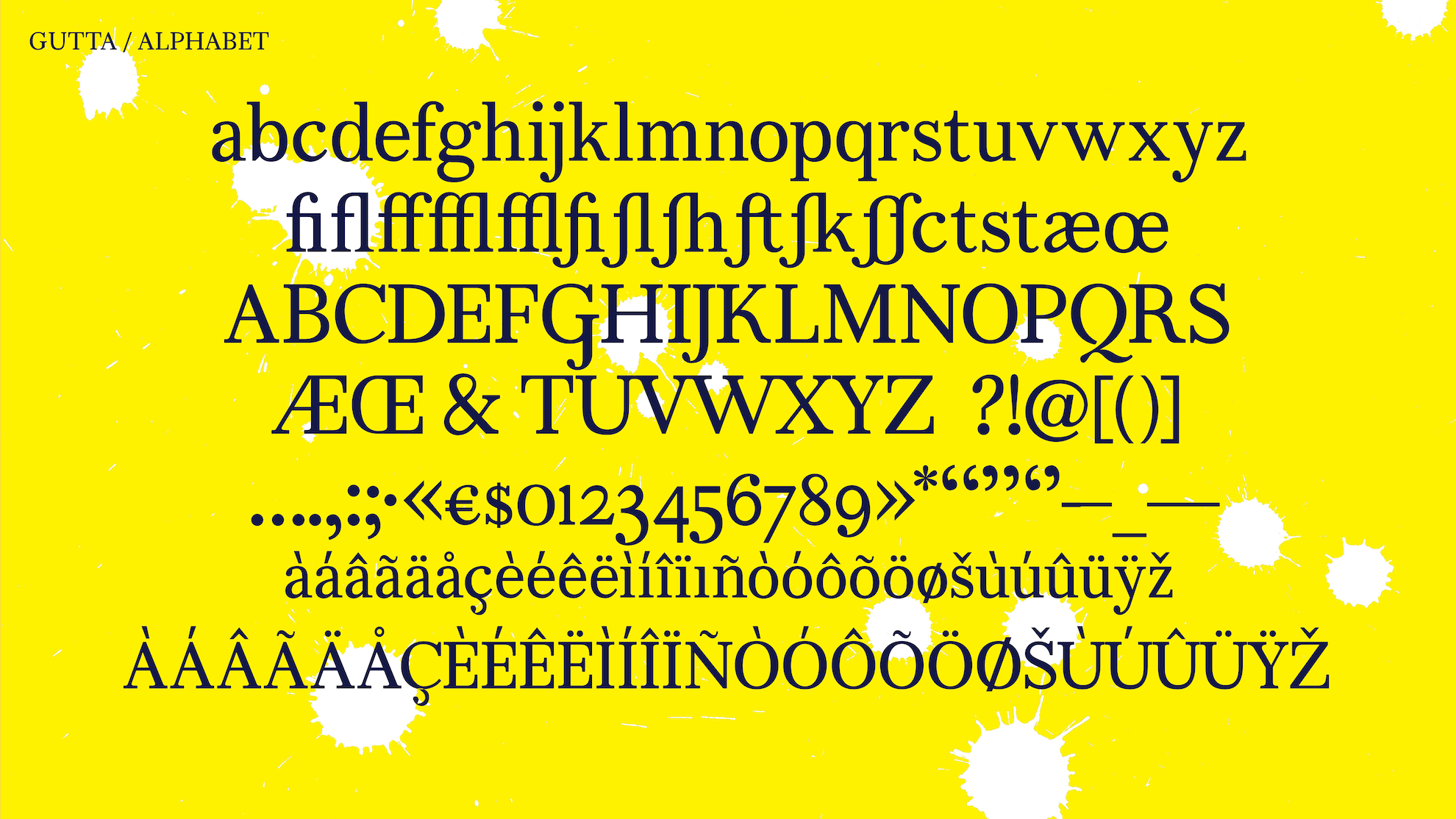
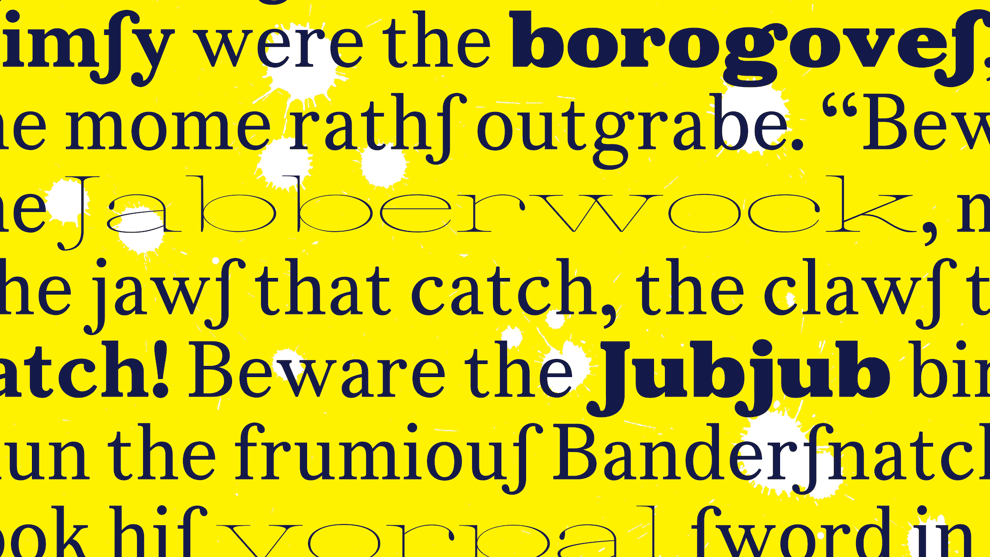
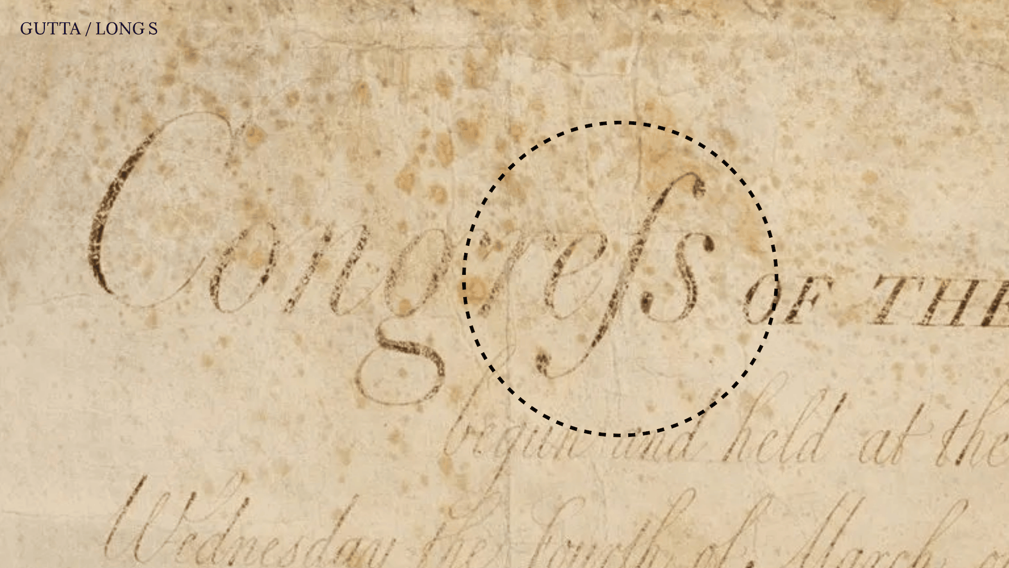
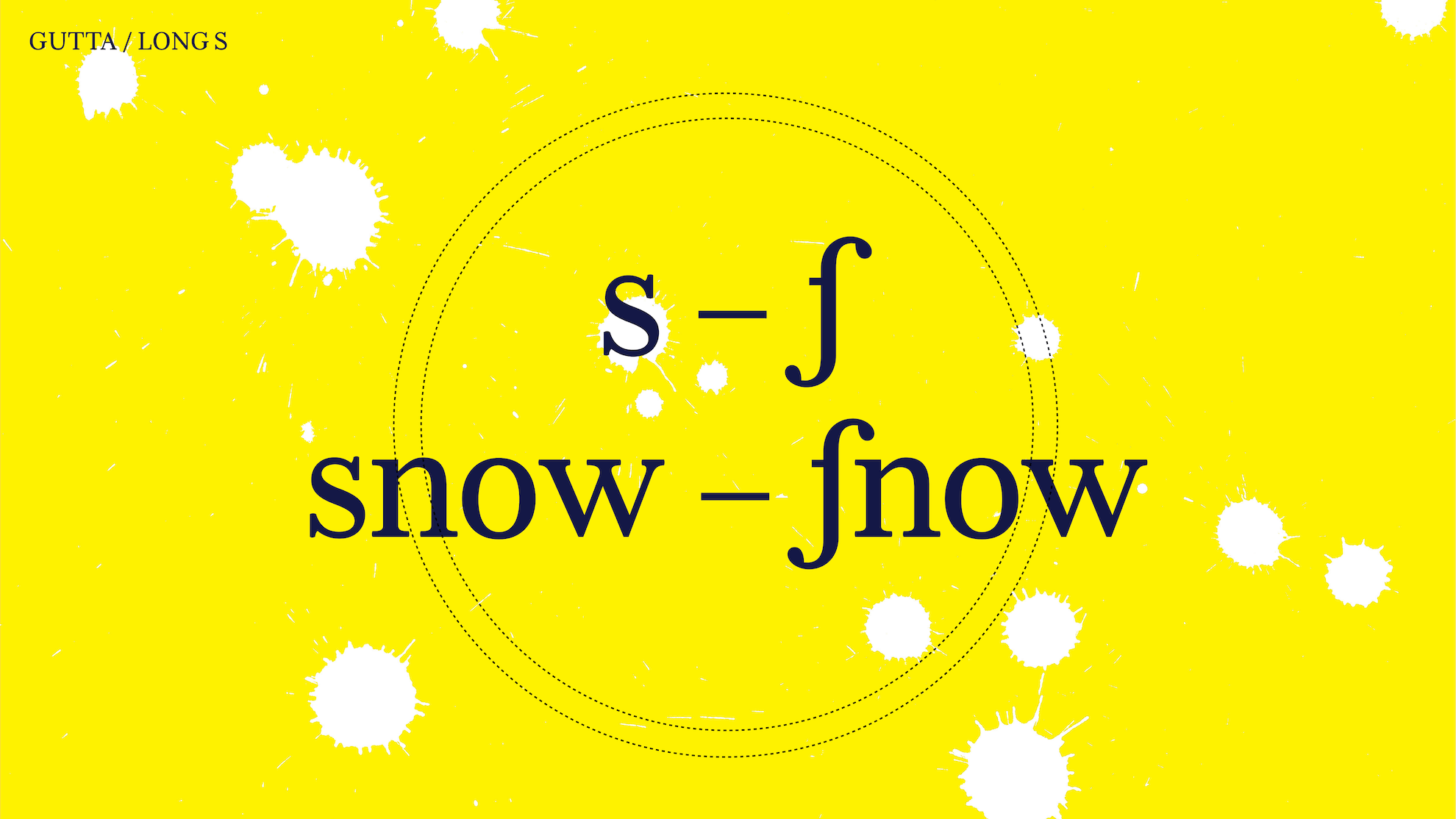
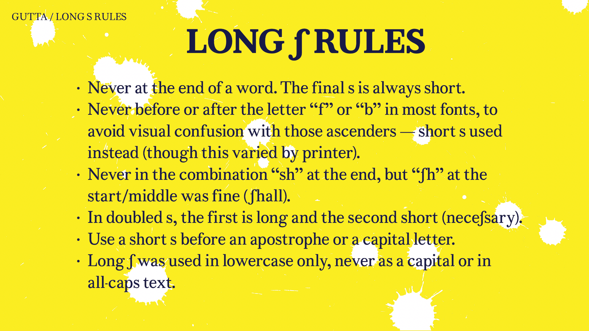
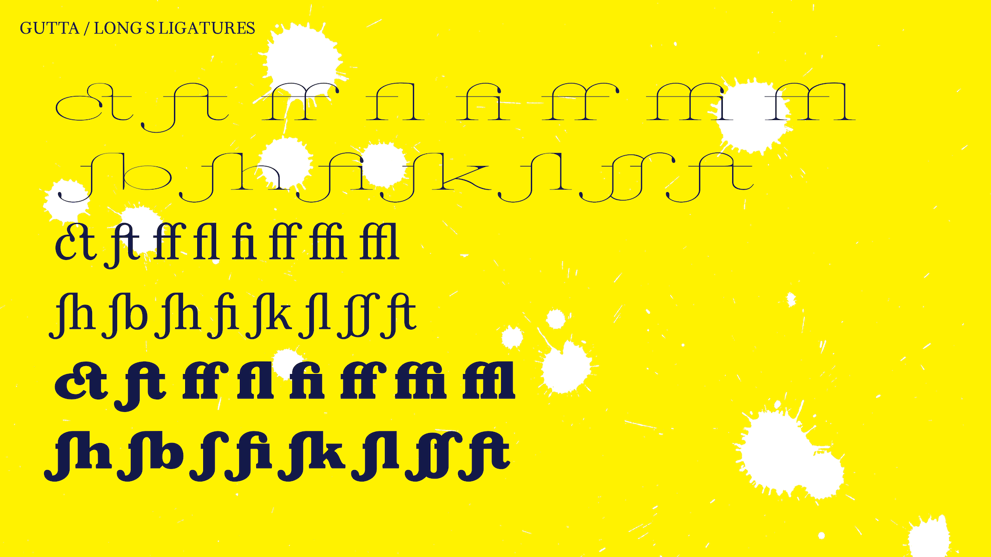
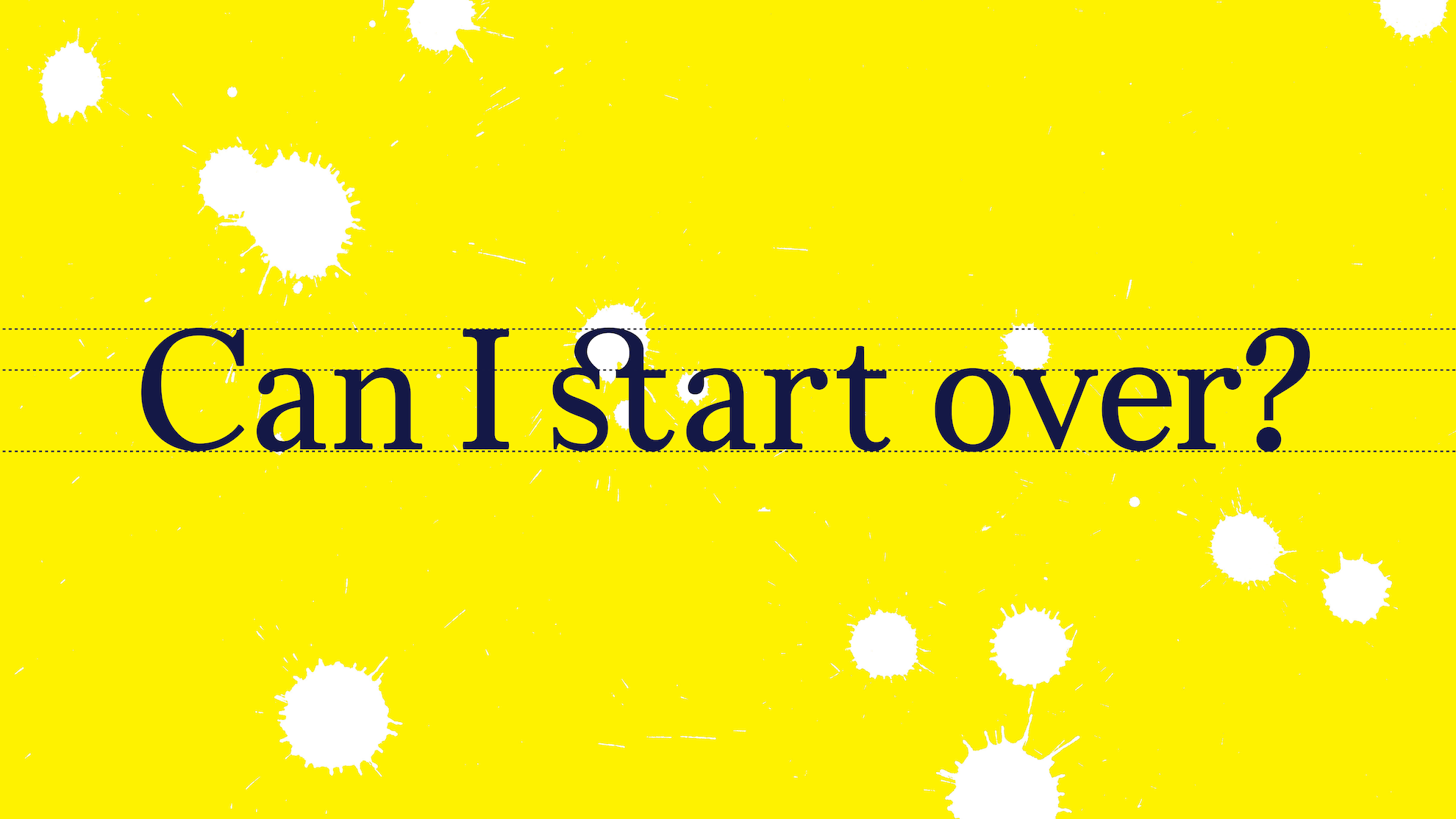
Gutta also restores the medial long ſ, the letter that Richard Austin’s own patron, John Bell, helped retire from English printing in the 1780s, the same decade, the same foundry, that produced this design. The glyph set includes the full range of historical long-s ligatures (ſi, ſl, ſt, ſſ, ſb, ſh, ſk), each drawn to interpolate cleanly across all three masters. Contextual alternates govern placement following period conventions: long ſ in initial and medial positions (poſſeſs, ſubſtance), round s at the end of a word, with rules handling the known exceptions. Building the ligature system meant translating those centuries-old spelling rules into working font code, matching node counts across masters and keeping the joins between ſ and its neighbouring letters consistent at every weight.
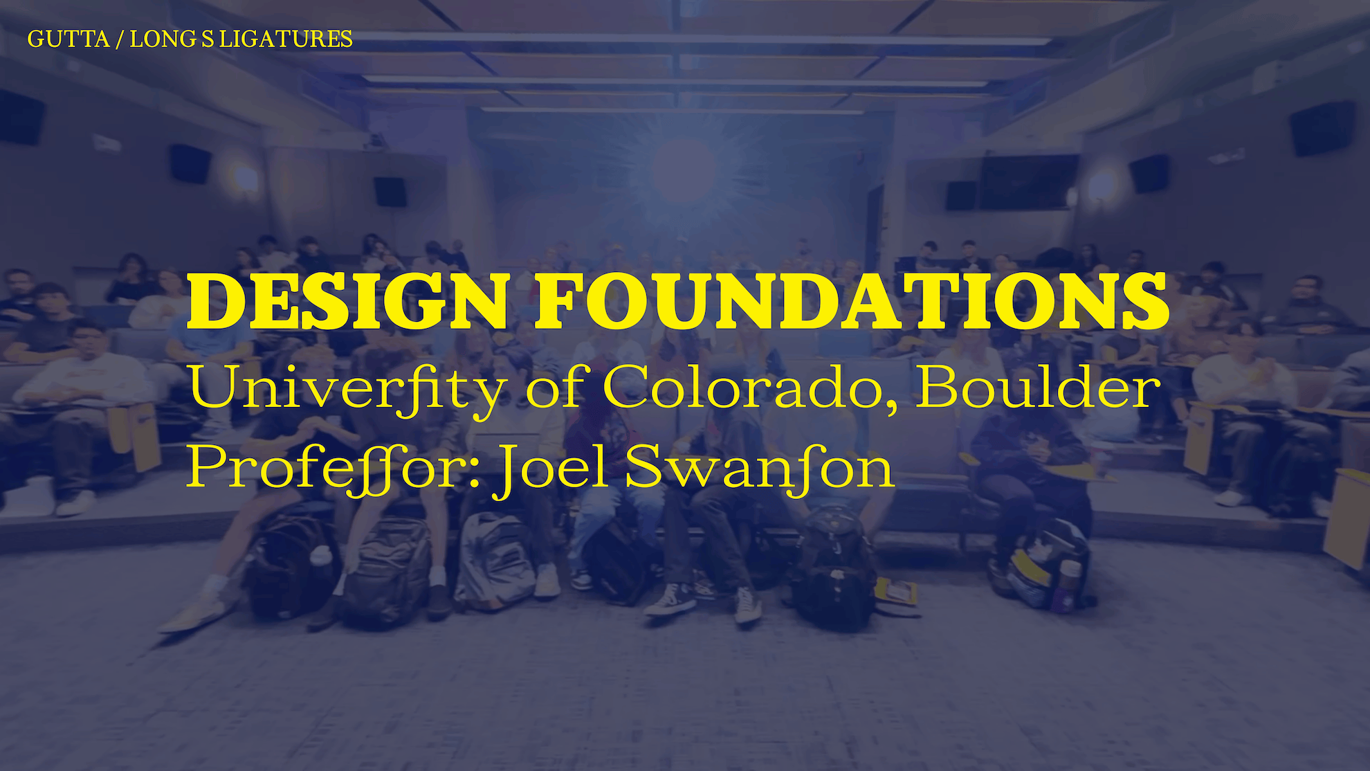
The typeface was designed at TypeParis 2026 by Joel Swanson, a visual artist and Associate Professor at the University of Colorado Boulder’s ATLAS Institute, where he directs the TYPO Lab.

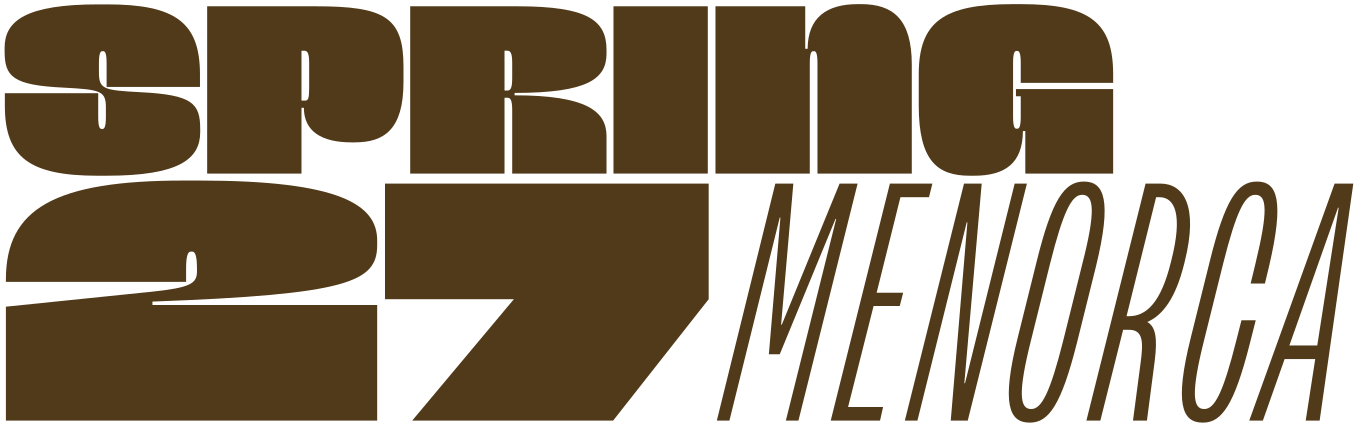
Apply before 14 January for the three-week type design course starting 5 April and ending 24 April 2027.

After 10 years in Paris, we reinvent our type design programme. We go from 6 weeks to 3 weeks, while maintaining the fundamentals that make TypeParis’ reputation.
The course will take place in Menorca, Spain for the first time. In 2027, we offer two levels, Foundation and Expert, which allows you to discover type design, or to gain expertise after an initial training.
➼ Subscribe to our mailing list to stay informed, until application period is launched.
Get ready & apply before 14 January 2027