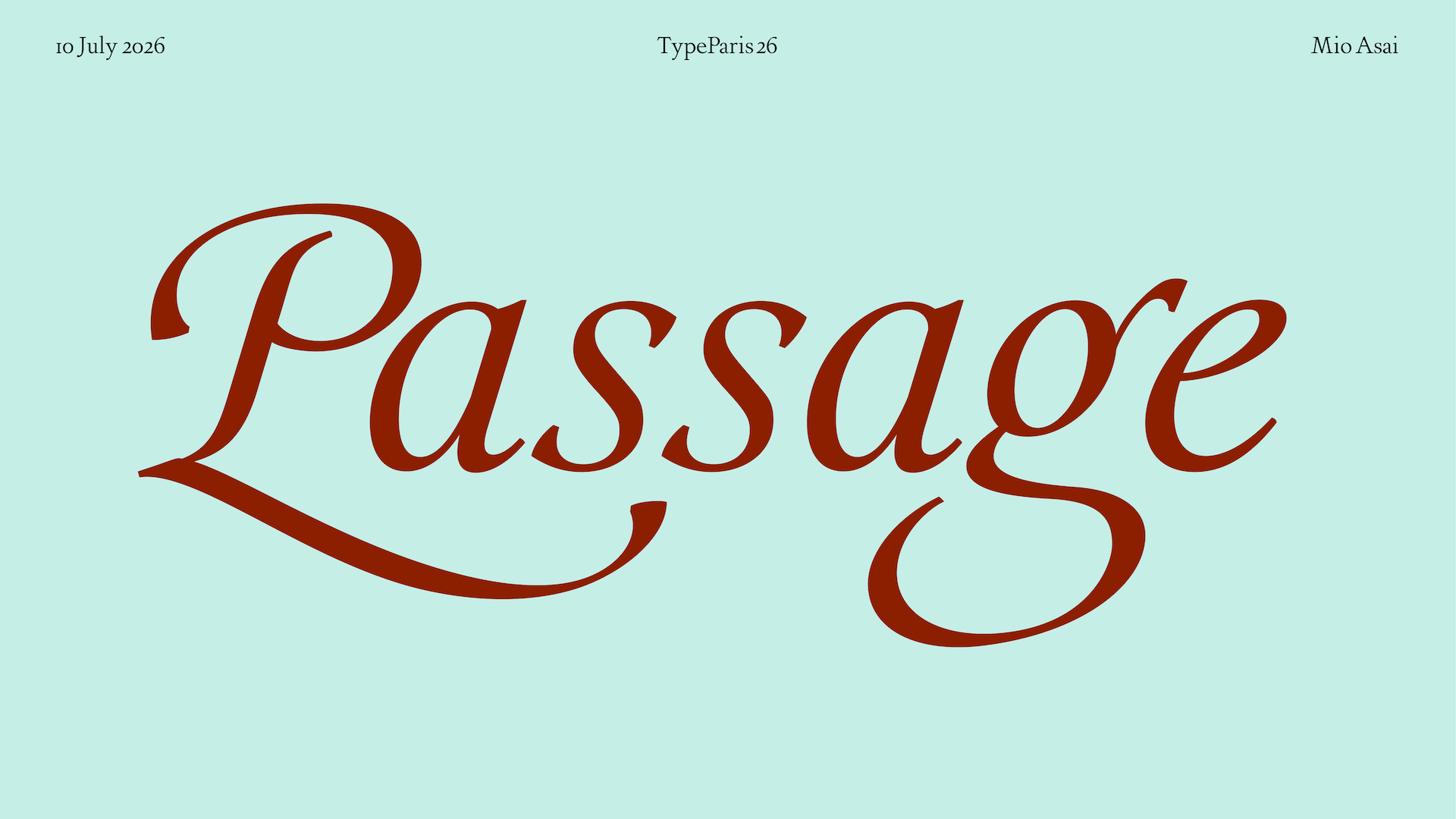
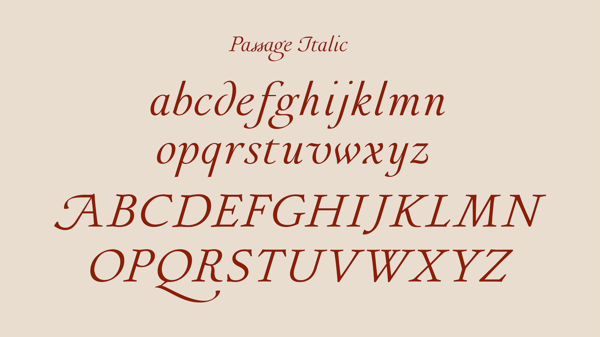
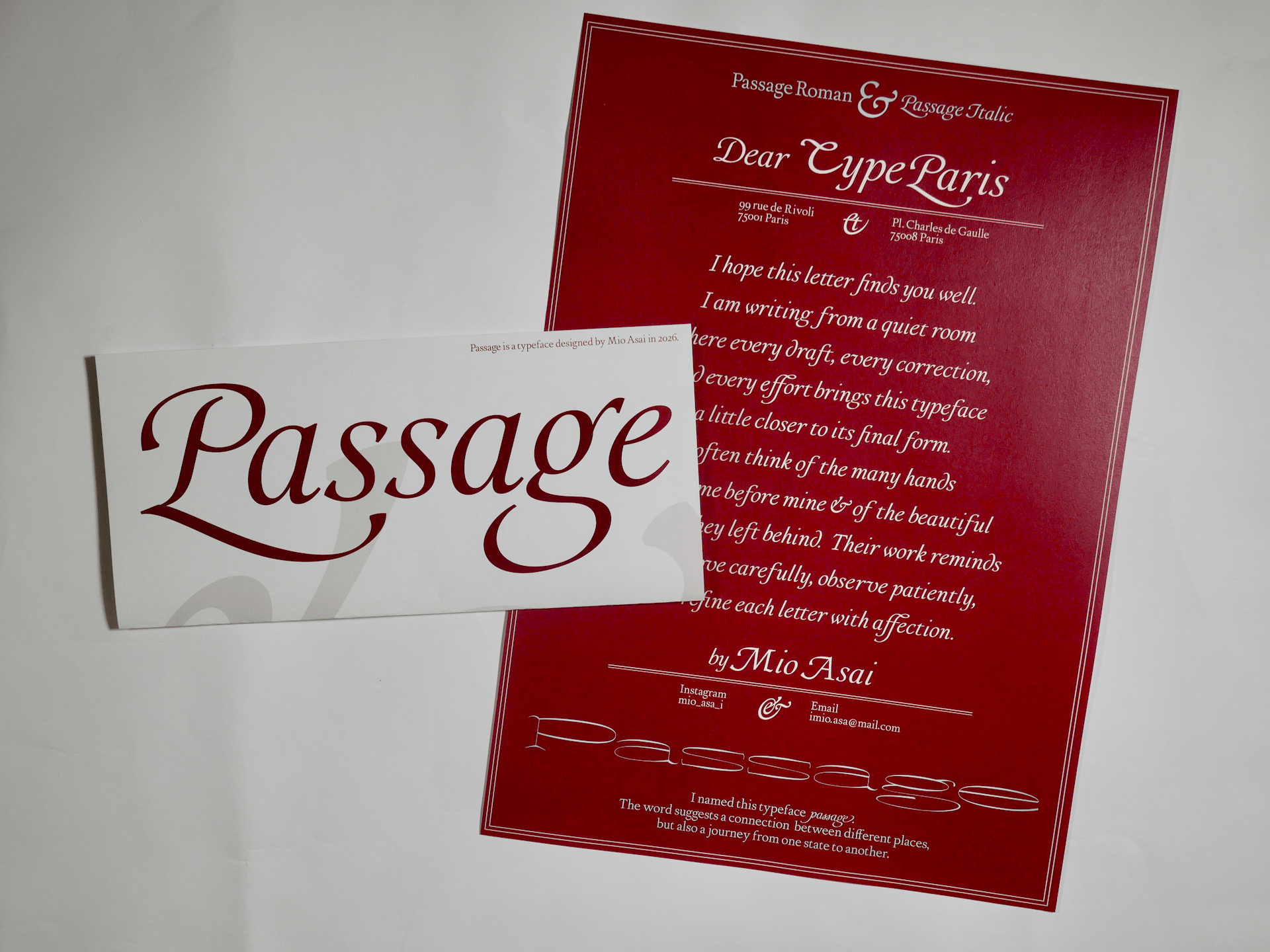
Passage
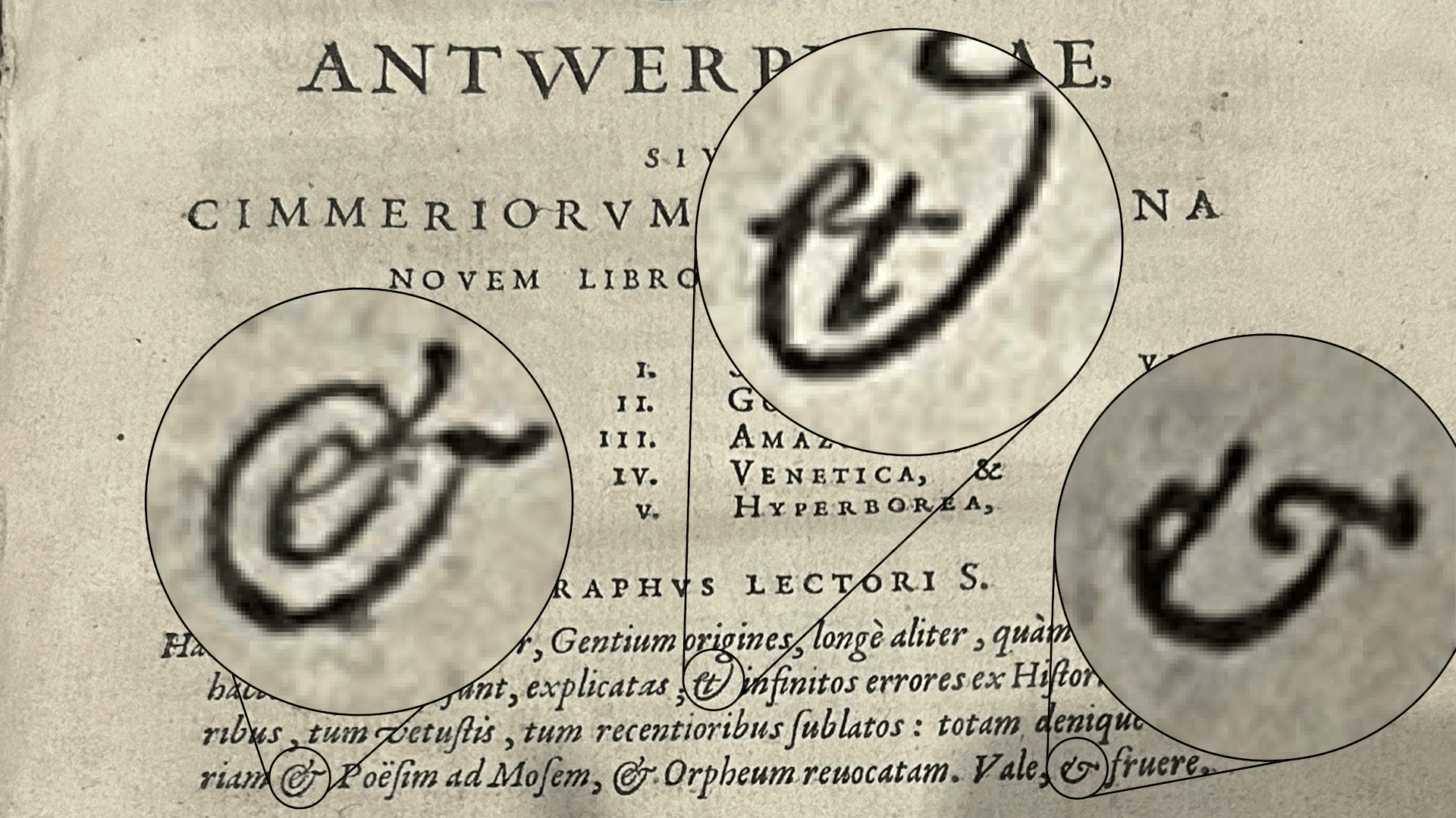
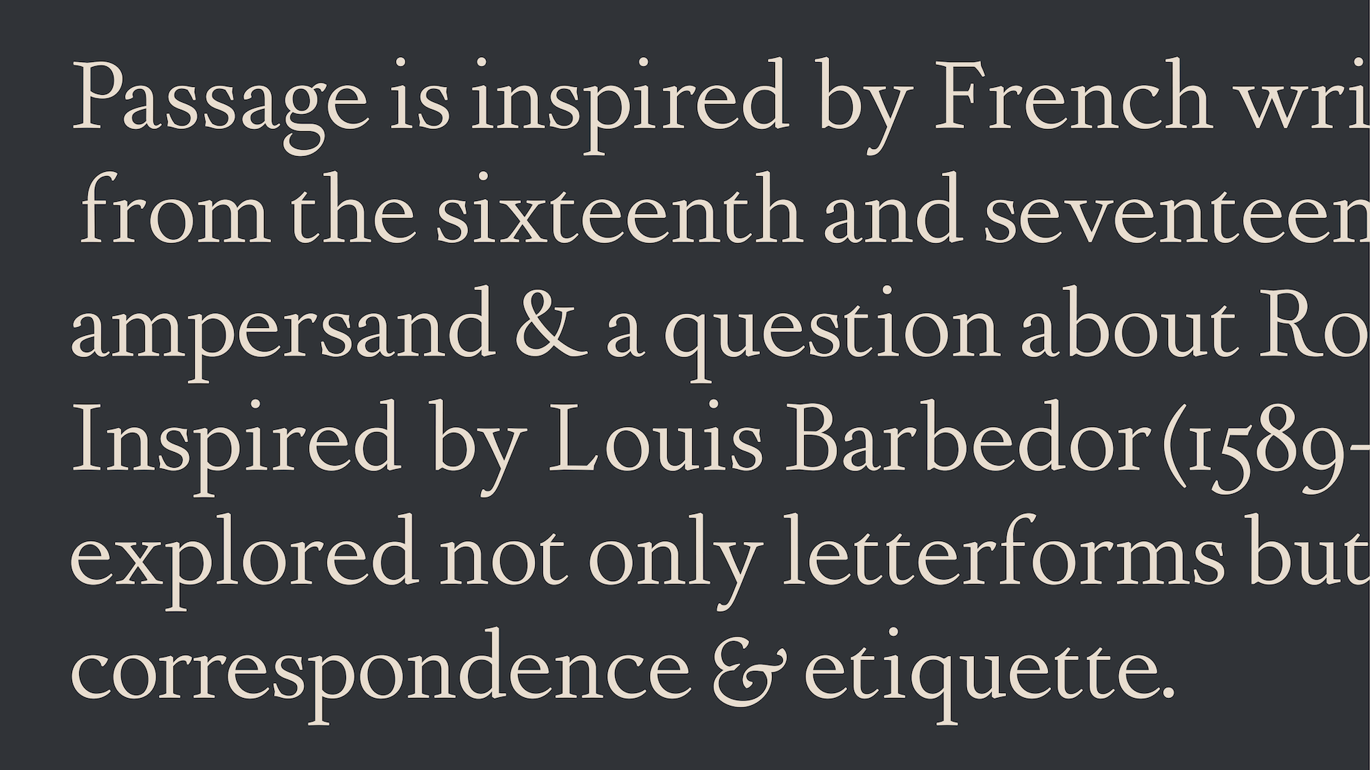
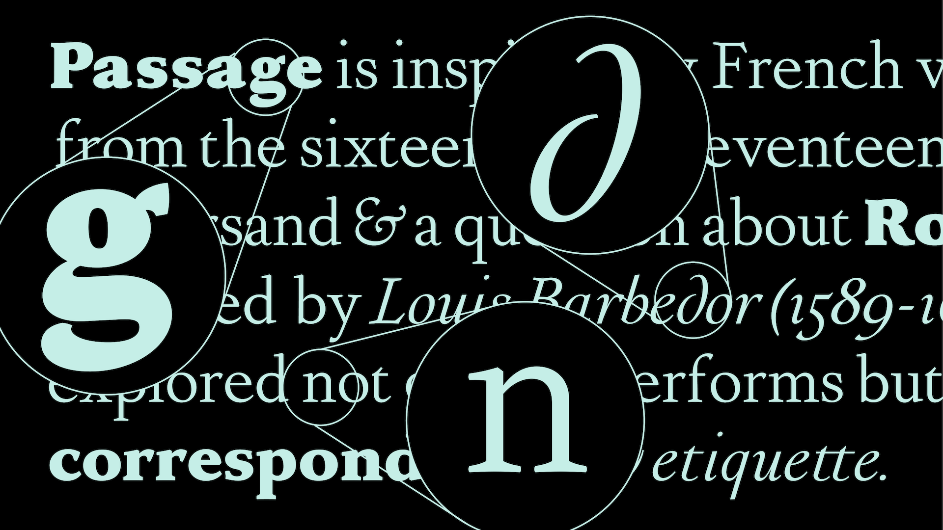
My project began with the ampersand.
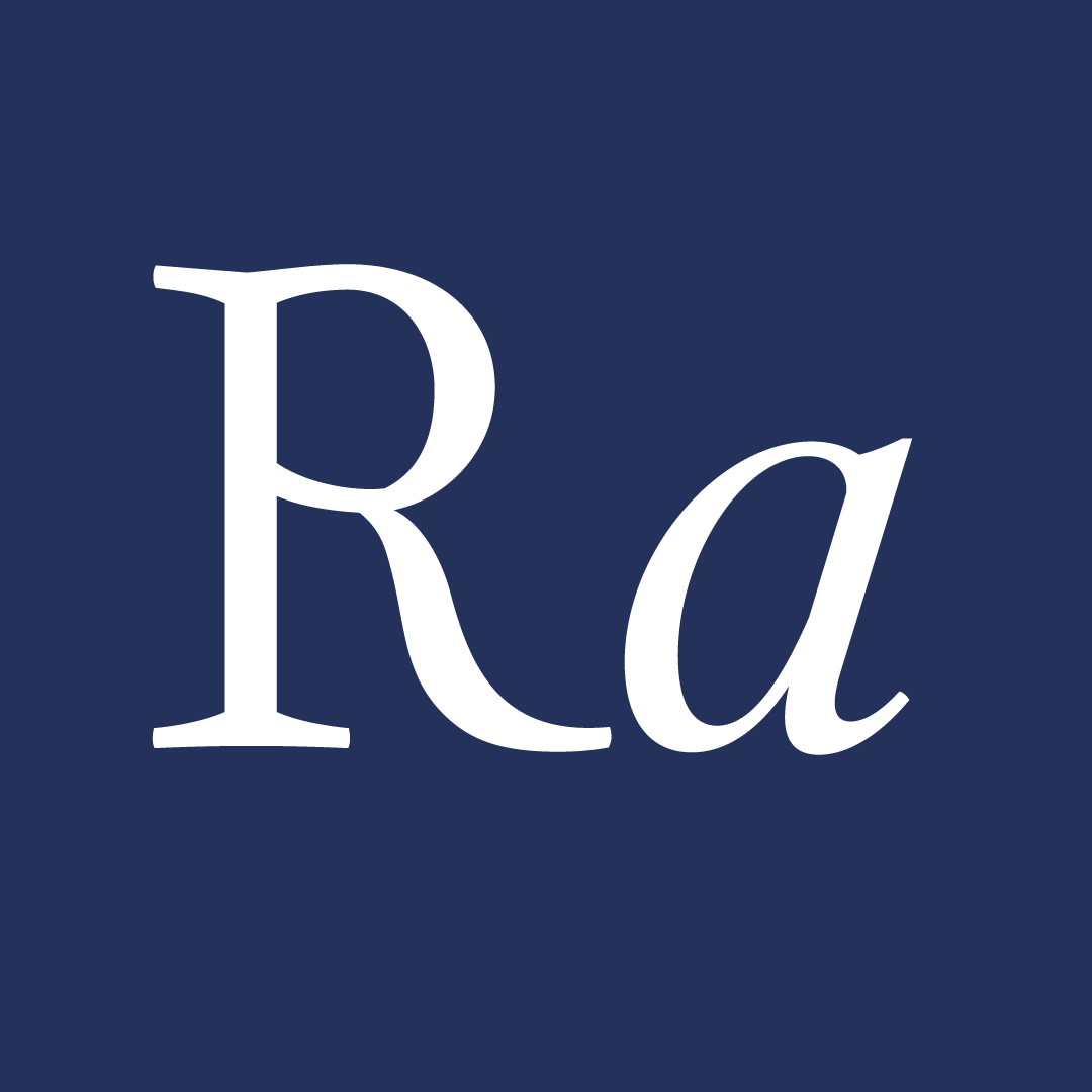
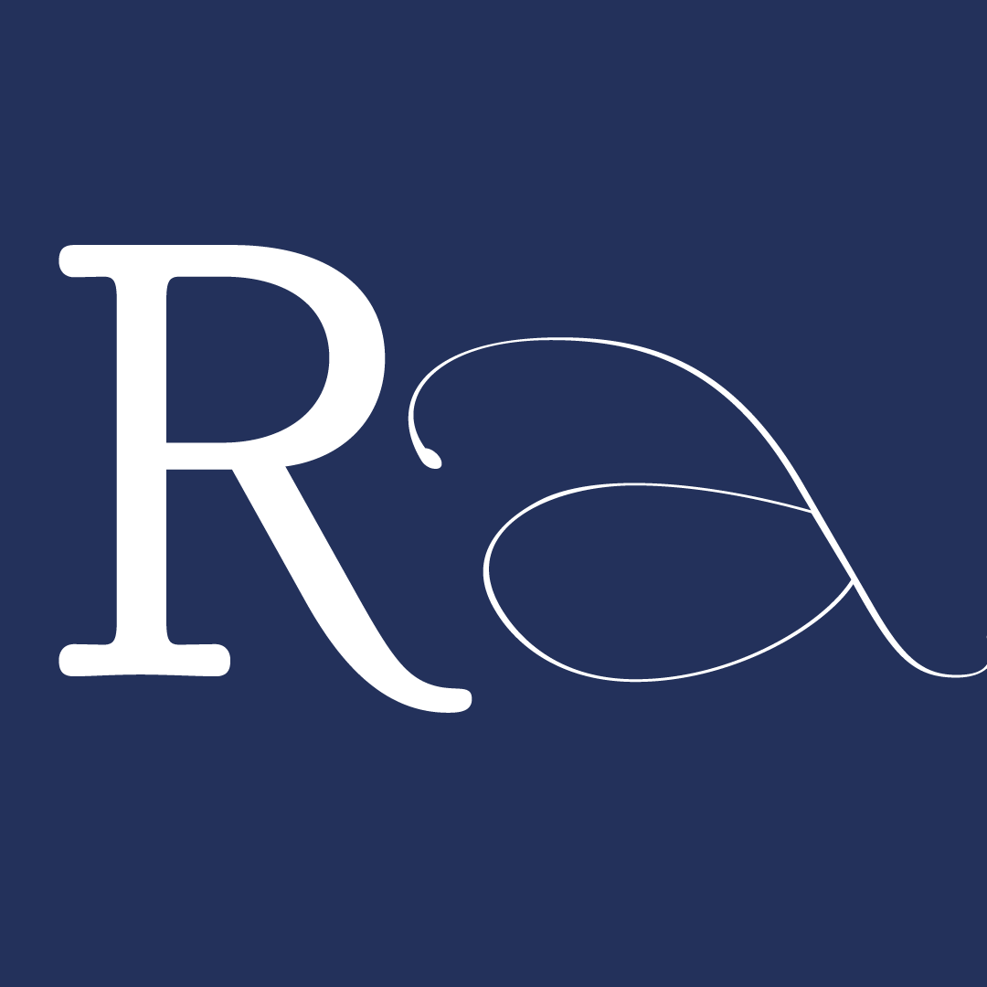
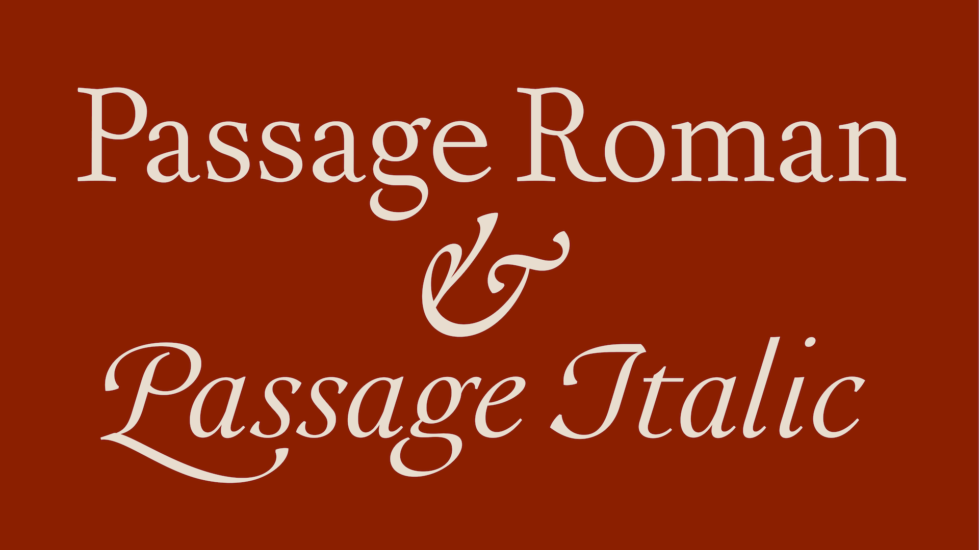
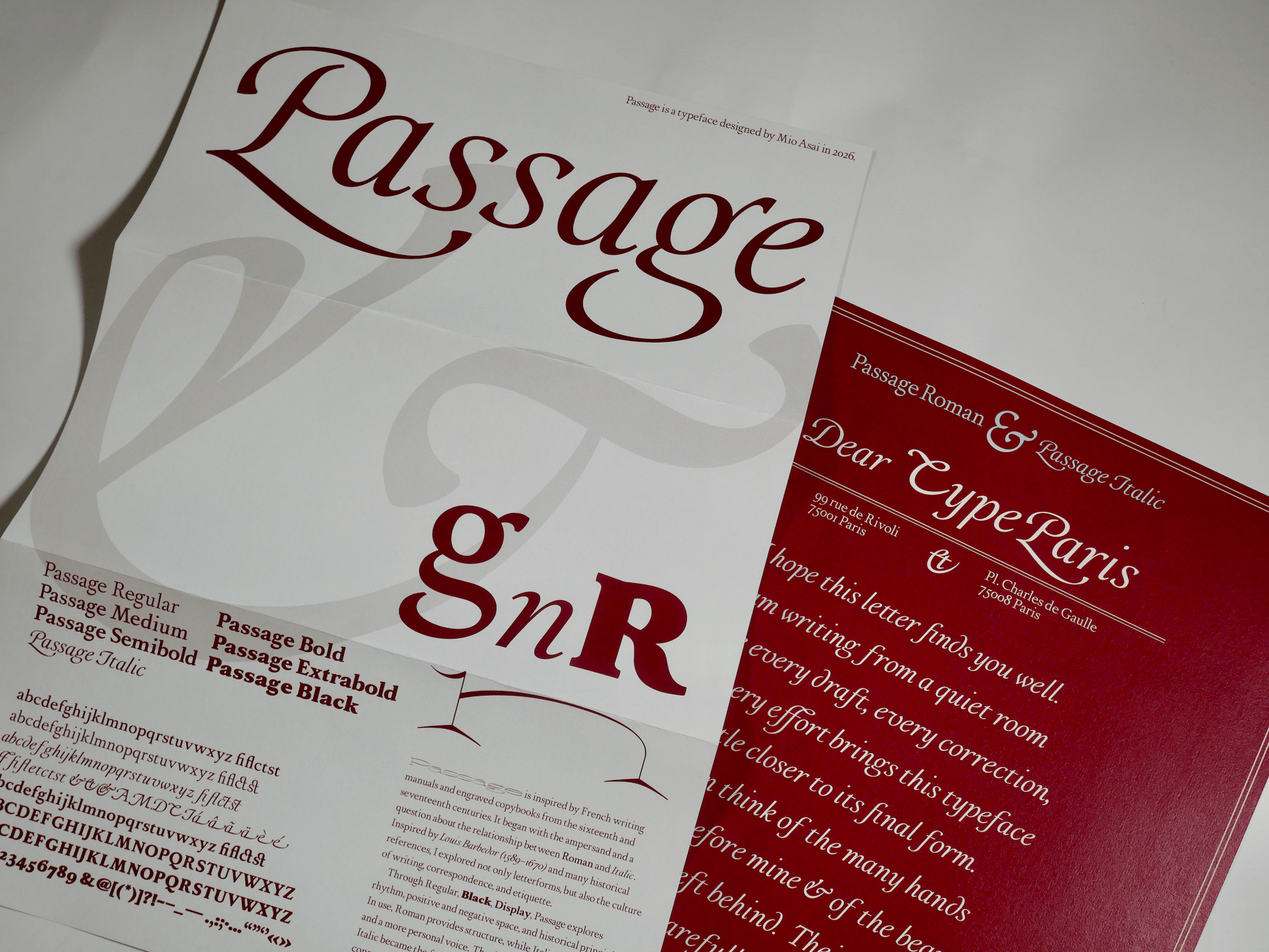
I became interested in it because there is no equivalent symbol in Japanese. While researching its history and different forms, I became fascinated by the relationship between Roman and Italic. The ampersand often changes dramatically between the two, yet it still belongs to the same typeface family. This made me wonder how such different forms can still feel connected.
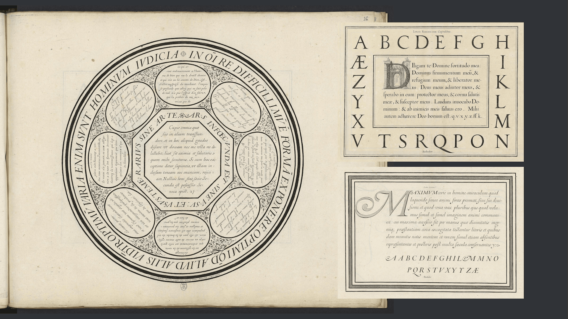
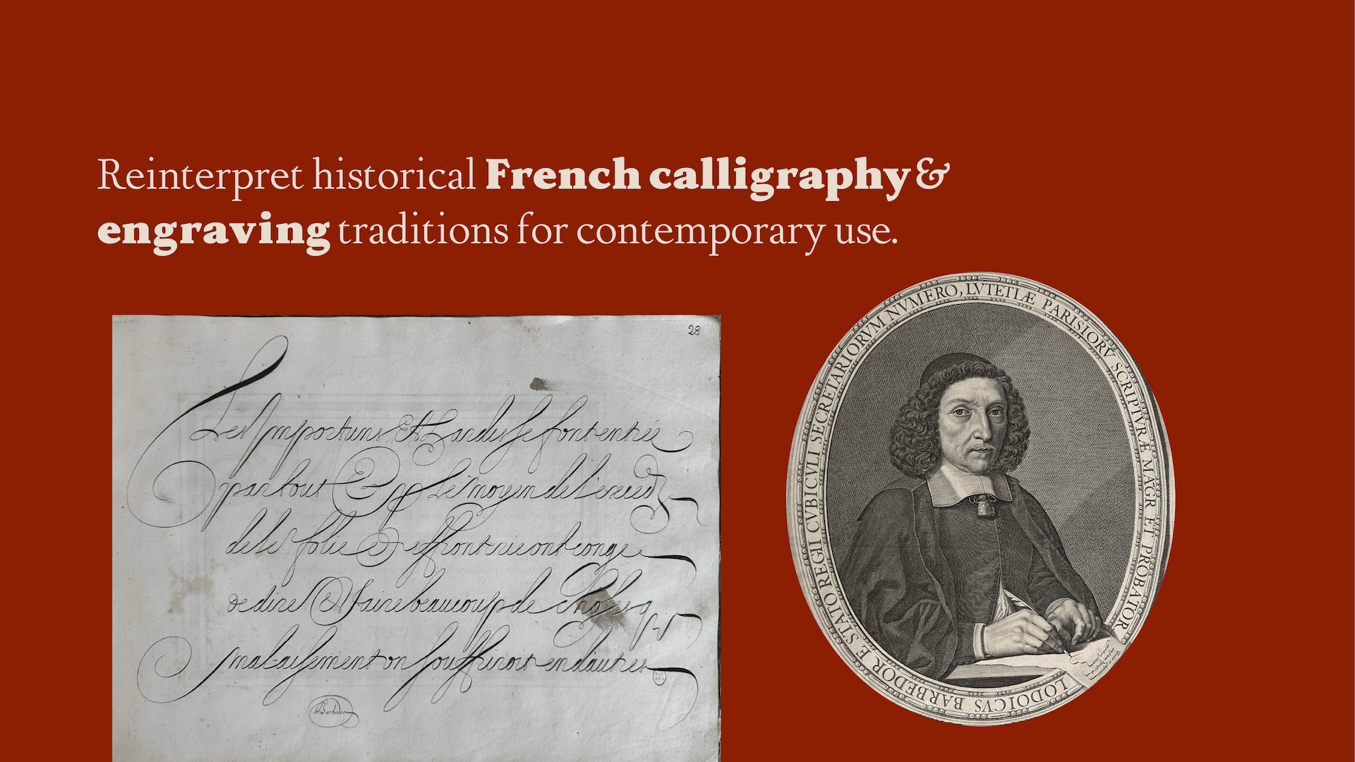
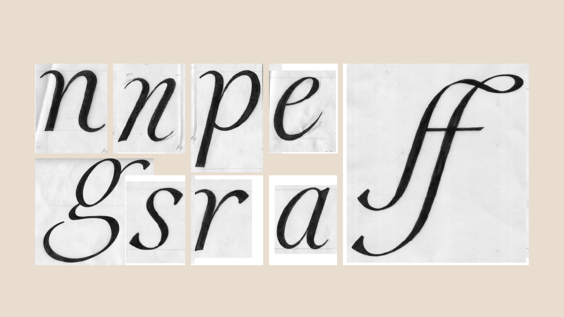
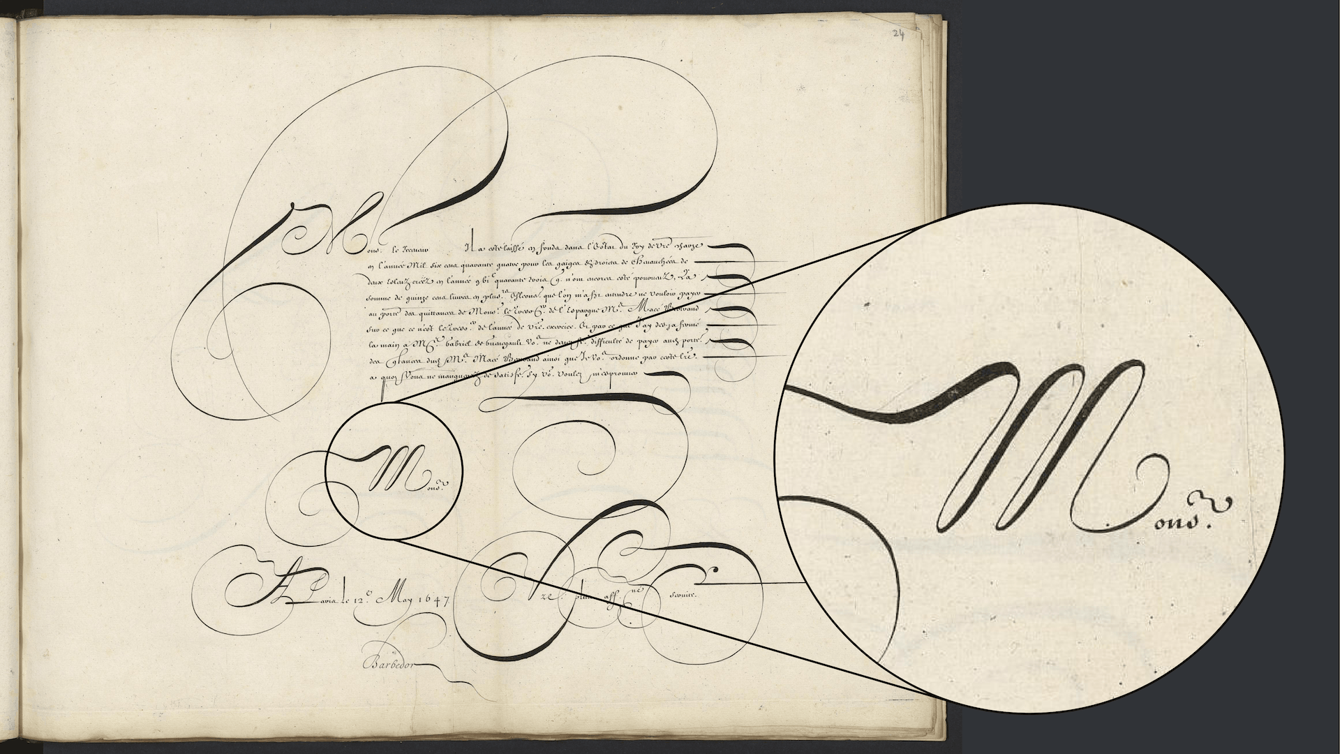
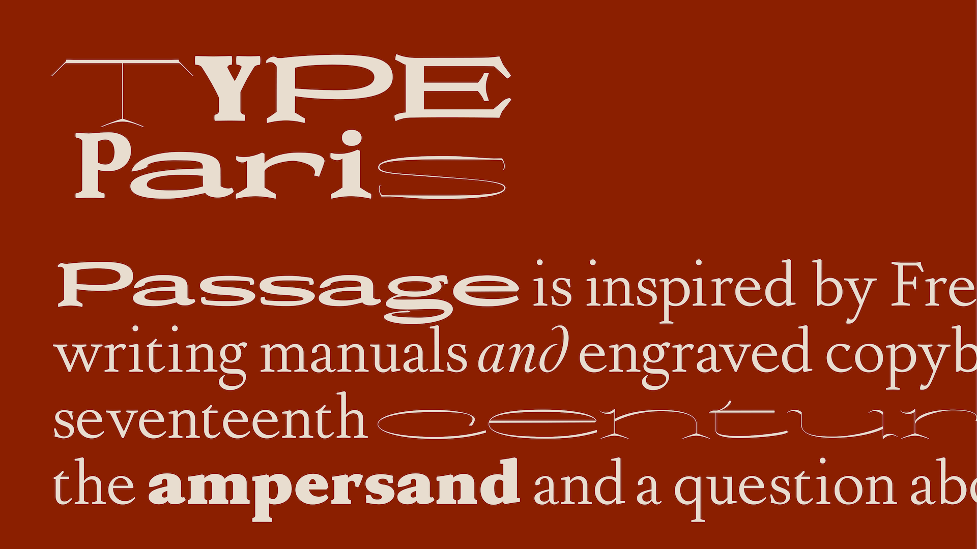
To explore this question, I studied French writing manuals and engraved copybooks from the sixteenth and seventeenth centuries. At first, I focused on the letterforms themselves. However, the elegance of the writing and the careful composition of the pages gradually drew my attention to writing itself and the culture behind it. One of the first references that inspired me was the work of Louis Barbedor, but as the project developed I expanded my research to many historical references, exploring how Roman and Italic developed from writing rather than from printed type.
As my research continued, I became interested not only in the letterforms, but also in the culture of correspondence. These manuals were not only about beautiful letters. They reflected etiquette, education, and the values of writing as a form of communication. I became increasingly interested in how the warmth of the human hand could be carried into a contemporary typeface.
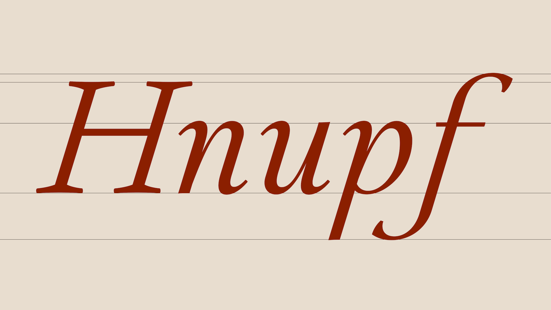
What fascinated me most was the harmony between discipline and humanity. Roman conveys structure, clarity, and stability, while Italic expresses movement, rhythm, and humanistic warmth. The coexistence of these two qualities became one of the main ideas of the project.
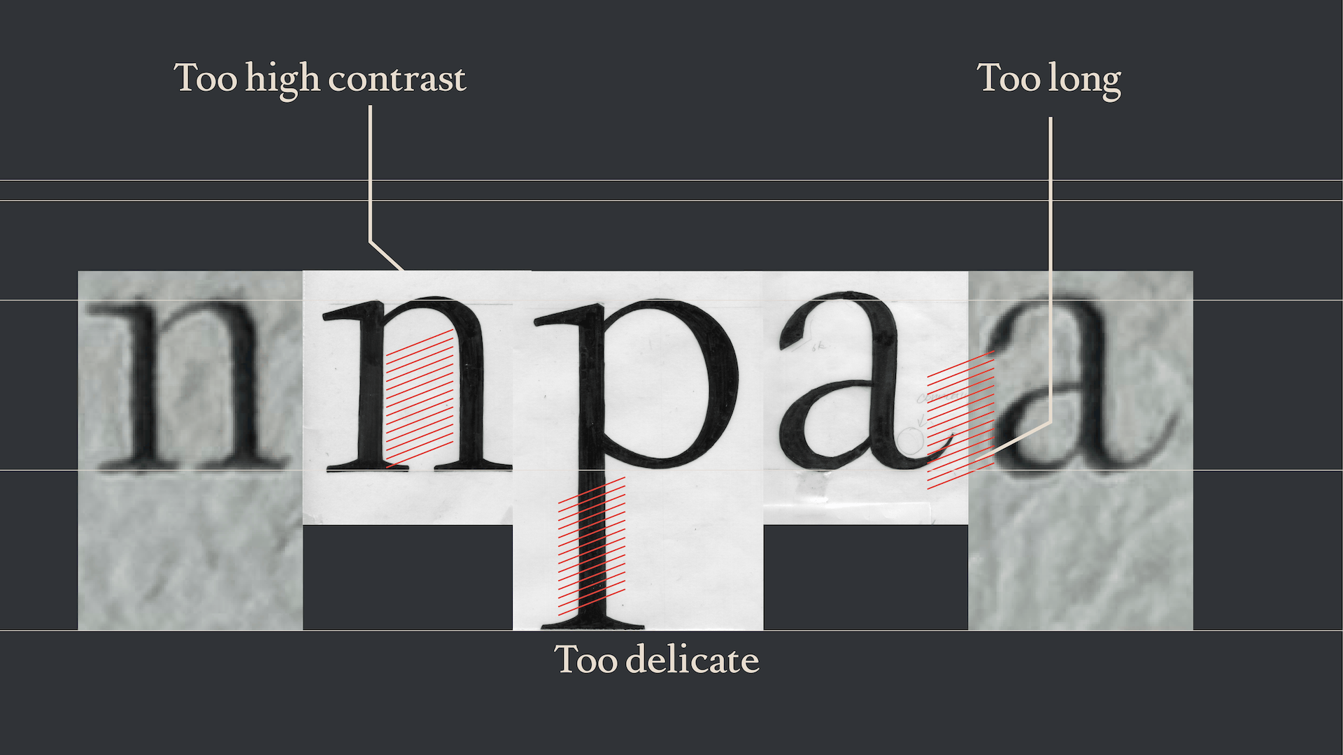
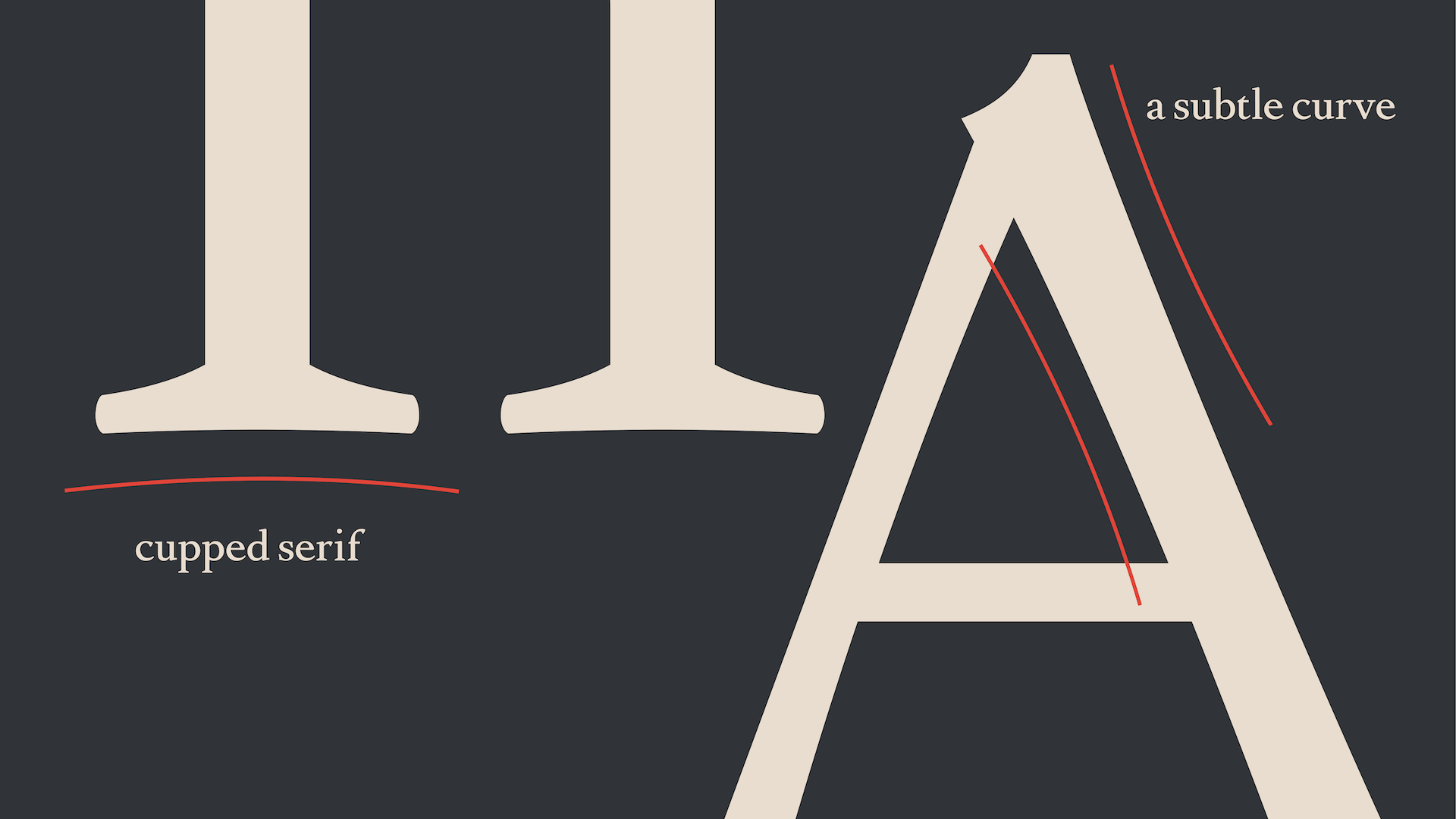
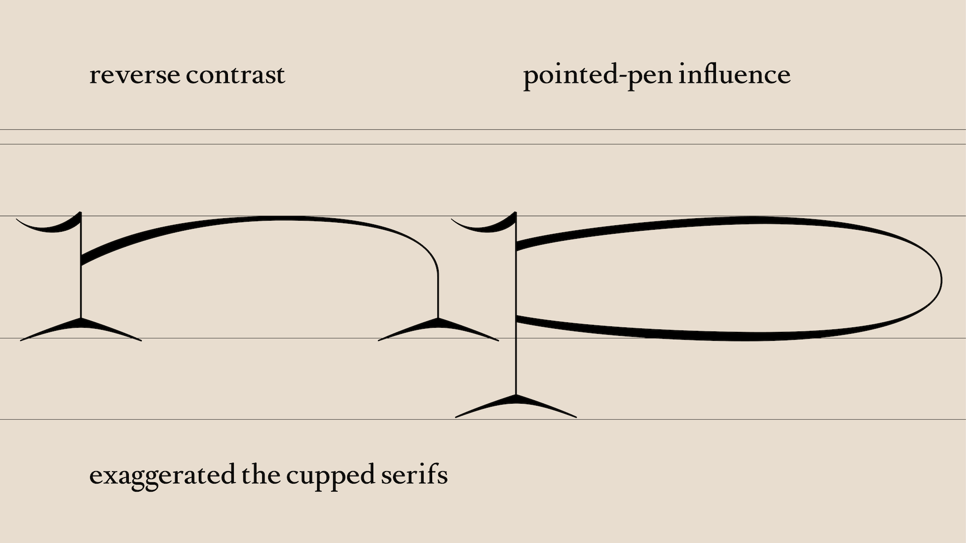
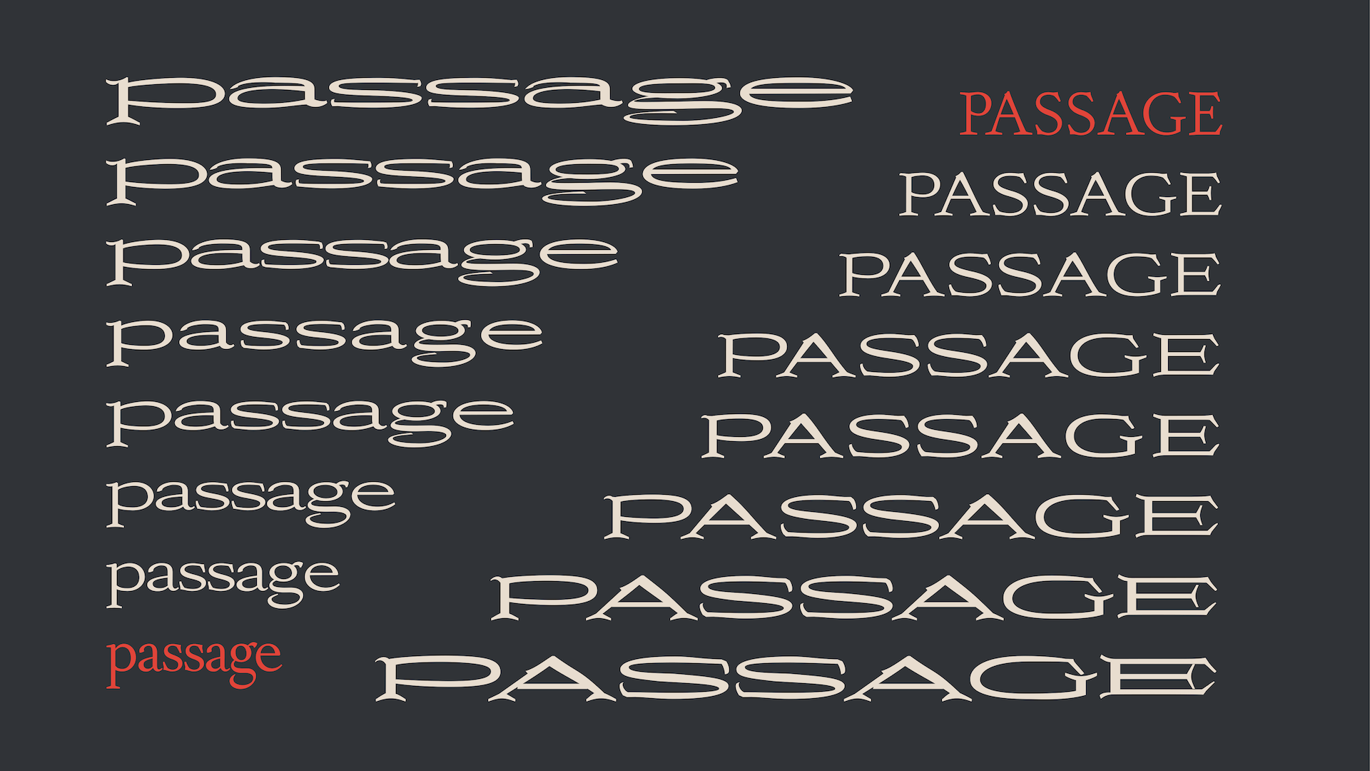
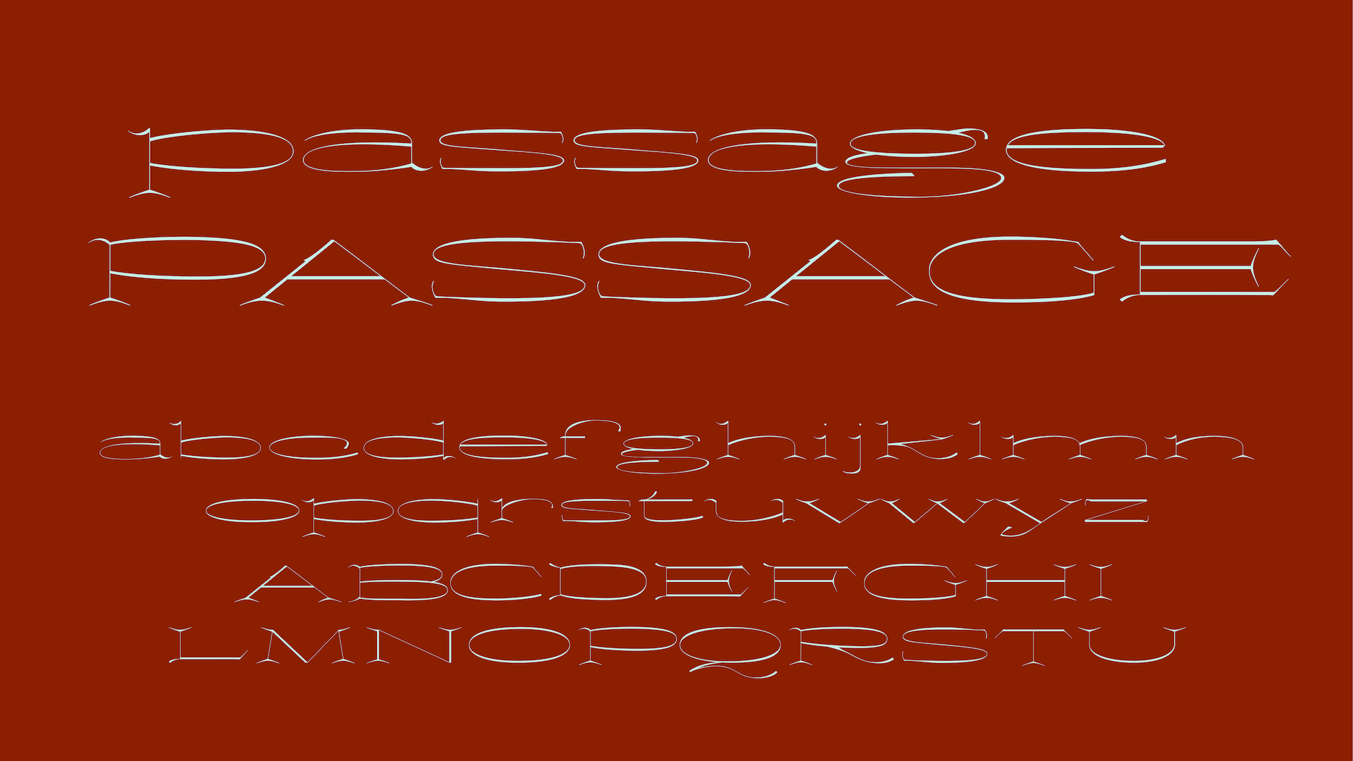
As the project progressed, I also explored the typeface beyond the Regular style in two directions: developing display styles and expanding the weight range from a Black Master. To explore its potential as a display typeface, I designed a wide Creative Master with exaggerated cupped serifs and reverse contrast. At the same time, I developed a Black Master as the starting point for expanding the family across different weights. These studies showed me how important the relationship between black and white space is to the rhythm and consistency of the typeface. Comparing different masters also gave me new ways to evaluate the historical structures I was trying to reinterpret. Interpolation between masters revealed inconsistencies that were difficult to notice in the Regular style, helping me refine the design.
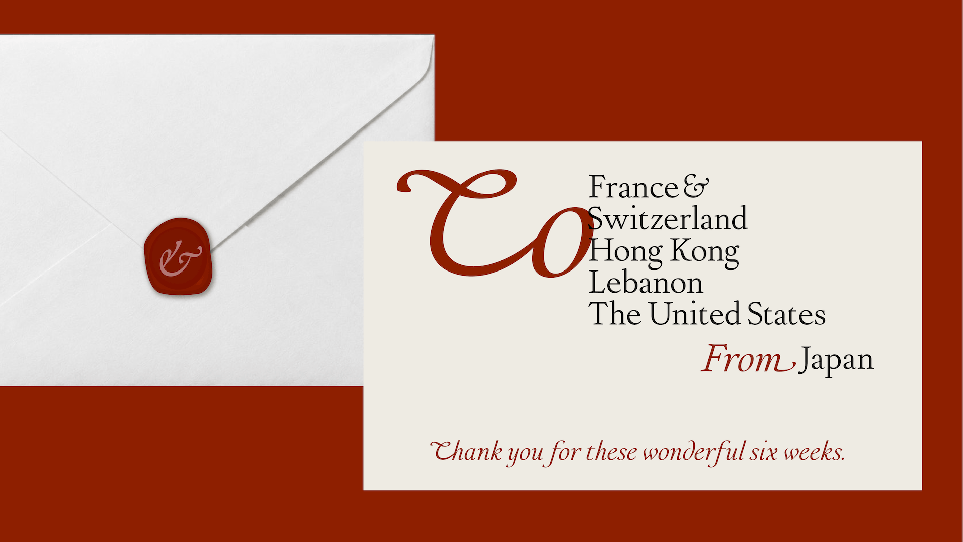
To explore these ideas in practice, I created a series of stationery applications, including letterheads, envelopes, business cards, and letters. Roman may help organise information such as names and addresses, while Italic may bring a greater sense of humanistic warmth. These mockups helped me explore how the two styles might work together in everyday communication.
Through this project, I hope to better understand the relationship between Roman and Italic and how historical writing traditions can continue to inspire contemporary type design.
The typeface is still a work in progress, and there is much I would like to refine. I hope to continue developing it while deepening my understanding through drawing.
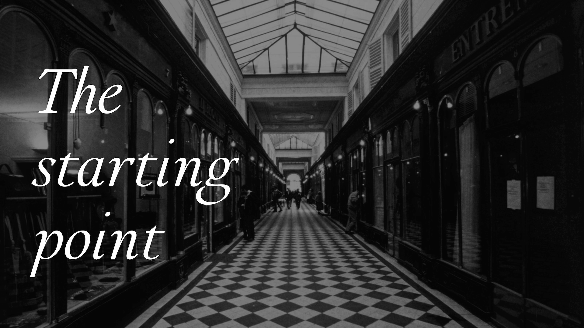
I named this typeface Passage because the word suggests a connection between different places. It also reminds me of the covered passages of Paris, which connect streets while creating spaces for encounters and discovery. For me, this project is about many kinds of passages: between Roman and Italic, writing and type, history and contemporary design, and even between different cultures.
Throughout the project, I found myself constantly moving back and forth between historical references and my own drawings. This process taught me the importance of approaching both historical letterforms and the culture behind them with humility and respect. The name Passage represents not only the typeface itself, but also the journey of learning, observing, drawing, and moving continually between the past and the present.
I am deeply grateful to everyone at TypeParis for making this journey possible.

Apply before 14 January for the three-week type design course starting 5 April and ending 24 April 2027.

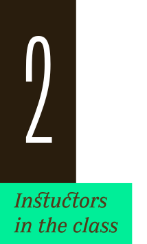
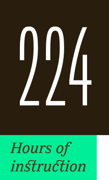
After 10 years in Paris, we reinvent our type design programme. We go from 6 weeks to 3 weeks, while maintaining the fundamentals that make TypeParis’ reputation.
The course will take place in Menorca, Spain for the first time. In 2027, we offer two levels, Foundation and Expert, which allows you to discover type design, or to gain expertise after an initial training.
➼ Subscribe to our mailing list to stay informed, until application period is launched.
Get ready & apply before 14 January 2027