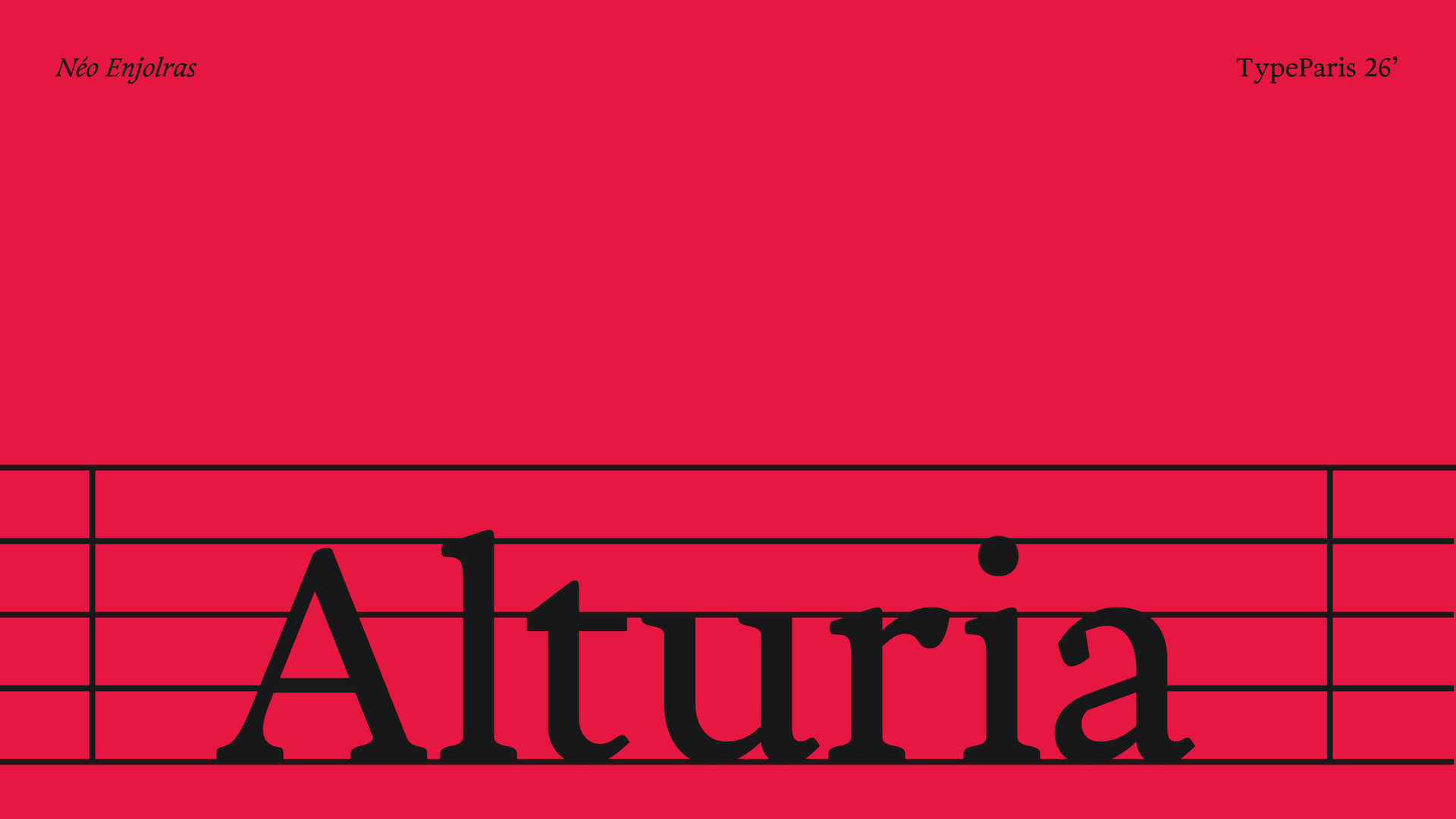
Alturia
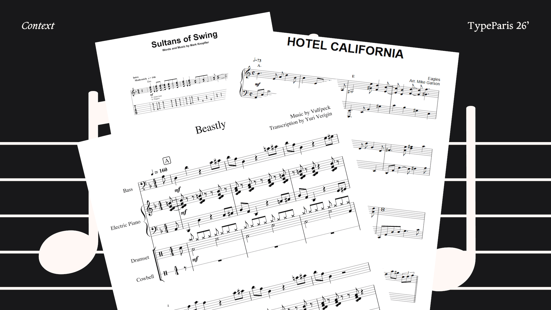
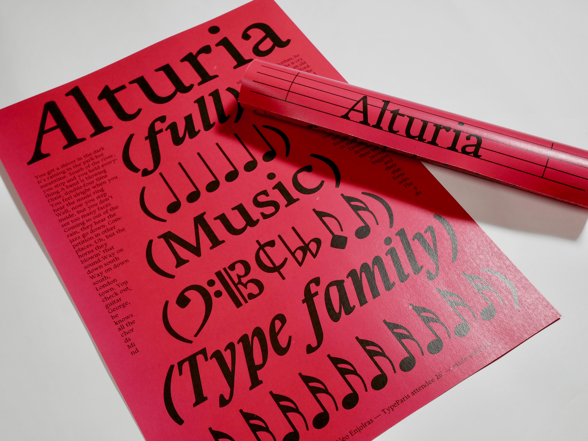
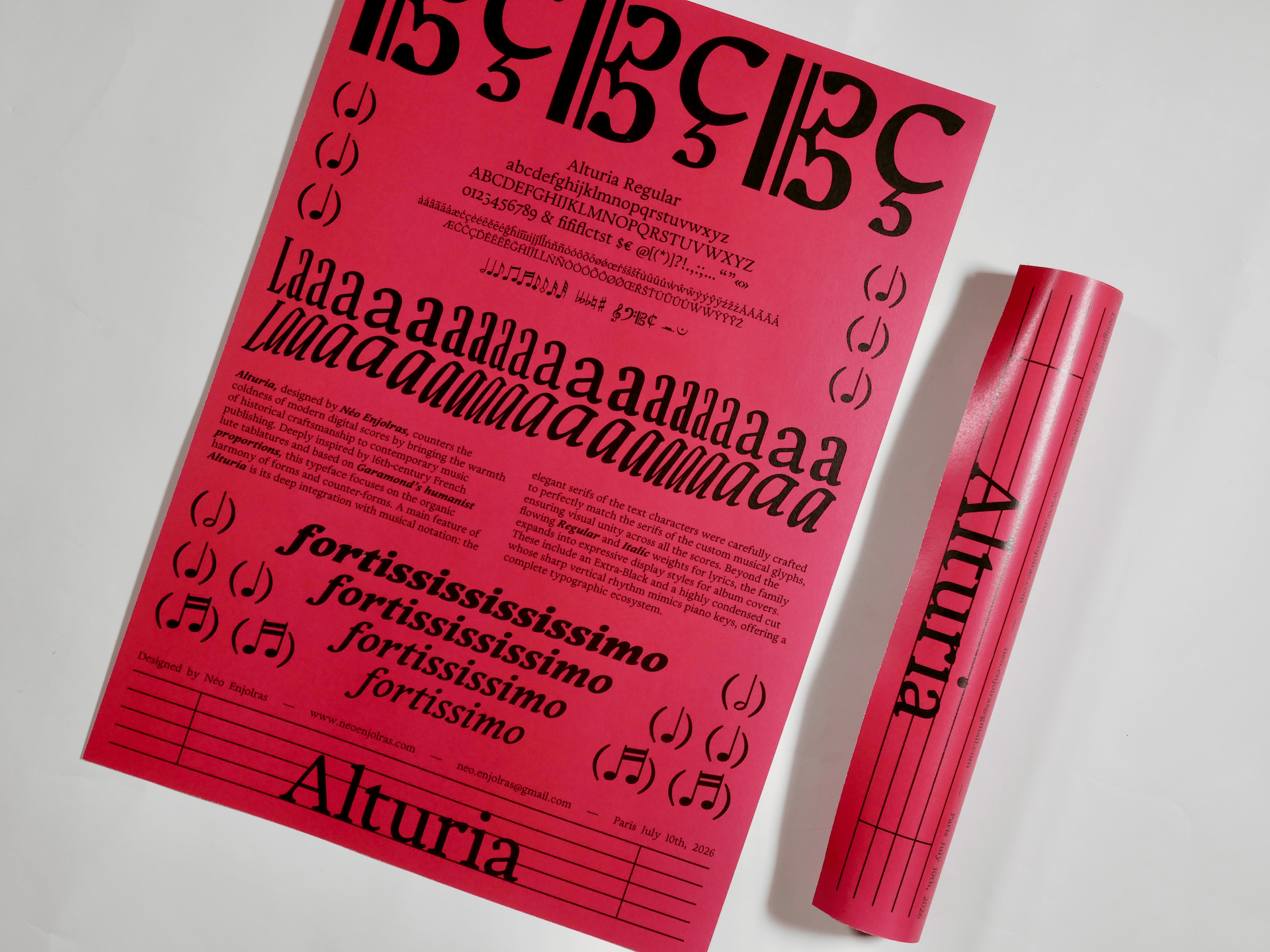
Music and typography share a deep connection through rhythm, spacing, and tension. As a multidisciplinary designer and an active musician—playing drums, bass, and guitar—I spend a lot of time reading modern digital scores. While today’s notation software is highly precise, the printed results often look cold. They lack the human personality that music itself holds. This contrast between the emotion of sound and the mechanical feel of modern scores inspired my new typeface, Alturia.
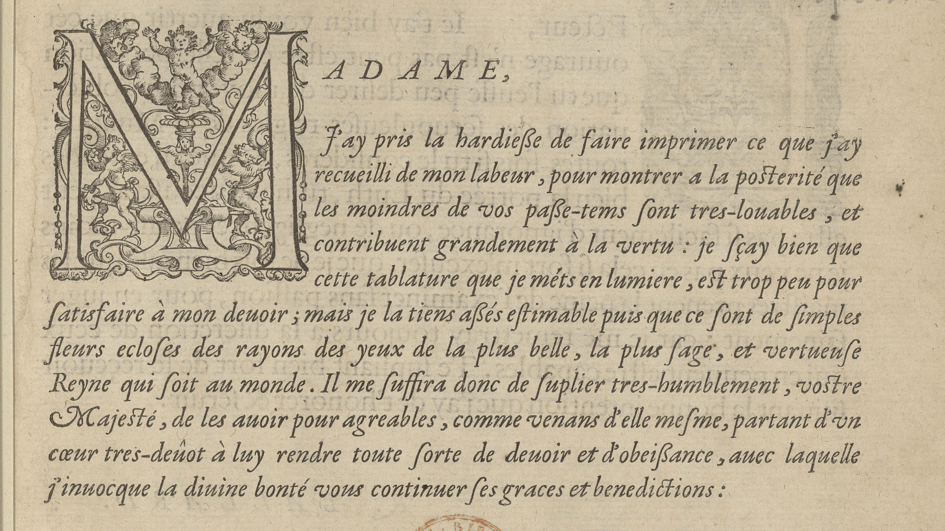
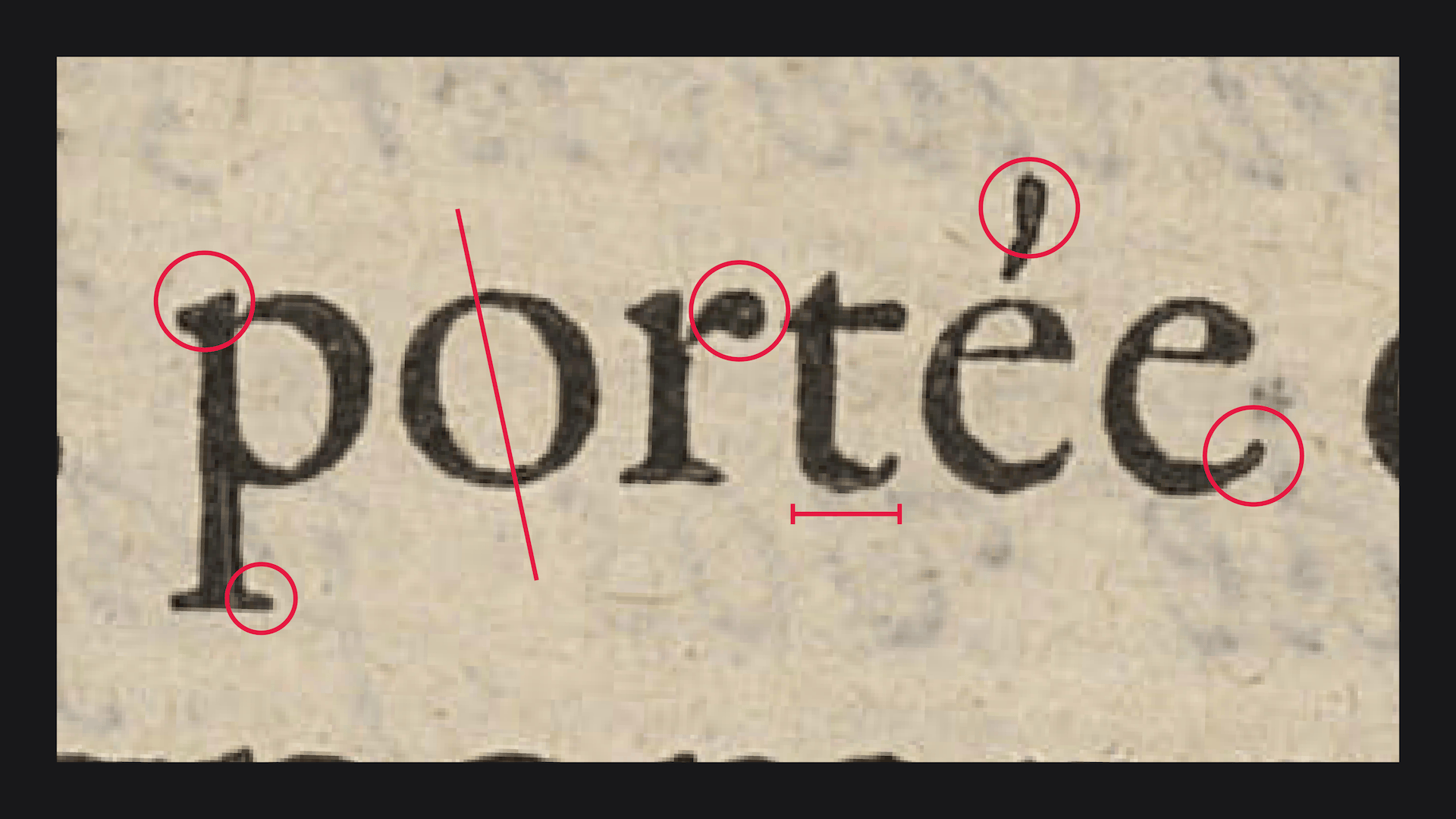
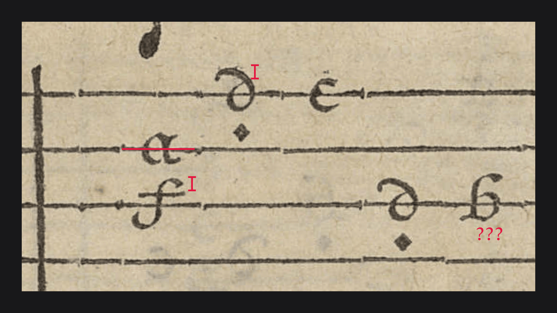
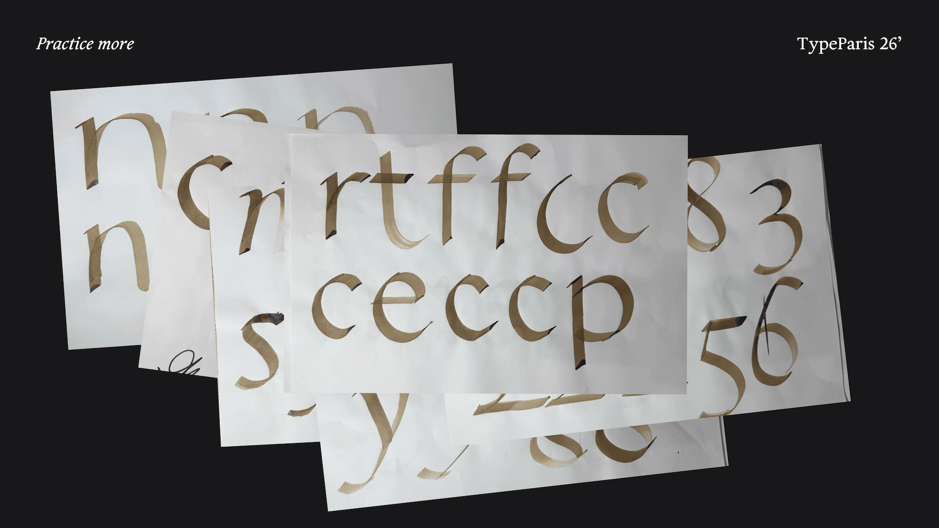
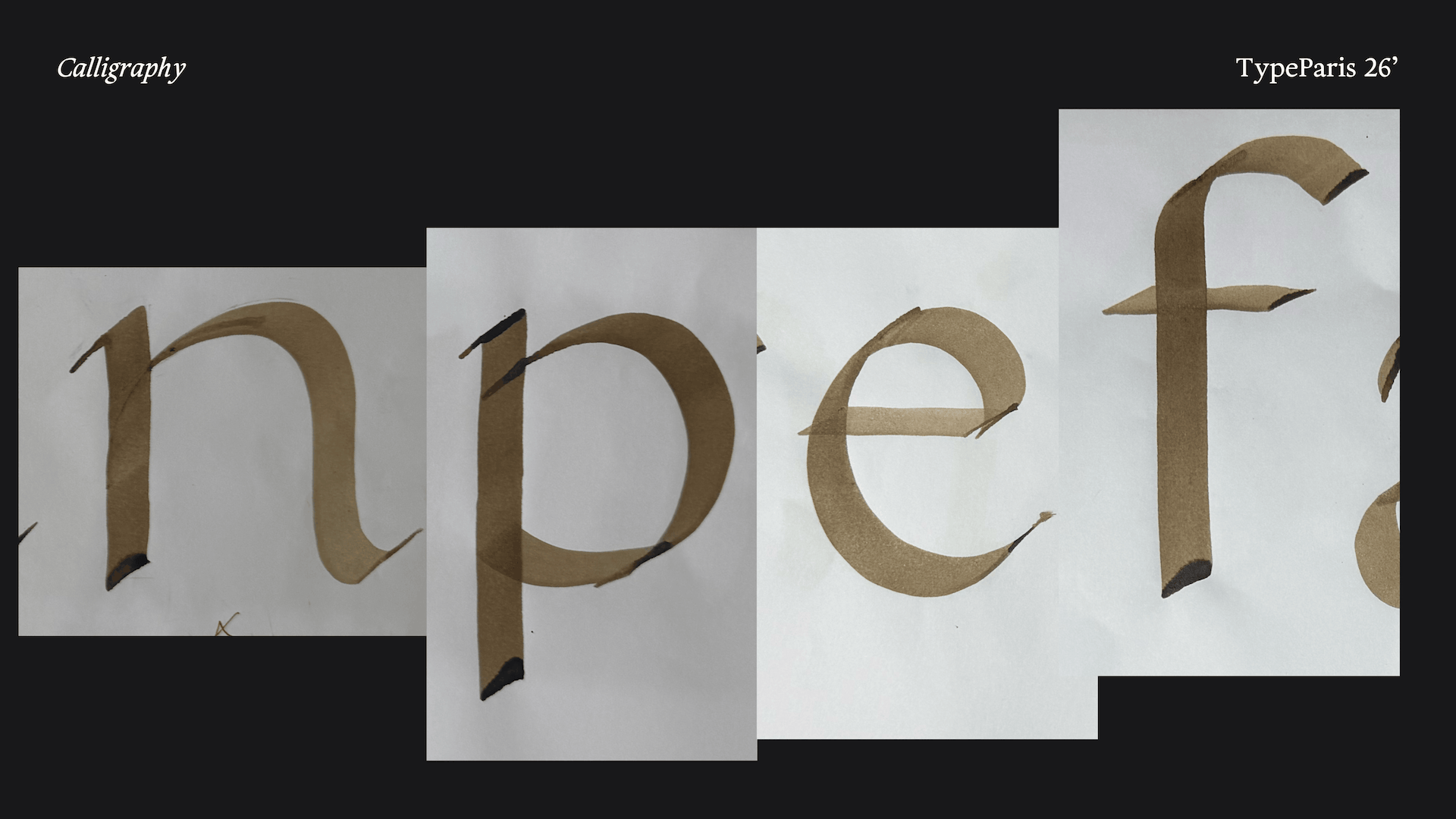
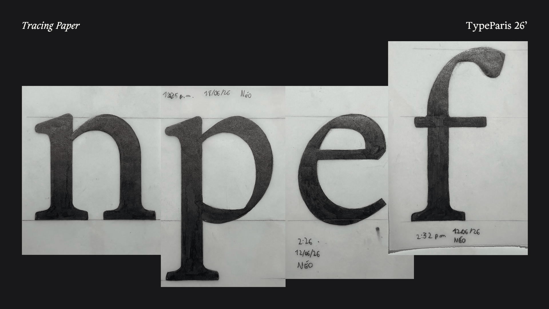
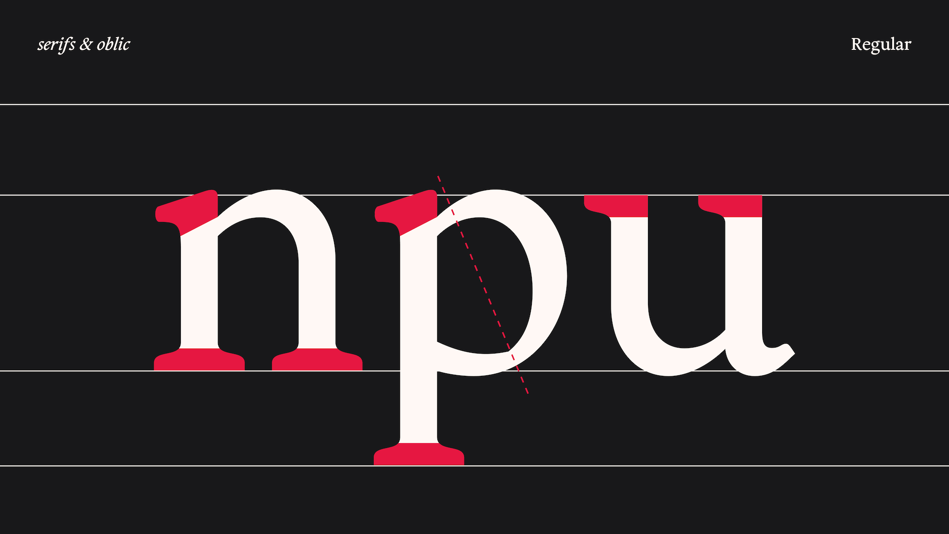
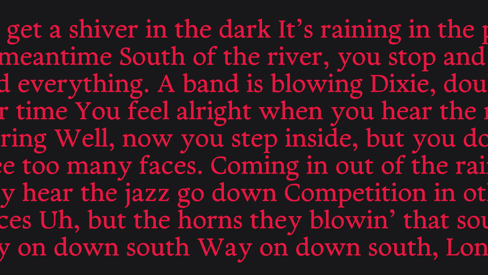
Searching for warmth, I looked at 16th-century French music printing, particularly old lute tablatures like those by Adrian Le Roy. I was amazed by the challenge early punchcutters faced: creating letters that remained easy to read even when crossed by horizontal staff lines, while also crafting highly expressive title pages. To translate this feeling into a modern design, I needed a strong architectural foundation. Following a key discussion with Jean-François, I decided to base the typeface’s proportions on the classic Garamond. This provided the perfect humanist structure to build upon—deeply rooted in traditional calligraphy, yet perfectly adaptable to modern editorial needs.
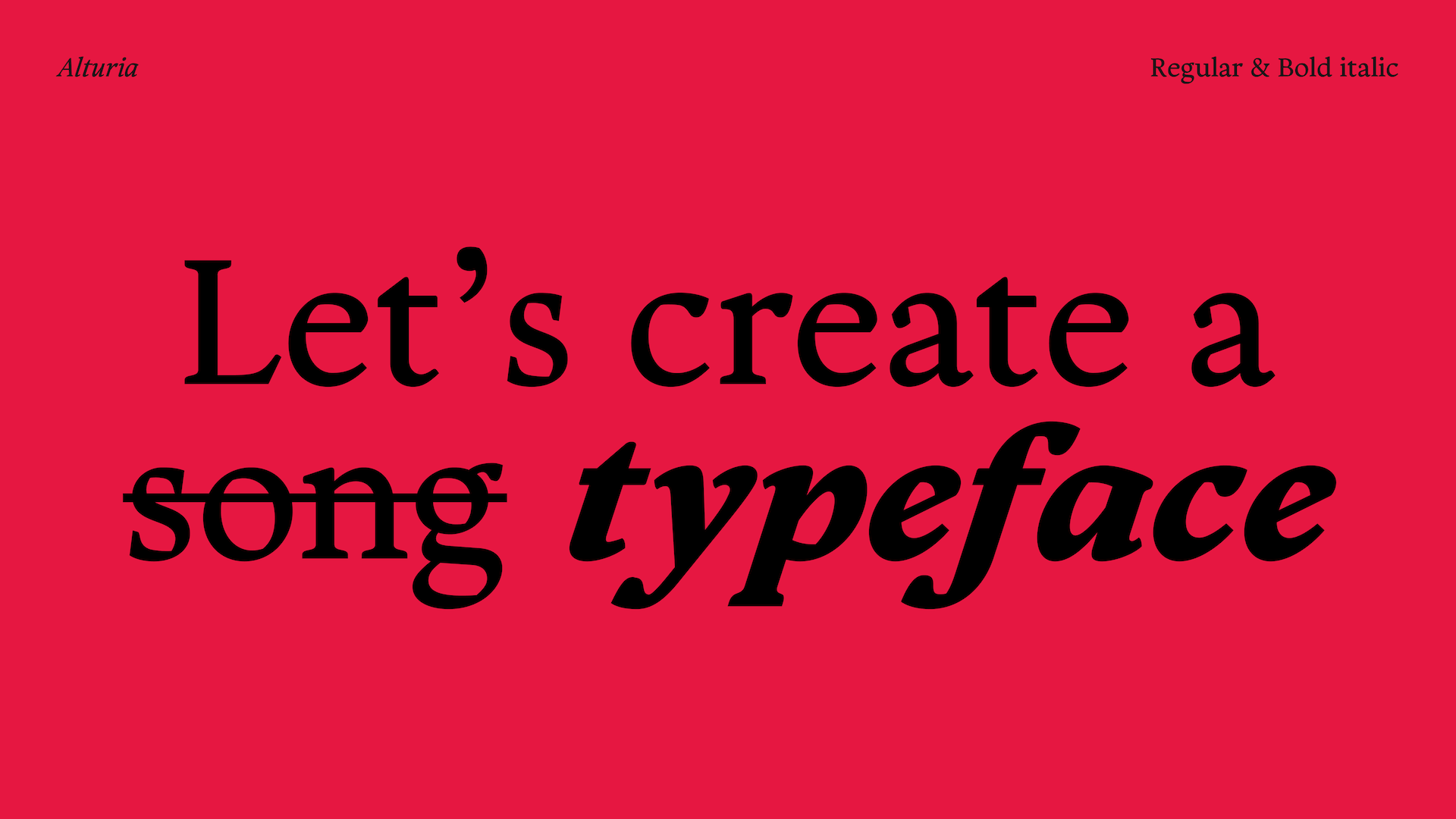
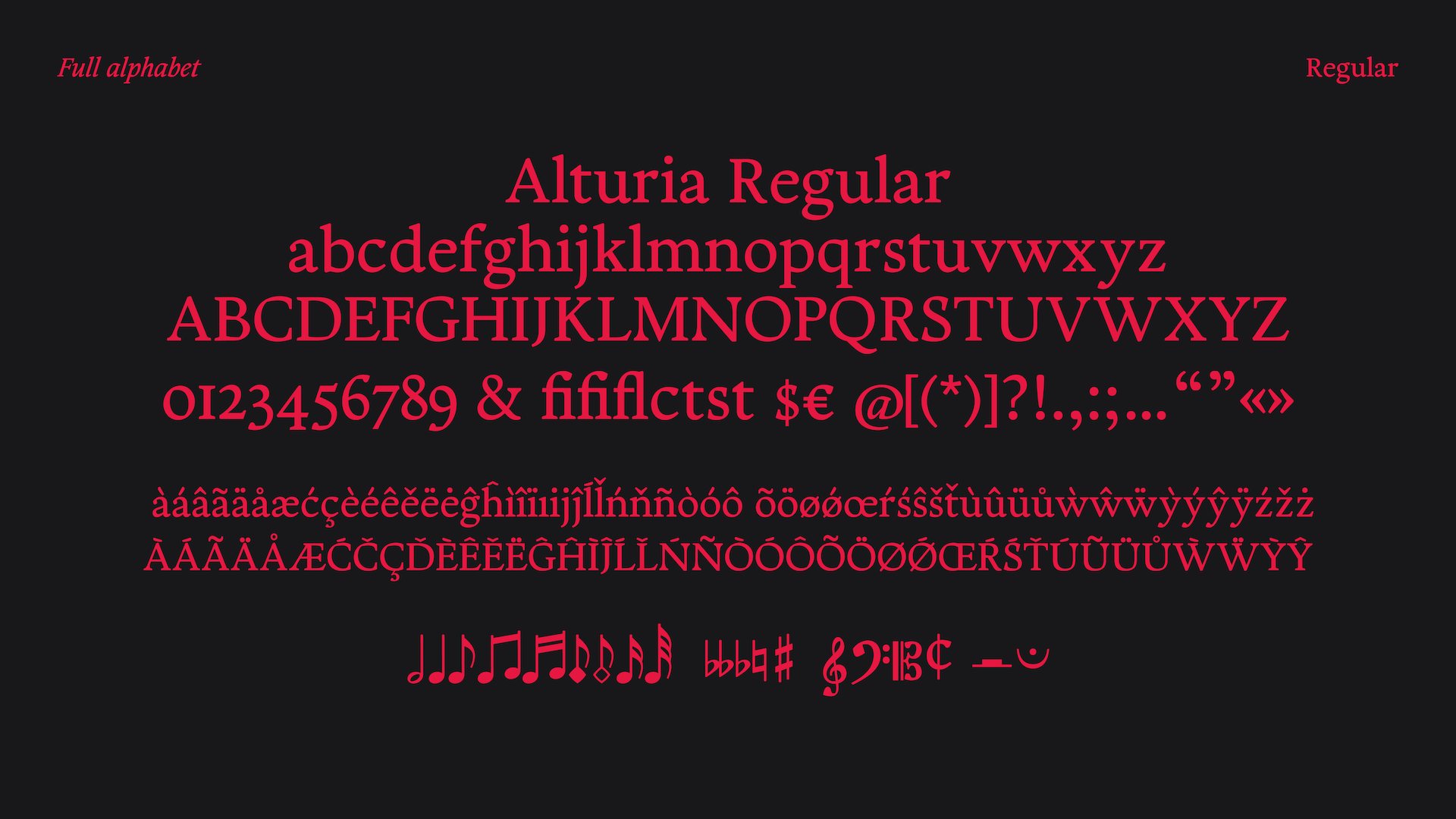
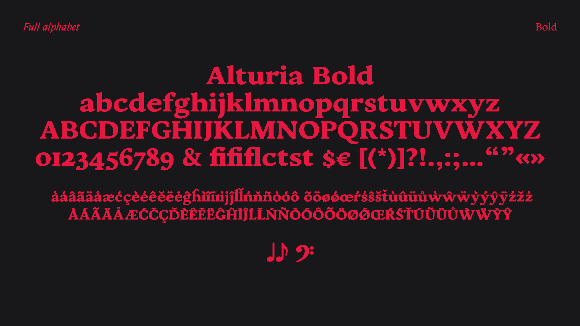
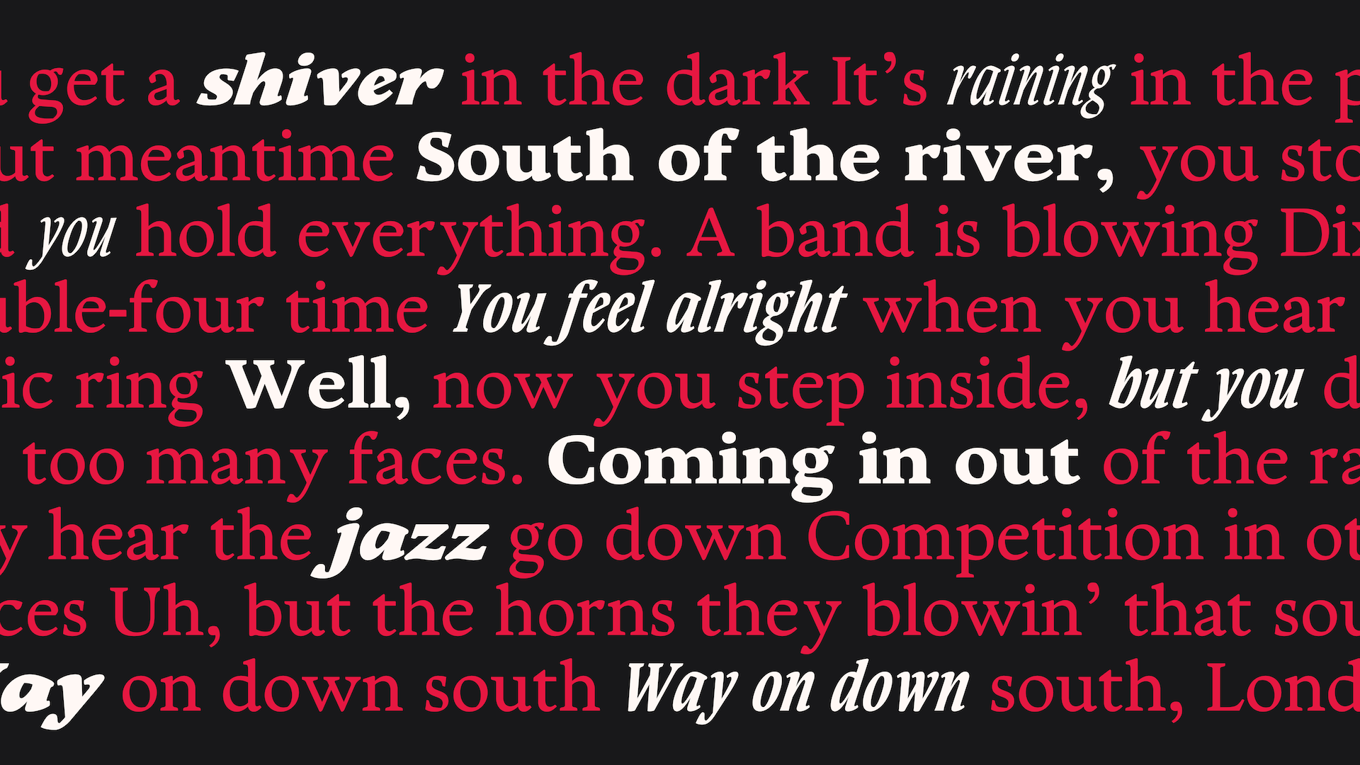
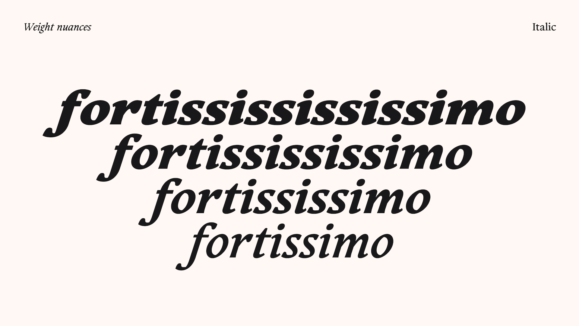
The name Alturia is a mix of Aria (a clear melody) and Altus (height and vocal range). My main goal was to bring historical warmth to the letters while keeping them strictly readable on a complex music grid. The Regular weight acts as the clear, reliable core. Next to it is a flowing Italic, which is absolutely essential for adding lyrical annotations, performance notes, or quoting composers.
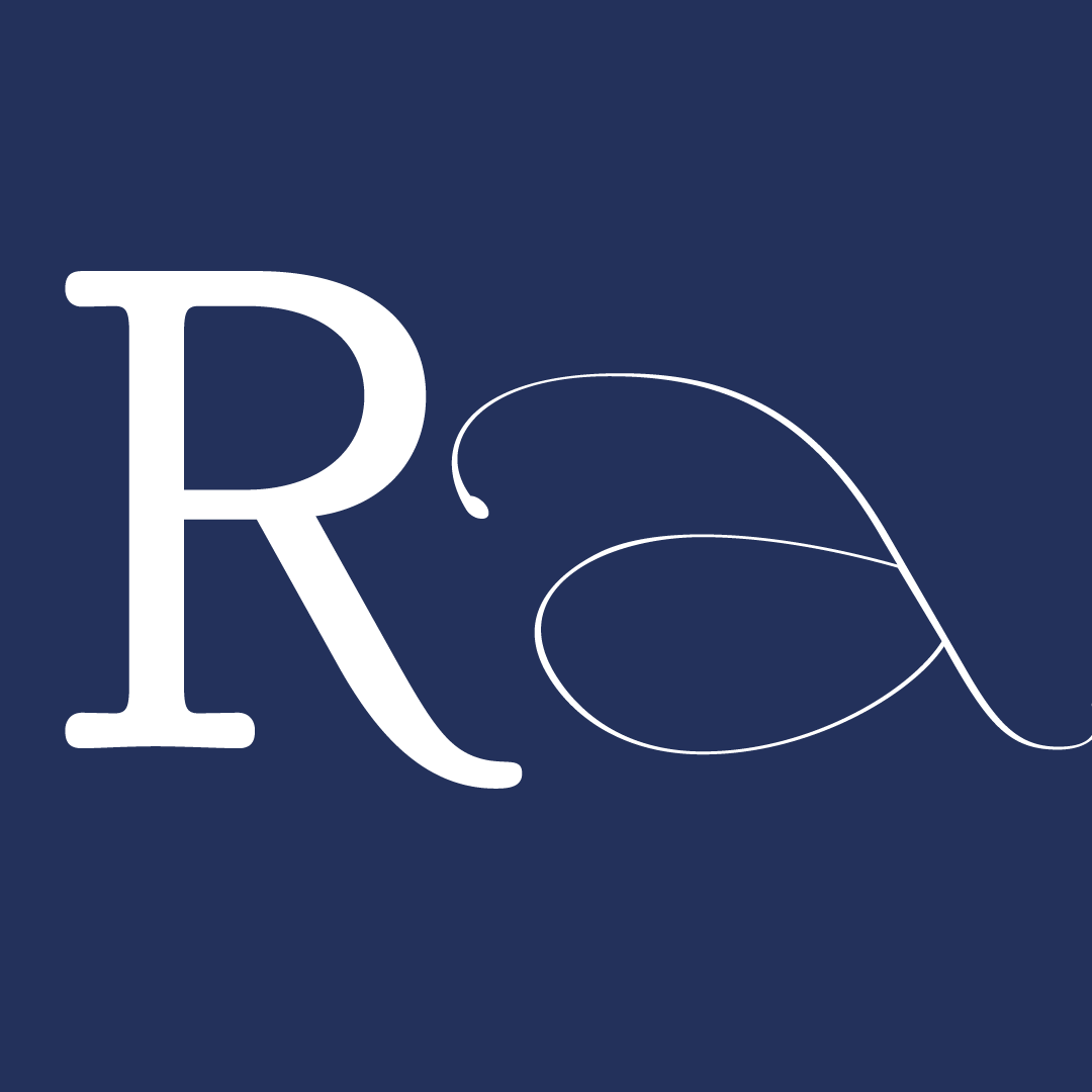
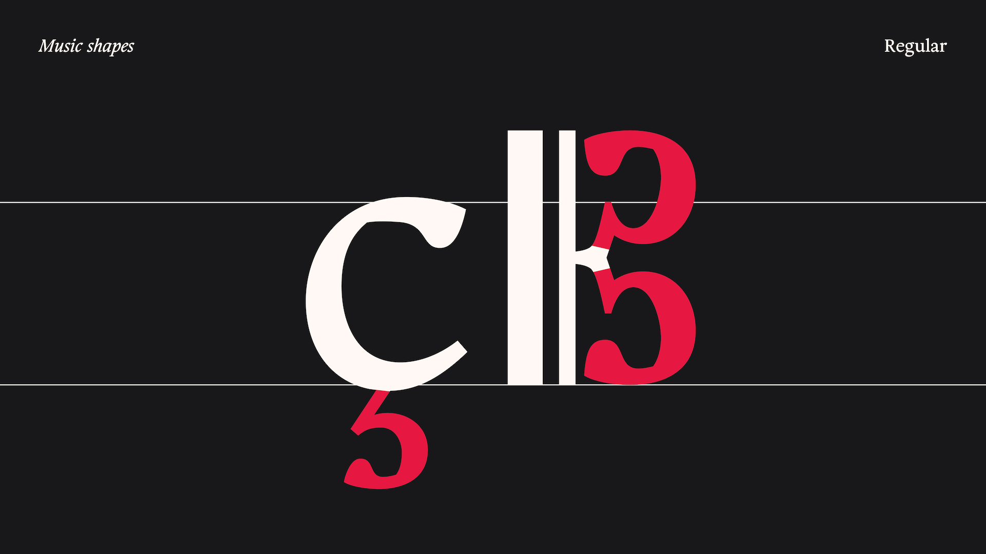
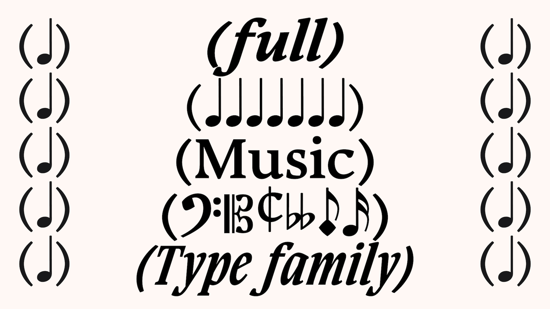
To fully serve the world of music publishing, I designed several specific features. First, I developed a special "Crossed" master. Reading letters with lines drawn through them is a classic tablature issue, so this master adapts its counter-forms perfectly to a horizontal bar. To capture the more organic and fun vibe of those old prints, I also added a set of playful alternate characters. For large headings and score titles, I created custom ligatures to allow for creative typographic play. Finally, to make the typeface a truly complete tool, I designed a set of basic musical notes and clefs. Even though these musical symbols must follow very strict, standardised rules, I drew them to naturally blend with Alturia’s humanist warmth.
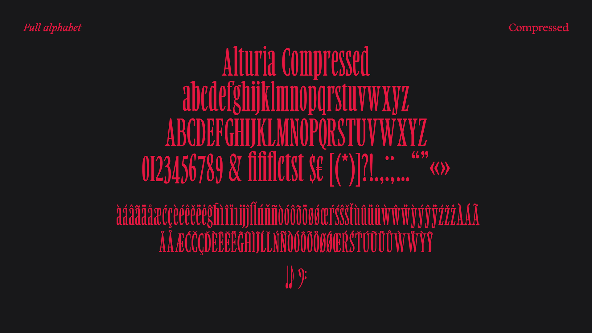
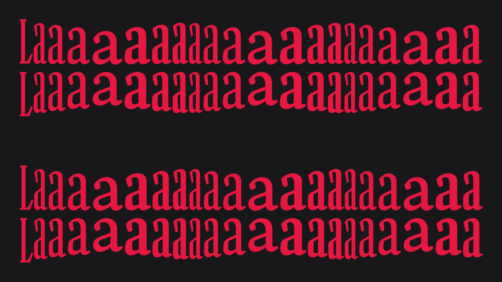
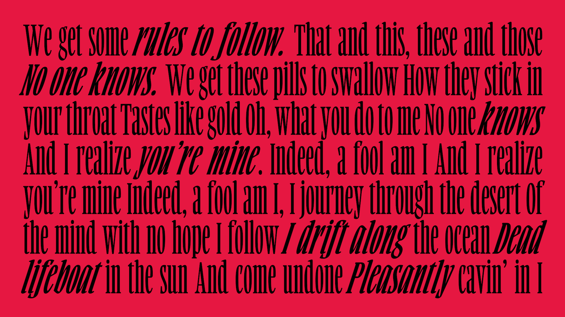
Beyond the text weights, Alturia expands into expressive display styles for album covers and big headers. The Extra Black version steps away from the classic Garamond proportions—it is wide, round, and very heavy, bringing a bold, modern contrast to the family. Finally, I created a very stiff, highly condensed Creative Master. Designing this involved strict spacing constraints, turning the typography into a visual beat. Its sharp vertical rhythm is meant to look like the keys of a piano or the parallel strings of a guitar.
Alturia bridges the gap between historical craftsmanship and modern digital publishing, offering a complete and expressive typographic system specifically designed for the world of music.

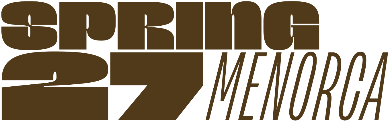
Apply before 14 January for the three-week type design course starting 5 April and ending 24 April 2027.
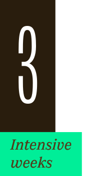
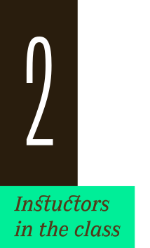
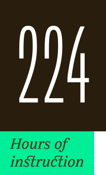
After 10 years in Paris, we reinvent our type design programme. We go from 6 weeks to 3 weeks, while maintaining the fundamentals that make TypeParis’ reputation.
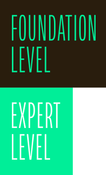
The course will take place in Menorca, Spain for the first time. In 2027, we offer two levels, Foundation and Expert, which allows you to discover type design, or to gain expertise after an initial training.
➼ Subscribe to our mailing list to stay informed, until application period is launched.
Get ready & apply before 14 January 2027