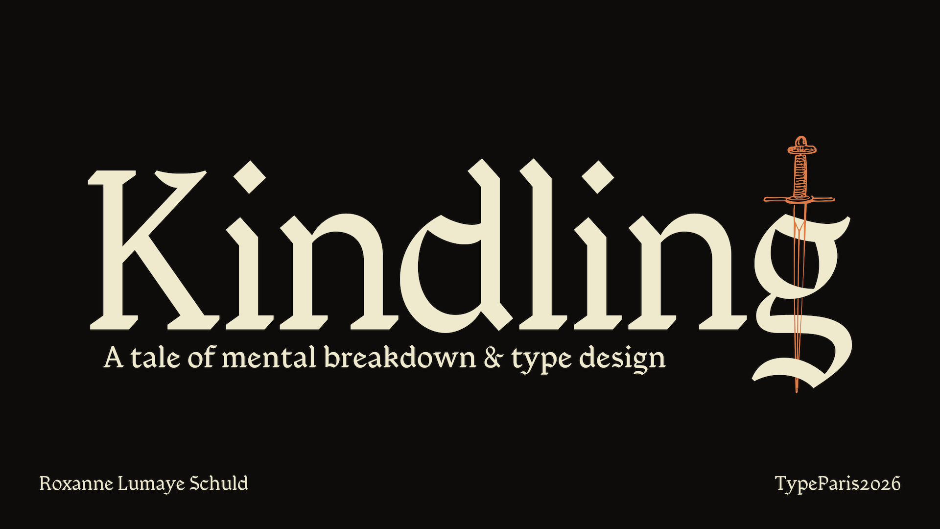
Kindling
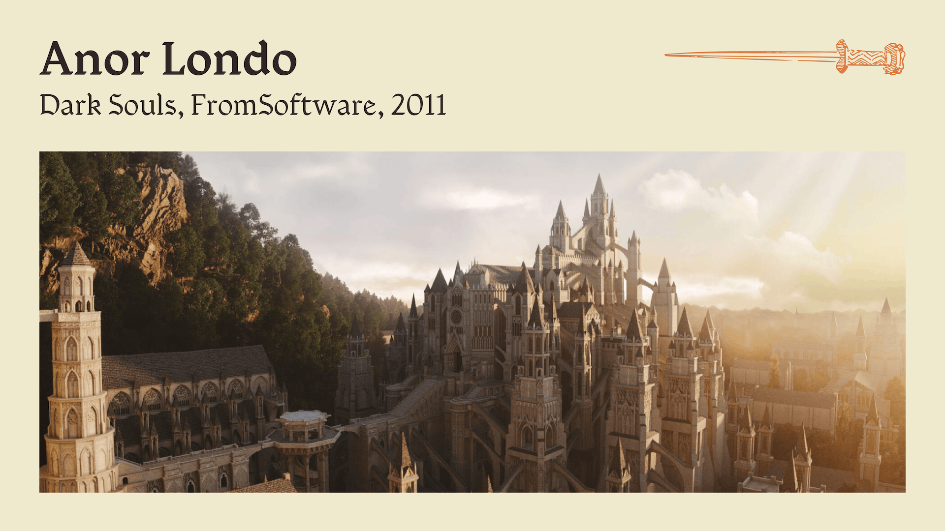
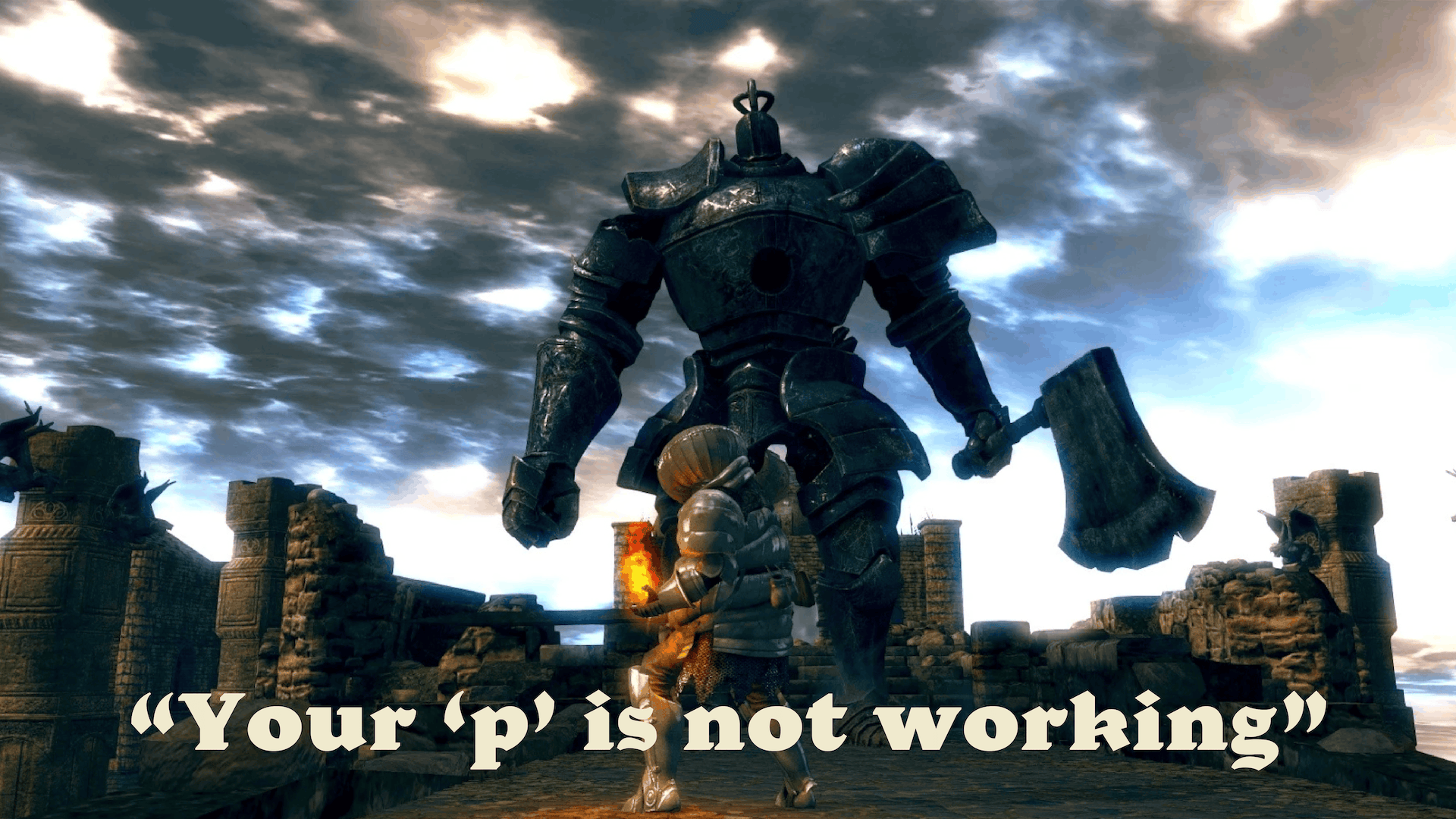
In early 2026, I encountered a piece of art that transported me into a whole new world. It moved me deeply and challenged me personally in ways I truly did not expect. You might think it to be an awarded novel or some Master’s painting, but the artwork I am describing here is, in fact, a video game. Dark Souls was originally released in 2011 by FromSoftware and was later remastered for a second release in 2018. It is a dark fantasy action role-playing game that is renowned for its difficulty and has received critical acclaim for its entire series. Yet, despite getting its undisputed laurels, video games in general are still looked down upon by people who might not consider it an art form in and of itself. I decided to take inspiration from this game for my TypeParis project partly because I felt like the programme would match Dark Souls’ intensely challenging gameplay (it did)! But, mostly, I was inspired by the strange nightmarish world FromSoftware had built, and spending hours refining the curve of an “a” felt very close in spirit to developers dedicating weeks on the perfect ripple dancing on swampy waters.
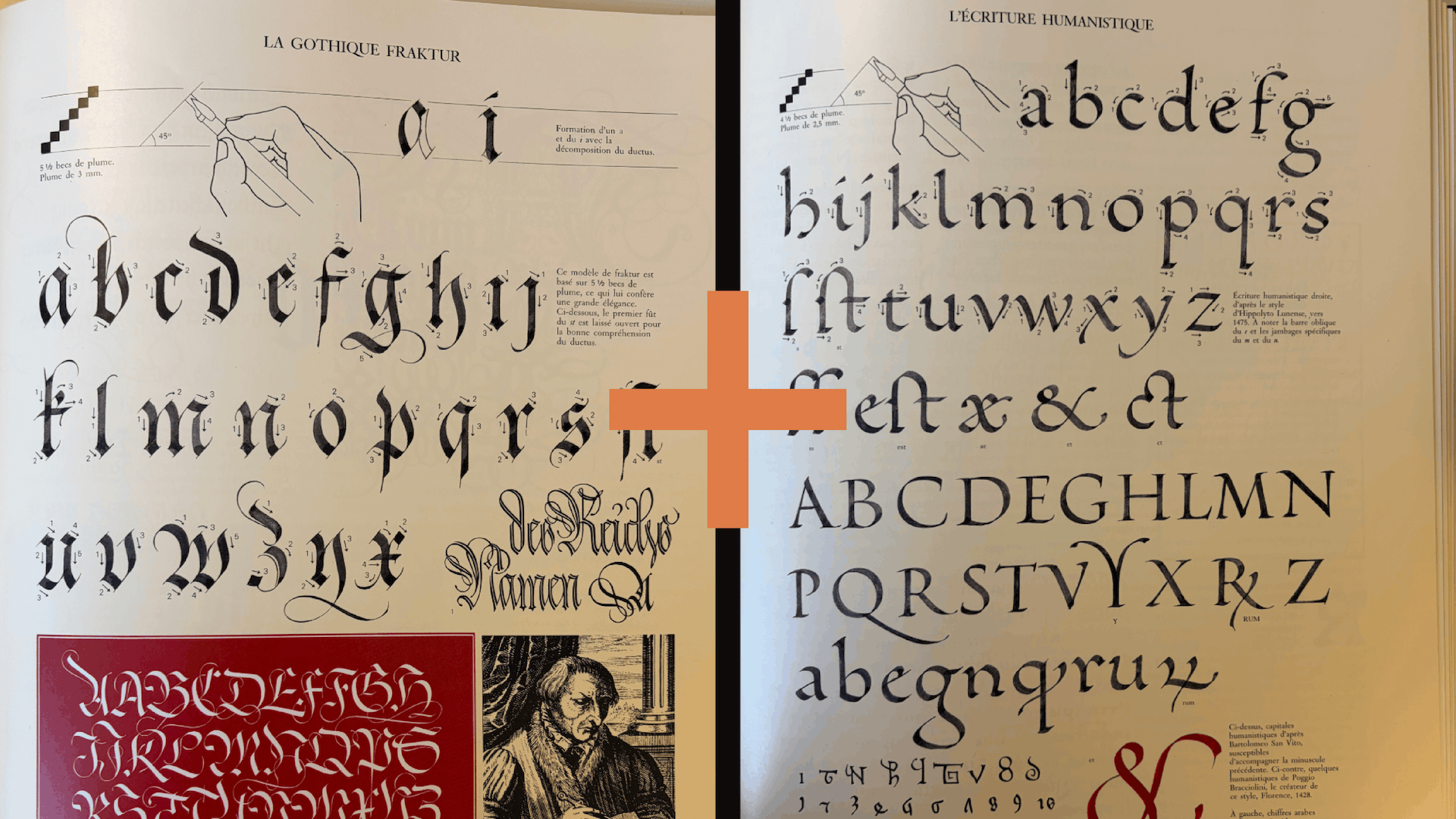
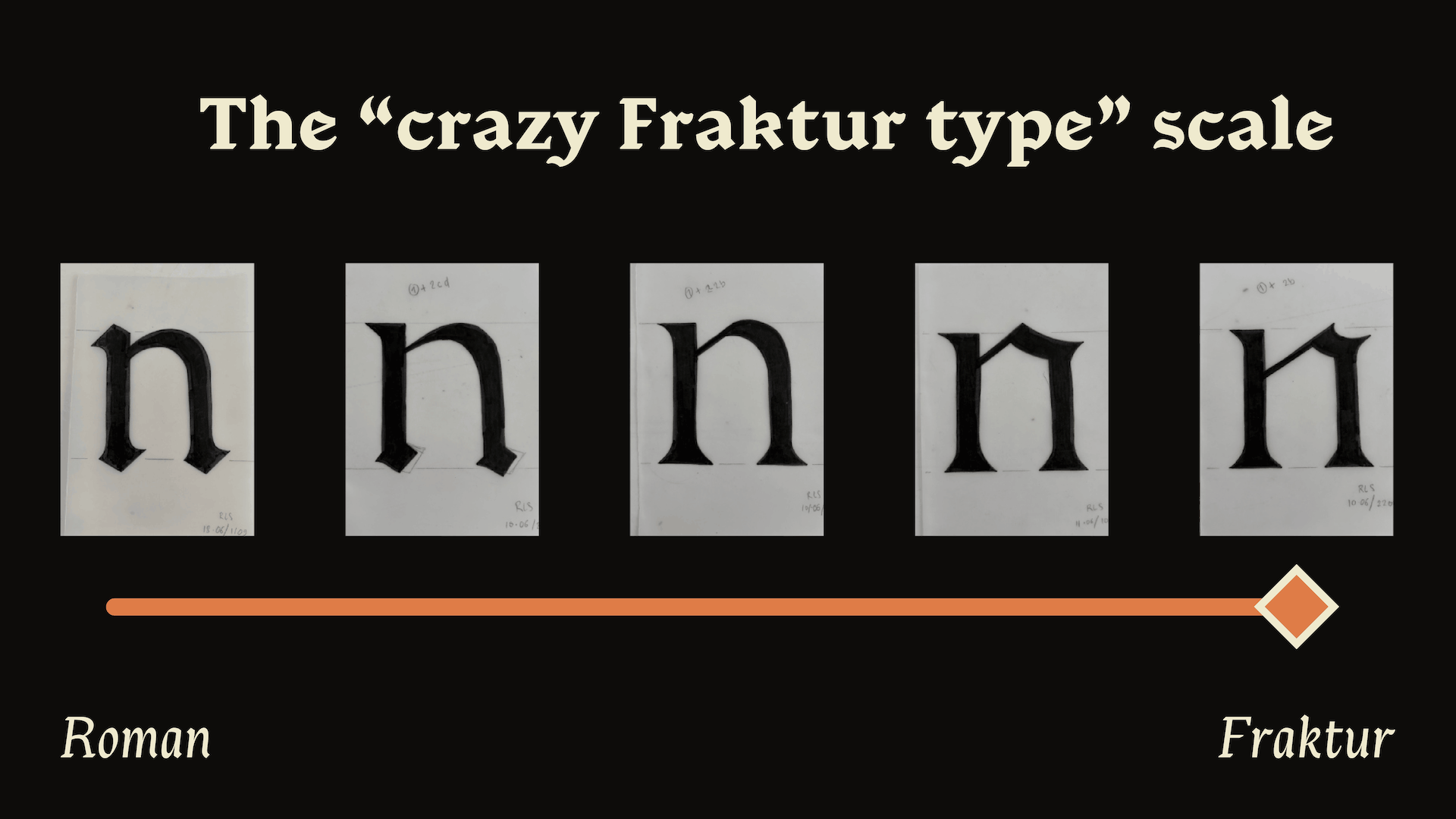
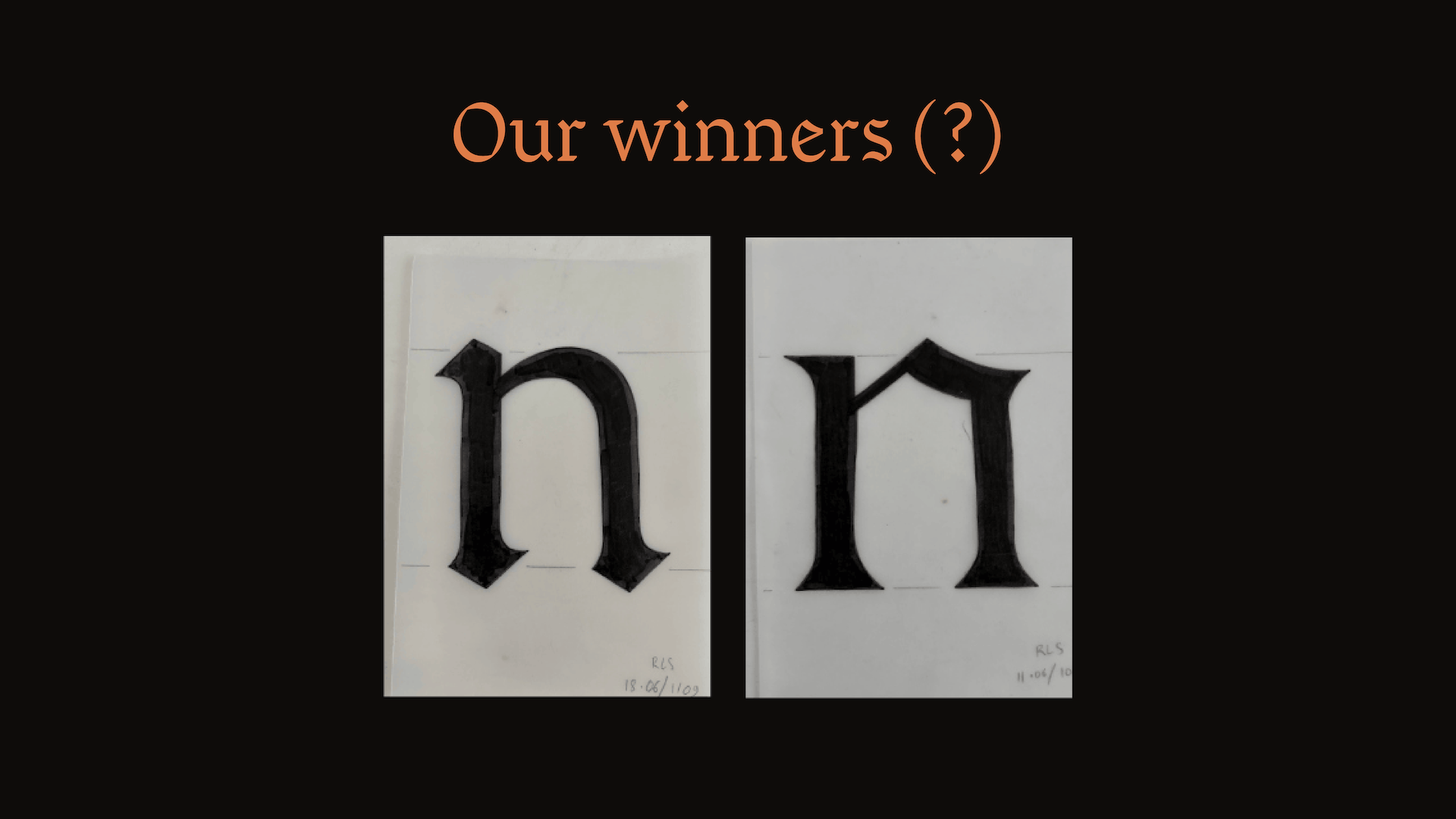
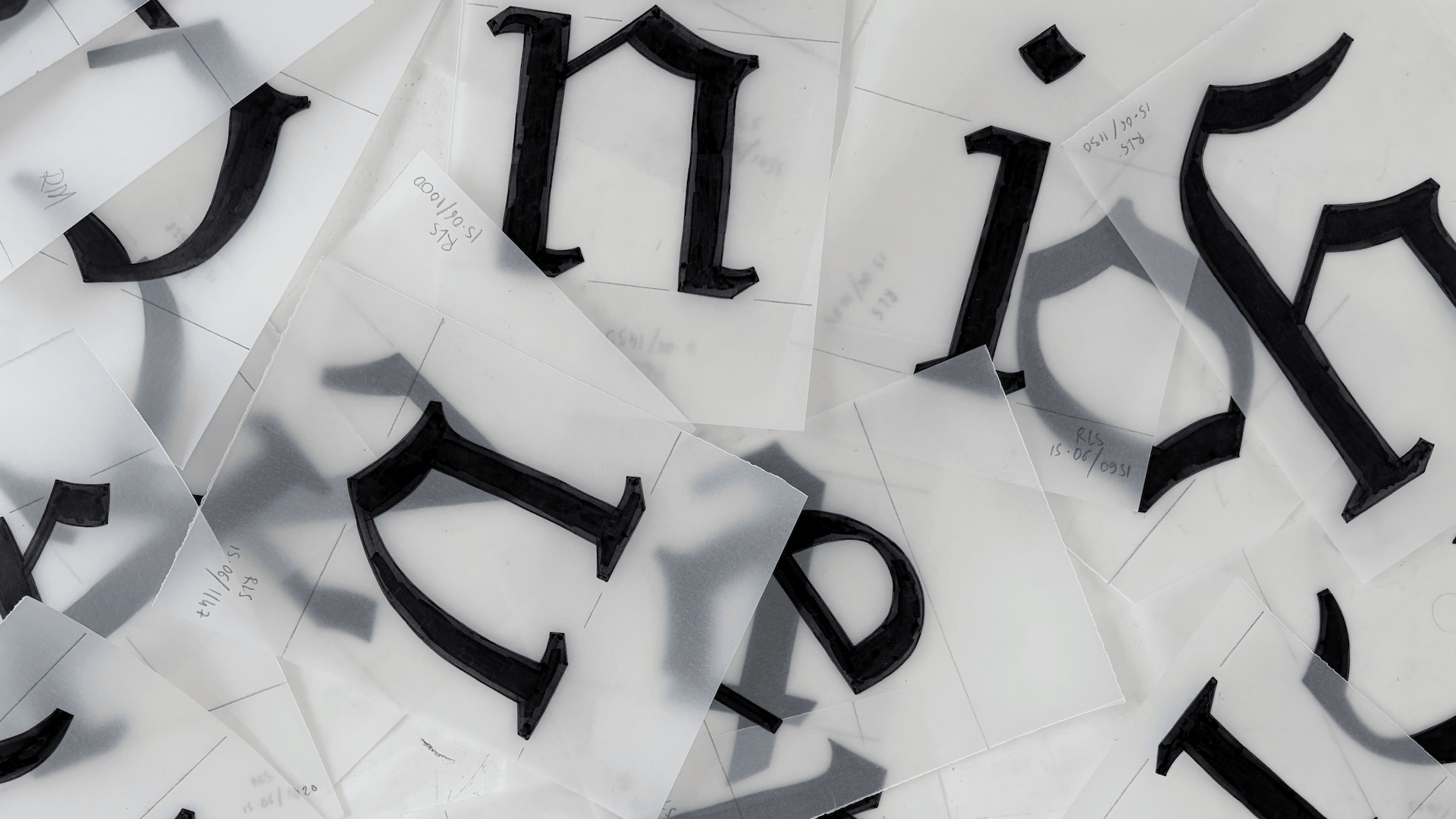
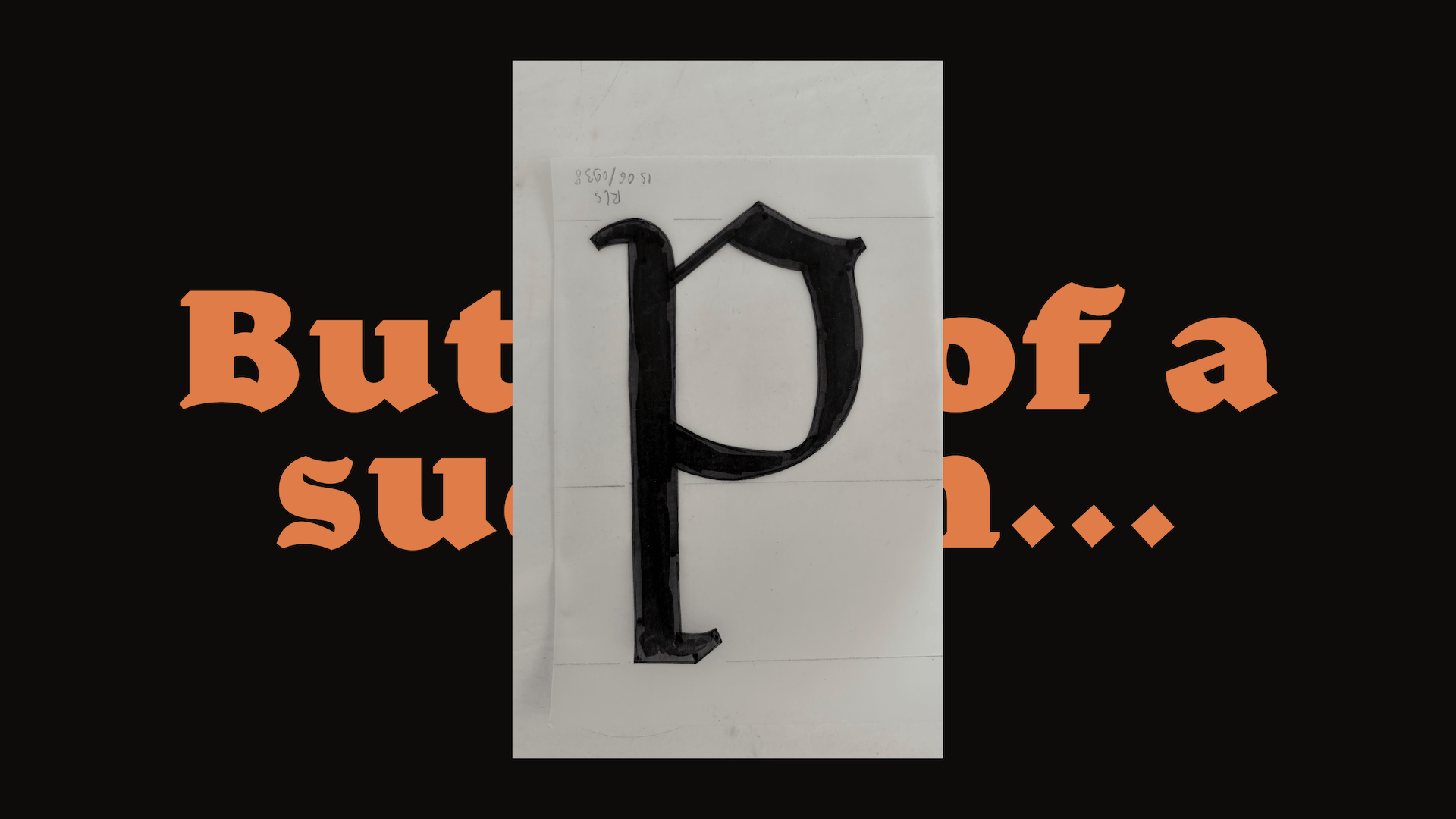
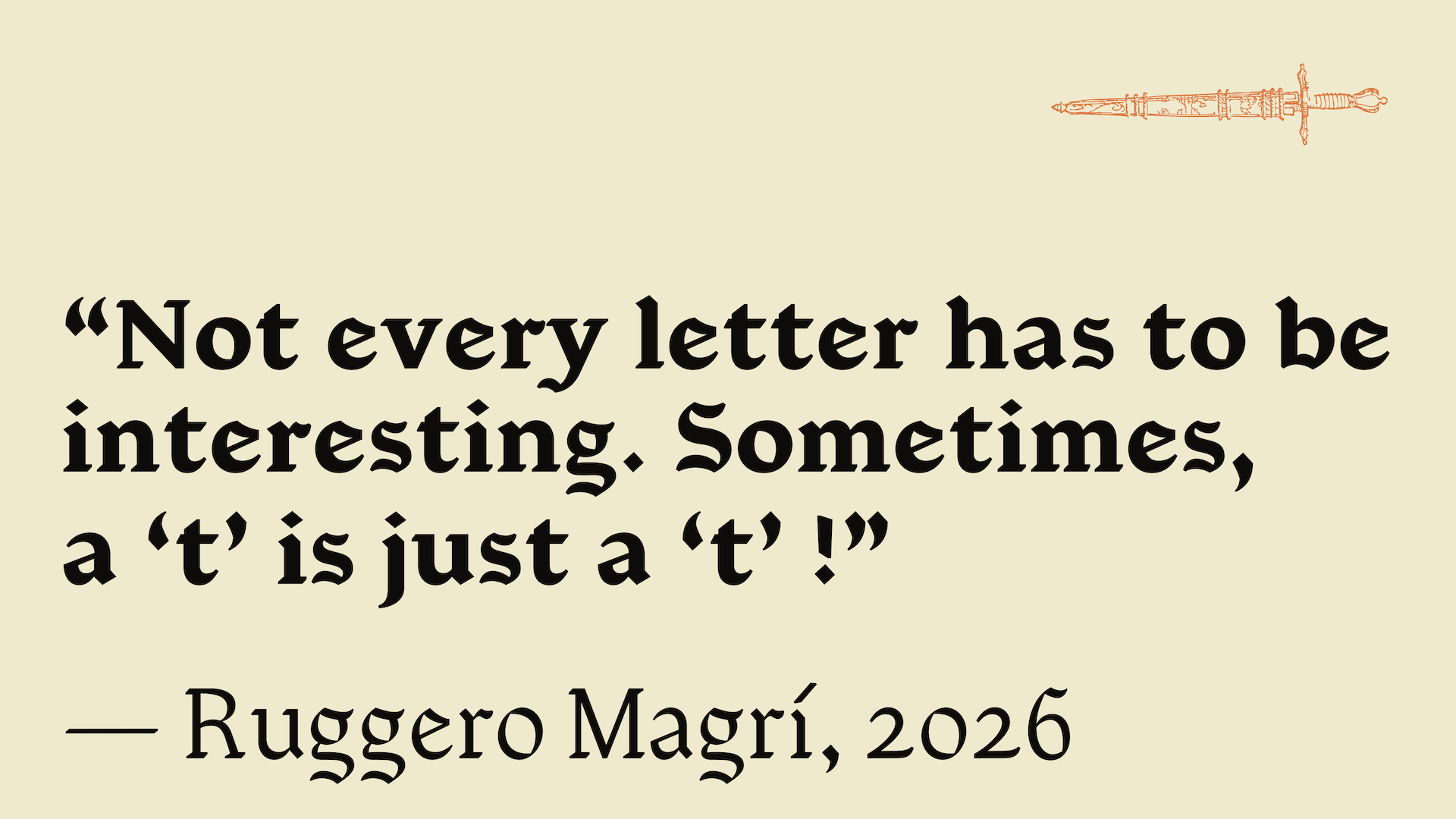
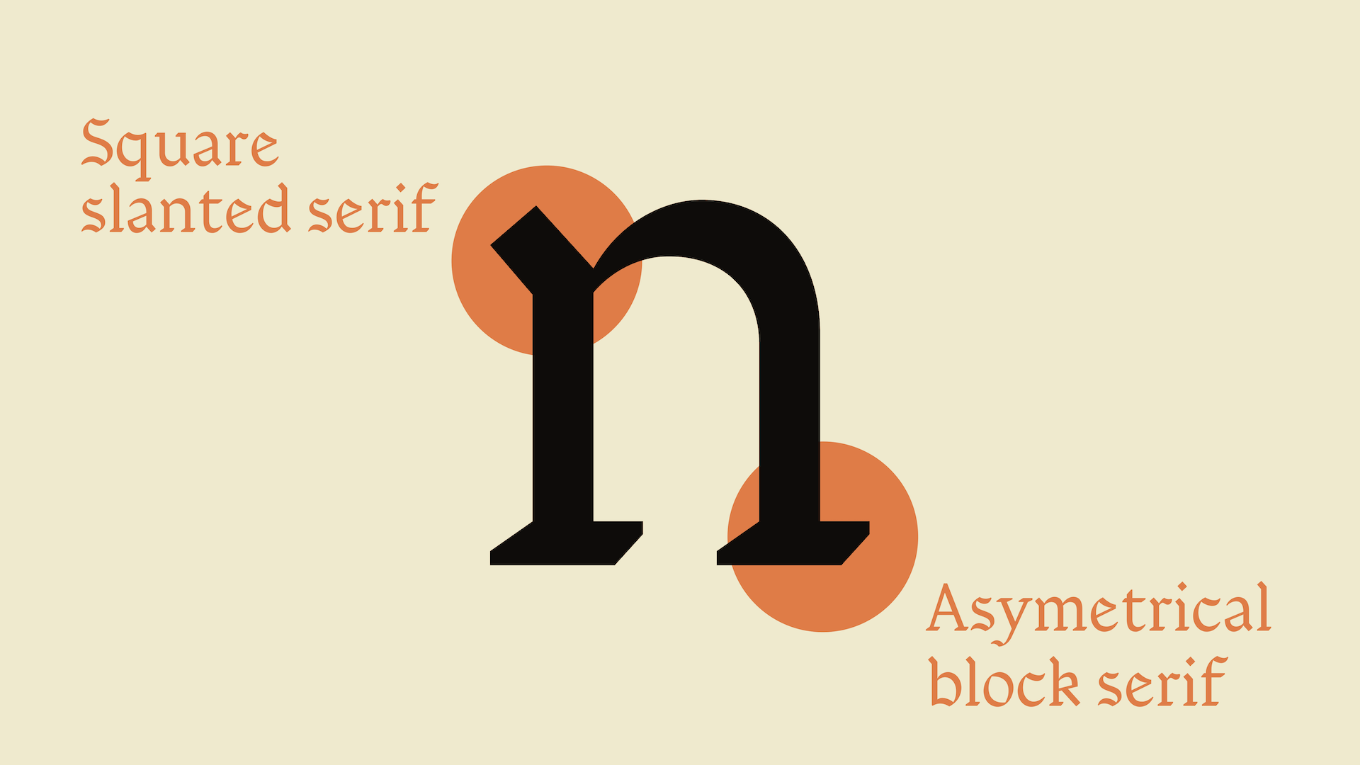
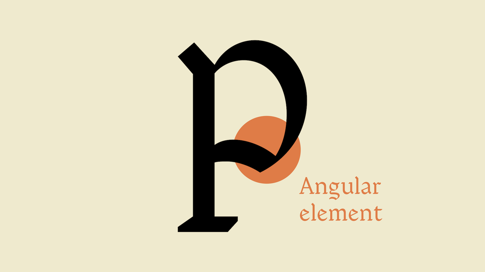
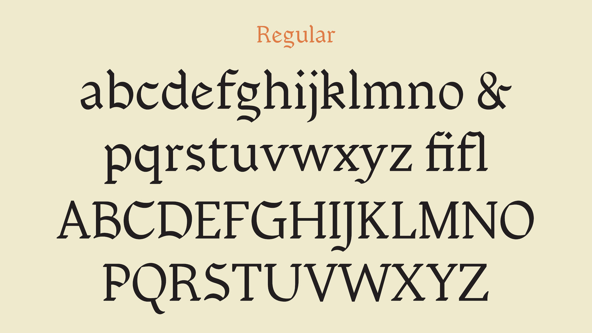
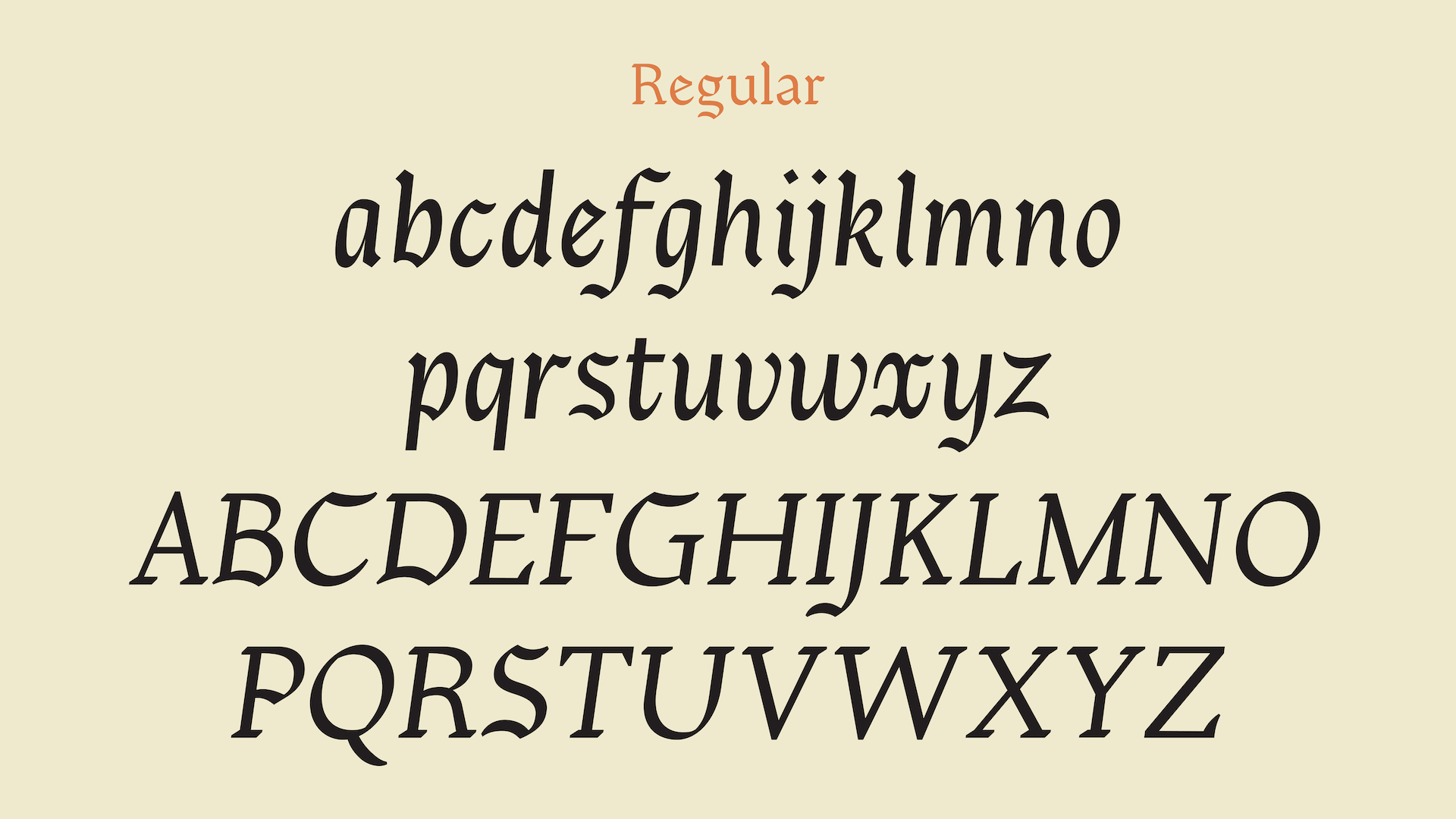
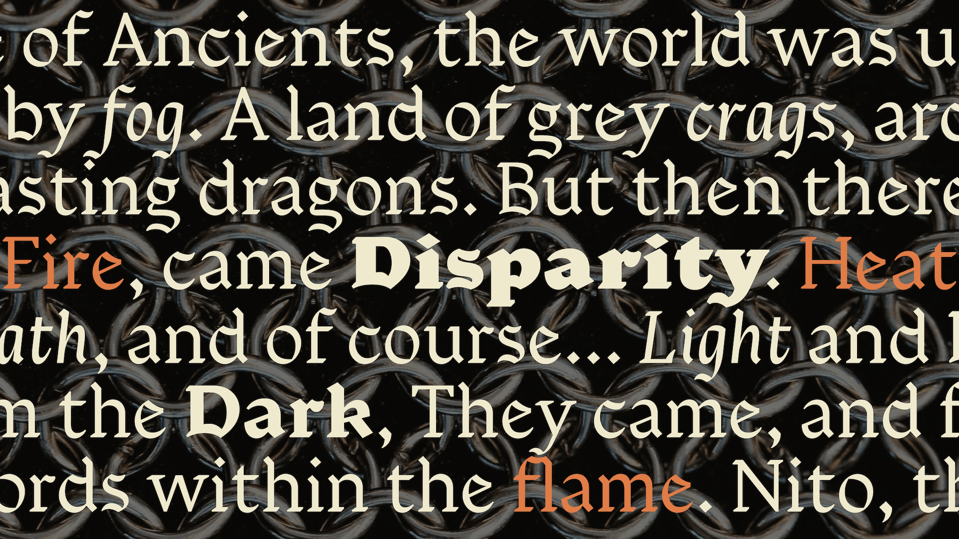
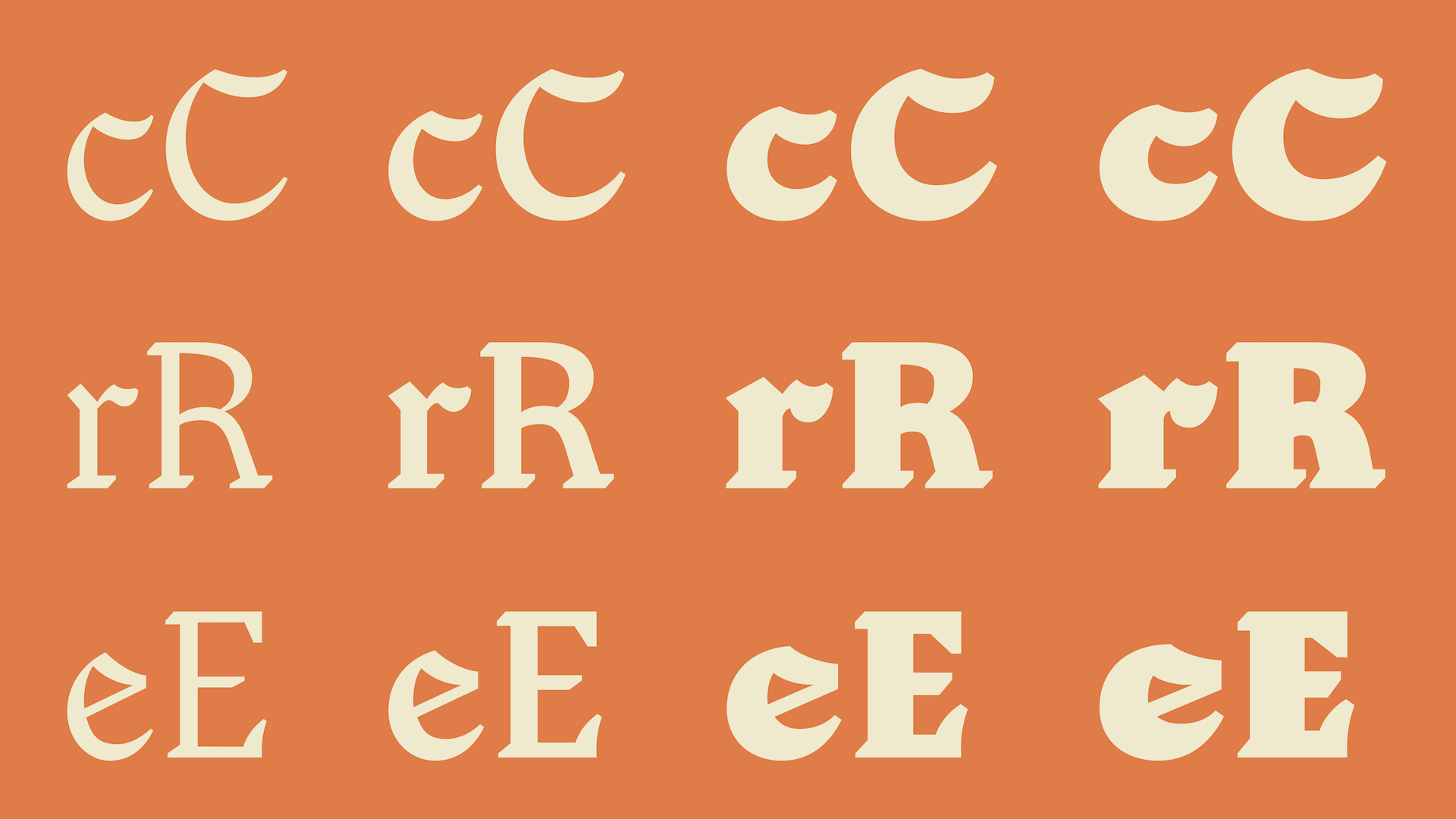
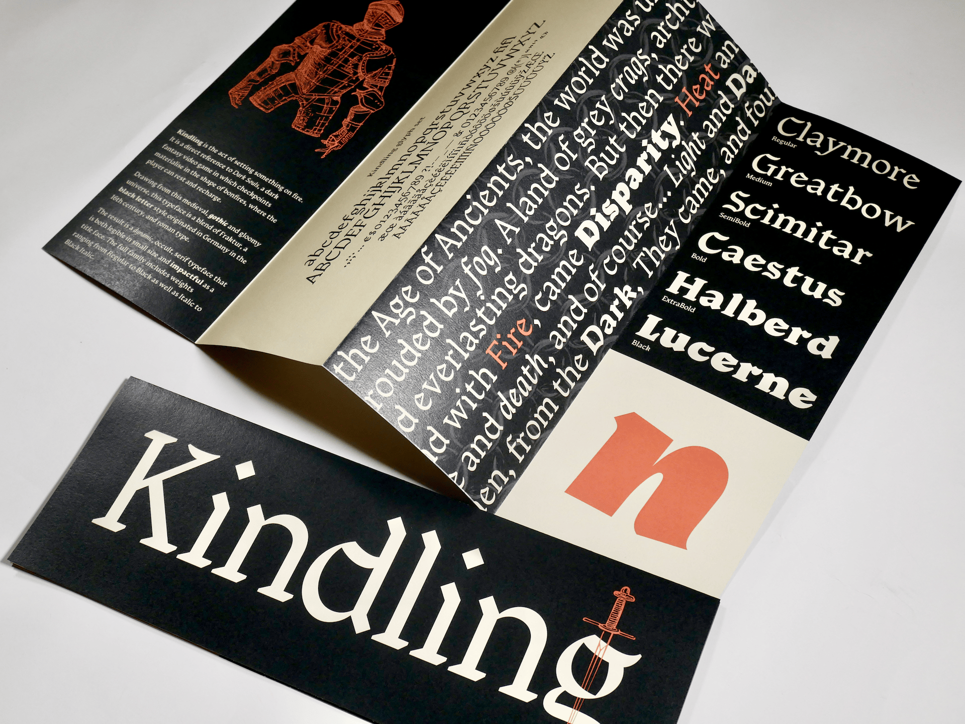
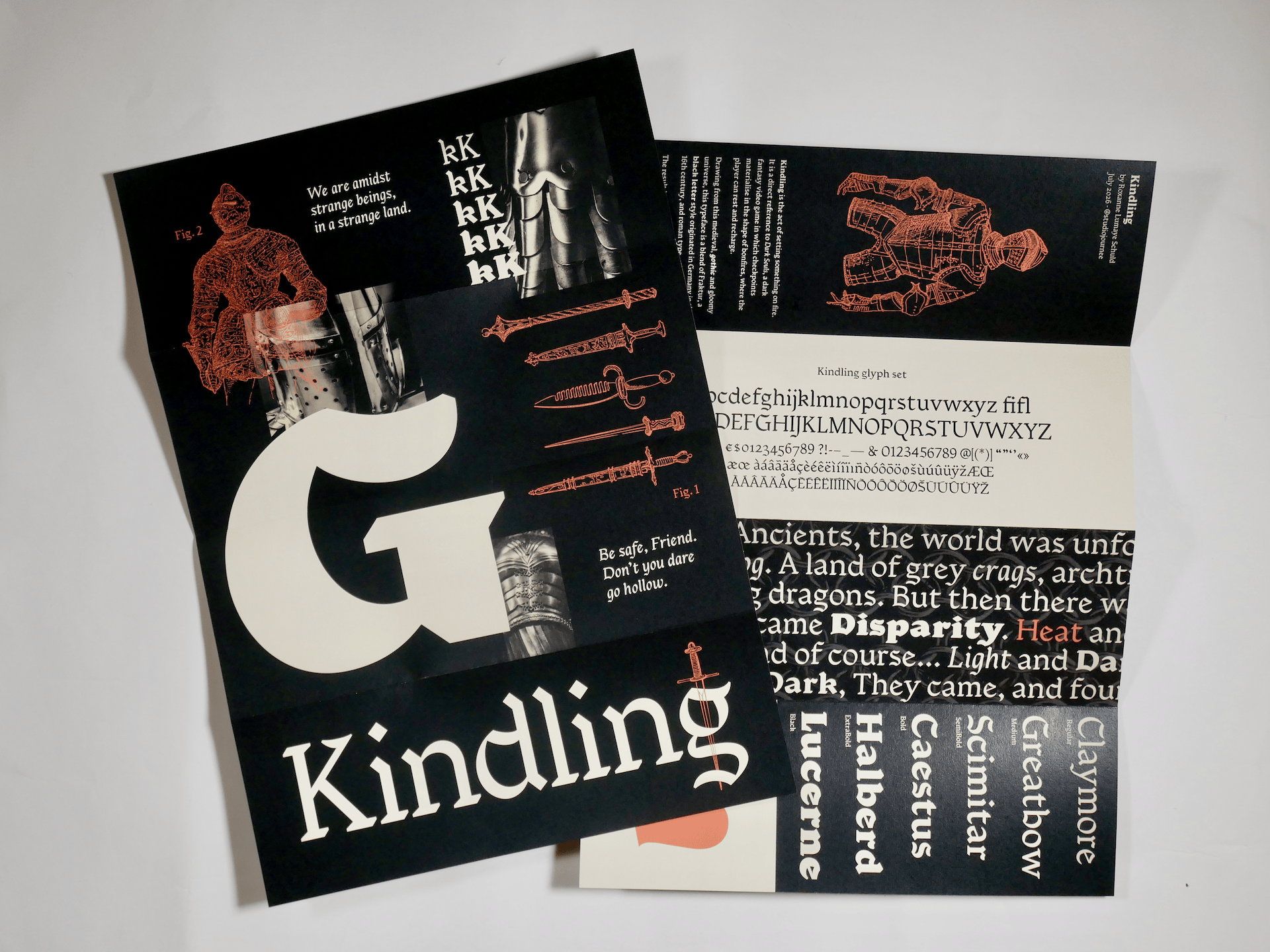
Drawing from the medieval, gothic and gloomy world the game is set in, I was bound to reference some sort of Black Letter calligraphic style in my project. After discussing it with instructors, we agreed that the best angle for my typeface would be to infuse some characteristics of Fraktur type into a humanist, more traditional shape. The challenge was to hint at the Black Letter’s singular texture while being uncompromising on legibility. It took me a few iterations and plenty of back and forth to finally determine a system that could be developed into a complete glyph set. I ensured that letters kept Roman proportions in order to hint at the structured rhythm of handwriting while adding some angular, squarish elements that are typically found in Fraktur. Letters with fewer of those elements provide stability and grounding for the reading experience while more expressive letters bring colour and personality to a text.
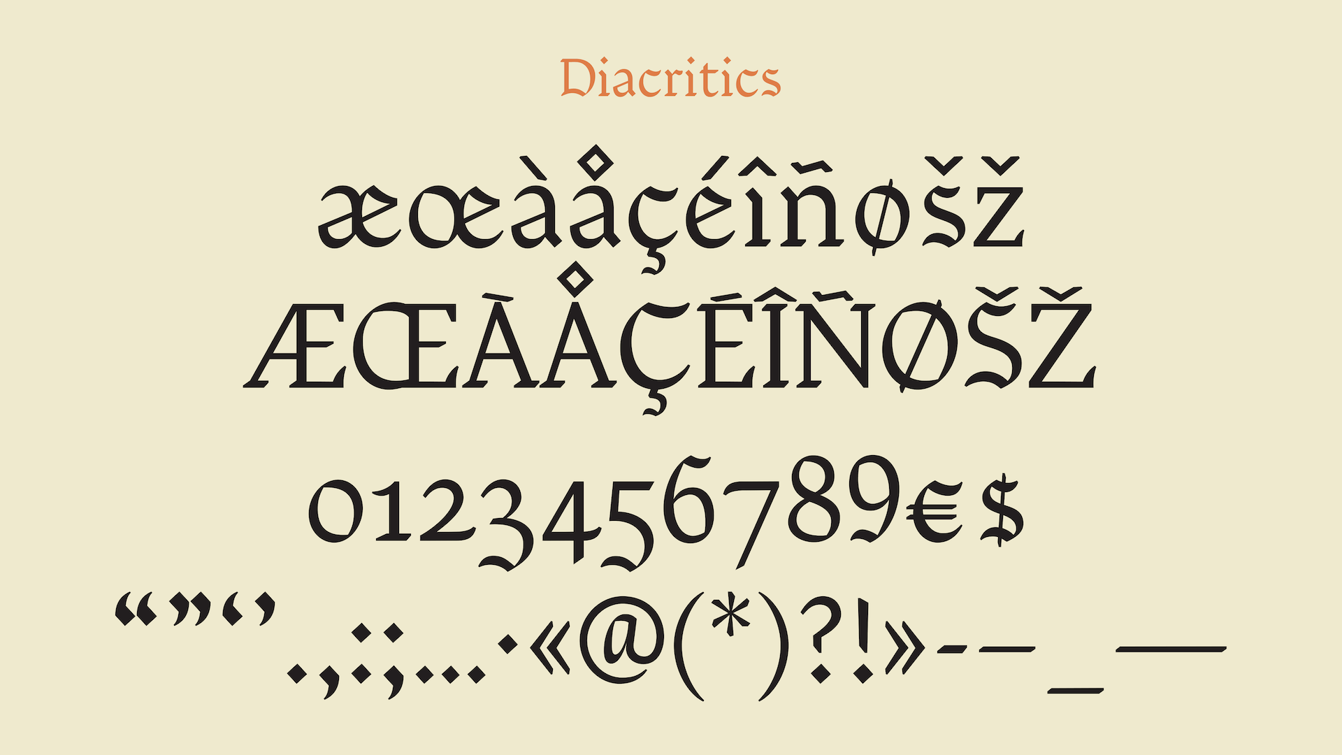
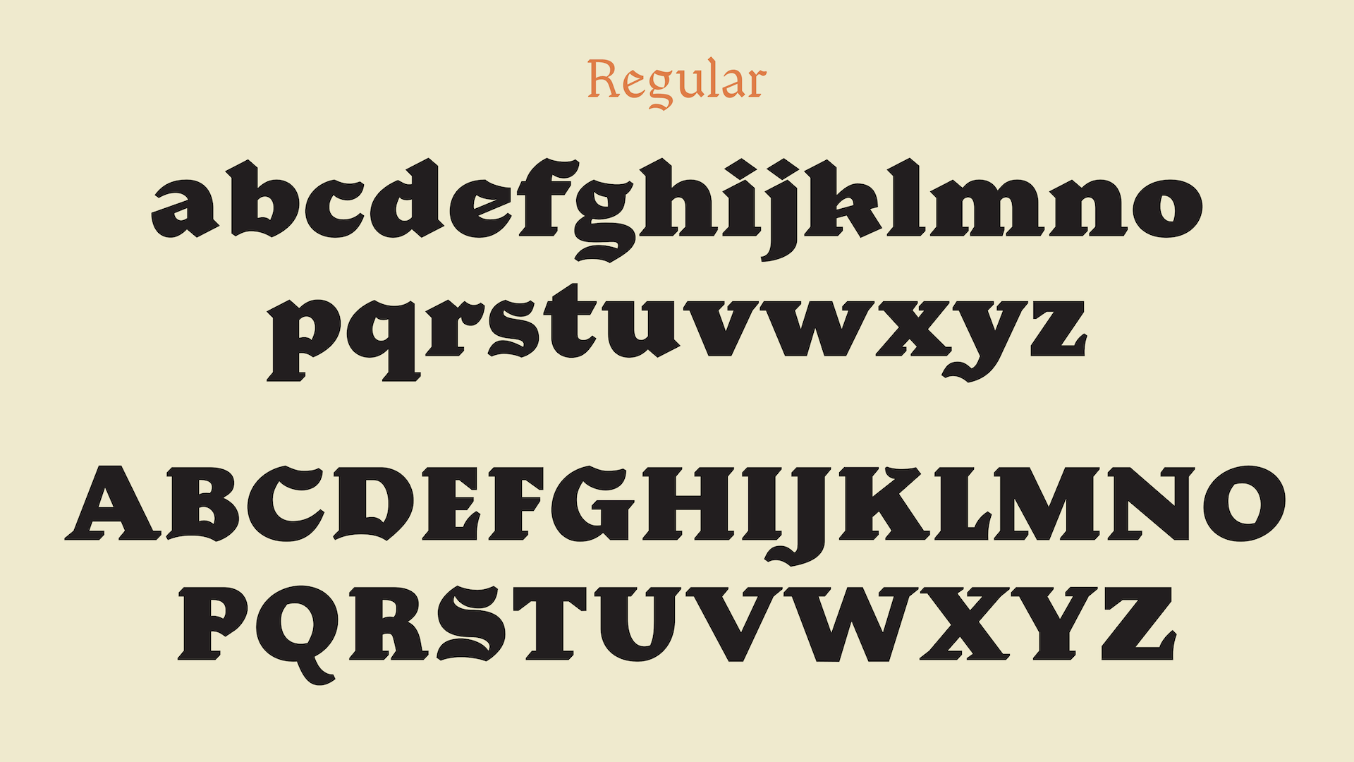
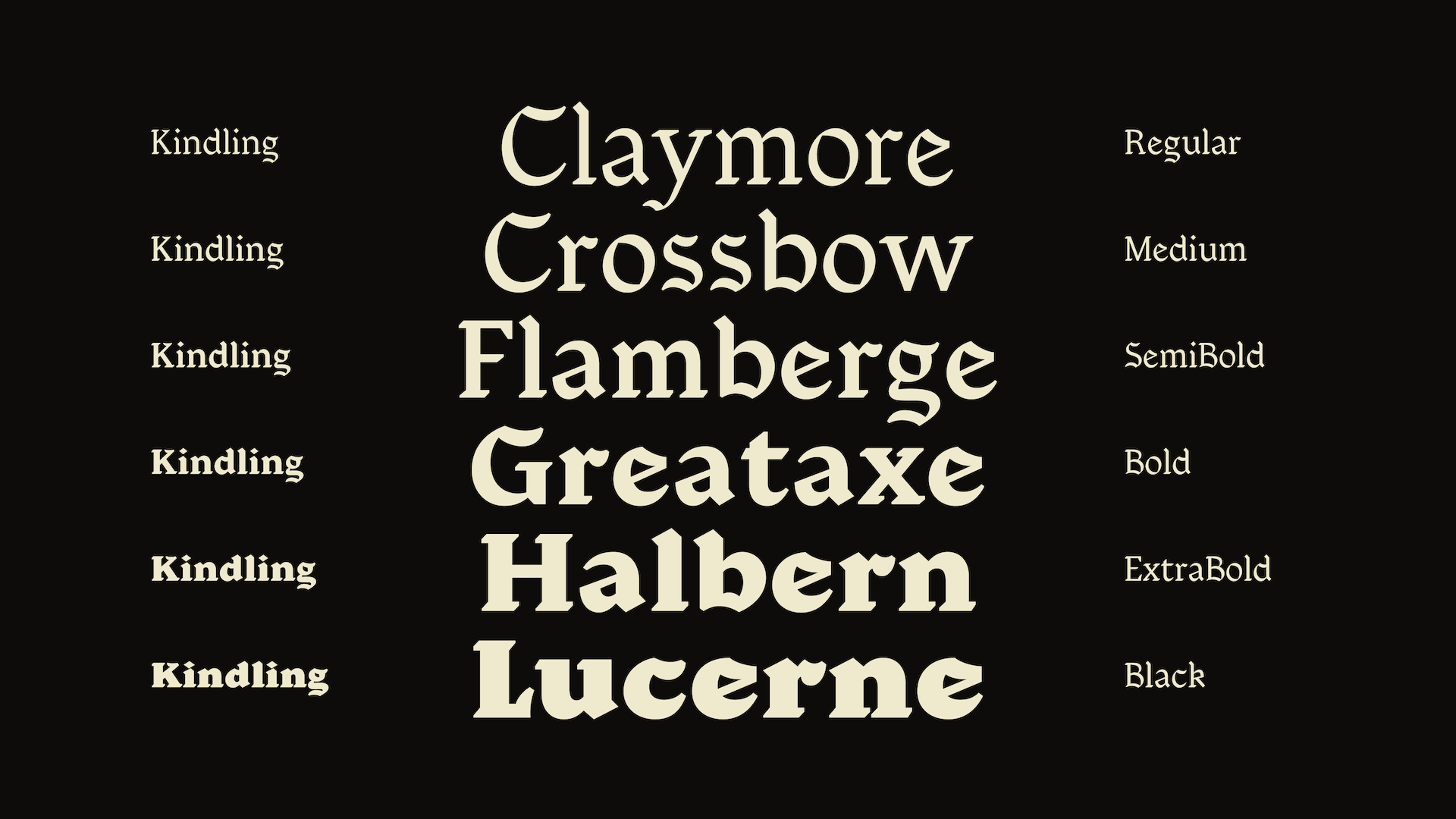
The result is a dynamic, occult, serif typeface that is both legible in small size and impactful as a title face. The full family includes weights from Regular to Black as well as an italic, a black italic and an experimental reverse contrast version.

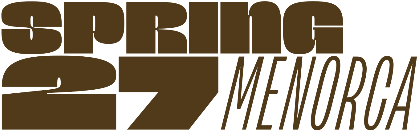
Apply before 14 January for the three-week type design course starting 5 April and ending 24 April 2027.
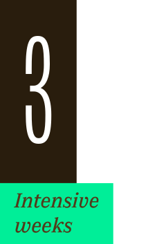
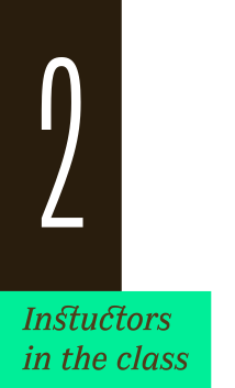
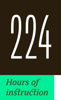
After 10 years in Paris, we reinvent our type design programme. We go from 6 weeks to 3 weeks, while maintaining the fundamentals that make TypeParis’ reputation.
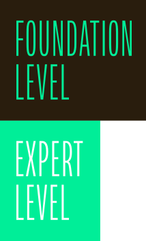
The course will take place in Menorca, Spain for the first time. In 2027, we offer two levels, Foundation and Expert, which allows you to discover type design, or to gain expertise after an initial training.
➼ Subscribe to our mailing list to stay informed, until application period is launched.
Get ready & apply before 14 January 2027