Balise
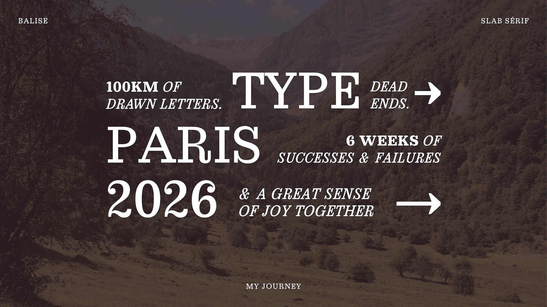
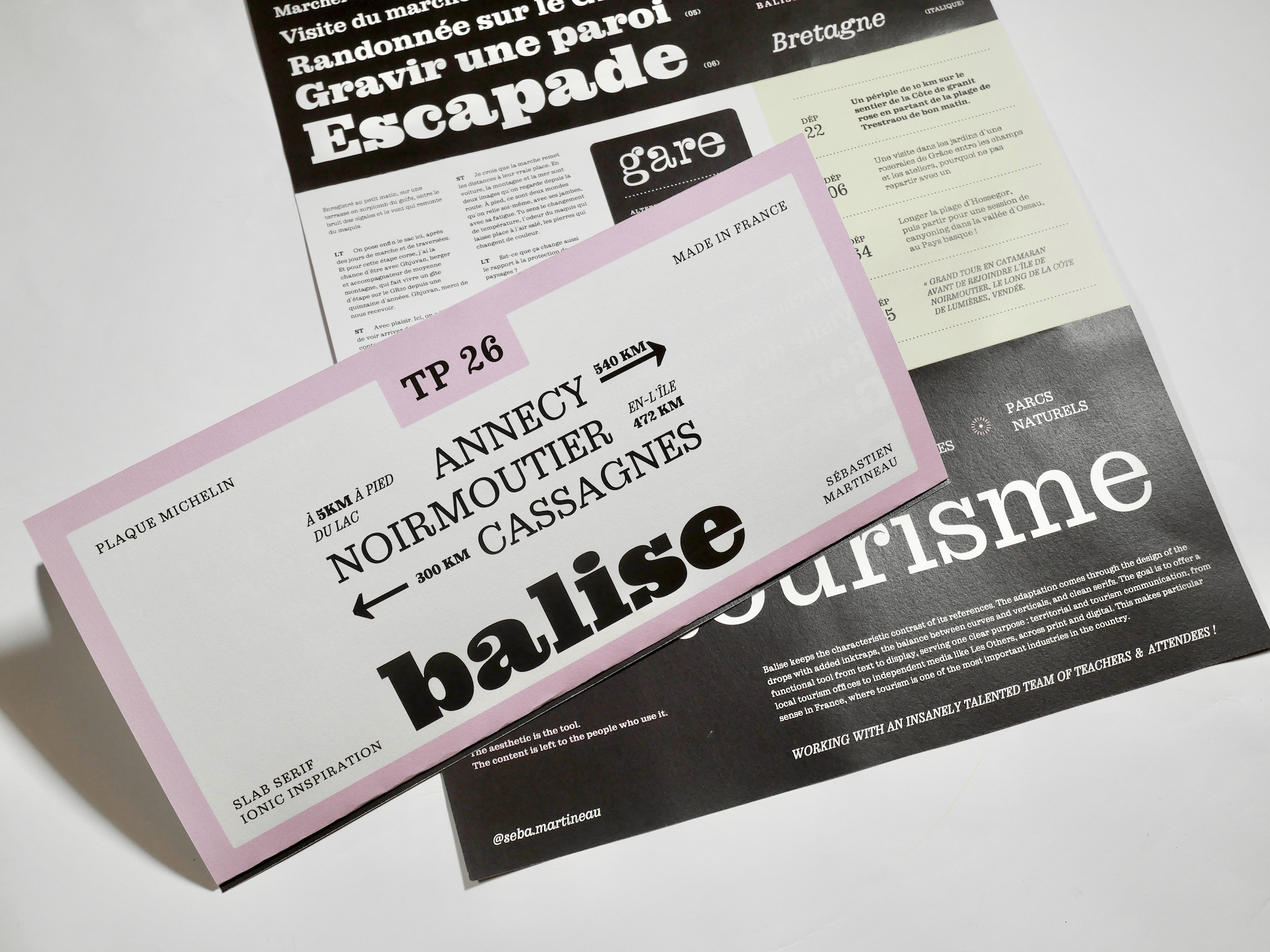
For some time now, I have developed a real interest in Slab Serif typefaces, by seeing them again and again around me. This typographic family is not very common today, which made every encounter feel immediately noticeable, on posters, at flea markets, and more recently in new brand identities. I thought I could use it as raw material for TypeParis. The next step was finding a clear framework to support that choice and define a precise angle to move forward.
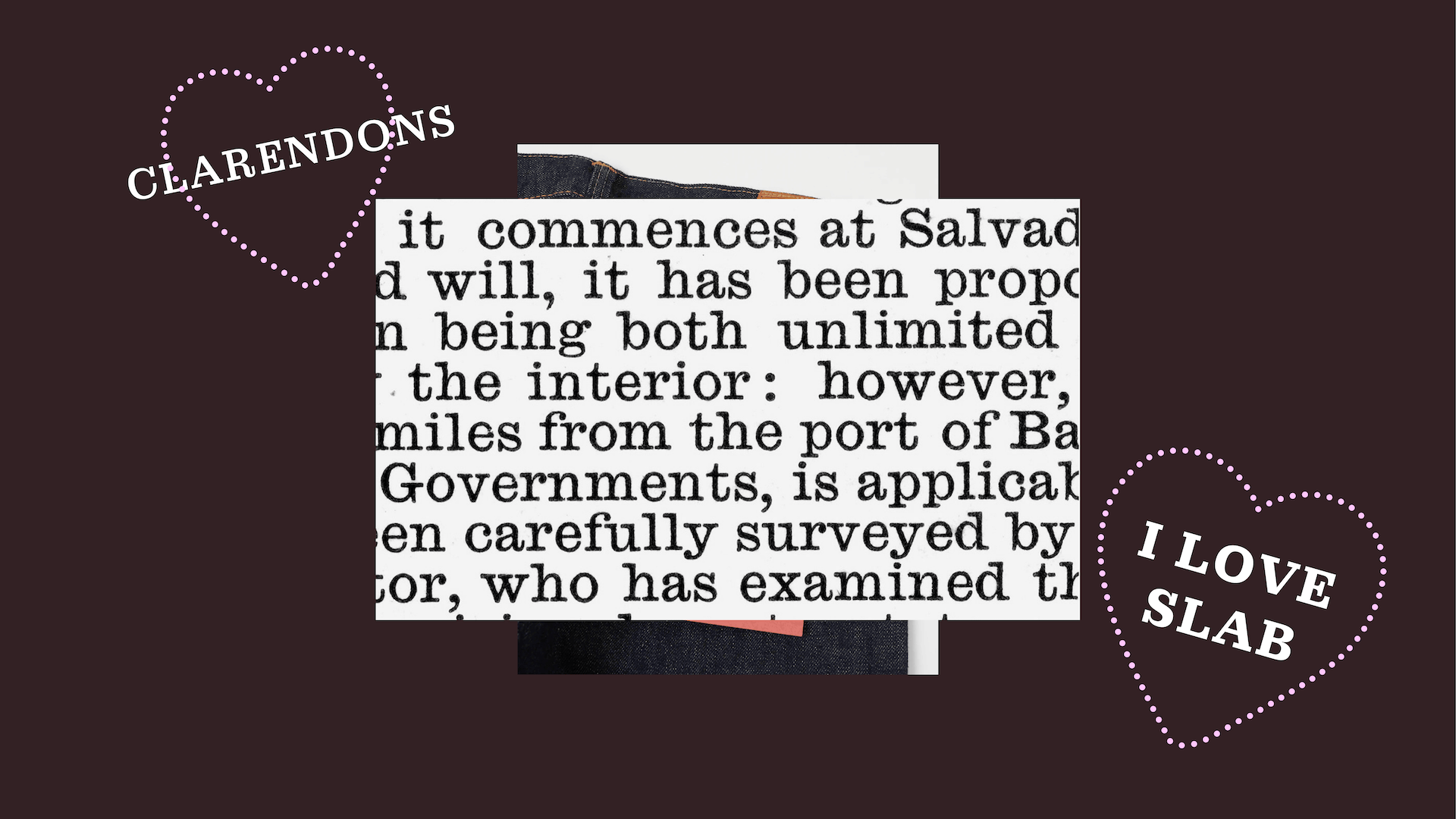
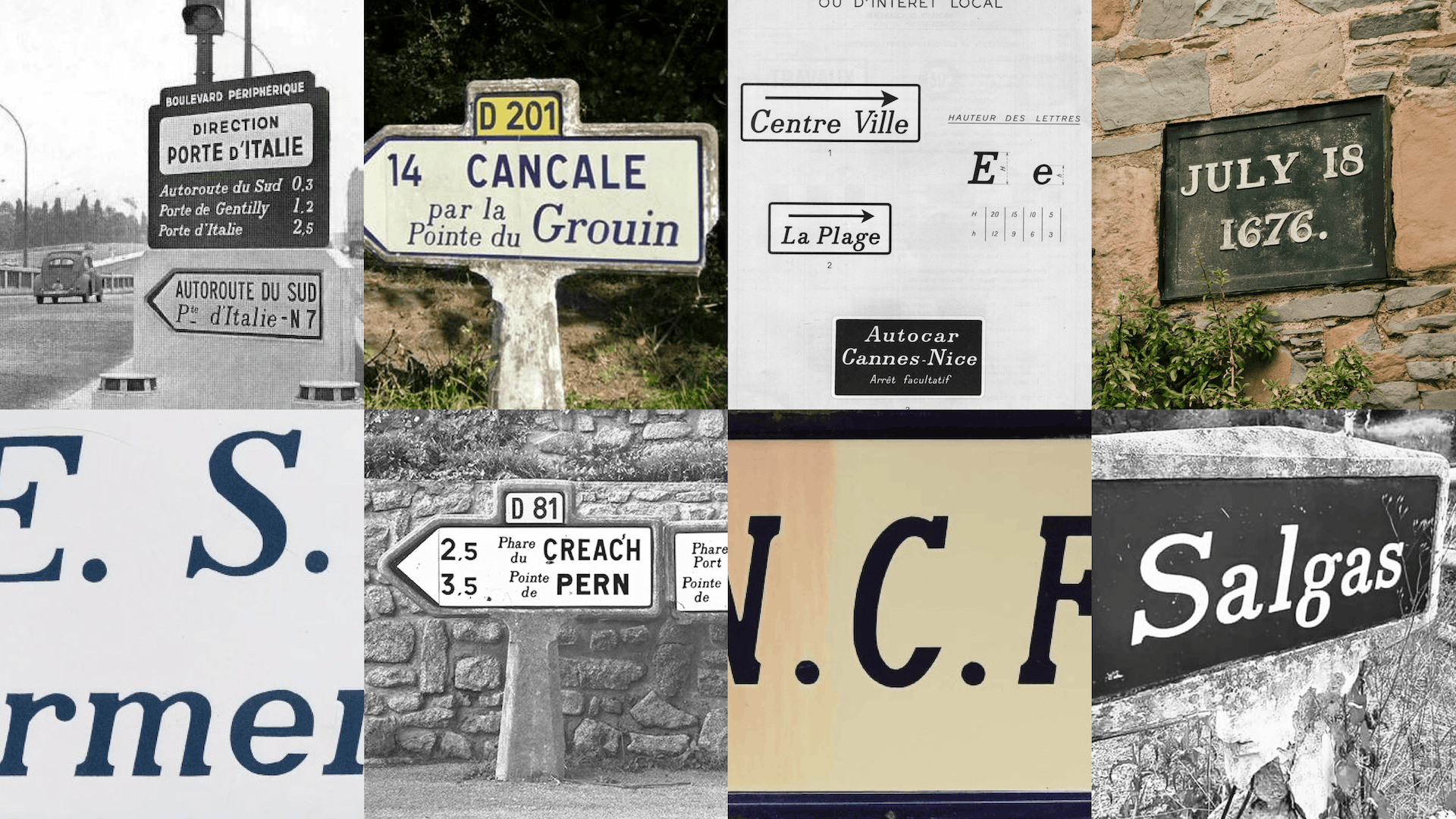
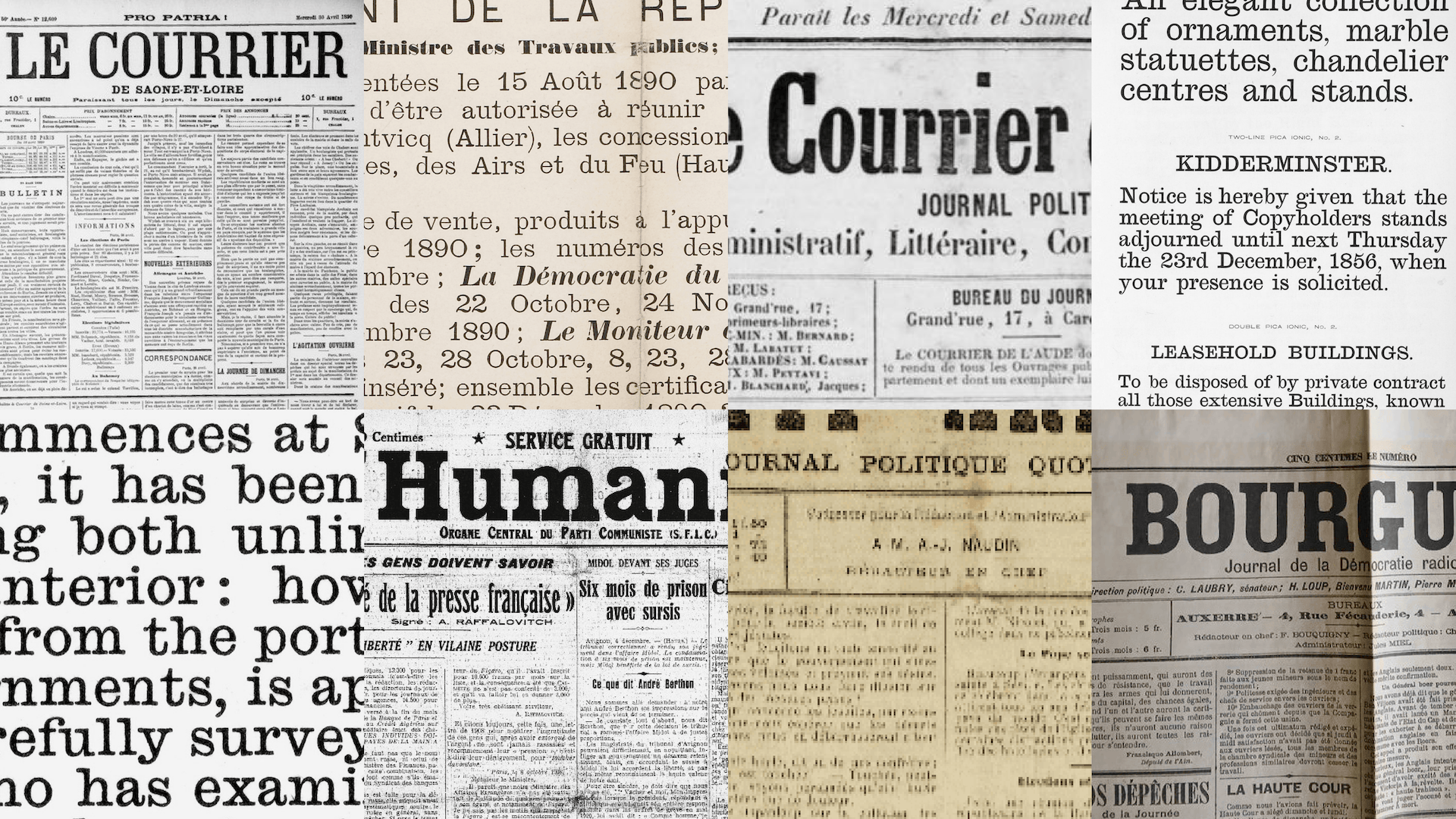
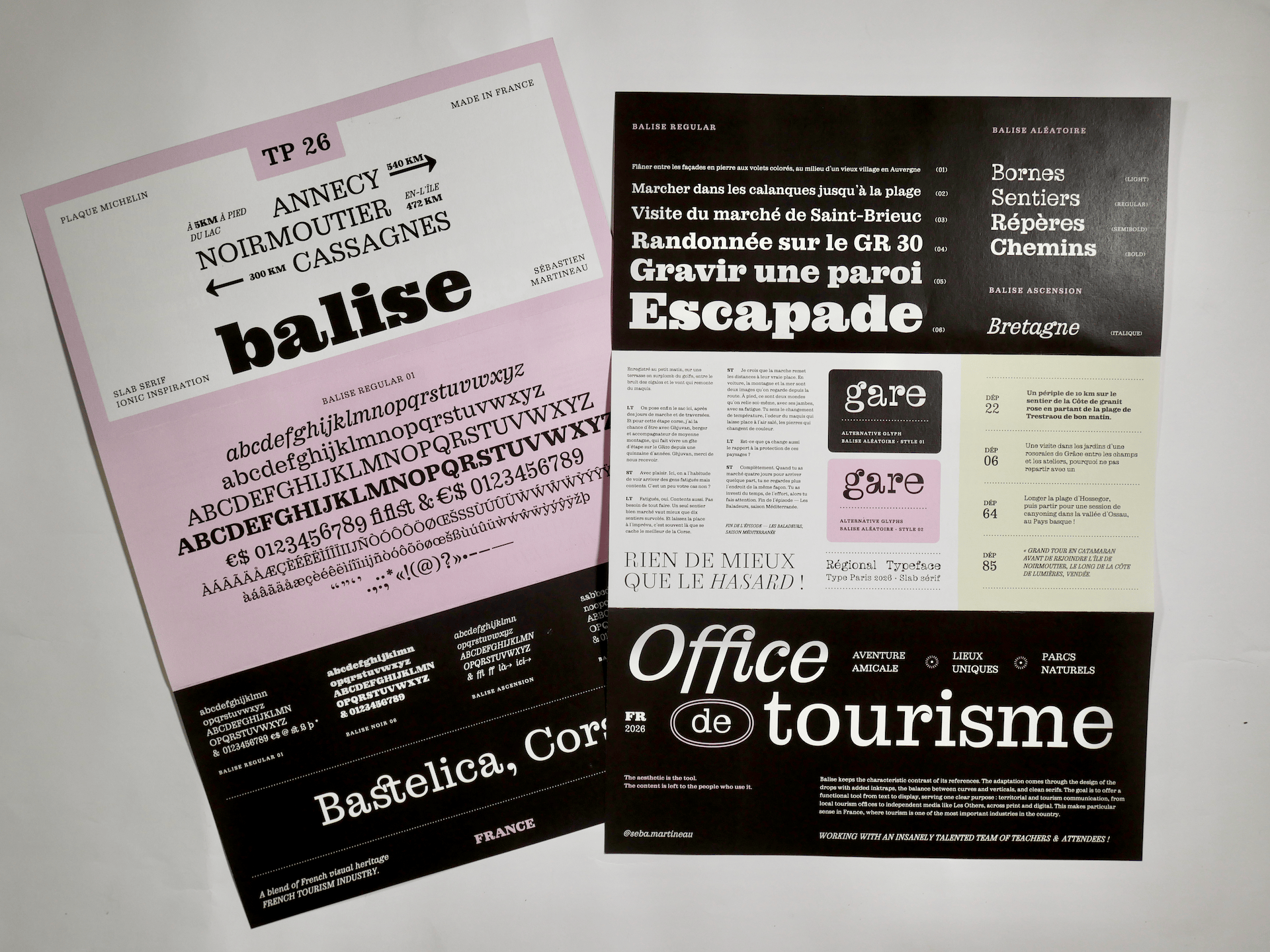
This family goes back to the 19s and 20s centuries, driven by industrialisation, the French press, and certain official documents. Research led me to two main sources. First, the Ionic and Clarendon typefaces used in French national and regional newspapers, often very rounded, shaped by cheap printing techniques. Then the Michelin road markers, found all over France in the iconic form of their stone bornes, which are part of the rural French visual heritage. I was particularly drawn to the bold italic Slab, with its very clean forms, originally made for tourist signage and hiking trails. This makes particular sense in France, where tourism is one of the most important industries in the country.
Both have slowly disappeared from the French visual landscape.
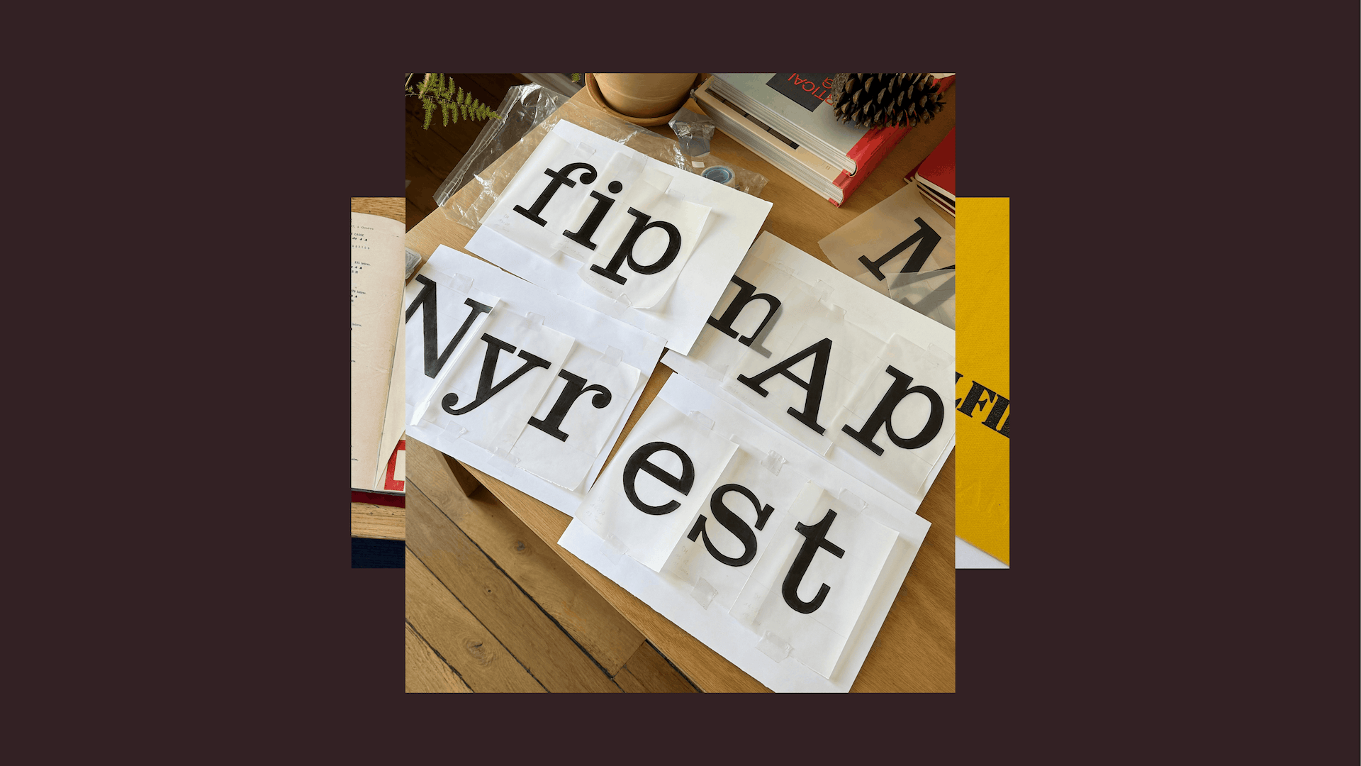
What followed was a back-and-forth between historical research, archives, type specimens, specialist bookshops, and a practical approach focused on what the typeface needed to do. That movement between the two shaped the project a lot.
Revival was not the initial goal. But it is the form the project naturally took through practice. A compromise between staying close to the historical references and refining certain elements to fit contemporary uses.
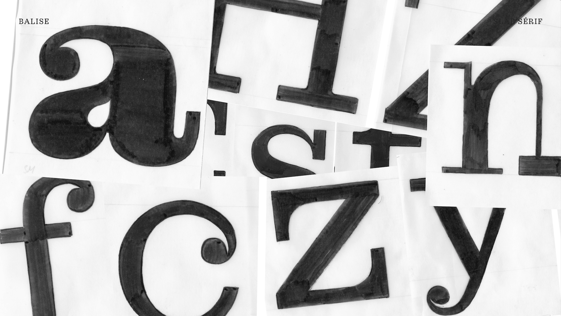
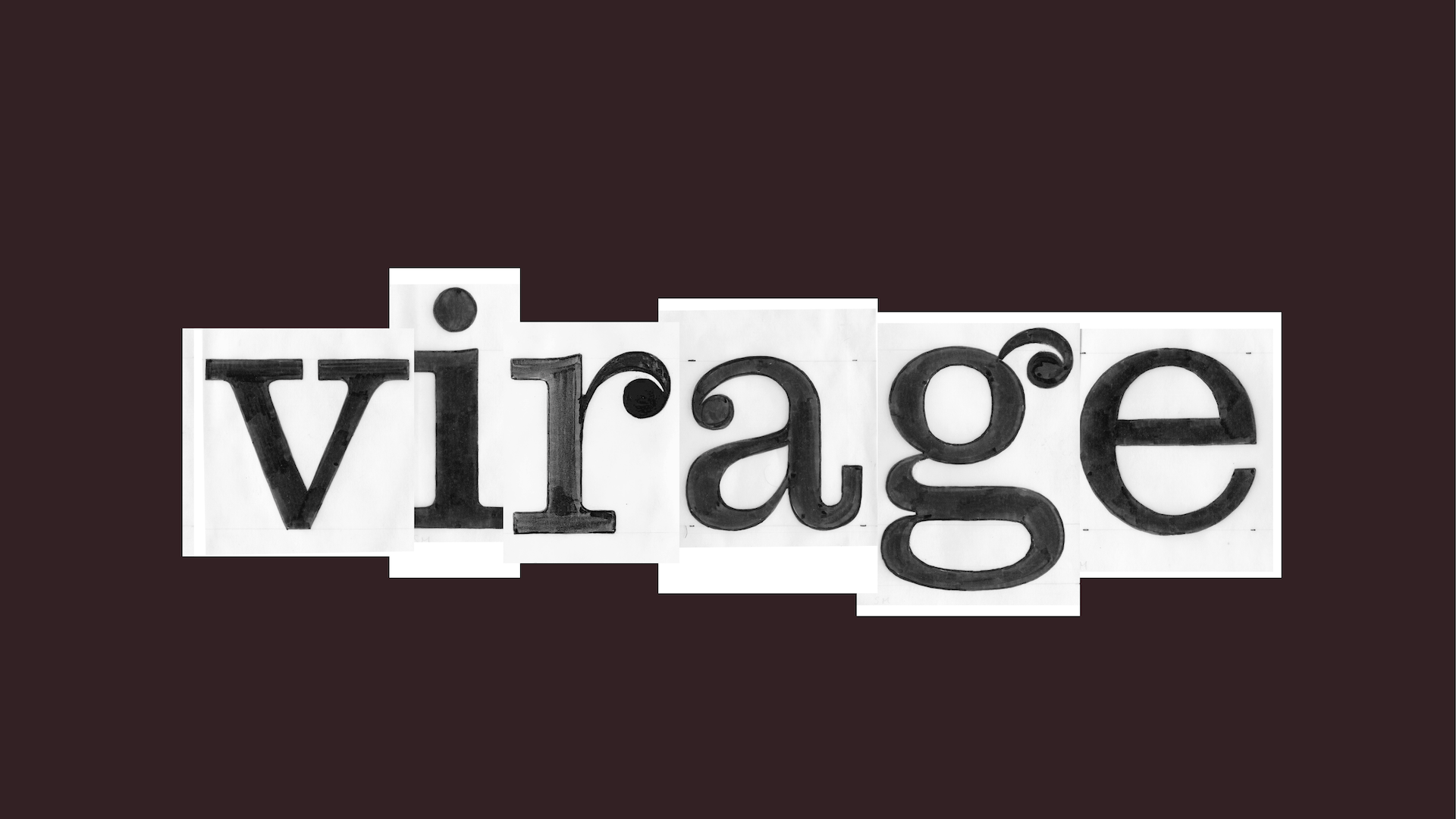
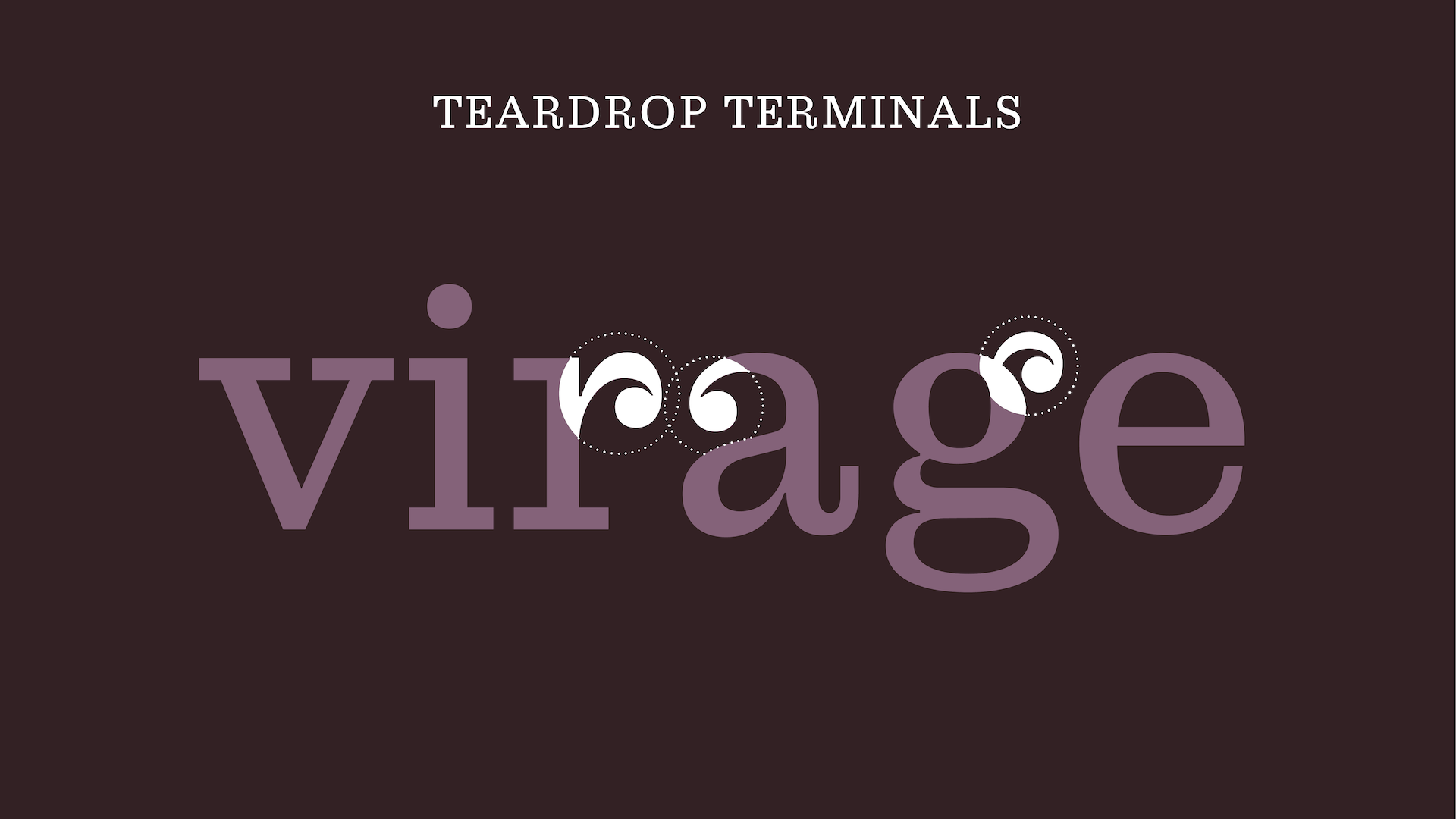
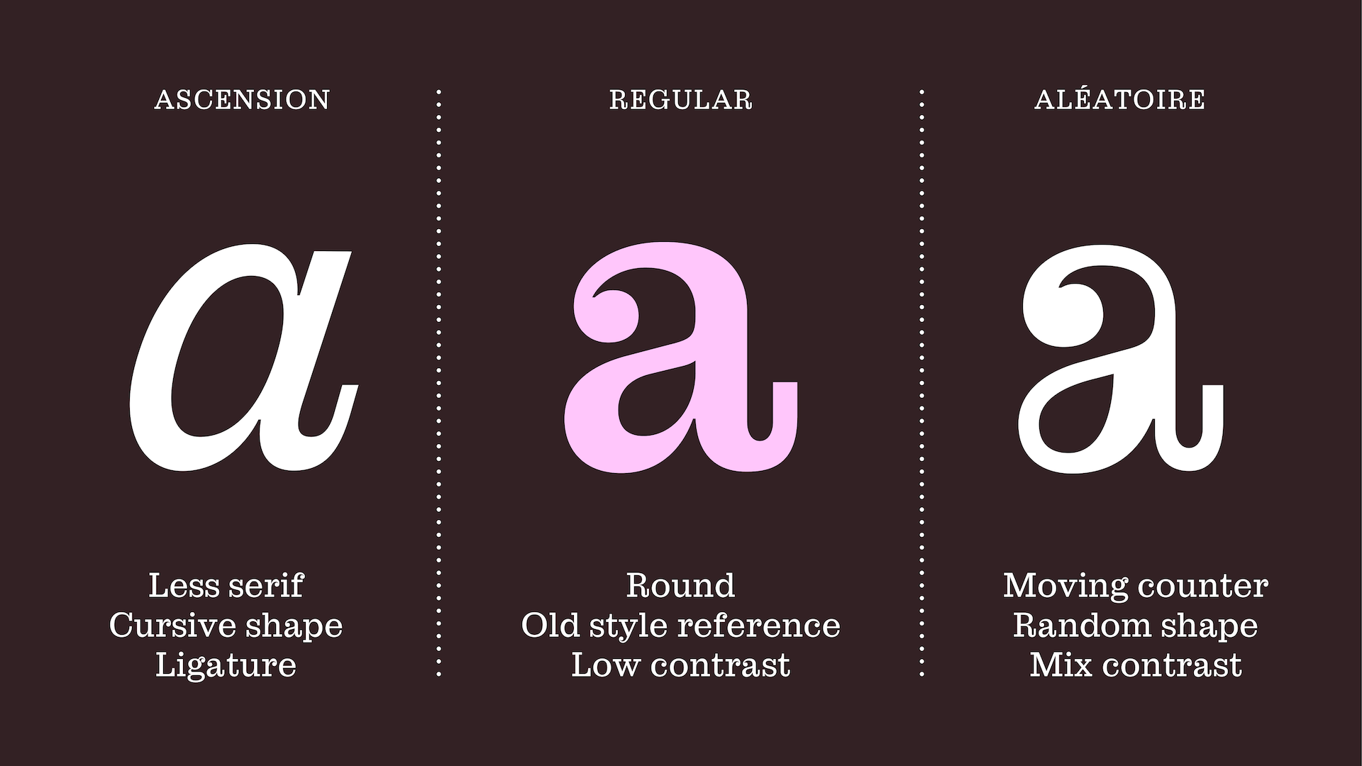
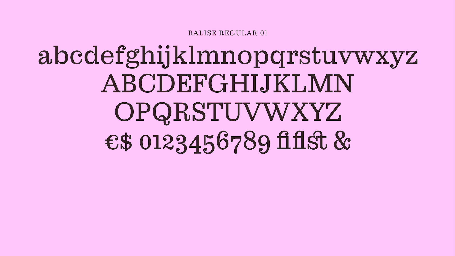
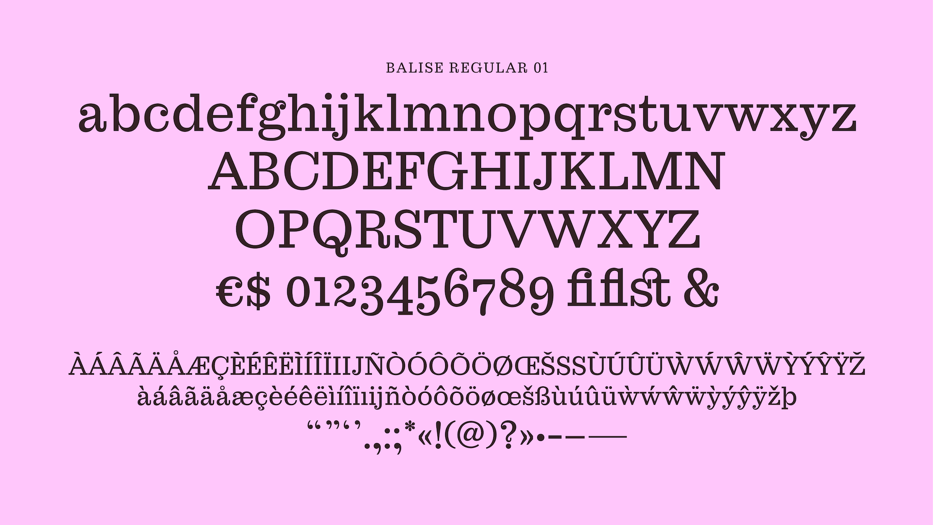
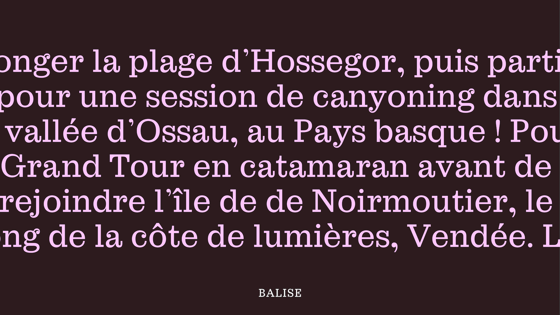
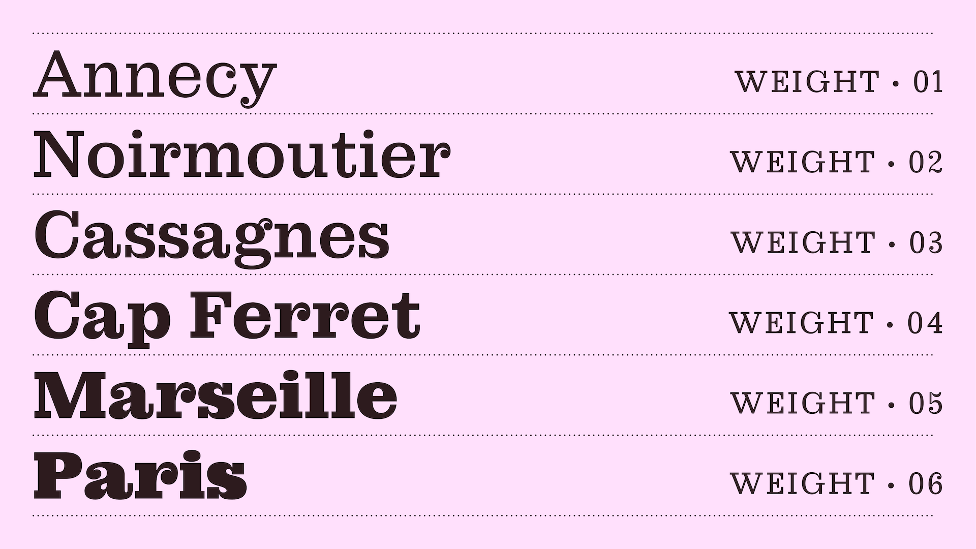
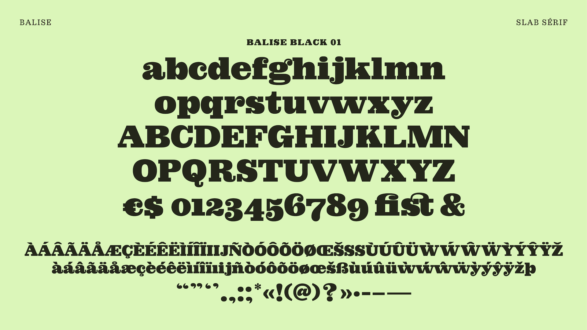
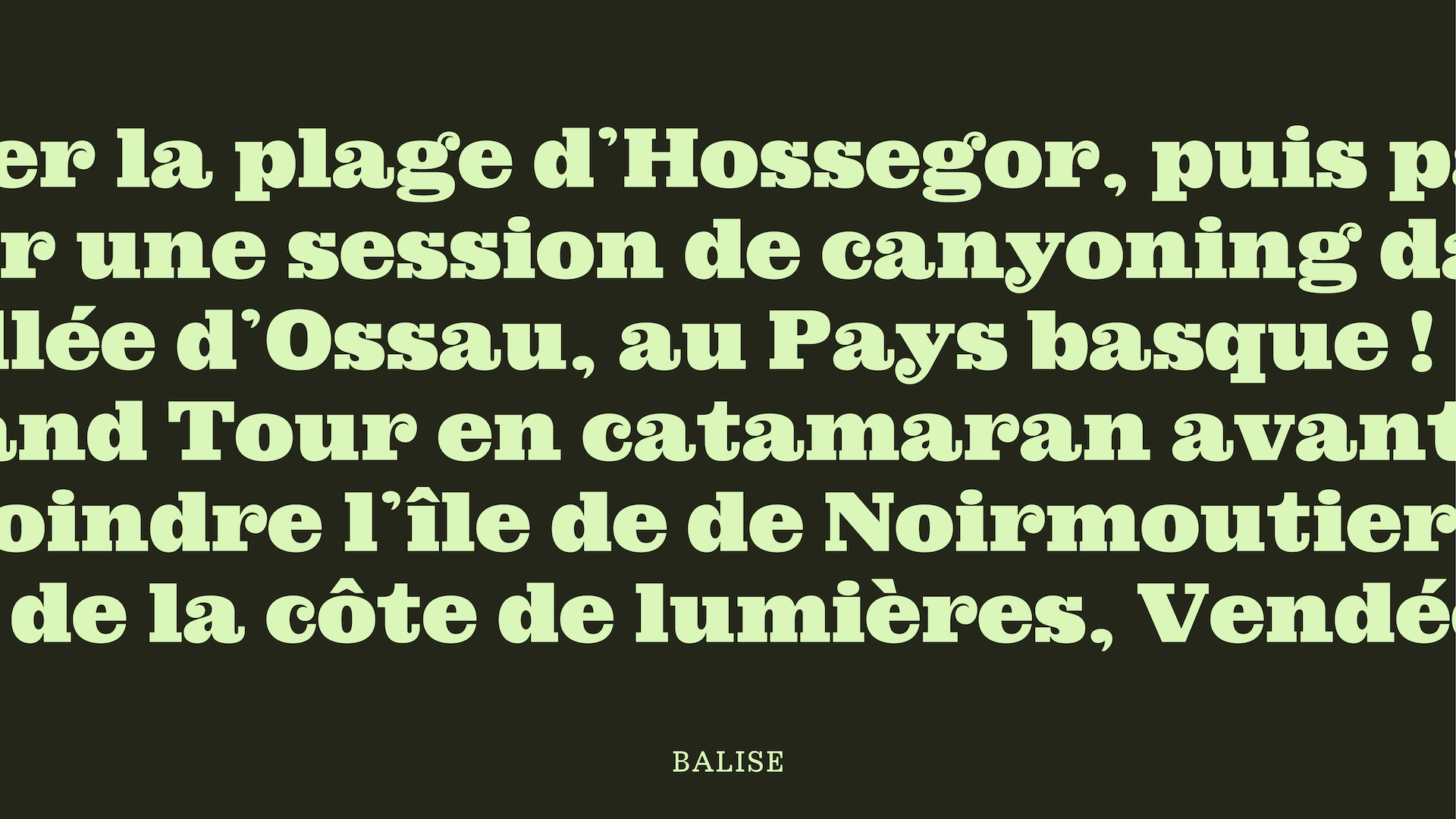
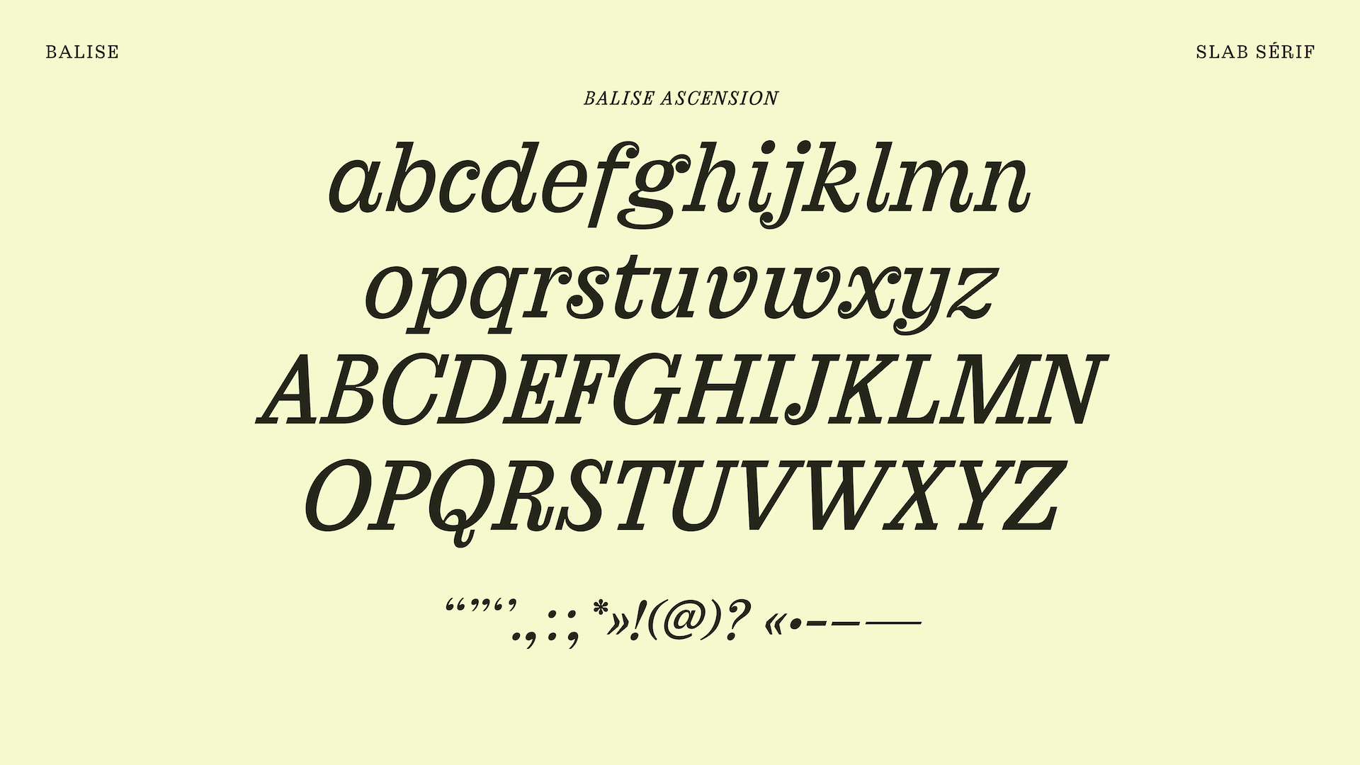
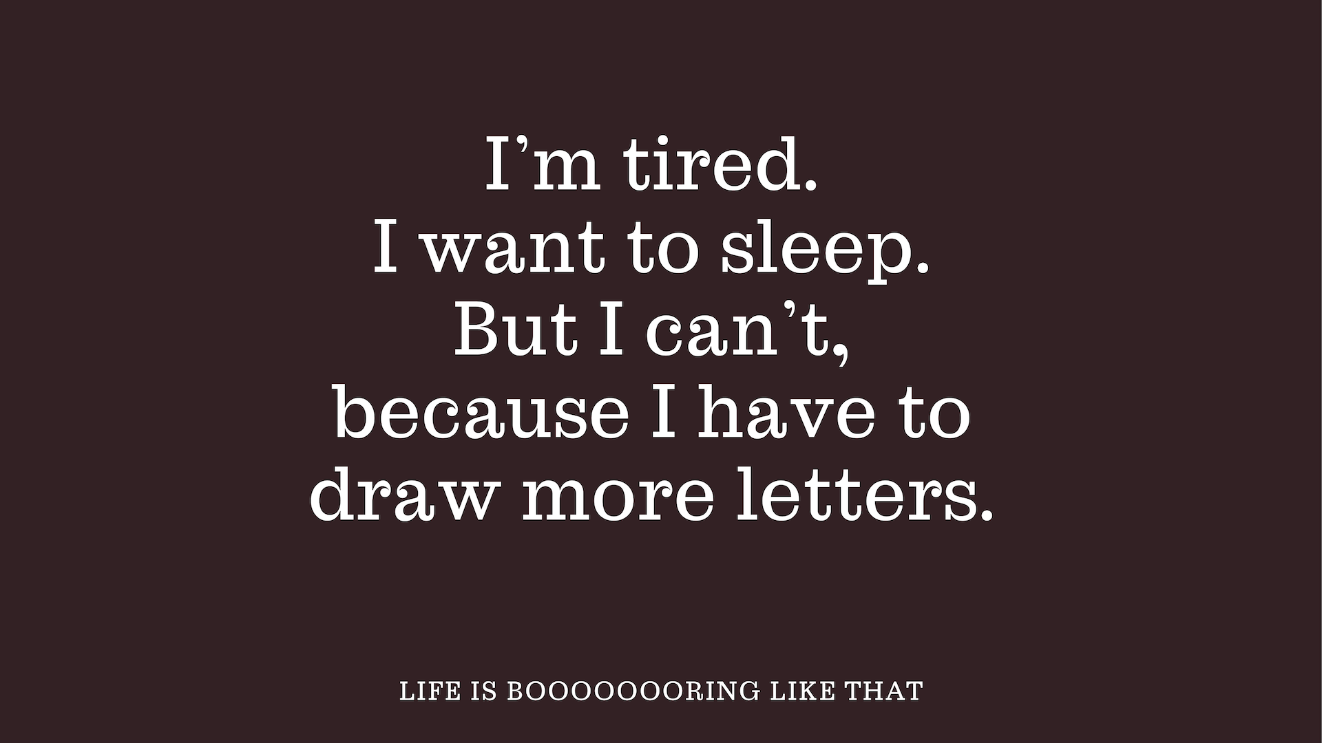
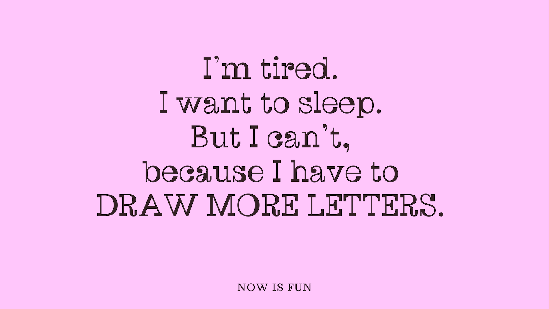
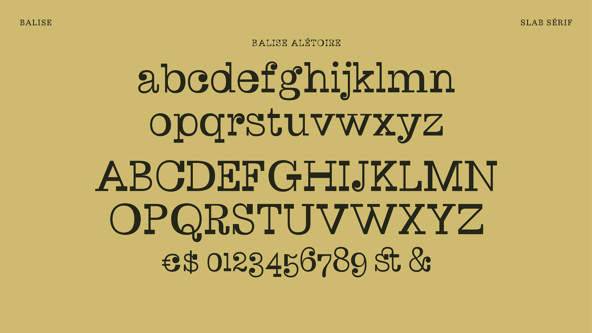
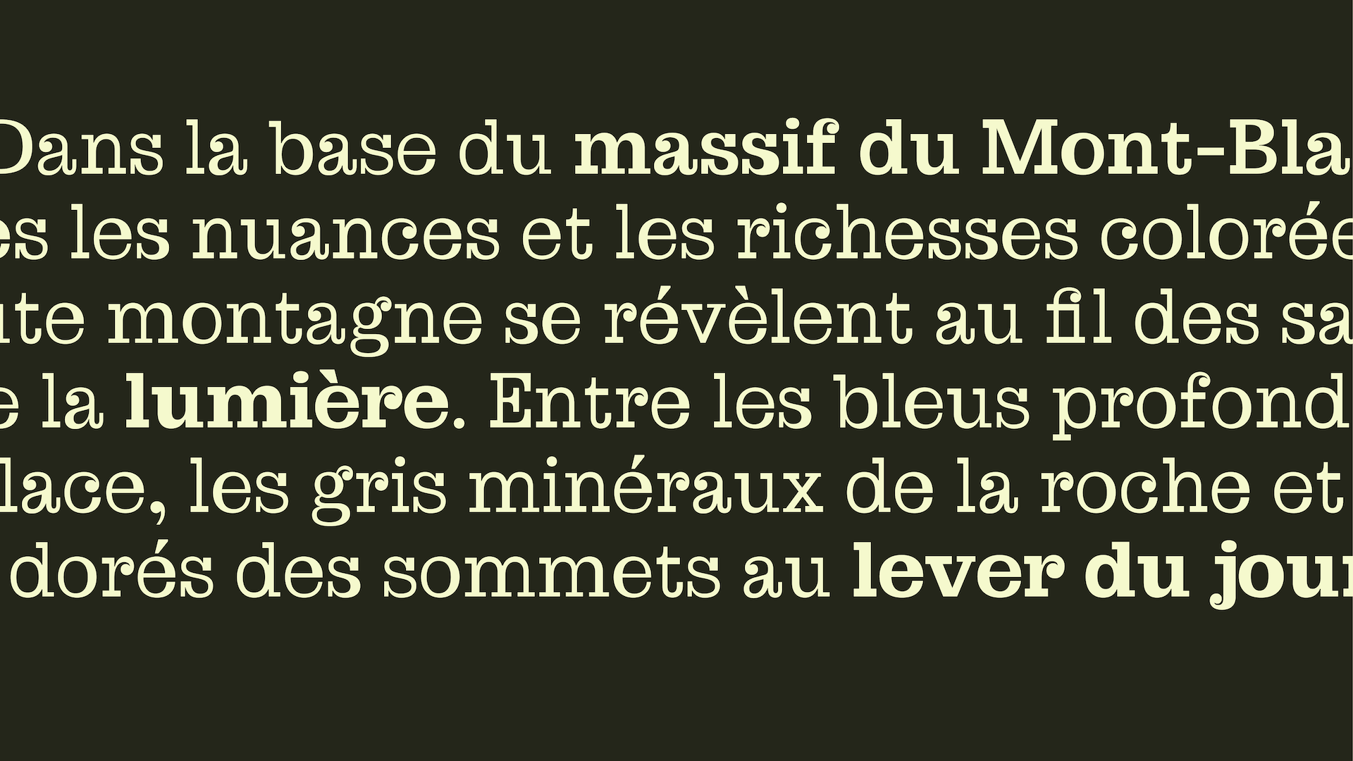
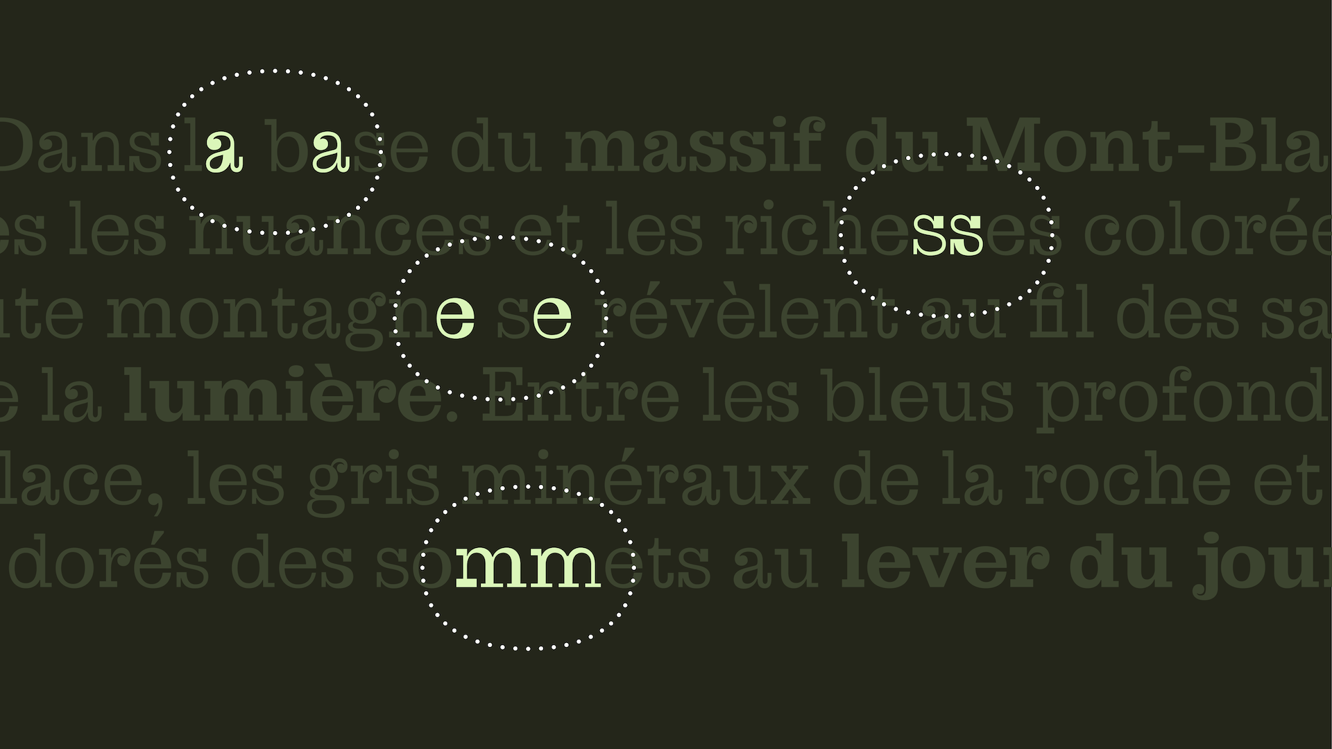
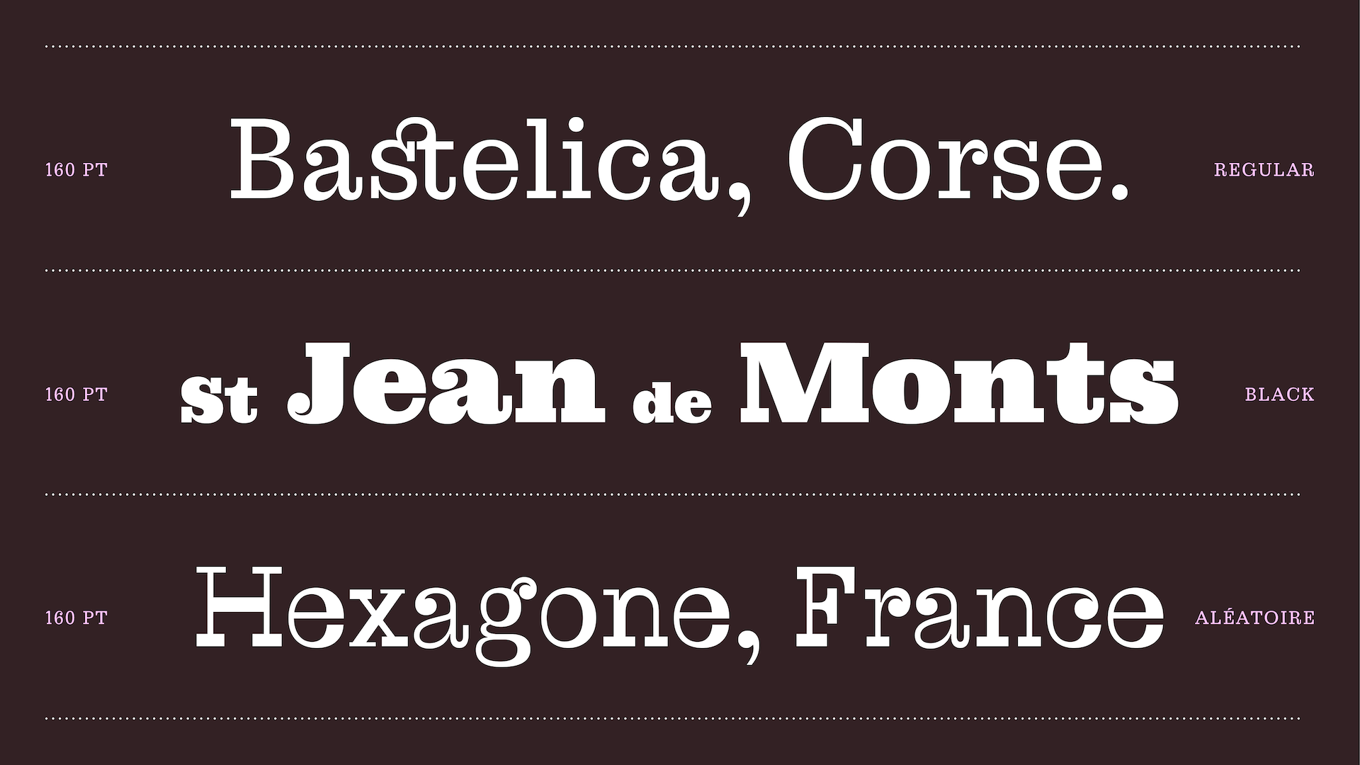
Balise keeps the characteristic contrast of its references. The adaptation comes through the design of the drops with added inktraps, the balance between curves and verticals, and clean serifs. The goal is to offer a functional tool from text to display, serving one clear purpose : territorial and tourism communication, from local tourism offices to independent media like Les Others, across print and digital.
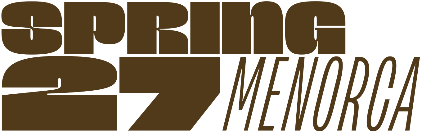
Apply before 14 January for the three-week type design course starting 5 April and ending 24 April 2027.

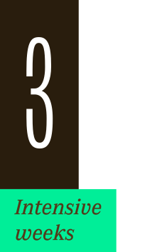
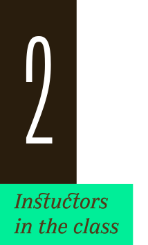
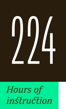
After 10 years in Paris, we reinvent our type design programme. We go from 6 weeks to 3 weeks, while maintaining the fundamentals that make TypeParis’ reputation.
The course will take place in Menorca, Spain for the first time. In 2027, we offer two levels, Foundation and Expert, which allows you to discover type design, or to gain expertise after an initial training.
➼ Subscribe to our mailing list to stay informed, until application period is launched.
Get ready & apply before 14 January 2027