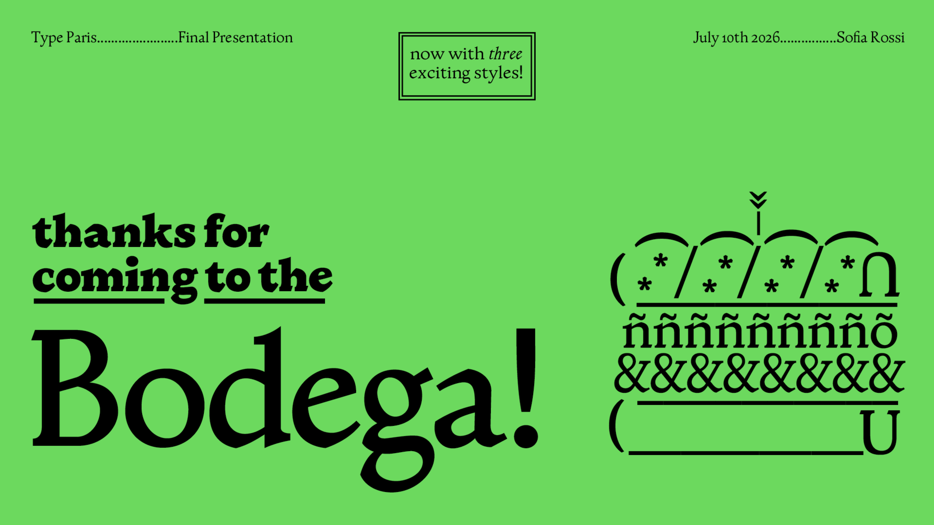
Bodega
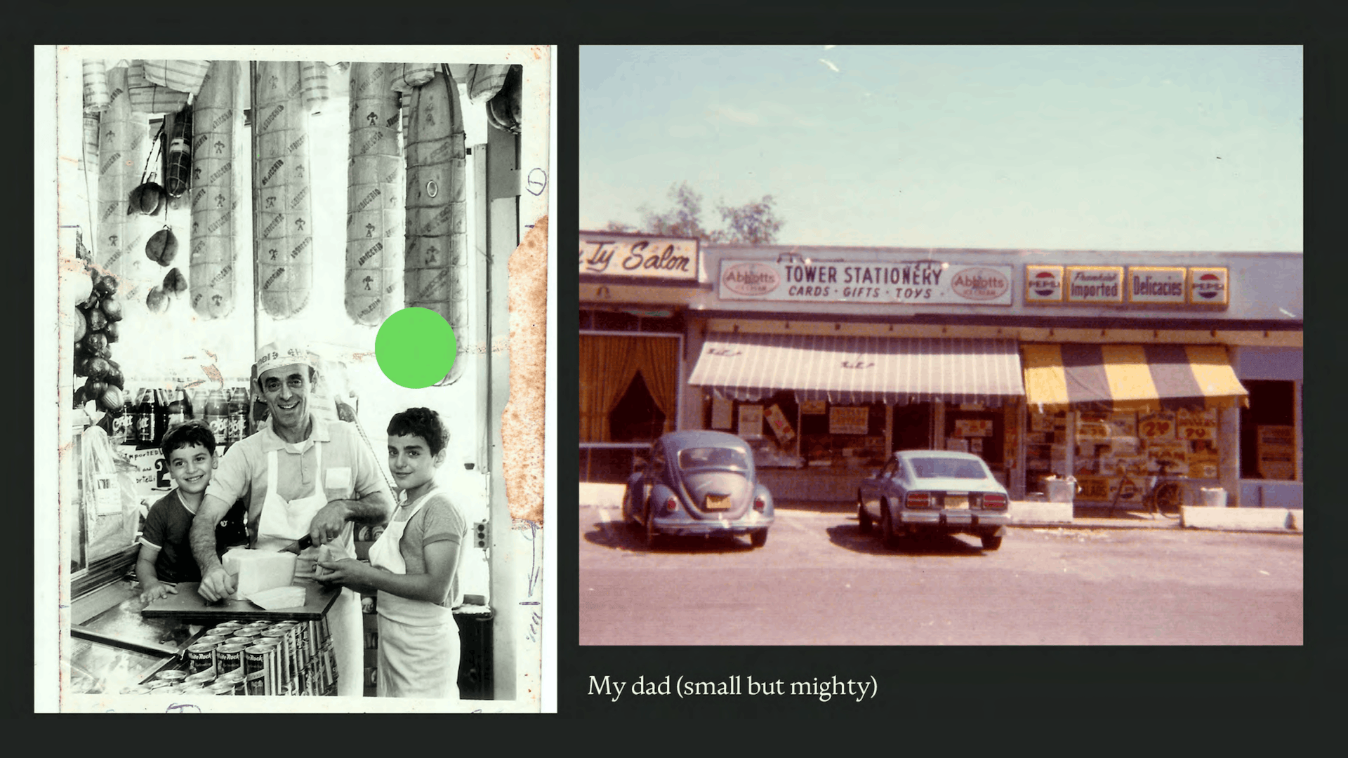
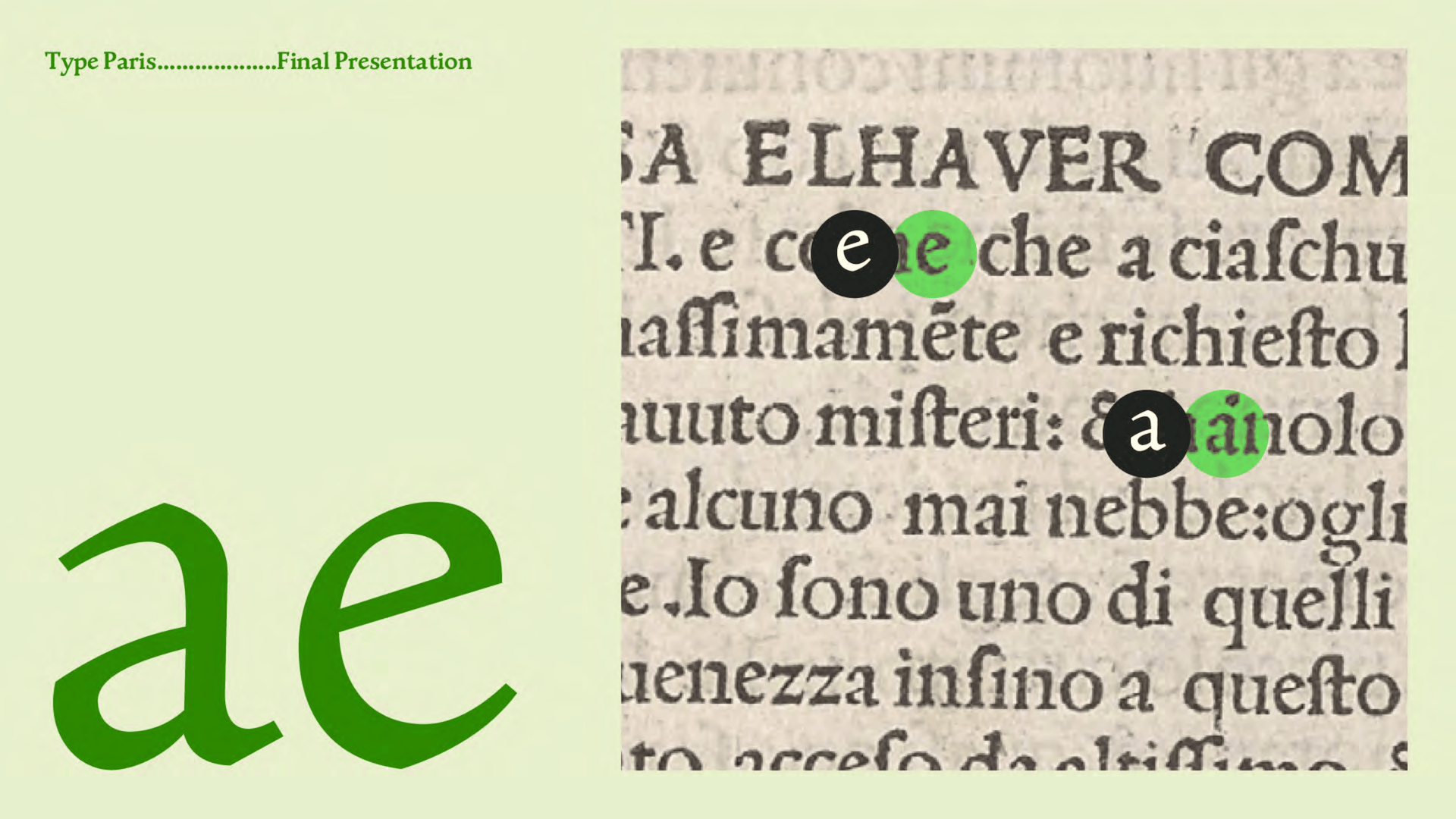
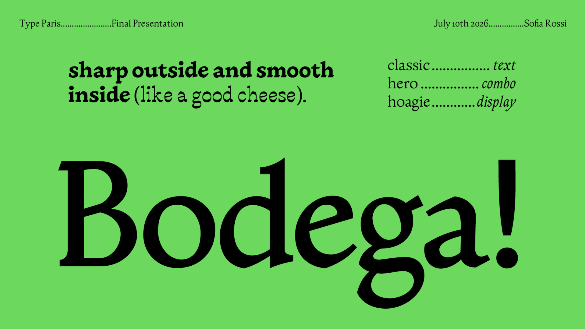
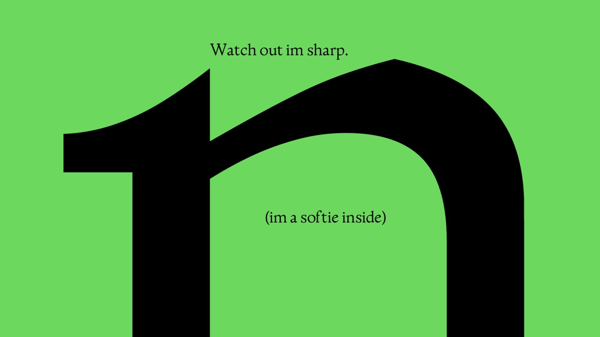
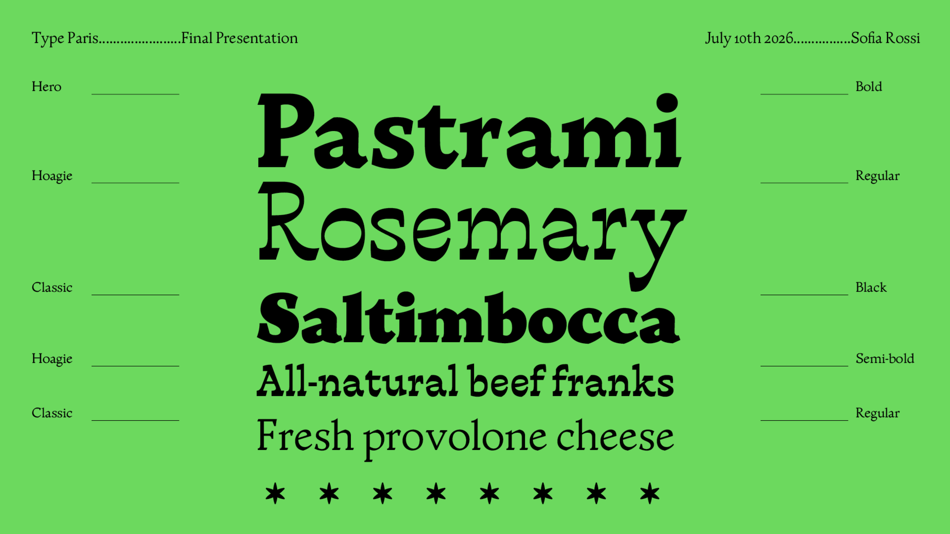
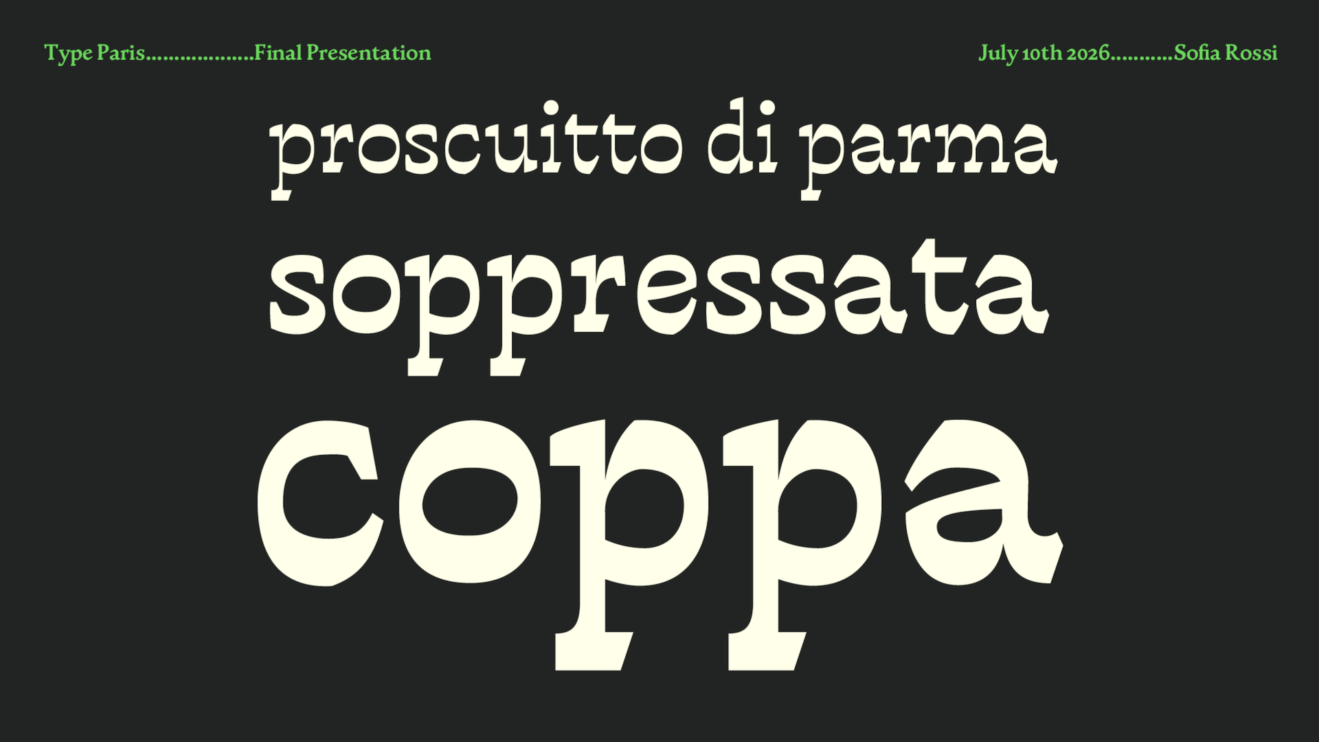
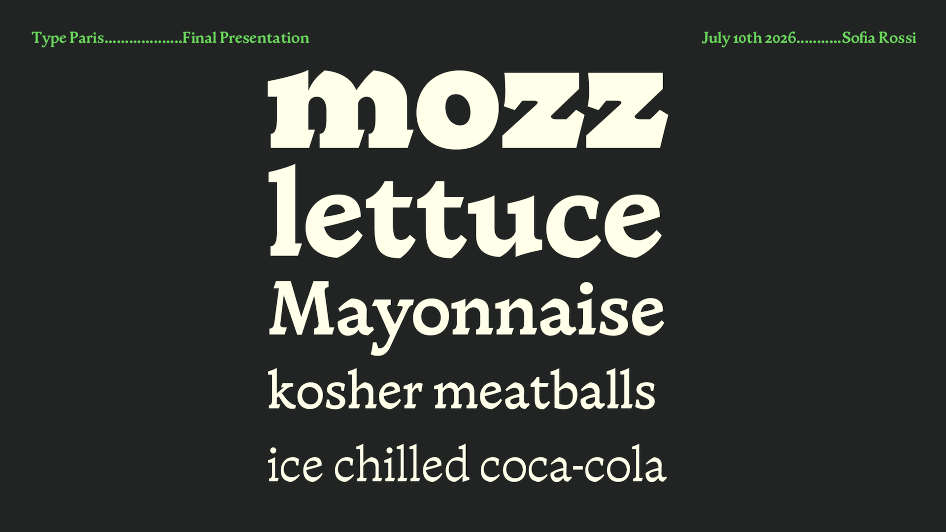
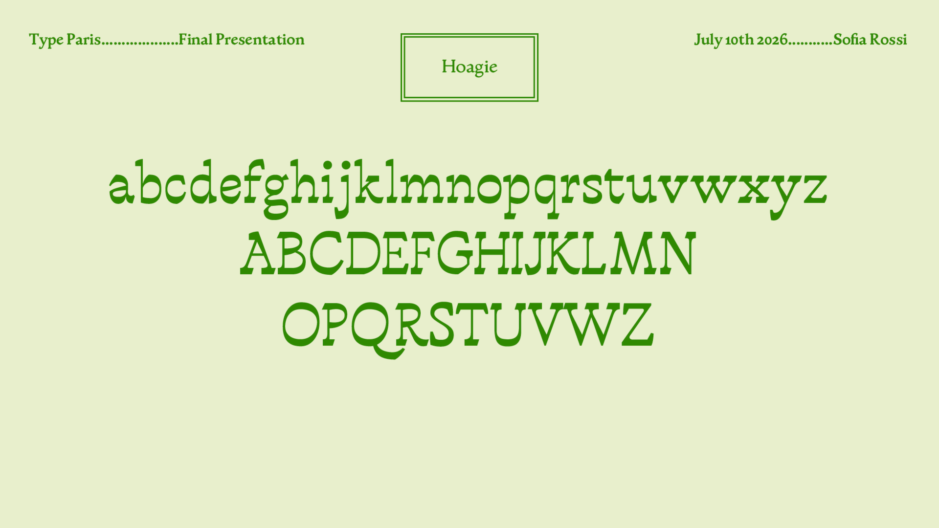
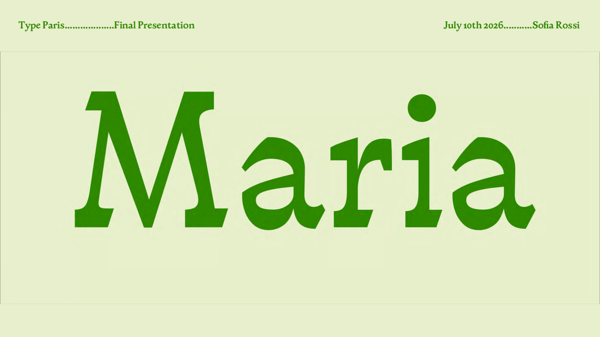
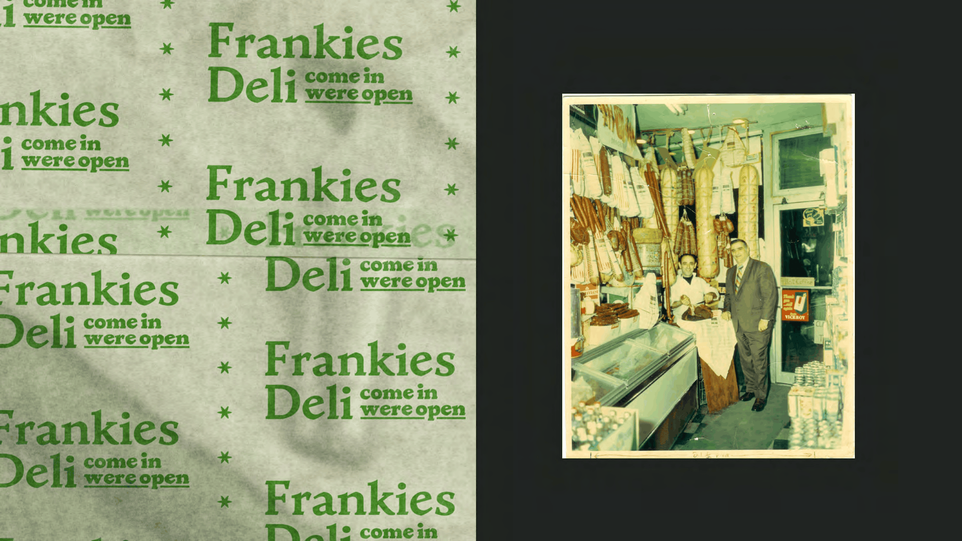
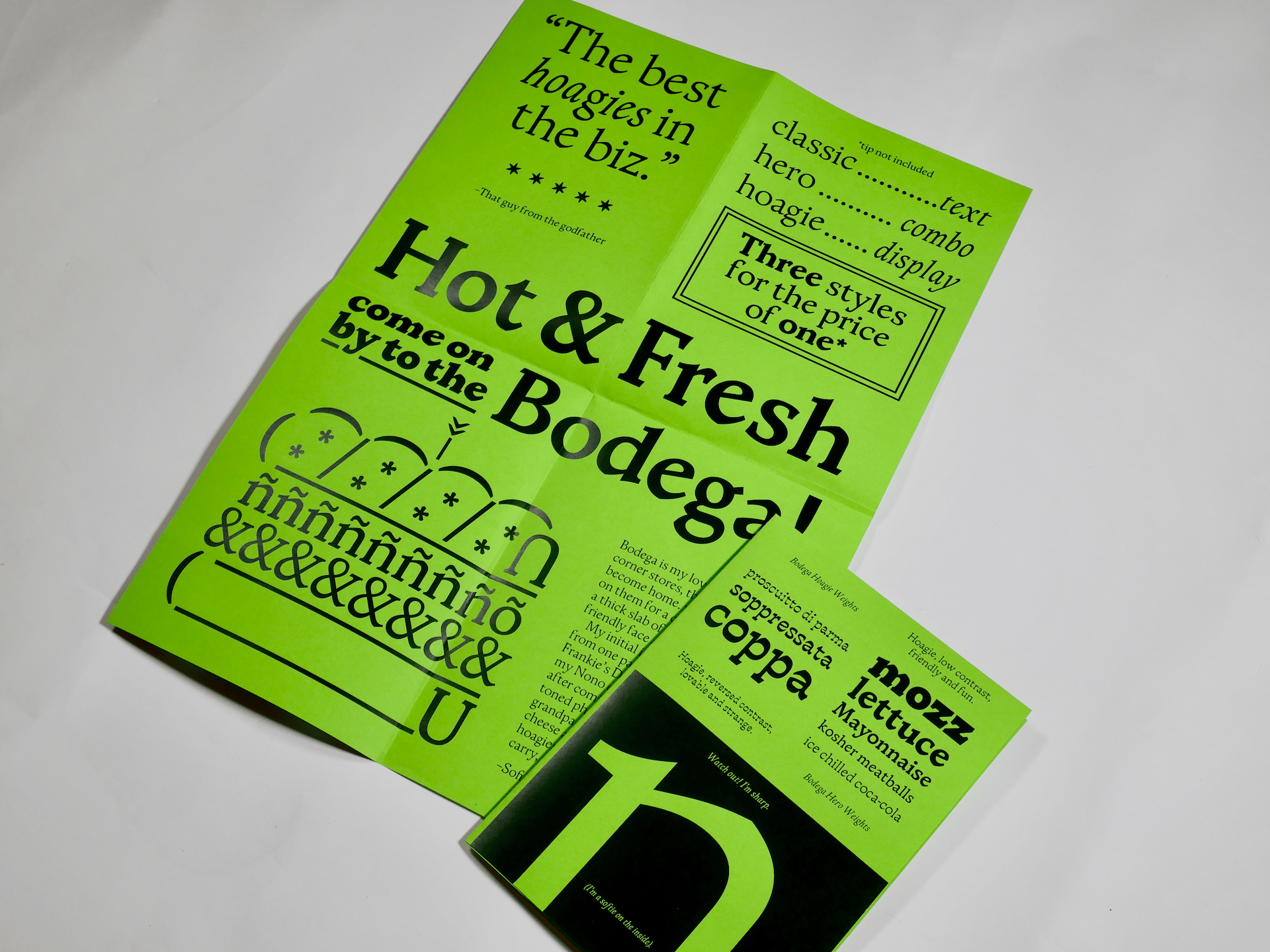
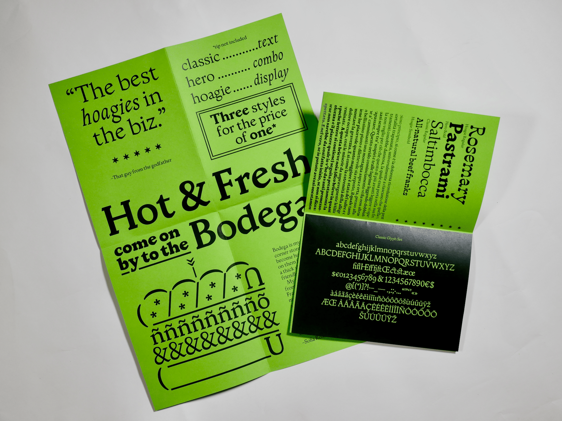
Bodega is my love letter to corner stores, the shops that become routine; you can count on them for a cheap sandwich, or a slab of cheese, or just a friendly face. My initial inspiration came from one particular store, Frankie’s Deli, the Italian delicatessen my Nono opened in New Jersey after coming to the States. Black and white photos show my dad and grandpa in a jungle of hanging cheeses and cured meats, carrying hoagies longer than both arms outstretched. With Bodega, I matched the familiarity of the deli with a humanist serif, drawn from the work of 15th-century Italian punch cutters. Bodega display brings in the atmosphere, cracking jokes and cutting you a thick cut of pastrami.
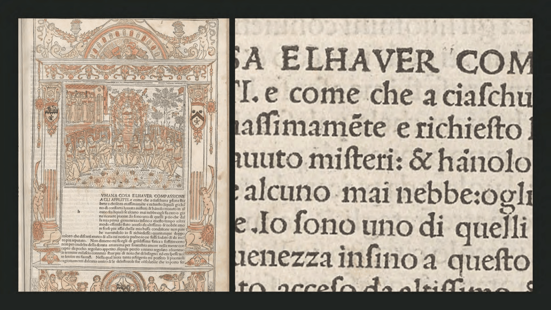
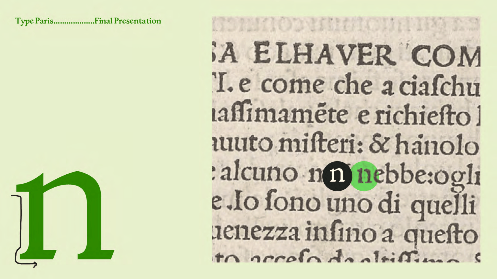
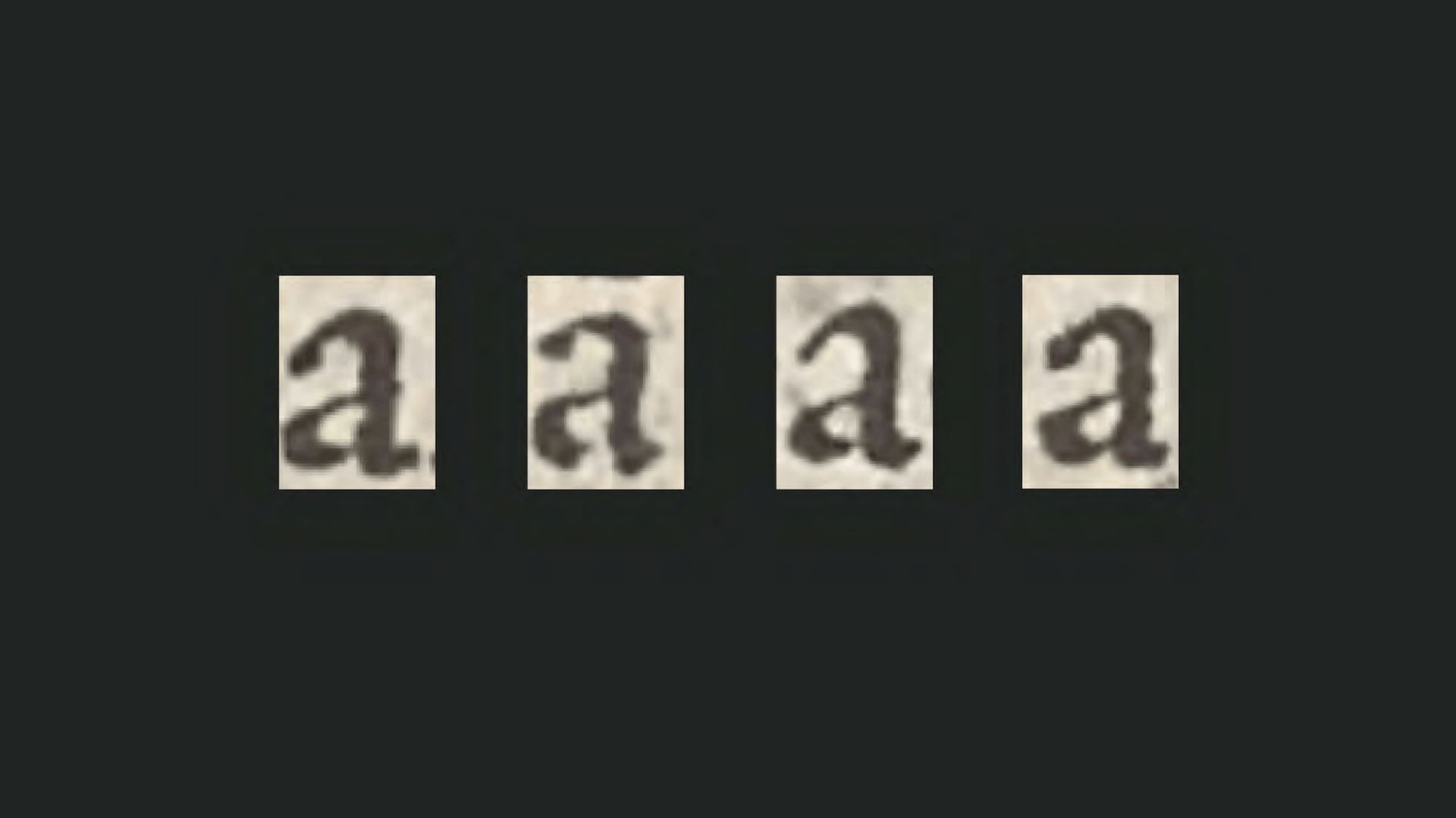
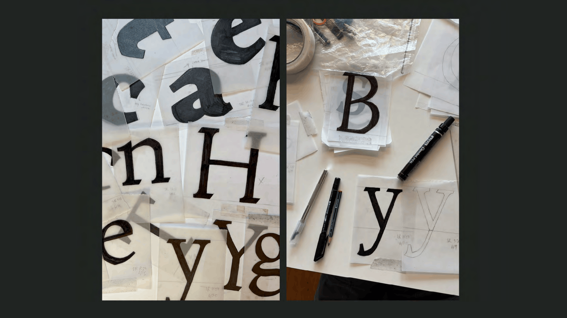
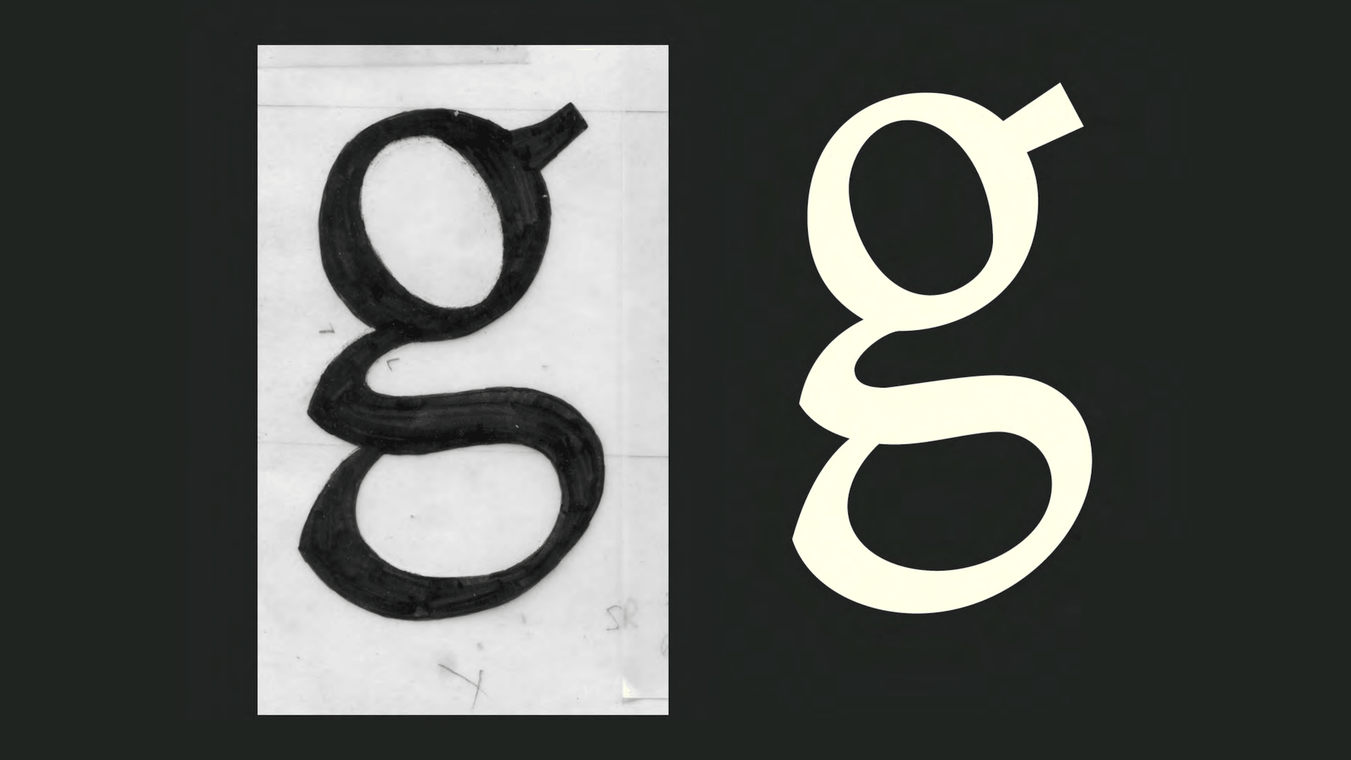
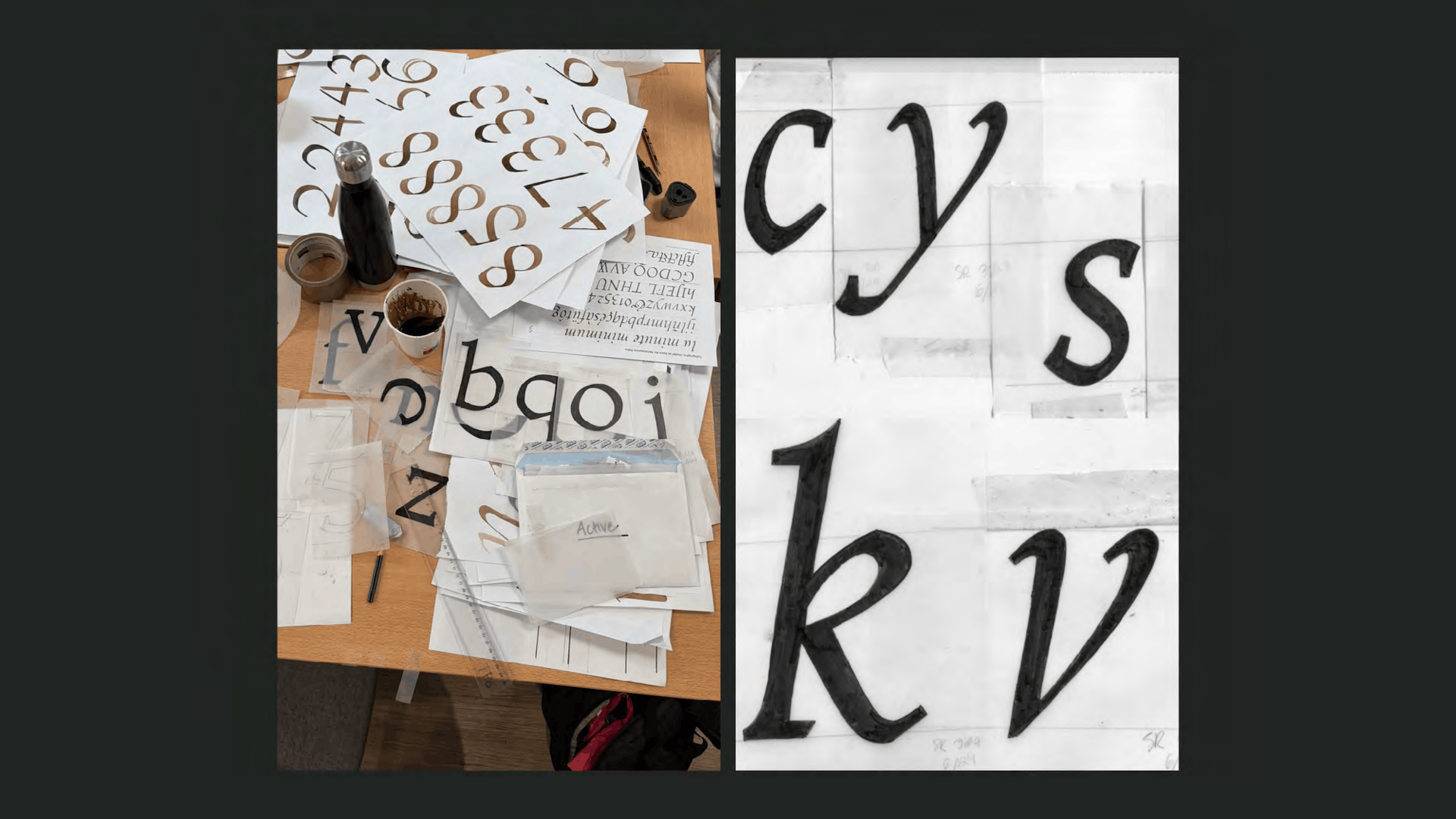
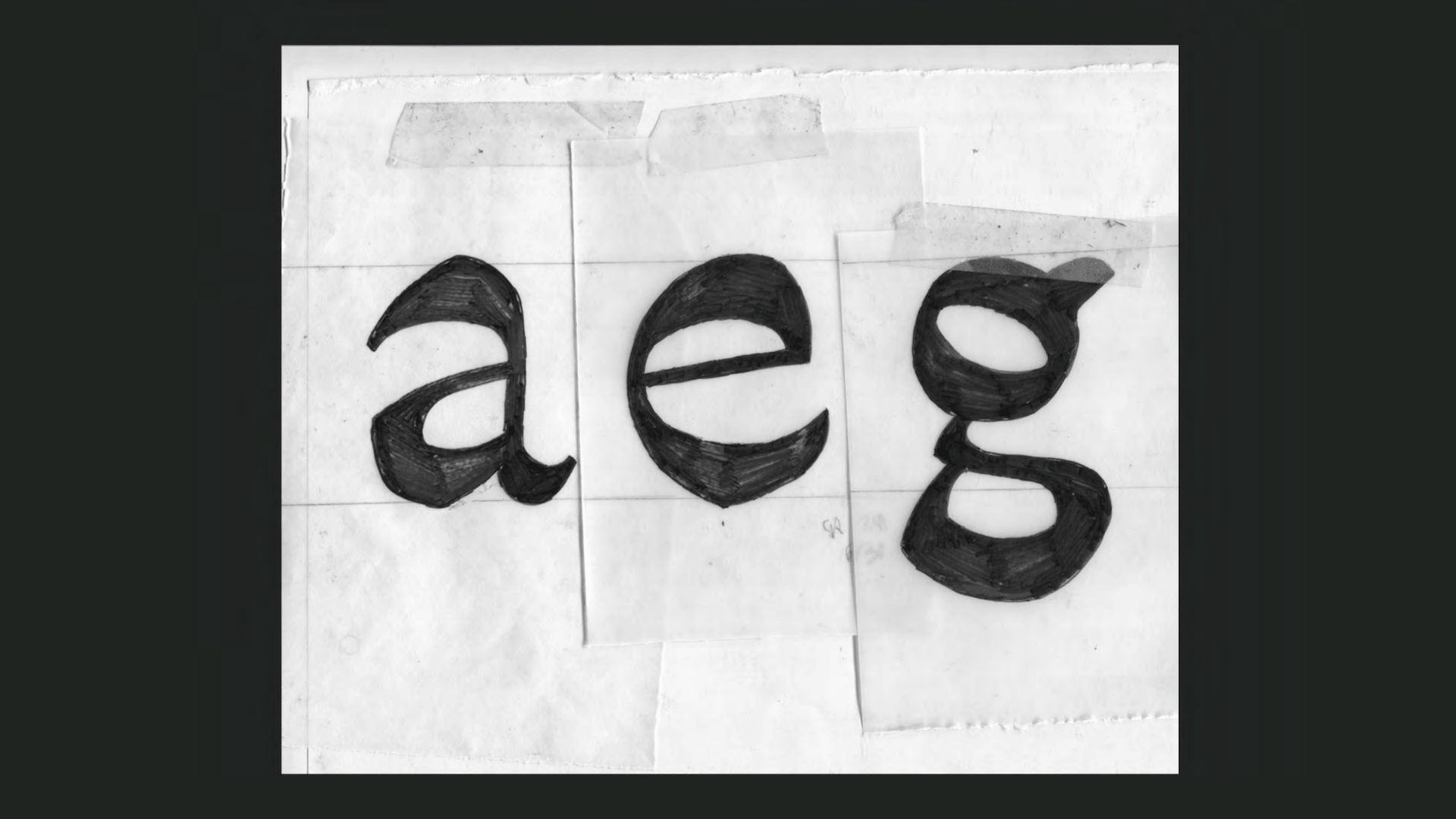
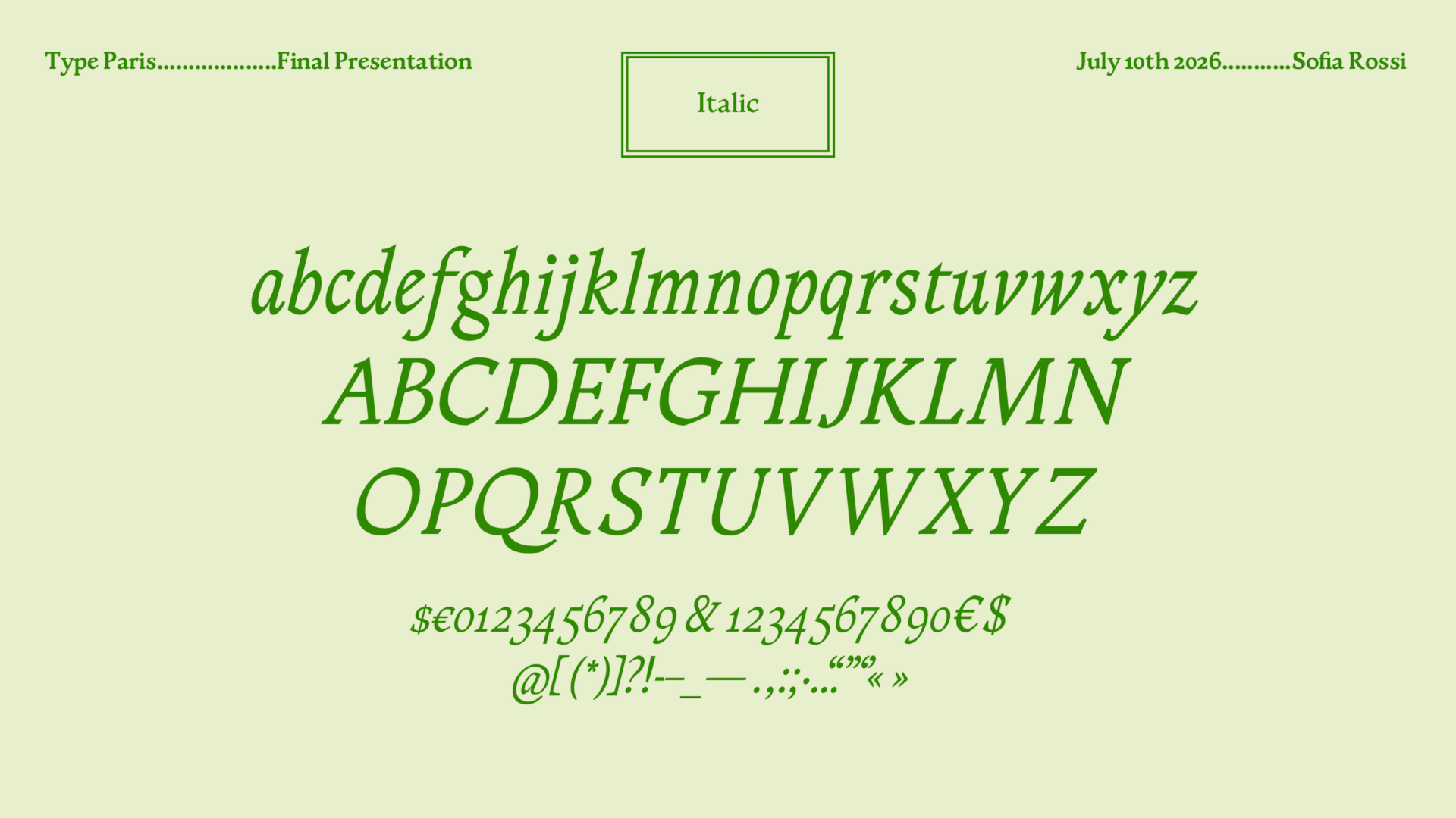
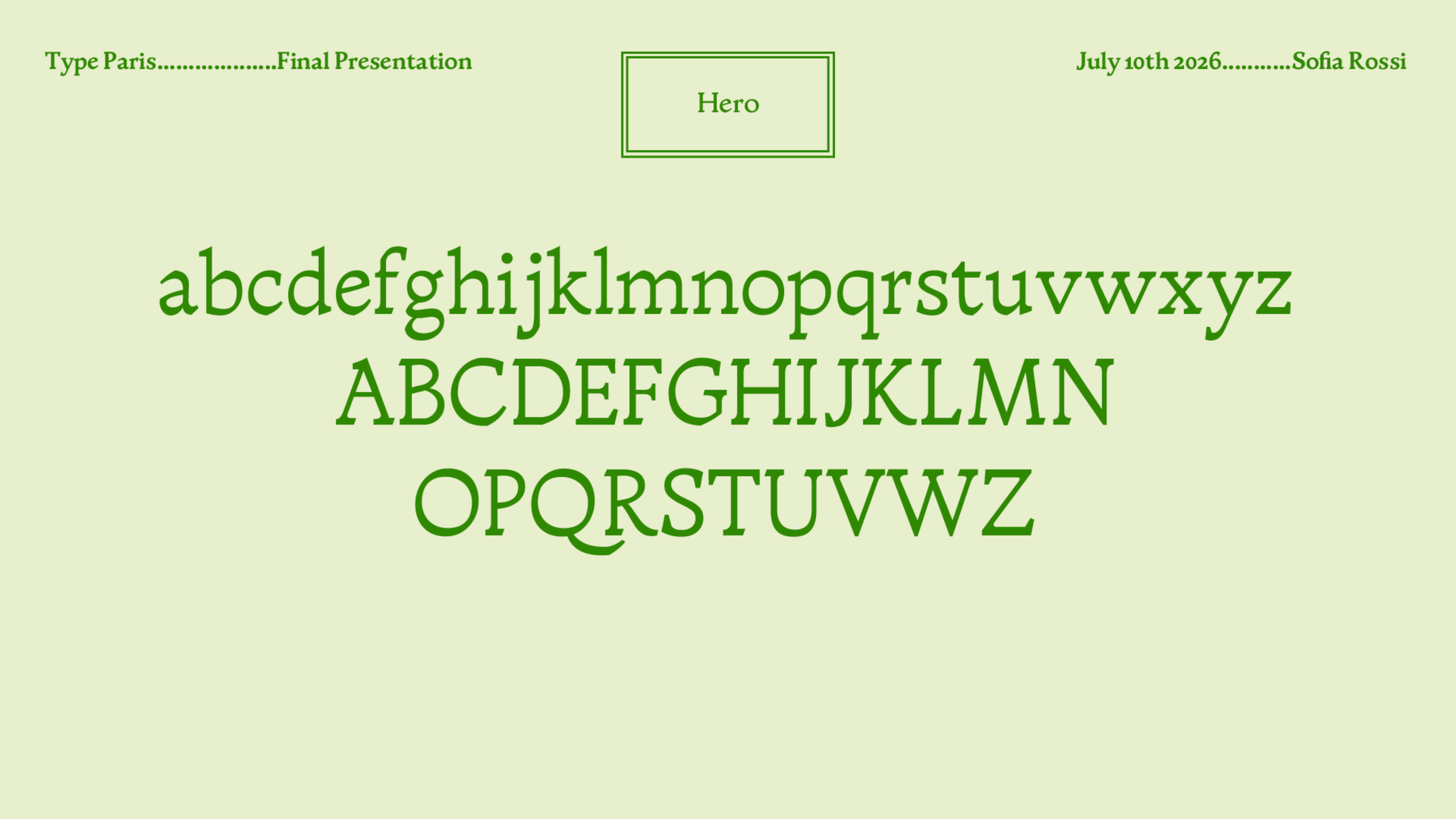
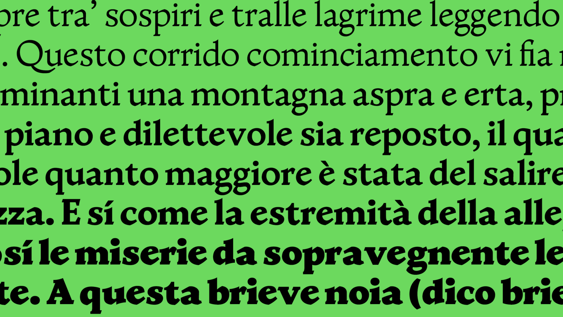
Bodega text draws from a beautiful version of the Decameron, a classic Italian comedy with raunchy and colourful characters, set by punch cutters in Venice in 1492. This source came with imperfections that left me room to play, with messy printing and certain letters entirely absent because they weren’t used yet (the s, for example, only existed as the long s). The real experimentation came in reversing the contrast, meshing the old and new in a melting pot with no idea of the result.

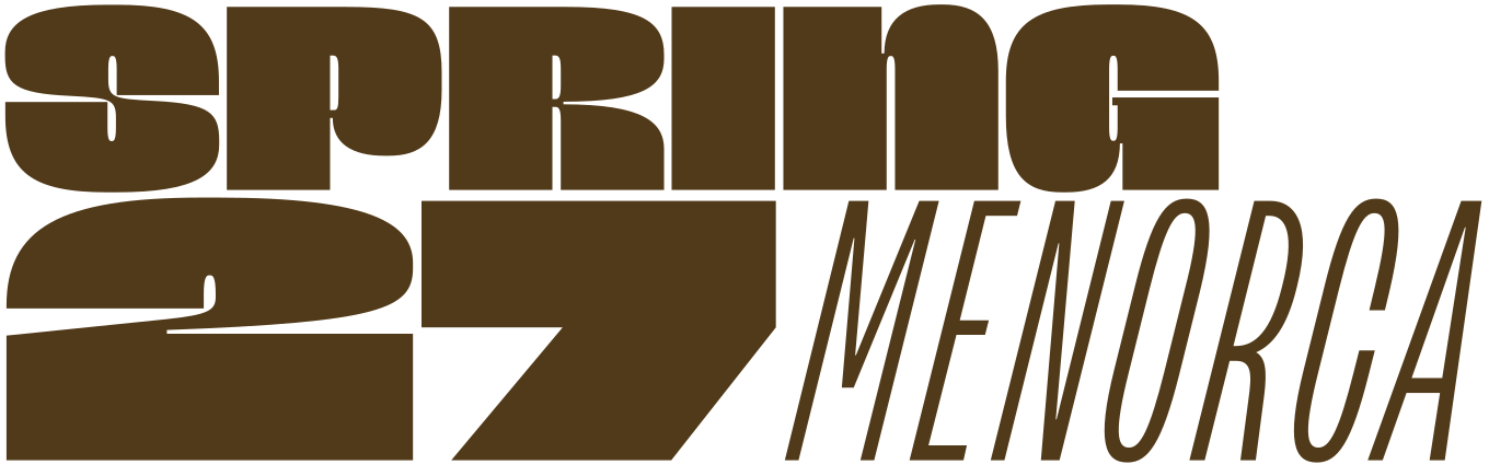
Apply before 14 January for the three-week type design course starting 5 April and ending 24 April 2027.

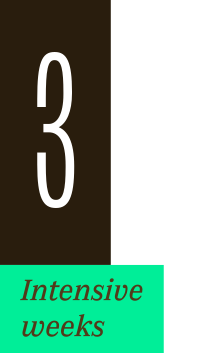
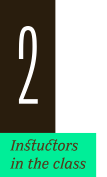
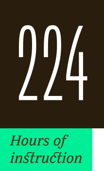
After 10 years in Paris, we reinvent our type design programme. We go from 6 weeks to 3 weeks, while maintaining the fundamentals that make TypeParis’ reputation.
The course will take place in Menorca, Spain for the first time. In 2027, we offer two levels, Foundation and Expert, which allows you to discover type design, or to gain expertise after an initial training.
➼ Subscribe to our mailing list to stay informed, until application period is launched.
Get ready & apply before 14 January 2027