Um, Berella
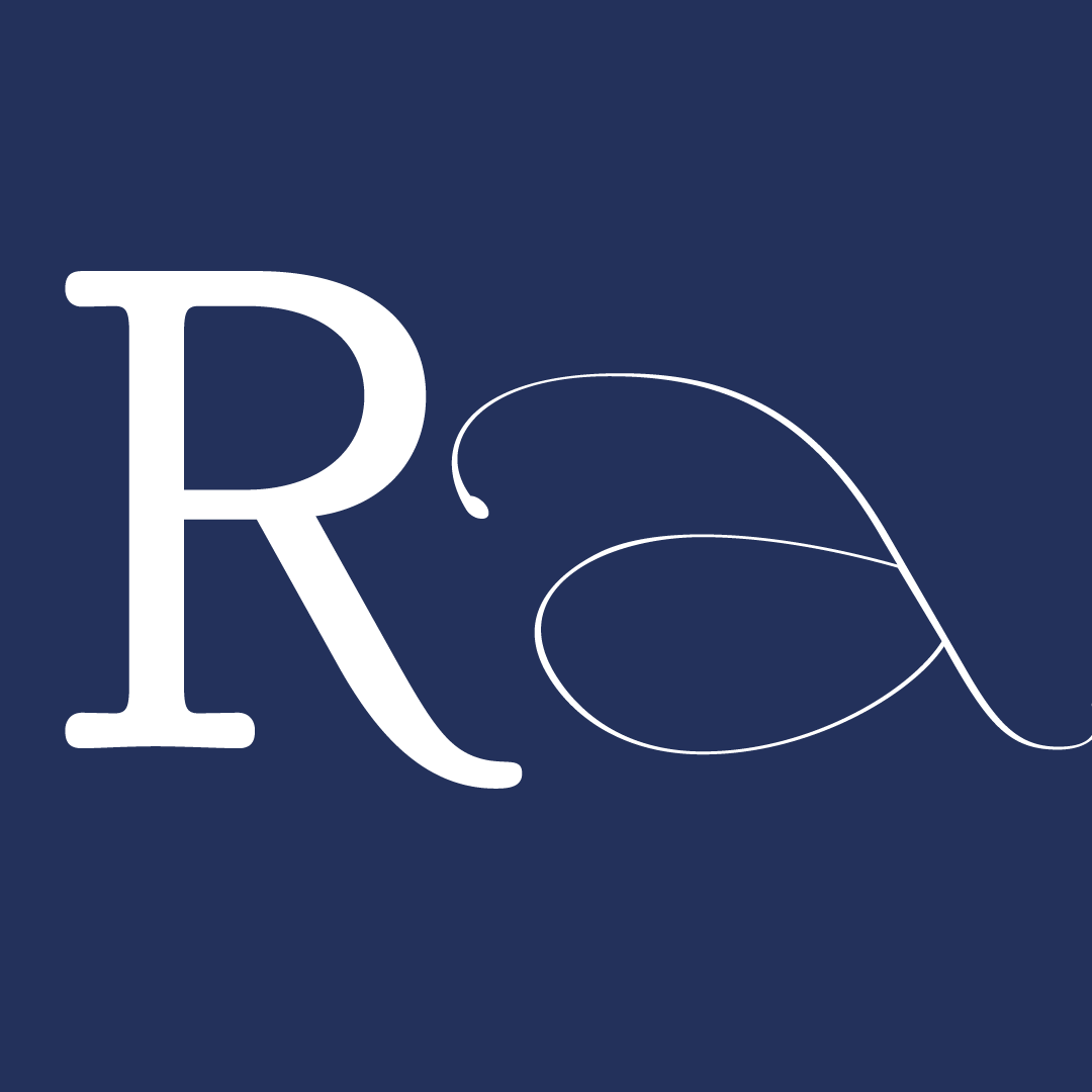
Um, Berella is a flared serif typeface family inspired by the style, attitude, and vision of Rihanna — global pop sensation, style and cultural icon, entrepreneur, and designer. Its snatched waists, accentuated curves, assertive joins, and tension between its outer curvature and inner obtuse angles borrow the common tropes exhibited by Rihanna’s design preferences. The features are drawn decisively and full of attention to construction, with no frilliness or extraneousness. The curves are never too overt to veer into clownish territory. The geometry involves straight edges, but rarely uses boring right angles and triangles. We mean business here.
The Regular weight serves well as an approachable and versatile style for text and headline applications. Keeping its inner angles from being too sharp ensures that there’s never too much to disrupt the gently undulating rhythm of a paragraph of text. The snatched waist is not too snatched to veer too far away from the reliable serif modulation and forms that make ease readers across an even grey of text. At the same time, the slightly condensed proportions make it feel contemporary and fit words well in a headline setting. It stands tall to say what is being said.
The rest of the family demonstrates the chameleonic quality Um, Berella shares with its inspiration. All the way in the Thin and Light weights, Um, Berella becomes more delicate and intricate. The glyphs bare their soul while still quietly evoking its sharps and curves. It is ballad Rihanna. On the opposite extreme, the Black and Pitch Black weights put on the swagger that a big, structured jacket brings to an outfit, as Rihanna frequently demonstrates in her street style. They take up space, round out their sharpness, bring a little sauce to the table, and speak loudly. It is the brash, no-holds-barred attitude Rihanna.
The condensed weights amp up the fashion and confidence of Um, Berella even further. It exudes the energy of walking tall in a good pair of heels and carrying your shoulders high. The x-height is not adjusted significantly, which makes it slightly less readable than the Regular weight, however it is more striking as a display weight instead.
Explorations into other styles such as high contrast, reverse contrast, or a complementary sans serif never felt quite as true to the inspiration. They either felt too kitschy, try hard, or serious.
Designing your first type family, let alone designing it around a persona that lacks much direct visual personal or historical reference, has been a humbling challenge. How do I apply Rihanna’s boldness, sauce, confidence, and approachability to the text typeface’s traditional calligraphic model roots? It was all running on vibes and trying on outfits (Which heel fits this glyph?) until it fit (And a lot of crying in frustration?)
It took a week of drawing 10s of n’s across styles to hone in a few directions to expand and consider more seriously. The instructors emphasized that a typeface is a system of letters — A single n does not begin to encapsulate how the rules work across full rounds, diagonals, or the verticality of uppercase letters.
Ultimately, the snatched waist, tension between curves and obtuse angles, and condensed proportions best captured the keywords I defined for the project. It took a bit of massaging to make it work across the system, but we arrived eventually with a cohesive typeface. It’s almost too cohesive and straightforward that I spent the final portions of the TypeParis term wracking my brain to find Rihanna in this sensible text typeface. The further explorations into a more snatched waist, different contrast models, a more cursive italic, and even a sans didn’t produce any obvious directions forward yet. I felt quite constrained by the choices I made, yet I hope that with more time and distance from the project, and the physical + mental stress of these past six weeks, I could see how a flared serif is not a trap.
Regardless of where this project goes:
— Thank you to the instructors for all their support and patience with my many clarification questions :)
— Thank you to my classmates for making space for my loudness and my tears :)
— Thank you to the friends and family who listened to my nonsense about people and type things they knew nothing about — Who reminded me that I’m loved and not alone, that letters aside, what matters is having fun and remember to be a good human :)


The 6-week type design programme that you’ve been waiting for starts on 2 June and ends 10 July 2026.


Open to all Our summer programme is in English and covers typeface design and calligraphy techniques, type history, and software practices. Whether you’re a design pro or just curious about type design, you can learn all about it in a relatively short amount of time.
➼ Subscribe to our mailing list to don’t miss important updates.